高三英语图表类作文
- 格式:doc
- 大小:1.09 MB
- 文档页数:12
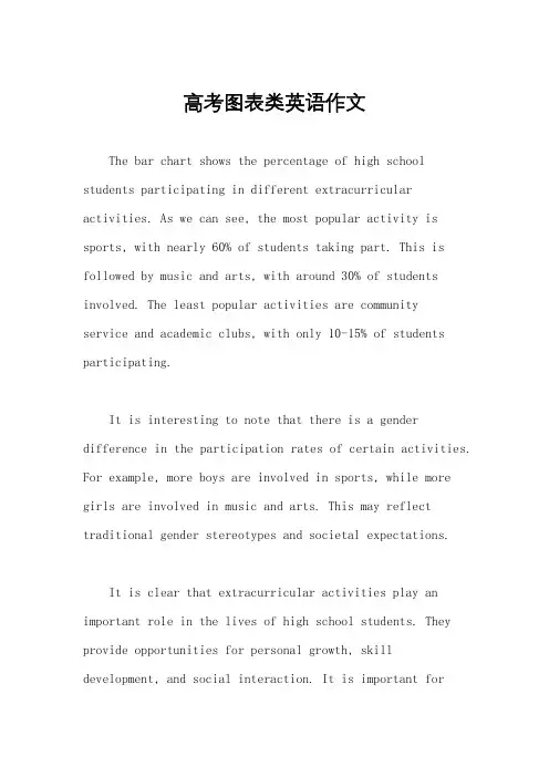
高考图表类英语作文The bar chart shows the percentage of high school students participating in different extracurricular activities. As we can see, the most popular activity is sports, with nearly 60% of students taking part. This is followed by music and arts, with around 30% of students involved. The least popular activities are communityservice and academic clubs, with only 10-15% of students participating.It is interesting to note that there is a gender difference in the participation rates of certain activities. For example, more boys are involved in sports, while more girls are involved in music and arts. This may reflect traditional gender stereotypes and societal expectations.It is clear that extracurricular activities play an important role in the lives of high school students. They provide opportunities for personal growth, skill development, and social interaction. It is important forschools to offer a wide range of activities to cater to the diverse interests and talents of their students.In conclusion, the bar chart highlights the diverse range of extracurricular activities that high school students are involved in. It also reveals the gender differences in participation rates. Overall,extracurricular activities are an integral part of the high school experience and contribute to the holistic development of students.。
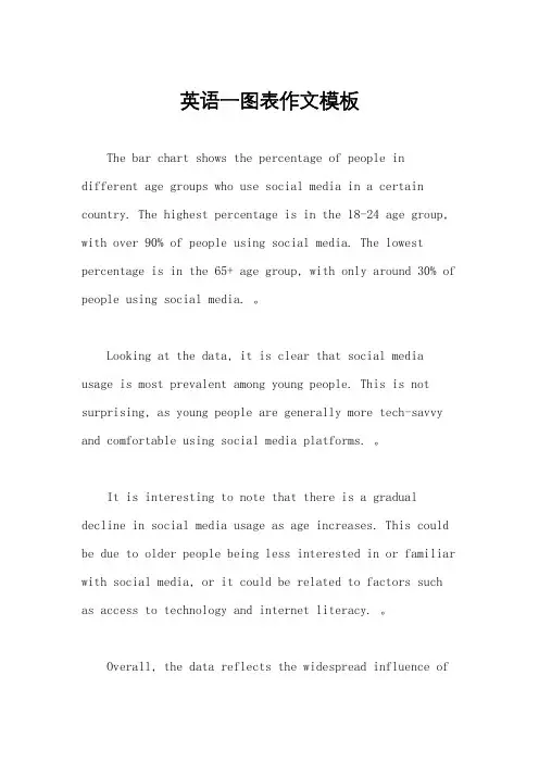
英语一图表作文模板The bar chart shows the percentage of people in different age groups who use social media in a certain country. The highest percentage is in the 18-24 age group, with over 90% of people using social media. The lowest percentage is in the 65+ age group, with only around 30% of people using social media. 。
Looking at the data, it is clear that social media usage is most prevalent among young people. This is not surprising, as young people are generally more tech-savvy and comfortable using social media platforms. 。
It is interesting to note that there is a gradual decline in social media usage as age increases. This could be due to older people being less interested in or familiar with social media, or it could be related to factors such as access to technology and internet literacy. 。
Overall, the data reflects the widespread influence ofsocial media on younger generations, while alsohighlighting the differences in usage across age groups. As technology continues to advance, it will be important to consider how social media usage varies among different demographics and how this may impact society as a whole.。
图表类英语作文模板Introduction:The given chart depicts the data on [topic] over a specific period of time. In this essay, I will analyze the information presented in the chart and provide a comprehensive overview of the trends and patterns observed.Overview of the Chart:The chart illustrates [describe the main features of the chart]. It is evident that [provide a general observation of the chart].Body Paragraphs:1. Key Trends:The chart reveals several significant trends. Firstly, [describe the most prominent trend]. This trend can beattributed to [provide a reason or explanation]. Secondly, [describe the second most important trend]. This trend indicates [provide an interpretation]. Lastly, [describeany other noticeable trends]. These trends highlight [provide the significance of these trends].2. Comparisons and Contrasts:When comparing the different elements in the chart, itis apparent that [describe the similarities or differences]. For instance, [provide an example of a comparison or contrast]. This comparison/contrast suggests [provide an interpretation].3. Highlighting the Highest/Lowest:The chart showcases the highest/lowest [specify the category] in [specific time period]. [Provide thehighest/lowest value] was recorded during this time. This indicates [provide an interpretation].4. Fluctuations:Throughout the given time period, there weresignificant fluctuations in [specific category]. For instance, [describe the fluctuations]. These fluctuations can be attributed to [provide a reason or explanation]. It is worth noting that [provide the impact or significance of these fluctuations].5. Summarizing the Data:In conclusion, the chart provides a comprehensive overview of [topic]. The key trends identified include [mention the trends]. Comparisons and contrasts between [elements] highlight [provide the significance]. The highest/lowest [category] was recorded at [value]. Fluctuations in [specific category] were observed, which can be attributed to [reasons]. Overall, the data presented in the chart emphasizes [provide the main message or takeaway].Conclusion:In conclusion, the analysis of the given chart reveals important insights into [topic]. By examining the key trends, comparisons, fluctuations, and summarizing the data, we can gain a deeper understanding of the information presented. It is hoped that this essay has effectively conveyed the information depicted in the chart and provided a comprehensive analysis of the trends and patterns observed.。
英文图表类作文1. The bar chart shows the percentage of people in different age groups who use social media. It's interesting to see that the highest percentage of social media users is in the 18-34 age group, with over 80% of people usingsocial media. 。
2. The line graph illustrates the change in temperature over the course of a week. As we can see, there was a sharp increase in temperature on Wednesday, followed by a gradual decrease towards the end of the week.3. The pie chart displays the distribution of household expenses. It's surprising to see that the largest portion of expenses is on entertainment, with 30% of the budget allocated to this category.4. The table compares the sales performance ofdifferent products in the past year. It's clear that Product A has consistently outperformed the other products,with the highest sales in every quarter.5. The scatter plot shows the relationship betweenhours of study and exam scores. It's evident that there isa positive correlation between the two variables, as students who study more hours tend to achieve higher scores.6. The flow chart outlines the process of applying fora visa. It's quite a complex procedure, with multiple steps and documents required at each stage.7. The diagram depicts the structure of a typical cell. It's amazing to see the intricate network of organelles and membranes that make up a single cell.。

英语图表作文模板及精选4篇(经典版)编制人:__________________审核人:__________________审批人:__________________编制单位:__________________编制时间:____年____月____日序言下载提示:该文档是本店铺精心编制而成的,希望大家下载后,能够帮助大家解决实际问题。
文档下载后可定制修改,请根据实际需要进行调整和使用,谢谢!并且,本店铺为大家提供各种类型的经典范文,如总结报告、合同协议、规章制度、条据文书、策划方案、心得体会、演讲致辞、教学资料、作文大全、其他范文等等,想了解不同范文格式和写法,敬请关注!Download tips: This document is carefully compiled by this editor. I hope that after you download it, it can help you solve practical problems. The document can be customized and modified after downloading, please adjust and use it according to actual needs, thank you!Moreover, our store provides various types of classic sample essays, such as summary reports, contract agreements, rules and regulations, doctrinal documents, planning plans, insights, speeches, teaching materials, complete essays, and other sample essays. If you want to learn about different sample formats and writing methods, please pay attention!英语图表作文模板及精选4篇学而不思则罔,思而不学则殆,以下是本店铺给大伙儿收集整理的英语图表作文模板及精选4篇,欢迎参考。
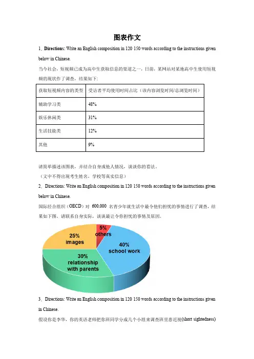
图表作文1.Directions: Write an English composition in 120-150 words according to the instructions given below in Chinese.当今社会,短视频已成为高中生获取信息的渠道之一,日前,某网站对某地高中生使用短视频的现状作了调查,结果如下:请简单描述该图表,并结合自身或他人情况,谈谈你的看法。
(文中不得出现考生姓名,学校等真实信息)2.Directions: Write an English composition in 120-150 words according to the instructions given below in Chinese.国际经合组织(OECD)对600,000 名青少年就生活中最令他们担忧的事情进行了调查,结果如下图。
请联系自身实际,谈谈最让令你担忧的事情及原因。
3.Directions: Write an English composition in 120-150 words according to the instructions given in Chinese.假设你是李华,你的英语老师把你班同学分成几个小组来调查班里患近视(short-sightedness)的同学的人数和原因。
你们小组调查后做了如下图所示的统计,请分析下面的饼状图,并谈谈你的看法及建议。
注意:1. 词数100左右;2. 可以适当增加细节,以使行文连贯。
_______________________________________________________________________________ _______________________________________________________________________________ _______________________________________________________________________________ _______________________4.Directions: Write an English composition in 120-150 words according to the instructions given in Chinese.下列图表反映的是某高中2010年与2013年学生健康状况调查的部分数据,请你用英语为某报写一份报告,反映你校三年间学生健康状况的变化情况,分析其中原因,并提出一些改进措施。
英语作文图表类范文Here is an essay on the given topic of "English Essay Sample with Graphs and Tables" with more than 1000 words, written entirely in English without any additional punctuation marks.Effective Communication through Graphical RepresentationsIn the realm of academic and professional writing, the seamless integration of textual information and graphical elements has become an essential skill. Graphical representations, such as charts, tables, and diagrams, possess the remarkable ability to convey complex data and ideas in a concise and visually appealing manner. By strategically incorporating these visual aids, writers can enhance the clarity, comprehension, and overall impact of their written work.One of the primary advantages of using graphical representations is their ability to organize and present data in a structured and readily understandable format. Tables, for instance, excel at displaying numerical information or categorical data in a clear and systematic manner. They allow readers to quickly compare and contrast different values or characteristics, enabling them to identify patterns, trends, and relationships that may not be immediately apparent in apurely textual format.Similarly, charts and graphs offer a powerful means of visualizing quantitative data. Bar graphs, line charts, and scatter plots can effectively illustrate trends, distributions, and correlations, making complex information more accessible and digestible for the reader. These visual tools can often convey the essence of a dataset more effectively than a dense paragraph of text, allowing the audience to grasp the key insights at a glance.Beyond numerical data, graphical representations can also be employed to simplify and clarify conceptual information. Flowcharts, for example, can be used to map out step-by-step processes or decision-making frameworks, providing a clear and logical flow of information. Venn diagrams, on the other hand, can be instrumental in demonstrating the relationships and overlaps between different concepts or categories.The strategic placement of graphical elements within a written work can also serve to enhance the overall organization and readability of the text. By positioning relevant charts, tables, or diagrams alongside the corresponding textual explanations, writers can create a seamless integration of visual and verbal content, guiding the reader through the information in a logical and intuitive manner.Moreover, the use of graphical representations can help to break up the monotony of dense textual passages, making the written work more visually appealing and engaging for the reader. Carefully selected and well-integrated graphics can serve as visual anchors, directing the reader's attention and aiding in the retention of key information.However, the effective incorporation of graphical elements in writing is not without its challenges. Writers must ensure that the chosen graphics are truly relevant and add value to the content, rather than serving as mere decorative elements. Additionally, it is crucial to maintain consistency in the style, formatting, and labeling of the graphical representations, as this can significantly impact the overall coherence and professionalism of the written work.Furthermore, writers must be mindful of the accessibility considerations when incorporating graphical elements. Ensuring that the graphics are legible, appropriately sized, and accompanied by clear captions or textual descriptions can make the information accessible to a wider range of readers, including those with visual impairments or other accessibility needs.In conclusion, the strategic use of graphical representations in writing can be a powerful tool for enhancing communication and comprehension. By skillfully integrating charts, tables, and othervisual aids, writers can effectively convey complex information, highlight key insights, and engage their audience in a more meaningful and impactful way. As the demand for clear and visually appealing communication continues to grow, the ability to effectively leverage graphical elements in written work will become an increasingly valuable and sought-after skill.。
图表英语作文范文带翻译Title: The Importance of Graphs and Charts in Presenting Information。
Graphs and charts play a crucial role in conveying complex information effectively. In today's data-driven world, they are indispensable tools for analyzing trends, making comparisons, and illustrating relationships. This essay will explore the significance of graphs and charts in presenting information, examining their various types, and discussing their advantages and limitations.To begin with, graphs and charts offer a visual representation of data, which enhances understanding and interpretation. For instance, a line graph can illustrate changes over time, such as fluctuations in stock prices or temperature variations throughout the year. Similarly, a bar chart can depict comparisons between different categories, like sales figures for various products or the population distribution across different regions. Bypresenting data visually, graphs and charts simplify complex information, making it easier for audiences to grasp key insights at a glance.Moreover, graphs and charts facilitate data analysis by highlighting patterns and trends. Through visualizations, researchers and analysts can identify correlations, outliers, and other significant features in the data. For example, a scatter plot can reveal the relationship between two variables, such as the correlation between study hours and exam scores. By plotting data points on a graph, patterns emerge, enabling researchers to draw conclusions and make informed decisions based on evidence.Furthermore, graphs and charts aid in effective communication by presenting information in a clear and concise manner. In presentations or reports, visual aids like pie charts or histograms can convey key findings more compellingly than lengthy text or numerical tables. Visual representations engage audiences and help them absorb information more readily. Additionally, graphs and charts can be customized with colors, labels, and annotations toemphasize important points or differentiate between data sets, enhancing clarity and impact.However, it is essential to acknowledge the limitations of graphs and charts. While they excel at summarizing large datasets and identifying trends, they can also oversimplify complex phenomena. Misleading visualizations, such as distorted scales or truncated axes, can distort the true nature of the data and lead to erroneous conclusions. Therefore, it is crucial to critically evaluate the design and accuracy of graphs and charts to ensure they accurately represent the underlying information.In conclusion, graphs and charts are invaluable tools for presenting information effectively in various fields, from scientific research to business analytics. They offer visual clarity, facilitate data analysis, and enhance communication by simplifying complex concepts. However, it is essential to use them judiciously and critically evaluate their accuracy to avoid misinterpretation. Ultimately, when used appropriately, graphs and charts are powerful instruments for conveying insights and drivinginformed decision-making.标题,图表在呈现信息中的重要性。
大英赛图表类作文英语模板英文回答:Introduction:In this essay, we will analyze a given bar chart that demonstrates the distribution of different types of products sold in a retail store over a specific period. By interpreting the data presented graphically, we will gain insights into the store's sales performance and identify potential areas for improvement.Body Paragraph 1:The bar chart reveals that electronics emerged as the most popular product category, accounting for 30% of total sales. This indicates a strong demand for electronic devices such as computers, smartphones, and televisions within the target market. Smartphones, in particular, have become an essential tool for communication, informationaccess, and entertainment, driving their high sales volume.Body Paragraph 2:Furniture and home appliances followed electronics in popularity, contributing 25% and 20% to total sales, respectively. Consumers' desire for comfort, convenience, and aesthetic appeal in their living spaces has likely influenced these high sales figures. Furniture pieces such as sofas, chairs, and tables provide functionality and enhance the overall ambiance of a home, while home appliances like refrigerators, washing machines, and air conditioners make daily living more effortless and efficient.Body Paragraph 3:Clothing sales accounted for 15% of total revenue, indicating a steady demand for apparel items. The fashion industry's constant evolution and the introduction of new trends may have contributed to this consistent sales performance. Consumers are likely drawn to the store'sselection of clothing options that meet their diverse style preferences and needs.Body Paragraph 4:Health and beauty products comprised the smallest proportion of sales at 10%. While these products may be essential for personal care and hygiene, their sales volume suggests that they are not as in-demand as other categories in the store. Factors such as competition from specialized beauty stores or online retailers could have influencedthis lower sales figure.Body Paragraph 5:To enhance sales performance and cater to customer preferences, the store could consider expanding its electronics and home appliance offerings. By introducing a wider range of models and brands, they can appeal to a broader customer base and potentially increase revenue. Additionally, offering competitive pricing, promotions, and personalized recommendations could further boost sales.Conclusion:In conclusion, the bar chart analysis reveals that electronics, furniture, and home appliances are the top-selling product categories in the retail store. By understanding the sales distribution and identifying areas for improvement, the store can optimize its product offerings and marketing strategies to drive future growth and enhance customer satisfaction.中文回答:引言:在这篇论文中,我们将分析一个给定的条形图,该条形图展示了一段时间内零售店中不同类型产品销售的分布情况。
图表类型的英语写作如果不擅于观察漫画的话,作文写出来可能会偏题。
下面是小编给大家带来图表类英语作文,供大家参阅!图表类英语作文范文篇1第一段:说明图表开篇句:As the bar chart shows, ____ during the years of ____to____.扩展句:1、As early as _____.2、Then _____ years later, ____.3、And arriving in the year ____, ____.第二段:解释图表变化原因主题句:Several factors contribute to _____.扩展句:1、______. (原因1)2、And ______.(原因2)3、Furthermore, ______ (原因3)4、All these result in ____.第三段:提出解决办法结尾句:However, ____ is faced with some problems.扩展句:1、With _____, ____, the effect of which is not only discouraging, but also challenging.2、So my principle is to pay due attention to ___, but not justto____.示范第一段:说明图表开篇句:As the bar chart shows, the number of people below the poverty line decreased dramatically during the years of 1978 to1997.扩展句:1、As early as 1978, about 250 million people were under the poverty line.2、Then seven years later, the number became three fifths thatof1978.3、And arriving in the year 1997, the number was reduced to50millions.第二段:解释图表变化原因主题句:Several factors contribute to the sharp decrease of the below-poverty population.扩展句:1、The reform and opening following 1978 enabled the peasants to become much better off. (原因1)2、And with the development of Chinese economy, that policy also improved city dwellers lives greatly. (原因2)3、Furthermore, the high-tech introduced made it possible for the countrys economy asa whole to take off. (原因3)4、All these result in the great fall of the Chinesepopulationbelow the poverty line.结尾句:However, a further decrease in the number of poverty-stricken people is faced with some problems.扩展句:1、With quite few employees being laid off, the effect of which is not only discouraging, but also challenging.2、So my principle is to pay due attention to the newcomers, but not just to care for the poor, say, in remote mountain areas.图表类英语作文范文篇3一、图表类型基本单词图表类型:table(表格)、chart(图表)、diagram(图标)、graph(多指曲线图)、column chart(柱状图)、pie graph(饼图)、tree diagram(树形图)、饼图:pie chart、直方图或柱形图:bar chart/histogram、趋势曲线图:line chart/curve diagram、表格图:table、流程图或过程图:flow chart/sequence diagram、程序图:processing/procedures diagram二、图表描述基本词语1、描述:show、describe、illustrate、can be seen from、clear、apparent、reveal、represent2、内容:figure、statistic、number、percentage、proportion三、常用的描述句型The table/chart diagram/graph shows (that)According to the table/chart diagram/graphAs (is) shown in the table/chart diagram/graphAs can be seen from the table/chart/diagram/graph/figures,figures/statistics shows (that)……It can be seen from the figures/statisticsWe can see from the figures/statisticsIt is clear from the figures/statisticsIt is apparent from the figures/statisticstable/chart/diagram/graph figures (that) ……table/chart/diagram/graph shows/describes/illustrates看过图表类英语范文的人还范文As the bar chart shows, the number of people below the poverty line decreased dramatically during the years of 1978 to 1997. Asearly as 1978, about 250 million people were under the poverty line.Then seven years later, the number became three fifths that of 1978.And arriving in the year 1997, the number was reduced to 50 millions.Several factors contribute to the sharp decrease of the below-poverty population. The reform and opening following 1978 enabled the peasants to become much better off. And with the development of Chinese economy, that policy also improved city dwellers lives greatly. Furthermore, the high-tech introduced made it possible for the countrys economy as a whole to take off. All these result in the great fall of the Chinese population below the poverty line.However, a further decrease in the number of poverty-stricken people is faced with some problems. With quite few employees being laid off, the effect of which is not only discouraging, but also challenging. So my principle is to pay due attention to the newcomers, but not just to care for the poor, say, in remote mountain areas.范文篇2The past years have witnessed a mounting number of Chinese scholars returning from overseas. As is lively illustrated by the column chart, the number of returnees climbed from a mere 69.3 thousand in 2008 to over 272.9 thousand in 2012, at an annual increase rate of around 50%.A multitude of factors may have led to the tendency revealed by the chart, but the following are the critical ones from my perspective. First and foremost, along with the development of Chinese economy and society, the number of Chinese studying abroad has been soaring in the past years, which has provided an expanding base for the number of returnees. In the second place, the government has enacted a series of preferential policies to attract overseas Chinese scholars back home. Last but not least, the booming economy, science and technology in this country have generated more attative job opportunites for scholars returning from overseas.The waves of returnees will definitely contribute to this nation’s development, since they have brought back not only advanced science and technology but also pioneering concepts of education and management. With more scholars coming back from overseas, and with the concerted efforts of the whole nation, we have reasons to expect a faster rejuvenation of this country.Directions: For this part, you are allowed 30 minutes to write a short essay entitled Education Pays based on the statistics provided in the chart below (Weekly earnings in 2010). Please give a brief deion of the chart first and then make comments on it. You should write at least 120 words but no more than 180 words.首段:图表描述(引出图表)This chart is provided by US Bureau of Labor and it is simple but enlightening. (图表描述万能) In 2010, it had become a trend for doctors, masters and bachelors to earn more money in a week in US--- $1551, $1272 and $1038. Meanwhile, other individuals could not enjoy satisfactory earnings, if they did not receive better education.二段:主题评论+现象+意义(图表联系主题)Obviously, this chart can be naturally associated with the importance of education: (图表内容评论)if individuals intend to acquire/ get better earnings, it is advisable for them to gain higher degrees. (现象)In the contemporary America, it is a common phenomenon for a host of companies/ firms/ corporations/ organizations to hire/ employ/ recruit doctors and masters and pay them better salaries. (相关人+感受) And an increasing number of youngsters find it rather difficult to get better jobs, if they do not get better education. (意义) It is education that enables them to build up adequate knowledge, skills and ability to deal with important tasks. (总结)As a matter of fact, employees and employers in large numbers have come to realize the significance of higher degrees.(观点)As a college student, I am convinced that it is of great necessity for youngsters to enhance ourselves by studying hard and getting better degrees. (号召)We should bear in mind that education is/means a worthy investmentDirections:Write an article on Changes on State-owned Houses and Private Houses of China. In your article you should(1) the present situation(2) the possible causes(3) its impactOwnership of Houses in BeijingOwnership of houses in Beijing has significantly changed in recent years. In 1990, 75 percent of the houses were state owned. But in 1995, the ratio of state-owned houses to private ones was 60 to 40. And the ownership changed dramatically since 1995 and by the end of the century, 80 percent of houses were private.There might have been two main reasons. One of the reasons was the policy of the government. In the 1990s, China carried on with its reform policy and the government called for privatization of the sate-owned estate. But it took time for the reform to come into effect. But from 1995 on when people have recognized its significance, the reformation took bigger steps. Another reason was that the people were getting better off and they could afford buying their own houses.Such changes have had great impact on individuals as well as the society. On one hand, the individuals must save money to buy an apartment or to pay the mortgage. On the other hand, a heaven burden has been taken off the government so that it can take more effective measures to improve people s life.题目:就中国公房和私房的变化写一篇短文。
英语一图表类作文1. The chart shows the percentage of people indifferent age groups who use social media on a daily basis. It's interesting to see that the younger generations are the most active users, with over 90% of teenagers using social media every day.2. Looking at the data, it's clear that social media has become an integral part of our daily lives. Even older age groups, such as those over 60, are now using social media regularly, albeit to a lesser extent compared to younger age groups.3. The rise of social media has changed the way we communicate and interact with each other. It has become a primary source of news, entertainment, and connection for many people, regardless of their age.4. However, the chart also highlights the potential negative effects of excessive social media use, such asaddiction, mental health issues, and decreased productivity. It's important for users to be mindful of their usage andset boundaries to maintain a healthy balance.5. In conclusion, social media has undoubtedly revolutionized the way we connect and share information,but it's essential to use it responsibly and in moderationto avoid its negative consequences. Let's embrace the benefits of social media while also being aware of its potential drawbacks.。
高考英语写作素材之作文精选:图表类(共16篇)精选X文一:最近,你作为研究性学习课题组的成员就高中英语教材的看法在同学中间开展了一次调查,调查的结果如下:请根据以上调查结果,写一120左右的调查报告。
报告的开头已给出。
I recently surveyed my classmates about their views on the new English textbook…One possible version:I recently surveyed my classmates about their views on the new English textbook. According to the survey, 80% of the students were quite satisfied with it, while 15% disliked it and 5% had no opinion. Students who liked it said the pictures with the texts were very attractive, which greatly aroused their interests in learning. Moreover, the book was very interesting, covering many hot topics and providing lots of cultural knowledge of the world. However, students who disliked it plained there were too many new words and difficult sentences, making the texts difficult to understand. In conclusion, the new English textbook has helped most students improve their English enormously.精选X文二:面对中学生“出国热”,社会对此有不同的看法。
英语图表作文模板及范文(通用12篇)英语图表作文模板及范文第1篇The table/chart diagram/graph shows (that)According to the table/chart diagram/graphAs (is) shown in the table/chart diagram/graphAs can be seen from the table/chart/diagram/graph/figures,figures/statistics shows (that)……It can be seen from the figures/statisticsWe can see from the figures/statisticsIt is clear from the figures/statisticsIt is apparent from the figures/statisticstable/chart/diagram/graph figures (that) ……table/chart/diagram/graph shows/describes/illustrates图表类英语作文范文The past years have witnessed a mounting number of Chinese scholars returning from overseas. As is lively illustrated by the column chart, the number of returnees climbed from a mere thousand in 2023 to over thousand in 2023, at an annual increase rate of around 50%.A multitude of factors may have led to the tendency revealed by the chart, but the following are the critical ones from my perspective. First and foremost, along with the development of Chinese economy andsociety, the number of Chinese studying abroad has been soaring in the past years, which has provided an expanding base for the number of returnees. In the second place, the government has enacted a series of preferential policies to attract overseas Chinese scholars back home. Last but not least, the booming economy, science and technology in this country have generated more attative job opportunites for scholars returning from overseas.The waves of returnees will definitely contribute to this nation’s development, since they have brought back not only advanced science and technology but also pioneering concepts of education and management. With more scholars coming back from overseas, and with the concerted efforts of the whole nation, we have reasons to expect a faster rejuvenation of this country.更多培训课程:苏州个人提升英语更多学校信息:苏州虎丘区朗阁教育机构咨询电话:英语图表作文模板及范文第2篇Students tend to use computers more and more frequently nowadays. Reading this chart, we can find that the average number of hours a student spends on the computer per week has increased sharply. In 1990, it was less than 2 hours; and in 1995, it increased to almost 4 hours, and in 2000, the number soared to 20 hours.Obviously computers are becoming increasingly popular. There areseveral reasons for this change. First, computers facilitate us in more aspects of life. Also, the fast development of the Internet enlarges our demands for using computers. We can easily contact with friends in remote places through the Internet. Besides, the prices of computers are getting lower and lower, which enables more students to purchase them. However, there still exist some problems, such as poor quality, out-of-date designs and so on. And how to balance the time between using computers and studying is also a serious problem. Anyhow, we will benefit a lot from computers as long as we use them properly.英语图表作文模板及范文第3篇As can be clearly seen from the graph/table/chart (As is shown in the table/figure), great changed have taken place in_______, The_________ have/has skyrocketed/jumped from _____ to _____. When it comes to the reasons for the changes, different people give different explanations. Here I shall just give a begin with, ______What’s more,___________, Last but not least, ________. While it is desirable that ___________, there are still some problems and difficulties for __________ Firstly, __________ ,In addition, __________ ,In a word, __________ .以上就是为大家整理的英语专四图表作文范文模板,希望能够对大家有所帮助。
图表类高中英语作文Graphs and charts are an integral part of high school English curriculum. They serve as powerful visual aids that can enhance understanding and communication of complex information. In this essay, I will explore the significance of incorporating graphs and charts in high school English classes and their benefits for student learning.Firstly, graphs and charts are effective tools for presenting data and statistical information in a clear and concise manner. In many high school English assignments, students are required to analyze and interpret numerical data, whether it is related to a literary work, a current event, or a social issue. By using graphs and charts, students can visually organize and comprehend the data, making it easier for them to identify patterns, trends, and relationships. This, in turn, allows them to draw more insightful conclusions and formulate well-supported arguments in their written work.Moreover, the ability to interpret and create graphs and charts is a valuable skill that transcends the boundaries of the Englishclassroom. In today's data-driven world, the ability to effectively communicate complex information through visual means is highly sought after in various professional and academic settings. By incorporating graph and chart analysis into the high school English curriculum, educators can prepare students for the demands of higher education and the workforce, where the ability to interpret and present data visually is often a crucial requirement.Furthermore, the use of graphs and charts in high school English classes can enhance student engagement and understanding. Many students find numerical data and statistical information daunting or dry, especially when presented in a purely textual format. However, by incorporating visual representations of this information, teachers can make the content more accessible and engaging for students. Graphs and charts can help students grasp complex concepts more easily, as they provide a more intuitive and memorable way of processing information.Additionally, the process of creating graphs and charts can be a valuable learning experience for students. By engaging in the task of transforming textual or numerical data into a visual representation, students develop critical thinking and problem-solving skills. They must consider the most appropriate graph or chart type to effectively communicate the information, as well as the best way to organize and present the data. This exercise not only strengthenstheir understanding of the content but also fosters their ability to think creatively and communicate effectively.Another significant benefit of incorporating graphs and charts in high school English classes is the opportunity for interdisciplinary learning. English curriculum often intersects with other academic subjects, such as history, science, and social studies. By using graphs and charts to analyze and interpret information from these fields, students can make meaningful connections between different disciplines, enhancing their overall understanding and appreciation of the subject matter.For instance, in a high school English class studying a novel set in a historical context, students could be asked to create a timeline or a chart to visualize the key events and their chronological relationships. This exercise would not only deepen their understanding of the literary work but also reinforce their knowledge of the historical period. Similarly, in a unit on environmental issues, students could analyze data presented in graphs and charts to better comprehend the impact of human activities on the ecosystem, and then incorporate this information into their written assignments.Furthermore, the use of graphs and charts in high school English classes can foster the development of essential 21st-century skills, such as critical thinking, problem-solving, and data literacy. Asstudents engage with these visual representations of information, they learn to ask probing questions, identify biases or limitations in the data, and draw well-reasoned conclusions. These skills are not only valuable in the English classroom but also crucial for success in various academic and professional pursuits.In conclusion, the incorporation of graphs and charts in high school English classes is a valuable pedagogical approach that offers numerous benefits for student learning and development. By using these visual aids, teachers can enhance student engagement, improve comprehension of complex information, foster interdisciplinary connections, and cultivate essential skills for the21st-century. As high school English curricula continue to evolve, the strategic use of graphs and charts should be embraced as a powerful tool for enhancing the teaching and learning experience.。
高考英语作文图表类1. According to the chart, the number of people living in urban areas has been steadily increasing over the past decade.2. The data shows a significant rise in the use of smartphones among teenagers, with almost 90% of them owning a smartphone.3. The bar graph indicates a clear correlation between education level and income, with higher education leading to higher earning potential.4. The pie chart reveals that the majority of greenhouse gas emissions come from the transportation sector, highlighting the need for more sustainable transportation options.5. The line graph illustrates the fluctuating trend of global temperatures over the years, emphasizing the urgencyof addressing climate change.6. The data table presents a comparison of average life expectancy across different countries, showing disparities in healthcare access and quality.7. The scatter plot demonstrates a positiverelationship between hours of study and exam scores, suggesting that hard work does pay off in academic achievement.8. The chart displays the distribution of household income in a particular region, indicating income inequality and the need for economic reforms.9. The line graph depicts the increasing trend of online shopping, reflecting the convenience and popularity of e-commerce in today's digital age.10. The bar graph shows the consumption patterns of various age groups, highlighting differences in spending habits and preferences.。
图表类高中英语作文(中英文实用版)Chart-Based English Essay Writing for High School StudentsIn the realm of English essay writing, high school students are often tasked with crafting compelling narratives or arguments based on various charts and graphs.This exercise serves not only to hone their analytical skills but also to foster their ability to express complex information in a clear and concise manner.在英语作文的天地里,高中生们常常需要根据各式图表和图形来完成引人入胜的故事叙述或论证。
这项练习不仅锻炼了他们的分析能力,同时也培养了他们以简洁明了的方式表达复杂信息的能力。
Chart analysis demands a keen eye for detail and a thorough understanding of the data presented.Students must learn to identify trends, patterns, and anomalies, and then articulate these findings in their essays.图表分析需要具备敏锐的观察力以及对所展示数据的深入了解。
学生们必须学会识别趋势、模式和异常,并在作文中清晰地表达这些发现。
When constructing an essay based on a chart, it is crucial to begin with a strong introduction that captures the reader"s attention and provides a brief overview of the chart"s content.This sets the stage for the analysis that follows.在基于图表构建作文时,开篇就尤为重要,需要吸引读者的注意力,并简要概述图表的内容。
英语必修三图表作文Here is an essay on the topic "English Compulsory Three Diagram Essay" with a word count exceeding 1,000 words, written entirely in English as per your instructions.In today's rapidly evolving global landscape, the mastery of the English language has become increasingly vital for personal and professional success. One key aspect of this linguistic proficiency is the ability to effectively interpret and analyze various forms of data presentation, such as graphs, charts, and tables. This skill, often referred to as "English Compulsory Three," is a crucial component of the modern educational curriculum, preparing students to navigate the complexities of the information-driven world.The ability to comprehend and analyze graphical data is a fundamental tool for critical thinking and problem-solving. Graphs and charts convey complex information in a concise and visually appealing manner, allowing individuals to quickly identify patterns, trends, and relationships that may not be readily apparent in raw data. By developing the skills to interpret these visual representations, students can enhance their understanding of a wide range of subjects, from economics and sociology to scientificresearch and technological advancements.One of the primary benefits of mastering the English Compulsory Three is the enhanced capacity for effective communication. In today's global marketplace, the ability to present and discuss data-driven insights is a highly sought-after skill. Whether in academic settings, professional meetings, or public presentations, the fluent interpretation of graphs and charts can enable individuals to articulate their ideas clearly, persuasively, and with a level of nuance that text-based communication alone often struggles to achieve.Moreover, the proficiency in interpreting graphical data is not limited to formal academic or professional contexts. In our daily lives, we are constantly bombarded with visual representations of information, from financial reports to weather forecasts. The ability to quickly understand and draw meaningful conclusions from these data visualizations empowers individuals to make more informed decisions, whether it's managing personal finances, planning a vacation, or evaluating the impact of public policies.Beyond the practical applications, the development of English Compulsory Three skills also fosters a deeper appreciation for the power of data and its role in shaping our understanding of the world. By learning to critically analyze and interpret graphical information, students cultivate a more nuanced and evidence-based approach toproblem-solving and decision-making. This, in turn, can lead to more informed and responsible citizens, capable of engaging in constructive dialogues and contributing to the betterment of their communities.However, the mastery of English Compulsory Three is not without its challenges. Interpreting complex data visualizations requires a combination of mathematical reasoning, language proficiency, and spatial awareness. Students must be able to navigate the technical language and conventions used in the creation of graphs and charts, while also possessing the critical thinking skills to extract meaningful insights from the presented information.To address these challenges, educational institutions have implemented a variety of strategies to enhance the teaching and learning of English Compulsory Three. This includes the integration of data analysis exercises into the curriculum, the use of interactive learning tools and simulations, and the emphasis on developing cross-disciplinary skills that foster a holistic understanding of the role of data in various fields of study.Furthermore, the increasing prevalence of digital technologies has opened up new opportunities for the advancement of English Compulsory Three skills. The proliferation of data visualization software and online tools has made it easier for students to create,manipulate, and analyze a wide range of graphical representations, further enhancing their ability to interpret and communicate complex information.In conclusion, the mastery of English Compulsory Three is a vital component of a well-rounded education in the 21st century. By developing the skills to interpret and analyze graphical data, students not only enhance their academic and professional prospects but also cultivate a deeper understanding of the world around them. As the global landscape continues to evolve, the importance of this linguistic and analytical proficiency will only continue to grow, making it a crucial investment in the future of individuals and societies alike.。
图表及漫画类作文一写作模板(1) 组图写作模板The story took place 时间和地点.事件起因(要点一,图片一的内容). 事件的发展(要点二、三……,图片二、三……的内容). 事件结局(最后一个要点,最后一张图片的内容)From the story, I feel自己的看法或感想.(2)对比图写作模板Great changes have taken place in地点since时间.In the past, 描述过去的情景(图片一的内容). But now our village/school/city is taking on a new look. 描述现在的情景(图片二的内容).There are many reasons for the great changes. First, 变化的第一个理由. Second, 变化的第二个理由. Third, 变化的第三个理由…Last but not least, 变化的最后一个理由.I think自己的感想.(3)单张图写作模板As can be seen in the picture, 图画内容. The picture tells us概括图片大意.The implied meaning of this picture should be taken into consideration seriously. To begin with, 揭示涵义/原因/结果1. Second, 揭示涵义/原因/结果2.In my opinion/ As for me, we should take some measures to deal with the problem. First , we should具体措施1. Second, we must具体措施2. Only in this way can we solve the problem of 图画内容.(4)图表作文模板As is shown/ indicated/ illustrated by the figure/ percentage in the table/ graph/ chart/ pie, _____________ (作文题目的议题)has been on rise/ decline, significantly/ dramatically/steadily rising/ decreasing from ________ to _______. From the sharp/ marked decline/rise in the chart, it goes without saying that ____________________.There are at least two reasons accounting for _______________. On the one hand, ______________. On the other hand, ___________ is due to the fact that ______________. Inaddition, ___________ is responsible for _______________. Maybe there are some other reasons to show________________. But it is generally believed that the above mentioned reasons are commonly convincing.As far as I am concerned, I hold the point of view that______________________.二范文(1)组图组图通常呈现一件事情发生的始末,考生要根据几幅图的先后顺序介绍事情的全过程。
有时需要发表考生个人的感想。
写作时,要根据主题的需要来概括每幅图的写作要点,一定要分清主要内容和次要内容,必写内容和非必写内容。
下图叙述了我和父亲散步时所发生的事情。
请根据下面6幅图,用英语写一篇题为An Accident的短文。
短文必须包括以下内容: 1. 图中讲述了一个什么故事 2. 女孩的言行说明了什么问题?3. 你对此事有什么感想?注意:1. 对于图中所发生的事情可以适当发挥想象,增加有关细节,但必须合理;2. 单词数:150左右,标题已经给出,不计入总词数。
An Accident_______________________________________________________________________________ _______________________________________________________________________________ _______________________________________________________________________________One possible version:One day Daddy and I were taking a walk by the lake when a girl rode past at a very high speed. Then suddenly we heard a frightened scream, followed by a big noise of something dropping into the water. We turned and found the girl struggling in the lake, crying for help. Daddy and I ran quickly towards her, and pulled her out. We also managed to get her bike out. Almost immediately, the girl rode away even without saying “Thanks”. I felt quite disappointed at her behavior.We don’t help others for “Thanks”, but nowadays many young people don’tknow how to be polite. What a pity it is for our society and for our civilization. At the same time, I remembered stories where people offered their hand but were later accused of causing the accidents. How lucky we were. After all, we escaped being included in such stories. (151words)(2)对比图对比图通常是提供两到三张图画,考生应对图画进行全面而细致的研究,除了掌握每一幅图画的信息,还应该对图画之间的相应联系或彼此之间的差异有所理解,从而在整体上把握图画所传达的信息。
这种命题形式主要是考查考生描写和议论的表达能力。
为纪念汶川大地震三周年,某英文报发起关于灾区新貌的征文活动。
请根据以下图片提示,以“Great Changes”为题,用英语写一篇短文应征。
内容要点如下1. 某中学灾后三年来的变化,如教学与活动场所,以及师生精神面貌等;2. 发生变化的原因;3. 你的感想。
注意:1. 短文标题与开头已给出,不计入总词数;2. 可根据图片提示适当发挥;3. 词数:150左右。
Great ChangesI am deeply impressed by the great changes that have taken place in the school over the past three years._______________________________________________________________________________ _______________________________________________________________________________ _______________________________________________________________________________ One possible version:I am deeply impressed by the great changes that have taken place in the school over the past three years.On May 12, 2008, a severe earthquake destroyed almost everything in the school, leaving badly-damaged buildings. It is now, however, taking on a new look. Tall buildings have been put up, including classroom and laboratory buildings, and a library. There is also a newly-built standard playground. In the new environment, teachers and students are living happily andworking hard. It is really amazing that the once-ruined place has now been turned into a beautiful school, full of life.Obviously, without the help of the whole society, there would be no new school today. It is love and concern that have brought about the great changes. Many hands make light work. We can work wonders if we unite as a family, caring for each other and helping those in need. Union is strength.(3)单张图画单张图画通常是提供一幅图画(一般是漫画)并配以一定的文字提示。