《字体设计基础英文》PPT课件
- 格式:ppt
- 大小:1.18 MB
- 文档页数:4

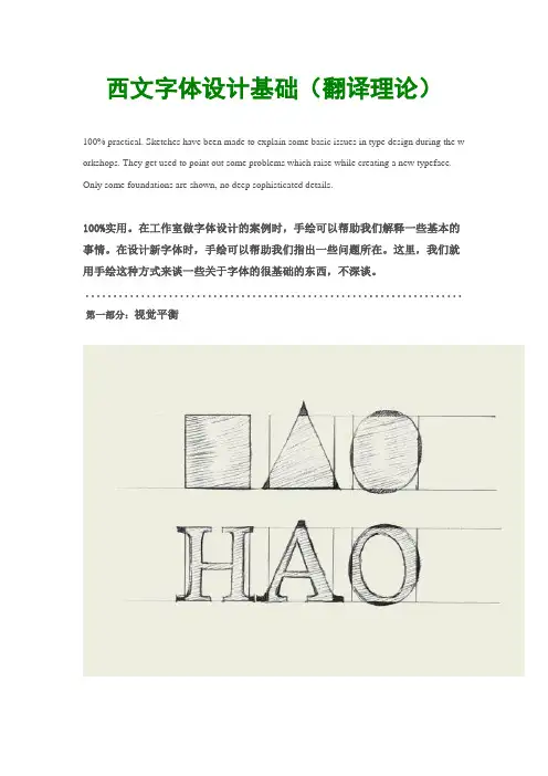
西文字体设计基础(翻译理论)100% practical. Sketches have been made to explain some basic issues in type design during the w orkshops. They get used to point out some problems which raise while creating a new typeface. Only some foundations are shown, no deep sophisticated details.100%实用。
在工作室做字体设计的案例时,手绘可以帮助我们解释一些基本的事情。
在设计新字体时,手绘可以帮助我们指出一些问题所在。
这里,我们就用手绘这种方式来谈一些关于字体的很基础的东西,不深谈。
....................................................................第一部分:视觉平衡Same size for all! To optically align all characters on a line, they cannot not have exactly the same mathematical height. For examplethe triangle on this drawing has to be higher than the rectangle. If this is not the case, the triangle will for sure look smaller than therectangle.While creating a typeface, you want all the letters to have the same height.视觉平衡!我们把所有字母在视觉上保持水平对齐,但是我们发现他们并没有绝对意义上的相同高度。