bar chart英语图表作文
- 格式:docx
- 大小:12.79 KB
- 文档页数:1

柱状图描述英文作文英文:When it comes to describing a bar chart, there are a few key things to keep in mind. First, it's important to understand what the chart is showing. Is it comparing different categories or showing changes over time? Once you have a clear understanding of the chart's purpose, you can start to analyze the data.One thing to look for is any patterns or trends in the data. For example, if the chart is showing sales figuresfor different products over the course of a year, you might notice that certain products consistently perform better than others. This could be due to a variety of factors, such as marketing efforts or changes in consumer preferences.Another thing to consider is any outliers or anomalies in the data. These are data points that don't fit with theoverall pattern of the chart. For example, if the chart is showing average temperatures over the course of a month, you might notice a few days where the temperature was much higher or lower than the rest of the month. This could be due to weather events such as heat waves or cold snaps.Overall, when describing a bar chart, it's important to take a close look at the data and try to identify any patterns or trends. By doing so, you can gain a deeper understanding of the information being presented and draw meaningful conclusions.中文:描述柱状图时,需要注意几个关键点。

英语图表作文范文条形图Title: Analyzing the Growth of E-commerce in the Global Marketplace.In the dynamic landscape of modern business, the rise of e-commerce has been nothing short of transformative. This bar chart presents a comparative analysis of the growth of e-commerce in various regions of the world, highlighting the significant differences and patterns inits adoption and expansion.The chart is divided into four main categories: North America, Europe, Asia-Pacific, and the Rest of the World (ROW). Each category is further sub-divided into years, representing the period from 2016 to 2022. The bars within each category indicate the percentage growth of e-commerce in each region over the given time frame.North America, represented by the blue bars, exhibits a consistent growth trend throughout the period. While theinitial growth rate was relatively modest, it picked up significantly in recent years, indicating a maturing market and increasing consumer confidence in online shopping. This growth can be attributed to factors such as widespread internet access, a technologically savvy population, and a robust infrastructure supporting e-commerce transactions.Europe, depicted by the green bars, follows a similar trend to North America, albeit with a slightly slower growth rate. This can be explained by factors such as the diversity of languages and currencies within the European Union, which can make cross-border transactions more complex. However, despite these challenges, the European e-commerce market has shown resilience and continues to expand.The Asia-Pacific region, shown by the orange bars, experiences the most significant growth in e-commerce adoption. This rapid expansion can be attributed to several factors, including the region's rapidly growing middle class, widespread access to mobile technology, and a younger, more tech-savvy demographic. Furthermore,governments in many Asian countries have been proactive in promoting e-commerce development through policies and infrastructure investments, further accelerating its growth.The Rest of the World (ROW), represented by the purple bars, displays a mixed pattern of growth. While someregions within this category have seen modest increases ine-commerce activity, others have lagged behind. This heterogeneity can be attributed to a range of factors, including economic development, infrastructure, andcultural preferences for traditional shopping methods. However, even within this diverse group, there are pocketsof rapid growth, indicating that the potential for e-commerce expansion remains untapped in many parts of the world.Comparing the four regions, it is evident that theAsia-Pacific region has emerged as the fastest-growing market for e-commerce. This trend is likely to continue in the coming years, driven by factors such as increasing internet penetration, mobile phone ownership, and a young, tech-savvy population. North America and Europe, althoughmature markets, continue to experience steady growth, indicating that there is still room for expansion in these regions. The Rest of the World, while diverse and challenging, offers巨大的潜力 for e-commerce companies looking to expand their global footprint.In conclusion, the bar chart presents a compelling picture of the growth of e-commerce in different regions of the world. From North America's consistent growth to the Asia-Pacific region's rapid expansion, the chart highlights the dynamism and diversity of the global e-commerce landscape. As companies and policymakers continue to navigate this evolving market, it is crucial to stay attuned to these trends and leverage them to drive sustainable growth and innovation.。

初二图表类英语作文范文{z}Title: Sample English Essay on Charts for Grade 8Introduction:In this essay, we will analyze and discuss the data presented in a bar chart.The bar chart illustrates the spending habits of people in our city.This essay will provide a detailed analysis of the data and draw conclusions based on the information presented.Body:The bar chart consists of five categories of spending: clothing, food, housing, entertainment, and transportation.The data shows that the highest spending category is food, with an average expenditure of 3000 yuan per month.This is followed by housing, with an average expenditure of 2500 yuan per month.Clothing accounts for the third highest spending category, with an average expenditure of 1500 yuan per month.Entertainment and transportation spending are relatively lower, with average expenditures of 1000 yuan and 500 yuan per month, respectively.From this data, it is evident that food and housing are the primary expenses for people in our city.This is not surprising, as food is a basic necessity and housing is a significant financial commitment.The high spending on food can be attributed to the diverse food culture in our city, with numerous restaurants and food options available.The relatively high spending on housing can be attributed to the rising property prices in our city.As the cost of living increases, more and more people are spending a significant portion of their income on housing.On the other hand, the lower spending on clothing can be attributed to the availability of affordable clothing options in our city.With numerous shopping malls and street vendors, people have easy access to a wide range of clothing at low prices.Similarly, the relatively low spending on transportation can be attributed to the well-developed public transportation system in our city.The availability of buses, taxis, and地铁makes commuting convenient and affordable for people.Conclusion:In conclusion, the bar chart illustrates the spending habits of people in our city.Food and housing are the primary expenses, followed by clothing, entertainment, and transportation.The data reflects the diverse food culture, rising property prices, and well-developed public transportation system in our city.This information provides valuable insights into the financial priorities and lifestyle of people in our city.。

英语柱状图图表作文真题English:When interpreting a bar chart in English, it is important to first analyze the axes and the data being presented. The x-axis typically represents categories or groups, while the y-axis displays the values or amounts being measured. It is crucial to pay attention to the scale of the axes in order to accurately interpret the data. Next, it is essential to identify any trends or patterns present in the data. This can include noting any fluctuations, relationships, or comparisons between the different categories. Additionally, it is important to provide a clear and concise description of the data, highlighting key points and trends that are evident in the bar chart. Finally, it is recommended to provide a conclusion or summary of the data presented in order to provide a comprehensive analysis.Chinese:在解释英语柱状图时,首先重要的是分析图表的坐标轴和所展示的数据。

描述柱状图英文作文英文:When it comes to describing a bar chart, the firstthing that comes to my mind is data visualization. A bar chart is a graphical representation of data that uses rectangular bars to compare values between different categories. It is one of the most commonly used charts in data analysis and presentation.To describe a bar chart, we need to start with the axis. The horizontal axis represents the categories being compared, while the vertical axis represents the values being measured. The bars are then drawn perpendicular tothe axis, with their height or length proportional to the value being measured.For example, let's say we have a bar chart comparingthe sales of different products in a store. The horizontal axis would have the names of the products, while thevertical axis would have the sales figures. The bars would then be drawn for each product, with their height representing the sales figures.When describing a bar chart, it is important to provide context and explain the significance of the data being presented. We can use phrases like "as we can see from the chart" or "it is clear that" to introduce our analysis. We can also use comparative language to highlight the differences between categories, such as "product A had significantly higher sales than product B".Overall, a bar chart is a powerful tool for visualizing and analyzing data. By following a few simple guidelines, we can effectively describe and interpret the information presented in a bar chart.中文:谈到描述柱状图,我首先想到的是数据可视化。
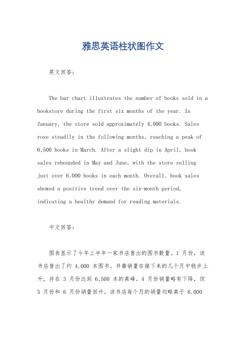
雅思英语柱状图作文
英文回答:
The bar chart illustrates the number of books sold in a bookstore during the first six months of the year. In January, the store sold approximately 4,000 books. Sales rose steadily in the following months, reaching a peak of 6,500 books in March. After a slight dip in April, book sales rebounded in May and June, with the store selling
just over 6,000 books in each month. Overall, book sales showed a positive trend over the six-month period, indicating a healthy demand for reading materials.
中文回答:
图表显示了今年上半年一家书店售出的图书数量。
1 月份,该书店售出了约 4,000 本图书。
书籍销量在接下来的几个月中稳步上升,并在 3 月份达到 6,500 本的高峰。
4 月份销量略有下降,但5 月份和 6 月份销量回升,该书店每个月的销量均略高于 6,000
本。
总体而言,书籍销量在这六个月期间呈现积极趋势,表明对阅读材料有健康的需求。

柱状图描述英文作文英文:When it comes to describing a bar chart, there are a few key things to keep in mind. First, it's important to understand what the chart is showing. In general, a bar chart is used to display data in a way that makes it easy to compare different values. Each bar represents adifferent category or group, and the height of the bar corresponds to the amount of data in that category.For example, let's say you're looking at a bar chart that shows the sales of different products over the course of a year. Each bar would represent a different product, and the height of the bar would correspond to the amount of sales for that product. By looking at the chart, you could quickly see which products were the most popular and which ones were less successful.Another important thing to consider when describing abar chart is the scale of the chart. This refers to the range of values that are represented on the chart. For example, if the chart only goes up to 100, then any values above 100 won't be shown. It's important to keep this in mind when interpreting the data, as it can affect how you understand the chart.Overall, a bar chart is a useful tool for displaying data in a way that's easy to understand. By paying attention to the categories, the scale, and the overall layout of the chart, you can quickly get a sense of what the data is telling you.中文:描述柱状图时,有几个关键点需要注意。

图表描述类英语作文(4篇)图表描述类英语作文篇一The above bar chart informs us of the phenomenon that there exist some differences in additional working hours among diverse careers, especially between self-employed businessmen and civil servants. Self-employed businessmen spend nearly 2 hours per day in working overtime. On the contrary, civil servants’ additional working hours is the shortest, only less than 50 minutes per day. The overtime of scientific researchers, cultural and sports workers and teachers is 80 minutes, 70 minutes and 55 minutes respectively.Ample reasons can account for this phenomenon. Firstly, to make more profits, self-employed businessmen have to spend more time in manufacturing products, attracting customers, providing after-sale services and managing staff. Moreover, with the competition becoming fiercer, they have no alternative but to work overtime to avoid being eliminated by the market and their rivals. When it comes to civil servants, things have gone otherwise. Confronted with less risks as well as pressures and leading a steady and routine life, they don’t have to work overtime frequently.Working overtime is a two-bladed sword. Surely, it will generate considerable benefits. However, it will give rise to some damages, especially to our health. We should balance our work, life and health or we will eventually become a machine and salve of work.四级英语作文图表类篇二图片模板:It seems to me that the cartoon / drawing issending a message about ____________(图画内容),which reveals ____________(稍作评价).In myperspective of view, ____________ (表明个人观点)。

高一英语图表作文范例English:The bar chart illustrates the percentage of students participating in various extracurricular activities at a high school in China. It can be observed from the chart that the most popular activity among students is sports, with 45% of students choosing to participate. Following sports, music and art activities are the next most popular choices, each with 20% of students participating. Interestingly, only a small percentage of students, approximately 15%, are involved in academic clubs or volunteer work. Overall, the data indicates a preference for physical and creative pursuits among the student population.Translated content:这幅条形图展示了中国某所高中学生参与各种课外活动的百分比。
从图中可以看出,最受学生欢迎的活动是体育运动,有45%的学生选择参加。
紧随其后的是音乐和艺术活动,每种活动都有20%的学生参与。
有趣的是,只有约15%的学生参与学术社团或义工活动。
总体而言,数据表明学生群体更偏爱体育和创意追求。

雅思写作小作文范文雅思写作柱状图bar chart 日常花费今天我们雅思写作小作文范文的文章来研究下柱状图bar chart。
该图表共显示了4个国家,分别为德国、意大利、法国和英国,以及这些国家的民众在音响、网球拍、香水、CD、玩具和电影方面的花费。
因为图中数据较多(共有24个),如果每条数据都详细描述的话,无论是时间和篇幅都不够用。
因此小编搜集了一篇相应的考官范文,以供大家参考。
雅思写作小作文题目雅思写作小作文范文The bar chart compares consumer spending on six different items in Germany, Italy, France and Britain.柱状图比较了德国、意大利、法国和英国的消费者在六种不同物品上的花费。
It is clear that British people spent significantly more money than people in the other three countries on all six goods. Of the six items, consumers spent the most money on photographic film.很明显,英国民众在所有六种物品上都明显花费比其他三个国家民众更多的金钱。
在六种物品中,消费者在电影上花费的金钱最多。
People in Britain spent just over £170,000 on photographic film, which is the highest figure shown on the chart. By contrast, Germans were the lowest overall spenders, with roughly the same figures (just under £150,000) for each of the six products.英国民众在电影上的花费超过170000英镑。

大英赛图表类作文英语模板英文回答:Introduction:In this essay, we will analyze a given bar chart that demonstrates the distribution of different types of products sold in a retail store over a specific period. By interpreting the data presented graphically, we will gain insights into the store's sales performance and identify potential areas for improvement.Body Paragraph 1:The bar chart reveals that electronics emerged as the most popular product category, accounting for 30% of total sales. This indicates a strong demand for electronic devices such as computers, smartphones, and televisions within the target market. Smartphones, in particular, have become an essential tool for communication, informationaccess, and entertainment, driving their high sales volume.Body Paragraph 2:Furniture and home appliances followed electronics in popularity, contributing 25% and 20% to total sales, respectively. Consumers' desire for comfort, convenience, and aesthetic appeal in their living spaces has likely influenced these high sales figures. Furniture pieces such as sofas, chairs, and tables provide functionality and enhance the overall ambiance of a home, while home appliances like refrigerators, washing machines, and air conditioners make daily living more effortless and efficient.Body Paragraph 3:Clothing sales accounted for 15% of total revenue, indicating a steady demand for apparel items. The fashion industry's constant evolution and the introduction of new trends may have contributed to this consistent sales performance. Consumers are likely drawn to the store'sselection of clothing options that meet their diverse style preferences and needs.Body Paragraph 4:Health and beauty products comprised the smallest proportion of sales at 10%. While these products may be essential for personal care and hygiene, their sales volume suggests that they are not as in-demand as other categories in the store. Factors such as competition from specialized beauty stores or online retailers could have influencedthis lower sales figure.Body Paragraph 5:To enhance sales performance and cater to customer preferences, the store could consider expanding its electronics and home appliance offerings. By introducing a wider range of models and brands, they can appeal to a broader customer base and potentially increase revenue. Additionally, offering competitive pricing, promotions, and personalized recommendations could further boost sales.Conclusion:In conclusion, the bar chart analysis reveals that electronics, furniture, and home appliances are the top-selling product categories in the retail store. By understanding the sales distribution and identifying areas for improvement, the store can optimize its product offerings and marketing strategies to drive future growth and enhance customer satisfaction.中文回答:引言:在这篇论文中,我们将分析一个给定的条形图,该条形图展示了一段时间内零售店中不同类型产品销售的分布情况。

根据柱状图写英语作文英文回答:The bar chart depicts the distribution of coffee consumption across various age groups in a specific region during a particular period. The data is presented in two sets of bars, representing the average number of cups consumed daily by males and females within each age group.An examination of the chart reveals that coffee consumption patterns differ significantly between the two genders. Females generally consume a lower number of cups compared to males across all age groups, except for the 15-24 years old category. In that age group, females consume slightly more coffee than males, with an average of 1.2 cups daily compared to 1.1 cups for males.Among males, coffee consumption peaks in the 25-34 years old age group, with an average of 2.1 cups consumed daily. This suggests that males in this age range may havehigher caffeine needs due to increased work and social obligations. Consumption gradually declines in subsequent age groups, reaching its lowest point in the 65+ years old category, where males consume an average of only 0.8 cups daily.For females, the highest consumption rate is observedin the 45-54 years old age group, with an average of 1.4 cups consumed daily. This could be attributed to lifestyle factors, such as the increased prevalence of child-rearing responsibilities and social activities during this period. Consumption decreases in the following age groups,bottoming out at 0.7 cups daily in the 65+ years old category.Overall, the bar chart provides insights into thecoffee consumption habits of both males and females within different age groups in the specified region and time frame. The data shows that males tend to consume more coffee than females, and that consumption patterns vary based on age group and gender-specific factors.中文回答:条形图描绘了特定地区特定时期内不同年龄段的咖啡消费分布情况。

雅思写作小作文范文雅思写作柱状图bar chart 阿拉伯国家电脑和互联网使用情况今天我们雅思写作小作文范文的文章来研究下柱状图bar chart。
该图表给出了9个阿拉伯国家中电脑和互联网使用者在人口中所占的比例。
这九个国家分别为埃及、约旦、科威特、黎巴嫩、摩洛哥、阿曼、沙特阿拉伯、叙利亚、阿联酋。
图表中数据较多,比较考察大家分组比较的能力。
小编收集了一篇相关的高分范文,以供大家参考。
雅思写作小作文题目The graph below shows the number of Computer and Internet users in different Arab countries.Summarise the information by selecting and reporting the main features, and make comparisons where relevant.雅思写作小作文范文The bar graph outlines the proportion of Arab citizens who are connected to the Internet and use computers. Generally speaking, the UAE and Kuwait have by far the highest ratio of netizens, citizens who have access to the computer and Internet technology, while it was the lowest in Egypt and Syria.柱状图给出了阿拉伯国家居民连入互联网和使用电脑的比例。
大体来说,阿联酋和科威特拥有最高比例的网民,即可以接触到电脑和互联网技术的人。
这一数字在埃及和叙利亚最低。
As the diagram suggests, around one-third of the UAE citizens have access to the Internet, a ratio which is quite higher than their computer possessions. Kuwait in terms of its internet and computer users stood at the second position but has a significantly lower number of netizens when compared to that of the UAE. Besides, this article is from Laokaoya website, roughly 10% of Kuwaitis own computers and use the Internet. Lebanese Internet users were somewhat higher than their ratio of computer owners and only 50 out of thousand Lebanese owned computers and their Internet users’ ratio was slightly higher. Interestingly computer ownership in Saudi Arabia was roughly 0.7% and the Internet users were even lower. Finally, computer and the Internet users in the remaining Arab countries like Morocco, Jordan, Oman, and Syria were fewer than 0.5% and this depicts a dismaying figure in terms of computer and Internet technology penetration in these countries.正如图表中所给出的那样,大约三分之一的阿联酋国家居民可以连入互联网,该比例要比他们的电脑拥有率还高许多。

描述条形图的英语作文英文回答:A bar chart, also known as a bar graph, is a graph that presents data using rectangular bars with heights orlengths proportional to the values they represent. Barcharts are used to compare different categories of data and to show the changes in data over time.The x-axis of a bar chart typically represents the different categories of data, while the y-axis represents the values associated with each category. The height or length of each bar is proportional to the value it represents. Bar charts can be either vertical or horizontal, with vertical bar charts being the most common.Bar charts are a simple and effective way to visualize data, making them a popular choice for presentations and reports. They are particularly useful for comparingdifferent categories of data, as they allow for easy visualcomparisons. However, bar charts can also be used to show changes in data over time by plotting the data values for different time periods on the x-axis.中文回答:条形图,也称为条形统计图,是一种以矩形条表示数据的图表,条的高度或长度与它们表示的值成正比。

柱状图英文作文描述英文:When it comes to describing a bar chart, it is important to provide accurate and detailed information about the data presented. In this particular case, the chart displays information about the number of students who participated in extracurricular activities over a period of five years.Looking at the chart, we can see that the number of students who participated in extracurricular activities has been steadily increasing over the years. In 2015, there were only 500 students who participated, but by 2019, that number had increased to over 1,000. This shows that more and more students are becoming involved in extracurricular activities, which is great news for schools and communities alike.It is also interesting to note that there are someactivities that are more popular than others. For example,in 2019, the most popular activity was sports, with over600 students participating. Music and drama came in second and third place, respectively, with around 300 students each. This could be due to a variety of factors, such asthe availability of resources or the interests of the students themselves.Overall, this bar chart provides valuable insights into the participation levels of students in extracurricular activities. It is important for schools to encourage students to get involved in these activities, as they can have a positive impact on academic performance, social skills, and overall well-being.中文:描述柱状图时,需要提供准确详细的数据信息。

柱状图英文作文English:A bar chart, also known as a bar graph, is a graphical representation of data where the length of bars represents the magnitude of the values they represent. Each bar typically represents a category or group, and the height or length of the bar corresponds to the value it represents. Bar charts are commonly used to compare the values of different categories or to track changes over time for a single category. They are effective in presenting large amounts of data in a visually appealing and easy-to-understand format, making them a popular choice for presentations, reports, and academic papers. Additionally, bar charts can be horizontal or vertical depending on the orientation of the bars, with each orientation offering its advantages in terms of readability and space utilization. Overall, bar charts are a versatile tool for visualizing data and conveying insights to a wide audience.中文翻译:柱状图,也称为条形图,是一种数据的图形表示,其中条的长度代表它们所代表的值的大小。

雅思写作小作文范文雅思写作柱状图bar chart 文盲比例今天我们雅思写作小作文范文的文章来研究下柱状图bar chart。
该图表所显示的数据为六种国家和地区中,男性和女性文盲分别所占的比例。
可以很明显的看出从左到右,比例逐渐增加。
我们一方面可以比较各个国家的男女差异,另一方面也可以先比较它们的整体差异,然后再去研究性别。
小编搜集了一篇相关的高分范文,以供大家参考。
雅思写作小作文题目The chart below shows estimated world illiteracy rates by region and by gender for the year 2000.Summarise the information by selecting and reporting the main features, and make comparisons where relevant.雅思写作小作文范文The given bar chart shows the approximate world illiteracy rates by gender and region for the year 2000. As is observed in the given column graph, in all cases, the illiteracy rate among women was higher than men. Developed countries had almost ignorable illiteracy rate. On the contrary, about half of the population in South Asia, Arab states and Africa were illiterate.上面的柱状图按照地区和性别展示了2000年世界文盲比例的大致数据。
College English test
As the bar chart shows, the number of the candidates of college English test increased dramatically during the years of 1990 to 2010. And so do the percent of passers. As early as 1990, the number of candidates was 0.3 million. Then ten years later, it became five times as many as that of 1990. While arriving in the year 2010, the number soared to 3.6 million. The percent of passers was 31%, 47% and 65% separatelyin the three years.
Personally, several factors contribute to the sharp increase of the candidates. First of all, English is the most widely spoken language. In order to keep up with the developed countries, it is necessary that the whole people of China reinforce learning English. Furthermore, due to the policy ofopeningup, our economy achieved sucha rapid development that we could make communication even cultural exchange with foreigners. Besides, China has become one of the most attractive countriesthat a huge number of foreigners travel to China every year. Therefore, people attach more and more importance to English. Last but not least, English is a required course that students spare no effort to learn it well. Moreover, English is the necessity for overseas studying. Thus, there’s no doubt that the number of candidates and the percent of passers get a great increase. All these account for the phenomenon.
As far as I analyze, the number of candidates will rise slightly in future, while the percent of passers will be higher and higher.。