雅思作文写作Task-1第二课时—柱状图和饼状图
- 格式:doc
- 大小:585.00 KB
- 文档页数:9
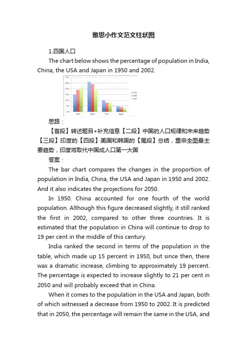
雅思小作文范文柱状图1.四国人口The chart below shows the percentage of population in India, China, the USA and Japan in 1950 and 2002.思路:【首段】转述题目+补充信息【二段】中国的人口规律和未来趋势【三段】印度的【四段】美国和韩国的【尾段】总结,重申全图最主要趋势,印度将取代中国成人口第一大国答案:The bar chart compares the changes in the proportion of population in India, China, the USA and Japan in 1950 and 2002. And it also indicates the projections for 2050.In 1950. China accounted for one fourth of the world population. Although this figure decreased slightly, it still ranked the first in 2002, compared to other three countries. It is estimated that the population in China will continue to drop to 19 per cent in the middle of this century.India ranked the second in terms of the population in the table, which made up 15 percent in 1950, but since then, there was a dramatic increase, climbing to approximately 19 percent. The percentage is expected to increase slightly to 21 per cent in 2050 and will probably exceed that in China.When it comes to the population in the USA and Japan, both of which witnessed a decrease from 1950 to 2002. It is predicted that in 2050, the percentage will remain the same in the USA, andin Japan, the percentage is likely to keep falling.Overall, it seems that India will become the country with the largest population although there is still a huge number of people in China.2.通勤工具Different modes of transport used to travel to and from work in one European city in 1960, 1980 and 2000.思路:1. 分段原则为:上升的一段,下降的一段,波动的一段。

饼状图和柱状图英语作文英文回答:Bar charts and pie charts are two of the most common types of graphs used to visualize data. Both types of charts have their own advantages and disadvantages, and the best choice for a particular situation will depend on the data being presented and the desired outcome.Bar charts are used to compare the values of different categories. Each category is represented by a vertical bar, and the length of the bar corresponds to the value of the category. Bar charts are easy to read and understand, and they can be used to compare a large number of categories. However, bar charts can be misleading if the categories are not evenly spaced, and they can be difficult to compare if the values are very different.Pie charts are used to show the relative proportions of different categories. Each category is represented by aslice of the pie, and the size of the slice corresponds to the proportion of the category. Pie charts are easy to read and understand, and they can be used to show the relative importance of different categories. However, pie charts can be misleading if the categories are not evenly spaced, and they can be difficult to compare if the values are very different.In general, bar charts are better for comparing the values of different categories, while pie charts are better for showing the relative proportions of different categories. However, the best choice for a particular situation will depend on the data being presented and the desired outcome.中文回答:柱状图和饼状图是两种最常用的图表类型,用于可视化数据。
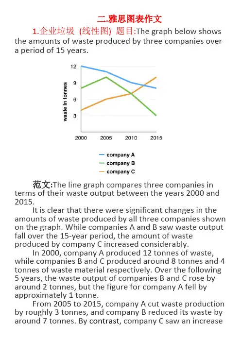
二.雅思图表作文1.企业垃圾(线性图) 题目:The graph below shows the amounts of waste produced by three companies over a period of 15 years.范文:The line graph compares three companies in terms of their waste output between the years 2000 and 2015.It is clear that there were significant changes in the amounts of waste produced by all three companies shown on the graph. While companies A and B saw waste output fall over the 15-year period, the amount of waste produced by company C increased considerably.In 2000, company A produced 12 tonnes of waste, while companies B and C produced around 8 tonnes and 4 tonnes of waste material respectively. Over the following 5 years, the waste output of companies B and C rose by around 2 tonnes, but the figure for company A fell by approximately 1 tonne.From 2005 to 2015, company A cut waste production by roughly 3 tonnes, and company B reduced its waste by around 7 tonnes. By contrast, company C saw an increasein waste production of approximately 4 tonnes over the same 10-year period. By 2015, company C’s waste output had risen to 10 tonnes, while the respective amounts of waste from companies A and B had dropped to 8 tonnes and only 3 tonnes.(192 words, band 9)这条线图对三家公司的废物产出从2000年到2015年进行了比较。
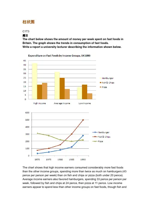
柱状图C1T3题目The chart below shows the amount of money per week spent on fast foods in Britain. The graph shows the trends in consumption of fast foods.Write a report a university lecturer describing the information shown below.The chart shows that high income earners consumed considerably more fast foods than the other income groups, spending more than twice as much on hamburgers (43 pence per person per week) than on fish and chips or pizza (both under 20 pence). Average income earners also favored hamburgers, spending 33 pence per person per week, followed by fish and chips at 24 pence, then pizza at 11 pence. Low income earners appear to spend less than other income groups on fast foods, though fish andchip remains their most popular fast food, followed by hamburgers and then pizza. From the graph we can see that in 1970, fish and chips were twice as popular as burgers, pizza being at that time the least popular fast food. The consumption of hamburgers and pizza has risen steadily over the 20 year period to 1990 while the consumption of fish and chips has been in decline over that same period with a slight increase in popularity since 1985.分析:题目The chart below shows the amount of money per week spent on fast foods in Britain. The graph shows the trends in consumption of fast foods.两句话,两个图第一段The chart shows that high income earners consumed considerably more fast foods than the other income groups, spending more than twice as much on hamburgers (43 pence per person per week) than on fish and chips or pizza (both under 20 pence).•说明了高收入人群的两个特点,第一是消耗快餐最多,第二是人群中hamburger, fish and chips, pizza的特点•spending more than twice as much on hamburgers than on fish and chip and chips or pizza 这是一句令人费解的句子,含义应为“消耗的汉堡是薯片或匹萨的两倍多”,应用的句型应当为典型的表示倍数关系的句型“n times as…as”,比如✓This airplane flies two times as fast as that one. 这家飞机的飞行速度是那架的两倍。
第 1 页中公留学无忧,让留学更简单小作文模板素材雅思小作文很多人不要模板, 拒绝套用雅思作文模板。
但是对于初试者, 或者目 标分是雅思 6 分的学生而言, 作文模板是必要而且也确实有效的。
关键是要有逻 辑性。
只要具备一定的逻辑性,模板一样会非常出彩!雅思小作文总体分为两种: 线状图/饼状图/柱状图/柱状图/表格题/地图题/流程 图万能开头与结尾模板:(6.0 分以下均可适用,6.5 分以上参考使用) 开头1.This graph/pie chart/table/bar chart reflects the (rate/percentage/proportion/number … ) of ( 对 象 ) in(place/country) from …to …2.According to the figure , it is not spurring findings that there was/were 总体趋势的描述(the overall trend tended to indicate …/the general trend is …/其他) 结尾1.In conclude , the overall trend tended to illustrate ……during this XX year period2.the data/statistics/figures lead us to the conclusion that ……这些数 据资料令我们得出结论……按题型类别:(提供很多句式请自选)①线状图1.先(上升/下降)后(下降/上升),之后便平稳(1)According to the data , the years from … to … saw/witness a rise/climb/drop in the number/rate/percentage/proportion of 对象 from 数据 to 数据,which was followed by a rapid decrease/reduce/increase over the **years.(2)The number/rate…dropped/went up again from…in ** year to…in ** year第 1 页第 2 页中公留学无忧,让留学更简单and then went up gradually until ** year ,when there was a leveling off/leveling out at 数据 for 一段时间。
柱形图和饼状图的英语作文The Utility and Applications of Bar Charts and Pie Charts.In the realm of data visualization, bar charts and pie charts stand as two of the most fundamental and widely used tools. Each serves a distinct purpose in communicating complex information in a simple, intuitive manner. Bar charts excel at showing comparisons between categories, while pie charts are ideal for depicting the proportional distribution of data.Bar charts are effectively employed when comparing numerical values across different categories. They are particularly useful in identifying patterns, trends, and outliers. For instance, in a business context, a bar chart could be used to compare sales figures for different products over a specific period. Each bar represents a product, and its height or length corresponds to the sales figure. This allows for quick identification of whichproducts are performing well and which ones may require additional attention.The versatility of bar charts extends to their ability to handle various types of data, including absolute values, relative values, and even trends over time. By grouping bars together, it becomes possible to compare multiple sets of data side by side. For example, a bar chart could show the sales figures for different regions within the same company, or it could compare sales across multiple companies within the same industry.Pie charts, on the other hand, are ideal forvisualizing the proportional distribution of data. They are often used to represent a whole divided into itsconstituent parts. Each slice of the pie corresponds to a particular category, and its size relative to the whole pie indicates its proportion. Pie charts are particularly effective at highlighting the relative importance of each category without the need for complex numerical calculations.In the context of market research, for instance, a pie chart could depict the market share held by different competitors in a given industry. The slices would represent the individual companies, and their sizes would indicate their respective market shares. Such a visualization makes it easy to identify the market leader, as well as any potential challengers.Pie charts are also useful in scenarios where the sum of all parts equals a fixed value, such as in budget allocation or time management. By dividing a pie intoslices representing different expenses or activities, it becomes possible to quickly identify where the majority of resources are being allocated. This information can then be used to make informed decisions about reallocating resources or prioritizing certain areas.When choosing between a bar chart and a pie chart, itis important to consider the nature of the data being presented and the message that needs to be communicated. Bar charts are generally more effective at showing comparisons and trends, while pie charts excel at depictingproportional relationships. By understanding the strengths and limitations of each tool, it becomes possible to select the most appropriate visualization for a given dataset.In conclusion, bar charts and pie charts are invaluable tools for data visualization. Each has its own unique strengths and applications, and together they provide a comprehensive toolbox for communicating complex information in a clear and understandable manner. By mastering these fundamental visualization techniques, individuals and organizations can more effectively convey their data-driven insights and make informed decisions based on accurate and visually engaging representations of their data.。
饼状图和柱状图英语作文英文回答:Pie charts and bar charts are two types of data visualization tools that are commonly used to represent categorical and numerical data, respectively. Each type of chart has its own strengths and weaknesses, and the choice of which chart to use depends on the specific data and the purpose of the visualization.Pie charts are circular graphs that are divided into sectors, with each sector representing a category of data. The size of each sector is proportional to the value of the corresponding category. Pie charts are simple to create and interpret, and they are effective at showing the relative proportions of different categories. However, pie charts can be misleading if the data is not evenly distributed, as the larger sectors will appear to be more significant than they actually are.Bar charts are rectangular graphs that display data ina series of vertical or horizontal bars. Each barrepresents a category of data, and the height or length of the bar is proportional to the value of the corresponding category. Bar charts are easy to read and compare, and they are effective at showing trends and relationships over time. However, bar charts can be cluttered if there are a large number of categories, and they can be difficult tointerpret if the data is not evenly distributed.中文回答:饼状图是一种圆形图表,分为若干扇形,每个扇形代表一类数据。

图表作文讲解2:柱状图和饼状图学生面授老师时间本次课时雅思写作第二课时教学思路1.作文简介、写作技巧2.实例讲解3.分析总结4.课后作业教学目标柱状图、饼状图知识点讲解基本特征和写作方法实例分析讲解重点写作技巧讲解范文学习柱状图和饼状图写作方法备考资料剑桥IELTS4-8教学详细内容:一、写作技巧详解1.柱状图特点➢柱状图是动态图表,切入点是描述趋势。
➢柱状图写作注重“比较”(找出similarity)和“对比”(找出difference),也就是说需要横向总结所有柱状图表的共性特征,也要分别描写各个柱子的个性特征。
➢两种写作方式:其一是对不同时间段内的数据进行比较,适合于数据代表的物体较少且时间界限明确的情况。
另外是对单独数据的全程描述,适合于描述数据对象很多且时间划定不清晰的情况。
2.饼状图特点饼形图与柱形图或者线形图所截然不同的是它没有了横轴与纵轴,而以饼形的分割来表示百分比,可以依照三步审题分析法来进行观察:➢观察共有几张饼状图,以及它们之间的关系是什么(一般说来,雅思图表题中极少见到单饼图);➢观察每张饼状图中有哪几个区域,以及各个区域分别代表什么;➢观察单个饼状图中各区域间的百分比差异,以及相同区域在各个饼状图间的百分比的比较或发展。
饼状图是所有图表题中最好写的一种,唯一值得注意的地方在于如何丰富百分比的表达和“占”的表达,要采取多样性的表达,如25%=a quarter of, 50%=half of, >50%=a/the majority of.描写饼状图中的比例构成就是饼状图图表作文的重点,但也应注意,这种描述并不是对图形的简单重复,对各项数据比例的描述应建立在归纳整理的基础上有条理地进行。
学生不仅要善于找数据,更重要的是要善于从数据或比例中升华出来,找到规律和本质。
常用词汇、句型及模板1.柱状图1)倍数的表达今年的产量是去年产量的两倍➢The output this year is two times(twice) more than last year’s.➢As much as 不可数名词 as many as 可数The books of this semester are two times as many as that of last semester. ➢ A is two times the amount of B不可数➢ A is two times the number of B可数2) 常用套句➢There was …in the number of A from …to … (over next years), which was followed by … and then… until…when there was … for the next … years.➢From…onwards, there was … in the number of A which then increased / decreased …at …% in …➢In …, the number reached (was) …%, but (30) years later there was …➢The number of A increased rapidly from … to … during the (five-year) period. ➢In the (three years) from … through…, the percentage of A was slightly larger / smaller than that of B.➢The graphs show a threefold increase in the number of A.➢Here is an upward trend in the number of A.➢… (year) witnessed / saw a sharp rise in A.2.饼状图1)常用词:percentage, proportion, make up, constitute, account for, take up, ..isdivided into…parts, consume the largest/smallest portion.2)例句:➢The graph, presented in a pie chart, shows the general trend in…..➢The percentage of A in … is more than twice tha n that of B.➢The biggest loss was to A area.➢There is not a great deal of difference between A and B.➢In general positions, females outnumber males.➢ A much greater percentage of men than women are found in managerial positions. ➢The profit of company A doubled from May to September.3)模板:➢The two pie charts describe ………………………➢The first point to note is …………………………➢Comparing the graphs, …………………………….➢The graphs also suggest that ………………………➢In conclusion, it can be seen from the data that …………………..4)饼状图作文模型The two pie charts illustrate the significant changes in people’s ways of communication from 1970 to 1995.The first graph shows that in 1975, the most popular way to communicate was letter writing, with the percentage of 50%. Others ___________________________, the figures are 32% and 18% respectively.It can be seen from the second graph that ways of communication changed a lot in two decades. By 1995, ______________________________. By contrast, ________________________________.Comparing the two pie charts, we can see that the use of the phones and computers during the same period had both risen considerably. However, letter writing became less popular among the people.In general, people inclined to use more modernized mediums to communicate with others, while the traditional way became less employed.The pie chart depicts the proportion of ___________________________. It consists of six segments, the largest one representing _________, which account for 26% of the total. _____________ takes up 21%, becoming the second largest.__________________________________. The rest proportions, 15% of all, constituting 5% and 10% respectively.From the chart it can be seen clearly that ________________________.二、实例分析分析思路:1.第一幅柱状图的描述单位是百万,即人数;第二幅则是百分比。

IELTS WRITING:TASK 1Introductory sentence:1.表格显示了1995 年二月某大学书店小说类图书、非小说类图书以及杂志(fiction books, non-fiction books, and magazines) 的销售情况。
2.从1950 年至1990 年,城市居民的交通方式发生了显著的变化。
3.本图显示,男女之间每周用于无酬工作的时间是不一样的。
4.柱状图比较了到1994 年6 月前12 个月内顶点石油工司(ACME Oil Company) 各级管理人员中男女所占的比例。
5.两幅饼状图表明了体力劳动与非体力劳动(manual and non-manual occupation)61 个基本工种中男性与女性的受雇比例。
6 •两幅饼状图说明了男性和女性被捕(arrest)的比例,而条形图则说明了他(她)们被捕的原因。
7. 本图显示了1994年财政年度(financial year)四个季度以及12个月份中顶点跑车公司和布莱森汽车公司( Acme Sports Cars and Branson Motors) 的赢利情况。
8. 曲线图展示了1950 年至1996 年间全世界以百万公顷为计算单位的谷物收割总面积。
(hectare)9. 图表表明了自1985年以来弗莱德尼亚(Freedonia)地区能源需求和矿物燃料能够供给的能源之间的关系,并做出直至2005 年的预测。
10. 据图所示,1975年至1995年20年间Freedona共和国地区劳动大军(work force)中妇女人数发生了很大的变化。
11. 据图表所示,广播电听众与电视观众人数有许多变化。
12. 本图表表示出了四个不同欧洲国家消费者的喜好。
13. 此表通过四项基本经济指数显示出所选五个国家在1982年的生活水平。
14. 只要看一眼1994年加拿大、日本、秘鲁和扎伊尔(Canada, Japan, Peru and Zaire)四个国家的四项经济和社会指数(indicator) 就能发现富裕和贫穷国家之间存在的巨大差别。
雅思小作文 T A S K 1 图表题规律注意事项:1 . Task1 是客观写作,要求客观真实。
2 . 客观性:不应该有任何图里没有而靠自己主观想象加入的成分。
结尾段针对图形做出的总结性结论也应该是根据图表的实际内容做出的符合逻辑的总结。
准确性:图表里面的数据介绍要力求精确,不能抄错数字。
但当一个特征点没有落在一个准确的坐标值上时,允许进行合理的目测或估计一个大概数值。
详尽性:要有层次感,并不需要把所有的数字都推到文章里。
3 . 类型Table 表格题Line Graph 线图Bar Chart 柱状图Pie Chart 饼状图Process Chart 流程图4 . 看图要注意单位,标题和图例。
5 . 对于多数小作文题,题中给出了几个图就对应的写出几个主体段。
题目里只给出一个图,根据图中包含几类图形元素写几个主体段。
图中只给了一个图,但图中所含图形元素很多,则分类。
题目中出现多线多柱多饼,用“对应提取法“,把每组里的对应元素提出来组织主体段。
6 . 时态和发生时间意义对应。
陈述永恒事实的句型,其主句的谓语动词必定用一般现在时。
若题目里没有出现时间,则全文都使用一般现在时。
7 . 结构开头段(1~2句)改写原题主体段1 总体概括具体介绍数字主体段N 总体概括具体介绍数字结尾段(1~2句)介绍总数(若图里并没有明确的给出总数,则省略)结论(根据图里的数据得出有一定合理性的结论)8 . 开头段的改写题目中ShowProportion InformationThe number/amount of FamilyMalesFemaleInfluence改写成illustrate /compare percentagedatathe figure for householdmenwomenaffect/effectCategories kinds/typesSubway system Storeunderground railway/train system shop9 . 介绍数据或描述变化趋势的常用词。
雅思图表作文:一.图表的种类(表格,柱状图,线形图,饼状图,流程图,地图等)二.解题思路:开头段改写题目,正文段学会分组,结尾段学会总结。
(一定要与不要)三.学员问题:分组问题,时态问题,常备词汇,短语记不住,不会用。
四.常备词汇五.写什么?:起点(最高值),终点(最低值),拐点,交点,变化趋势,总数(末段)第一类:表格题目:剑桥7, Test 1 Writing Task 1You should spend about 20 minutes on this task.The table below gives information on consumer spending on different items in five different countries in 2002.Summarise the information by selecting and reporting the main features, and make comparisons where relevant.Write at least 150 words.Percentage of national consumer expenditure by category-2002参考范文:The table gives the breakdown about data on consumer spending on various items (Food/Drink/Tobacco, Clothing/Footwear and Leisure/Education) in five different countries (Ireland, Italy, Spain, Sweden and Turkey) in 2002.Generally, each country consumed much more in food/drink/tobacco where Turkey dominated the first place with 32.14%, standing in marked contrast with Sweden (only 15.77%) than in other 2 categories. In terms of Clothing/Footwear, Italy expectedly spent most with 9% compared with still Sweden seeing the smallest proportion (5.4%). As for Leisure/Education, it was Turkey and Spain that consumed the most and least with 4.35% and 1.98% respectively.Additionally, we can see immediately that in food/drink/tobacco, after Turkey, Ireland,Spain and Italy came in turn with 28.91%, 18.80% and 16.36%. On the contrary, in Clothing/Footwear, we failed to see big gap from Ireland, Spain and Turkey in middle positions which saw different reductions of 2.57%, 2.49% and 2.37% in comparison with Italy, likewise, in Leisure/Education, still small differences were found. To be exact, Turkey was followed by Sweden, Italy and Ireland in a slow falling turn with 3.22%, 3.2% and 2.21%.In conclusion, people prefer to spend on those products directly relating to food. (189 words)Writing Task 1You should spend about 20 minutes on this task.The table below summarises some data collected by a college bookshop for the month of February 1998.Write a report describing the sales figures of various types of publications, based on the information shown in the table.Write at least 150 words.参考范文:The table describes some sales figures gathered by a university bookstore for February, 1998.We can see from the table that the non-book club member figures are made up of sales to college staff, college students and members of the public. More specifically, college staff bought 332 magazines, 44 fiction and 29 non-fiction books while college students bought 1249 magazines, 194 non-fiction books and 31 fiction books. More magazines were sold to college students than any other group of customers. In contrast, although no fiction books were sold to members of the public, they bought 122 non-fiction books and 82 magazines.According to the table,book club members bought more fiction (76) and non-fictionbooks (942) than other customers. On the other hand, magazine sales to club members (33) were fewer than to any other type of customers.The total number of sales for the month was 3134 (1474 to college students, 405 to staff,204 to the public and 1051 to book club members). 151 books sold were fiction and1287 were non-fiction. Therefore, it can be clearly seen from the table that magazines accounted for the greatest number of sales (1696).(192 words)使用括弧的注意事项:后面不加单位。
雅思4类图表作文范文
一、柱状图。
哇塞,看这柱状图,某城市的私家车数量可是像火箭一样往上
冲啊!五年前才5万辆,现在直接飙到15万辆了,涨得比房价还快!不过话说回来,公共交通那边就不太好过了,以前每天80万人次,
现在只剩下60万了,看来大家都更喜欢自己开车出门啊。
二、折线图。
话说这折线图,看得我心情都跟着起伏了。
那国家失业率啊,
前几年涨得跟股票似的,从4%一路飙升到6%,让人看了都捏把汗。
不过好在后来稳住了,还往下掉了点,虽然没回到从前,但好歹也
算个好兆头吧。
雅思小作文饼图写法全解析The IELTS writing task 1 often requires test-takers to describe and analyze visual data, such as graphs, charts, and diagrams. One common type of visual data is the pie chart, which presents data in a circular form, divided into segments to represent proportions of a whole. In this essay, I will provide a comprehensive guide to writing a successful IELTS task 1 essay using a pie chart as the visual data.First and foremost, it is crucial to understand the basic structure of a pie chart. A pie chart typically consists of several segments, each representing a different category or component of the whole. The size of each segment corresponds to the proportion of the whole that it represents. When describing a pie chart, it is important to provide an overview of the data by identifying the main categories and their respective proportions. This can be done by stating the total number of categories and highlighting the largest and smallest segments.Following the initial overview, the next step is to provide specific details about each category represented in the pie chart. This includes describing the data in each segment, comparing the proportions of different categories, and identifying any significant trends or patterns. For example, if the pie chart represents the distribution of household expenses, the writer should describe the percentage of income spent on categories such as housing, transportation, food, and leisure activities. Additionally, the writer should compare the proportions of these categories to highlight any notable differences or similarities.In addition to describing the data, it is important to analyze the information presented in the pie chart. This involves interpreting the significance of the proportions and identifying any implications or conclusions that can be drawn from the data. For instance, if the pie chart illustrates the market share of different smartphone brands, the writer should analyze which brand has the largest share and what this indicates about consumer preferences. Furthermore, the writer shouldconsider any potential reasons for the observed patterns and offer explanationsfor the data presented in the pie chart.When writing an IELTS task 1 essay based on a pie chart, it is essential to use a variety of language and grammatical structures to effectively convey the information. This includes using appropriate vocabulary to describe the data, such as 'the majority,' 'a significant proportion,' 'a small fraction,' and 'a negligible amount.' Additionally, the writer should utilize comparative and superlative forms to compare the proportions of different categories, as well as adverbs and adjectives to emphasize the significance of certain data points.Furthermore, it is important to organize the information in a clear andlogical manner, using cohesive devices to connect ideas and guide the reader through the essay. This can be achieved by using transition words and phrases, such as 'furthermore,' 'in addition,' 'moreover,' and 'on the other hand,' to indicate relationships between different aspects of the data. Additionally, the writer should use appropriate grammatical structures, such as passive voice and conditional sentences, to convey the information in a formal and academic tone.In conclusion, writing a successful IELTS task 1 essay based on a pie chart requires a thorough understanding of the structure and content of the visual data. By providing an overview, describing the details, analyzing the information, and using a variety of language and grammatical structures, test-takers caneffectively convey the information presented in the pie chart. This guide serves as a comprehensive resource for approaching and mastering the task of writing a pie chart-based IELTS task 1 essay.。
饼状图和柱状图英语作文English: A pie chart, also known as a circle chart, is a circular statistical graphic that is divided into slices to illustrate numerical proportions. Each slice of the pie chart represents a category or percentage of the whole. Pie charts are useful for showing the relative sizes of different data points within a dataset. On the other hand, a bar chart, or column chart, is a chart that uses vertical or horizontal bars to represent data. The length or height of each bar corresponds to the value it represents. Bar charts are effective for comparing different categories or tracking changes over time. Both pie charts and bar charts are valuable tools for visualizing and interpreting data, but they have different use cases and strengths depending on the specific context of the data being presented.中文翻译: 饼状图,又称为圆形图表,是一种圆形的统计图表,被分成几个部分以展示数字比例关系。
雅思A类TASK1图表作文写作方法一、图形种类及概述法:数据图表:a data graph/chart/diagram/illustration/table饼图:pie chart表格图:table直方图或柱形图:bar chart / histogram趋势曲线图:line chart / curve diagram流程图或过程图:flow chart / sequence diagram程序图:processing/procedures diagram圆柱图:column chart描述:show/describe/illustrate/apparent/reveal/represent/demonstrate/indicate/depict以下是一些较常用的描述用法The table/chart diagram/graph shows (that)According to the table/chart diagram/graphAs (is) shown in the table/chart diagram/graphAs can be seen from the table/chart/diagram/graph/figures,figures/statistics shows (that)...It can be seen from the figures/statisticsWe can see from the figures/statisticsIt is clear from the figures/statisticsIt is apparent from the figures/statisticstable/chart/diagram/graph figures (that) ...二、data的具体表达法增加:increase / raise / rise / go up / grow/ jump/ ascend减少:decrease / grow down / drop / fall/decline/reduce/ descend波动:fluctuate / rebound / undulate / wave ...稳定:remain stable(steady) / stabilize / level off ...最常用的两种表达法:1. Verb+Adverb formThe number of XXX+increase/jump/rise/decrease/drop/fall/fluctuate...+insignificantly/significantly/slightly/suddenly/rapidly/dramatically/sharply/steeply/steadily/ gradually/slowly...+from (第一时间) to (第二时间) / between (第一时间) and (第二时间)2. Adjective+Noun formThere was a (very)sudden/rapid/dramatic/significant/sharp/steep/steady/gradual/slow/slight+increase/jump/rise/decrease/drop/fall/fluctuation (注意:上述很多词不可用于修饰fluctuation)+in the number of XXX from (第一时间) to (第二时间) / between (第一时间) and (第二时间)描述稳定的data:The number of XXX remained steady/stable from (第一时间) to (第二时间) / between (第一时间) and (第二时间)The number of XXX stayed the same from (第一时间) to (第二时间) / between (第一时间) and (第二时间)There was little change / hardly any change / no change in the number of XXX from from (第一时间) to (第二时间) / between (第一时间) and (第二时间)描述不同状态的dataNoun form:steady drop / sharp rise peak / dramatic fall / sharp dropVerbal form:(to) bottom out / (to) reach the bottom / (to) increase gradually / (to) reach a plateau / (to) remain steady描述the highest point以及the lowest point高点极值:The monthly profit / The figures / The situation ...+peaked in (月份/年) <准确时间点用at XXX> at XXX% / XXX(极点data)或者reached a peak / a high point at XXX% / XXX(极点data)低点极值:XXX bottomed out / reached+rock / the bottom / a low point或者hit a trough此外,在描述过程中还有很多的conjunctional words/sentences,最常用的固定搭配如下:并列:as well as(句首/中), also, as well(句尾), either, neither, too, moreover, furthermore, in addition, additionally, besides, what's more, apart from ...举例:for example, for instance, to illustrate, as an illustration, in particular, particularly, especially事实:as a matter of fact, in fact, actually, as long as, so long as ...雷同/近似:similarly, likewise(句首/尾), at the same time, equally ...转折:however, whereas, nevertheless, nonetheless, though, although, even though, while, yet, on the contrary, contrarily, in contrast, conversely, on the other hand, unlikely, in stead (of), in s123e of, des123e of ...原因与结果1. cause-suggestion (几乎不常用)since / now that ...; I hope that...because of/on account of/owing to/thanks to + (doing) sth, I hope that...2. cause-effect (较常用)XXX lead to / bring about / result in/ account for ...(一个句子), therefore / thus / hence / as a result / consequently / (and) so ...3. effect-cause (较常用)XXX be caused by / result from / be the result of / be the effect of / be the consequence of ...(一个句子), because ...it is adj. that ...it is unimaginable that ...it is undeniable that ...it is interesting to discover that ...变化程度:sudden/suddenly 突然的,意外的 rapid/rapidly 迅速的,飞快的,险峻的的dramatic/dramatically 戏剧性的,生动的 significant/significantly 有意义的,重大的,重要的sharp/sharply 锐利的,明显的,急剧的steep/steeply 急剧升降的steady/steadily 稳固的,坚定不移的 gradual/gradually 渐进的,逐渐的slow/slowly 缓慢的,不活跃的 slight/slightly轻微的、略微地stable/stably 稳定的其它在描述中的常用到的词significant changes 图中一些较大变化noticeable trend 明显趋势during the same period 在同一时期 distr123te 分布,区别unequally 不相等地pronounced 明显的average 平均no doubt 无疑地corresponding adj. 相应的,通讯的 represent vt. 阐述,表现overall 总体上讲 in the case of adv. 在...的情况下in terms of / in respect of / regarding 在...方面三、标准化结构:(此部分仅供参考。
图表作文讲解2:柱状图和饼状图
分析思路:
1.第一幅柱状图的描述单位是百万,即人数;第二幅则是百分比。
2.第二幅柱状图仅显示了1970年和2000年的信息,而第一幅柱状图显示了1970、1980、
1990、2000年的信息。
3.由第一幅柱状图可以看出,从1980年到2000年,结婚人数和离婚人数的变化趋势相似。
4.从第二幅图可以看出,在2000年,结婚和寡居的成年人的比例有所降低而从未结婚过
和离婚的比例则有所上升。
范文分析
One chart①shows the number of marriages and divorces in the USA in 1970, 1980, 1990 and 2000.The other②shows the marital status of adult Americans in 1970 and 2000. 首段概述图表信息,对题目进行改写,注意动词的用法和时态。
➢描述类的常用词有:show/describe/illustrate/demonstrate/indicate;
分析思路
1.四个饼状图可以分为两组,一组是澳大利亚,一组是法国;
2.饼状图由五部分组成:coal, oil, natural gas, hydro power, nuclear power;
3.图中的时间是1980年和2000年
4.单位是units
范文分析
The charts①compare the sources of electricity in Australia and France in the years 1980 and 2000. Between these years electricity production almost②doubled, ③rising from 100 units to 170 in Australia, and from 90 to 180 units in France.
①对比:compare
②翻番:double
③从多少增长到多少:rise from……to……
In 1980 Australia used coal as the main electricity source (50 units) and the①remainder was produced from natural gas, hydro power (each producing 20 units) and oil (which produced only 10 units). By 2000, coal had become the fuel for more than 75% of electricity produced and only hydro②continued to be another significant
2.饼状图。