雅思写作task 1 饼状图 Pie Chart(课堂PPT)
- 格式:ppt
- 大小:394.00 KB
- 文档页数:49


雅思小作文 T A S K 1 图表题规律注意事项:1 . Task1 是客观写作,要求客观真实。
2 . 客观性:不应该有任何图里没有而靠自己主观想象加入的成分。
结尾段针对图形做出的总结性结论也应该是根据图表的实际内容做出的符合逻辑的总结。
准确性:图表里面的数据介绍要力求精确,不能抄错数字。
但当一个特征点没有落在一个准确的坐标值上时,允许进行合理的目测或估计一个大概数值。
详尽性:要有层次感,并不需要把所有的数字都推到文章里。
3 . 类型Table 表格题Line Graph 线图Bar Chart 柱状图Pie Chart 饼状图Process Chart 流程图4 . 看图要注意单位,标题和图例。
5 . 对于多数小作文题,题中给出了几个图就对应的写出几个主体段。
题目里只给出一个图,根据图中包含几类图形元素写几个主体段。
图中只给了一个图,但图中所含图形元素很多,则分类。
题目中出现多线多柱多饼,用“对应提取法“,把每组里的对应元素提出来组织主体段。
6 . 时态和发生时间意义对应。
陈述永恒事实的句型,其主句的谓语动词必定用一般现在时。
若题目里没有出现时间,则全文都使用一般现在时。
7 . 结构开头段(1~2句)改写原题主体段1 总体概括具体介绍数字主体段N 总体概括具体介绍数字结尾段(1~2句)介绍总数(若图里并没有明确的给出总数,则省略)结论(根据图里的数据得出有一定合理性的结论)8 . 开头段的改写题目中ShowProportion InformationThe number/amount of FamilyMalesFemaleInfluence改写成illustrate /compare percentagedatathe figure for householdmenwomenaffect/effectCategories kinds/typesSubway system Storeunderground railway/train system shop9 . 介绍数据或描述变化趋势的常用词。
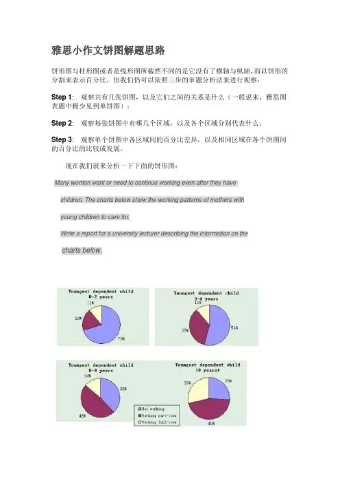
雅思小作文饼图解题思路饼形图与柱形图或者是线形图所截然不同的是它没有了横轴与纵轴,而以饼形的分割来表示百分比,但我们仍可以依照三步的审题分析法来进行观察:Step 1: 观察共有几张饼图,以及它们之间的关系是什么(一般说来,雅思图表题中极少见到单饼图);Step 2: 观察每张饼图中有哪几个区域,以及各个区域分别代表什么;Step 3: 观察单个饼图中各区域间的百分比差异,以及相同区域在各个饼图间的百分比的比较或发展。
现在我们就来分析一下下面的饼形图:Many women want or need to continue working even after they havechildren. The charts below show the working patterns of mothers withyoung children to care for.Write a report for a university lecturer describing the information on thecharts below.Step 1: 一共有四张饼图,它们分别按照由母亲照料的最年幼孩子的年龄大小来进行排列,从0 ~ 2岁到10岁以上;Step 2: 每张饼图中都有三种区域:白色区、深色区和浅色区。
它们分别表示母亲的工作状态:白色区为“没有工作”,深色区为“兼职工作”,浅色区为“全职工作”;Step 3: 白色区在0 ~ 2岁时处于绝对优势,占70%,而随着孩子年龄的增长,白色区渐渐地变小,在10岁以上时只有26%;深色区在孩子年幼时比例很小:0 ~ 2岁时只有19%。
随着孩子的长大,深色区急剧扩张,在5 ~ 9岁时达到顶峰,占48%,但在10岁以后却轻微下降到45%;而浅色区的变化则是在同一时期内分别占到了11%,11%,14%和29%。
当然,在开始写文章之前,我们还必须决定文章所用的时态。
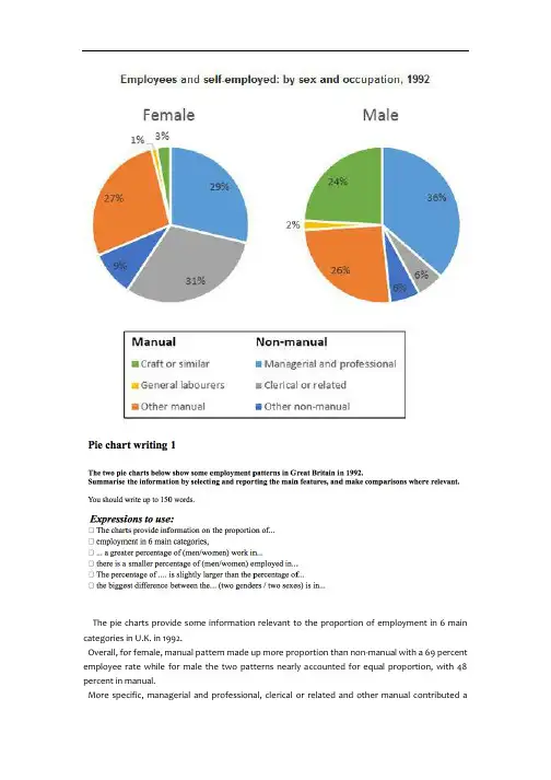
The pie charts provide some information relevant to the proportion of employment in 6 main categories in U.K. in 1992.Overall, for female, manual pattern made up more proportion than non-manual with a 69 percent employee rate while for male the two patterns nearly accounted for equal proportion, with 48 percent in manual.More specific, managerial and professional, clerical or related and other manual contributed asubstantial part of all female employee, at 87 percent. However, for male employee managerial and professional, craft or similar and other manual had a significant percentage in the pie chart, at 86 percent.Apparently, managerial and professional and other manual had a great proportion in all employed persons. And the biggest difference between two genders was in clerical or related pattern and craft or similar pattern because only 6 percent of men chosen clerical or related pattern while there were approximately 5 times of women chosen it. When there were a quarter of man do craft or similar pattern, just 3 percent female did these.There were some small percentages of both men and women who employed in other non-manual job, craft or similar job, respectively in 9 percent and 3 percent. As for male employee, clerical or related and other non-manual jobs share the same small proportion with 6 percent. General laborers pattern is the least popular job pattern with only 1 percent women chosen it and 2 percent men chosen .。

图表作文讲解2:柱状图和饼状图学生面授老师时间本次课时雅思写作第二课时教学思路1.作文简介、写作技巧2.实例讲解3.分析总结4.课后作业教学目标柱状图、饼状图知识点讲解基本特征和写作方法实例分析讲解重点写作技巧讲解范文学习柱状图和饼状图写作方法备考资料剑桥IELTS4-8教学详细内容:一、写作技巧详解1.柱状图特点➢柱状图是动态图表,切入点是描述趋势。
➢柱状图写作注重“比较”(找出similarity)和“对比”(找出difference),也就是说需要横向总结所有柱状图表的共性特征,也要分别描写各个柱子的个性特征。
➢两种写作方式:其一是对不同时间段内的数据进行比较,适合于数据代表的物体较少且时间界限明确的情况。
另外是对单独数据的全程描述,适合于描述数据对象很多且时间划定不清晰的情况。
2.饼状图特点饼形图与柱形图或者线形图所截然不同的是它没有了横轴与纵轴,而以饼形的分割来表示百分比,可以依照三步审题分析法来进行观察:➢观察共有几张饼状图,以及它们之间的关系是什么(一般说来,雅思图表题中极少见到单饼图);➢观察每张饼状图中有哪几个区域,以及各个区域分别代表什么;➢观察单个饼状图中各区域间的百分比差异,以及相同区域在各个饼状图间的百分比的比较或发展。
饼状图是所有图表题中最好写的一种,唯一值得注意的地方在于如何丰富百分比的表达和“占”的表达,要采取多样性的表达,如25%=a quarter of, 50%=half of, >50%=a/the majority of.描写饼状图中的比例构成就是饼状图图表作文的重点,但也应注意,这种描述并不是对图形的简单重复,对各项数据比例的描述应建立在归纳整理的基础上有条理地进行。
学生不仅要善于找数据,更重要的是要善于从数据或比例中升华出来,找到规律和本质。
常用词汇、句型及模板1.柱状图1)倍数的表达今年的产量是去年产量的两倍➢The output this year is two times(twice) more than last year’s.➢As much as 不可数名词 as many as 可数The books of this semester are two times as many as that of last semester. ➢ A is two times the amount of B不可数➢ A is two times the number of B可数2) 常用套句➢There was …in the number of A from …to … (over next years), which was followed by … and then… until…when there was … for the next … years.➢From…onwards, there was … in the number of A which then increased / decreased …at …% in …➢In …, the number reached (was) …%, but (30) years later there was …➢The number of A increased rapidly from … to … during the (five-year) period. ➢In the (three years) from … through…, the percentage of A was slightly larger / smaller than that of B.➢The graphs show a threefold increase in the number of A.➢Here is an upward trend in the number of A.➢… (year) witnessed / saw a sharp rise in A.2.饼状图1)常用词:percentage, proportion, make up, constitute, account for, take up, ..isdivided into…parts, consume the largest/smallest portion.2)例句:➢The graph, presented in a pie chart, shows the general trend in…..➢The percentage of A in … is more than twice tha n that of B.➢The biggest loss was to A area.➢There is not a great deal of difference between A and B.➢In general positions, females outnumber males.➢ A much greater percentage of men than women are found in managerial positions. ➢The profit of company A doubled from May to September.3)模板:➢The two pie charts describe ………………………➢The first point to note is …………………………➢Comparing the graphs, …………………………….➢The graphs also suggest that ………………………➢In conclusion, it can be seen from the data that …………………..4)饼状图作文模型The two pie charts illustrate the significant changes in people’s ways of communication from 1970 to 1995.The first graph shows that in 1975, the most popular way to communicate was letter writing, with the percentage of 50%. Others ___________________________, the figures are 32% and 18% respectively.It can be seen from the second graph that ways of communication changed a lot in two decades. By 1995, ______________________________. By contrast, ________________________________.Comparing the two pie charts, we can see that the use of the phones and computers during the same period had both risen considerably. However, letter writing became less popular among the people.In general, people inclined to use more modernized mediums to communicate with others, while the traditional way became less employed.The pie chart depicts the proportion of ___________________________. It consists of six segments, the largest one representing _________, which account for 26% of the total. _____________ takes up 21%, becoming the second largest.__________________________________. The rest proportions, 15% of all, constituting 5% and 10% respectively.From the chart it can be seen clearly that ________________________.二、实例分析分析思路:1.第一幅柱状图的描述单位是百万,即人数;第二幅则是百分比。