数据可视化英文PPT概要介绍
- 格式:ppt
- 大小:3.69 MB
- 文档页数:17


数据分析与可视化的流程结构英语The Data Analysis and Visualization Workflow: A Comprehensive Overview.Introduction.Data analysis and visualization are critical processes for extracting meaningful insights from complex datasets. The workflow involves multiple stages, each with its own set of tools and techniques, and understanding the proper sequence of these stages is essential for effective data analysis. This article provides a comprehensive overview of the data analysis and visualization workflow, outlining the key steps involved and highlighting best practices for each stage.Step 1: Data Collection and Acquisition.The first step in the data analysis and visualization workflow is data collection and acquisition. This involvesgathering the relevant data from various sources, such as databases, surveys, experiments, and social media platforms. The quality of the data collected is crucial, as itdirectly impacts the accuracy and reliability of the subsequent analysis and visualization. Data cleaning and preprocessing techniques are often employed to ensure data accuracy and consistency.Step 2: Data Exploration and Understanding.Once the data is collected, it needs to be explored and understood to identify patterns, trends, and potential relationships. Exploratory data analysis (EDA) techniques, such as descriptive statistics, frequency distributions,and scatterplots, are used to gain insights into the data and formulate hypotheses for further investigation. This stage helps in identifying outliers, missing values, and potential biases that can impact the analysis.Step 3: Data Preparation and Transformation.Data preparation and transformation involve modifyingthe data to make it suitable for analysis and visualization. This includes data cleaning, feature engineering, and data transformation techniques. Data cleaning involves removing duplicate data, handling missing values, and correctingdata inconsistencies. Feature engineering involves creating new features or modifying existing features to enhance the quality and accuracy of the analysis. Data transformation techniques, such as normalization, scaling, and binning,are used to prepare the data for specific visualization and modeling techniques.Step 4: Data Modeling and Analysis.Data modeling and analysis involve applying statistical and machine learning techniques to the data to uncover patterns and relationships. Statistical models, such as regression models, time series models, and clustering algorithms, are used to identify significant relationships and make predictions. Machine learning models, such as supervised learning and unsupervised learning algorithms, are used for classification, prediction, and pattern recognition tasks.Step 5: Data Visualization and Interpretation.Data visualization is the process of presenting data in a graphical format to communicate insights and findings effectively. Choosing the appropriate visualization technique is crucial to ensure that the data is presentedin a clear and concise manner. Common visualization techniques include bar charts, histograms, scatterplots, line charts, and heat maps. The choice of visualization technique depends on the type of data, the purpose of visualization, and the target audience.Step 6: Communication and Storytelling.The final step in the data analysis and visualization workflow is communication and storytelling. This involves presenting the findings and insights derived from the data analysis in a clear and compelling manner. Effective communication involves presenting the results in a logical and structured way, highlighting the key findings, and providing actionable recommendations. Storytellingtechniques can be used to engage the audience, make the findings relatable, and inspire action.Best Practices for Each Stage.Data Collection and Acquisition: Ensure data quality, relevance, and representativeness.Data Exploration and Understanding: Use EDA techniques to identify patterns, trends, and potential relationships.Data Preparation and Transformation: Clean the data, handle missing values, and transform data as needed to improve analysis and visualization.Data Modeling and Analysis: Select appropriate statistical and machine learning techniques based on the research question and data characteristics.Data Visualization and Interpretation: Choose visualization techniques that effectively communicate insights and findings.Communication and Storytelling: Present results clearly, highlight key findings, and provide actionable recommendations.Conclusion.The data analysis and visualization workflow is a multifaceted process that requires a combination of technical skills, analytical thinking, and effective communication abilities. Understanding the proper sequence of steps and adhering to best practices for each stage are crucial for successful data analysis and visualization. By following a structured and iterative approach, organizations can harness the power of data to gain valuable insights, make informed decisions, and drive business outcomes.。


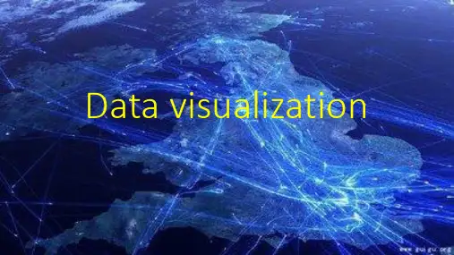
可视化数据短片英语Visualizing Data ShortsIntroduction:In this article, we delve into the world of visualizing data through short films. With the increasing availability of data in various fields, the art of transforming complex information into visually appealing narratives has gained significant importance. These visualizations, often referred to as data shorts, not only convey information effectively but also captivate and engage the audience. In this article, we explore the significance, process, and impact of creating visualizations in the English language.1. The Importance of Visualizing Data:Visualizing data allows for the transformation of dull and complex information into easily understandable visuals. It helps in simplifying intricate concepts and enables efficient communication. Data shorts provide an engaging and interactive experience, which is crucial in today's fast-paced world where attention spans are limited. By visualizing data, insights can be extracted, patterns can be identified, and meaningful stories can be told.2. The Process of Creating Data Shorts:a. Data Collection: The first step involves gathering relevant data from reliable sources. This data should be accurate, comprehensive, and representative of the subject being explored.b. Data Analysis: After collecting the data, it needs to be carefully analyzed to identify trends, patterns, and key insights. This step is crucial in determining the main message that the data short will convey.c. Storytelling: Once the data has been analyzed, the next step is crafting a compelling narrative. The story should have a clear structure, a well-defined beginning, middle, and end, and should effectively communicate the main findings of the data.d. Visual Design: The visual design is an essential element in data shorts. It involves selecting appropriate colors, fonts, and graphic elements to enhance the story and convey the information clearly. The visual design should be visually appealing, consistent, and easy to understand.e. Animation and Motion: Adding animation and motion brings the data to life and engages the audience. Utilizing various techniques such as transitions, panning, zooming, and animated data points can enhance the visual appeal and help in telling a more compelling story.f. Sound Design: The addition of sound effects, background music, and narration can further enhance the audience's experience. It adds depth and emotion to the visualization, making it more immersive and engaging.3. The Impact of Data Shorts:a. Effective Communication: Data shorts enable complex information to be communicated effectively to a wide range of audiences. Through visual storytelling, data becomes more accessible, understandable, and memorable.b. Decision Making: Visualizing data in the form of shorts can aid decision-making processes. The clear presentation of insights allowspolicymakers, researchers, and businesses to make informed choices based on the data presented.c. Advocacy and Awareness: Data shorts have the power to raise awareness and drive change. By combining compelling visuals with impactful narratives, data shorts can bring attention to important social, economic, and environmental issues.d. Education and Learning: Visualizing data in short films can enhance the learning experience by presenting information in an engaging and relatable manner. Students, researchers, and educators can benefit from visually appealing data representations that convey complex concepts concisely.Conclusion:Visualizing data through shorts is a powerful tool for conveying complex information in an engaging and easily understandable format. By combining compelling narratives with visually appealing designs, data shorts have the potential to captivate and inspire audiences across different fields. The significance of visualizing data cannot be underestimated, as it facilitates effective communication, aids decision-making, raises awareness, and enhances the learning experience. Embracing the art of data visualization has the potential to transform the way we explore, understand, and communicate information.。