图表作文常用词和套句Pie Chart 百分比的表达
- 格式:ppt
- 大小:254.50 KB
- 文档页数:57
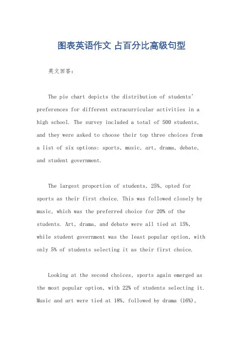
图表英语作文占百分比高级句型英文回答:The pie chart depicts the distribution of students' preferences for different extracurricular activities in a high school. The survey included a total of 500 students, and they were asked to choose their top three choices from a list of six options: sports, music, art, drama, debate, and student government.The largest proportion of students, 25%, opted for sports as their first choice. This was followed closely by music, which was the preferred choice for 20% of the students. Art, drama, and debate were all tied at 15%, while student government was the least popular option, with only 5% of students selecting it as their first choice.Looking at the second choices, sports again emerged as the most popular option, with 22% of students selecting it. Music and art were tied at 18%, followed by drama (16%),debate (14%), and student government (10%).Finally, when it came to the third choices, music wasthe most popular option, with 23% of students selecting it. Art and sports were tied at 19%, followed by drama (16%), debate (13%), and student government (9%).Overall, the pie chart shows that sports, music, andart are the most popular extracurricular activities among high school students, while student government is the least popular.中文回答:这张饼状图描述了高中生对不同课外活动偏好的分布。
在英语中,饼图通常被用于展示数据的比例或百分比。
以下是写作饼图作文的万能模板:1. Introduction: 描述饼图的目的是什么,以及它要传达的主要信息。
For example, the pie chart below displays the percentage of total income spent on various categories by households in a certain city.例如,下面的饼图展示了某个城市家庭总收入在各类别的花费百分比。
2. Description of the Pie Chart: 描述饼图中每个部分的大小和含义。
As shown in the pie chart, the largest proportion, approximately 35%, is allocated to housing expenses. This is followed by expenses on food and non-alcoholic beverages, representing approximately 20%.如饼图所示,最大的一部分,约占总数的35%,是住房支出。
接下来是食品和非酒精饮料的支出,约占总数的20%。
3. Comparison: 比较饼图中各部分的大小,突出重要信息。
For instance, the proportion of housing expenses is significantly higher than that of other categories. This indicates that housing costs are a significant burden for many families in this city.例如,住房支出的比例明显高于其他类别。
这表明住房成本对这个城市的许多家庭来说都是一个沉重的负担。
英语小作文饼状图模板英文回答:Pie Chart Template。
A pie chart is a circular graph that shows the relative proportions of different parts of a whole. It is often used to represent data that is categorical, such as the distribution of different types of products sold or the proportion of different age groups in a population.To create a pie chart, you will need to:1. Gather your data. This should be in the form of a table or spreadsheet, with one column for the category and one column for the value.2. Calculate the total value of all the data points.3. Calculate the proportion of each data point to thetotal value.4. Create a circle and divide it into sectors, with the size of each sector proportional to the proportion of the corresponding data point.5. Label each sector with the corresponding category.Example。
The following table shows the sales of different types of products in a store:| Product | Sales |。
饼状图百分比英语作文Pie Chart Percentages.Pie charts are a type of circular graph that visually represents data in a proportional manner. Each sector of the pie represents a percentage of the whole, with the sum of all sectors equalling 100%. Pie charts are commonly used in various fields, including business, marketing, and statistics, to present complex data in a simple and easy-to-understand format.Calculating Percentages.Determining the percentage represented by each sector of a pie chart involves dividing the value of that sector by the total value of all sectors and multiplying theresult by 100. Here's the formula:Percentage = (Value of Sector / Total Value) x 100。
Example 1。
Suppose we have a pie chart with four sectors representing the market share of different companies in an industry. The values of each sector are as follows:Company A: $20,000。
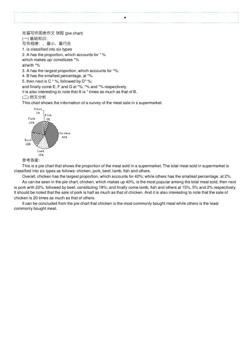
托福写作图表作⽂饼图 (pie chart) (⼀) 基础知识: 写作规律:、最⼩、最巧合 1. is classified into six types 2. A has the proportion, which accounts for * % which makes up/ constitutes *% at/with *% 3. A has the largest proportion, which accounts for *%; 4. B has the smallest percentage, at *%. 5. then next is C * %, followed by D* %; and finally come E, F and G at *%, *% and *% respectively. it is also interesting to note that A is * times as much as that of B. (⼆) 例⽂分析 This chart shows the information of a survey of the meat sale in s supermarket. 参考答案: This is a pie chart that shows the proportion of the meat sold in a supermarket. The total meat sold in supermarket is classified into six types as follows: chicken, pork, beef, lamb, fish and others. Overall, chicken has the largest proportion, which accounts for 40%; while others has the smallest percentage, at 2%. As can be seen in the pie chart, chicken, which makes up 40%, is the most popular among the total meat sold, then next is pork with 20%, followed by beef, constituting 18%; and finally come lamb, fish and others at 15%, 5% and 2% respectively. It should be noted that the sale of pork is half as much as that of chicken. And it is also interesting to note that the sale of chicken is 20 times as much as that of others. It can be concluded from the pie chart that chicken is the most commonly bought meat while others is the least commonly bought meat.。

百分数占比类图表英语作文英文回答:Percentage proportion charts are a graphical representation of the distribution of a particular quantity or value as a percentage of the whole. They are commonly used to illustrate the relative contributions of different components to a total value, or to compare the proportionsof different values within a dataset.Percentage proportion charts can take various forms, including bar charts, pie charts, and stacked bar charts.In a bar chart, each bar represents a different category or value, and the height of the bar corresponds to the percentage of the total value represented by that categoryor value. In a pie chart, a circle is divided into sectors, with each sector representing a different category or value. The size of each sector corresponds to the percentage ofthe total value represented by that category or value. In a stacked bar chart, multiple bars are stacked on top of eachother, with each bar representing a different category or value. The height of each stack corresponds to the total value represented by that category or value.Percentage proportion charts are useful for quickly visualizing the relative proportions of different components within a dataset. They can be used to identify the most significant contributors to a total value, to compare the proportions of different values over time, or to make comparisons between different datasets.Here are some examples of how percentage proportion charts can be used:A marketing manager could use a percentage proportion chart to visualize the distribution of sales across different product categories. This information could be used to identify the most popular product categories and to develop targeted marketing campaigns.A financial analyst could use a percentage proportion chart to visualize the distribution of assets within aportfolio. This information could be used to assess therisk and return profile of the portfolio and to make investment decisions.A scientist could use a percentage proportion chart to visualize the distribution of different species within an ecosystem. This information could be used to understand the biodiversity of the ecosystem and to identify potential threats to the ecosystem.中文回答:百分比比例图表是一种以百分比的形式对特定数量或价值分布进行图形化的表示。
可编辑修改精选全文完整版雅思小作文饼图常用词汇、万能句型、范文整理一、饼图常用词汇1.占比词汇-account for:占据-constitute:构成-make up:组成-represent:代表-comprise:包括-occupy:占有-consist of:由……组成2.描述数据词汇-significant:显著的-considerable:相当大的-minor:较小的-negligible:可以忽略的-substantial:大量的-slight:轻微的-moderate:适度的3.比较词汇1-similar:相似的-different:不同的-compare with:与……相比-in contrast to:与……形成对比-while:然而-whereas:然而-on the other hand:另一方面4.其他常用词汇-proportion:比例-segment:部分-percentage:百分比-distribution:分布-category:类别-sector:扇形二、饼图万能句型1.开头句型-The pie chart illustrates the proportion of categories in a specific field.-The pie chart provides information about the distribution of various segments.-The pie chart depicts the percentage of different categories in a given context.2.数据描述句型2-Category A accounts for a significant proportion of the total, reaching XX%.-XX%of the total is occupied by Category B.emiring it the largest segment.-Category C constitutes a considerable part, comprising XX%of the pie chart.-The proportion of Category D is relatively minor, only accounting for XX%.3.比较句型-In comparison with Category A, Category B has a higher percentage of XX%.-While Category A occupies XX%,Category B represents a larger proportion of XX%.-The distribution of Category C is similar to that of Category D, both comprising XX%.-In contrast to Category A, the percentage of Category B is significantly lower, at XX%.4.总结句型-Overall, the pie chart reveals a clear distribution of categories in the given field.-In summary, the majority of the pie chart is occupied by Category A, followed by Category B.-It can be concluded that Category C and Category D play minor roles in the overall distribution.3三、实战演练题目:The pie chart below shows the main reasons for traffic accidents in a particular area. Summarise the information by selecting and reporting the main features, and make comparisons where relevant.答案:The pie chart illustrates the main reasons for traffic accidents in a specific area. Upon analysis, several key points can be identified.First and foremost, the largest proportion of traffic accidents is caused by driver error, accounting for 45%of the total. This is followed by poor weather conditions, which constitute 25%of the accidents. Vehicle defects and road conditions each occupy 10%of the pie chart, while the remaining 10%is attributed to other factors.In comparison, driver error is the most significant factor, nearly doubling the percentage of poor weather conditions. Meanwhile, vehicle defects and road conditions share the same proportion, both comprising a minor part of the total.Overall, the pie chart reveals that driver error is the primary cause of traffic accidents in the given area, with poor weather conditions being the second4most common factor. Other factors, such as vehicle defects and road conditions, play relatively minor roles in the overall distribution.5。
饼状图百分比英语作文英文回答:Pie charts are a type of graphical representation that displays data in the form of slices of a pie. Each slice represents a category of data, and the size of the slice corresponds to the percentage of the total data that category represents. Pie charts are commonly used to represent the relative proportions of different categories of data, such as market share, population distribution, or budget allocation.To calculate the percentage of a slice in a pie chart, you can use the following formula:Percentage = (Size of slice / Total size of pie) 100。
For example, if a pie chart has a total size of 100 units and one slice has a size of 20 units, the percentage of that slice would be:Percentage = (20 / 100) 100 = 20%。
Pie charts can be a useful way to visualize therelative proportions of different categories of data, but they can also be misleading. For example, if a pie charthas a large number of slices, it can be difficult to seethe relative sizes of the slices. Additionally, pie charts can be distorted by the way that the data is presented. For example, if one category of data is much larger than the other categories, it can make the other categories appear smaller than they actually are.中文回答:饼状图是一种图形表示形式,它以饼片的形式显示数据。
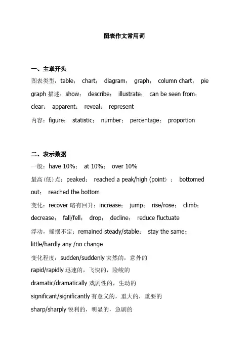
图表作文常用词一、主章开头图表类型:table;chart;diagram;graph;column chart;pie graph 描述:show;describe;illustrate;can be seen from;clear;apparent;reveal;represent内容:figure;statistic;number;percentage;proportion二、表示数据一般:have 10%;at 10%;over 10%最高(低)点:peaked;reached a peak/high (point) ;bottomed out;reached the bottom变化:recover 略有回升;increase;jump;rise/rose;climb;decrease;fall/fell;drop;decline;reduce fluctuate浮动,摇摆不定:remained steady/stable;stay the same;little/hardly any /no change变化程度:sudden/suddenly突然的,意外的rapid/rapidly迅速的,飞快的,险峻的dramatic/dramatically 戏剧性的,生动的significant/significantly有意义的,重大的,重要的sharp/sharply锐利的,明显的,急剧的steep/steeply急剧升降的steady/steadily稳固的,坚定不移的gradual/gradually渐进的,逐渐的slow/slowly缓慢的,不活跃的slight/slightly轻微的、略微地stable/stably 稳定的表示范围:from…to…between…and…for…to…多长时间直至U 表示程度:almost adv.几乎,差不多nearly adv.几乎,密切地approximately adv.近似的,大约about adv,附近,大约,转向,左右,周围just over刚超过over adv.结束,越过,从头到尾exactly adv.正确地,严密地precisely adv.正好精确地;清晰地比例:20 percent 20%one in three 1/3one out of every four 1/4significant changes图中一些较大变化noticeable trend 明显趋势during the same period 在同一时期grow/grew 增长distribute分布,区别unequally不相等地pronounced 明显的average 平均no doubt无疑地corresponding adj.相应的,通讯的represent vt.阐述,表现overall总体上讲except除外in the case of adv.在…的情况下in contrast相反,大不相同in conclusion adv.最后,总之in comparison相比之下inversely adv.相反地,倒转地in general通常,大体上,一般而言rang from excessive adj.过多的,过分的,额外lower v.降低,跌落elapse vi.(时间)过去,消逝category n.种类government policy 政府政策market forces市场规率measure n.尺寸,方法,措施v.估量,调节forecast n.先见,预见v.预测1.有用的词上升:increase rise ascend core surge go up climb mount level up 下降:decrease fall drop descend decline reduce lessen level down 平稳:stable steady remain/maintain/keep/be the same as/similar to 波动:fluctuate fluctuation rise and falls up and down 占:occupy take up account for gain而:while however whereas on the other hand actually/in fact相比:by contract on the contrary likewise compared with最高点:the highest the top the summit the peak the most最低点:bottom less least rock bottom平均:mean average趋势:tendency trend inclination预见:prediction达到顶峰:mount to在***中占***:***gain the percentage of***有一个稳定的过程:a stable period can be seen原则:A.不可能写的很好,关键是要很稳地写清楚。
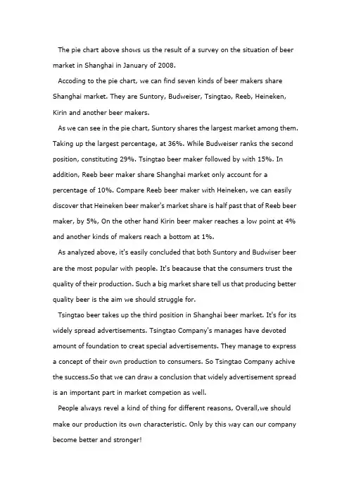
The pie chart above shows us the result of a survey on the situation of beer market in Shanghai in January of 2008.Accoding to the pie chart, we can find seven kinds of beer makers share Shanghai market. They are Suntory, Budweiser, Tsingtao, Reeb, Heineken, Kirin and another beer makers.As we can see in the pie chart, Suntory shares the largest market among them. Taking up the largest percentage, at 36%. While Budweiser ranks the second position, constituting 29%. Tsingtao beer maker followed by with 15%. In addition, Reeb beer maker share Shanghai market only account for a percentage of 10%. Compare Reeb beer maker with Heineken, we can easily discover that Heineken beer maker's market share is half past that of Reeb beer maker, by 5%, On the other hand Kirin beer maker reaches a low point at 4% and another kinds of makers reach a bottom at 1%.As analyzed above, it's easily concluded that both Suntory and Budwiser beer are the most popular with people. It's beacause that the consumers trust the quality of their production. Such a big market share tell us that producing better quality beer is the aim we should struggle for.Tsingtao beer takes up the third position in Shanghai beer market. It's for its widely spread advertisements. Tsingtao Company's manages have devoted amount of foundation to creat special advertisements. They manage to express a concept of their own production to consumers. So Tsingtao Company achive the success.So that we can draw a conclusion that widely advertisement spread is an important part in market competion as well.People always revel a kind of thing for different reasons, Overall,we should make our production its own characteristic. Only by this way can our company become better and stronger!。
1. 饼状图主体段写法第一句话:说明饼状图的组成部分第二句话:说明占比例最大的部分第三句话以后:说明占比例第二的部分(或者:把剩下的几部分分类,把比例相同的部分捏合到一起说明)第一句:It can be seen from the pie chart that the electricity is used for four purposes.主体段第一句开头“由图可见”的常用表达:It can be clearly seen from the chart that…As can be clearly seen from the chart,We can see clearly from the chart that…According to the… chart,It is apparent/ obvious / evident / manifest from the…. chart that…主体段第一句和第二句的过渡句:To be more exact, = More exactly,To be more precise, = More precisely,To be more specific, = More specifically,To be more detailed, = More detailedly第二句开始:To be more precise, heating rooms and water accounts for the largest proportion (52.5%) of the electricity used, while the demand of ovens, kettles and washing machines occupies the 17.5% of the total need of electricity. Lighting, TV andradio represent the same percentage(15%) as do vacuum cleaners, food mixers and electric tools.饼状图写作要点:1.介绍各扇面及总体的关系2.各个扇面之间的比较,同类扇面在不同时间,不同地点的比较3.重点突出特色最明显的扇面:最大的,最小的,互相成倍的描写句式:1.It is clear that the most +adj. + 主题词is A, which accounts for ___% of all 主题词.2. B is the next largest + 主题词, ___% lower than A of all 主题词and followedclosely by C.3.The above three items of 主题词altogether take about ___%.4.By contrast, D, E and F make the smallest percentage of total 主题词, which are___%, ___% and ___% respectively.模仿例句:In 1950, the urban population represented less than 13% of the total. It is now about 40% and is expected to reach 60% by 2030. (摘自BBC)表示占据的动词或动词短语:form; comprise; make up; occupy; constitute; cover; represent; account for; be shared by倍数和比例的表达:a quarter of ……; half of ……; a majority of ……double (这三个词都可以做名词,动词和形容词); triple; quadruple… be twice as adj. as ……例句:The dining-room is twice as big as the kitchen. … more than ___ times as adj. as …… 例句:There are more than twice as many kangaroos as people in Australia.He is more than three times as rich as I.A has something in common with BA shares some similarity with BThe difference between A and B lies in ……Sentence Patterns:Introduction:The (two) pie charts show (reveal, suggest, illustrate, demonstrate, indicate, describe, relate) the proportion (percentage) of A and B…in (7) (categories), divided into…and…(one is…, another is…)Comparison:1、The biggest difference between (2) groups is in …, where A makes up % while (whereas) B constitutes % (makes up=constitutes=accounts for)the highest percentage / amount of A, which was approximately %, was for…. (=in) /was found in2、The percentage of A in …is more than twice the percentage of B, the ration is % to % (% compared to %)3、In…, while there is (not) a great deal of difference between the percentage of A and B (the former is % and the latter is %).in …, while a greater percentage of A than B are found in…(the former is % and the latter is %).4、There are more A (in …), reaching %, compared with % of B5、By contrast, A has increased (declined), from % in …to % in ….Compared with B, A …Conclusion:To sum up/ In conclusion / It appears that…/ The two charts clearly show…饼状图一例Many women want or need to continue working after they have children. The chart below shows the working after they have children. The chart below shows the working pattern of mothers with young children.the introduction can be written like this:Even just after having a child, a large number women return to work. As the child grows older, the percentage of mothers who choose or need to continue working rises. At least until the child is ten, the larger number of working mothers take part-time occupations. When the child is ten years or older, the number of the full-timers more than doubles while that of the part-timers decrease.Each chart entails / contains instruction, which illustrates what the chart involves rather than the over trends.Paragraph 1:When the youngest child is at most 2 years old, 30% of the women return to work. 19% full-time, and 11% as part-timers.Paragraph 2:The percentage of full timers remains the same until the child turns five and increased slightly to 14% when the child is at most 9 years old, but the percentage of part-time working mothers grows dramatically to 35 and continues growing to 48% by the time the child is 9.Paragraph 3:A change occurs after the child grows to ten. The number of full-time working mothers doubles in percentage to 29, while that of the part-timers is reduced slightly to by 3% to 45%.Conclusion:It appears that, when the child turns to ten, women have much fewer maternal responsibilities than the years before.You should spend about 20 minutes on this task. Write a report for a university lecturer describing the information shown below. You should write at least 150 words.In this analysis we will examine three pie charts. The first one is headed ‘World Spending.’ The second is ‘World Population’ and the third is ‘Consumption ofResources.’In the first chart we can see that people spend most of their income (24%) on food. Transport and then housing are the next major expenses at 18% and 12% respectively. Only 6% of income is spent on clothing.In the second chart entitled ‘World Population’, it is not surprising to find that 57% of people live in Asia. Europe and the Americans account for nearly 30% of the total, whilst 10% of people live in Africa.Finally, the third chart reveals that the USA and Europe consume a huge 60% of the world’s resource.To sum up, the major expenditure is on food, the population figures are the highest for Asia and the major consumers are the USA and Europe. (182 words)范文参考The two graphs show that oil was the major energy source in the USA in both 1980 and 1990 and that coal, natural gas and hydroelectric power remained in much the same proportions. On the other hand, there was a dramatic rise in nuclear power,which doubled its percentage over the ten years.Oil supplied the largest percentage of energy, although the percentage decreased from 42% in 1980 to 33% in 1990. Coal in 1990 was the second largest source of energy, increasing its proportion to 27% from 22% in the previous decade. Natural gas, the second largest source in 1980 at 26%, decreased its share very slightly to provide 25% of America’s energy ten years later. There was no change in the percentage supplied by hydroelectric power which remained at 5% of the total energy used. Nuclear power the greatest change: in 1990 it was 10%, twice that of the 1980s.(152 words)句型套路让“饼图”写作华彩绽放许多考生觉得饼图十分简单,也就是一些百分比及数字的列举,对该类图表不太重视,准备并不充分。
图表英语作文模板百分比英文回答:Introduction.Charts and graphs are commonly used in various fields to visually represent data and information. They provide a concise and compelling way to communicate complex insights and trends, making them invaluable tools for businesses, researchers, and decision-makers.Types of Graphs.There are numerous types of graphs, each designed to illustrate different types of data and patterns. Some common types include:Bar graphs: Use rectangular bars to compare values across different categories or time periods.Line graphs: Connect data points using lines to show trends or changes over time.Pie charts: Represent data as portions of a circle, indicating the relative proportions of different categories.Scatterplots: Plot data points on a two-dimensional plane to explore relationships between two or more variables.Histograms: Display the distribution of data within a specific range.Percentile Graphs.Percentile graphs are specialized graphs used to showthe distribution of data within a population. For example,a 50th percentile (median) graph divides a population into two equal halves. The x-axis typically represents the percentile, while the y-axis represents the corresponding value.Benefits of Using Charts.Charts offer several advantages for data visualization and analysis:Clarity and Conciseness: Charts simplify complex data into visual representations, making it easier to understand and interpret.Trends and Patterns: Charts reveal trends, patterns, and relationships that may not be apparent from raw data.Comparison and Contrast: Charts allow for easy comparison and contrast between different data sets.Effective Communication: Visualizations caneffectively convey information to audiences with varying levels of statistical literacy.Considerations for Graphing.When creating graphs, it is essential to consider thefollowing factors:Data Accuracy: Ensure that the data used in the graph is accurate and reliable.Appropriate Graph Type: Select the graph type that best suits the data and the intended purpose.Clear and Informative Axes: Label axes clearly and include necessary units to facilitate interpretation.Color and Symbolism: Use colors and symbols effectively to distinguish between data points and emphasize key insights.Ethical Considerations: Avoid manipulation or distortion that could mislead the audience.Conclusion.Charts and graphs are powerful tools for visualizing and understanding data. By understanding the differenttypes of graphs and the principles of effective graphing, individuals can effectively communicate and derive insights from complex information.中文回答:引言。
饼图英语作文万能句子Pie Chart English Essay Universal Sentences1. The pie chart provides a visual representation of data in the form of a circle, which is divided into sectors that represent different categories or groups.2. It is evident from the pie chart that there is a clear breakdown of data into specific categories, allowing for easy understanding and interpretation of the information presented.3. One of the advantages of using a pie chart is that it can clearly illustrate the proportion of each category in relation to the whole, making it easier for viewers to grasp the overall distribution of data.4. The key to interpreting a pie chart effectively is to focus on the size of each sector relative to the whole circle, as this reflects the percentage or proportion of the data that each category represents.5. Pie charts are often used to compare the distribution of different variables or to show the relative sizes of various categories within a dataset, making them a valuable tool for data visualization.6. It is important to note that pie charts are best suited for representing data that is categorical in nature, where each category is distinct and does not overlap with any other.7. When presenting data in a pie chart, it is crucial to ensure that the categories are clearly labeled and that the chart is visually appealing and easy to interpret.8. In conclusion, the pie chart is a useful and effective tool for visually representing data in a clear and concise manner, making it an essential component of data analysis and presentation.。
饼状图百分比英语作文English: In a pie chart, percentages are used to represent the proportion of different categories or groups in a whole. Each sector in the pie chart is allocated a certain percentage based on the relative size of that category in comparison to the total. This visual representation allows viewers to easily compare the different categories and understand the distribution of the data at a glance. The percentages in a pie chart are often displayed within or near each sector to clearly show the exact proportion it represents. It is essential to label each sector with the corresponding category name to provide clarity and context. Moreover, the use of different colors or patterns in each sector can further enhance the understanding of the data and make it more visually appealing. Overall, pie charts with percentages are a useful tool for presenting data in a clear and concise manner, making complex information more accessible and comprehensible to a wide audience.中文翻译: 在饼状图中,百分比被用来表示不同类别或组在整体中的比例。
智课网IELTS备考资料雅思写作经典范文:饼图(pie chart)写作经典范例鉴赏本文来自雅思作文网《饼图(pie chart)写作经典范例鉴赏》。
小作文提高:饼图(pie chart)写作经典范例鉴赏胡伟提示:饼图(pie chart)是雅思写作Task 1 里常考的题型之一,其写作非常值得我们深入研究。
现专供一饼图的写作范例与各位“雅友”一起分享,期望对大家的饼图写作带去一些启发和帮助。
不过,在鉴赏前还是请各位先看图表,并思考以下问题:概述两图描述了什么(需要对象和时间)?两图中哪两种消费方式占的比例比较大?各自又有什么变化(数据说明)?两图中还有哪些消费方式发生了变化?变化特征大吗?具体有什么变化(数据说明)?两图中哪些消费方式相对变化不大?对应数据是什么?“占”多少百分比如何丰富表达?必要的时候,一些特殊的百分比用什么适当的英文单词来表达?写作题目:WRITING TASK 1:You should spend about 20 minutes on this task. prefix = o ns = "urn:schemas-microsoft-com:office:office" /The charts below show US spending patterns from 1966 to 1996.Summarise the information by selecting and reporting the main features, and make comparisons where relevant.You should write at least 150 words.预祝您雅思作文更上一层楼,感谢您阅读《饼图(pie chart)写作经典范例鉴赏》一文.本文来自雅思作文网《饼图(pie chart)写作经典范例鉴赏》。
写作范例:The piecharts show changes in American spending patterns between 1966 and 1996.Food and cars made up the two biggest items of expenditure in both years. Together they comprised over half of household spending. Food accounted for 44% of spending in 1966, but this dropped by two thirds to 14% in 1996. However, the outlay on cars doubled, rising from 23% in 1966 to 45% in 1996.Other areas changed significantly. Spending on eating out doubled, climbing from 7% to 14%. The proportion of salary spent on computers increased dramatically, up from 1% in 1996 to 10% in 1996. However, as computer expenditure rose, the percentage of outlay on books plunged from 6% to 1%.Some areas remained relatively unchanged. Americans spent approximately the same amount of salary on petrol and furniture in both years.In conclusion, increased amounts spent on cars, computers, and eating out were made up for by drops in expenditure on food and books.本文来源:预祝您雅思作文更上一层楼,感谢您阅读《饼图(pie chart)写作经典范例鉴赏》一文.。