雅思写作小作文饼图真题句子练习PieSentences
- 格式:docx
- 大小:1.36 MB
- 文档页数:5
雅思小作文饼状图英文回答:The pie chart illustrates the percentage of various sources of energy consumed in a particular region during a specific year. The data is presented in a clear and concise manner, with each slice of the pie representing a different energy source.Upon examining the pie chart, it becomes evident that non-renewable energy sources dominate the region's energy consumption. Fossil fuels, including coal, natural gas, and oil, account for a substantial 80% of the total energy usage. This heavy reliance on non-renewable resources highlights the region's dependence on finite energy sources, which raises concerns about future energy security and environmental sustainability.In contrast, renewable energy sources play a relatively minor role in the region's energy mix. Solar and wind powercombined contribute a mere 10% to the total energy consumption. This low percentage suggests a lack of investment in renewable energy infrastructure and a reluctance to transition towards cleaner and more sustainable energy sources.Hydroelectricity stands out as the most significant renewable energy source, accounting for 5% of the region's energy consumption. However, this figure is stillrelatively low compared to the potential hydroelectric resources that the region may possess. The untapped potential of hydroelectricity presents an opportunity for the region to increase its reliance on renewable energy and reduce its dependence on fossil fuels.Overall, the pie chart provides valuable insights into the region's energy consumption patterns. The dominance of non-renewable energy sources raises concerns about the region's long-term energy security and environmental sustainability. The underutilization of renewable energy sources, particularly hydroelectricity, suggests a need for increased investment and a shift towards a more sustainableenergy future.中文回答:此饼状图展示了某个地区在某一年中各种能源消耗所占的百分比。
雅思图表作文模板句Para1. This is a table / chart / (line线状bar柱状pie饼状)graph which demonstrate / illustrate / reveal /depict /privide information about............. Para2. (1)Obvious /Apparent from the graph is that ...rank the first/highest,while/whereas ....turn out to be the lowest(2)It is exhibited/shown in the table that.....(3)It can be seen from the table that.....Para3.(1)饼.柱图A,which accounts for...%,ranks the first;then next is B with...%;followed by C,constituting...%;finally it comes D.E.F at...%...%and...%respectively(2)特殊变化(不变,增长或下降多的)①It is worth mentioning that....②It must be pointed out that....③More striking/suprising is that....Para4.To conclude /In conclusion/overallPara5. this is a graph which illustrates...这个图表向我们展示了...Para6 .this table shows the changing proportion of a &b from...to...该表格描述了...年到...年间a与b的比例关系。
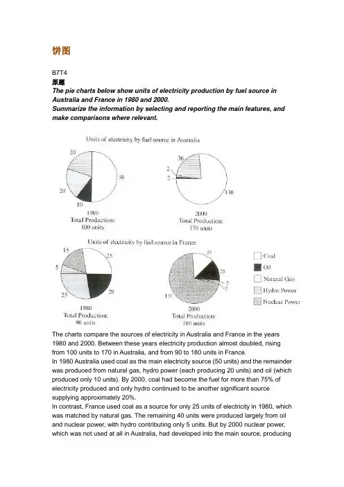
饼图B7T4原题The pie charts below show units of electricity production by fuel source in Australia and France in 1980 and 2000.Summarize the information by selecting and reporting the main features, and make comparisons where relevant.The charts compare the sources of electricity in Australia and France in the years 1980 and 2000. Between these years electricity production almost doubled, rising from 100 units to 170 in Australia, and from 90 to 180 units in France.In 1980 Australia used coal as the main electricity source (50 units) and the remainder was produced from natural gas, hydro power (each producing 20 units) and oil (which produced only 10 units). By 2000, coal had become the fuel for more than 75% of electricity produced and only hydro continued to be another significant source supplying approximately 20%.In contrast, France used coal as a source for only 25 units of electricity in 1980, which was matched by natural gas. The remaining 40 units were produced largely from oil and nuclear power, with hydro contributing only 5 units. But by 2000 nuclear power, which was not used at all in Australia, had developed into the main source, producingalmost 75% of electricity, at 126 units, while coal and oil together produced only 50 units. Other sources were no longer significant.Overall, it is clear that by 20000 these two countries relied on different principal fuel sources: Australia relied on coal and France on nuclear power.分析:题目The pie charts below show units of electricity production by fuel source in Australia and France in 1980 and 2000.•文章谈到的四个要素:units of electricity production, fuel source, Australia and France, 1980 and 2000第一段The charts compare the sources of electricity in Australia and France in the years 1980 and 2000.•四个要素也不能少: sources, electricity, Australia and France, 1980 and 2000 •这次我们也试着将名词性短语改成一个句子, The charts indicate how many units of electricity were produced by different fuel sources in Australia and Francebetween 1980 and 2000.Between these years electricity production almost doubled, rising from 100 units to 170 in Australia, and from 90 to 180 units in France.•说明两个国家从1980到2000的总量的变化•比较一下两个double的用法Ø double [vi]: Electricity production almost doubled.Ø double [vt]: The two countries doubled their electricity production.Ø 这两种用法在雅思图表作文中都很常用,注意一下第二段In 1980 Australia used coal as the main electricity source (50 units) and the remainder was produced from natural gas, hydro power (each producing 20 units) and oil (which produced only 10 units).•说明了澳大利亚1980年情况,•注意同义表达use…as the source, be produced fromBy 2000, coal had become the fuel for more than 75% of electricity produced and only hydro continued to be another significant source supplying approximately 20%.•说明了澳大利亚2000年的情况,注意此处引用了百分数,而非绝对值•这里采用了fuel作为了表达的主语,如Coal had become the fuel, Hydro continued to be another source.第三段In contrast, France used coal as a source for only 25 units of electricity in 1980, which was matched by natural gas. The remaining 40 units were produced largely from oil and nuclear power, with hydro contributing only 5 units.•说明法国1980年的情况•类似于1980年澳大利亚的表达:use…as a source, be produced fromBut by 2000 nuclear power, which was not used at all in Australia, had developed into the main source, producing almost 75% of electricity, at 126 units, while coal and oil together produced only 50 units. Other sources were no longer significant.•说明了法国2000年的情况•类似于2000年澳大利亚的表达:nuclear had developed into the main source第四段Overall, it is clear that by 20000 these two countries relied on different principal fuel sources: Australia relied on coal and France on nuclear power.上文谈到了1980年和2000年两国的发电总量变化(年代变化),这里谈到2000年两国的主要依赖能源(国家对照)词汇句型积累雅思图表作文基本功主要考察的是同义表达,如下面的这句话,就会有多种表达•Australia used coal as the main electricity source•Coal was the main source for electricity in Australia.•The main proportion of electricity was produced from coal in Australia.•Coal became the main fuel to produce electricity in Australia.这个句子中有几个要素coal, electricity, Australia, 你只要将这几个要素所作的句子成分发生变化,句式就会呈现多样性,同义多样表达必须掌握,大家平时可以自己多做这样的练习,以便掌握好这项基本技能。
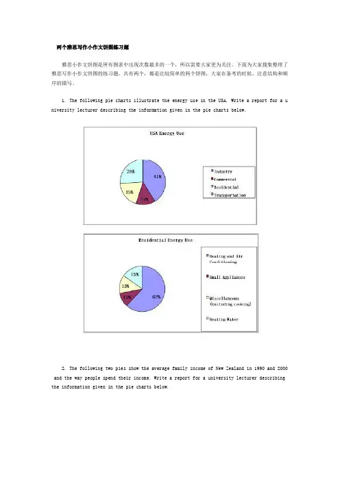
两个雅思写作小作文饼图练习题雅思小作文饼图是所有图表中出现次数最多的一个,所以需要大家更为关注。
下面为大家搜集整理了雅思写作小作文饼图的练习题,共有两个,都是比较简单的两个饼图,大家在备考的时候,注意结构和顺序的描写。
1. The following pie charts illustrate the energy use in the USA. Write a report for a u niversity lecturer describing the information given in the pie charts below.2. The following two pies show the average family income of New Zealand in 1990 and 2000 and the way people spend their income. Write a report for a university lecturer describing the information given in the pie charts below.以上就是这两个雅俗写作小作文饼图练习题的全部内容,包括了美国的能源使用和新西兰的平均家庭收入两个话题。
大家在备考雅思写作小作文饼图的时候,可以适当的练习一下上面的这两个题目。
雅思小作文图表描述方式小结雅思小作文的图表描述是有自己的方式和特点的,掌握了这个方式可以让大家的小作文备考更快也更加贴近考试的要求。
下面就为大家整理了雅思小作文图表描述的方式,供大家参考。
1. 与趋势有关的词语:上升(v.):increase, rise, climb, ascend, surge, shoot up下降(v.):decrease, decline, drop, fall, descend, plunge持平(v.):remain stable, keep constant, level off, flatten out波动(v.):fluctuate, wave, go up and down快速(adj./adv.):considerable/considerably, significant/significantly, substantial/subst antially, remarkable/remarkably, dramatic/dramatically稳步(adj./adv.):steady/steadily, stable/stably, moderate/moderately, modest/modestly缓慢(adj./adv.):slight/slightly, minimal/minimally, marginal/marginally顶点(n. /v.):peak趋势 (n.):trend/ tendency2. 与大小相关的词语:Outnumber (v.):在数量上超过The demonstrators were outnumbered by the policeExceed (v.):在数量上超过Triple (v.):变成三倍The figure has tripled.Double (v.):变成两倍The price of houses has virtually doubled over the past few years.Mount to (v.):达到Counterpart (n.):对应的另一方,比较的另一方 this product is better than its counterpart s此外,朗阁海外考试研究中心建议考生还应考虑一下题中数据和百分比有没有联系,如果有的话还应辅以一些关于比例和占据的语句。
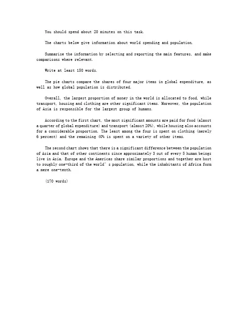
You should spend about 20 minutes on this task.The charts below give information about world spending and population.Summarise the information by selecting and reporting the main features, and make comparisons where relevant.Write at least 150 words.The pie charts compare the shares of four major items in global expenditure, as well as how global population is distributed.Overall, the largest proportion of money in the world is allocated to food, while transport, housing and clothing are other significant items. Moreover, the population of Asia is responsible for the largest group of humans.According to the first chart, the most significant amounts are paid for food (almost a quarter of global expenditure) and transport (almost 20%), while housing also accounts for a considerable proportion. The least among the four is spent on clothing (merely 6 percent) and the remaining 40% is spent on a variety of other items.The second chart shows that there is a significant difference between the population of Asia and that of other continents since approximately 3 out of every 5 human beings live in Asia. Europe and the Americas share similar proportions and together are host to roughly one-third of the world’s population, while the inhabitants of Africa form a mere one-tenth.(170 words)。
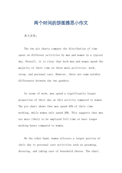
两个时间的饼图雅思小作文英文回答:The two pie charts compare the distribution of time spent on different activities by men and women in a typical day. Overall, it is clear that both men and women spend the majority of their time on three main activities: work, sleep, and personal care. However, there are some notable differences between the two genders.In terms of work, men spend a significantly larger proportion of their day on this activity compared to women. The pie chart shows that men spend 45% of their time working, while women only spend 30%. This suggests that men are more likely to be employed full-time or have longer working hours compared to women.On the other hand, women allocate a larger portion of their day to personal care activities such as grooming, dressing, and taking care of household chores. The chartreveals that women spend 35% of their time on personal care, whereas men only spend 25%. This indicates that women tendto take on more responsibilities related to maintaining the household and their personal appearance.When it comes to sleep, both genders allocate a similar amount of time for rest. Men spend 30% of their day sleeping, while women spend 28%. This suggests that both men and women prioritize getting enough rest and recognize the importance of sleep for their overall well-being.中文回答:这两个饼图比较了男性和女性在一天中不同活动上所花费的时间分配。
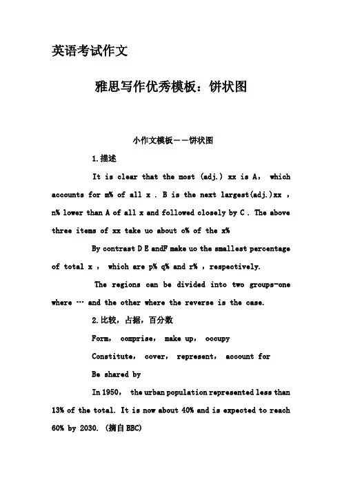
英语考试作文雅思写作优秀模板:饼状图小作文模板――饼状图1.描述It is clear that the most (adj.) xx is A, which accounts for m% of all x . B is the next largest(adj.)xx ,n% lower than A of all x and followed closely by C . The above three items of xx take uo about o% of the x%By contrast D E andF make uo the smallest percentage of total x , which are p% q% and r% ,respectively.The regions can be divided into two groups-one where … and the other where the reverse is the case.2.比较,占据,百分数Form, comprise, make up, occupyConstitute, cover, represent, account forBe shared byIn 1950, the urban population represented less than 13% of the total. It is now about 40% and is expected to reach 60% by 2030. (摘自BBC)3.比例,倍数A quarter of…Half of…A majority of…A has something in common with bA shares some similarity with bThe difference between a and b lies in…Double, triple, quadruple (v, n, adj)原来的2倍-double, 50→100原来的3倍-triple, 50→150原来的4倍-quadruple, 50→200The value of the house has increased fourfold (=it is now worth four times as much as before).…be twice as adj. as …..…more than xx times as adj. as …..。
1. 饼状图主体段写法第一句话:说明饼状图的组成部分第二句话:说明占比例最大的部分第三句话以后:说明占比例第二的部分(或者:把剩下的几部分分类,把比例相同的部分捏合到一起说明)第一句:It can be seen from the pie chart that the electricity is used for four purposes.主体段第一句开头“由图可见”的常用表达:It can be clearly seen from the chart that…As can be clearly seen from the chart,We can see clearly from the chart that…According to the… chart,It is apparent/ obvious / evident / manifest from the…. chart that…主体段第一句和第二句的过渡句:To be more exact, = More exactly,To be more precise, = More precisely,To be more specific, = More specifically,To be more detailed, = More detailedly第二句开始:To be more precise, heating rooms and water accounts for the largest proportion (52.5%) of the electricity used, while the demand of ovens, kettles and washing machines occupies the 17.5% of the total need of electricity. Lighting, TV andradio represent the same percentage(15%) as do vacuum cleaners, food mixers and electric tools.饼状图写作要点:1.介绍各扇面及总体的关系2.各个扇面之间的比较,同类扇面在不同时间,不同地点的比较3.重点突出特色最明显的扇面:最大的,最小的,互相成倍的描写句式:1.It is clear that the most +adj. + 主题词is A, which accounts for ___% of all 主题词.2. B is the next largest + 主题词, ___% lower than A of all 主题词and followedclosely by C.3.The above three items of 主题词altogether take about ___%.4.By contrast, D, E and F make the smallest percentage of total 主题词, which are___%, ___% and ___% respectively.模仿例句:In 1950, the urban population represented less than 13% of the total. It is now about 40% and is expected to reach 60% by 2030. (摘自BBC)表示占据的动词或动词短语:form; comprise; make up; occupy; constitute; cover; represent; account for; be shared by倍数和比例的表达:a quarter of ……; half of ……; a majority of ……double (这三个词都可以做名词,动词和形容词); triple; quadruple… be twice as adj. as ……例句:The dining-room is twice as big as the kitchen. … more than ___ times as adj. as …… 例句:There are more than twice as many kangaroos as people in Australia.He is more than three times as rich as I.A has something in common with BA shares some similarity with BThe difference between A and B lies in ……Sentence Patterns:Introduction:The (two) pie charts show (reveal, suggest, illustrate, demonstrate, indicate, describe, relate) the proportion (percentage) of A and B…in (7) (categories), divided into…and…(one is…, another is…)Comparison:1、The biggest difference between (2) groups is in …, where A makes up % while (whereas) B constitutes % (makes up=constitutes=accounts for)the highest percentage / amount of A, which was approximately %, was for…. (=in) /was found in2、The percentage of A in …is more than twice the percentage of B, the ration is % to % (% compared to %)3、In…, while there is (not) a great deal of difference between the percentage of A and B (the former is % and the latter is %).in …, while a greater percentage of A than B are found in…(the former is % and the latter is %).4、There are more A (in …), reaching %, compared with % of B5、By contrast, A has increased (declined), from % in …to % in ….Compared with B, A …Conclusion:To sum up/ In conclusion / It appears that…/ The two charts clearly show…饼状图一例Many women want or need to continue working after they have children. The chart below shows the working after they have children. The chart below shows the working pattern of mothers with young children.the introduction can be written like this:Even just after having a child, a large number women return to work. As the child grows older, the percentage of mothers who choose or need to continue working rises. At least until the child is ten, the larger number of working mothers take part-time occupations. When the child is ten years or older, the number of the full-timers more than doubles while that of the part-timers decrease.Each chart entails / contains instruction, which illustrates what the chart involves rather than the over trends.Paragraph 1:When the youngest child is at most 2 years old, 30% of the women return to work. 19% full-time, and 11% as part-timers.Paragraph 2:The percentage of full timers remains the same until the child turns five and increased slightly to 14% when the child is at most 9 years old, but the percentage of part-time working mothers grows dramatically to 35 and continues growing to 48% by the time the child is 9.Paragraph 3:A change occurs after the child grows to ten. The number of full-time working mothers doubles in percentage to 29, while that of the part-timers is reduced slightly to by 3% to 45%.Conclusion:It appears that, when the child turns to ten, women have much fewer maternal responsibilities than the years before.You should spend about 20 minutes on this task. Write a report for a university lecturer describing the information shown below. You should write at least 150 words.In this analysis we will examine three pie charts. The first one is headed ‘World Spending.’ The second is ‘World Population’ and the third is ‘Consumption ofResources.’In the first chart we can see that people spend most of their income (24%) on food. Transport and then housing are the next major expenses at 18% and 12% respectively. Only 6% of income is spent on clothing.In the second chart entitled ‘World Population’, it is not surprising to find that 57% of people live in Asia. Europe and the Americans account for nearly 30% of the total, whilst 10% of people live in Africa.Finally, the third chart reveals that the USA and Europe consume a huge 60% of the world’s resource.To sum up, the major expenditure is on food, the population figures are the highest for Asia and the major consumers are the USA and Europe. (182 words)范文参考The two graphs show that oil was the major energy source in the USA in both 1980 and 1990 and that coal, natural gas and hydroelectric power remained in much the same proportions. On the other hand, there was a dramatic rise in nuclear power,which doubled its percentage over the ten years.Oil supplied the largest percentage of energy, although the percentage decreased from 42% in 1980 to 33% in 1990. Coal in 1990 was the second largest source of energy, increasing its proportion to 27% from 22% in the previous decade. Natural gas, the second largest source in 1980 at 26%, decreased its share very slightly to provide 25% of America’s energy ten years later. There was no change in the percentage supplied by hydroelectric power which remained at 5% of the total energy used. Nuclear power the greatest change: in 1990 it was 10%, twice that of the 1980s.(152 words)句型套路让“饼图”写作华彩绽放许多考生觉得饼图十分简单,也就是一些百分比及数字的列举,对该类图表不太重视,准备并不充分。
饼图英语作文万能句子Alright, here are some example sentences for a pie chart essay in English, each with a unique language style to reflect conversational fluency and diversity:1. Casual style: The pie chart shows that sports take up the biggest slice, like always. Guess everyone loves to stay active!2. Informal style: Hey, look at that! The tech section is growing faster than a weed in the garden. People are really into their gadgets these days.3. Descriptive style: The distribution of preferencesin the pie chart is quite intriguing. The education segment seems to be steadily increasing, indicating a growing interest in personal development.4. Comparative style: Compared to last year's data, the entertainment slice has shrunk significantly. Maybe peopleare finding other ways to spend their free time.5. Conversational style: So, what do you think? The travel segment is quite large. I bet a lot of people are dreaming of their next vacation.6. Opinionated style: Clearly, the food and beverage section is way too big! People should spend more on healthy habits instead of indulging in junk food.7. Humorous style: Wow, the sleep segment is tiny! Who can relate to that? I feel like I'm always fighting to get more shut-eye.8. Formal style: It is noteworthy that the business and finance sector commands a considerable portion of the chart, indicating a stable economic outlook.9. Inquisitive style: I'm curious about the hobbies and interests segment. What kind of activities do people find most fulfilling?10. Emotional style: Just looking at the family and relationships slice makes me feel all warm and fuzzy inside. Relationships are truly the most important thing in life.。
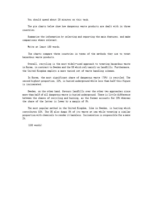
You should spend about 20 minutes on this task.The pie charts below show how dangerous waste products are dealt with in three countries.Summarise the information by selecting and reporting the main features, and make comparisons where relevant.Write at least 150 words.The charts compare three countries in terms of the methods they use to treat hazardous waste products.Overall, recycling is the most widely-used approach to treating hazardous waste in Korea, in contrast to Sweden and the UK which rely mainly on landfills. Furthermore, the United Kingdom employs a more varied set of waste handling schemes.In Korea, the most significant share of dangerous waste (70%) is recycled. The second highest proportion, 22%, is buried underground while less than half this figure is incinerated.Sweden, on the other hand, favours landfills over the other two approaches since more than half of all dangerous waste is buried underground. There is little difference between the shares of recycling and burning, as the former accounts for 25% whereas the share of the latter is lower by a margin of 5%.The most popular method in the United Kingdom, like in Sweden, is burying which contributes 82%. The UK also dumps 8% of its waste at sea while treating a similar proportion with chemicals to render it harmless. Incineration is responsible for a mere 2%.(180 words)。
You should spend about 20 minutes on this task.The three pie charts below show the changes in annual spending by a particular UK school in 1981, 1991 and 2001.Summarise the information by selecting and reporting the main features, and make comparisons where relevant.Write at least 150 words.The charts compare changes in the shares of five different items which comprised the yearly expenses of a British school between 1981 and 2001.Overall, while the shares of three items experienced rises, there were declines in the remaining two. Moreover, academic staff salaries contributed the largest proportion of expenditure throughout the survey, whereas insurance had the smallest share.Wages paid to the teaching staff accounted for the most significant proportion of expenditure in 1981 (40%) and went up by a quarter before declining slightly. In comparison, the salaries of non-academic employees were responsible for less than a third of all expenses in 1981, but their share dipped substantially by 13% over the course of these 20 years.The share of furniture and equipment was initially as high as that of educational resources (15%), but while the former dropped by 2/3 before rising fivefold, the latter experienced a marked rise after which it halved, reaching just below 10%.The contribution of insurance had risen minimally from 2% to 3% by 1991, before climbing almost threefold in 2001.(177 words)。
雅思范⽂ 篇⼀:雅思⼩作⽂饼状图 You should spend about 20 minutes on this task. Write a report for a university lecturer describing the information shown below. You should write at least 150 words. In this analysis we will examine three pie charts. The first one is headed ‘World Spending.’ The second is ‘World Population’ and the third is ‘Consumption of Resources.’ In the first chart we can see that people spend most of their income (24%) on food. In some countries this percentage would obviously be much higher. Transport and then housing are the next major expenses at 18% and 12% respectively. Only 6% of income is spent on clothing. In the second chart entitled ‘World Population’, it is not surprising to find that 57% of people live in Asia. In fact China and India are two of the most populated countries in the world and they are both situated on this continent. Europe and the Americans account for nearly 30% of the total, whilst 10% of people live in Africa. Finally, the third chart reveals that the USA and Europe consume a huge 60% of the world’s resource. To sum up, the major expenditure is on food, the population figures are the highest for Asia and the major consumers are the USA and Europe. The two graphs show that oil was the major energy source in the USA in both 1980 and 1990. It is manifest from the pie charts that coal, natural gas and hydroelectric power remained in much the same proportions. On the other hand, there was a dramatic rise in nuclear power, which doubled its percentage over the ten years. Oil supplied the largest percentage of energy, although the percentage decreased from 42% in 1980 to 33% in 1990. Coal in 1990 was the second largest source of energy, increasing its proportion to 27% from 22% in the previous decade. Natural gas, the second largest source in 1980 at 26%, decreased its share very slightly to provide 25% of America’s energy ten years later. There was no change in the percentage supplied by hydroelectric power which remained at 5% of the total energy used. Nuclear power the greatest change: in 1990 it was 10%, twice that of the 1980s. 篇⼆:雅思⼩作⽂饼状图范⽂ This lesson will provide you with tips and advice on how to write an IELTS pie chart for task one. To begin, take a look at the pie chart below and the model answer. You should spend about 20 minutes on this task. The pie charts show the main reasons for migration to and from the UK in 2007. Summarize the information by selecting and reporting the main features and make comparisons where relevant. Write at least 150 words Sample Answer The pie charts illustrate the primary reasons that people came to and left the UK in 2007. At first glance it is clear that the main factor influencing this decision was employment.Having a definite job accounted for 30 per cent of immigration to the UK, and this figure was very similar for emigration, at 29%. A large number of people, 22%, also emigrated because they were looking for a job, though the proportion of people leaving the UK for this purpose was noticeably lower at less than a fifth. Another major factor influencing a move to the UK was for formal study, with over a quarter of people immigrating for this reason. However, interestingly, only a small minority, 4%, left for this. The proportions of those moving to join a family member were quite similar for immigration and emigration, at 15% and 13% respectively. Although a significant number of people (32%) gave ‘other’ reasons or did not give a reason why they emigrated, this accounted for only 17% with regards to immigration. 篇三:雅思写作⼩作⽂饼图真题句⼦练习Pie Sentences Pie chart In 1980 Australia used coal as the main electricity source(50 units) and the remainder was produced from natural gas, hydro power(each producing 20 units) and oil,which produced only 10 units. 在1980年,澳⼤利亚使⽤煤作为主要的电⼒来源(50 units),剩下的电⼒由天然⽓,氢能(两者各产⽣20 units)和⽯油,它仅仅只产⽣10 units。
饼图雅思英语作文Sure, here's a sample response for an IELTS Writing Task 1 describing a pie chart:The provided pie chart illustrates the distribution of expenditures in a typical household in a certain country.Overall, it is evident that the highest proportion of the household budget is allocated to housing, followed by transportation and food, while the least amount is spent on healthcare and education combined.To delve deeper into the specifics, housing comprises the largest portion, accounting for 35% of the total expenditures. This indicates the significance of housing expenses in the household budget, which could include rent or mortgage payments, utility bills, and maintenance costs.Transportation ranks as the second most substantial expense, representing 25% of the budget. This allocationencompasses various transportation-related costs such as vehicle maintenance, fuel, insurance, and public transportation fares.Food expenditure constitutes 20% of the household budget, making it the third-largest expense category. This encompasses groceries, dining out, and other food-related expenses.Moving on, healthcare and education collectively make up only 10% of the total expenditures, with healthcare accounting for 7% and education for 3%. This suggests that healthcare and education are relatively less prioritized compared to other essential expenses.Finally, the remaining 10% of the budget is distributed among other miscellaneous expenses, which may include entertainment, clothing, personal care items, and savings.In conclusion, the pie chart illustrates a typical distribution of expenditures in a household, with housing, transportation, and food occupying the largest shares ofthe budget. This breakdown provides valuable insights into the spending habits and priorities of households in the depicted country.。
WRITING TASK 1:You should spend about 20 minutes on this task.* The chart and graph below give information about sales and share prices for Coca-Cola.* Summarise the information by selecting and reporting the main features, and make comparisons where relevant.You should write at least 150 words.The pie chart shows the worldwide distribution of sales of Coca-Cola in the year 2000 and the graph shows the change in share prices between 1996 and 2001.In the year 2000, Coca-Cola sold a total of 17.1 billion cases of their fizzy drink product worldwide. The largest consumer was North America, where 30.4 per cent of the total volume was purchased. The second largest consumer was Latin America. Europe and Asia purchased 20.5 and 16.4 per cent of the total volume respectively, while Africa and the Middle East remained fairly small consumers at 7 per cent of the total volume of sales.Since 1996, share prices for Coca-Cola have fluctuated. In that year, shares were valued at approximately $35. Between 1996 and 1997, however, prices rose significantly to $70 per share. They dipped a little in mid-1997 and then peaked at $80 per share in mid-98. From then until 2000 their value fell consistently but there was a slight rise in mid-2000.The diagrams below show the population of various parts of the world and their g Government spending on education.Write a report for a university lecturer describing the information shown below.You should write at least 150 words.The pie charts below show units of electricity production by fuel source in Australia and France in 1980 and 2000.Summarize the information by selecting and reporting the main features, and make comparisons where relevant.The charts compare the sources of electricity in Australia and France in the years 1980 and 2000. Between these years electricity production almost doubled, rising from 100 units to 170 units in Australia, and from 90 to 180 units in France.In 1980 Australia used coal as the main electricity source (50 units) and the remainder was produced from natural gas, hydro power (each producing 20 units) and oil (which produced only 10 units). By 2000, coal had become the fuel for more than 75% if electricity production and only hydro continued to be another significant source supplying approximately 20%.In contrast, France used coal as a source for only 25 units of electricity in 1980, which was matched by natural gas. The remaining 40 units were produced largely from oil and nuclear power, with hydro contributing only 5 units. But by 2000, nuclear power, which was not used at all in Australia, had developed into the main source, producing almost 75% of electricity, while coal and oil together produced only 50 units. Other sources were no longer significant.Overall, it is clear that by 2000 these two countries relied on different principal fuel sources: Australia relied on cola and France relied on nuclear power.The following pie charts illustrate the energy use in the USA. Write a report for a university lecturer describing the information given in the pie charts below.1 能源的使用被分为了( )四个大的类别( ),分别是( )工业,商业,住宅和交通。
【雅思写作真题】剑桥9Test3饼图类小作文实例参考【雅思写作真题】剑桥9 Test3 饼图类小作文实例参考“真题:剑桥9 Test3 图表类小作文”The charts below give information on the ages of the populations of Yemen and Italy in 2000 and projections for 2050.Summarise the information by selecting and reporting the main features, and make comparisons where relevant.考生原文These pie charts illustrates what proportion are accounted by human in respective age group of Yemen and Italy in 2002, and predicting the future changes to 2050.In Yemen, 0-14 years old young children were the domain group in 2000, at 50.1%. And smaller proportion of 15-19 years old person in the same period, which was 46.3%. While 50 years past, 15-59 years old people will become the most group of people, rising to 57.3%. Although there is a increase in old peoplewho are over 60 years old. But they still the least group of person, which were rising from 3.6% in 2000 to 5.7% in 2005.In terms of Italy, according to projection, 15-59 years old people experience a dramatic decrease, declining from 61.6% in 2000 to 46.2% in 2050. While it still the most group of people. In 2000, the proportion of over 60 years old was 24.1%, which doubled the percentage in 2050 through projection. Contrary to Yemen, the percentage of people who are 15-59 years old is the least no matter what period.Overall, there are decrease of young children in both countries. Even in Italy, the percentage of children is much smaller than those in Italy.批改By 晟睿 Anna本次批改严格按照IELTS小作文评分标准进行。
雅思写作小作文饼图真题句子练习P i e S e n t e n c e s It was last revised on January 2, 2021
P i e c h a r t In 1980 Australia used coal as the main electricity source(50 units) and the remainder was produced from natural gas, hydro power(each producing 20 units) and oil,which produced only 10 units.
在1980年,澳大利亚使用煤作为主要的电力来源(50 units),剩下的电力由天然气,氢能(两者各产生20 units)和石油,它仅仅只产生10 units。
By 2000, coal had become the fuel for more than 75% of electricity produced and only hydro continued to be another significant source supplying approximately 20%.
到了2000年,煤已经成为了产生超过75%电力的能源了,同时只有氢能继续成为另一个重要的供应来源,大约是20%。
In contrast, France used coal as a source for only 25 units of electricity in 1980, which was matched by natural gas.
相比之下,法国在1980年用煤供电只有25 units,这和天然气相同。
The remaining 40 units were produced largely from oil and nuclear power, with hydro contributing only 5 units.
剩下的40 units 主要都产生于石油和核能,其中氢能只贡献了5 units。
But by 2000 nuclear power, which was not used at all in Australia, had developed into the main source, producing almost 75% of electricity, at 126 units, while coal and oil together produced only 50 units.
但是到了2000年,在澳大利亚不会使用的核能,已经发展成为了主要能源,生产大约75%的电力,达到126 units, 相反煤和石油一共只生产 50 units。
In all three years, the greatest expenditure was on staff salaries.
在这三年中,最大的花费是在员工工资上。
But while other workers’ salaries saw a fall from 28% in 1981 to only 15% of spending in 2001,teachers’pay remained the biggest cost, reaching 50% of total spending in 1991 and ending at 45% in 2001.
但是尽管其他工人的工资见证了一个从1981年的28%到2001年仅仅15%的下降,老师的工资依然保持着最大的花费,在1991年达到了总共花费的50%和2001年结束于45%。
Expenditure on resources such as books had increased to 20% by 1991 before decreasing to only 9% by the end of the period.
在这个时期末下降到只有9%之前,在资源,比如书上面的花费到1991年上涨到了20%。
This cost decreased to only 5% of total expenditure in 1991 but rose dramatically in 2001 when it represented 23% of the school budget.
这个花费在1991年下降到只有总体花费的5%,但是在2001年剧烈上升,那个时候它占据了学校预算的23%。
Similarly, the cost of insurance saw a rising trend, growing from only 2% to 8% by 2001.
相似地,保险的花费看见了一个增长趋势,从只有2%增长到2001年的8%。
Globally, 65% of degradation is caused by too much animal grazing and tree clearance, constituting 35% and 30% respectively.
全球的,65%的土地退化是由于过度的放牧和砍伐树木,两者分别占据了35%和30%。
A further 28% of global degradation is due to over-cultivation of crops.
另外的28%全球退化是由于过度种植。
Other causes account for only 7% collectively.
其他原因占据了整体的7%。
At 36% we can see that the travel sector accounted for the majority of online sales in 2003, but this percentage had dropped to 29% by 2013.
我们可以看见在2003年旅游部分占据了网络销售量的大部分,占有36%,但是这个比例到了2013年下降到了29%。
Across the same ten-year period,as an increasing number of people chose to purchase films and music online, we can see that transactions went from just 21% to 33%, making it the retail sector with the highest overall share of the online market.
经历了同样的十年,因为越来越多的人选择网上购买电影和音乐,我们可以看见交易量从仅仅的21%上升到33%,使之零售部分占有了网络市场整体最高的份额。
In 2003, the clothing industry boasted an impressive 24% of total online sales in New Zealand.
2003年新西兰的衣服行业占有了网络销售的24%。
However, by 2013, the figure had fallen considerably to 16%.
然而,到了2013年,这个数据显着地下降到了16%。
Interestingly, online sales of books eventually overtook sales of clothes, although books still represented only 22% of the market.
有趣的是,书本的网上销售量最终超过了衣服的销售量,尽管书本依然只占有市场的22%。