中考英语作文范文-图表说明文
- 格式:doc
- 大小:28.00 KB
- 文档页数:3
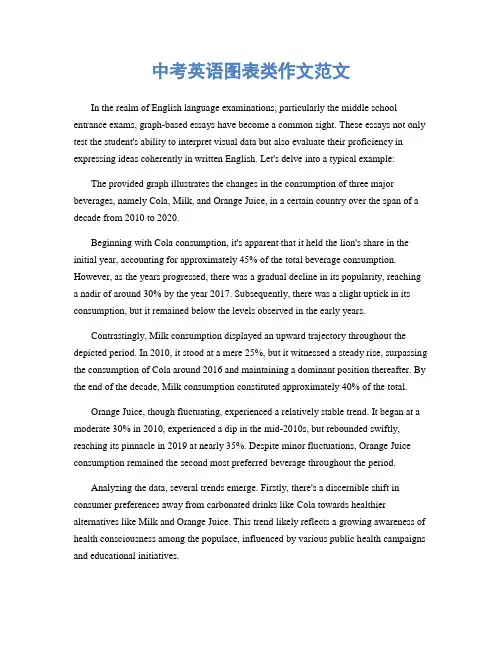
中考英语图表类作文范文In the realm of English language examinations, particularly the middle school entrance exams, graph-based essays have become a common sight. These essays not only test the student's ability to interpret visual data but also evaluate their proficiency in expressing ideas coherently in written English. Let's delve into a typical example:The provided graph illustrates the changes in the consumption of three major beverages, namely Cola, Milk, and Orange Juice, in a certain country over the span of a decade from 2010 to 2020.Beginning with Cola consumption, it's apparent that it held the lion's share in the initial year, accounting for approximately 45% of the total beverage consumption. However, as the years progressed, there was a gradual decline in its popularity, reaching a nadir of around 30% by the year 2017. Subsequently, there was a slight uptick in its consumption, but it remained below the levels observed in the early years.Contrastingly, Milk consumption displayed an upward trajectory throughout the depicted period. In 2010, it stood at a mere 25%, but it witnessed a steady rise, surpassing the consumption of Cola around 2016 and maintaining a dominant position thereafter. By the end of the decade, Milk consumption constituted approximately 40% of the total.Orange Juice, though fluctuating, experienced a relatively stable trend. It began at a moderate 30% in 2010, experienced a dip in the mid-2010s, but rebounded swiftly, reaching its pinnacle in 2019 at nearly 35%. Despite minor fluctuations, Orange Juice consumption remained the second most preferred beverage throughout the period.Analyzing the data, several trends emerge. Firstly, there's a discernible shift in consumer preferences away from carbonated drinks like Cola towards healthier alternatives like Milk and Orange Juice. This trend likely reflects a growing awareness of health consciousness among the populace, influenced by various public health campaigns and educational initiatives.Secondly, the steady rise in Milk consumption underscores its status as a dietary staple, potentially driven by its nutritional benefits and cultural significance in many societies.Thirdly, while Orange Juice didn't witness as dramatic a rise as Milk, its resilience in maintaining a significant share of the market indicates a consistent demand for fruit-based beverages.In conclusion, the graph paints a vivid picture of evolving beverage consumption patterns in the depicted country. It serves as a reflection of broader societal trends towards healthier lifestyles and dietary choices. As we move forward, understanding and adapting to these changing preferences will be crucial for businesses in the beverage industry to remain relevant and competitive.。
初中英语作文图表类模板及范文In the realm of English essay writing for junior high students, the chart and graph essay genre poses a unique challenge. This type of essay requires students to analyze and interpret data presented visually, translate it into meaningful insights, and then communicate these insights clearly and coherently. To assist students in this endeavor, a template and sample essay are provided below.**Template for Chart/Graph Essay**1. **Introduction**:* Briefly introduce the chart/graph and its purpose.* State the main trend or observation. 2. **Body Paragraph 1**:* Describe the data related to the first key aspect of the chart/graph. * Analyze the reasons behind the trend or observation. * Discuss the significance or implicationsof this trend. 3. **Body Paragraph 2**:* Describe the data related to the second key aspect of the chart/graph. * Analyze the reasons behind the trend orobservation. * Discuss the significance or implications of this trend. 4. **Conclusion**:* Summarize the main trends and observations. * Provide a closing thought or recommendation based on the analysis.**Sample Essay****Title**: Interpreting Trends in Teenage Sleep Habits In the chart below, we see a comparison of average sleep hours among teenagers in different countries. The chart reveals a concerning trend: the majority of teenagers in these countries are not getting enough sleep.In the United States, the average teenager sleeps just over 7 hours per night, which is below the recommended 8-10 hours. This could be due to various factors, such as late-night social media use, academic pressure, or extracurricular activities. The lack of sufficient sleep among American teenagers could have serious implicationsfor their health and academic performance.In contrast, teenagers in China sleep an average of over 8 hours per night. This could be attributed tocultural differences in sleep habits or the relatively lighter academic workload compared to their peers in the United States. The higher sleep hours among Chinese teenagers might explain their better performance in international academic competitions.Overall, the chart highlights the need for a global effort to improve sleep habits among teenagers. Parents, educators, and policymakers should work together to create an environment that encourages healthy sleep patterns. For example, schools could implement earlier start times and provide more breaks during the day to encourage better sleep habits among students. Additionally, parents can set limits on screen time before bedtime and ensure a quiet and comfortable sleep environment for their children. By prioritizing sleep, we can help teenagers achieve theirfull potential both academically and physically.**解析**:这篇图表类英语作文围绕“青少年睡眠习惯的趋势”展开。
关于图表类的英语作文初三80字全文共10篇示例,供读者参考篇1Title: My Junior High School Life - A Look at the StatsHey guys! Today I want to talk to you about some cool stats I found about junior high school life. I know statistics can be boring sometimes, but trust me, these ones are really interesting!Firstly, did you know that 70% of students in junior high school participate in at least one extracurricular activity? That's so cool, right? Whether it's sports, music, or art, there are so many fun things to do outside of class.Next, let's talk about homework. I know, I know, homework is the worst. But guess what? On average, junior high school students spend about 2-3 hours on homework every night. That's a lot of time, but hey, hard work pays off in the end!Oh, and speaking of hard work, did you know that 85% of junior high school students say they feel stressed about their grades? I totally get it, grades are important. But remember, it's okay to ask for help if you need it. You're not alone!Finally, let's talk about friendships. Did you know that 90% of junior high school students say they have at least one close friend? Friends are so important, they're like your cheerleaders in life. So make sure to cherish your friendships and always be there for each other.So there you have it, some fun stats about junior high school life. I hope you found them as interesting as I did. Remember, junior high school can be tough, but with hard work, a positive attitude, and great friends, you can conquer anything!篇2Title: My Thoughts on the Chart - A Fun Look at DataHey everyone, today I want to talk about something super cool - charts! I know, I know, charts might sound boring, but trust me, they can actually be pretty interesting. So let's dive in and take a look at some data in a fun way.First off, let's talk about bar charts. Bar charts are like a bunch of colorful bars that show you how much of something there is. For example, a bar chart might show you how many cupcakes each person ate at a party. It's a fun way to see who ate the most and who maybe had too many sweet treats!Next up, there's line graphs. Line graphs are like a bunch of dots connected by lines. They're great for showing how something changes over time. Imagine if you wanted to see how your height changed each year - a line graph could show you if you grew a lot or just a little each year.Lastly, we have pie charts. Pie charts are like a yummy pie cut into slices. Each slice shows you how much of something there is compared to the whole pie. It's a fun way to see what part of the pie is the biggest or smallest.So, charts might seem boring at first, but if you look at them in a fun way, they can actually be pretty cool. Take some time to explore different types of charts and see what fun data you can discover! Who knows, you might just become a chart master in no time!篇3Title: My Experience with Charts and GraphsHi everyone! Today I want to tell you about my experience with charts and graphs in school. It's actually pretty cool once you get the hang of it!So, in class we often use charts and graphs to help us understand and analyze data. They can show us things like trends, comparisons, and even make predictions. It's like a visual way of representing information, which makes it easier for us to understand.One of the types of charts we use is a bar graph. It has bars that represent different categories of data, and the height of the bars shows the amount or value of each category. For example, we once made a bar graph to compare the favorite foods of our classmates. It was fun to see which food was the most popular!Another type of chart we use is a line graph. It's great for showing how something changes over time. We once made a line graph to track the temperature in our city throughout the year. It was interesting to see how the temperature went up and down with the seasons.I also learned about pie charts, which are great for showing how a whole is divided into parts. We once made a pie chart to show the different types of pets owned by our classmates. It was cool to see which pet was the most popular!Overall, I think charts and graphs are really helpful for understanding data in a fun and visual way. I'm glad I learnedhow to read and make them in school. It's like a superpower that helps me analyze information better!That's all for now. Thanks for listening to my story about charts and graphs. Bye-bye!篇4Title: My Exciting Adventure with Charts and GraphsHey everyone! Today I want to tell you about my super exciting adventure with charts and graphs. Sounds boring, right? But trust me, it's actually really cool!So, my teacher gave us this assignment to analyze some data and create our own charts and graphs. At first, I was like, "Ugh, why do we have to do this?" But then I started working on it, and it was so much fun!I had to collect data about my classmates' favorite colors, and then I made a colorful pie chart to show the results. It was so cool to see all the different colors and how they compared to each other. Plus, I got to use all these cool colors and shapes to make my chart look awesome.Next, I had to analyze the data and write a little report about it. I was a bit worried about this part, but it turned out to bepretty easy. I just had to look at my chart and think about what it was telling me. I felt like a real scientist or something!Finally, I presented my findings to the class. I was a bit nervous at first, but everyone was super interested in my chart and asked me lots of questions. It was really cool to see how my hard work paid off and how much everyone enjoyed learning about the data.In the end, I learned that charts and graphs aren't boring at all. They're actually a really fun way to present data and learn new things. I can't wait to do another project like this in the future!Well, that's all for now. Thanks for listening to my story. I hope you all have your own awesome adventures with charts and graphs soon! Bye!篇5Title: My Analysis of a ChartHey everyone! Today I want to talk about a chart that I saw in my textbook. It's all about the different types of pets people have in the United States. I thought it was super interesting, so I wanted to share my thoughts with all of you.The chart showed that the most popular pet in the US is a dog. Wow, I wasn't surprised at all because dogs are so cute and friendly! Cats were the second most popular pet, followed by fish, birds, and rabbits. I didn't know so many people had birds as pets, that's pretty cool!I also noticed that more people in urban areas have cats as pets, while people in rural areas prefer dogs. That's really interesting because I guess it makes sense that people in the city would have a cat since they don't need as much space to roam around.Another thing that stood out to me was that more women than men have pets. Girls really love their furry friends, huh? I wonder why that is. Maybe boys are more into sports and stuff.Overall, I thought the chart was really cool and I learned a lot from it. I'm definitely going to tell my friends about it. Do any of you have pets? Let me know in the comments below! Thanks for listening, see ya!篇6Oh hi! Today, I want to talk about this cool chart I found in my textbook. It's all about different types of animals and their population in the world. It's super interesting!First, let me tell you about the chart. It's divided into different categories like mammals, birds, reptiles, amphibians, and fish. Each category has a different color so it's easy to see the data. The chart shows the number of species in each category and also how many of them are endangered.Now, let's talk about the mammals. Did you know that there are around 5,500 species of mammals in the world? That's a lot! But the sad part is that over 1,000 of them are endangered. We need to protect these animals and their habitats!Next, let's look at the birds. There are over 10,000 species of birds out there. Isn't that amazing? But around 1,300 of them are endangered. We need to make sure they have enough food and places to live.Oh, and don't forget about the reptiles, amphibians, and fish. They also have a lot of species, but many of them are in danger too. It's up to us to take care of our planet and all the animals that live here.I learned so much from this chart. It's important to understand how many animals are out there and what we can do to help them. Let's all work together to protect our planet and the amazing creatures that call it home!篇7Title: My Thoughts on a ChartHey guys, today I want to talk about a chart I saw in my textbook. It was all about the different types of animals in the world. There were mammals, birds, reptiles, amphibians, and fish. It was pretty cool to see all the different animals grouped together like that.In the chart, it showed how many species of each type of animal there are. Did you know that there are over 5,400 species of mammals in the world? That's a lot of different kinds of animals with fur or hair and mammary glands like cows, dogs, and lions. And there are even more species of birds – over 10,000! Birds have feathers and lay eggs, like chickens, eagles, and penguins.Reptiles are another group of animals in the chart. There are about 10,000 species of reptiles, including snakes, turtles, and lizards. Reptiles are cold-blooded and most have scales. And then there are the amphibians, like frogs and salamanders. There are about 7,000 species of amphibians in the world. They are cold-blooded too, and they start their lives in water.Lastly, there are the fish. There are over 31,000 species of fish in the world. They have gills and most have scales, but not all of them. Fish live in water, like oceans, rivers, and lakes. Some fish can even live in really deep parts of the ocean where it's really dark.Isn't it amazing how many different types of animals there are in the world? Each type has its own unique characteristics and ways of living. It's so cool to learn about all the diversity of life on Earth. I can't wait to see more charts like this in my textbook!篇8Title: My Analysis of the ChartHey guys, today I'm going to talk about a chart that I found super interesting. It's all about the different types of pets people have in our town. Let's dive into it!First off, the chart shows that the most popular pet in our town is dogs, with 40% of people owning one. I'm not surprised because dogs are so cute and friendly. I have a dog myself, and he's the best!Next up is cats, with 30% of people owning one. Cats are cool too, but they can be a bit aloof sometimes. I have a friend who has a cat, and it always ignores me when I go over to her house.After cats, we have fish at 15%. Fish are pretty low maintenance pets, but I think they're a bit boring. You can't really play with them or cuddle them like you can with a dog or cat.Lastly, we have birds at 10% and reptiles at 5%. Birds are cool because they can talk and sing, but they can be pretty loud sometimes. As for reptiles, I think they're a bit creepy with all their scales and slithery movements.Overall, I think the chart is super cool to look at. It's interesting to see what kinds of pets people in our town have. If I could choose, I would definitely go for a dog every time. What about you guys? What's your favorite pet? Let me know in the comments! Thanks for listening, see you next time!篇9Oh man, I have to write a super long essay about a chart for my English class. But hey, I'll make it fun and easy to read, just like how my teacher always says. So, here goes!The chart I'm going to talk about is all about the types of pets that people have in our city. It shows that most people have dogs, followed by cats, fish, birds, and some even have reptiles as pets. It's really cool to see all the different kinds of animals that people love to have as companions!I find it interesting that dogs are the most popular pets. I mean, who doesn't love a cute and fluffy dog? They're so loyal and playful, it's no wonder they're so popular. Cats are also super popular, probably because they're so independent and mysterious. And fish, well, they're easy to take care of and fun to watch swimming around in their tank.I was surprised to see that some people have birds as pets. I mean, they're cool and all with their colorful feathers and chirping, but I never thought people would have them as pets. And reptiles? That's just crazy to me. I mean, snakes and lizards are cool and all, but I wouldn't want to have one as a pet.Overall, this chart has been super interesting to look at. It's amazing to see how many different types of pets people have and how much they love them. I think I might even convince my parents to let me have a pet of my own after seeing this chart. Who knows, maybe I'll even have a dog, just like everyone else in our city!篇10Hey guys, today I want to talk about charts with you. Do you know what charts are? Charts are like pictures that show information in a easy-to-understand way. They can be in different shapes, like bar charts, pie charts, and line charts.Let me tell you a story about charts. Once upon a time, there was a girl named Lily. Lily had to do a project about her favorite fruits. She decided to make a chart to show which fruit was the most popular among her friends. She collected data from ten friends and made a bar chart to display the results. Can you guess what fruit was the favorite? It was bananas! Most of her friends loved bananas.Charts are great because they help us see information quickly. They are also fun to make. You can use different colors and shapes to make your chart look cool. So next time you have to present data, try making a chart. It will make your work stand out!In conclusion, charts are a useful tool for showing information in a visual way. They are easy to understand and fun to make. So don't be afraid to use charts in your projects. Happy charting!。
图文图表英文作文1. The first image shows a group of people enjoying a picnic in the park. They are sitting on a checkered blanket, eating sandwiches and laughing together. The sun is shining, and everyone looks relaxed and happy.2. In the second image, we see a line graph depicting the rise in global temperatures over the past century. The line steadily climbs upward, indicating a clear trendtoward warmer average temperatures worldwide.3. Moving on to the third image, it is a stunningaerial view of a bustling city at night. The skyscrapersare illuminated with colorful lights, and the streets below are filled with cars and people. It's a vibrant and dynamic scene.4. The fourth image is a simple bar chart showing the distribution of wealth in different regions of the world. The wealthiest region has the tallest bar, while thepoorest region's bar is barely visible in comparison.5. Finally, the last image is a beautiful painting of a serene countryside landscape. Rolling hills, a winding river, and a quaint farmhouse all come together to create a peaceful and idyllic setting.In conclusion, these diverse images offer a glimpseinto various aspects of life, from leisure and enjoyment to pressing global issues and the beauty of nature. Each one tells its own unique story and evokes different emotions.。

英语作文图表作文(五篇范文)第一篇:英语作文图表作文图表分析作文1As is clearly shown in the table/ figure/ graph / chart, 图表总体描述 between 年代 and 年代.Especially, 突出的数据变化.There are three reasons for 具体表示急剧上升、下降或特殊现象的词.To begin with, 原因一.In addition / Moreover, 原因二.For example, 具体例证.Last but no least, 原因三.In short,总结上文.As far as I am concerned, / For my part, / As for me,作者自己的观点.On the one hand, 理由一.On the other hand, 理由二.In brief,总结上文.图表分析作文2The table / figure / graph / chart shows that 图表总述from 年代to年代.It is self-evident that突出的数据变化.Three possible reasons contribute to 具体表示急剧上升、下降或特殊现象的词或代词代替上文内容.One reason is that原因一.Another reason is that 原因二.For instance,举例证.What’s more原因三.As a result, 重述上文之趋势.However, in my opinion 作者观点.For one thing,理由一.For another, 理由二.T o sum up,总结上文.图表分析作文3It can be seen from the table / figure / graph / chart that图表总述between年代and年代.Especially,突出的数据变化.Why are there such great changes during 图表涉及的年头数years? There are mainly two reasons explaining具体表示急剧上升、下降或特殊现象的词或代词代替上文内容.First,原因一.In the old days,比较法说明过去的情况.But now,说明现在的情况.Second,原因二.As a result,总结上文.In my viewpoint,作者自己的观点.On the one hand,论点一.On the other hand,论点二.图表分析作文4As the table / figure / graph / chart shows,图表总述in the past years年代.Obviously,突出的数据变化.Why are there suchsharp contrasts during 图表涉及的年头 years?Two main factors contribute to具体表示急剧上升、下降或特殊现象的词或代词代替上文内容.First of all,原因一.In the past,比较法说明过去的情况.But now 说明现在的情况.Moreover,原因二.Therefore,总结上文.As I see it,作者自己的观点.For one thing,论点一.For another,论点二.图表作文补充句型• As is shown in the graph…如图所示…•The graph shows that…图表显示…•As can be seen from the table,…从表格中可以看出…•From the chart, we know that…从这张表中,我们可知…• All these data clearly prove the fact that… 所有这些数据明显证明这一事实,即…• The increase of ….In the ci ty has reached to 20%.….在这个城市的增长已达到20%.• In 1985, the number remained the same.1985年,这个数字保持不变.• There was a gradual decline in 1989.1989年,出现了逐渐下降的情况.第二篇:英语图表作文图表描述专题训练(一)这类作文时,注意以下几点:第一,审题时,除了要把握好图表的表层信息外,还要分析图标的深层含义,如原因、根源、可能的发展趋势等。
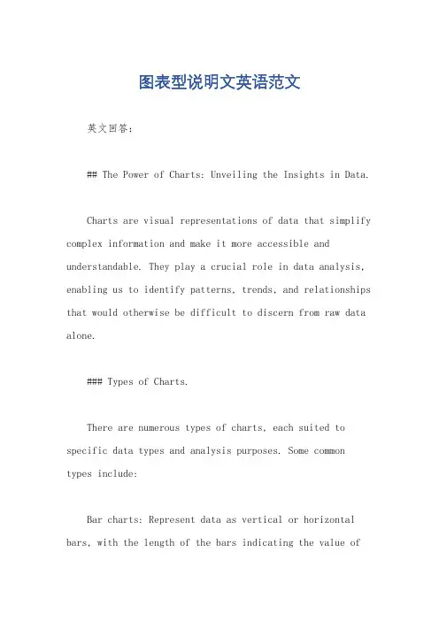
图表型说明文英语范文英文回答:## The Power of Charts: Unveiling the Insights in Data.Charts are visual representations of data that simplify complex information and make it more accessible and understandable. They play a crucial role in data analysis, enabling us to identify patterns, trends, and relationships that would otherwise be difficult to discern from raw data alone.### Types of Charts.There are numerous types of charts, each suited to specific data types and analysis purposes. Some common types include:Bar charts: Represent data as vertical or horizontal bars, with the length of the bars indicating the value ofthe data points.Line charts: Connect data points with lines, showing the trend or progression of data over time or with respect to other variables.Pie charts: Divide data into slices representing different categories' proportions.Scatter plots: Plot individual data points as dots on a coordinate plane, highlighting the relationship between two variables.Histograms: Display the distribution of data bydividing the range into bins and showing the frequency of occurrence within each bin.### Benefits of Using Charts.Charts offer several advantages over raw data:Improved comprehension: Visualizing data makes iteasier to understand patterns, trends, and relationships than reading numerical tables.Easy identification of outliers: Charts can highlight unusual data points that may represent errors orsignificant deviations from the norm.Facilitate comparisons: Charts allow for quick and easy comparisons between different datasets or data subsets.Enhance presentations: Charts can make presentations more visually appealing and engaging, enhancing the audience's understanding of the data.### How to Create Effective Charts.Creating informative and visually effective charts requires careful attention to the following principles:Choose the right chart type: Select the chart type that best suits the data and analysis objectives.Use clear labels: Label axes, titles, and legendsclearly and concisely to guide readers through the chart.Ensure appropriate scale: Use a scale that accurately represents the range of data and avoids distorting the patterns.Highlight important features: Use color, size, or other visual cues to emphasize key insights or areas of interest.### Conclusion.Charts are a powerful tool for data analysis and communication. They transform complex numerical data into visual representations that reveal insights, facilitate understanding, and support informed decision-making. By understanding the different types of charts, their benefits, and best practices for creating them, we can harness the power of charts to unlock valuable insights from data.中文回答:## 图表的力量,揭示数据中的见解。

中考英语书面表达专题《图表作文》提出建议或希望→I hope you can join us.【写作模板】介绍图表:The table shows...Here are the results of...According to the graph,we can find...The chart reflects several trends.In the first picture,we can see...发表感想:I think it is...We should...【范文展示】Clubs are callingThe new term is coming.For all our new students,I would like to introduce our clubs to you.Cool Players is a good choice for sports lovers.Here you can do sports one hour a day to strengthen your body and watch sports matches.If you are interested in books,SmartReaders is a good choice.Reading good books and writing reading notes is useful to improve your writing and widen your horizons.Do you want to be a good cook? In Excellent Cooks,you will learn how to design healthy menus and cook dishes,which can lead to a healthy life.If you want to design your own clothes,come to Fashion Designers.You can learn a lot from the professional teachers.These are the most popular clubs in our school,and I hope you can join us.【名师点评】范文紧紧围绕图画中展示的内容,向读者介绍了学校各个社团的名称,开展的活动及活动的目的,要点齐全,语言简洁准确。
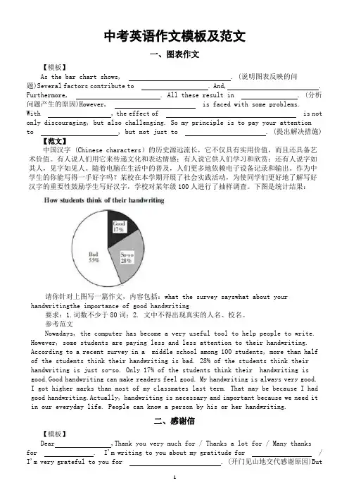
中考英语作文模板及范文一、图表作文【模板】As the bar chart shows, . (说明图表反映的问题)Several factors contribute to . And, . Furthermore, . All these result in . (分析问题产生的原因)However, is faced with some problems.With , the effect of is not only discouraging, but also challenging. So my principle is to pay your attentionto , but not just to . (提出解决措施) 【范文】中国汉字 (Chinese characters)的历史源远流长,它不仅具有实用价值,而且还具备艺术价值。
有人说人们用它来传递文化和表达情感;有人说它供人们学习和欣赏:还有人说字如其人,见字如见人。
随着电脑在生活中的普及,人们更多地依赖电子设备记录和输出。
作为中学生的你能写得一手好字吗?某校在本学期开展了社会实践活动,为使同学们更好地了解写好汉字的重要性鼓励学生写好汉字,学校对某年级100人进行了抽样调查。
下图是统计结果:请你针对上图写一篇作文,内容包括:what the survey sayswhat about your handwritingthe importance of good handwriting要求:1.词数不少于80词;2. 文中不得出现真实的人名、校名。
参考范文Nowadays, the computer has become a very useful tool to help people to write. However, some students are paying less and less attention to their handwriting. According to a recent survey in a middle school among 100 students, more than half of the students think their handwriting is bad. 28% of the students think their handwriting is just so-so. Only 17% of the students think their handwriting is good.Good handwriting can make readers feel good. My handwriting is always very good.I got higher marks than most of my classmates last term. That may be because I had good handwriting.Actually, handwriting is necessary and important because we need it in our everyday life. People can know a person by his or her handwriting.二、感谢信【模板】Dear ,Thank you very much for / Thanks a lot for / Many thanksfor . I'm writing to you about my gratitude for / I'm very grateful to you for . (开门见山地交代感谢原因)Butfor / Without your help, . (从反面衬托对方的作用) / It's very kind of you to . (从正面说明对方的作用)I hope to have the opportunity to express my gratitude to you / repay your kindness. I will feel very honored and pleased if . (提出回报对方的方式) Would you please let me know ? (希望对方给予回应) Thank you again for what you have done. (再次表达感谢)Yours sincerely,________【范文】假定你是李华,经常帮助你学习英语的朋友Alex即将返回自己的国家。

英语图表作文模板及范文(通用12篇)(经典版)编制人:__________________审核人:__________________审批人:__________________编制单位:__________________编制时间:____年____月____日序言下载提示:该文档是本店铺精心编制而成的,希望大家下载后,能够帮助大家解决实际问题。
文档下载后可定制修改,请根据实际需要进行调整和使用,谢谢!并且,本店铺为大家提供各种类型的经典范文,如工作总结、工作计划、合同协议、条据文书、策划方案、句子大全、作文大全、诗词歌赋、教案资料、其他范文等等,想了解不同范文格式和写法,敬请关注!Download tips: This document is carefully compiled by this editor. I hope that after you download it, it can help you solve practical problems. The document can be customized and modified after downloading, please adjust and use it according to actual needs, thank you!Moreover, our store provides various types of classic sample essays for everyone, such as work summaries, work plans, contract agreements, doctrinal documents, planning plans, complete sentences, complete compositions, poems, songs, teaching materials, and other sample essays. If you want to learn about different sample formats and writing methods, please stay tuned!英语图表作文模板及范文(通用12篇)英语图表作文模板及范文第1篇The table/chart diagram/graph shows (that)According to the table/chart diagram/graphAs (is)shown in the table/chart diagram/graphAs can be seen from the table/chart/diagram/graph/figures,figures/statistics shows (that)……It can be seen from the figures/statisticsWe can see from the figures/statisticsIt is clear from the figures/statisticsIt is apparent from the figures/statisticstable/chart/diagram/graph figures (that)……table/chart/diagram/graph shows/describes/illustrates图表类英语作文范文The past years have witnessed a mounting number of Chinese scholars returning from overseas.As is lively illustrated by the column chart, the number of returnees climbed from a mere thousand in 20XX to over thousand in 20XX, at an annual increase rate of around 50%.A multitude of factors may have led to the tendency revealed by the chart, but the following are the critical ones from my perspective.First and foremost, along with the development ofChinese economy and society, the number of Chinese studying abroad has been soaring in the past years, which has provided an eXpanding base for the number of returnees.In the second place, the government has enacted a series of preferential policies to attract overseas Chinese scholars back st but not least, the booming economy, science and technology in this country have generated more attative job opportunites for scholars returning from overseas.The waves of returnees will definitely contribute to this nation’s development, since they have brought back not only advanced science and technology but also pioneering concepts of education and management.With more scholars coming back from overseas, and with the concerted efforts of the whole nation,we have reasons to eXpect a faster rejuvenation of this country.更多培训课程:苏州个人提升英语更多学校信息:苏州虎丘区朗阁教育机构咨询电话:英语图表作文模板及范文第2篇Students tend to use computers more and more frequently nowadays.Reading this chart, we can find that the average number of hours a student spends on the computer per week has increased sharply.In 1990, it was less than 2 hours; and in 1995, it increased to almost 4 hours, and in 2000, the numbersoared to 20 hours.Obviously computers are becoming increasingly popular.There are several reasons for this change.First,computers facilitate us in more aspects of life.Also, the fast development of the Internet enlarges our demands for using computers.We can easily contact with friends in remote places through the Internet.Besides, the prices of computers are getting lower and lower,which enables more students to purchase them.However, there still eXist some problems, such as poor quality, out-of-date designs and so on.And how to balance the time between using computers and studying is also a serious problem.Anyhow, we will benefit a lot from computers as long as we use them properly.英语图表作文模板及范文第3篇As can be clearly seen from the graph/table/chart (As is shown in the table/figure), great changed have taken place in_______,The_________have/has skyrocketed/jumped from _____to _____.When it comes to the reasons for the changes,different people give different eXplanations.Here I shall just give a begin with, ______What’s more,___________, Last but not least, ________.While it is desirable that ___________,there are still some problems and difficulties for __________Firstly, __________,In addition, __________,In a word, __________.以上就是为大家整理的英语专四图表作文范文模板,希望能够对大家有所帮助。

图表描述类英语作文(4篇)图表描述类英语作文篇一The above bar chart informs us of the phenomenon that there exist some differences in additional working hours among diverse careers, especially between self-employed businessmen and civil servants. Self-employed businessmen spend nearly 2 hours per day in working overtime. On the contrary, civil servants’ additional working hours is the shortest, only less than 50 minutes per day. The overtime of scientific researchers, cultural and sports workers and teachers is 80 minutes, 70 minutes and 55 minutes respectively.Ample reasons can account for this phenomenon. Firstly, to make more profits, self-employed businessmen have to spend more time in manufacturing products, attracting customers, providing after-sale services and managing staff. Moreover, with the competition becoming fiercer, they have no alternative but to work overtime to avoid being eliminated by the market and their rivals. When it comes to civil servants, things have gone otherwise. Confronted with less risks as well as pressures and leading a steady and routine life, they don’t have to work overtime frequently.Working overtime is a two-bladed sword. Surely, it will generate considerable benefits. However, it will give rise to some damages, especially to our health. We should balance our work, life and health or we will eventually become a machine and salve of work.四级英语作文图表类篇二图片模板:It seems to me that the cartoon / drawing issending a message about ____________(图画内容),which reveals ____________(稍作评价).In myperspective of view, ____________ (表明个人观点)。
图表类英语作文范文As we all know, English writing is an important part of English learning. In English writing, using charts and graphs can make the content more intuitive and vivid, and also help readers understand the information more easily. Therefore, mastering the skills of writing chart-based English compositions is of great significance. In this article, we will take a look at some sample chart-based English compositions and analyze their writing techniques.Sample 1: The chart above shows the changes in the number of tourists visiting a certain city from 2015 to 2020. As can be seen from the chart, the number of tourists has been steadily increasing over the past six years. In 2015, the city welcomed around 2 million tourists, and this number has risen to 3.5 million in 2020. The main reason for this growth is the improvement of the city's tourism infrastructure, as well as the increase in publicity and promotion efforts. In addition, the city's unique culture and beautiful scenery have also contributed to its popularity among tourists.Sample 2: The pie chart above illustrates the distribution of students' after-school activities. It can be observed that the majority of students, accounting for 40%, choose to participate in sports activities after school. This is followed by 30% of students who prefer to engage in artistic activities such as painting and music. 20% of students spend their time on academic enrichment, while the remaining 10% of students choose to relax at home. This chart reflects the diverse interests and hobbies of students, and also indicates the importance of providing a variety of after-school activity options for students.Sample 3: The bar graph above presents the survey results of students' favorite subjects. According to the graph, English is the most favored subject among students, with 35% of the surveyed students choosing it as their favorite. This is followed by Mathematics, which is favored by 25% of students. Science and History are equally popular, each favored by 20% of students. The least favored subject is Geography, with only 10% of students showing interest in it. This chart not only reflects students'preferences for different subjects, but also provides valuable information for educators to better understand students' learning interests and needs.In conclusion, using charts and graphs in English writing can effectively enhance the expression of information and make the content more vivid and intuitive. Through the analysis of the above sample chart-based English compositions, we can learn various writing techniques and skills, such as accurately describing the data, making comparisons, and drawing conclusions. Therefore, it is essential for English learners to practice writing chart-based compositions in order to improve their English writing abilities.。
图表类英语作文万能The bar chart shows the percentage of people indifferent age groups who use social media on a daily basis. It is clear that the younger age groups have a higher percentage of daily social media users compared to theolder age groups.The line graph illustrates the trend of global temperatures over the past century. There is a noticeable increase in temperatures starting from the mid-20th century, indicating the phenomenon of global warming.The pie chart displays the distribution of household expenses in a typical family. It is evident that thelargest portion of the budget goes towards housing,followed by transportation and food.The scatter plot demonstrates the relationship between hours of studying and exam scores. There seems to be a positive correlation between the two variables, suggestingthat the more hours a student studies, the higher their exam score is likely to be.The column chart depicts the sales performance of different products in a company. It is evident that Product A has the highest sales volume, followed by Product B and Product C.The area chart shows the fluctuation of stock prices over a period of time. There are peaks and valleys in the chart, indicating the volatility of the stock market.Overall, these various types of charts and graphs provide valuable insights into different aspects of data and trends in a visually appealing way.。
The Impact of Technology on StudentLearning: A Visual AnalysisIn recent years, the integration of technology into education has become increasingly prevalent. This trend is evident in various aspects of academic life, from online courses to interactive whiteboards in classrooms. To gain a deeper understanding of how technology has influenced student learning, we analyze the data presented in the accompanying chart.The chart compares the average test scores of students in traditional classrooms with those in technology-enhanced environments. The data is presented across different grades and subject areas, providing a comprehensive overview of the impact of technology on academic performance.At first glance, it is evident that students in technology-enhanced classrooms generally achieve highertest scores than those in traditional settings. This trend is consistent across all grades and subject areas, indicating that technology can serve as a powerful tool to enhance student learning.In elementary school, the average test scores in technology-enhanced classrooms are approximately 10% higher than in traditional classrooms. This gap widens in middle school, where students in technology-enhanced environments score an average of 15% higher. By high school, the difference is even more pronounced, with an average increase of 20% in test scores.The data also reveals that the impact of technology is not uniform across subject areas. In mathematics and science, where technology can be particularly useful for visualization and simulations, the average test scores are significantly higher in technology-enhanced classrooms. On the other hand, in subjects like language arts and history, where traditional teaching methods may still play a significant role, the difference in test scores is less pronounced.However, it is important to note that while technology can enhance student learning, it is not a panacea for all educational challenges. The data suggests that effective integration of technology into the classroom requires careful planning and implementation. Simply introducingtechnology without a clear pedagogical framework may not yield significant improvements in student learning.In conclusion, the data presented in the chart demonstrates that technology can have a positive impact on student learning. However, the impact varies across grades, subject areas, and the way technology is integrated into the classroom. To maximize its benefits, educators need to consider the specific needs of their students and design technology-enhanced learning experiences that are tailored to their unique requirements.**技术对学生学习的影响:图表分析**近年来,技术融入教育已成为越来越普遍的趋势。
图表英语作文范文带翻译Title: The Importance of Graphs and Charts in Presenting Information。
Graphs and charts play a crucial role in conveying complex information effectively. In today's data-driven world, they are indispensable tools for analyzing trends, making comparisons, and illustrating relationships. This essay will explore the significance of graphs and charts in presenting information, examining their various types, and discussing their advantages and limitations.To begin with, graphs and charts offer a visual representation of data, which enhances understanding and interpretation. For instance, a line graph can illustrate changes over time, such as fluctuations in stock prices or temperature variations throughout the year. Similarly, a bar chart can depict comparisons between different categories, like sales figures for various products or the population distribution across different regions. Bypresenting data visually, graphs and charts simplify complex information, making it easier for audiences to grasp key insights at a glance.Moreover, graphs and charts facilitate data analysis by highlighting patterns and trends. Through visualizations, researchers and analysts can identify correlations, outliers, and other significant features in the data. For example, a scatter plot can reveal the relationship between two variables, such as the correlation between study hours and exam scores. By plotting data points on a graph, patterns emerge, enabling researchers to draw conclusions and make informed decisions based on evidence.Furthermore, graphs and charts aid in effective communication by presenting information in a clear and concise manner. In presentations or reports, visual aids like pie charts or histograms can convey key findings more compellingly than lengthy text or numerical tables. Visual representations engage audiences and help them absorb information more readily. Additionally, graphs and charts can be customized with colors, labels, and annotations toemphasize important points or differentiate between data sets, enhancing clarity and impact.However, it is essential to acknowledge the limitations of graphs and charts. While they excel at summarizing large datasets and identifying trends, they can also oversimplify complex phenomena. Misleading visualizations, such as distorted scales or truncated axes, can distort the true nature of the data and lead to erroneous conclusions. Therefore, it is crucial to critically evaluate the design and accuracy of graphs and charts to ensure they accurately represent the underlying information.In conclusion, graphs and charts are invaluable tools for presenting information effectively in various fields, from scientific research to business analytics. They offer visual clarity, facilitate data analysis, and enhance communication by simplifying complex concepts. However, it is essential to use them judiciously and critically evaluate their accuracy to avoid misinterpretation. Ultimately, when used appropriately, graphs and charts are powerful instruments for conveying insights and drivinginformed decision-making.标题,图表在呈现信息中的重要性。
图表类英语作文范文图表类型的英语写作如果不擅于观察漫画的话,作文写出来可能会偏题。
下面是小编给大家带来图表类英语作文,供大家参阅!图表类英语作文范文篇 1 第一段:说明图表开篇句:As the bar chart shows, ____ during the years of ____to____.扩展句:1、As early as _____.2、Then _____ years later, ____.3、And arriving in the year ____, ____.第二段:解释图表变化原因主题句:Several factors contribute to _____.扩展句:1、______. 原(因1)2、And ______.(原因2)3、Furthermore, ______ ( 原因3)4、All these result in ____.第三段:提出解决办法结尾句:However, ____ is faced with some problems.扩展句:1、With _____, ____, the effect of which is not only discouraging, but also challenging.2、So my principle is to pay due attention to ___, but notjustto____.示范第一段:说明图表开篇句:As the bar chart shows, the number of people below the poverty line decreased dramatically during the years of 1978 to1997.扩展句:1、As early as 1978, about 250 million people were under the poverty line.2、Then seven years later, the number became three fifthsthatof1978.3、And arriving in the year 1997, the number was reducedto50millions.第二段:解释图表变化原因主题句:Several factors contribute to the sharp decrease ofthe below-poverty population.扩展句:1、The reform and opening following 1978 enabledthe peasants to become much better off. ( 原因1)2、And with the development of Chinese economy, that policy also improved city dwellers lives greatly. ( 原因2)3、Furthermore, the high-tech introduced made it possiblefor the countrys economy as a whole to take off. ( 原因3)4 、All these result in the great fall of theChinesepopulationbelow the poverty line.第三段:提出解决办法结尾句:However, a further decrease in the number of poverty-stricken people is faced with some problems.扩展句:1、With quite few employees being laid off, the effect of which is not only discouraging, but also challenging.2 、So my principle is to pay due attention to the newcomers, but not just to care for the poor, say, in remote mountain areas.范文As the bar chart shows, the number of people below thepoverty line decreased dramatically during the years of 1978to 1997. Asearly as 1978, about 250 million people were underthe poverty line.Then seven years later, the number became three fifths that of 1978.And arriving in the year 1997, the number was reduced to 50 millions.Several factors contribute to the sharp decrease of the below-poverty population. The reform and opening following1978 enabled the peasants to become much better off. And with the development of Chinese economy, that policy also improved city dwellers lives greatly. Furthermore, the high-tech introduced made it possible for the countryseconomy as a whole to take off. All these result in the great fallof the Chinese population below the poverty line.However, a further decrease in the number of poverty-stricken people is faced with some problems. With quite few employees being laid off, the effect of which is notonly discouraging, but also challenging. So my principle is topay due attention to the newcomers, but not just to care forthe poor, say, in remote mountain areas.图表类英语作文范文篇2The past years have witnessed a mounting number of Chinese scholars returning from overseas. As is lively illustrated by the column chart, the number of returnees climbed from a mere 69.3 thousand in 2008 to over 272.9 thousand in 2012, at an annual increase rate of around 50%.A multitude of factors may have led to the tendency revealed by the chart, but the following are the critical ones from my perspective. First and foremost, along with the development of Chinese economy and society, the number ofChinese studying abroad has been soaring in the past years,which has provided an expanding base for the number of returnees. In the second place, the government has enacted aseries of preferential policies to attract overseas Chinesescholars back home. Last but not least, the booming economy, science and technology in this country have generated moreattative job opportunites for scholars returning from overseas.The waves of returnees will definitely contribute to this nation’s development, since they have brought back not only advanced science and technology but also pioneering concepts of education and management. With more scholarscoming back from overseas, and with the concerted efforts ofthe whole nation, we have reasons to expect a faster rejuvenation of this country.图表类英语作文范文篇 3 一、图表类型基本单词图表类型:table( 表格)、chart( 图表)、diagram( 图标)、graph( 多指曲线图) 、column chart( 柱状图) 、pie graph( 饼图) 、tree diagram( 树形图)、饼图:pie chart 、直方图或柱形图:bar chart/histogram 、趋势曲线图:line chart/curve diagram 、表格图:table 、流程图或过程图:flow chart/sequence diagram 、程序图:processing/procedures diagram二、图表描述基本词语1、描述:show 、describe 、illustrate 、can be seen from 、clear 、apparent 、reveal 、represent2、内容:figure 、statistic 、number 、percentage 、proportion三、常用的描述句型The table/chart diagram/graph shows (that)According to the table/chart diagram/graphAs (is) shown in the table/chart diagram/graphAs can be seen from the table/chart/diagram/graph/figures ,figures/statistics shows (that)……It can be seen from the figures/statisticsWe can see from the figures/statisticsIt is clear from the figures/statisticsIt is apparent from the figures/statisticstable/chart/diagram/graph figures (that) ……table/chart/diagram/graph shows/describes/illustrates看过图表类英语范文的人还。
图表分析作文英文1. The chart shows the percentage of different age groups in a population. It is clear that the largest age group is the 25-34 age range, accounting for 30% of the population. This is followed by the 15-24 age group, which makes up 25% of the population. The smallest age group is the 65 and over category, comprising only 5% of the population.2. Moving on to the next chart, it illustrates the distribution of income levels among households. Interestingly, the majority of households fall into the middle-income bracket, with 40% of households earning between $30,000 and $60,000 per year. On the other hand, the lowest income bracket, with earnings below $20,000 per year, accounts for 20% of households, while the highest income bracket, with earnings above $100,000 per year, represents 15% of households.3. Now let's turn our attention to the bar graph, whichdisplays the consumption of different food groups. Unsurprisingly, grains and cereals are the most consumed food group, with 40% of the population regularly consuming them. Fruits and vegetables come in second place, with 30% of the population including them in their diet. Dairy products and meat are consumed by 20% and 15% of the population respectively, while sweets and snacks are the least consumed, with only 10% of the population indulging in them.4. The final chart provides information on the modes of transportation used by people for their daily commute. Itis evident that the majority of people prefer to useprivate cars, accounting for 50% of the population. Public transportation, including buses and trains, is the second most popular mode of transportation, used by 30% of the population. Walking and cycling are chosen by 10% of the population, while motorcycles and scooters are used by 5% of the population. Surprisingly, only a small percentage of the population, around 5%, use taxis or ride-sharing services.5. In conclusion, these charts provide valuableinsights into the demographics, income distribution,dietary habits, and transportation choices of a population. It is clear that there is a wide range of age groups, income levels, food preferences, and transportation preferences within the population. This diversityhighlights the different needs and lifestyles ofindividuals within the society.。
中考英语图表类作文范文In recent years, the use of social media platforms has become increasingly prevalent among teenagers.近年来,社交媒体平台的使用在青少年群体中变得日益普遍。
Many adolescents spend a significant amount of time on platforms such as Instagram, TikTok, and Snapchat, often at the expense of other important activities, such as studying, exercising, or spending time with family and friends.许多青少年在Instagram、TikTok、Snapchat等平台上花费大量时间,往往是以牺牲其他重要活动为代价,比如学习、锻炼或和家人朋友相处。
While social media can provide a sense of connectedness and facilitate communication with others, it also has the potential to negatively impact teenagers' mental health and overall well-being.尽管社交媒体可以提供一种联系感,并促进与他人的交流,但它也有可能对青少年的心理健康和整体健康产生负面影响。
For instance, studies have shown that excessive use of social media is associated with higher levels of anxiety, depression, and feelings of inadequacy among teenagers.例如,研究表明,过度使用社交媒体与青少年更高水平的焦虑、抑郁和自卑感有关联。
中考英语作文英语作文模板:图表作文的框架
as is shown/indicated/illustrated by the figure/percentage in the
table(graph/picture/pie/chart), ___作文题目的议题_____ has been on rise/ decrease (goesup/increases/drops/decreases),
significantly/dramatically/steadily rising/decreasing from______ in _______
to ______ in _____。
From the sharp/marked decline/ rise in the chart, it
goes without saying that ________。
There are at least two good reasons accounting for ______。
On the one hand, ________。
On the other hand, _______ is
due to the fact that ________。
In addition, ________ is
responsible for _______。
Maybe there are some other reasons
to show ________。
But it is generally believed that the above mentioned reasons are commonly convincing。
As far as I am concerned, I hold the point of view that _______。
I am sure my opinion is both sound and well-grounded。
图表作文(讲解图表,结合实际,总结观点)
海淀:
十、文段表达(共15分)
根据中文提示和图表内容,写一篇意思连贯、符合逻辑、不少于60词的文段。
文段的开头已给出,其词数不计入所完成的文段内。
请不要写出你的校名和姓名。
75. 现在的中学生每月都有一定数量的零花钱。
某校对九年级(1)班的30名学
生进行了零花钱用途的调查。
结果如下:有的同学常买零食或书籍,有的同学把钱花在手机或其他方面,也有的同学把零花钱存了起来。
请你任选图表中的2至3项简述调查结果,谈谈你是如何支配零花钱的,并说明理由。
Nowadays, most middle school students have pocket money every month,
and we did a survey in Class 1, Grade 9.
海淀答案:
十、文段表达(共15分)
One possible version:
Nowadays, most middle school students have pocket money every month, and we did a survey in Class 1, Grade 9.
As the result shows, among the thirty students taking part in the survey, most of them often buy snacks; about a half spend their pocket money on books, and a few save some of it.
51015202530snacks books
mobile phones
savings others
However, things on me are quite different. I usually spend most of the money buying good and educational books which I think make me more knowledgeable. Only a small part is spent on snacks as most of the snacks are in fact unhealthy for us. And I save the rest against a rainy day.
It is true that we have more and more pocket money now and we must make good use of it because it is influencing the way we are growing up.
词汇注解:r esult n. 结果survey n. 调查snack n. 零食
save v. 节省educational a. 教育的in fact 事实上
knowledgeable a. 有知识的as 因为
And I save the rest against a rainy day. 并且,我省下余下的钱,以备急用。