雅思写作课程作业
- 格式:doc
- 大小:1.12 MB
- 文档页数:5
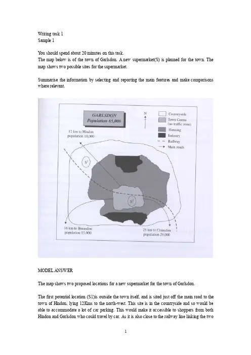
Writing task 1Sample 1Y ou should spend about 20 minutes on this task.The map below is of the town of Garlsdon. A new supermarket(S) is planned for the town. The map shows two possible sites for the supermarket.Summarise the information by selecting and reporting the main features and make comparisons where relevant.MODEL ANSWERThe map shows two proposed locations for a new supermarket for the town of Garlsdon.The first potential location (S1)is outside the town itself, and is sited just off the main road to the town of Hindon, lying 12Kms to the north-west. This site is in the countryside and so would be able to accommodate a lot of car parking. This would make it accessible to shoppers from both Hindon and Garlsdon who could travel by car. As it is also close to the railway line linking the twotowns to Cransdon(25km to the south-east), a potentially large number of shoppers would also be able to travel by train.In contrast, the suggested location, S2, is right in the town centre, which would be good of local residents. Theoretically the store could be accessed by road or rail from the surrounding towns, including Bransdon, but as the central area is a no-traffic zone, cars would be unable to park and access would be difficult.Overall, neither site is appropriate for all the towns, but for customers in Cransdon, Hindon and Garlsdon, the out-of-town site (S1) would probably offer more advantages.Sample 2The table below gives information about the underground railway systems in six cities.Summarise the information by selecting and reporting the main features, and make comparisons where relevant.Underground Railway SystemsMODEL ANSERThe table shows the details regarding the underground railway systems in six cities.London has the oldest underground railway systems among the six cities. It was opened in the year 1863, and it is already 140 years old. Paris is the second oldest, in which it was opened in the year 1900. This was then followed by the opening of the railway systems in Tokyo, Washington DC and Kyoto. Los Angeles has the newest underground railway system, and was only opened in the year 2001. In terms of the size of the railway systems, London, for certain, has the largest underground railway systems. It has 394 kilometers of route in total, which is nearly twice as large as the system in Paris. Kyoto, in contrast, has the smallest system. It only has 11 kilometers ofroute, which is more than 30 times less than that of London.Interestingly, Tokyo, which only has 155 kilometers of route, serves the greatest number of passengers per year, at 1927 millions passengers. The system in Paris has the second greatest number of passengers, at 1191 millions passengers per year. The smallest underground railway system, Kyoto, serves the smallest number of passengers per year as predicted.In conclusion, the underground railway systems in different cities vary a lot in the size of the system, the number of passengers served per year and in the age of the system.Sample 3The graph and table below give information about water use worldwide and water consumption in two different countries.Summarise the information by selecting and reporting the main features, and make comparisons where relevant.MODEL ANSWERThis model has been prepared by an examiner as an example of a very good answer. However, please note that this is just one example out of many possible approaches.The graph shows how the amount of water used worldwide changed between 1900 and 2000.Throughout the century, the largest quantity of water was used for agricultural purposes, and this increased dramatically from about 500 km3 to around 3,000 km3 in the year 2000. Water used in the industrial and domestic sectors also increased, but consumption was minimal until mid-century. From 1950 onwards, industrial uses grew steadily to just over 1,000 km3, while domestic use rose more slowly to only 300 km3oth far below the levels of consumption by agriculture.The table illustrates the differences in agricultural consumption in some areas of the world by contrasting the amount of irrigated land in Brazil (26,500 km3 ) with that in the D.R.C. (100 km3). This means that a huge amount of water is used in agriculture in Brazil, and this is reflected on the figures for water consumption per person: 359 m3 compared with only 8 m3 in the Congo. With a population of 176 million, the figures for Brazil indicate how high agricultural water consumption can be in some countries.Sample 4The table below gives information about changes in modes of travel in England between 1985 and 2000.Summarise the information by selecting and reporting the main features and make comparisons where relevant.A verage distance in miles traveled per person per year, by mode of travelSAMPLE ANSERThis is an answer written by a candidate who achieved a Band 6score. Here is the examiner’scomment:This answer does not introduce the information in the table, nor does it report it accurately. The figures are misinterpreted as representing the number of people rather than the average number of miles traveled per person per year. Consequently the information about the increase in total travel is simply not mentioned, so not all key information is covered. There is an attempt to summarise trends in the figures, but the reader cannot get a clear overall picture of the information because of the fundamental confusionNevertheless, the information is organized and the writing flows quite well because of good use of referencing and other connectors, but there are occasional errors in these and the links between ideas are slightly confusing at times.The strong feature in this answer is the range of vocabulary which is used with some flexibility and good control. A good range of structures is also used, but there are still some fairly basic mistakes, such as in the choice of tense, subject/verb agreement and inappropriate use of the passive.In 2000 the most preferred mode of travel is by car with 4,860 people. There’s a noticeable decrease in public transportation locally where it dropped from 429 people in 1985 to 274 people in 2000. However the long distance bus rides is much more preferred by people as its figures are more than doubled in the last 15 years. People who chose to walk or cycle are decreased slightly in 2000, which probable made people take the train more often. There is a significant increase in the numbers of people who traveled by train. It jumped from 289 in 1985 to 366 in 2000. This makes the train second popular mode of transportation. The biggest leap in the chart is the increase of taxi users who are tripled in 2000 with 42 people where it was only 13 in 1985.Apart from all this modes of travel, there are some more different types of travel as well of course. Number of people choosing different modes of travel is rapidly increased from 450 to 585 in 2000.Sample 5The diagrams below show the life cycle of the silkworm and the stages in the production of silk cloth.Summarise the information by selecting and reporting the main features, and make comparisons where relevant.MODEL ANSWERThis model has been prepared by an examiner as an example of a very good answer. However, please note that this is just one example out of many possible approaches.The first diagram shows that there are four main stages in the life of the silkworm. First of all, eggs are produced by the moth and it takes ten days for each egg to become a silkworm larva that feeds on mulberry leaves. This stage lasts for up to six weeks until the larva produces a cocoon of silk thread around itself. After a period of about three weeks, the adult moths eventually emerge from these cocoons and the life cycle begins again.The cocoons are the raw material used for the production of silk cloth. Once selected, they are boiled in water and the threads can be separated in the unwinding stage. Each thread is between 300 and 900 metres long, which means they can be twisted together, dyed and then used toproduce cloth in the weaving stage.Overall, the diagrams show that the cocoon stage of the silkworm can be used to produce silk cloth through a very simple process.Sample 6The charts below give information about USA marriage and divorce rates between 1970 and 2000, and the marital status of adult Americans in two of the years.Summarise the information by selecting and reporting the main features and make comparisons where relevant.SAMPLE ANSWERThis is an answer written by a candidate who achieved a Band 6.5 score. Here is the examiner’s comment:The task Achievement is the weak point in this answer. Some of the data is summarized but the points are not well-selected to convey the key trends shown in the charts. The main features of the first chart are not adequately presented and the overall conclusion does not summarise the main information. No figures are given to illustrate the points made.The information is well-organised, however, with clear paragraphing and well-signaled sections. The accurate use of a range of sequencers and other linkers makes it easy to follow the writing. There are examples of errors but they are not frequent and do not cause confusion.A range of vocabulary is used with flexibility, in spite of some inappropriate collocations and awkward phrasing. Structures are varied and generally accurate, while any mistakes do not make the message unclear.We are given two charts which show us a few sets of data about the marital status of the Americans between 1970 and 2000.The first chart compares the number of marriages and divorces in the United States of America between 1970 and 2000. We can see that data is given for each decade; the number of people who are getting married decreased slightly since 1980, as well as the divorces one. Nevertheless, divorces increased between 1970 and 1980.The second chart is more precise about the different marital status of the Americans between 1970 and 2000. The number of divorced people has risen more than the double during this two years, and the data for the never married people has also increased significantly. However, less and less people are married, as the first chart showed us; the widowed American number is also decreasing.As a conclusion, we can say that the marital status background of the Americans has maybe known the greatest change it had ever seen.Sample 7The graph below shows the demand for electricity in England during typical days in winter and summer. The pie chart shows how electricity is used in an average English home.Summarise the information by selecting and reporting the main features, and make comparisons where relevant.SAMPLE ANSWERThis is an answer written by a candidate who achieved a Band 6score. Here is the examiner’s comment:This answer focuses too closely on the details in the graph but fails to compare trends or general differences between figures of winter and summer. Some comparisons are made, but these are about details, and it is difficult to get a clear idea of the information from this description.Similarly, information in the pie chart is simply listed using the language from the chart and there is no attempt to relate this to information in the graph.The description is not well organized, although a range of linkers are used, and the use of paragraphs does not reflect the different sections of information covered.There is a suitable range of vocabulary for this task, although some words are misused and there are several spelling errors. The range and control of grammatical structures is the strong point ofthe main part of this response. There are examples of complex structures that are used with accuracy and some flexibility.The use of electricity in England is indispensed with demand for electricity in England during typical days in wither and summer is illustrated in the graph. The use of electricity in an average English home is shown in the pie chart. From the graph, it is generally obvious that the demand is in its maximum around 2100 in winter times, and in its minimum around 400, being almost constant between 1200 and 2100 in winter times. During summer times, on the other hand, the demand reaches its top point around 1300, and the bottom point around 900, being almost constant between 1550 and 2000.In wither times, the curve gradually increases to reach 40,000 units of electricity by 3 o’clock in the morning. This is followed by gradual decline to its lowest limit of 30,000 units at 9 o’clock. A gradual rise is obvious again to reach a stationary level between 3 o'clock and 9 o’clock of about 40,000 units again. Then, there is a sharp rise in the next hour to reach its maximum before collapsing again to a a lower level by the end of the day.In summer time, the curve gradually decrease to reach its lower limit around 9 o’clock of a bit more that 10,000 units. A gradual increase is noticed to reach its top of 20,000 after which a stationary phase is obvious between 3 o’clock and 10 o’clock at night of about 15,000 units.The pie chart, on the other hand, shows that 52.5% of the electricity is used for heating rooms and water. 17.5% is consumed for ovens, kettles and washing machines, 15% is used in lighting, TV and radio, and finally 15% is consumed in the sue of vacuum cleaners, food mixtures and electric tools.。
剑桥雅思11Test3雅思写作task2题目+范文剑11Test3雅思写作task2题目+范文Some people say that the only reason for learning a foreign language is in order to travel to or work in a foreign country. Others say that these are not the only reasons why someone should learn a foreign language. Discuss both these views and give your opinion.a)题目分析,包括写作中需要讨论的观点以及考生可能对题目产生的错误理解。
8要点1.考生要证明学习外语的原因是为了能够在国外找到工作或者旅游。
2.考生要阐释其他一些学习外语的原因。
3.对相关问题给出自己的观点。
8错误理解1.学生在讨论第一方观点的时候没有注意到only一词。
2.学生在写自己观点的时候过于机械,一定要站在某一方立场上进行说明。
b) 雅思写作范文一:For most people in modern society learning another language opens doors for travel and work in the country, or countries, where that language is spoken. Having been born in China, we learn English from a very young age and many of us have the desire to study, and potentially work in the West, particularly the UK or the US. These opportunities were not available to my grandparents, or even my parents, so my generation should feel lucky to have them and n ot feel blas é in the learning and eventual use of such a useful new life skill.There are still, however, a large number of people that although have the ability to speak a language other than their native tongue do not wish to leave their mother country, but instead are happy to use their language skills in the advancements of their own domestic career or maybe for international companies that wish to establish a base here.In my opinion, as a young adult having learned English andwishing to experience the world and different cultures and all the opportunities that my second language might bring I believe, that it would be a huge mistake if I were not to spend at least some time abroad. This may not mean I will want to live in another country, but it does mean I have the opportunity to should I desire it. Gaining a wide range of life experience, I think, is crucial to becoming a well- rounded member of society in general.对于现代社会的多数人来说,学习另外一门语言打开了去相应国家旅行或工作的大门。


You should spend about20minutes on this task.The pie charts below illustrate the number of journal articles read per week by all students,PhD students,and junior lecturers at an Australian university.Summarise the information by selecting and reporting the main features,and make comparisons where relevant.The three pie charts illustrate how many articles from academic journals are read weekly by PhD students and junior lecturers compared to other students at an Australian university.For example,the overwhelming majority of those studying doctorates read at least twelve articles per week in comparison with the average student. The figures were80per cent and twelve per cent respectively. Furthermore,only five per cent of PhD level students read between one and five articles,whereas the average for all students in this category is a hefty 67per cent.Meanwhile,for junior lecturers the pattern appears to be slightly different. Most read six or more articles per week(99per cent),but out of this total 24per cent read twelve or more,which is almost a third of the corresponding figure for PhD level students.It is clear that those students who are researching for a PhD read more articles than either junior lecturers or other students.(160words)。
一环境类:(1)垃圾增多是人类不得不解决的环境问题之一。
随着世界人口的不断增加与城市设施和福利制度的不断完善,越来越多的人选择居住在城市里,造成城市化进程加剧,从而产生了大量的生活垃圾,这些生活垃圾对环境造成恶劣的影响。
据报道,2012年在中国,共产生了30亿只废弃的塑料袋,大量事实显示,这些废弃的塑料袋需要深度掩埋在地下长达数百年之久,(它对土壤的伤害是无可限量的)。
如果人类再继续无节制的使用塑料袋,若干年后,世界将不会再有干净的土地供人们生存。
The increasing rubbish becomes one of the most important problem that we have to cope with . As population growth ,and the facility and the system of welfare promoting gradually, a growing number of people prefer to live in the urban area, which contributes to the urbanization, At the same time ,the appearance of lot of rubbish has bad influence on the circumstance,Official figures show that there are three thousands millions plastic our of use in2012 in China. And a lot of rubbish need to be buried in the deep soil for several cents.If people continue using the plastic randomly, we will not have the pure soil to live around the world in the future .(2) 沙尘暴的频繁爆发是人类目前不得不解决的环境问题之一。
雅思作文小组作业模板英文回答:Task 1: Bar Chart。
The bar chart depicts the percentage of people using different modes of transportation in three cities: London, New York, and Tokyo. In London, 35% of commuters travel by bus, 25% by underground, 20% by car, 15% by bicycle, and 5% by other means. In New York, 45% of people use the subway, 30% drive, 15% take buses, and 10% walk. Tokyo exhibits a different pattern, with 50% of residents commuting by train, 30% by bicycle, 15% by bus, and 5% by other methods.Observation:London has a more diversified transportation system, with a significant proportion of people using multiple modes, including buses, underground, cars, and bicycles.New York relies heavily on its subway system, with nearly half of the population using it for daily commutes.Tokyo stands out with a high percentage of train commuters and a notable presence of cyclists.Task 2: Cause and Effect Essay。
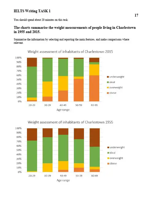
You should spend about20minutes on this task.The charts summarise the weight measurements of people living in Charlestown in1955and2015.Summarise the information by selecting and reporting the main features,and make comparisons where relevant.The charts provide an analysis of the weight issues among the residents of the town of Charlestown in1955and in2015.In1955,the youngest age group had the fewest number/amount of weight issues,with more than70%of20-29-year-olds being assessed as having a healthy weight.In the same year,excess weight was only a significant problem among40-49-year-olds,20-30%of whom were classified as either overweight or obese.In fact,being underweight was a more significant problem affecting more than twenty percent/percentage of each age group, and the elderly in particular,with40%of the over60s being classified as underweight.In stark contrast to this,for/in2015,being underweight was only a problem among20-29-year olds,with20%obtaining this diagnosis,and the number of underweight elderly people had fallen by/to10%.The charts clearly show that,in modern times,obesity poses a considerable problem from the age of30upwards.In fact,there was a steadily/steady increase in this problem in almost every age group over29until the age of60,when the vast majority are considered to have an unhealthy weight.It is important to note that,by the age of60,less than50%of each age group was considered to have a perfect weight by the year2015.This is a fall in/ of10%compared of/to the same age group in1955.When compared/comparing the two years,it is clear that there has been a significant increase in/of the number of obese people in Charlestown,and there was a general drop of/in the number of underweight people between 1955and2015.。
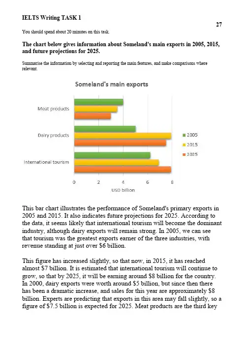
You should spend about20minutes on this task.The chart below gives information about Someland's main exports in2005,2015, and future projections for2025.Summarise the information by selecting and reporting the main features,and make comparisons where relevant.This bar chart illustrates the performance of Someland's primary exports in 2005and2015.It also indicates future projections for2025.According to the data,it seems likely that international tourism will become the dominant industry,although dairy exports will remain strong.In2005,we can see that tourism was the greatest exports earner of the three industries,with revenue standing at just over$6billion.This figure has increased slightly,so that now,in2015,it has reached almost$7billion.It is estimated that international tourism will continue to grow,so that by2025,it will be earning around$8billion for the country. In2000,dairy exports were worth around$5billion,but since then there has been a dramatic increase,and sales for this year are approximately$8 billion.Experts are predicting that exports in this area may fall slightly,so a figure of$7.5billion is expected for2025.Meat products are the third keyindustry in Someland,but sales have dropped since2000and now stand at $3.5billion.It is expected that sales will continue to decrease in the future.(187words)。
You should spend about20minutes on this task.The pie chart below shows the main reasons why agricultural land becomes less productive.The table shows how these causes affected three regions of the world during the1990s.Summarise the information by selecting and reporting the main features,and make comparisons where relevant.The pie chart shows that there are four main causes of farmland becoming degraded in the world today.Globally,65%of degradation is caused by too much animal grazing and tree clearance,constituting35%and30% respectively.A further28%of global degradation is due to over-cultivation of crops.Other causes account for only7%collectively.These causes affected different regions differently in the1990s,with Europe having as much as9.8%of degradation due to deforestation,while the impact of this on Oceania and North America was minimal,with only 1.7%and0.2%of land affected respectively.Europe,with the highest overall percentage of land degraded(23%),also suffered fromover-cultivation(7.7%)and over-grazing(5.5%).In contrast,Oceania had 13%of degraded farmland and this was mainly due to over-grazing (11.3%).North America had a lower proportion of degraded land at only 5%,and the main causes of this were over-cultivation(3.3%)and,to a lesser extent,over-grazing(1.5%).Overall,it is clear that Europe suffered more from farmland degradation than the other regions and the main causes there were deforestation and over-cultivation.(184words)。
You should spend about20minutes on this task.The tables below give information about sales of Fairtrade*-labelled tea and pineapples in2010and2015in five European countries.Summarise the information by selecting and reporting the main features,and make comparisons where relevant.*Fair trade:a category of products for which farmers from developing countries have been paid an officially agreed fair price.The two tables contain sales data for Fairtrade tea and pineapples in2010and2015,in five nations of Europe.The first table shows low-level tea sales increasing in all five countries,albeit to widely varying degrees.In two places sales increased by the same small amount:2.8-3 million euros in Germany,and1.8-2million in Norway.The increment was slightly larger in Netherlands,from2-2.7million euros.Meanwhile,in Austria sales doubled from4-8million euros.Finally,in France there was an enormous increase,from2.5-21million euros.In the second table,it is Austria which stands out as buying far more Fairtrade pineapples than the other four countries.The sales figures for Austria jumped from16-48million euros across these five years,while in France and Netherlands sales only grew from2-6.5and from1.6-5million euros respectively.Norway and Germany showed a different pattern,with falls in pineapple sales from2.8-2and3-1.9million euros.Comparing the two tables,it is clear that in2010Fairtrade tea sales ranged from1.8-4 million euros in these five countries,while pineapple sales also mostly clustered between1.6and3million euros,with Austria the outlier at a huge16million euros. By2015,sales figures for both products had risen across the board,except for Norway and Germany which recorded drops in pineapple sales.(225words)。
You should spend about20minutes on this task.The charts below show the reasons why people travel to work by bicycle or by car.Summarise the information by selecting and reporting the main features,and make comparisons where relevant.The first chart shows the reasons why some people in the UK prefer to cycle to work.Conversely,the second chart gives reasons for those who choose to go to work by car.The highest percentage of those who favour cycling say that this is because riding a bicycle to work is healthier than driving.30%of them gave this as a reason.The same amount of people,30%say that they cycle to work because it causes less pollution.13%of people cycle to work because it is cheaper than driving.Surprisingly,a similar amount of people said that they cycled to work because it is faster than travelling by car.In contrast to this,the percentage who prefer to travel by car because it is more comfortable is40%.The two least important reasons for going to work by car,with14%and11%respectively,is that people need to carry things to work and that it is safer than cycling to work.Finally,16%say they prefer driving because it is faster than cycling.This contrasts with the cyclists who ride to work because it is faster than driving.In general,it seems that the majority of people who cycle to work do this for health and environmental reasons.By contrast,those who travel by car want to have a more comfortable journey over longer distances.(229words)。
You should spend about20minutes on this task.The table below shows the results of a20-year study into why adults in the UK attend arts events.Summarise the information by selecting and reporting the main features,and make comparisons where relevant.The table illustrates four reasons why adults in the UK have attended arts events over the past twenty years.The major reason over the whole twenty-year period was a desire to see a specific performer or artist;while the least important reason was attending arts events for work-related reasons.The percentage of people who attended events out of a desire to see a particular performer has remained relatively stable throughout the twenty-year period;varying from58%twenty years ago to56%today. On the other hand,the percentage of people accompanying children has shown a significant increase,from9%20years ago to just under a quarter today.As far as those who attended arts events because of special occasions or celebrations are concerned,the percentage fell slightly from27%20 years ago to20%a decade ago,dropping dramatically to9%today. There has been a slight increase in the percentage of people attending arts events for work or business,from6%20years ago to just over10%today.Overall,there has been a rise in people attending events in order to accompany children and for work-related reasons,while fewer people choose to attend an arts event as a form of celebration.(204words)。
You should spend about20minutes on this task.The charts below show the results of a survey about what people of different age groups say makes them most happy.Summarise the information by selecting and reporting the main features,and make comparisons where relevant.There are several similarities between what younger and older people say makes them most happy.However,there are several striking differences.Firstly,let us look at the similarities.It is noticeable that for both younger and older people,the highest percentage says that achievement at work brings them most happiness:31%for the younger age group and32%for the older group.Doing hobbies is also very important for both groups:the second largest percentage of both age groups mention doing hobbies as making them most happy.Turning now to the differences,many younger people regard having a good appearance as extremely important:18%of them state this brings them most happiness.This is followed by15%who state that travel brings them happiness.Neither of these two factors is mentioned by older people. Instead,20%of older people report that having financial security is mostimportant to their happiness and14%say they feel most happy when they are with their family.(163words)。