雅思小作文线图
- 格式:ppt
- 大小:506.00 KB
- 文档页数:12
雅思小作文各种图题、表格题技巧总结雅思作文Task 1受图表内容的限制,遣词造句的要求非常有限,只需针对考试,把核心表达用准用熟即可,所谓博大不如精深。
下面是威学教育雅思教研组总结的雅思小作文线图题、柱形图题、饼图题、表格题以及流程图等的写作总结!线图、柱状图、饼图,表格题介绍段introduction介绍段内容几乎完全不用创新,就是对题目文字部分的第二段做改写,paraphrase the rubric.所谓改写,要么换词,要么换句式。
例如:(I4-100)The charts below give information about travel to and from the UK and most popular countries for UK residents to visit.换词(1) 图 The charts图:chart, graph(雅思写作中完全等价,无差别)线:line / curve chart柱图:bar / column graph饼:pie chart表:table / statistics / figures(2) 动词“表明”give information about介绍段是客观描述,用一般现在时态,give information about 虽然在这篇作文中最好不再用,但是informal learning,随手学到的东东,留作其它文章再用。
替换的词语和结构很多,比如我常用的show /illustrate / demonstrate/compare,大家也可以选几个自己喜欢并且拼写准确的形成风格。
第二段其余部分的替换因题而异,比如travel换成visitthe UK换成Britain(注意不是England,英格兰只是Britain的一部分)popular换成fashionablecountry换成nationUK residents to visit换成UK tourists不过随着练习作文数量的增加,你会惊喜的发现,雅思图表作文,连描述的对象都是类似的。

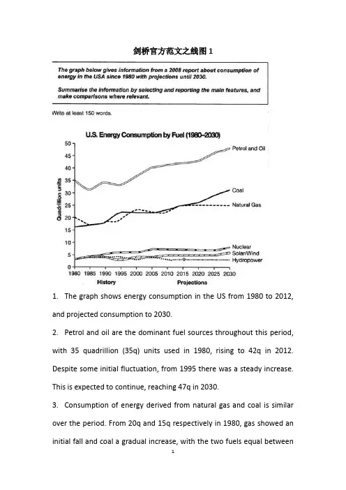
剑桥官方范文之线图11.The graph shows energy consumption in the US from 1980 to 2012, and projected consumption to 2030.2.Petrol and oil are the dominant fuel sources throughout this period, with 35 quadrillion (35q) units used in 1980, rising to 42q in 2012. Despite some initial fluctuation, from 1995 there was a steady increase. This is expected to continue, reaching 47q in 2030.3.Consumption of energy derived from natural gas and coal is similar over the period. From 20q and 15q respectively in 1980, gas showed an initial fall and coal a gradual increase, with the two fuels equal between1985 and 1990. Consumption has fluctuated since 1990 but both now provide 24q. Coal is predicted to increase steadily to 31q in 2030, whereas after 2014, gas will remain stable at 25q.4.In 1980, energy from nuclear, hydro-and solar/wind power was equal at only 4q. nuclear has risen by 3q, and solar/wind by 2. After slight increases, hydropower has fallen back to the 1980 figure. It is expected to maintain this level until 2030, while the others should rise slightly after 2025.5.Overall, the US will continue to rely on fossil fuels, with sustainable and nuclear energy sources remaining relatively insignificant.剑桥官方范文之线图21.The graph illustrates changes in the amounts of beef, lamb, chicken and fish consumed in a particular European country between 1979 and 2004.2.In 1979 beef was by far the most popular of these foods, with about 225 grams consumed per person per week. Lamb and chicken were eaten in similar quantities ( around 150 grams), while much less fish was consumed (just over 50 grams).3.However, during this 25-year period the consumption of beef andlamb fell dramatically to approximately 100 grams and 55 grams respectively. The consumption of fish also declined,but much less significantly to just below 50 grams, so although it remained the least popular food, consumption levels were the most stable.4.The consumption of chicken, on the other hand, showed an upward trend, overtaking that of lamb in 1980 and that of beef in 1989. By 2004 it had soared to almost 250 grams per person per week.5.Overall, the graph shows how the consumption of chicken increased dramatically while the popularity of these other foods decreased over the period.。
雅思作文线状图【篇一:雅思小作文——线形图(line graphs)】智课网ielts备考资料雅思小作文——线形图(line graphs)摘要:线形图是雅思写作task 1 里常考的图形之一,其写作非常值得我们深入研究。
现专供以下学习材料,希望能对各位“雅友”的线形图写作带去一些启发和帮助。
线形图是雅思写作task 1 里常考的图形之一,其写作非常值得我们深入研究。
现专供以下学习材料,希望能对各位“雅友”的线形图写作带去一些启发和帮助。
line graphsline graphs are more popular than all other graphs combined because their visual characteristics reveal data trends clearly and these graphs are easy to create. line graphs, especially useful in the fields of statistics and science, are one of the most common tools used to present data.a line graph is a visual comparison of how two variables—shown on the x- and y-axes—are related or vary with each other. it shows related information by drawing a continuous line between all the points on a grid. for information on the shapes of line graphs, see the organizing data chapter.line graphs compare two variables: one is plotted along the x-axis (horizontal) and the other along the y-axis(vertical). the y-axis in a line graph usually indicates quantity (e.g., dollars, litres) or percentage, while the horizontal x-axis often measures units of time. as a result, the line graph is often viewed as a time series graph. for example, if you wanted to graph the height of a baseball pitch over time, you could measure the time variable along the x-axis, and the height along the y-axis.although they do not present specific data as well as tables do, line graphs are able to show relationships more clearly than tables do. line graphs can also depict multiple series which are usually the best candidate for time series data and frequency distribution.e graphs share a similar purpose. the column graph, however, reveals a change in magnitude, whereas the line graph is used to show a change in direction.in summary, line graphsshow specific values of data wellreveal trends and relationships between datacompare trends in different groups of a variablegraphs can give a distorted image of the data. if inconsistent scales on the axes of a line graph force data to appear in a certain way, then a graph can even reveal a trend that is entirely different from the one intended. this means that the intervals between adjacent points along the axis may be dissimilar, or that the same data charted in two graphs using different scales will appear different.example 1 – plotting a trend over timefigure 1 shows one obvious trend, the fluctuation in the labour force from january to july. the number of students at andrews high school who are members of the labour force is scaled using intervals on the y-axis, while the time variable is plotted on the x-axis.the number of students participating in the labour force was 252 in january, 252 in february, 255 in march, 256 in april, 282 in may, 290 in june and 319 in july. when examined further, the graph indicates that the labour forceparticipation of these students was at a plateau for the first four months covered by the graph (january to april), and for the next three months (may to july) the number increased steadily. figure 1. labour force participation in andrews high schoolexample 2 – comparing two related variablesfigure 2 is a single line graph comparing two items; in this instance, time is not a factor. the graph compares thenumber of dollars donated by the age of the donors. according to the trend in the graph, the older the donor, the more money he or she donates. the 17-year-old donors donate, on average, $84. for the 19-year-olds, the average donation increased by $26 to make the average donation of that age group $110.figure 2. average number of dollars donated at evergreen high school, by age of donorexample 3 – using correct scalewhen drawing a line, it is important that you use the correct scale. otherwise, the lines shape can give readers the wrong impression about the data. compare figure 3 with figure 4:figure 3. number of guilty crime offenders, grishamvillefigure 4. number of guilty crime offenders, grishamvilleusing a scale of 350 to 430 (figure 3) focuses on a small range of values. it does not accurately depict the trend in guilty crime offenders between january and may since it exaggerates that trend and does not relate it to the bigger picture. however, choosing a scale of 0 to 450 (figure 4) better displays how small the decline in the number of guilty crime offenders really was.example 4 – multiple line graphsa multiple line graph can effectively compare similar items over the same period of time (figure 5).figure 5. cell phone use in anytowne, 1996 to 2002figure 5 is an example of a very good graph. the message is clearly stated in the title, and each of the line graphs is properly labelled. it is easy to see from this graph that the total cell phone use has been rising steadily since 1996,except for a two-year period (1999 and 2000) where the numbers drop slightly. the pattern of use for women and men seems to be quite similar with very small discrepancies between them.相关字搜索:雅思【篇二:线状图】如何写好开头段1表示展示,显示的单词归纳1. show. to make sth. clear; to prove sth.证明,表明v. to say what sb./sth. is like 描写,描绘;叙述揭示;揭露;暴露;泄露4. display v. /displei/ to show signs of sth., especially a quality or feeling 显示;表现;显露5. illustrate v. to use pictures, photographs, diagrams, etc. ina book, etc. (用图、实例等)说明,阐明6.demonstrate v. to show sth. clearly by giving proof or evidence 显示,表露to show sb./sth., especially in a picture 展示;描述8. indicatev. to show that sth. is true or exists 表明;象征;暗示9.unfold v. to be gradually made known; to gradually make sth. known to other people显露,表露;呈现10. exhibit v. to show signs of sth?especially a quality or feeling 表尔,显出11. depict v. to show or represent sth. in a work of art such asa drawing or painting描绘,描画;描述12. outline 描绘以上动词在语义都接近,但需注意:它们后面所跟的宾语不同总结起来就是而担其它的一般只接名词宾语!对...进行分析the table gives a breakdown of different types of family who were living in poverty in australia in 2009.提供关于...的信息the chart gives information about post-school qualifications in terms of different levels of further education reached by men and women in australia in 2009.比较the charts compare the sources of electricity in australia and france in the years 1980....a glance at the graph provided reveals some striking similarities between chinese and us birth rates during the period 1920-2000.....5.given are two graphs concerning criminality in britain.其它替换词★number 丨nambs/数字★figure 丨figa/数字★percentage百分率,百分比the percentage of aged couples who lived in poverty in australia in 1999 was 4%. ★proportion 比例,比率this bar chart indicates the proportion of medical complaints of patients visiting therapists in australia in 2012.★rate 比例,比率;率the bar chart reveals different rates of post-school qualifications in australia in 2010. ★amount. /smaunt/数量,数额(一般与不可数名词连用)theres been a great amount of research into the subject.强化练习到尼泊尔的游客来自何处)in march 2010.有多少降雨)over a year,.(3) the chart gives 混合型汽车在全球的销售)between 2006 and 2009.不同交通方式)used by overseas visitors to travel in new zealand.少图书馆的书.) over this four-year period.售) in japan, the us and the rest of the world from 2006 to 2009.2.时间的连接词练习(二选一)1.the number of students who took spanish was 150 in/on 2010.2.according to the data, mandarin decreased during/at that period.3.since/from 2000, the trends have changed greatly.4.the chart shows the number of people going abroadfrom/between 2000 and 2010.5.in general, all the figures steadily increased over/from 1911 to 2011 .6.during the period 1980 and/to 1990, there was a gradual decrease.7.i have been learning japanese for/in two years now.8.the chart shows changes in irish school eollment figures over/at a 20-year period.9.on/in may 4,2012,in plain sight concluded its fifth and final season.10.the 12th china beijing international high-tech expo will be held in/on may.11.the number started a long decline from 1930onwards/afterwards.12.the period 1250 to/and 1350 is a period of religious and secular literature in english.13.the charts indicate how much a uk school spent on different costs in/for four separate years: 1981,1991,2001 and 2011.表示连续的时间段2. during the same period3. in the no. years spanning from 19xx through 19xx4. from then on= from this time onwards= in the subsequent years.句子翻译练习1.以上的线状图表明了在英国冬季和夏季的一天中用电的需求量。
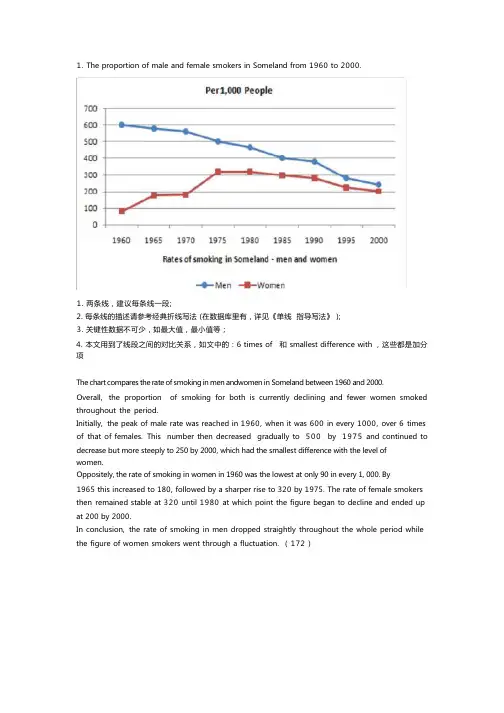
1. The proportion of male and female smokers in Someland from 1960 to 2000.1. 两条线,建议每条线一段;2. 每条线的描述请参考经典折线写法 (在数据库里有,详见《单线指导写法》 );3. 关键性数据不可少,如最大值,最小值等 ;4. 本文用到了线段之间的对比关系,如文中的 : 6 times of 和 smallest difference with ,这些都是加分项The chart compares the rate of smoking in men andwomen in Someland between 1960 and 2000.Overall,the proportion of smoking for both is currently declining and fewer women smoked throughout the period.Initially,the peak of male rate was reached in 1960, when it was 600 in every 1000, over 6 times of that of females.This number then decreased gradually to 500by 1975and continued to decrease but more steeply to 250 by 2000, which had the smallest difference with the level of women.Oppositely, the rate of smoking in women in 1960 was the lowest at only 90 in every 1, 000. By1965 this increased to 180, followed by a sharper rise to 320 by 1975. The rate of female smokers then remained stable at 320 until 1980 at which point the figure began to decline and ended up at 200 by 2000.In conclusion,the rate of smoking in men dropped straightly throughout the whole period while the figure of women smokers went through a fluctuation. ( 172 )2. Radio and television audiences throughout the day in 1992.以下是 6 分, 7 分和 9 分范文,可以看出,上 6 分的文章都有一个共性,就是没有大的语法错误,分段合适,表达清晰,且进行适当的词汇替换。

雅思英语图表作文范文第1篇A类雅思各类图表作文要点及范文一.曲线图解题关键1曲线图和柱状图都是动态图,解题的切入点在于描述趋势。
2在第二段的开头部分对整个曲线进行一个阶段式的总分类,使写作层次清晰,同时也方便考官阅卷。
接下来再分类描述每个阶段的specifictrend,同时导入数据作为分类的依据。
3趋势说明。
即,对曲线的连续变化进行说明,如上升、下降、波动、持平。
以时间为比较基础的应抓住“变化”:上升、下降、或是波动。
题中对两个或两个以上的变量进行描述时应在此基础上进行比较,如变量多于两个应进行分类或有侧重的比较。
4极点说明。
即对图表中最高的、最低的点单独进行说明。
不以时间为比较基础的应注意对极点的描述。
5交点说明。
即对图表当中多根曲线的交点进行对比说明。
6不要不做任何说明就机械地导入数据,这不符合雅思的考试目的。
曲线图常用词汇动词—九大运动趋势一:表示向上:increase,rise,improve,grow,ascend,mount,aggrandize,goup,climb, take off, jump,shoot up暴涨,soar,rocket, skyrocket雅思英语图表作文范文第2篇It is said that countries are becoming similar to each other because of the global spread of the same products, which are now available for purchase almost anywhere. I strongly believe that this modern development is largely detrimental to culture and traditions worldwide.A country’s history, language and ethos are all inextricably bound up in its manufactured artefacts. If the relentless advance of international brands into every corner of the world continues, these bland packages might one day completely oust the traditional objects of a nation, which would be a loss of richness and diversity in the world, as well as the sad disappearance of t he manifestations of a place’s character. What would a Japanese tea ceremony be without its specially crafted teapot, or a Fijian kava ritual without its bowl made from a certain type of tree bark?Let us not forget either that traditional products, whether these be medicines, cosmetics, toy, clothes, utensils or food, provide employment for local people. The spread of multinational products can often bring in its wake a loss of jobs, as people urn to buying the new brand,perhaps thinking it more glamorous than the one they are used to. This eventually puts old-school craftspeople out of work.Finally, tourism numbers may also be affected, as travelers become disillusioned with finding every place just the same as the one they visited previously. To see the same products in shops the world over is boring, and does not impel visitors to open their wallets in the same way that trinkets or souvenirs unique to the particular area too.Some may argue that all people are entitled to have access to the same products, but I say that local objects suit local conditions best, and that faceless uniformity worldwide is an unwelcome and dreary prospect.Heres my full answer:The line graphs show the average monthly amount that parents in Britain spent on their children’s s porting activities and the number of British children who took part in three different sports from 2008 to is clear that parents spent more money each year on their children’s participation in sports over the six-year period. In terms of the number of children taking part, football was significantly more popular than athletics and 2008, British parents spent an average of around £20 per month on their children’s sporting activities. Parents’ spending on children’s sports increased gradually over the followi ng six years, and by 2014 the average monthly amount had risen to just over £ at participation numbers, in 2008 approximately 8 million British children played football, while only 2 million children were enrolled in swimming clubs and less than 1 million practised athletics. The figures for football participation remained relatively stable over the following 6 years. By contrast, participation in swimming almost doubled, to nearly 4 million children, and there was a near fivefold increase in the number of children doing athletics.剑桥雅思6test1大作文范文,剑桥雅思6test1大作文task2高分范文+真题答案实感。
线图雅思小作文范文解析线图雅思小作文范文解析!动态线图,这已成为近两年来雅思考试的主流,下面三立在线小编就为大家分享一篇雅思写作小范文之线图九分范文。
希望同学们可以从中学习雅思线图写作技巧The line graph compares average yearly spending by Americans on mobile andlandline phone services from 2001 to 2010.概括线图内容It is clear that spending on landline phones fell steadily over the 10-yearperiod, while mobile phone expenditure rose quickly. The year 2006 marks thepoint at which expenditure on mobile services overtook that for residentialphone services.总述一条线总体趋势,和另一条行程对比In 2001, US consumers spent an average of nearly $700 on residential phoneservices, compared to only around $200 on cell phone services. Over thefollowing five years, average yearly spending on landlines dropped by nearly$200. By contrast, expenditure on mobiles rose by approximately $300.自2001年开始,描述cell phone每一段的变化趋势。
In the year 2006, the average American paid out the same amount of money onboth types of phone service, spending just over $500 on each. By 2010,expenditure on mobile phones had reached around $750, while the figure forspending on residential services had fallen to just over half this amount.对比手机服务,写出手机服务的特征。
雅思线图范文The line graph illustrates the changes in the number of people using public transportation in a particular city from 2010 to 2020. Overall, there was a significant increase in the usage of public transportation over the decade, with the number of people using buses and trains showing a steady rise.In 2010, the number of people using buses stood at around 2 million, while the number of train users was slightly higher at 2.5 million. Over the next five years, there was a noticeable increase in the usage of both buses and trains, with the number of bus users reaching 3.5 million and train users reaching 4 million in 2015.From 2015 to 2020, the number of people using buses continued to rise, reaching a peak of 4.5 million, while the number of train users remained relatively stable at 4 million. This indicates that buses were the preferred mode of public transportation for the majority of people in the city.In contrast, the number of people using bicycles and walking showed a downward trend over the same period. In 2010, the number ofcyclists and pedestrians stood at 1.5 million and 2 million respectively. However, by 2020, the number of cyclists had dropped to 1 million, while the number of pedestrians had decreased to 1.5 million.The reasons behind the increase in the number of people using buses and trains could be attributed to the city's efforts to improve public transportation infrastructure, such as the introduction of new bus routes and the expansion of the train network. Additionally, the rising cost of owning and maintaining a car may have prompted more people to opt for public transportation as a more cost-effective and environmentally friendly alternative.In conclusion, the line graph clearly demonstrates the upward trend in the number of people using buses and trains for public transportation in the city over the past decade. This shift towards public transportation may have been influenced by a combination of factors, including improvements in infrastructure and the increasing cost of car ownership.。

雅思小作文线图题线图要注意分段。
尤其是多条线,如果放在一起描述,很容易混乱。
所以建议还是分开来描述,主要原则是仅看描述就能画出图线。
以下是小编收集的雅思小作文线图题,希望大家认真阅读!一般而言,是按时间,除了结合时间还要看走势上的分段,大段的描述不可缺;另外就是最高点和最低点,以及拐点的数字以及时点描述。
只有具备了这两点,才能画出图线的走势。
对于不同线之间的比较,可以在最后一段进行,利用交点进行分段。
下面,环球雅思将结合具体例题来详细讲解:The graph below shows the proportion of the population aged 65 and over between 1940 and 2040 in three different countries.文章的写作步骤:Introduction:用一句话介绍图表表示的内容,可以是题目内容的改写。
Summary:描述两个要点:3 个国家的总体趋势和其中可以看出的最明显的变化。
Details:先比较一下三个国家在1940 年的情况,然后比较1990年的情况。
Details:描述日本那条线上最明显的变化,然后比较三个国家2040 年的情况。
这是一幅典型的多线图,图中有三条曲线,分别代表美国、瑞典和日本三国老年人的比例变化情况。
在正常情况下,这类图形可以采用分线描述的方法,把每条曲线的信息都描写清楚,最后再进行总结和对比。
但是可以发现,图中代表美国和瑞典曲线的走势大体相仿,只有在2000 年到2030 年这段时间里有所差异,可以采用分组思想并为一组来写,而日本的曲线走势比较不同,因此可以单独描写。
但是与常规图形不同的是,这幅图的时间跨度比较大,包含了过去、现在和将来。
那么在描述的时候如果完全是按照曲线的顺序来进行,肯定会碰到时态表达的问题,比如在2000 年到2030 年这段时间里的变化趋势到底应该用什么时态来写,而且在描述每条线变化的时候,都会碰到同样的问题,这时就应该考虑多线图是否有其他的解题思路。
线图C5T1原题The graph below shows the proportion of the population aged 65 and over between 1940 and 2040 in three different countries.Summarize the information by selecting and reporting the main features, and make comparisons where relevant.The graph shows the increase in the ageing population in Japan, Sweden and the USA. It indicates that the percentage of elderly people in all three countries is expected to increase to almost 25% of the respective populations by the year 2040. In 1940 the proportion of people aged 65 or more stood at only 5% in Japan, approximately 7% in Sweden and 9% in the US. However, while the figures for the Western countries grew to about 15% in around 1990, the figure for Japan dipped to only 2.5% for much of this period, before rising to almost 5% again at the present time.In spite of some fluctuation in the expected percentages, the proportion of older people will probably continue to increase in the next two decades in the three countries. A more dramatic rise is predicted between 2030 and 2040 in Japan, by which time it is thought that the proportion of elderly people will be similar in the three countries.分析:题目The graph below shows the proportion of the population aged 65 and over between 1940 and 2040 in three different countries.第一段The graph shows the increase in the ageing population in Japan, Sweden and the USA.•作者没有一上来提示图表内容,而是直接奔向中心思想,也就是文章的主旨句。

雅思小作文 T A S K 1 图表题规律注意事项:1 . Task1 是客观写作,要求客观真实。
2 . 客观性:不应该有任何图里没有而靠自己主观想象加入的成分。
结尾段针对图形做出的总结性结论也应该是根据图表的实际内容做出的符合逻辑的总结。
准确性:图表里面的数据介绍要力求精确,不能抄错数字。
但当一个特征点没有落在一个准确的坐标值上时,允许进行合理的目测或估计一个大概数值。
详尽性:要有层次感,并不需要把所有的数字都推到文章里。
3 . 类型Table 表格题Line Graph 线图Bar Chart 柱状图Pie Chart 饼状图Process Chart 流程图4 . 看图要注意单位,标题和图例。
5 . 对于多数小作文题,题中给出了几个图就对应的写出几个主体段。
题目里只给出一个图,根据图中包含几类图形元素写几个主体段。
图中只给了一个图,但图中所含图形元素很多,则分类。
题目中出现多线多柱多饼,用“对应提取法“,把每组里的对应元素提出来组织主体段。
6 . 时态和发生时间意义对应。
陈述永恒事实的句型,其主句的谓语动词必定用一般现在时。
若题目里没有出现时间,则全文都使用一般现在时。
7 . 结构开头段(1~2句)改写原题主体段1 总体概括具体介绍数字主体段N 总体概括具体介绍数字结尾段(1~2句)介绍总数(若图里并没有明确的给出总数,则省略)结论(根据图里的数据得出有一定合理性的结论)8 . 开头段的改写题目中ShowProportion InformationThe number/amount of FamilyMalesFemaleInfluence改写成illustrate /compare percentagedatathe figure for householdmenwomenaffect/effectCategories kinds/typesSubway system Storeunderground railway/train system shop9 . 介绍数据或描述变化趋势的常用词。
雅思小作文线形图技巧雅思小作文线形图技巧相信很多参加过雅思考试的学员都会认为小作文要比大作文要难写,认为小作文很难写得出彩。
根据多年的教学经验,主要原因是他们的句型都过于单一。
其实要想让小作文写得好,也并非就是一件很难的事情。
今天店铺就来教大家一个帮助大家提高折线图表达的技巧。
在介绍技巧之前,请大家对比一下关于描述电视机观众人数变化的一个折线图5.5分的考生例文和6.5分高分范文的节选片段。
5.5分考生例文:at 6 a.m., the proportion of TV viewers was much lower than that of radio listeners, with only 2%. After that, it increased with fluctuation and overtook that of radio listeners at 12.40, with 15%. Then it continued to ascend until it reached a peak at 45% at 8 p.m., when it started to drop, before it levelled off between 2 a.m. and 5 a.m.6.5分高分范文:At 6 a.m., the percentage of TV viewers was only 2%. during the next 8 hours, it showed a gradual upward trend and outnumbered the figure of radio listeners. Then, it rose continuously and peaked at 45% at 8p.m.. After there was a considerable decline until 2 a.m. in the next morning, it levelled off at 2% in the last few hours.对比了两篇文章之后,我们很容易发现考生例文中,整个文章句型基本上都是主谓宾句型,尽管这位学员注意到了词汇的多样性。
2020雅思小作文考官范文(线形图题型)主题:老年人口题型:线图The graph below shows the proportion of the population aged 65 and over between 1940 and 2040 in three different countries满分范文:The line graph compares the percentage of people aged 65 or more in three countries over a period of 100 years.It is clear that the proportion of elderly people increases in each country between 1940 and 2040. Japan is expected to see the most dramatic changes in its elderly population.In 1940, around 9% of Americans were aged 65 or over, compared to about 7% of Swedish people and 5% of Japanese people. The proportions of elderly people in the USA and Sweden rose gradually over the next 50 years, reaching just under 15% in 1990. By contrast, the figures for Japan remained below 5% until the early 2000s.Looking into the future, a sudden increase in the percentage of elderly people is predicted for Japan, with a jump of over 15% in just 10 years from 2030 to 2040. By 2040, it is thought that around 27% of the Japanese population will be 65 years old or more, while the figures for Sweden and the USA will be slightly lower, at about 25% and 23% respectively.主题:手机变迁题型:线图The line graph shows the average annual expenditures on cell phone and residential phone services between 2001 and 2010.范文:The line graph compares average yearly spending by Americans on mobile and landline phone services from 2001 to 2010.It is clear that spending on landline phones fell steadily over the 10-year period, while mobile phone expenditure rose quickly. The year 2006 marks the point at which expenditure on mobile services overtook that for residential phone services.In 2001, US consumers spent an average of nearly $700 on residential phone services, compared to only around $200 on cell phone services. Over the following five years, average yearly spending on landlines dropped by nearly $200. By contrast, expenditure on mobiles rose by approximately $300.In the year 2006, the average American paid out the same amount of money on both types of phone service, spending just over $500 on each. By 2010, expenditure on mobile phones had reached around $750, while the figure for spending on residential services had fallen to just over half this amount.主题:网络使用题型:线图The line graph below shows internet usage in different countries.范文:The line graph compares the percentage of people in three countries who used the Internet between 1999 and 2009.It is clear that the proportion of the population who used the Internet increased in each country over the period shown. Overall, a much larger percentage of Canadians and Americans had access to the Internet in comparison with Mexicans, and Canada experienced the fastest growth in Internet usage.In 1999, the proportion of people using the Internet in the USA was about 20%. The figures for Canada and Mexico were lower, at about 10% and 5% respectively. In 2005, Internet usage in both the USA and Canada rose to around 70% of the population, while the figure for Mexico reached just over 25%.By 2009, the percentage of Internet users was highest in Canada. Almost 100% of Canadians used the Internet, compared to about 80% of Americans and only 40% of Mexicans.。
雅思A类写作TASK 1第一讲折线图与趋势折线图和部份柱状图、饼状图以及表格通常用来显示某一段时间内事物的变化情况以及变化趋势,因此首先我们要先学习如何描述趋势变化。
总体来讲,趋势描写:(1)要总结事物变化的总体趋势;(2)要叙述事物某个时间段内的变化情况。
描写趋势六要素Example:The graph shows the sales of laptops in a company in 2022.S^les of laptops in 2022趋势描写常用的词汇Exercise 1:60 竺就Machin 歸足hi 2022 (in tlrnu皿ds)in the number of machines sold in 2022.soldin 2022.7. The number of machines sold was ............. on the way up/on the up/on the riseExercise 2: Follow the pattern of Exercise 1 finish 7 sentences describi the chart below.1. ........................................................................................................................2 ...............................................................................1. There was an .......2. The number of machines sold .........in 2022. 3. The number of machines sold ....... steadily in 2022. 4. 2022 saw a steady....... in the number of machines sold. 5. T he number of machines sold ......... in 2022.6. T here was an obviously ......... trendin the number of machines (on the ...... )3 ...............................................................................4 ...............................................................................5 ...............................................................................6. ..............................................................................7 ........................................................................................................ ...........................................................引入段的写法图表作文第一段要写的成功需要牢记以下几点:概括介绍图表的所有要素:图表类型、研究对象、数据形式、地区和时间等。
雅思写作●薛睿●Wexin : 285531668一、Task 1 小作文(图表类作文):线图/饼图/ 表格/ 柱图/ 地图/ 流程/ 综合:字数要求150 words+:时间推荐20 mins:分数比例40%小作文类型20406080100120一月二月三月四月亚洲区欧洲区北美区幻灯片12二、Task 2 大作文(议论文):题目会给出一个看法、问题,考试需就此进行论述:字数要求 250 words+:时间 推荐 40 mins:分数比例 60%例:1.Each year, crime committed by young people is on the rise. What do you think are the causes of this? What solutions can you suggest?2.Advertising has harmful effect on young people, it should be strictly limited. Do you agree or not.三、注意事项1答题纸:不要混淆Task1,Task2的写作位置, 不要在考官评卷区填写,不要忘记填写个人信息2不用写题目3格式要求:(1)缩进式:每段开头空四格,每段之间不空行.(2)齐头式:每段开头要顶头写(不空格),但每段与每段之间要空一行.4答题纸的位置:Task 1 :缩进式--P2 : 5到6 行(每行10-14字) .齐头式--P2: 9-10行Task 2 :缩进式--P2 :最少一半–15行齐头式--P2 :第二页的2/3 –19行-20行四:评分标准:1.Task response (TR)--立场鲜明例(1)Currently more and more people respect elders and become convinced that older people should live with their families, other people believe that older people should live at a nursing home. Discuss both views and give your opinion.Do you agree or disagree ?(2)In today, young people do more housework.--- 事实:A- 忙于工作/学习 B- 可以找家政In today, young people should more housework.---利弊:A- 独立能力 B- 分担家庭负担(3)王大锤结婚了---事实:A- 举办婚礼 B- 结婚证 C- 戴上戒指王大锤应该结婚---利弊:A- 开心/不孤单 B- 年龄大了 C- 传宗接代2 Coherence & Cohesion (CC)---连贯与衔接:连接词:(1)+原因- because/ for/ since +句子、because of/ due to + 词./短语(2)+ 让步–although/ though + 句子、despite / in spite of +短语3 Lexcial Resource (LR)---用词丰富/准确性(1)Increase/ grow/ rise(2)Advantage/ benefit/ upside/ superiority4 Grammatical Range & Accuracy (GRA)---语法- 句式多样/准确性(1)语法错误句式杂糅:The question whether that( 删掉) government adopt some measures is unknown.同位语– Alex, my classmate, will go to Beijing in next month.The news that Mayday will release album is exciting (2)从句不能单独成句子Some countries are not able to solve environmental problems, although these countries have raised these problem’s devasting effect.Alex cannot go to school. Because he is ill.Because Alex is ill. So that he cannot go to school.(3)代词指代不清Employers permit employees to work at home, so they are able to finish their tasks more effectively .Employers permit employees to work at home, so staffs are able to finish their tasks more effectively .(4)代词混淆Consulting your families for advice is better than overcoming a problem ourselves. Consulting our families for advice is better than overcoming a problem ourselves. (5)从句-需要引导词Students receive job training is importantThat students receive job training is important. = 形式主语=It is important that students receive job training(6)Happen/ appear vi –没有被动语态The accident was similar to the one that was(删掉) happened last year.NO.1 middle school happened a fire accident. (X)A fire accident happened in No.1 middle school (√)(7)零冠词–集合名词 people/ 不可数名词 /可数名词复数A –可数名词单数(除非特指)An- 首字母为元音The –特指(可数/不可数名词单数/复数)(8)主谓动作- 一致Reading books can absorb a lot of knowledge (X)Students can absorb a lot of knowledge by reading books. (√)线性图Line Graph一、线图三要素(每句话都要写):1 时间–时态、2 数据–单位、3 趋势–替换词二、线图常用表达1.上升:动词increase to / rise to/ grow to / raise to / climb to (幅度小)/ jump to 或者rocket to (幅度大)名词an increase/ a rise / a growth/ a boom形容词Increasing adj 上升的2.下降:动词fall to / decline to/ decrease to / drop to/ dip to / slump to (暴跌)名词a fall/ a decline/ a decrease/ a drop/ a reduction3.平稳:动词keep stable/ steady/ unchanged名词a stable stage/ trend/ process 、no change4.波动:动词go up and down/ go rise and fall/ fluctuate名词a fluctuation / some ups and downs5.数量: number + 可数名词amount +不可数名词A large number of - manyThe number of of ---……的数量5.比率:rate/ proportion/ percent6.变化程度: 慢--slight/ insignificant/ minor Increase slightly / a slight increase中moderate/ modest快steep陡峭的/ sharp/ considerable/ dramatic / significant/ obvious7.时间替换: from 1990 to 2000from 1990 until 2000between 1990 and 2000during the period of 1990-2000Within the ten years / In the first/ next/ following/ final/ last ten years 8.时间段:从过去开始到将来结束 1990-2040特殊表达- 预估计:The number is estimated to increase .The period of 1990-2040 is predicted to see a growth A rise is projected to happen between 1990 and 2040.没有there be 句型9.特殊点:最高值--1 The highest point 2 the Peak / summit 峰值 3 The maximum 最高值最低值---1 the lowest point 2 the bottom 3 The minimum 最低值10.句式转换:(男生的数量从1990年500人上升到2000的3000人)数量作主语:During the period of 1990-2000, the number of boys increased sharply from 500 to 3,000时间作主语:主语必须是名词(From A to B (X))、时间+ see/ experience/ witness 目睹+ 趋势(名词)The period of 1990-2000 saw a significant rise about/ concerning the number of boys. (500 –3,000)There be 句型:There be + 趋势(名词)There was a steep growth about the number of boys between 1990 and 2000, which was from 500 to 3,000. (数字三个为一组)趋势作主语:趋势+ appear/ happen/ take place + 状语A dramatic raise for the number of boys appeared within tenyears from 500 to 3,000.三:线图文章结构:P1 开头段---①套句型:It is noticeable/ crystal-clear / apparent that…或者As can be seen from the graph, it reveals/ indicates that .... ②替换题目中的单词- 尽可能换- 不会换不要换注意:①主谓一致②below 删了③现在时●P2 主体段---50-70 words。