雅思小作文技巧及范文
- 格式:doc
- 大小:309.50 KB
- 文档页数:15
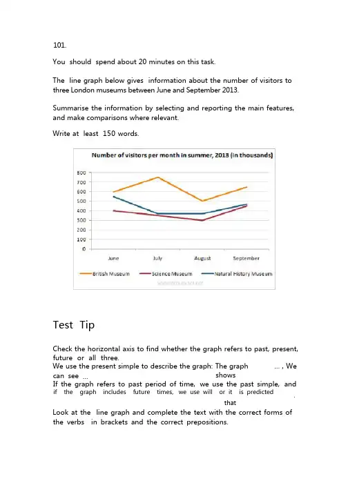
101.You should spend about 20 minutes on this task.The line graph below gives information about the number of visitors to three London museums between June and September 2013.Summarise the information by selecting and reporting the main features, and make comparisons where relevant.Write at least 150 words.Test TipCheck the horizontal axis to find whether the graph refers to past, present, future or all three.We use the present simple to describe the graph: The graph … , We can see … showsIf the graph refers to past period of time,we use the past simple,andif the graph includes future times,we use will or it is predicted.that Look at the line graph and complete the text with the correct forms of the verbs in brackets and the correct prepositions.The graph shows(show) how many people visited(visit) three London museums in the summer of 2013. Most visitors went(go) to the British museum between June and September. The number fluctuated(fluctuate) between 500 and 750. By contrast, the Science Museum and the Natural History Museum received(receive) fewer visitors. The number of people who visited the Science Museum dropped(drop) gradually from 400 thousand to 300 from June to August then rose(rise) to 450 thousand in September. We can see(see) that the trend for the Natural History Museum was(be) similar. There was a sharp drop in visitors from June to July. The number remained stable(remain stable) in August and then increased(increase) steadily in September.102.You should spend about 20 minutes on this task.The chart below shows the percentage change in the share of international students among university graduates in different Canadian provinces between 2001 and 2006.Summarise the information by selecting and reporting the main features, and make comparisons where relevant.Write at least 150 words.Source:Statistics Canada,Postsecondary Student Information SystemTest TipIn Task 1 of the IELTS Writing modules, you may be asked to describe a graph which shows changes over a period of time. To do this you need to use language expressing change and appropriate tenses. In the exam, make sure you leave time to edit your written answer. You will lose marks if you make too many mistakes in grammar and vocabulary.Model answerThe chart shows changes in the share of international students who graduated from universities in different Canadian provinces over a period of 5years.In 2001, this share had a relatively narrow range, from 3% in Ontario to 7.0% in New Brunswick. Nova Scotia had the second highest proportion at 6.5%.Five years later,the figures for most provinces had risen,with the exception of Alberta.There,the figures fell by 1% to just over 4%. By 2006, some parts of Canada experienced a considerable increase in their share of international graduates.Growth in this share was especially strong in the case of New Brunswick, where the figures rose from 7% to 12%. The largest growth occurred in British Columbia, where it more than doubled to 11%.Over this five-year period,changes in the proportion of international graduates have been very uneven across the provinces of Canada. However, New Brunswick remained the province with the highest percentage overall. (158 words)103.You should spend about 20 minutes on this task.The chart below gives information about the UK's ageing population in 1985 and makes predictions for 2035.Summarise the information by selecting and reporting the main features, and make comparisons where relevant.Write at least 150 words.Source:Office for National Statistics,National Records of Scotland,Northern Ireland Statistics and ResearchAgencyExam TipIn Writing Task 1, it is essential to understand what the graph or chart is representing.Look closely at the information in the instructions as well as all details of the graph or chart.The graph in this task shows the percentage of over 65s in each country of the UK.The following are incorrect statements:•Wales had more over 65s than England. (The graph is in percentages, not numbers)• Northern Ireland had 12% of over 65s in 1985. (The countries do not add up to 100% so Northern Ireland did not have 12% of all over 65s. The graph shows that 12% of thepopulation of Northern Ireland was over 65.)Model answerThe graph shows how the size and distribution of the UK's ageing population is likely to change over a 50-year period.Overall,the proportions are predicted to increase in all UK countries.In 1985, 15 per cent of the UK population was over 65, but by 2035, this will account for 23per cent of the total population.A closer look at the data reveals that the ageing population is expected to rise more in some parts of the UK than in other. In 1985, Wales had the highest percentage of people aged 65 and over, at 16 per cent. The second-largest group could be found in England and the third in Scotland. Northern Ireland had lowest proportion, with 12 per cent aged 65 and over. By 2035,Wales is still going to have by far the greatest percentage of over 65s,with figures likely to reach 26per cent.However,the biggest increases in this age group,relative to the rest of the population,are predicted to occur in Northern Ireland and Scotland. In Northern Ireland, for example,this figure will increase almost double to 23per cent. (189 words)104.You should spend about 20 minutes on this task.The diagrams below give information on transport and car use in Edmonton. Summarise the information by selecting and reporting the main features, and make comparisons where relevant.Write at least 150 words.People’s reasons for using the car in cityCommute to work ShoppingLeisure activities Taking children to school Business 55% 15% 15% 40% 45%Test TipIn IELTS Writing Task 1, when you must describe two figures, ask yourself the following:1)What do both figures relate to?2)What kind of relationship is evident?(a similarity, a difference, a cause and effect relationship or some other type of relationship)3) Which aspects of each figure should be highlighted?4) Should I describe the figures in separate paragraphs, or should I compare different aspects of the figures within a series of paragraph? Model answerThe table shows the reason why people in Edmonton use their cars in the city and the pie chart explains what type of transport people prefer to use most of the time.Looking at the pie chart first,it is clear that the car is the most popular means of transport in this city.45%of the people say that they prefer to commute by car. The second most popular form of transport is the LRT, while busses and taxis are the main means of transport for the rest of the people.The table gives more detailed information about why people use their cars. Surprisingly, 55% of the people need to commute to work by car. Cars are also used a lot for taking children to school or business purposes.Only 15% of drivers are doing their shopping and, similarly, 15% need to travel by car for leisure.Overall, people in Edmonton make good use of alternative methods of transport but there is a heavy dependence on cars for work.(170 words)105.You should spend about 20 minutes on this task.The bar chart below shows shares of expenditures for five major categories in the United States, Canada, the United Kingdom, and Japan in the year 2009.Write a report for a university lecturer describing the information below.Write at least 150 words.Source: U.S. Bureau of Labor StatisticsTest TipIn Writing Task 1, it is a good idea to end your answer by summarizing the main information shown by the diagram. You are not required to explain this information.Read the following sample answer. Complete the answer by filling the gaps with the words in the box.by contrast indicates lowest comparesoverall whereas except higherhighest however largest amongThe bar chart compares how consumers in the United States, Canada, the United Kingdom,and Japan allocated different shares of total spending to categories such as food, housing, and transportation in 2009.We can see that the United States had the highest housing expenditure share, 26% of total expenditures in 2009. The United Kingdom and Japan followed, with 24% and 22%, respectively. Canada had the lowest housing share at 21%. Housing was the largest expenditure component in all countries except Japan.By contrast,Canada had the largest transportation share of all four countries at 20%. The United States and the United Kingdom had the next-highest transportation shares, 17% and 15%, respectively. Japan had the lowest, at 10%.However, in Japan, consumers spent 23% of their total expenditures on food in 2009. The United Kingdom had the second-highest share at 20%. Canada, with 15%, and the United States, with 14% had the lowest food expenditure shares among the countries studied.Overall,the data indicates that housing and health care shares of total expenditures were higher in the United States than in Canada, the United Kingdom, and Japan in 2009, whereas Americans had the lowest clothing share.Canada had the highest clothing and transportation shares,and Japan had the highest food share, among the countries compared.Show Answers - Hide Answers(214 words)106.Vocabulary TipNotice the following rules for the spelling of the words programme and program :programme (UK only) = a show on televisionprogram (US only) = a show on televisionprogram (UK and US) = instructions for a computer (a verb and a noun) You should spend about 20 minutes on this task.The charts give information about two genres of TV programmes watched by men and women and four different age groups in Australia.Summarise the information by selecting and reporting the main features, and make comparisons where relevant.Write at least 150 words.IELTS Tip•With graphs, make sure you understand what each axis is measuring.• With bar and pie charts, there is often a key which tells you what each different bar or area represents.• With tables, read the data across the rows and down the columns to identify the key features.Fill in the gaps in the model answer.The charts give information about the genres of TV programmes that Australian men and women and different age groups watch.It is clear from the charts that women tend to watch more television than man overall, although they watch slightly fewer game shows. The people who watch themost television are in the 45+ age group.Nearly 70% of women watch reality shows, which is almost twice as many as the percentage of men who choose this genre of programme.Nevertheless, most age groups watch more reality shows than game shows revealing that game shows are generally less popular than reality shows.The percentage of people watching reality shows increases steadily from ages 16 to 45 with the lowest / smallest percentage of viewers, at just over 50% of the age group 16-24 and the highest / biggest / largest / greatest percentage, at 68% of the over-45s.However,the pattern is different for game shows.The number of programmes watched by25-to44-year-olds is significantly/considerably lower than the number watched by 16- to 24-year-olds and those over 45. Just over 50%of16-to24-year-olds watch game shows,but this share is not as high as the share of people aged 45 and over watching game shows, at nearly 70%. Only 41% of 35- to 44-year-olds watch game shows, and the share of 24- to 34-year-olds is slightly / even lower at 38%.107.You should spend about 20 minutes on this task.The graph below shows the changes in food consumption by Chinese people between 1985 and 2010.Summarise the information by selecting and reporting the main features, and make comparisons where relevant.Write at least 150 words.Writing TipIt is best to use amount and quantity for uncountable nouns,although both are used for countable nouns as well, particularly quantity.The amount of consumption decreased in the last 25 years.AnswerThe graph shows changes in the amount of fish, salt and meat eaten per person per week in China between 1985 and 2010.From the graph we can see that people in China consumed more fish than either meat or salt throughout the period. In 1985, the consumption of fish stood at 610 grams, then increased to 700 grams in 1990. Although it dipped in 1995, it then rose steadily and reached 850 grams in 2010.In contrast, there was a consistent drop in salt consumption. The amount consumed decreased steadily from almost 500 grams per person to only 200 grams by 2010. The amount of meat consumed weekly started at about 100grams. However, this gradually increased throughout the period. By 2010 it was at the same level as the consumption of salt.Overall,the consumption of fish rose,while the consumption of salt fell. In addition, the consumption of meat, while at a relatively low level, rose significantly during this period.108.You should spend about 20 minutes on this task.The graph below shows the population change between1940and2000in three different counties in the U.S. state of Oregon.Summarise the information by selecting and reporting the main features, and make comparisons where relevant.Write at least 150 words.IELTS TipThe structure of your answer would look like this:Introduction - Explain briefly in your own words what the information shows. Give more detail than the question and make comparisons where appropriate.Main Body - Decide how to organise your paragraphs. For example, in the model answer below, paragraph 2 is about 1940- 1970, paragraph 3 is about 1970-2000 for Columbia and Yamhill, and paragraph 4 is about 1970-2000 for Washington. Use words such as although and however to make contrasts, and words such as likewise to introduce similarities.Always include the actual data you have been given. The final paragraph is not a conclusion in this type of task.Model answerThe graph shows the increase in population of three counties, Columbia, Yamhill and Washington in the U.S. state of Oregon, between 1940 and 2000. In 1940, Columbia had the lowest population of the three counties, at around 25,000. This compared with about 30,000 in Yamhill and approximately 75,000 in Washington.By 1970, Columbia’s population had risen to just under 36,000. Although this appears on the graph to be a gentle increase, it is in fact an increase of approximately 50%. Yamhill’s population also rose by nearly 50% between 1940 and 1970: from 30,000 to just under 45,000. However, the greatest real increase was in Washington, where the population in 1970 had increased by approximately 75,000, to 125,000.The years 1970 to 2000 saw the populations of Columbia and Yamhill increase by approximately the same amounts that they had increased by the thirty years before. In 2000, Columbia’s population – at approximately 76,000 – was triple what it had been in 1940. Likewise, Yamhill’s population, at around 90,000, was almost triple what it was in 1940.Although Washington ’s increase in population between 1940 and 1970 w as large,its increase in the following thirty years was even sharper,rising from about 125,000 in 1970 to more than 240,000 in 2000.(206 words)109.IELTS TipYou will lose marks if you make grammatical errors in your writing, particularly when errors are frequent and effect meaning. Be careful of the following common mistakes when describing numbers.amount and number: amount is used with uncountable nouns; number is used with countable nouns, e.g. The amount of meat consumed in China between 1985 and 2010. NOT .per cent and percentage:per cent is always used with a number;percentage is used on its own without a number,e.g.The percentage of male teachers in the UK. NOT . According to the graph, four per cent of the total household budget went towards transportation . NOT .You should spend about 20 minutes on this task.The graph below shows the amount of money spent on books in Germany,France, Italy and Austria between 1995 and 2005.Write a report for a university lecturer describing the information below.Write at least 150 words.Read the following sample plete the answer by filling the gaps with the words in the box.biggest much sharplessleastmoredramaticallythree timesThe line graph compares the amount of money spent on buying books in Germany, France, Italy and Austria over a period of ten years between 1995 and 2005.In 1995 Austria spent the least amount of money on books, while Italy and France spent about as much as each other. However, by 2001, the gap in spending between these two countries had widened and considerably more money was spent in France than In Italy.As can be seen from the graph, the amount of money spent increased in all four countries but rose the most dramatically in Austria.The period between 2000 and 2005 saw a sharp growth and in 2005 the Austrians spent three times as much money as they did in 1995.However, during this ten-year period, Germany remained the biggest spenders on book, with all three other countries spending much less on them.110.IELTS TipIt is quite common for IELTS Writing Task 1 to involve more than one piece of information relating to the topic. For example, you may get two or three pie charts that you must compare. The pie charts may represent different years and show trends over time.In this case,you will have to describe the changes and similarities/differences between the pie charts. Related Topic: Comparing pie chartsYou should spend about 20 minutes on this task.The three pie charts below show the changes in annual spending by local authorities in Someland in 1980, 1990 and 2000.Summarise the information by selecting and reporting the main features, and make comparisons where relevant.Write at least 150 words.Expenditure by local authorities in SomelandModel answerThe charts show how much local authorities spent on a range of services in Someland in three separate years: 1980, 1990 and 2000.In all three years,the greatest expenditure was on education.But while K-12 education saw a fall from 25% in 1980 to only 18% of spending in 2000, higher education remained the largest proportion, reaching 45% of total spending in 1990 and ending at 40% in 2000.Expenditure on health and human resources had increased to 20% by 1990before decreasing to only 10% by the end of the period. In contrast, the share of transportation saw an opposite trend. This cost decreased to only 6% of total expenditure in 1990 but rose dramatically in 2000 when it represented 22% of the total budget. Similarly, the cost of environmental services saw a rising trend, growing from only 4% to 9% by 2000. Overall,higher education constituted the largest cost to local authorities,and while spending increased for transportation and environmental services, there were corresponding drops in expenditure on health and human resources and K-12 education.(178 words)。
雅思小作文写作技巧及范文一.图表类型饼状图,直方图或柱形图趋势曲线图表格图流程图或过程图程序图二.解题技巧A. 表格图1 横向比较: 介绍横向各个数据的区别,变化和趋势2 纵向比较:介绍横向各个数据的区别,变化和趋势3 无需将每一个数据分别说明,突出强调数据最大值和最小值,对比时要总结出数据对比最悬殊的和最小的说明:考察例举数字的能力和方法。
注意怎样通过举一些有代表性的数据来有效地说明问题。
B. 曲线图1 极点说明: 对图表当中最高的,最低的点要单独进行说明2 趋势说明: 对图表当中曲线的连续变化进行说明,如上升,下降,波动,持平3 交点说明: 对图表当中多根曲线的交点进行对比说明说明:关键是把握好曲线的走向和趋势,学会 general classification, 即在第二段的开头部分对整个曲线进行一个阶段式的总分类,使写作层次清晰。
接下来在分类描述每个阶段的 specific trend, 同时导入数据作为你分类的依据。
注意不要不做任何说明就机械性的导入数据!可以使用一些比较 native 的单词和短语来描述 trend。
C. 饼状图1 介绍各扇面及总体的关系2 各个扇面之间的比较,同类扇面在不同时间,不同地点的比较3 重点突出特点最明显的扇面:最大的,最小的,互相成倍的D. 柱状图1. 比较 : similarity2.对比 : difference)3.横向总结所有柱状图表的共性特征 & 分别描写各个柱子的个性特征E.流程图1.首先说明:做什么工作的过程,目的是什么 2.准备工作 3.按时间/过程先后描述4.结果 5.简单总结说明:注意流程图里的“因果关系” 或每一流程的“承前启后” 关系;表达每一流程的主体内容,阐明这种关系;揭示其内在联系或规律;最后,给予简要归纳和总结。
F. 实物/器具工作过程 1.实物的名称,功能 2.基本结构 3.工作过程 4.简单总结G. 综合图1 不求甚解,不拘泥于细节2 分门别类,分段落详细介绍各个图表3 不画蛇添足,主观臆断或猜测图表之间的关系三.写作结构框架结构1.开头:该图阐述的是______ 的______.共有以下几个部分组成。

雅思小作文总结段怎么写范文【篇1】雅思小作文总结段怎么写范文在雅思小作文的征途中,总结段犹如一篇乐章的终曲,既要铿锵有力,又要余音绕梁。
它不仅是全文的收束,更是对前文信息的提炼与升华,需得精心雕琢,方能成就佳作。
以下,便是对雅思小作文总结段撰写的一次深度剖析,旨在以实例为引,为诸君揭示其撰写之奥秘。
首先,总结段需紧扣主题,如鹰击长空,直击要害。
在雅思小作文中,这往往意味着对图表或数据的核心信息进行再提炼,以一两句话概括全文主旨。
例如,在描述某城市近十年来交通流量变化的作文中,总结段可如此开篇:“综上所述,近十年来,该城市交通流量呈显著增长态势,尤以早晚高峰时段为甚。
”此言一出,全文主旨便跃然纸上。
其次,总结段应巧妙运用对比、归纳等修辞手法,使信息更加鲜明、有力。
对比,可凸显数据间的差异;归纳,则能提炼共性,深化主题。
如在一篇关于全球气候变化影响的作文中,总结段可如此写道:“对比过去与现在,全球气候变化已对生态环境造成了不可逆转的影响,海平面上升、极端天气频发等现象日益严峻,亟需全球共同努力应对。
”此句通过对比,将气候变化的严峻性展现得淋漓尽致。
再者,总结段还需适当加入个人见解或建议,以彰显文章的深度与广度。
这既是对前文信息的升华,也是对读者思考的引导。
在一篇关于教育投入与回报的作文中,总结段可如此收尾:“综上所述,教育投入与回报之间存在着密切的正相关关系。
因此,政府应加大对教育的投入力度,提高教育质量,以培养出更多高素质的人才,为国家的发展注入源源不断的动力。
”此言不仅总结了全文主旨,更提出了切实可行的建议,使文章更具现实意义。
最后,总结段的撰写还需注意语言的精炼与流畅。
切忌冗长啰嗦,应如行云流水般自然流畅。
同时,适当运用高级词汇与复杂句型,可使文章更加光彩照人。
如在一篇关于城市垃圾分类的作文中,总结段可如此表述:“总而言之,城市垃圾分类是一项系统工程,需要政府、企业和市民三方面的共同努力。
唯有如此,方能实现垃圾减量化、资源化和无害化处理,为城市的可持续发展奠定坚实基础。

雅思作文四段式模板第一段:引出主题。
第二段:详细描写。
球球的毛是白色的,就像雪一样白。
它的眼睛又大又圆,像两颗黑宝石似的。
它的小鼻子总是湿漉漉的,可有趣了。
球球特别喜欢玩球,我把球一扔出去,它就像箭一样冲出去,然后用嘴把球叼回来,放到我的脚边,还摇着它那小尾巴,好像在说:“主人,我们再玩一次吧。
”有一次,我不小心把自己的玩具弄丢了,正着急呢,球球跑过来,在沙发底下嗅了嗅,然后把我的玩具给叼了出来。
它可真是我的小帮手。
第三段:表达情感。
球球就像我的小跟班一样,我走到哪里它就跟到哪里。
我写作业的时候,它就趴在我的脚边,安安静静的。
我要是不开心了,它就会用它的小脑袋蹭我的手,还会舔舔我的脸,我的烦恼一下子就没了。
我特别爱我的球球,它是我生活中的小伙伴,就像我的家人一样重要。
第四段:总结全文。
球球是我最爱的小宠物,它给我带来了很多快乐。
这就是我家的球球,一个超级可爱的小狗。
就像我按照这个模板写作文一样,把我想说的关于球球的事情都写出来了。
第一段:引入校园生活。
第二段:校园里的事。
在学校里,我有很多好朋友。
比如我的同桌小明,他是个很热心的人。
有一次我忘记带铅笔了,正发愁呢,小明就把他的铅笔递给我,还笑着说:“我们一起用。
”我们的老师也特别好。
老师讲课的时候就像在讲故事一样。
有一回讲历史故事,老师讲得绘声绘色,我感觉自己就像穿越到了古代一样。
我看到了古人穿着长长的衣服,在大街上走来走去。
学校的操场也很热闹,课间休息的时候,同学们有的跳绳,跳绳的同学就像小猴子一样灵活,绳子在空中甩得呼呼响;有的在踢毽子,毽子像小鸟一样在空中飞来飞去。
第三段:校园生活的意义。
校园生活对我来说很重要。
在这里我能学到好多知识,像数学里有趣的数字游戏,语文里那些优美的古诗。
我还学会了和朋友们相处,当我和朋友闹别扭的时候,我就会想到要互相包容。
就像有一次我和另一个同学因为一个小玩具起了争执,后来我们都意识到自己的错误,互相道歉,又成了好朋友。
雅思写作小作文模板及范文雅思写作小作文模板及范文。
雅思写作小作文是雅思考试中的一个重要部分,它要求考生在有限的时间内写出一篇简短的文章,表达自己的观点和看法。
为了帮助考生更好地应对雅思写作小作文,下面将介绍一些常用的写作模板和范文,供考生参考。
模板一,提出观点。
首先,引出话题,简要介绍自己的观点;其次,列举2-3个支持自己观点的理由或例子;最后,总结观点,得出结论。
范文一,提出观点。
Nowadays, more and more people prefer to work from home rather than in an office. In my opinion, working from home has several advantages.Firstly, working from home can save commuting time and reduce stress. Many people spend hours commuting to and from work every day, which can be tiring and frustrating. By working from home, they can avoid the daily commute and have more time for themselves.Secondly, working from home can improve work-life balance. With the flexibility of working hours, people can better manage their time and allocate more time to their families and personal interests. This can lead to a happier and more fulfilling life.In conclusion, working from home has many benefits, including saving time, reducing stress, and improving work-life balance. Therefore, I believe that working from home is a preferable option for many people.模板二,对比观点。

雅思英语图表作文范文第1篇A类雅思各类图表作文要点及范文一.曲线图解题关键1曲线图和柱状图都是动态图,解题的切入点在于描述趋势。
2在第二段的开头部分对整个曲线进行一个阶段式的总分类,使写作层次清晰,同时也方便考官阅卷。
接下来再分类描述每个阶段的specifictrend,同时导入数据作为分类的依据。
3趋势说明。
即,对曲线的连续变化进行说明,如上升、下降、波动、持平。
以时间为比较基础的应抓住“变化”:上升、下降、或是波动。
题中对两个或两个以上的变量进行描述时应在此基础上进行比较,如变量多于两个应进行分类或有侧重的比较。
4极点说明。
即对图表中最高的、最低的点单独进行说明。
不以时间为比较基础的应注意对极点的描述。
5交点说明。
即对图表当中多根曲线的交点进行对比说明。
6不要不做任何说明就机械地导入数据,这不符合雅思的考试目的。
曲线图常用词汇动词—九大运动趋势一:表示向上:increase,rise,improve,grow,ascend,mount,aggrandize,goup,climb, take off, jump,shoot up暴涨,soar,rocket, skyrocket雅思英语图表作文范文第2篇It is said that countries are becoming similar to each other because of the global spread of the same products, which are now available for purchase almost anywhere. I strongly believe that this modern development is largely detrimental to culture and traditions worldwide.A country’s history, language and ethos are all inextricably bound up in its manufactured artefacts. If the relentless advance of international brands into every corner of the world continues, these bland packages might one day completely oust the traditional objects of a nation, which would be a loss of richness and diversity in the world, as well as the sad disappearance of t he manifestations of a place’s character. What would a Japanese tea ceremony be without its specially crafted teapot, or a Fijian kava ritual without its bowl made from a certain type of tree bark?Let us not forget either that traditional products, whether these be medicines, cosmetics, toy, clothes, utensils or food, provide employment for local people. The spread of multinational products can often bring in its wake a loss of jobs, as people urn to buying the new brand,perhaps thinking it more glamorous than the one they are used to. This eventually puts old-school craftspeople out of work.Finally, tourism numbers may also be affected, as travelers become disillusioned with finding every place just the same as the one they visited previously. To see the same products in shops the world over is boring, and does not impel visitors to open their wallets in the same way that trinkets or souvenirs unique to the particular area too.Some may argue that all people are entitled to have access to the same products, but I say that local objects suit local conditions best, and that faceless uniformity worldwide is an unwelcome and dreary prospect.Heres my full answer:The line graphs show the average monthly amount that parents in Britain spent on their children’s s porting activities and the number of British children who took part in three different sports from 2008 to is clear that parents spent more money each year on their children’s participation in sports over the six-year period. In terms of the number of children taking part, football was significantly more popular than athletics and 2008, British parents spent an average of around £20 per month on their children’s sporting activities. Parents’ spending on children’s sports increased gradually over the followi ng six years, and by 2014 the average monthly amount had risen to just over £ at participation numbers, in 2008 approximately 8 million British children played football, while only 2 million children were enrolled in swimming clubs and less than 1 million practised athletics. The figures for football participation remained relatively stable over the following 6 years. By contrast, participation in swimming almost doubled, to nearly 4 million children, and there was a near fivefold increase in the number of children doing athletics.剑桥雅思6test1大作文范文,剑桥雅思6test1大作文task2高分范文+真题答案实感。
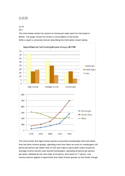
柱状图C1T3题目The chart below shows the amount of money per week spent on fast foods in Britain. The graph shows the trends in consumption of fast foods.Write a report a university lecturer describing the information shown below.The chart shows that high income earners consumed considerably more fast foods than the other income groups, spending more than twice as much on hamburgers (43 pence per person per week) than on fish and chips or pizza (both under 20 pence). Average income earners also favored hamburgers, spending 33 pence per person per week, followed by fish and chips at 24 pence, then pizza at 11 pence. Low income earners appear to spend less than other income groups on fast foods, thoughfish and chip remains their most popular fast food, followed by hamburgers and then pizza.From the graph we can see that in 1970, fish and chips were twice as popular asburgers, pizza being at that time the least popular fast food. The consumption of hamburgers and pizza has risen steadily over the 20 year period to 1990 while the consumption of fish and chips has been in decline over that same period with a slight increase in popularity since 1985.分析:题目The chart below shows the amount of money per week spent on fast foods inBritain. The graph shows the trends in consumption of fast foods.两句话,两个图第一段The chart shows that high income earners consumed considerably more fastfoods than the other income groups, spending more than twice as much onhamburgers (43 pence per person per week) than on fish and chips or pizza(both under 20 pence).说明了高收入人群的两个特点,第一是消耗快餐最多,第二是人群中hamburger, fish and chips, pizza的特点spending more than twice as much on hamburgers than on fish and chip and chips or pizza 这是一句令人费解的句子,含义应为“消耗的汉堡是薯片或匹萨的比如两倍多”,应用的句型应当为典型的表示倍数关系的句型“n times as…as”,? This airplane flies two times as fast as that one. 这家飞机的飞行速度是那架的两倍。

雅思小作文范文10篇英文回答:1. Write a letter to your friend describing your new house.Dear [Friend's Name],。
I hope this letter finds you well. I'm writing to you today to tell you all about my new house! I'm so excited to finally have a place of my own, and I know you're going to love it too.The house is located in a quiet neighborhood, and it's just a short walk from the beach. It's a two-story house with three bedrooms and two bathrooms. The kitchen is spacious and has all the appliances I need. The living room is cozy and has a fireplace. The backyard is fenced in and has a patio and a fire pit.I've been living in the house for about a month now, and I'm really starting to feel at home. I love cooking in the kitchen, and I've been spending a lot of time reading in the living room. The backyard is perfect for entertaining, and I've already had a few friends over for BBQs.I know you're coming to visit next month, and I can't wait to show you my new house. I think you're going to love it as much as I do.Love,。

雅思小作文考官范文(精选6篇)(经典版)编制人:__________________审核人:__________________审批人:__________________编制单位:__________________编制时间:____年____月____日序言下载提示:该文档是本店铺精心编制而成的,希望大家下载后,能够帮助大家解决实际问题。
文档下载后可定制修改,请根据实际需要进行调整和使用,谢谢!并且,本店铺为大家提供各种类型的经典范文,如工作总结、工作计划、合同协议、条据文书、策划方案、句子大全、作文大全、诗词歌赋、教案资料、其他范文等等,想了解不同范文格式和写法,敬请关注!Download tips: This document is carefully compiled by this editor. I hope that after you download it, it can help you solve practical problems. The document can be customized and modified after downloading, please adjust and use it according to actual needs, thank you!Moreover, our store provides various types of classic sample essays for everyone, such as work summaries, work plans, contract agreements, doctrinal documents, planning plans, complete sentences, complete compositions, poems, songs, teaching materials, and other sample essays. If you want to learn about different sample formats and writing methods, please stay tuned!雅思小作文考官范文(精选6篇)雅思小作文考官范文第1篇第一段:复述文章主题+引出论点典型的大作文文章开篇,中规中矩,不失为实战中最好用也是最稳妥的写法。
文章结构:Introduction, 1-2 sentences, rewrite the questionBody1, 1+X sentences, 第一句总体概括,X句具体介绍数字Body2, 1+X sentences, 第一句总体概括,X句具体介绍数字Conclusion, 1-2 sentences, 第一句介绍总数(可不写);第二句做总结。
开头段:1-2句,转述原题转述原题3法:①添加单词②删除单词③替换单词(注意:改动不需过多,3-4处,即可)原题一句变两句,两句变一句。
全部改写,要保证语法、句型的正确性。
开头段的时态:永远一般现在时【原文】The table shows the results of a survey in 2004 which asked undergraduate and postgraduate students of a UK university whether they were satisfied with the facilities at the university.【改写】The diagram gives a breakdown(明细表)about different attitudes among undergraduate and postgraduate students towards equipments of a UK college in the year 2004.【原文】The chart below shows the different levels of post-school qualifications in America and the proportion of men and women who held them in 1999.改后:The bar chart illustrates the diverse levels of post-school certificates in the US and the percentage of males and females holding them in 1999.Level out (变得水平;持平)Example: In 1985, earnings leveled out amongst people with a Master’s degree and with a Doctoral degree.句型、词汇、短语:As shown in the first/second …….. ,According to the …….. ,Overall, it can be seen thatThis table shows a striking difference/similarity betweenThe most striking feature of the graph is the sudden increase in the popularity in the computer games.Another fact worth noticing in the graph is that …….后面接完整的句子如果要跟名词不加thatAnother fact worth noticing in the graph is the high cost of fuels.The most remarkable point is that …….The graph shows the difference between the percentages注意用复数of males and females doing full-time jobs.在表示百分数时可以用percent或percentage percentage的一个意思就是百分比(名词)就不能直接跟在数词后面,要表示"百分之36"时,只能说"a PERCENTAGE of 36" 而不是"36 PERCENTAGE"(因为percentage只能作名词);前者用法是: 数词+percent+of+sth;这时后面谓语的单复数以percent后面跟的主语为主,例如:2 percent of the apples(这里是复数的可数名词) are(所以用复数) eaten.2 percent of the apple(这里是单数,指的是一个苹果的一部分) is(用单数) eaten.2 percent of the water(这里是不可数名词) is(单数) drunk.后者的用法是The percentage of +sth+ is, 注意这里不管后面跟的是什么词,都用is(这里忽略别的时态)1.The percentage of the students is 46.2.The percentage of the water is 46.The size of the population will increase shaply in the future..75.6 percent of the male population over sixteen ... …16岁以上男性人群的75.6%.A small/large proportion of students are ……..In Britain people spent the smallest amount of money on personal + sth.大量 a large/considerable/substantial number of 可数 a large/considerable/substantial amount of不可数少量 a small/limited/tiny number of a few of a small/limited/tiny amount of a little ofLots of /a lot of /plenty of 即可用于可数也可用于不可数过去一段时间内的情况变化,用过去式。

剑15test2小作文范文题目是关于一个城市中心的变化,有两张地图,一张是现在的,一张是规划中的。
一、开头。
哟呵,今天咱们来瞅一瞅这个城市中心的大变样。
就像看一个人从现在的模样即将要变身成超级酷炫的新样子,这两张地图可老有趣了。
二、现在的城市中心描述。
现在呢,城市中心就像一个有点杂乱但是充满生活气息的大杂烩。
中间有个老市场,就像个巨大的蜂窝,到处都是小摊位,人来人往的,热闹得很。
市场的东边是一些矮矮的居民楼,看起来有点年头了,墙皮都有点脱落,像个满脸皱纹的老人。
再往西边看呢,有一条窄窄的小河,河水不是很清澈,河上的桥也有点破旧,感觉像个摇摇欲坠的老古董。
河的西岸有一个小小的停车场,里面停得满满当当的,车就像沙丁鱼罐头里的鱼一样挤在一起。
三、规划中的城市中心描述。
再看看未来的规划,哇塞,这简直是要从灰姑娘变成公主啊!那个老市场要被拆除啦,取而代之的是一个超级现代化的购物中心。
这购物中心就像一个巨大的时尚盒子,里面估计会有各种各样的大牌商店,到时候那些爱逛街的人估计要乐疯了。
原来东边的旧居民楼呢,要被推倒重建,变成一排崭新的高楼大厦,像一个个挺拔的士兵站在那里。
这些高楼大厦里应该会有很多公寓,住在里面的人就可以享受城市的美景啦。
西边那条可怜的小河可要有大变化喽,要进行河道清理,让河水清澈得像镜子一样。
河上的旧桥会被拆掉,新建一座又宽敞又漂亮的大桥,感觉就像给小河戴上了一条璀璨的项链。
河对岸的小停车场也会扩大好几倍,变成一个大型的多功能停车场,这样就再也不用担心车没地方停啦。
而且啊,在这个新的城市中心规划里,还会增加很多绿化,就像给这个城市中心穿上了一件绿色的外套,到处都会是绿树和鲜花,想想就觉得美得很。
四、总结。
总的来说,这个城市中心的规划就是一场华丽的变身秀。
从现在这个有点老旧、杂乱的样子变成一个现代化、充满活力又美丽的地方。
这就像是给这个城市注入了一针强心剂,未来肯定会吸引更多的人来这里生活、工作和玩耍。
小作文精讲(一)-------柱状图(bar chart)migrant amphibian seaweed gorilla ocean river stream pool pond lakePest insecticide killer whale sperm whale terrestrial aquatic marine lifeEndanger habit habitat nutrient vegetation vegetarian threatenLog restrict=inhibit=restrain maintain territory territorial generateEmerge connect =depend on=lean on=count on erosion intact HR resource Source nurture nurse discard=abandon vital=important =significant =critical abundant =lush sustain overestimate underestimate preserve strip=depriveFracture hibernate hide+ber+nate decline=fall=reduce=depress legal illegalFragile reproduce 同位语require measure be sufficient toEnsure emphasis emphasize=highlight=stress expansion justified=reasonable Destination include exclude graduate postgraduate一写作思路及技巧1.看清横纵轴分别代表什么。
(多数都是纵轴代表百分比,横轴代表时间,年龄,频度等。
雅思小作文大全及范文1雅思小作文大全及范文雅思考试是全球范围内最受欢迎的英语语言能力考试之一。
其中,雅思写作分为大作文和小作文两部分。
小作文主要测试考生的书面表达能力,包括图表描述、流程图描述、地图描述等。
下面将为大家提供一份雅思小作文大全及范文,以帮助考生更好地备考。
1. 图表描述题目:The chart below shows the percentage of people who played team sports in a small town in 2010 and 2015.范文:The bar chart illustrates the proportion of individuals participating in team sports in a small town in the years 2010 and 2015. Overall, it can be observed that there was a significant increase in the number of people engaging in team sports during this period.In 2010, approximately 40% of the town's population participated in team sports, while the remaining 60% did not engage in any form of team sports. However, by 2015, this figure had risen to around 60%, indicating a substantial growth in participation.Looking at the specific sports, football was the most popular team sport in both years. In 2010, around 25% of the population played football, while basketball and volleyball were played by approximately 10% and 5% of the residents, respectively. In contrast, by 2015, the percentage of people playing football had increased to nearly 40%, while basketball and volleyball saw a slight decline to about 8% and 4% respectively.In conclusion, the bar chart demonstrates that the number of individuals participating in team sports in the small town increased significantly between 2010 and 2015. Football remained the most popular sport, while basketball and volleyball experienced slight fluctuations in participation rates.2. 流程图描述题目:The diagram below shows the process of recycling plastic bottles.范文:The diagram illustrates the process of recycling plastic bottles. It can be seen that there are six main stages involved in this process, from the collection of plastic bottles to the production of new plastic products.Firstly, the plastic bottles are collected by recycling trucks and transported to a recycling center. At the recycling center, the bottles are sorted according to their type and color. This is followed by the process of shredding, where the bottles are cut into small pieces.Next, the shredded plastic is washed and cleaned to remove any impurities. Once the plastic is clean, it is melted down and transformed into small pellets. These pellets are then transported to a plastic manufacturing plant.In the manufacturing plant, the plastic pellets are reheated and molded into various shapes, such as bottles, containers, or other plastic products. Finally, the new plastic products are packaged and ready to be distributed to consumers.Overall, the diagram shows a clear and systematic process of recycling plastic bottles, starting from collection and sorting, to shredding, cleaning, melting, molding, and finally, the production of new plastic products.3. 地图描述题目:The maps below show the changes that have taken place in a seaside town between 1995 and present day.范文:The maps compare the changes that have occurred in a seaside town between 1995 and the present day. Overall, it can be seen that there have been significant developments in terms of infrastructure and facilities in the town over the years.In 1995, the town had a small harbor located to the east of the town center. There were only a few buildings near the harbor, including a hotel and a restaurant. The town center itself consisted of a few streets with residential houses and a small park.In contrast, the present day map shows a much larger and more developed town. The harbor has been expanded and now includes a marina, which can accommodate a greater number of boats. Additionally, there are several new buildings surrounding the harbor, including a shopping mall, a cinema, and a sports center.Furthermore, the town center has undergone significant changes. The number of streets has increased, and there are now more residential houses and commercial buildings. The small park has been transformed into a larger recreational area with a playground and a picnic area.In conclusion, the maps clearly demonstrate the substantial growth and development of the seaside town over the years. The expansion of the harbor, the construction of new buildings, and the improvement of recreational facilities have contributed to the overall transformation of the town.。
雅思小作文流程图范文(共7篇)雅思,流程图,作文,范文篇一:雅思流程图的写作(含范文深度点评) WRITING TASK 1You should spend about 20 minutes on this task.The illustrations below show how chocolate is produced. Summarise the informaiton by selecting and reporting the main features.Write at least 150 words.【高分范文及深度点评】The diagram shows the stages in the process of making chocolate.【所有的小作文第一句话都要用一般现在时。
流程图必备三个词:process:整个过程, stage:阶段,step:步骤】Chocolate comes from the cacao tree, which is grown in parts of SouthAmerica, Africa and Indonesia.【开头不能冲上来就直接介绍cacao tree,而是通过主题词chocolate引出,否则显得太唐突】【流程图特点之一:介绍过程要使用一般现在时】【流程图特点之二:大量使用定语从句,将有关联的两句话连接。
】【流程图特点之三:大量使用被动语态】The tree produces large red pods which contain white cocoa beans. Firstly,【使用一些表示顺序的连接词】when the pods are ripe,they are harvested, the beans are removed andthey are fermented for several days in large wooden boxes.【三个句子的并列:“句子A,句子B and 句子C”。
2024雅思写作范文很抱歉,截至2023年7月,2024年的雅思考试还没有发生,所以我不能提供2024年雅思写作的真题范文。
不过我可以给你一些不同类型雅思写作题目的通用范文示例,并且按照口语化、幽默化的风格来写:一、雅思大作文同意不同意类(以“是否应该禁止动物在马戏团表演”为例)题目: Some people think that animals should be banned from performingin circuses. Do you agree or disagree?范文:Well, you know, when it comes to whether animals should be banned from circus shows, I'm all for the ban.First off, let's think about how those poor animals are treated.They're often crammed into tiny cages when they're not performing. It'slike they're living in a prison on wheels! And the training methods? Someof them are just cruel. I mean, have you ever seen a big, majestic elephant standing on its head just because some trainer forces it to? It's notnatural at all.Secondly, we're living in a time when we should respect all living things. Animals have their own rights, just like us humans. They should be free to roam around in their natural habitats, not being dragged aroundfrom one town to another to do silly tricks for our entertainment.Sure, some might say that circus animals are well cared for and it's a tradition to have them in circuses. But come on! Tradition or not, if it involves making animals suffer, it's time to change. So, in a nutshell, yep, ban those animals from circuses for good.二、雅思大作文讨论双方观点并给出自己观点类(以“线上学习和线下学习哪个更好”为例)题目: Some people believe that online learning is more effective than traditional classroom learning. Others think that traditional classroom learning is still the best. Discuss both views and give your own opinion.范文:Hey there! So, we've got this big debate about online learning and traditional classroom learning.Let's start with the folks who think online learning is the bomb. Well, they've got some good points. For one thing, it's super convenient. You can roll out of bed in your pajamas, grab a cup of coffee, and start learning. No need to commute to school or deal with traffic jams. And there are so many resources available online. You can watch videos from all over the world, and you can learn at your own pace. If you don't get something the first time, you can just rewind and watch it again. It's like having a personal learning genie.But then there are those who swear by traditional classroom learning. And they're not wrong either. In a classroom, you get to interact with your teachers and classmates face to face. There's something really special about asking a question and getting an immediate answer. And you can have group discussions, which are a lot of fun. You learn from other people's ideas, and sometimes you end up having a good laugh too. Plus, the classroom environment kind of forces you to focus. There's no way you can just turn off your camera and go do something else like you might be tempted to do in an online class.As for me, I think it depends on the person. If you're a really self disciplined person, online learning can be great. But if you need that extra push and you love the social aspect of learning, then traditional classroom learning is the way to go. It's like choosing between a comfypair of slippers (online learning) and a pair of stylish boots (classroom learning). Both have their charm, but different people will preferdifferent things.三、雅思小作文柱状图(以描述不同年龄段人群使用社交媒体的时长为例)题目: The bar chart shows the amount of time different age groups spend on social media per day.范文:Well, take a look at this bar chart. It's like a snapshot of our social media crazy world.For the younguns, the teenagers, they're on social media for what seems like forever. I mean, it's like they're glued to their phones. The bars show that they spend a whopping three hours or more on social media every day. They're probably chatting with their friends, posting selfies, and checking out the latest trends.Then we've got the young adults, in their 20s and 30s. They're not too far behind. They still spend a good two to three hours on social media daily. I guess they're using it for networking, keeping up with the news, and sharing pictures of their cool vacations or new pets.As for the middle aged folks, in their 40s and 50s, they seem to be a bit more restrained. They spend around one to two hours on social media. They might be using it to stay in touch with family members or to join some hobby related groups.And finally, the oldies, the over 60s. They're the least active on social media, spending less than an hour a day. I can just picture them trying to figure out how to post a simple message or like a photo. It's kind of cute, really.Overall, it's clear that age plays a big role in how much time people spend on social media. The younger you are, the more likely you are to be a social media addict. But who can blame them? Social media is like a whole new world these days.。
雅思小作文范文10篇1. 表格题型。
The bar chart illustrates the amount of money spent on fast food by people of different income groups in a particular country in 2019. It is evident from the chart that the highest expenditure on fast food is made by people in the middle income group, while the lowest expenditure is made by those in the low income group.2. 饼图题型。
The pie chart depicts the percentage of different types of leisure activities engaged in by people in a certaincity in 2020. It is clear from the chart that the most popular leisure activity is watching movies, followed by sports and outdoor activities, while the least popular activity is reading.3. 流程图题型。
The process diagram illustrates the various stages involved in the production of chocolate. Overall, the process consists of six main stages, starting from the harvesting of cocoa beans to the packaging of the final product. Each stage is crucial in ensuring the quality and taste of the chocolate.4. 表格题型。
剑雅11test3小作文高分范文
了解您的需求,下面是以口语化方式表达、保持独立段落并且每个段落语言特点各不相同的几个示例:
---。
段落一:
哇,这城市真是壮观啊!高楼大厦,一排排的,玻璃幕墙闪闪发亮,简直就像是未来的世界。
那些摩天大楼的反射在附近的湖面上跳跃,太美了。
段落二:
说到城市,也得提提那些安静的角落。
你知道吗,就在这个繁华都市的中心,有个公园,简直就是城市的一片绿洲。
绿草地、大树,还有孩子们的笑声,简直就像另一个世界。
段落三:
说到休闲,我得说说咖啡。
你知道吗,我最喜欢的就是找个咖
啡店坐下来,喝杯咖啡,放松一下。
那里的氛围真好,柔和的灯光,舒服的沙发,还有咖啡的香味,简直让人心旷神怡。
段落四:
晚上的城市更有意思。
太阳一落山,整个城市就变成了灯光的
海洋。
霓虹灯、路灯,到处都亮堂堂的,就像进入了一个童话世界。
白天的喧嚣也慢慢安静下来,整个城市都放松了下来。
段落五:
每当我站在这儿,看着这个城市,我都觉得好激动。
这就是我
的世界,我的梦想和现实都在这里交织。
这里既有我的过去,也有
我的未来。
这个城市,永远都会在我心里占据一个特殊的位置。
---。
这些段落的语言更加口语化,风格各异,同时也避免了使用任
何形式的连接词、过渡词或句子,保持了文本的跳跃性和即时性。
希望这些示例能够满足您的需求。
雅思小作文技巧及范文
雅思小作文写作技巧及范文一.图表类型
饼状图,直方图或柱形图趋势曲线图表格图流程图或过程图程序图
二.解题技巧
A. 表格图
1横向比较: 介绍横向各个数据的区别,变化和趋势2纵向比较:介绍横向各个数据的区别,变化和趋势3无需将每一个数据分别说明,突出强调数据最大值和最小值,对比时要总结出数据对比最悬殊的和最小的
说明:考察例举数字的能力和方法。
注意怎样经过举一些有代表性的数据来有效地说明问题。
B. 曲线图
1极点说明: 对图表当中最高的,最低的点要单独进行说明
2趋势说明: 对图表当中曲线的连续变化进行说明,如上升,下降,波动,持平
3交点说明: 对图表当中多根曲线的交点进行对比说明
说明:关键是把握好曲线的走向和趋势,学会general classification,即在第二段的开头部
分对整个曲线进行一个阶段式的总分类,使写作层次清晰。
接下来在分类描述每个阶段的specific trend,同时导入数据作为你分类的依据。
注意不要不做任何说明就机械性的导入数据!能够使用一些比较native的单词和短语来描述trend。
C. 饼状图
1介绍各扇面及总体的关系2各个扇面之间的比较,同类扇面在不同时间,不同地点的比较3重点突出特点最明显的扇面:最大的,最小的,互相成倍的
D. 柱状图
1.比较: similarity
2.对比: difference)
3.横向总结所有柱状图表的共性特征 & 分别描写各个柱子的个性特征
E. 流程图
1.首先说明:做什么工作的过程,目的是什么2.准备工作3.按时间/过程先后描述4.结果5.简单总结
说明:注意流程图里的“因果关系”或每一流程的“承前启后”关系;表示每一流程的主体内容,阐明这种关系;揭示其内在联系或规律;最
后,给予简要归纳和总结。
F. 实物/器具工作过程1.实物的名称,功能2.基本结构3.工作过程4.简单总结
G. 综合图
1不求甚解,不拘泥于细节2分门别类,分段落详细介绍各个图表3不画蛇添足,主观臆断或猜测图表之间的关系
三.写作结构
框架结构
1.开头:该图阐述的是______的______.共有以下几个部分组成。
shows (that)/According to / As (is)shown in … / As can be seen from /
It can be seen from /We can see from / It is clear / apparent from the figures/statistics / It is from / This …tells us the main story about / concerning / concerned with / on / related to…2.分析:首先看到的是____, 在_____年呈现出____的趋势/ 占______; 其次,……第三[比
较分析]
1)内容:figure、statistic、number、percentage、
proportion 2)用语:
从图中能够看出,……发生了巨大变化as can be seen from the diagram,great changes have taken place in……
从图表我们能够很清楚(明显)看到……from the table/chart/diagram/figu re,we can see clearly that……or it is clear/apparent from the chart that……
这个图表向我们展示了……this is a graph which illustrates……
该表格描述了……年到……年间a与b的比例关系this table shows the changing proportion of a & b from……to……
该图以圆形图形式描述了……总的趋势the graph,presented in a pie chart,shows the general trend in……
在……至……期over the period。