雅思写作小作文线形图表题(附范文)
- 格式:docx
- 大小:689.90 KB
- 文档页数:6

雅思作文图表题范文第1篇It is said that countries are becoming similar to each other because of the global spread of the same products, which are now available for purchase almost anywhere. I strongly believe that this modern development is largely detrimental to culture and traditions worldwide.A country’s history, language and ethos are all inextricably bound up in its manufactured artefacts. If the relentless advance of international brands into every corner of the world continues, these bland packages might one day completely oust the traditional objects of a nation, which would be a loss of richness and diversity in the world, as well as the sad disappearance of the manifestations of a place’s character. What would a Japanese tea ceremony be without its specially crafted teapot, or a Fijian kava ritual without its bowl made from a certain type of tree bark?Let us not forget either that traditional products, whether these be medicines, cosmetics, toy, clothes, utensils or food, provide employment for local people. The spread of multinational products can often bring in its wake a loss of jobs, as people urn to buying the new brand, perhaps thinking it more glamorous than the one they are used to. This eventually puts old-school craftspeople out of work.Finally, tourism numbers may also be affected, as travelers become disillusioned with finding every place just the same as the one they visited previously. To see the same products in shops the world over is boring, and does not impel visitors to open their wallets in the same way that trinkets or souvenirs unique to the particular area too.Some may argue that all people are entitled to have access to the same products, but I say that local objects suit local conditions best, and that faceless uniformity worldwide is an unwelcome and dreary prospect.Heres my full answer:The line graphs show the average monthly amount that parents in Britain spent on their children’s sporting activities and the number of British children who took part in three different sports from 2008 to is clear that parents spent more money each year on their children’s participation in sports over the six-year period. In terms of the number of children taking part, football was significantly more popular than athletics and 2008, British parents spent an average of around £20 per month on their children’s sporting activities. Parents’ spending on children’s sports increased gradually over the following six years, and by 2014 the average monthly amount had risen to just over £ at participation numbers, in 2008 approximately 8 million British children played football, while only 2 million children were enrolled in swimming clubs and less than 1 million practised athletics. The figures for football participation remained relatively stable over the following 6 years. By contrast, participation in swimming almost doubled, to nearly 4 million children, and there was a near fivefold increase in the number of children doing athletics.剑桥雅思6test1大作文范文,剑桥雅思6test1大作文task2高分范文+真题答案实感。
雅思图表线性图写作范文-CAL-FENGHAI.-(YICAI)-Company One1-CAL-本页仅作为文档封面,使用请直接删除雅思图表线性图写作范文(总3页)-CAL-FENGHAI.-(YICAI)-Company One1-CAL-本页仅作为文档封面,使用请直接删除WRITING TASK 1You should spend about 20 minutes on this task.The graph below gives information about cinema attendancein Australia between 1990 and the present, with projections to 2010.Summarise the information by selecting and reporting the main features, and make comparisons where relevant.Write at least 150 words.The graph shows percentages of cinema attendance at least once a year in Australia between 1990 to 2010 with projections for the future. The graph is described by 4 groups of different ages which are 14 to 24, 25 to 34, 35 to 49 and over 50 year olds.The youngest age group people have been going to cinema more than any other age groups and the percentage has been keeping very high at approximately90% since 1990. It is predicted to keep the high and to increase more from 2006.The middle age groups people have enjoyed going cinema between 60% to 80%. The percentage of age 25 to 34 group has been higher than the one of age 35 to 49group but from 2006 the percentage of 25 to 34 year olds people will decrease while the one of 35 to 49 year olds people will increase and get higher than the other one.The oldest people seem to go cinema less than the other groups but the percentageof the attendance has slightly going up by 15% from 40% to 55% between 1990 to 2004 and it will keep increasing to 60% by 2010.Overall, it seems the younger age people, the more going to cinema.(210 words)【考官评语】Band 6This response addresses the requirements of the task and selects relevant material to describe. Key features and an overview are presented, although clearer highlighting, more support and a more comprehensive overview would be needed to reach a higher band. Information is well-organised and there is a clear overall progression in the response. There is some effective use of cohesive devices, but only limited use of reference and substitution. The range of vocabulary is not wide, but it is adequate for the task. Control of word form and spelling is consistentlygood, although there are some clumsy noun phrases that indicatelimited flexibility. The candidate attempts to use a mix of simple and complex sentences, but control is variable and grammatical errors or omissionsare quite intrusive at times. Figures are poorly integrated into sentences and indicate evident limitations.。
雅思作文线状图【篇一:雅思小作文——线形图(line graphs)】智课网ielts备考资料雅思小作文——线形图(line graphs)摘要:线形图是雅思写作task 1 里常考的图形之一,其写作非常值得我们深入研究。
现专供以下学习材料,希望能对各位“雅友”的线形图写作带去一些启发和帮助。
线形图是雅思写作task 1 里常考的图形之一,其写作非常值得我们深入研究。
现专供以下学习材料,希望能对各位“雅友”的线形图写作带去一些启发和帮助。
line graphsline graphs are more popular than all other graphs combined because their visual characteristics reveal data trends clearly and these graphs are easy to create. line graphs, especially useful in the fields of statistics and science, are one of the most common tools used to present data.a line graph is a visual comparison of how two variables—shown on the x- and y-axes—are related or vary with each other. it shows related information by drawing a continuous line between all the points on a grid. for information on the shapes of line graphs, see the organizing data chapter.line graphs compare two variables: one is plotted along the x-axis (horizontal) and the other along the y-axis(vertical). the y-axis in a line graph usually indicates quantity (e.g., dollars, litres) or percentage, while the horizontal x-axis often measures units of time. as a result, the line graph is often viewed as a time series graph. for example, if you wanted to graph the height of a baseball pitch over time, you could measure the time variable along the x-axis, and the height along the y-axis.although they do not present specific data as well as tables do, line graphs are able to show relationships more clearly than tables do. line graphs can also depict multiple series which are usually the best candidate for time series data and frequency distribution.e graphs share a similar purpose. the column graph, however, reveals a change in magnitude, whereas the line graph is used to show a change in direction.in summary, line graphsshow specific values of data wellreveal trends and relationships between datacompare trends in different groups of a variablegraphs can give a distorted image of the data. if inconsistent scales on the axes of a line graph force data to appear in a certain way, then a graph can even reveal a trend that is entirely different from the one intended. this means that the intervals between adjacent points along the axis may be dissimilar, or that the same data charted in two graphs using different scales will appear different.example 1 – plotting a trend over timefigure 1 shows one obvious trend, the fluctuation in the labour force from january to july. the number of students at andrews high school who are members of the labour force is scaled using intervals on the y-axis, while the time variable is plotted on the x-axis.the number of students participating in the labour force was 252 in january, 252 in february, 255 in march, 256 in april, 282 in may, 290 in june and 319 in july. when examined further, the graph indicates that the labour forceparticipation of these students was at a plateau for the first four months covered by the graph (january to april), and for the next three months (may to july) the number increased steadily. figure 1. labour force participation in andrews high schoolexample 2 – comparing two related variablesfigure 2 is a single line graph comparing two items; in this instance, time is not a factor. the graph compares thenumber of dollars donated by the age of the donors. according to the trend in the graph, the older the donor, the more money he or she donates. the 17-year-old donors donate, on average, $84. for the 19-year-olds, the average donation increased by $26 to make the average donation of that age group $110.figure 2. average number of dollars donated at evergreen high school, by age of donorexample 3 – using correct scalewhen drawing a line, it is important that you use the correct scale. otherwise, the lines shape can give readers the wrong impression about the data. compare figure 3 with figure 4:figure 3. number of guilty crime offenders, grishamvillefigure 4. number of guilty crime offenders, grishamvilleusing a scale of 350 to 430 (figure 3) focuses on a small range of values. it does not accurately depict the trend in guilty crime offenders between january and may since it exaggerates that trend and does not relate it to the bigger picture. however, choosing a scale of 0 to 450 (figure 4) better displays how small the decline in the number of guilty crime offenders really was.example 4 – multiple line graphsa multiple line graph can effectively compare similar items over the same period of time (figure 5).figure 5. cell phone use in anytowne, 1996 to 2002figure 5 is an example of a very good graph. the message is clearly stated in the title, and each of the line graphs is properly labelled. it is easy to see from this graph that the total cell phone use has been rising steadily since 1996,except for a two-year period (1999 and 2000) where the numbers drop slightly. the pattern of use for women and men seems to be quite similar with very small discrepancies between them.相关字搜索:雅思【篇二:线状图】如何写好开头段1表示展示,显示的单词归纳1. show. to make sth. clear; to prove sth.证明,表明v. to say what sb./sth. is like 描写,描绘;叙述揭示;揭露;暴露;泄露4. display v. /displei/ to show signs of sth., especially a quality or feeling 显示;表现;显露5. illustrate v. to use pictures, photographs, diagrams, etc. ina book, etc. (用图、实例等)说明,阐明6.demonstrate v. to show sth. clearly by giving proof or evidence 显示,表露to show sb./sth., especially in a picture 展示;描述8. indicatev. to show that sth. is true or exists 表明;象征;暗示9.unfold v. to be gradually made known; to gradually make sth. known to other people显露,表露;呈现10. exhibit v. to show signs of sth?especially a quality or feeling 表尔,显出11. depict v. to show or represent sth. in a work of art such asa drawing or painting描绘,描画;描述12. outline 描绘以上动词在语义都接近,但需注意:它们后面所跟的宾语不同总结起来就是而担其它的一般只接名词宾语!对...进行分析the table gives a breakdown of different types of family who were living in poverty in australia in 2009.提供关于...的信息the chart gives information about post-school qualifications in terms of different levels of further education reached by men and women in australia in 2009.比较the charts compare the sources of electricity in australia and france in the years 1980....a glance at the graph provided reveals some striking similarities between chinese and us birth rates during the period 1920-2000.....5.given are two graphs concerning criminality in britain.其它替换词★number 丨nambs/数字★figure 丨figa/数字★percentage百分率,百分比the percentage of aged couples who lived in poverty in australia in 1999 was 4%. ★proportion 比例,比率this bar chart indicates the proportion of medical complaints of patients visiting therapists in australia in 2012.★rate 比例,比率;率the bar chart reveals different rates of post-school qualifications in australia in 2010. ★amount. /smaunt/数量,数额(一般与不可数名词连用)theres been a great amount of research into the subject.强化练习到尼泊尔的游客来自何处)in march 2010.有多少降雨)over a year,.(3) the chart gives 混合型汽车在全球的销售)between 2006 and 2009.不同交通方式)used by overseas visitors to travel in new zealand.少图书馆的书.) over this four-year period.售) in japan, the us and the rest of the world from 2006 to 2009.2.时间的连接词练习(二选一)1.the number of students who took spanish was 150 in/on 2010.2.according to the data, mandarin decreased during/at that period.3.since/from 2000, the trends have changed greatly.4.the chart shows the number of people going abroadfrom/between 2000 and 2010.5.in general, all the figures steadily increased over/from 1911 to 2011 .6.during the period 1980 and/to 1990, there was a gradual decrease.7.i have been learning japanese for/in two years now.8.the chart shows changes in irish school eollment figures over/at a 20-year period.9.on/in may 4,2012,in plain sight concluded its fifth and final season.10.the 12th china beijing international high-tech expo will be held in/on may.11.the number started a long decline from 1930onwards/afterwards.12.the period 1250 to/and 1350 is a period of religious and secular literature in english.13.the charts indicate how much a uk school spent on different costs in/for four separate years: 1981,1991,2001 and 2011.表示连续的时间段2. during the same period3. in the no. years spanning from 19xx through 19xx4. from then on= from this time onwards= in the subsequent years.句子翻译练习1.以上的线状图表明了在英国冬季和夏季的一天中用电的需求量。
题目分析,包括回答中需要涉及的要点、对比以及考生可能对题目产生的错误理解。
WRITING要点1. 其中两个代表薪资水平,两个代表基础设施配备,第五个代表保险(财务方面)。
2. 不同的方面代表不同的趋向。
?3. 文章应该提及所有出现的数字。
(包含 15 组数字)名师点题剑桥雅思 8作文考生可能产生的错误理解和问题1. 应使用过去完成时。
?2. 数字用百分比表达,不必写出总额数。
建议的写作结构,对比此结构与考生有可能采用的不恰当结构。
介绍部分应该把题目用自己的话重写一遍。
正文主体部分可以有三种写作样式。
可以将正文划分为 5 段(每段描述一个条目),或者分为 3 段(每段按照薪资水平,基础设施配备和保险来描述一个饼形图)。
对大部分考生而言,每段描述一个饼形图的写作样式或许会比较容易,但是如果选择此种样式,切忌数字重复出现。
最后应该有一个简短的评论,要特别突出 1-2 个关键点。
参考范文?The pie charts show how a school spent money, in percentage terms, in the years 1981, 1991and 2001, across five categories.The majority of spending in each year was on salaries. Teachers’ salaries accounted for 40% of spending in 1981. This increased to 50% in 1991, but dropped to 45% in 2001. Salaries for other workers accounted for 28% of spending in 1981, 22% in 1991 and 15% in 2001, demonstrating a constant fall.Spending on resources such as books and on furniture and equipment took up 30% ofspending in 1981 – 15% each. By 1991, spending on resources had risen to 20% whilst spending on furniture and equipment had fallen dramatically to only 5%. By 2001, spending on resources had more than halved (in percentage terms) to 9% whereas spending on furniture and equipment had risen relatively substantially to 23%.Finally, spending on insurance rose from 2% in 1981 to 3% in 1991 and thereafter to a more significant 9% of the total in 2001.In summary, relative spending in all five categories changed a lot, with spendingon teachers’ salaries being the largest portion.(187 words)。

雅思英语图表作文范文第1篇A类雅思各类图表作文要点及范文一.曲线图解题关键1曲线图和柱状图都是动态图,解题的切入点在于描述趋势。
2在第二段的开头部分对整个曲线进行一个阶段式的总分类,使写作层次清晰,同时也方便考官阅卷。
接下来再分类描述每个阶段的specifictrend,同时导入数据作为分类的依据。
3趋势说明。
即,对曲线的连续变化进行说明,如上升、下降、波动、持平。
以时间为比较基础的应抓住“变化”:上升、下降、或是波动。
题中对两个或两个以上的变量进行描述时应在此基础上进行比较,如变量多于两个应进行分类或有侧重的比较。
4极点说明。
即对图表中最高的、最低的点单独进行说明。
不以时间为比较基础的应注意对极点的描述。
5交点说明。
即对图表当中多根曲线的交点进行对比说明。
6不要不做任何说明就机械地导入数据,这不符合雅思的考试目的。
曲线图常用词汇动词—九大运动趋势一:表示向上:increase,rise,improve,grow,ascend,mount,aggrandize,goup,climb, take off, jump,shoot up暴涨,soar,rocket, skyrocket雅思英语图表作文范文第2篇It is said that countries are becoming similar to each other because of the global spread of the same products, which are now available for purchase almost anywhere. I strongly believe that this modern development is largely detrimental to culture and traditions worldwide.A country’s history, language and ethos are all inextricably bound up in its manufactured artefacts. If the relentless advance of international brands into every corner of the world continues, these bland packages might one day completely oust the traditional objects of a nation, which would be a loss of richness and diversity in the world, as well as the sad disappearance of t he manifestations of a place’s character. What would a Japanese tea ceremony be without its specially crafted teapot, or a Fijian kava ritual without its bowl made from a certain type of tree bark?Let us not forget either that traditional products, whether these be medicines, cosmetics, toy, clothes, utensils or food, provide employment for local people. The spread of multinational products can often bring in its wake a loss of jobs, as people urn to buying the new brand,perhaps thinking it more glamorous than the one they are used to. This eventually puts old-school craftspeople out of work.Finally, tourism numbers may also be affected, as travelers become disillusioned with finding every place just the same as the one they visited previously. To see the same products in shops the world over is boring, and does not impel visitors to open their wallets in the same way that trinkets or souvenirs unique to the particular area too.Some may argue that all people are entitled to have access to the same products, but I say that local objects suit local conditions best, and that faceless uniformity worldwide is an unwelcome and dreary prospect.Heres my full answer:The line graphs show the average monthly amount that parents in Britain spent on their children’s s porting activities and the number of British children who took part in three different sports from 2008 to is clear that parents spent more money each year on their children’s participation in sports over the six-year period. In terms of the number of children taking part, football was significantly more popular than athletics and 2008, British parents spent an average of around £20 per month on their children’s sporting activities. Parents’ spending on children’s sports increased gradually over the followi ng six years, and by 2014 the average monthly amount had risen to just over £ at participation numbers, in 2008 approximately 8 million British children played football, while only 2 million children were enrolled in swimming clubs and less than 1 million practised athletics. The figures for football participation remained relatively stable over the following 6 years. By contrast, participation in swimming almost doubled, to nearly 4 million children, and there was a near fivefold increase in the number of children doing athletics.剑桥雅思6test1大作文范文,剑桥雅思6test1大作文task2高分范文+真题答案实感。

雅思线形图作文The line graph illustrates the number of visitors to three different London museums— the British Museum, the National Gallery, and the Science Museum— from 2007 to 2012.Overall, it is evident that the British Museum consistently attracted the highest number of visitors, while the Science Museum saw a gradual increase in attendance over the years. The National Gallery, however, experienced fluctuations in its visitor numbers.In 2007, the British Museum started with approximately 5 million visitors, which rose steadily to around 6 million in 2010 before peaking at approximately 6.5 million in 2012. This upward trend indicates its growing popularity among tourists.In contrast, the National Gallery had around 4.5 million visitors in 2007. The number fluctuated slightly, reaching a high of 5 million in 2008, but then it dropped to about 4 million in 2010, before recovering to 4.5 million in 2012. This inconsistency suggeststhat the National Gallery faced challenges in maintaining its visitor numbers.The Science Museum, starting at about 3 million visitors in 2007, showed a steady increase throughout the period, reaching around 4.5 million by 2012. This indicates an increasing interest in the Science Museum, possibly due to new exhibitions or marketing efforts.In conclusion, while the British Museum remained the most popular among the three, the Science Museum showed a positive growth trend, contrasting with the fluctuations experienced by the National Gallery.中文翻译:该线形图展示了从2007年到2012年间,三个不同伦敦博物馆—大英博物馆、国家美术馆和科学博物馆—的游客数量。

雅思小作文线形图【篇1】雅思小作文线形图在雅思学术写作的Task1中,线形图无疑是一个令人既爱又恨的存在。
爱它,因为它直观明了,能够清晰地展示数据的变化趋势;恨它,则因为稍有不慎,便可能陷入冗长繁琐的叙述之中。
然而,只要掌握了正确的技巧,线形图便能成为你笔下熠熠生辉的亮点。
面对线形图,首要之务便是理解数据。
这并非简单的数字堆砌,而是要通过观察,捕捉那些隐藏在数字背后的主要趋势。
正如鲁迅先生所言:“世上本没有路,走的人多了,也便成了路。
”在数据的世界里,那些显著的变化趋势,便是我们笔下的“路”。
它们引领着我们,将纷繁复杂的数据串联成一条清晰的线索。
在理解了数据之后,接下来便是组织段落。
线形图的叙述,切忌平铺直叙,而应有所侧重,有所取舍。
我们可以根据数据的特征,将其分为几个部分进行阐述。
每个部分,都应是一个独立的段落,有着自己的主题和论点。
如此,文章便有了清晰的脉络,读者也能更加轻松地跟随我们的思路,领略线形图的魅力。
在叙述的过程中,比较是不可或缺的一环。
但比较并非无的放矢,而应是在相关的地方,针对相似的数据进行对比。
这样的比较,才能凸显出数据的差异,进而揭示出背后的深层含义。
否则,便如同鲁迅先生笔下的“无意义的忙碌”,只会让读者感到困惑和疲惫。
最后,我们还需要注意覆盖所有的数据。
线形图中的每一个点,都代表着一段历史,一个故事。
我们不能因为某个数据点不显著,便将其忽略。
相反,我们应该用细腻的笔触,去描绘每一个数据点的变化,让读者能够感受到数据的跳动和生命的律动。
总之,线形图的写作,既是对数据的解读,也是对文字的驾驭。
只有当我们真正理解了数据,掌握了技巧,才能将线形图转化为笔下的佳作,让读者在字里行间,感受到数据的魅力和文字的力量。
【篇2】雅思小作文线形图在雅思考试的浩瀚题海中,小作文如同一叶扁舟,承载着考生们对英文写作能力的检验与追求。
而线形图,作为小作文中常见的一种图表类型,更是以其直观、动态的特点,成为了众多考生笔下的“常客”。
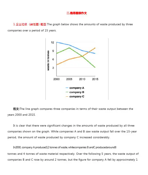
1.企业垃圾 (线性图) 题目:The graph below shows the amounts of waste produced by three companies over a period of 15 years.years 2000 and 2015.It is clear that there were significant changes in the amounts of waste produced by all three companies shown on the graph. While companies A and B saw waste output fall over the 15-year period, the amount of waste produced by company C increased considerably.In2000, company A produced12 tonnes of waste, whilecompanies B andC producedaround8tonnes and 4 tonnes of waste material respectively. Over the following 5 years, the waste output of companies B and C rose by around 2 tonnes, but the figure for company A fell by approximately 1tonne.From 2005 to 2015, company A cut waste production by roughly 3 tonnes, and company B reduced its waste by around 7 tonnes. By contrast, company C saw anincrease inwaste productionof approximately 4 tonnes over the same 10- year period. By 2015, company C’swaste output hadrisento10tonnes, while the respective amounts of waste fromcompanies A andB haddroppedto8 tonnes and only 3 tonnes.(192 words, band 9)这条线图对三家公司的废物产出从 2000 年到 2015 年进行了比较。

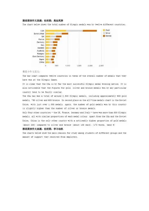
雅思图表作文真题:柱状图:奥运奖牌The chart below shows the total number of Olympic medals won by twelve different countries.雅思小作文范文:The bar chart compares twelve countries in terms of the overall number of medals that they have won at the Olympic Games.It is clear that the USA is by far the most successful Olympic medal winning nation. It is also noticeable that the figures for gold, silver and bronze medals won by any particular country tend to be fairly similar.The USA has won a total of around 2,300 Olympic medals, including approximately 900 gold medals, 750 silver and 650 bronze. In second place on the all-time medals chart is the Soviet Union, with just over 1,000 medals. Again, the number of gold medals won by this country is slightly higher than the number of silver or bronze medals.Only four other countries - the UK, France, Germany and Italy - have won more than 500 Olympic medals, all with similar proportions of each medal colour. Apart from the USA and the Soviet Union, China is the only other country with a noticeably higher proportion of gold medals (about 200) compared to silver and bronze (about 100 each).(178 words, band 9)雅思图表作文真题:柱状图:学习动机The charts below show the main reasons for study among students of different groups and the amount of support they received from employers.参考雅思小作文范文The bar charts compare students of different ages in terms of why they are studying and whether they are supported by an employer.It is clear that the proportion of students who study for career purposes is far higher among the younger age groups, while the oldest students are more likely to study for interest. Employer support is more commonly given to younger students.Around 80% of students aged under 26 study to further their careers, whereas only 10% study purely out of interest. The gap between these two proportions narrows as students get older, and the figures for those in their forties are the same, at about 40%. Students aged over 49 overwhelmingly study for interest (70%) rather than for professional reasons (less than 20%).Just over 60% of students aged under 26 are supported by their employers. By contrast, the 30-39 age group is the most self-sufficient, with only 30% being given time off and help with fees. The figures rise slightly for students in their forties and for those aged 50 or more.(178 words, band 9)雅思图表作文真题:柱状图:The chart below shows numbers of incidents and injuries per 100 million passenger miles travelled (PMT) by transportation type in 2002.雅思小作文范文The bar chart compares the number of incidents and injuries for every 100 million passenger miles travelled on five different types of public transport in 2002.It is clear that the most incidents and injuries took place on demand-response vehicles. By contrast, commuter rail services recorded by far the lowest figures.A total of 225 incidents and 173 injuries, per 100 million passenger miles travelled, took place on demand-response transport services. These figures were nearly three times as high as those for the second highest category, bus services. There were 76 incidents and 66 people were injured on buses.Rail services experienced fewer problems. The number of incidents on light rail trains equalled the figure recorded for buses, but there were significantly fewer injuries, at only 39. Heavy rail services saw lower numbers of such events than light rail services, but commuter rail passengers were even less likely to experience problems. In fact, only 20 incidents and 17 injuries occurred on commuter trains.(165 words, band 9)雅思图表作文真题:柱状图:各地房价The chart below shows information about changes in average house prices in five different cities between 1990 and 2002 compared with the average house prices in 1989.雅思小作文范文:The bar chart compares the cost of an average house in five major cities over a period of 13 years from 1989.We can see that house prices fell overall between 1990 and 1995, but most of the cities saw rising prices between 1996 and 2002. London experienced by far the greatest changes in house prices over the 13-year period.Over the 5 years after 1989, the cost of average homes in Tokyo and London dropped by around 7%, while New York house prices went down by 5%. By contrast, prices rose by approximately 2% in both Madrid and Frankfurt.Between 1996 and 2002, London house prices jumped to around 12% above the 1989 average. Homebuyers in New York also had to pay significantly more, with prices rising to 5% above the 1989 average, but homes in Tokyo remained cheaper than they were in 1989. The cost of an average home in Madrid rose by a further 2%, while prices in Frankfurt remained stable. (165 words)雅思图表作文真题:饼状图:垃圾处理The pie charts below show how dangerous waste products are dealt with in three countries.雅思小作文范文:The charts compare Korea, Sweden and the UK in terms of the methods used in each country to dispose of harmful waste.It is clear that in both the UK and Sweden, the majority of dangerous waste products are buried underground. By contrast, most hazardous materials in the Republic of Korea are recycled.Looking at the information in more detail, we can see that 82% of the UK’s dangerous waste is put into landfill sites. This disposal technique is used for 55% of the harmful waste in Sweden and only 22% of similar waste in Korea. The latter country recycles 69% of hazardous materials, which is far more than the other two nations.While 25% of Sweden's dangerous waste is recycled, the UK does not recycle at all. Instead, it dumps waste at sea or treats it chemically. These two methods are not employed in Korea or Sweden, which favour incineration for 9% and 20% of dangerous waste respectively.(159)。
2020雅思小作文考官范文(线形图题型)主题:老年人口题型:线图The graph below shows the proportion of the population aged 65 and over between 1940 and 2040 in three different countries满分范文:The line graph compares the percentage of people aged 65 or more in three countries over a period of 100 years.It is clear that the proportion of elderly people increases in each country between 1940 and 2040. Japan is expected to see the most dramatic changes in its elderly population.In 1940, around 9% of Americans were aged 65 or over, compared to about 7% of Swedish people and 5% of Japanese people. The proportions of elderly people in the USA and Sweden rose gradually over the next 50 years, reaching just under 15% in 1990. By contrast, the figures for Japan remained below 5% until the early 2000s.Looking into the future, a sudden increase in the percentage of elderly people is predicted for Japan, with a jump of over 15% in just 10 years from 2030 to 2040. By 2040, it is thought that around 27% of the Japanese population will be 65 years old or more, while the figures for Sweden and the USA will be slightly lower, at about 25% and 23% respectively.主题:手机变迁题型:线图The line graph shows the average annual expenditures on cell phone and residential phone services between 2001 and 2010.范文:The line graph compares average yearly spending by Americans on mobile and landline phone services from 2001 to 2010.It is clear that spending on landline phones fell steadily over the 10-year period, while mobile phone expenditure rose quickly. The year 2006 marks the point at which expenditure on mobile services overtook that for residential phone services.In 2001, US consumers spent an average of nearly $700 on residential phone services, compared to only around $200 on cell phone services. Over the following five years, average yearly spending on landlines dropped by nearly $200. By contrast, expenditure on mobiles rose by approximately $300.In the year 2006, the average American paid out the same amount of money on both types of phone service, spending just over $500 on each. By 2010, expenditure on mobile phones had reached around $750, while the figure for spending on residential services had fallen to just over half this amount.主题:网络使用题型:线图The line graph below shows internet usage in different countries.范文:The line graph compares the percentage of people in three countries who used the Internet between 1999 and 2009.It is clear that the proportion of the population who used the Internet increased in each country over the period shown. Overall, a much larger percentage of Canadians and Americans had access to the Internet in comparison with Mexicans, and Canada experienced the fastest growth in Internet usage.In 1999, the proportion of people using the Internet in the USA was about 20%. The figures for Canada and Mexico were lower, at about 10% and 5% respectively. In 2005, Internet usage in both the USA and Canada rose to around 70% of the population, while the figure for Mexico reached just over 25%.By 2009, the percentage of Internet users was highest in Canada. Almost 100% of Canadians used the Internet, compared to about 80% of Americans and only 40% of Mexicans.。
WRITING TASK 1You should spend about 20 minutes on this task.The graph below gives information about cinema attendancein Australia between 1990 and the present, with projections to 2010.Summarise the information by selecting and reporting the main features, and make comparisons where relevant.Write at least 150 words.The graph shows percentages of cinema attendance at least once a year in Australia between 1990 to 2010 with projections for the future. The graph is described by 4 groups of different ages which are 14 to 24, 25 to 34, 35 to 49 and over 50 year olds.The youngest age group people have been going to cinema more than any other age groups and the percentage has been keeping very high at approximately90% since 1990. It is predicted to keep the high and to increase more from 2006.The middle age groups people have enjoyed going cinema between 60% to 80%. The percentage of age 25 to 34 group has been higher than the one of age 35 to 49 group but from 2006 the percentage of 25 to 34 year olds people will decrease while the one of35 to 49 year olds people will increase and get higher than the other one.The oldest people seem to go cinema less than the other groups but the percentageof the attendance has slightly going up by 15% from 40% to 55% between 1990 to 2004 and it will keep increasing to 60% by 2010.Overall, it seems the younger age people, the more going to cinema.(210 words)【考官评语】Band 6This response addresses the requirements of the task and selects relevant material to describe. Key features and an overview are presented, although clearer highlighting, more support and a more comprehensive overview would be needed to reach a higher band. Information is well-organised and there is a clear overall progression in the response. There is some effective use of cohesive devices, but only limited use of reference and substitution. The range of vocabulary is not wide, but it is adequate for the task. Control of word form and spelling is consistentlygood, although there are some clumsy noun phrases that indicatelimited flexibility. The candidate attempts to use a mix of simple and complex sentences, but control is variable and grammatical errors or omissionsare quite intrusive at times. Figures are poorly integrated into sentences and indicate evident limitations.。
雅思写作 – LINE GRAPH
WRITING TASK 1 (
Test 2, Cambridge IELTS 7)
You should spend about 20 minutes on this task.
This graph below shows the consumption of fish and some different kinds of meat in a
European country between 1979 and 2004.
Summarise the information by selecting and reporting the main features, and make
comparisons where relevant.
Write at least 150 words.
范文
The graph illustrates changes in the amount of beef, lamb, chicken and fish
consumed in a particular European country between 1979 and 2004.
In 1979, beef was by far the most popular of these foods, with about 225 grams
consumed per person per week. Lamb and chicken were eaten in similar quantities
(around 150 grams), while much less fish was consumed (just over 50 grams).
However, during this 25-year period the consumption of beef and lamb fell
dramatically to approximately 100 grams and 55 grams respectively. The consumption
of fish also declined, but much less significantly to just below 50 grams, so although
it remained the least popular food, consumption levels were the most stable.
The consumption of chicken, on the other hand, showed an upward trend,
overtaking that of lamb in 1980 and that of beef in 1989. By2004 it had soared to
almost 250 grams per person per week.
Overall, the graph shows how the consumption of chicken increased dramatically
while the popularity of these other foods decreased over the period.
(173 words)
WRITING TASK 1 (
Test 4, Cambridge IELTS 8)
范文
The graph illustrates the quantities of goods transported in the United
Kingdom by four different modes of transport between the time period of 1974
and 2002. Over this span of 28 years, the quantities of goods transported by
road, water and pipeline have all increased while the quantity transported by
rail has remained almost constant at about 40 million tonnes.
The largest quantity of goods transported both in 1974 and 2002 was by
road (70 million tonnes and 98 million tonnes respectively) while the lowest
both in 1974 and 2002 was by pipeline (about 5 million tonnes and 22 million
tonnes respectively). The amount of goods transported by water was constant
from 1974 to 1978, where it showed an exponential growth, rising to almost
60 million tones after which it plateaued for about 20 years before starting to
rise gradually again.
The amount of goods transported by rail is almost constant at 40 million
tonnes in 1974 and 2002, with decreases in quantity in between the years. It
is also interesting to note that almost all showed a decrease in 1994 in
amount of goods transported except for the pipeline, which actually peaked in
that year.
In conclusion the road remains the most popular method of transporting
goods in the UK while water and pipelines are becoming increasingly used. In
contrast, rail has not become more popular as a method of transport.
WRITING TASK 1 (
Test 4, Cambridge IELTS 9)
范文
The graph shows energy consumption in the US from 1980 to 2012, and
projected consumption to 2030.
Petrol and oil are the dominant fuel sources throughout this period, with 35
quadrillion (35q) units used in 1980, rising to 42q in 2012. Despite some initial
fluctuation, from 1995 there was a steady increase. This is expected to
continue, reaching 47q in 2030.
Consumption of energy derived from natural gas and coal is similar over the
period. From 20q and 15q respectively in 1980, gas showed an initial fall and
coal a gradual increase, with the two fuels equal between 1985 and 1990.
Consumption has fluctuated since 1990 but both now provide 24q. Coal is
predicted to increase steadily to 31q in 2030, whereas after 2014, gas will
remain stable at 25q.
In 1980, energy from nuclear, hydro- and solar/wind power was equal at only
4q. Nuclear has risen by 3q, and solar/wind by 2. After slight increases,
hydropower has fallen back to the 1980 figure. It is expected to maintain this
level until 2030, while the others should rise slightly after 2025.
Overall, the US will continue to rely on fossil fuels, with sustainable and
nuclear energy sources remaining relatively insignificant.