雅思写作(三)数据图表类作文讲解及范文讲解
- 格式:pptx
- 大小:667.88 KB
- 文档页数:71
雅思小作文写作技巧及范文一.图表类型饼状图,直方图或柱形图趋势曲线图表格图流程图或过程图程序图二.解题技巧A. 表格图1 横向比较: 介绍横向各个数据的区别,变化和趋势2 纵向比较:介绍横向各个数据的区别,变化和趋势3 无需将每一个数据分别说明,突出强调数据最大值和最小值,对比时要总结出数据对比最悬殊的和最小的说明:考察例举数字的能力和方法。
注意怎样通过举一些有代表性的数据来有效地说明问题。
B. 曲线图1 极点说明: 对图表当中最高的,最低的点要单独进行说明2 趋势说明: 对图表当中曲线的连续变化进行说明,如上升,下降,波动,持平3 交点说明: 对图表当中多根曲线的交点进行对比说明说明:关键是把握好曲线的走向和趋势,学会 general classification, 即在第二段的开头部分对整个曲线进行一个阶段式的总分类,使写作层次清晰。
接下来在分类描述每个阶段的 specific trend, 同时导入数据作为你分类的依据。
注意不要不做任何说明就机械性的导入数据!可以使用一些比较 native 的单词和短语来描述 trend。
C. 饼状图1 介绍各扇面及总体的关系2 各个扇面之间的比较,同类扇面在不同时间,不同地点的比较3 重点突出特点最明显的扇面:最大的,最小的,互相成倍的D. 柱状图1. 比较 : similarity2.对比 : difference)3.横向总结所有柱状图表的共性特征 & 分别描写各个柱子的个性特征E.流程图1.首先说明:做什么工作的过程,目的是什么 2.准备工作 3.按时间/过程先后描述4.结果 5.简单总结说明:注意流程图里的“因果关系” 或每一流程的“承前启后” 关系;表达每一流程的主体内容,阐明这种关系;揭示其内在联系或规律;最后,给予简要归纳和总结。
F. 实物/器具工作过程 1.实物的名称,功能 2.基本结构 3.工作过程 4.简单总结G. 综合图1 不求甚解,不拘泥于细节2 分门别类,分段落详细介绍各个图表3 不画蛇添足,主观臆断或猜测图表之间的关系三.写作结构框架结构1.开头:该图阐述的是______ 的______.共有以下几个部分组成。
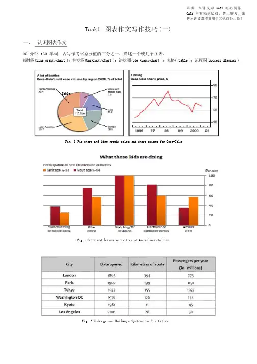
声明:本讲义为GARY 呕心制作,GARY 享有独家版权,禁止转发、出售本讲义或将其用于其他商业用途!Task1 图表作文写作技巧(一)一、认识图表作文20 分钟 150 单词,占写作考试总分值的三分之一,描述一个或几个图表。
线性图(line graph/chart );柱状图(bargraph/chart );饼状图(pie graph/chart );表格( table );流程图(process diagram ) Table:Fig. 1 Pie chart and line graph: sales and share prices for Coca-ColaFig.2 Preferred leisure activities of Australian childrenFig. 3 Underground Railways Systems in Six Cities二、图表作文审题要素1. 描述对象整个图表的数据都是针对描述对象的。
图表的上方标题一般会指示描述对象。
弄清描述对象非常重要,因为在行文时,需要频繁地用到它。
如:sales of Coca Cola,share price of Coca Cola,the preferred leisure activities of Australian kids aged 5-14, wages growth rate。
2. 描述单位对于有 X 轴(horizontal axis)和 Y 轴(vertical axis)的图表,描述单位一般在 Y 轴以符号的形式标明。
弄清描述单位对于数据的准确描述非常关键,把握不准的话就容易被当做跑题。
一般要弄清数字 ( number )和百分比( percentage; proportion )的区别。
另外,记住几个常用的单位缩写符号:$:dollarbn:billionm: million 或 metrekm: kilometre%: percentage / proportion 区别: per cent,000s: thousand比如,第一页的描述单位: bottle / percentage (pie chart), dollar (line chart), percentage (bar chart) 三、图表作文标准结构Part 1 开头段,介绍写作目的,需包含四个要素:图表类型主要描述动词describe,show,present,depict,indicate,representcompare / make a comparison between …描述对象背景信息(地点 + 时间)例如:The line graph gives some detailed information about the wages growth rate of some country over adecade from 1993 to 2003.The pie charts below show the percentage of men and women who smoked in Australia during a 40-yearperiod, between 1960 and 2000.Part 2 主体段:1 + N 结构1: 一句话概括总趋势或总特征( general trend or feature )套句:… have shown striking changes/differences.N: N 段 ( N≥1 )细节描述( striking trends or features )Part 3 结尾段结尾段给出结论。
雅思图表类英语作文模板【篇一:雅思图表作文模板】1 according to the chart```2 the date lead us to the conclusion that```3 the date show```4 the tree diagram reveals how```5 the figures show```6 this is a cure graph which describes the trend of```7 the pie graph depicts```8 the graph provides some interesting date regrarding```9 the table shows the changes in the number of ``` over the period from ```to ```10 as is shown in the table ```11 from the table ,we can clearly see that ```12 this table shows the changing proportion of x and y from ``` to ````13 the graph,presented in a pie chart, shows the general trend in```14 as can be seen from the grape ,the two curves show the flutuation of ```15 over the period from ```to ```the```remained level.16 in the year between ```and ```.17 in the 3 years spanning from 2005 through 2008.18 the number of ``` remained steady from ```to ````.19 the number sharply went up to ```20 the percentage of ``` stayed the same between ``` and ```21 the percentage remainede steady at```22 the percentage of ```is sightly large than that of.23 there is not a great deal of differece between ```and ```24 the graphs show a three fold increase in the number of ```25 ```decreased year by year while ```increased steadily.26 there is an upward trend in the number of ```27 a considerable increase occurred from ```to ```28 from ```to ```the rate of decrease slow down.29 from this year on,there was a gradual declinel reduction in the ```reaching a figure of.30 be similar to ```be the same as31 there are a lot similarities between ```and ```32 the difference between x and y lies in ``para 1,两句话:第一句:this is a _____chart, which demonstrates the number of_____ from ____ to____. 如果两个图,则:there are two charts below. the _____ chart describes the number of_____, and the _____ chart illustrates the figure of ____. 第二句:(所有题目适用),from thechart we can see that the number of ______ variesconstantly/greatly in _____. )para 2, as we can see from the chart,/or it is clear from thechart that ____. 如果有两个图:则:the _____ chart shows that ______./or as we can see from the first chart, _______para 3, (如果两个图的话,) it is clear from the second chartthat ?para 4 结尾:from the figures/statistics above, we cansee/conclude/draw a conclusion that ?the bar chart indicates the current situation of the amount of money spent on fastfoods according to different income classes in britain.for those who belong to the high-income class, hamburgerhas been shown to beperson per week. by contrast fish and chips remain at a rather low level of about 16pence per person per week, and pizza, though attracts more expenses, accounts for 19pence per person per week, merely 3 pence more than that of fish and chips.as expected, low-income class spend much less in all 3 categories than high-incomeclass, with fish and chips at the top of the list at 15 pence per capital per week, andpizza at the bottom at a weekly expense of 8 pence per capital. the average income group resembles high-income class in hamburger consumptionat the largest amount of 33 per person every week, and low-income class in pizzaconsumption at the smallest amount of 11 per person every week, but amazingly, fishand chips consumed by this group leads all classes at a weekly expense of 25 penceper person.in conclusion, hamburgers, in general gain more welcome than other types of fastfood.para1. this is a table / chart / (line线状 bar柱状 pie饼状)graph which demonstrate / illustrate /reveal /depict /privide information about.............para2.(1)obvious /apparent from the graph is that ...rank thefirst/highest,while/whereas ....turn out tobe the lowest(2)it is exhibited/shown in the table that.....(3)it can be seen from the table that.....para3.(1)饼.柱图 a,which accounts for...%,ranks the first;then next is b with...%;followed byc,constituting...%;finally it comes d.e.fat...%...%and...%respectively(2)特殊变化(不变,增长或下降多的)(3)①it is worth mentioning that.... ②it must be pointed out that.... ③morestriking/suprising is that.... para4.to conclude /inconclusion/overall1. 最明显的原因__,因此___the most obvious reason for this phenomenon is that_____consequently, ____.2. 无论你喜欢与否,_____已经变得越来越流行,这是有原因的no matter you like it or not, aaa has become more and more popular and there are many reasonfor it.3. 对我们来说,改变这个不利的环境____是非常紧急的it’s an urgent task for us to change this unfavorable situation: ____.4. 这个图片会让你想起一些奇怪的东西,这种现象还是会继续存在这个社会the picture can reminds you of some strange, yet familiar phenomena existing in our society.5. 提供了大量的解决方案,一些人建议___,另一些人建议___a great number of solutions are being offered. some people suggest that ____. others argue that .6. 对于____,我们应该____confronted with aaa, we should take a serious of effective measures to cope with thesituation.7. 然而,___引起了许多为问题,however____ may cause some problems. first, it is__second, __. finally, ____. so, it is clear that__has its advantages and disadvantages.8. 虽然_____有一个__的非常大的好处,但是它不能完全__在__方面although _____ has a great advantage of _____, it cant compete with ____ in ____.9. _____也许更喜欢_____,但是_____忍受_____的不利之出_____may be preferable to ____, but it suffers from the disadvantages that___.10. _____的有利之处比____的有利之处要多,举例说明,_____the advantages of ______are much greater that thoseof____.for instance, ___.11.but i don’t think it is a very good way to solve ___. for instance, _____.worst of all,______.12.there are many ways to ______. first, _____. second, _____. third, ___.13.on the contrary, there are some people in favor of _____.14.they believe___. moreover, they think____. there are several measures for us to adopt. first,we can____, there are a number of advantages of ____. another solution is to _____.15.it is high time that something was done about it. for example,_____. in addition,_____. all these measures will certainly _.16. there are some other people, who______. their reasons are different, something for _____,sometimes for____, and sometimes simply for _____.17._____ is necessary and important to our country’s development and construction. first, ____.what’s more, ___. most important of all,___.18.however, if not managed properly, ____ can create many problems.sometimes ____.furthermore,_. therefore, ___ has been gaining public concern.19.有很多原因____,①there are probably many reasons for ____. first, ____.②second, ____. finally, ___.there are, i think, two main reasons for __. in the first place, ___. in the second place, __. therefore,③well, why is there ____? i think there might be two reasons. one is ___, and the other is _____.④why___? for one thing, ____. for another,____. perhaps the main reason is ___.⑤why_____? the first reason is that___. the second reason is ___. the third is__. for all this,the main cause of_____ is due to ____.20.it is no easy job to find the reasons for this tendency which involves several complicated factors. for some ___. for others ____.21. “why do _____?” many people often ask questions like this.22. in recent years, there is a general tendency to ___. according to a study, there is__. comparedwith __ last year. why _____?23.according to a survey, there is a growing number of ___. what brings this result? the mainreason rests with.24.①some people prefer to ___. in their opinion, ____. in addition, ____. nevertheless,nowadays, __ has become more and more common.②many people are inclined to____. in their opinion, ___.they believe that ___.25. today, there __, which have brought a lot of harms in our daily life. first, __ second, ____. what makes things worse is that ___.26.nowadays, ___ has become a problem we have to face. though it’s easier said than done, with the help of modern technology, we now have many means to solve it.27. 对于这个图,说明了_①the graph shows the general trend in _______.②according to the figures/numbers/statistics/percentages in the table/chart/bar graph/line graph, it can be seen that ___. obviously, ____, but why?③the figure indicates/shows/suggests/proves that___. there isa steady/rapid development/trend of _.④from the graph/chart, we know the statistics of __ and _. it can be seen easily that ___.⑤according to the two graphs presented, it can be observed that ___ in the left graph, __. at the same time, _ as the right graph shows.28. 现在我们经常听到_____,但是真的如此吗?①these days we are often told that ____. but is it true?②these days we often hear about ___. but is this really the case?29. 一位著名的作家曾经说过_____one of the great writers once said that _. now it still has a realistic significance.30. 回看历史,______的想法从来都没流行过,一方面_____另一方面______in our history, the idea that ____ never has been so popular. on one hand, ___, on the other hand,31. 人们中有许多像____不同的意见,一些人认为_______there are different opinions among people as to ____. some people suggest that __.32. 一些人认为__对_______来说在许多方面都是好的,然而,其他人不同意some people hold the opinion that _ is superior to __ in many ways: others, however, disagree with it.33. 现在虽然越来越多的人___,但仍有一些__的人,他们也许认为_____nowadays although more and more people __, still there are some who think __, they may think【篇二:雅思图表作文模板20篇下载】智课网ielts备考资料雅思图表作文模板20篇下载摘要:雅思图表作文模板20篇下载。
回顾近两个月的雅思考试,表格图的出现频率有所上升,在4月底至5月底,甚至出现了连考三次的情况。
许多学生都表示对这种图表心存恐惧,研究中心分析认为主要源于以下几个原因:1)表格图包含数据较多;如果将数据进行逐一列举,句式显得单调且对数据缺乏分析,势必影响得分。
2)数据涉及分类层次复杂;在短短的几十分钟里,很难迅速对表格做出准确而得当的分类并选择典型值。
根据以上两个令学生望而却步的症结,可以得出表格题的核心在于:分类及典型值的抓取。
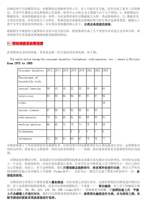
根据教学中观察的大量图表以及高分范文的分析,将表格图分成了几个类型并对其进行总结和分析,希望帮助学生更系统更准确地把握表格图的特征:1 有时间因素的表格图此类图表包含时间因素,常常是反映一些方面的变化和发展,如下图:The table below show s the consumer durables (telephone, refrigerator, etc.) owned in Britain from 1972 to 1983.容较为单纯,很容易让人联想到一类较为简单的图表——线图。
我们就来看看是否能够将其转化为线图。
对图表进行横向分析,发现我们可以借助线图的趋势表达来描写各电器百分比的变化,但同时也会陷入一个误区,即面面俱到,对每次变化都进行说明,许多学生会不断重复上升下降等句子,对自己的作文心存疑虑。
实际上,对于这种图表,我们只需观察总趋势即可,将首尾年份进行比较,得出几乎所有的电器的家庭占有率都呈上升趋势(Video除外)。
至此为止,我们只完成了图表分析的其中一步:典型值的抓取。
对图表的分类来自于图表设置的最初理念,对各电器之间进行对比,这就需要我们对图表进行纵向分析,对于这种相同趋势的图表,这里可以借助线图的另一个要素——变化幅度。
从上至下的幅度计算分别为25%, 5%,8%,21%,14%,2%,35%(video除外),思路就更为清晰,即按照快速上升,平稳上升及缓慢上升进行对比。

雅思英语图表作文范文第1篇A类雅思各类图表作文要点及范文一.曲线图解题关键1曲线图和柱状图都是动态图,解题的切入点在于描述趋势。
2在第二段的开头部分对整个曲线进行一个阶段式的总分类,使写作层次清晰,同时也方便考官阅卷。
接下来再分类描述每个阶段的specifictrend,同时导入数据作为分类的依据。
3趋势说明。
即,对曲线的连续变化进行说明,如上升、下降、波动、持平。
以时间为比较基础的应抓住“变化”:上升、下降、或是波动。
题中对两个或两个以上的变量进行描述时应在此基础上进行比较,如变量多于两个应进行分类或有侧重的比较。
4极点说明。
即对图表中最高的、最低的点单独进行说明。
不以时间为比较基础的应注意对极点的描述。
5交点说明。
即对图表当中多根曲线的交点进行对比说明。
6不要不做任何说明就机械地导入数据,这不符合雅思的考试目的。
曲线图常用词汇动词—九大运动趋势一:表示向上:increase,rise,improve,grow,ascend,mount,aggrandize,goup,climb, take off, jump,shoot up暴涨,soar,rocket, skyrocket雅思英语图表作文范文第2篇It is said that countries are becoming similar to each other because of the global spread of the same products, which are now available for purchase almost anywhere. I strongly believe that this modern development is largely detrimental to culture and traditions worldwide.A country’s history, language and ethos are all inextricably bound up in its manufactured artefacts. If the relentless advance of international brands into every corner of the world continues, these bland packages might one day completely oust the traditional objects of a nation, which would be a loss of richness and diversity in the world, as well as the sad disappearance of t he manifestations of a place’s character. What would a Japanese tea ceremony be without its specially crafted teapot, or a Fijian kava ritual without its bowl made from a certain type of tree bark?Let us not forget either that traditional products, whether these be medicines, cosmetics, toy, clothes, utensils or food, provide employment for local people. The spread of multinational products can often bring in its wake a loss of jobs, as people urn to buying the new brand,perhaps thinking it more glamorous than the one they are used to. This eventually puts old-school craftspeople out of work.Finally, tourism numbers may also be affected, as travelers become disillusioned with finding every place just the same as the one they visited previously. To see the same products in shops the world over is boring, and does not impel visitors to open their wallets in the same way that trinkets or souvenirs unique to the particular area too.Some may argue that all people are entitled to have access to the same products, but I say that local objects suit local conditions best, and that faceless uniformity worldwide is an unwelcome and dreary prospect.Heres my full answer:The line graphs show the average monthly amount that parents in Britain spent on their children’s s porting activities and the number of British children who took part in three different sports from 2008 to is clear that parents spent more money each year on their children’s participation in sports over the six-year period. In terms of the number of children taking part, football was significantly more popular than athletics and 2008, British parents spent an average of around £20 per month on their children’s sporting activities. Parents’ spending on children’s sports increased gradually over the followi ng six years, and by 2014 the average monthly amount had risen to just over £ at participation numbers, in 2008 approximately 8 million British children played football, while only 2 million children were enrolled in swimming clubs and less than 1 million practised athletics. The figures for football participation remained relatively stable over the following 6 years. By contrast, participation in swimming almost doubled, to nearly 4 million children, and there was a near fivefold increase in the number of children doing athletics.剑桥雅思6test1大作文范文,剑桥雅思6test1大作文task2高分范文+真题答案实感。


完整版)雅思经典图表作文范文XXX in fast food and sit-down restaurants.As can be seen from the charts。
XXX over the years。
In 1970.only 25% of a family's food budget was spent on eating out。
but this figure rose to almost 50% in 2000.This trend is likely dueto the XXX.The graph shows that the number of meals eaten in fast food restaurants has increased significantly compared to sit-down restaurants。
In 1980.the average person ate 20 meals in fast food restaurants and 60 meals in sit-XXX。
by 2000.the average person ate 60 meals in fast food restaurants and only 20 meals in sit-XXX fast-XXX society。
XXX.XXX。
XXX a negative one。
as it allows XXX。
it is XXX.Over the past three decades。
XXX。
In 1970.only 10% of the food budget was XXX。
but by 1980.this had increased to 15%。
In 1990.the pXXX 35%。
and in 2000.it rose again to 50%。
The n of family restaurant meals has also changed over the years。

雅思小作文表格图实例分析HEN system office room 【HEN16H-HENS2AHENS8Q8-HENH1688】雅思小作文表格图实例分析朗阁海外考试研究中心表格图是雅思小作文的常考图形之一,也是烤鸭们在备考时必须要准备的一类题型。
那么烤鸭们具体应该如何准备表格图呢?下面,朗阁海外考试研究中心的专家将以一道具体的实例,就这一题型的解题思路和步骤做出详尽的分析和解答。
The table below shows personal savings as a percentage of personal income for selected countries in 1989, 1999 and 2009.Personal savings as a percentage of personal income一、审题,决定大体写作方式首先,读题目,了解到这幅表格图是关于“几个国家的人民个人收入中存款的百分比”以及三个时间点(据此,正文部分描述存款率是时态基调为过去时)。
表格上方的title和题目表述一样,没有额外信息,因此,读一遍即可。
然后,审具体表格,决定大致写作方向和方式,即分段方式。
表格的审图需要注意以下几个方面:横轴,纵轴和总体数据特征。
此图中的横纵轴分别是时间和7个研究对象——7个国家。
横纵轴中间有一栏为时间,那说明,此图原则上应该按曲线图原理来写——即,描述7个国家存款率上升或下降趋势;但是,经过下一步对表格中数据总体特征的总结发现:7个国家的存款率在这一段时间内总体呈现下降趋势。
这一发现说明,如果继续按照曲线图原理描述,文章会非常单调,而且对比的空间也不大;相反,同一年份里,几个国家之间的差距很大。
因此,正文部分应该按时间分成三个段落,对比同一时间内,7个国家之间的存款率的高低。
最后,审题的最后一关是总结表格中数据的明显特征。
正文主要是从时间角度,纵向对比几个国家。
但是,我们同时也需要反方向观察和对比,也就是,几个国家内部不同时间内存款率的起伏。
雅思写作备考中的图表数据描述与分析方法在雅思写作备考中,图表数据的描述与分析方法是一个关键的技巧。
图表数据描述与分析旨在帮助考生清晰地传达图表中的信息,并展示对数据的深入理解。
本文将介绍一些有效的方法来描述和分析雅思写作中的图表数据。
一、图表数据描述1. 描述整体趋势:首先,我们可以描述图表中呈现的整体趋势。
可以使用类似于“总体来看”、“总体趋势是”等短语来引出描述。
例如,如果图表显示了过去几年某个城市的人口变化情况,可以说“总体来看,该城市的人口在近几年稳定增长”。
2. 细节描述:接下来,我们需要针对图表中的具体数据进行描述。
可以使用具体的数字、比例或百分比等来描述。
例如,如果图表显示了某个国家不同年龄段的人口比例,可以说“18至30岁年龄段的人口占总人口的30%,是各个年龄段中的最高比例”。
3. 时间和地点描述:如果图表中涉及到时间和地点的变化,我们也需要对其进行描述。
可以使用时间词和地点词来具体说明。
例如,如果图表显示了某个地区不同月份的降水量情况,可以说“6月份的降水量最高,为100毫米”。
二、图表数据分析1. 找出关键信息:在分析图表数据时,需要从中挑选出关键的信息。
这些关键信息可能是特殊的数据点、变化的趋势或者与主题相关的数据。
通过找出这些关键信息,可以帮助我们进行更有针对性的分析。
2. 建立对比:图表数据可以提供不同变量之间的比较基础。
在分析时,可以通过对比不同变量的数据来突出差异和相似之处。
例如,如果图表显示了不同国家的能源消耗量,可以对比两个或多个国家之间的差异并分析原因。
3. 确定影响因素:对图表数据进行深入分析时,需要确定可能影响数据变化的因素。
这些因素可能是经济因素、政治因素、社会因素等。
通过分析这些因素与数据的关系,可以深入理解数据的背后含义。
4. 展望未来趋势:在分析图表数据时,考生可以尝试根据已有数据预测未来的趋势。
这要求考生具备一定的推理能力和对数据的深入理解。
通过展望未来,可以增加文章的可读性和独特性。
雅思小作文图表题的分析技巧第一篇:雅思小作文图表题的分析技巧雅思小作文图表题的分析技巧柱状图:“比较”(找出similarity)和“对比”(找出difference),是写作的关键,既要横向总结所有柱状图表的共性特征,也要分别描写各个柱子的个性特征。
饼图:是所有图表题中最好写的一种,值得注意的是要处理好怎样丰富百分比的表达和“占”的表达。
不要一直用数字加百分比的格式,如25%。
特定的数字可以采取多样性的表达,如25%=a quarter of, 50%=half of, >50%=a,or the majority of。
曲线图:关键是把握好曲线的走向和趋势,学会general classification,即在第二段的开头部分对整个曲线进行一个阶段式的总分类,使写作层次清晰。
接下来在分类描述每个阶段的specific trend,同时导入数据作为你分类的依据。
注意不要不做任何说明就机械性的导入数据!可以使用一些比较native的单词和短语来描述trend。
表格题:考察例举数字的能力和方法。
注意怎样通过举一些有代表性的数据来有效地说明问题。
流程图:注意流程图里的“因果关系”或每一流程的“承前启后”关系;表达每一流程的主体内容,阐明这种关系;揭示其内在联系或规律;最后,给予简要归纳和总结。
以上美联英语学习网为各位考生整理了雅思小作文图表题的分析技巧,供考生们参考使用。
第二篇:雅思小作文---TASK1图表题雅思小作文TASK1图表题规律注意事项:1.Task1是客观写作,要求客观真实。
2.客观性:不应该有任何图里没有而靠自己主观想象加入的成分。
结尾段针对图形做出的总结性结论也应该是根据图表的实际内容做出的符合逻辑的总结。
准确性:图表里面的数据介绍要力求精确,不能抄错数字。
但当一个特征点没有落在一个准确的坐标值上时,允许进行合理的目测或估计一个大概数值。
详尽性:要有层次感,并不需要把所有的数字都推到文章里。
雅思写作小作文范文雅思写作柱状图bar chart 游戏销售量今天我们雅思写作小作文范文的文章来研究下柱状图bar chart。
这次图表的内容为四种游戏平台从2000年到2006年这7年间的销量。
图中用不同的颜色来表示不同的游戏类型,共有28个数据。
因为数据较多,相当考验大家分类对比的能力。
小编搜集了一篇相应的考官范文,以供大家参考。
雅思写作小作文题目The bar graph shows the global sales (in billions of dollars) of different types of digital games between 2000 and 2006.Summarise the information by selecting and reporting the main features, and make comparisons where relevant.雅思写作小作文范文The bar chart compares the turnover in dollars from sales of video games for four different platforms, namely mobile phones, online, consoles and handheld devices, from 2000 to 2006.柱状图比较了从2000年到2006年四个不同平台视频游戏以美元计算的销量,即移动电话,互联网,控制台和手持装置。
It is clear that sales of games for three out of the four platforms rose each year, leading to a significant rise in total global turnover over the 7-year period. Sales figures for handheld games were at least twice as high as those for any other platform in almost every year.很明显,四种平台中三种的游戏销量都逐年上升。
雅思图表作文:一.图表的种类(表格,柱状图,线形图,饼状图,流程图,地图等)二.解题思路:开头段改写题目,正文段学会分组,结尾段学会总结。
(一定要与不要)三.学员问题:分组问题,时态问题,常备词汇,短语记不住,不会用。
四.常备词汇五.写什么?:起点(最高值),终点(最低值),拐点,交点,变化趋势,总数(末段)第一类:表格题目:剑桥7, Test 1 Writing Task 1You should spend about 20 minutes on this task.The table below gives information on consumer spending on different items in five different countries in 2002.Summarise the information by selecting and reporting the main features, and make comparisons where relevant.Write at least 150 words.Percentage of national consumer expenditure by category-2002参考范文:The table gives the breakdown about data on consumer spending on various items (Food/Drink/Tobacco, Clothing/Footwear and Leisure/Education) in five different countries (Ireland, Italy, Spain, Sweden and Turkey) in 2002.Generally, each country consumed much more in food/drink/tobacco where Turkey dominated the first place with 32.14%, standing in marked contrast with Sweden (only 15.77%) than in other 2 categories. In terms of Clothing/Footwear, Italy expectedly spent most with 9% compared with still Sweden seeing the smallest proportion (5.4%). As for Leisure/Education, it was Turkey and Spain that consumed the most and least with 4.35% and 1.98% respectively.Additionally, we can see immediately that in food/drink/tobacco, after Turkey, Ireland,Spain and Italy came in turn with 28.91%, 18.80% and 16.36%. On the contrary, in Clothing/Footwear, we failed to see big gap from Ireland, Spain and Turkey in middle positions which saw different reductions of 2.57%, 2.49% and 2.37% in comparison with Italy, likewise, in Leisure/Education, still small differences were found. To be exact, Turkey was followed by Sweden, Italy and Ireland in a slow falling turn with 3.22%, 3.2% and 2.21%.In conclusion, people prefer to spend on those products directly relating to food. (189 words)Writing Task 1You should spend about 20 minutes on this task.The table below summarises some data collected by a college bookshop for the month of February 1998.Write a report describing the sales figures of various types of publications, based on the information shown in the table.Write at least 150 words.参考范文:The table describes some sales figures gathered by a university bookstore for February, 1998.We can see from the table that the non-book club member figures are made up of sales to college staff, college students and members of the public. More specifically, college staff bought 332 magazines, 44 fiction and 29 non-fiction books while college students bought 1249 magazines, 194 non-fiction books and 31 fiction books. More magazines were sold to college students than any other group of customers. In contrast, although no fiction books were sold to members of the public, they bought 122 non-fiction books and 82 magazines.According to the table,book club members bought more fiction (76) and non-fictionbooks (942) than other customers. On the other hand, magazine sales to club members (33) were fewer than to any other type of customers.The total number of sales for the month was 3134 (1474 to college students, 405 to staff,204 to the public and 1051 to book club members). 151 books sold were fiction and1287 were non-fiction. Therefore, it can be clearly seen from the table that magazines accounted for the greatest number of sales (1696).(192 words)使用括弧的注意事项:后面不加单位。
雅思图表小作文范文分析雅思图表小作文范文分析,今天就给大家带来了雅思图表小作文范文分析,希望能够帮助到大家,下面就和大家分享,来欣赏一下吧。
雅思图表小作文范文分析混合图之某市温度与降水The climograph below shows average monthly temperatures and rainfall in the city of Kolkata该图表展示一年当中加尔各答市的月均气温和降水。
请由此,作答150*,描述此图。
雅思图表小作文混合图9分范文:The chart compares average figures for temperature and precipitation over the course of a calendar year in Kolkata.(1句做介绍导入)It is noticeable that monthly figures for precipitation in Kolkata vary considerably, whereas monthly temperatures remain relatively stable. Rainfall is highest from July to August, while temperatures are highest in April and May.(2句做图表概述)Between the months of January and May, average temperatures in Kolkata rise from their lowest point at around 20°C to a peak of just over 30°C. Average rainfall in the city also rises over the same period, from approximately 20mm of rain in January to 100mm in May.(3句的细节段1)While temperatures stay roughly the same for the next four months, the amount of rainfall more than doubles between May and June. Figures for precipitation remain above 250mm from June to September, peaking at around 330mm in July. The final three months of the year see a dramatic fall in precipitation, to a low of about 10mm in December, and a steady drop in temperatures back to the January average.(3句的细节段2)(173 words, band 9) 附雅思小作文考官范文基本套路For the task 1 report, I aim for 9 sentences.这是他所擅长的图表作文4段9句大法,具体结构如下:1.Introduction: 1 sentence,Introduction段落,1句话介绍图表大意足矣2.Overview (summary): 2 sentences,Overview段,用2句话做图表信息的摘要3.First details paragraph: 3 sentences4.Second details paragraph: 3 sentences。