雅思哥雅思小作文3饼状图
- 格式:docx
- 大小:47.11 KB
- 文档页数:4
雅思小作文饼状图英文回答:The pie chart illustrates the percentage of various sources of energy consumed in a particular region during a specific year. The data is presented in a clear and concise manner, with each slice of the pie representing a different energy source.Upon examining the pie chart, it becomes evident that non-renewable energy sources dominate the region's energy consumption. Fossil fuels, including coal, natural gas, and oil, account for a substantial 80% of the total energy usage. This heavy reliance on non-renewable resources highlights the region's dependence on finite energy sources, which raises concerns about future energy security and environmental sustainability.In contrast, renewable energy sources play a relatively minor role in the region's energy mix. Solar and wind powercombined contribute a mere 10% to the total energy consumption. This low percentage suggests a lack of investment in renewable energy infrastructure and a reluctance to transition towards cleaner and more sustainable energy sources.Hydroelectricity stands out as the most significant renewable energy source, accounting for 5% of the region's energy consumption. However, this figure is stillrelatively low compared to the potential hydroelectric resources that the region may possess. The untapped potential of hydroelectricity presents an opportunity for the region to increase its reliance on renewable energy and reduce its dependence on fossil fuels.Overall, the pie chart provides valuable insights into the region's energy consumption patterns. The dominance of non-renewable energy sources raises concerns about the region's long-term energy security and environmental sustainability. The underutilization of renewable energy sources, particularly hydroelectricity, suggests a need for increased investment and a shift towards a more sustainableenergy future.中文回答:此饼状图展示了某个地区在某一年中各种能源消耗所占的百分比。
雅思写作小作文范文雅思写作饼状图pie chart 宾馆服务满意度今天我们雅思写作小作文范文的文章来研究下饼状图pie chart。
该题目包含两个图形,显示了某项调查问卷在2005年和2010年的结果。
该调查要求顾客对Parkway宾馆的客户服务给出评价,并将评价结果分为很差,差,满意,良好,优秀五个等级。
小编搜集了一篇相关的考官范文,以供大家参考。
雅思写作小作文题目The charts below show the results of a questionnaire that asked visitors to the Parkway Hotel how they rated the hotel’s customer service. The same questionnaire was given to 100 guests in the years 2005 and 2010.Summarise the information by selecting and reporting the main features, and make comparisons where relevant.雅思写作小作文范文The pie charts compare visitors’ responses to a survey about customer service at the Parkway Hotel in 2005 and in 2010.饼状图比较了2005年和2010年游客对Parkway宾馆客户服务满意度的调查结果。
It is clear that overall customer satisfaction increased considerably from 2005 to 2010. While most hotel guests rated customer service as satisfactory or poor in 2005, a clear majority described the hotel’s service as good or excellent in 2010.很明显,从2005年到2010年,整体的客户满意度有了很大的提升。
饼图英语作文3例饼图英语作文范文3例饼图英语作文范文篇一:1.雅思饼图写作范文一饼图写作范文一ThepiechartindicateshowtheU.S.budgetisspentinsixaspectsin cludinghumanresources,generalgovernment,physicalresources,c urrentandpastmilitaryandIraq&Afghanwarsin2004.Moneyspentinhumanresourcesaccountsfor32percentoftheto tal,occupyingthelargestshareinthewholebudget.Thesecondlarge stoneisgiventocurrentmilitarywith27percentofthebudget.Pastmil itaryreceivesmoneytenpercentlessthancurrentmilitary,followedb ygeneralgovernmentwhichconstitutes13percent.Thetwoaspects offeredtheleastmoneyinthebudgetarephysicalresourcesandIraq &Afghanwars,makingup8and3percentrespe(出自::饼图英语作文范文)ctively.Currentmilitary,pastmilitaryandIraq&Afghanwars,ifconsidere dseparately,arenotthelargestmoneyreceiverinthebudget.Thethre easpectsintotal,however,accountfor49percentofthebudget,much higherthanhumanresources,letalonegeneralgovernmentandphys icalresources.FromthechartitcanbeseenclearlythatthemajorityoftheU.S.bu dgetin2004isspentinmilitarywhiletherestisallocatedtohumanreso urces,generalgovernmentandphysicalresources.饼图英语作文范文篇二:雅思小作文饼图范文智课网IELTS备考资料雅思小作文饼图范文摘要:雅思小作文饼图范文。
多个饼图比较雅思小作文各位烤鸭们!今天咱们来唠唠雅思小作文里那种有多个饼图的情况。
这就像是一场饼图大聚会,每个饼图都有自己的小秘密要告诉我们呢。
比如说,我们拿到了三个饼图,分别是关于不同年份一个小镇居民的消费习惯的。
首先呢,咱得先整体扫一眼这几个饼图,看看有没有那种特别突出的部分,就像是人群里那个特别高的大个儿,一眼就能瞧见。
咱们先看第一个饼图,可能会发现住房支出占了最大的一块儿,就像一个大饼里最大的那块儿披萨。
也许有百分之四十呢,这说明啥?这就表示这个小镇的居民把相当大一部分钱都花在住的地方啦,可能这个小镇的房价或者房租不便宜呀。
再看第二个饼图,可能是几年后的情况了。
这时候你发现,哟呵,住房支出那块儿变小了一点,变成了百分之三十五。
而娱乐支出那块儿呢,变大了不少,从之前的百分之十涨到了百分之十五。
这就有点意思了,这可能意味着这个小镇的居民生活水平提高了一点,开始有更多的闲钱去享受生活了,去看个电影啦,唱个K啦之类的。
然后看第三个饼图,情况又有了新变化。
食品支出的占比突然增加了,从原来的百分之二十变成了百分之二十五。
这时候我们就得琢磨琢磨为啥了。
也许是这个小镇新开了好多美食店,各种美味的食物在诱惑居民们的味蕾,让他们忍不住把更多的钱花在吃上了呢。
在比较这些饼图的时候啊,咱们还得注意那些占比一直比较小的部分。
比如说教育支出,在这三个饼图里可能一直都只占百分之五左右,就像个小不点儿。
这可能反映出这个小镇在教育资源方面有一些状况,也许是教育资源比较有限,居民们也没太多钱投入到教育上,或者是这个小镇有一些比较便宜的公立教育体系,不需要居民花太多钱。
而且啊,我们描述的时候可不能干巴巴地只说数字。
比如说“食品支出在第三个饼图里是百分之二十五”,这可太无聊了。
咱们得说“哇塞,你看第三个饼图里,食品支出就像个突然膨胀的小气球,一下子占到了百分之二十五呢,比之前多了不少,感觉这个小镇的居民都变成吃货啦!”另外,我们在比较的时候还可以按照占比的大小顺序来说。
饼状图和折线图雅思英语作文Bar charts and line graphs are two of the most common types of graphs used to visualize data. Bar charts are used to compare different categories of data, while line graphs are used to show how data changes over time. Both types of graphs have their own strengths and weaknesses, and the best choice for a particular situation depends on the data being presented and the purpose of the graph.Bar charts are useful for comparing different categories of data. They are simple to create and easy to read, making them a good choice for presenting data to a general audience. Bar charts can be used to compare anything from sales figures to test scores to customer satisfaction ratings.Advantages of bar charts:Easy to create and read.Good for comparing different categories of data.Can be used to compare multiple data sets.Disadvantages of bar charts:Can be difficult to see trends over time.Not as effective for showing large amounts of data.Line graphs are useful for showing how data changes over time. They are often used to track trends, such as changes in stock prices, sales figures, or customer satisfaction ratings. Line graphs can also be used to compare different data sets over time.Advantages of line graphs:Good for showing trends over time.Can be used to compare different data sets over time.Can show large amounts of data.Disadvantages of line graphs:Can be difficult to read if there is a lot of data.Not as effective for comparing different categories of data.When choosing between a bar chart and a line graph, it is important to consider the data being presented and the purpose of the graph. Bar charts are a good choice for comparing different categories of data, while line graphs are a good choice for showing how data changes over time.Here are some examples of how bar charts and line graphs can be used to visualize data:A bar chart could be used to compare the sales figures of different products.A line graph could be used to track the stock price ofa company over time.A bar chart could be used to compare the customer satisfaction ratings of different companies.A line graph could be used to track the number of visitors to a website over time.By choosing the right type of graph for the data being presented, it is possible to create a visual representation that is easy to understand and informative.。
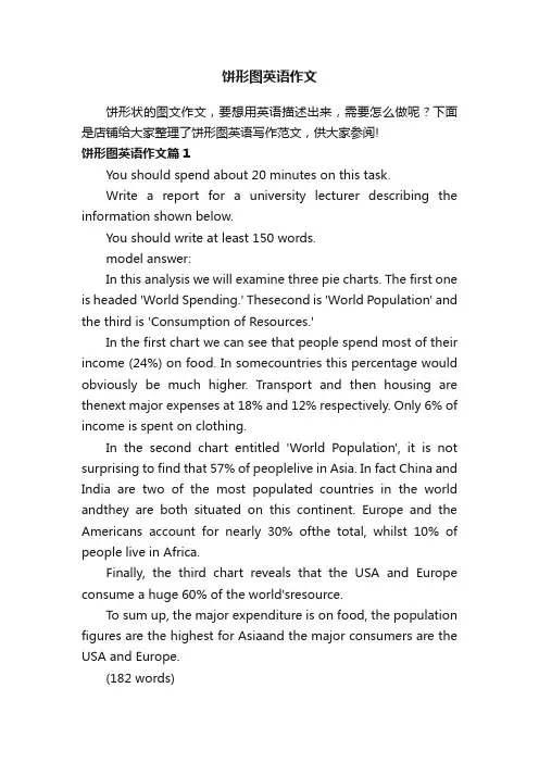
饼形图英语作文饼形状的图文作文,要想用英语描述出来,需要怎么做呢?下面是店铺给大家整理了饼形图英语写作范文,供大家参阅!饼形图英语作文篇1You should spend about 20 minutes on this task.Write a report for a university lecturer describing the information shown below.You should write at least 150 words.model answer:In this analysis we will examine three pie charts. The first one is headed 'World Spending.' Thesecond is 'World Population' and the third is 'Consumption of Resources.'In the first chart we can see that people spend most of their income (24%) on food. In somecountries this percentage would obviously be much higher. Transport and then housing are thenext major expenses at 18% and 12% respectively. Only 6% of income is spent on clothing.In the second chart entitled 'World Population', it is not surprising to find that 57% of peoplelive in Asia. In fact China and India are two of the most populated countries in the world andthey are both situated on this continent. Europe and the Americans account for nearly 30% ofthe total, whilst 10% of people live in Africa.Finally, the third chart reveals that the USA and Europe consume a huge 60% of the world'sresource.To sum up, the major expenditure is on food, the population figures are the highest for Asiaand the major consumers are the USA and Europe.(182 words)雅思小作文的要点就是理解图或者表想要表达的东西,然后用文字正确的阐述出来即可。
饼图雅思英语作文Pie charts are a common type of data visualization that represent the distribution of a categorical variable. They consist of a circle divided into sectors, with each sector representing a proportion of the whole. Pie charts are often used to show the relative sizes of different categories within a dataset.One advantage of pie charts is that they can easily convey the overall distribution of a categorical variable at a glance. The size of each sector is proportional to the percentage it represents, making it easy to compare the relative sizes of different categories. This can be especially useful when presenting data to a non-technical audience, as it allows for quick and intuitive understanding of the data.However, pie charts also have some limitations. For example, they can become difficult to read when there are too many categories, as the sectors become small and hardto distinguish. In addition, it can be challenging to accurately compare the sizes of different sectors, especially when they are similar in size. This can make it difficult to accurately interpret the data, especially when the differences between categories are small.In conclusion, pie charts are a useful tool forvisually representing the distribution of categorical data. They provide a quick and intuitive way to understand the relative sizes of different categories within a dataset. However, they also have limitations, such as difficulty in comparing small differences and becoming cluttered with too many categories. As with any data visualization, it's important to consider the specific characteristics of the data and the audience when deciding whether to use a pie chart.。
雅思写作小作文范文雅思写作饼状图piechart学校花费.doc雅思写作小作文范文雅思写作饼状图pie chart 学校花费今天我们雅思写作小作文范文的文章来研究下饼状图pie chart。
跟以前咱们见过的题目不同,这次有三个图形。
如此一来,数据就显得非常多和杂乱,十分考验大家挑选关键信息并进行比较的能力。
小编搜集了一篇相应的考官范文,以供大家参考。
雅思写作小作文题目The three pie charts below show the changes in annual spending by a particular UK school in 1981, 1991 and 2001.Summarise the information by selecting and reporting the main features, and make comparisons where relevant.雅思写作小作文范文The pie charts compare the expenditure of a school in the UK in three different years over a 20-year period.饼状图比较了一所英国学校在20年的时间跨度中三年的花费。
It is clear that teachers’ salaries made up the largest proportion of the school’s spending in all three years (1981, 1991 and 2001). By contrast, insurance was the smallest cost each year.很明显,教师的工资在所有三个年份(1981年,1991年和2001年)中占据学校花费的最大部分。
相比之下,保险在每一年里都是最小的花费。
In 1981, 40% of the school’s budget went on teachers’ salaries. This figure rose to 50% in 1991, but fell again by 5% in 2001. Th e proportion of spending on other workers’ wages fell steadily over the 20-year period, from 28% of the budget in 1981 to only 15% in 2001.1981年,学校预算的百分之四十用于教师的薪酬纸上。
雅思写作小作文范文雅思写作饼状图piechart健康饮食.doc雅思写作小作文范文雅思写作饼状图pie chart 健康饮食今天我们雅思写作小作文范文的文章来研究下饼状图pie chart。
该题目中共出现三张饼图,分别展示了碳水化合物、脂肪以及蛋白质在平均饮食、一般健康饮食、以及运动员健康饮食中所占的比例。
从中可以看出,碳水化合物占得比例越来越大,而蛋白质占得比例越来越小。
小编搜集了一篇相关的考官范文,以供大家参考。
雅思写作小作文题目雅思写作小作文范文The pie charts compare the proportion of carbohydrates, protein, and fat in three different diets, namely an average diet, a healthy diet, and a healthy diet for sport.饼状图比较了三种不同饮食中(平均饮食、健康饮食、以及专为运动员准备的健康饮食)碳水化合物、蛋白质和脂肪所占的比例。
It is noticeable that sports people require a diet comprising a significantly higher proportion of carbohydrates than an average diet or a healthy diet. The average diet contains the lowest percentage of carbohydrates but the highest proportion of protein.很明显,与平均饮食和一般的健康饮食相比,运动员需要的饮食中包含更多的碳水化合物。
平均饮食中的碳水化合物虽然较低,但蛋白质的比例最高。
Carbohydrates make up 60% of the healthy diet for sport. This is 10% higher than the proportion of carbohydrates in a normal healthy diet and 20% more than the proportion in an average diet. On the other hand, people who eat an average diet consume a greater amount of protein (40%) than those who eat a healthy diet (30%) and sportspeople (25%).碳水化合物构成运动员健康饮食的百分之60。
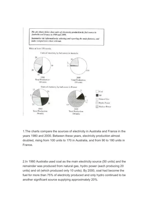
1.The charts compare the sources of electricity in Australia and France in the years 1980 and 2000. Between these years, electricity production almost doubled, rising from 100 units to 170 in Australia, and from 90 to 180 units in France.2.In 1980 Australia used coal as the main electricity source (50 units) and the remainder was produced from natural gas, hydro power (each producing 20 units) and oil (which produced only 10 units). By 2000, coal had become the fuel for more than 75% of electricity produced and only hydro continued to be another significant source supplying approximately 20%.3.In contrast, France used coal as a source for only 25 units of electricity in 1980, which was matched by natural gas. The remaining 40 units were produced largely from oil and nuclear power, with hydro contributing only 5 units. But by 2000, nuclear power, which was not used at all in Australia, had developed into the main source, producing almost 75% of electricity, at 126 units, while coal and oil together produced only 50 units. Other sources wereno longer significant.4.Overall, it is clear that by 2000 these two countries relied on different principal fuel sources: Australia relied on coal and France on nuclear power.分析:第一段:1 The charts compare the sources of electricity in Australia and France in the years 1980 and 2000Compare是“对比”,因为本文有两个国家四幅图,所以用compare就比较合适。
雅思三个饼图作文范文
雅思饼图作文范文(口语化版)。
段落一,聊聊教育支出的那些事儿。
说到教育支出啊,学费可是大头儿,差不多占了一半呢。
这就
说明啊,在咱们现在的教育体系里,学费还是家庭和个人最得掏钱的。
不过呢,课外辅导费也不低,都快三分之一了,这说明家长们
为了孩子的学业和竞争力可是下了血本了。
教材和学习资料虽然比
较稳定,但也占了不小的比例。
其他的像交通、住宿这些费用,虽
然不多,但也是教育支出里不能少的部分。
段落二,大家平时都怎么休闲啊?
说到休闲活动,大家可真是各有各的爱好。
阅读可是个不错的
选择,很多人都喜欢通过阅读来放松和涨知识。
运动也挺受欢迎的,毕竟身体是革命的本钱嘛,大家都挺重视健康的。
不过呢,社交媒
体现在也是大家离不开的了,虽然可能占用的时间不如阅读和运动多,但影响力可不小。
当然啦,还有旅行和其他活动,这些虽然不
常做,但也让大家的休闲生活更加丰富多彩。
段落三,聊聊现在的职业选择。
说到职业选择啊,信息技术这行可是热门得很,基本上占了最
大的份额。
这也难怪,现在可是数字化时代,信息技术发展得飞快,需求也大。
金融服务和教育行业也挺不错的,稳定又有发展前景。
制造业和服务业虽然不如前面几个热门,但也吸引了不少人。
1.步骤①审题,看图②几张饼,几种类(馅)③找最值④特殊数据和比例如25%= quarter2.关键信息①最值:最大,第二,最小②相同值③特殊值如1/2, 1/3, 1/43.动词(占有)Account for; comprise; represent; make up/take up; constitute; contribute4.句型①占据型XX + account for/ make up + the largest/highest/most proportion/percentage of total, which isN%.②拥有型XX + have + the fewest/least proportion/percentage of the chart, at N%.③排序型XX + ranks the first/second, contributing N% of the chart.④被动型the majority/main part of + XXX + made up of XXX5.特殊描述①相同/相似:share equal percentage/trendIt can be seen that / it is noted that A and B share equal percentage, both at N%.比例相近的同时描写respectively/differentlyOnly 30% and 28% Chinese students choose music and art respectively/differently.②倍数5月利润是3月的三倍The profit tripled from March to May.The profit increased by twofold from March to May.There was a twofold increase in the profit from March to MayThe profit in March is tripled as much as in May.Example: 同级比较,占据型,排序型(背下)Asia is the largest continent in the world, over four times as big as Europe. Representing one fifth of the world’s surface area, Africa ranks the second.③百分比A quarter; a third; two third; half双饼图:静态(无关联);动态(有趋势的改变,例如不同年份)1.静态对比和比较(对内和对外),使用1-2次,使用倍数关系,包括相同、不同、极值写法:按图形种类分段对内比较:在段内比,自己比,用关键数据对外比较:在结尾段,彼此比,笼统结合比2.动态结尾段:N年来,XXX的变化(类似线图结尾的变化对比)中间段写法1:两个饼图分别写中间段写法2:将数据转换成线图数据,按增加项、减少向、平稳项分组三饼图:写法1 分别写写法2 按趋势写(同线图)The table compares the difference in the ratio of both males and females who received a diploma in 1993. Obviously, males and females varied considerably in level of education.In 1993, 60% of males graduated with a master’s degree in comparison with 40% of females. When it comes to the ratio of postgraduate diploma, the gap between the males and females become even more significant, the figure of males was more than twice that of females (70% and 30% respectively). In contrast, females outnumbered males in the next two categories. A slightly higher percentage of females at 53% than males at 47% was recorded in the completion of bachelor’s degree. The rise in female rate was also witnessed in the proportion of undergraduate study where females with 65% nearly doubled males with 35%.In conclusion, more males than females received higher degree.段落的描述:美国人民的消费情况In 1996, Americans spent most money on the cars consumption, which was 45%. Restaurant and food shared the same percentages (14%), following the cars. Books accounted for the least proportion of the total, only at 1%.。
雅思写作小作文范文雅思写作饼状图piechart美国居民花费.doc雅思写作小作文范文雅思写作饼状图pie chart 美国居民花费今天我们雅思写作小作文范文的文章来研究下饼状图pie chart。
题目中的饼状图展示了1966年以及1996年美国居民在七种类别的商品上所花费的金钱比例。
写作过程中,我们可以按照下降,不变,上升进行分类;也可以按照最大、最小值进行分类。
小编搜集了一篇相关的高分范文,以供大家参考。
雅思写作小作文题目The given pie charts compare the expenses in 7 different categories in 1966 and 1996 by American Citizens.Summarise the information by selecting and reporting the main features, and make comparisons where relevant.雅思写作小作文范文The pie charts compare the expenditure of US residents in two different years in seven categories namely food, cars, petrol, restaurants, furniture, computers and books.饼状图比较了美国居民在两个不同的年份里在7种类别的物品上所花的金钱比例。
该7种类别的物品为:食物、汽车、汽油、餐厅、家具、电脑以及图书。
It is clear that the largest proportion of American citizens’ spending went on foods and cars. On the other hand, computers and books have the lowest percentage in the chart in 1966 and 1996 respectively. In 1966, 23% of American citizens’expenditure went on cars. This article is from Laokaoya website. The percentage rose to nearly double at 45% in 1996. The proportion of spending on food fell from 44% in 1966 to only 14% in 1996.很明显,绝大多数美国居民的花费用在食物和汽车之上。
英语考试作文雅思写作优秀模板:饼状图小作文模板――饼状图1.描述It is clear that the most (adj.) xx is A, which accounts for m% of all x . B is the next largest(adj.)xx ,n% lower than A of all x and followed closely by C . The above three items of xx take uo about o% of the x%By contrast D E andF make uo the smallest percentage of total x , which are p% q% and r% ,respectively.The regions can be divided into two groups-one where … and the other where the reverse is the case.2.比较,占据,百分数Form, comprise, make up, occupyConstitute, cover, represent, account forBe shared byIn 1950, the urban population represented less than 13% of the total. It is now about 40% and is expected to reach 60% by 2030. (摘自BBC)3.比例,倍数A quarter of…Half of…A majority of…A has something in common with bA shares some similarity with bThe difference between a and b lies in…Double, triple, quadruple (v, n, adj)原来的2倍-double, 50→100原来的3倍-triple, 50→150原来的4倍-quadruple, 50→200The value of the house has increased fourfold (=it is now worth four times as much as before).…be twice as adj. as …..…more than xx times as adj. as …..。
雅思写作小作文范文雅思写作饼状图pie chart 城市用水今天我们雅思写作小作文范文的相关文章来研究下饼状图,pie chart。
按照惯例,我们给大家准备了一篇考官范文。
不过与以往不同的是,这道题目中有三张图片,都是关于城市用水的。
大家可以参考下文章是如何选取数据并进行比较的。
雅思写作小作文题目The pie charts below compare water usage in San Diego, California and the rest of the world.Summarise the information by selecting and reporting the main features, and make comparisons where relevant.雅思写作小作文范文The pie charts give information about the water used for residential, industrial and agricultural purposes in San Diego County, California, and the world as a whole.这些饼图给出了圣地亚哥、加利福尼亚以及整个世界居民用水、工业用水和农业用水的信息。
It is noticeable that more water is consumed by homes than by industry or agriculture in the two American regions. This article is from Laokaoya website. Do not copy or repost it. By contrast, agriculture accounts for the vast majority of water used worldwide.显而易见,在两个美国地区,相比于工业和农业用水,家庭消耗掉的水要更多一些。
The two graphs show the main sources of energy in the USA in the 1980s and the 1990s.思路:1. 采用折线模式描述2. 注意重点数据的选取(max, min)3. 注意分段原则:一段写上升,一段写下降,一段写保持不变。
答案:The two graphs show that oil was the major energy source in the USA in both 1980 and 1990 and that coal, natural gas and hydroelectric power remained in much the same proportions. On the other hand, there was a dramatic rise in nuclear power, which doubled its percentage over the ten years.Oil supplied the largest percentage of energy, although the percentage decreased from 42% in 1980 to 33% in 1990. Coal in 1990 was the second largest source of energy, increasing its proportion to 27% from 22% in the previous decade. Natural gas, the second largest source in 1980 at 26%, decreased its share very slightly to provide 25% of America’s energy ten years later. There was no change in the percentage supplied by hydroelectric power which remained at 5% of the total energy used. Nuclear power the greatest change: in 1990 it was 10%, twice that of the 1980s.In conclusion, during the decade, the structure of energy resources remained, and the proportion of 3 aspects varied a lot, except natural gas and hydroelectric power.(180)Information on UAE government spending in 2000. The total budget was AED 315 billion.思路:1. 分段原则较为灵活,可以分,也可以不分;2. 注意数据的描述顺序为:从大到小;3. 描述的过程中注意数据的对比:大小关系,倍数关系等;答案:The graph tells us about the budget of the UAE government in 2000. In general, the most important targets were social security, health, and education.The biggest slice of the pie chart is taken up by social security including pensions, employment assistance and other benefits which made up slightly under one-third of total expenditure. Health and personal social services was the second highest budget cost. Hospital and medical services accounted for AED 53 billion, or about 15% of the budget. Education cost UAE AED 38 billion which comprises almost 12% of the whole budget. The government spent about seven percent of revenue on debt, and roughly similar amounts went towards defence (AED 22 billion) and law and order (AED 17 billion). Spending on housing, transport and industry totalled AED 37 billion. Finally, other expenditure accounted for AED 23 billion.All in all, the bulk of UAE government spending goes on social welfare and health. However, education, defence, and law and order are also major areas of spending.(167)3.消费模式The pie charts show changes in U.S. spending patterns between 1966 and 1996.思路:1. 主要采用折线模式,重点描述数据的改变和趋势2. 留意极值(MAX, MIN)的描述3. 分段的原则可为:上升的一段,下降的一段,保持不变的一段。
1.The charts compare the sources of electricity in Australia and France in the years 1980 and 2000. Between these years, electricity production almost doubled, rising from 100 units to 170 in Australia, and from 90 to 180 units in France.
2.In 1980 Australia used coal as the main electricity source (50 units) and the remainder was produced from natural gas, hydro power (each producing 20 units) and oil (which produced only 10 units). By 2000, coal had become the fuel for more than 75% of electricity produced and only hydro continued to be another significant source supplying approximately 20%.
3.In contrast, France used coal as a source for only 25 units of electricity in 1980, which was matched by natural gas. The remaining 40 units were produced largely from oil and nuclear power, with hydro contributing only 5 units. But by 2000, nuclear power, which was not used at all in Australia, had developed into the main source, producing almost 75% of electricity, at 126 units, while coal and oil together produced only 50 units. Other sources were
no longer significant.
4.Overall, it is clear that by 2000 these two countries relied on different principal fuel sources: Australia relied on coal and France on nuclear power.
分析:
第一段:
1 The charts compare the sources of electricity in Australia and France in the years 1980 and 2000
Compare是“对比”,因为本文有两个国家四幅图,所以用compare就比较合适。
这一句同样是对题干进行改写,交代一下这是什么图。
2 Between these years, electricity production almost doubled, rising from 100 units to 170 in Australia, and from 90 to 180 units in France.
Double是动词“翻倍”的意思,这里主要讨论数据的整体变化趋势,rising 是rise 的现在分词形式,相当于which rises或which rose。
第二段:
1 In 1980 Australia used coal as the main electricity source (50 units) and the remainder was produced from natural gas, hydro power (each producing 20 units) and oil (which produced only 10 units).
这个句子主要写澳大利亚1980年的最大能源比例,属于特殊值或特征值。
And the remainder 是“其余的电”,remainder相当于代词。
这样通过一个句子将其他不重要或不是特征的数值全部说出。
2 By 2000, coal had become the fuel for more than 75% of electricity produced and only hydro continued to be another significant source supplying approximately 20%.
By 2000,到了200年。
是引出数据对比。
More than 75%,多于75%。
And only hydro引出另外一个特殊值,即水能。
第三段:
1 In contrast, France used coal as a source for only 25 units of electricity in 1980, which was matched by natural gas.
In contrast,相反。
引出法国情况,作为一种对比。
Which引导定语从句,which was matched by 连接另外一个成分coal,两者数量相等。
用match这
个动词。
2 The remaining 40 units were produced largely from oil and nuclear power, with hydro contributing only 5 units.
Be produced by 被---生产的。
With引出复合结构。
With sht doing。
Contribute 是“贡献”。
因为hydro与contribute是主动关系,所以用Contributing,如果逻辑关系式被动,就用contributed。
3 But by 2000, nuclear power, which was not used at all in Australia, had developed into the main source, producing almost 75% of electricity, at 126 units, while coal and oil together produced only 50 units.
But引出两个不同情况的对比,by 2000引出时间。
Which 引出定语从句。
Not
at all,根本不。
Had developed 是主语nuclear power的谓语动词。
Producing
是现在分词做伴随状语,相当于定语从句which produces。
While是连词“而”,连接另外两个对比的东西。
Only起强调作用,表示“少”。