干货英语作文图表类范例
- 格式:docx
- 大小:95.79 KB
- 文档页数:5

图表类英语作文模板Introduction:The given chart depicts the data on [topic] over a specific period of time. In this essay, I will analyze the information presented in the chart and provide a comprehensive overview of the trends and patterns observed.Overview of the Chart:The chart illustrates [describe the main features of the chart]. It is evident that [provide a general observation of the chart].Body Paragraphs:1. Key Trends:The chart reveals several significant trends. Firstly, [describe the most prominent trend]. This trend can beattributed to [provide a reason or explanation]. Secondly, [describe the second most important trend]. This trend indicates [provide an interpretation]. Lastly, [describeany other noticeable trends]. These trends highlight [provide the significance of these trends].2. Comparisons and Contrasts:When comparing the different elements in the chart, itis apparent that [describe the similarities or differences]. For instance, [provide an example of a comparison or contrast]. This comparison/contrast suggests [provide an interpretation].3. Highlighting the Highest/Lowest:The chart showcases the highest/lowest [specify the category] in [specific time period]. [Provide thehighest/lowest value] was recorded during this time. This indicates [provide an interpretation].4. Fluctuations:Throughout the given time period, there weresignificant fluctuations in [specific category]. For instance, [describe the fluctuations]. These fluctuations can be attributed to [provide a reason or explanation]. It is worth noting that [provide the impact or significance of these fluctuations].5. Summarizing the Data:In conclusion, the chart provides a comprehensive overview of [topic]. The key trends identified include [mention the trends]. Comparisons and contrasts between [elements] highlight [provide the significance]. The highest/lowest [category] was recorded at [value]. Fluctuations in [specific category] were observed, which can be attributed to [reasons]. Overall, the data presented in the chart emphasizes [provide the main message or takeaway].Conclusion:In conclusion, the analysis of the given chart reveals important insights into [topic]. By examining the key trends, comparisons, fluctuations, and summarizing the data, we can gain a deeper understanding of the information presented. It is hoped that this essay has effectively conveyed the information depicted in the chart and provided a comprehensive analysis of the trends and patterns observed.。

英语作文图表作文(五篇范文)第一篇:英语作文图表作文图表分析作文1As is clearly shown in the table/ figure/ graph / chart, 图表总体描述 between 年代 and 年代.Especially, 突出的数据变化.There are three reasons for 具体表示急剧上升、下降或特殊现象的词.To begin with, 原因一.In addition / Moreover, 原因二.For example, 具体例证.Last but no least, 原因三.In short,总结上文.As far as I am concerned, / For my part, / As for me,作者自己的观点.On the one hand, 理由一.On the other hand, 理由二.In brief,总结上文.图表分析作文2The table / figure / graph / chart shows that 图表总述from 年代to年代.It is self-evident that突出的数据变化.Three possible reasons contribute to 具体表示急剧上升、下降或特殊现象的词或代词代替上文内容.One reason is that原因一.Another reason is that 原因二.For instance,举例证.What’s more原因三.As a result, 重述上文之趋势.However, in my opinion 作者观点.For one thing,理由一.For another, 理由二.T o sum up,总结上文.图表分析作文3It can be seen from the table / figure / graph / chart that图表总述between年代and年代.Especially,突出的数据变化.Why are there such great changes during 图表涉及的年头数years? There are mainly two reasons explaining具体表示急剧上升、下降或特殊现象的词或代词代替上文内容.First,原因一.In the old days,比较法说明过去的情况.But now,说明现在的情况.Second,原因二.As a result,总结上文.In my viewpoint,作者自己的观点.On the one hand,论点一.On the other hand,论点二.图表分析作文4As the table / figure / graph / chart shows,图表总述in the past years年代.Obviously,突出的数据变化.Why are there suchsharp contrasts during 图表涉及的年头 years?Two main factors contribute to具体表示急剧上升、下降或特殊现象的词或代词代替上文内容.First of all,原因一.In the past,比较法说明过去的情况.But now 说明现在的情况.Moreover,原因二.Therefore,总结上文.As I see it,作者自己的观点.For one thing,论点一.For another,论点二.图表作文补充句型• As is shown in the graph…如图所示…•The graph shows that…图表显示…•As can be seen from the table,…从表格中可以看出…•From the chart, we know that…从这张表中,我们可知…• All these data clearly prove the fact that… 所有这些数据明显证明这一事实,即…• The increase of ….In the ci ty has reached to 20%.….在这个城市的增长已达到20%.• In 1985, the number remained the same.1985年,这个数字保持不变.• There was a gradual decline in 1989.1989年,出现了逐渐下降的情况.第二篇:英语图表作文图表描述专题训练(一)这类作文时,注意以下几点:第一,审题时,除了要把握好图表的表层信息外,还要分析图标的深层含义,如原因、根源、可能的发展趋势等。
英语图表作文模板及精选4篇(经典版)编制人:__________________审核人:__________________审批人:__________________编制单位:__________________编制时间:____年____月____日序言下载提示:该文档是本店铺精心编制而成的,希望大家下载后,能够帮助大家解决实际问题。
文档下载后可定制修改,请根据实际需要进行调整和使用,谢谢!并且,本店铺为大家提供各种类型的经典范文,如总结报告、合同协议、规章制度、条据文书、策划方案、心得体会、演讲致辞、教学资料、作文大全、其他范文等等,想了解不同范文格式和写法,敬请关注!Download tips: This document is carefully compiled by this editor. I hope that after you download it, it can help you solve practical problems. The document can be customized and modified after downloading, please adjust and use it according to actual needs, thank you!Moreover, our store provides various types of classic sample essays, such as summary reports, contract agreements, rules and regulations, doctrinal documents, planning plans, insights, speeches, teaching materials, complete essays, and other sample essays. If you want to learn about different sample formats and writing methods, please pay attention!英语图表作文模板及精选4篇学而不思则罔,思而不学则殆,以下是本店铺给大伙儿收集整理的英语图表作文模板及精选4篇,欢迎参考。
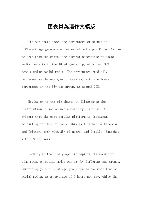
图表类英语作文模版The bar chart shows the percentage of people in different age groups who use social media platforms. As can be seen from the chart, the highest percentage of social media users is in the 18-24 age group, with over 90% of people using social media. The percentage gradually decreases as the age group increases, with the lowest percentage in the 65+ age group, at around 30%.Moving on to the pie chart, it illustrates the distribution of social media users by platform. It is evident that the most popular platform is Instagram, accounting for 40% of users. This is followed by Facebook and Twitter, both with 25% of users, and finally, Snapchat with 10% of users.Looking at the line graph, it depicts the amount of time spent on social media per day by different age groups. Surprisingly, the 25-34 age group spends the most time on social media, at an average of 3 hours per day, while the18-24 age group, despite having the highest percentage of users, only spends around 2 hours per day on social media.In conclusion, the charts provide valuable insightsinto the usage and preferences of social media among different age groups. It is clear that social media is most popular among younger age groups, with Instagram being the preferred platform, and the 25-34 age group spending the most time on social media.。

英语作文图表类范文Here is an essay on the given topic of "English Essay Sample with Graphs and Tables" with more than 1000 words, written entirely in English without any additional punctuation marks.Effective Communication through Graphical RepresentationsIn the realm of academic and professional writing, the seamless integration of textual information and graphical elements has become an essential skill. Graphical representations, such as charts, tables, and diagrams, possess the remarkable ability to convey complex data and ideas in a concise and visually appealing manner. By strategically incorporating these visual aids, writers can enhance the clarity, comprehension, and overall impact of their written work.One of the primary advantages of using graphical representations is their ability to organize and present data in a structured and readily understandable format. Tables, for instance, excel at displaying numerical information or categorical data in a clear and systematic manner. They allow readers to quickly compare and contrast different values or characteristics, enabling them to identify patterns, trends, and relationships that may not be immediately apparent in apurely textual format.Similarly, charts and graphs offer a powerful means of visualizing quantitative data. Bar graphs, line charts, and scatter plots can effectively illustrate trends, distributions, and correlations, making complex information more accessible and digestible for the reader. These visual tools can often convey the essence of a dataset more effectively than a dense paragraph of text, allowing the audience to grasp the key insights at a glance.Beyond numerical data, graphical representations can also be employed to simplify and clarify conceptual information. Flowcharts, for example, can be used to map out step-by-step processes or decision-making frameworks, providing a clear and logical flow of information. Venn diagrams, on the other hand, can be instrumental in demonstrating the relationships and overlaps between different concepts or categories.The strategic placement of graphical elements within a written work can also serve to enhance the overall organization and readability of the text. By positioning relevant charts, tables, or diagrams alongside the corresponding textual explanations, writers can create a seamless integration of visual and verbal content, guiding the reader through the information in a logical and intuitive manner.Moreover, the use of graphical representations can help to break up the monotony of dense textual passages, making the written work more visually appealing and engaging for the reader. Carefully selected and well-integrated graphics can serve as visual anchors, directing the reader's attention and aiding in the retention of key information.However, the effective incorporation of graphical elements in writing is not without its challenges. Writers must ensure that the chosen graphics are truly relevant and add value to the content, rather than serving as mere decorative elements. Additionally, it is crucial to maintain consistency in the style, formatting, and labeling of the graphical representations, as this can significantly impact the overall coherence and professionalism of the written work.Furthermore, writers must be mindful of the accessibility considerations when incorporating graphical elements. Ensuring that the graphics are legible, appropriately sized, and accompanied by clear captions or textual descriptions can make the information accessible to a wider range of readers, including those with visual impairments or other accessibility needs.In conclusion, the strategic use of graphical representations in writing can be a powerful tool for enhancing communication and comprehension. By skillfully integrating charts, tables, and othervisual aids, writers can effectively convey complex information, highlight key insights, and engage their audience in a more meaningful and impactful way. As the demand for clear and visually appealing communication continues to grow, the ability to effectively leverage graphical elements in written work will become an increasingly valuable and sought-after skill.。

⼀、图表作⽂写作常识 1、图形种类及概述法: 泛指⼀份数据图表:a data graph/chart/diagram/illustration/table 饼图:pie chart 直⽅图或柱形图:bar chart / histogram 趋势曲线图:line chart / curve diagram 表格图:table 流程图或过程图:flow chart / sequence diagram 程序图:processing/procedures diagram 2、常⽤的描述⽤法 The table/chart diagram/graph shows (that) According to the table/chart diagram/graph As (is) shown in the table/chart diagram/graph As can be seen from the table/chart/diagram/graph/figures, figures/statistics shows (that)…… It can be seen from the figures/statistics We can see from the figures/statistics It is clear from the figures/statistics It is apparent from the figures/statistics table/chart/diagram/graph figures (that) …… table/chart/diagram/graph shows/describes/illustrates how…… 3、图表中的数据(Data)具体表达法 数据(Data)在某⼀个时间段固定不变:fixed in time 在⼀系列的时间段中转变:changes over time 持续变化的data在不同情况下: 增加:increase / raise / rise / go up …… 减少:decrease / grow down / drop / fall …… 波动:fluctuate / rebound / undulate / wave …… 稳定:remain stable / stabilize / level off …… 最常⽤的两种表达法: 动词+副词形式(Verb+Adverb form) 形容词+名词形式(Adjective+Noun form) ⼆、相关常⽤词组 1、主章开头 图表类型:table、chart、diagramgraph、column chart、pie graph 描述:show、describe、illustrate、can be seen from、clear、apparent、reveal、represent 内容:figure、statistic、number、percentage、proportion 2、表⽰数据变化的单词或者词组 rapid/rapidly 迅速的,飞快的,险峻的 dramatic/dramatically 戏剧性的,⽣动的 significant/significantly 有意义的,重⼤的,重要的 sharp/sharply 锐利的,明显的,急剧的 steep/steeply 急剧升降的 steady/steadily 稳固的,坚定不移的 gradual/gradually 渐进的,逐渐的 slow/slowly 缓慢的,不活跃的 slight/slightly 轻微的、略微地 stable/stably 稳定的 3、其它在描述中的常⽤到的词 significant changes 图中⼀些较⼤变化 noticeable trend 明显趋势 during the same period 在同⼀时期 grow/grew 增长 distribute 分布,区别 unequally 不相等地 in the case of adv. 在……的情况下 in terms of / in respect of / regarding 在……⽅⾯ in contrast 相反,⼤不相同 government policy 政府政策 market forces 市场规率 measure n.尺⼨,⽅法,措施v.估量,调节 forecast n.先见,预见v.预测 三、考研英语图表写作套句精选 1.the table shows the changes in the number of……over the period from……to…… 该表格描述了在……年之……年间……数量的变化。
干货英语作文图表类范例(一)饼图模板Since______(背景介绍), Beijing has made remarkable results in attracting foreign business. According to the pie chart, the investors in different enterprises come from______(来源地区). _____(第一个地区的)investment ranks first, accounting for______(具体所占比例. _____(第二个地区的)investment makes up______(具体所占比例), putting it in second spot. The third is______(第三个地区)at_____(具体所占比例).It is generally believed that______(观点立场). In the first place, ____(第一个原因). Secondly, _____(第二个原因). Finally, _____(第三个原因). Therefore,______(结论).As far as______(讨论内容)are concerned, I think we can improve it as follows. On the one hand,_____(一方面建议). On the other hand,_____(另一方面建议).中文翻译自从______(背景介绍),北京在吸引外资方面已经做出了显著成果。
根据饼图来看,不同企业的投资者来自于_____(来源地区)。
______(第一个地区的)投资居于第一,占了_____(具体所占比例)。
______(第二个地区的)投资占总比的_____(具体所占比例),使其处于第二的位置。
第三名是_____(第三个地区),有_____(具体所占比例)。
考研英语作⽂万能模板:图表 考研英语作⽂中免不了有⼀些图表作⽂,那么怎么应对这些作⽂呢?店铺考研英语作⽂频道为⼤家提供考研英语作⽂万能模板:图表,希望⼤家喜欢。
考研英语作⽂万能模板:图表 1. According to the figures shown in the table/graph we can see/conclude that… 例句:According to the figures shown in the table, we can see that great changes have been taking place in people’s diet over the period from 1988 to 1998. 2. We can see/We have noted/It can be seen from the table/chart/graph that… 例句:We have noted from the graph that there is a wide gap between the top ten universities both of China and of the world. 3. The graph/table/chart shows/indicates/reveals/points out that… 例句:The chart reveals that the number of road accidents is spiraling upward every year as more and more highways are constructed all over China. 4. As is shown/can be seen in the chart/graph/diagram released by the government… 例句:As we can see in the diagram released by the government, the rapid growth of population has resulted in the extinction of many wildlife species. 5. After considering the information in the graph/table/chart, we might conclude that… 例句:After considering the information in the graph, we might conclude that the energy structure in rural areas has been greatly improved over the past 15 years. 6.The chart/graph/table shows a minimal/slight/slow/steady/marked/dramatic/sharp/suddenincrease/rise/decline/reduction/fall/drop in…compared with those of last year/10 years ago/last century… 例句:The graph shows a marked decline in the number of wildlife species compared with that of last century. 7. This year, the products of…dropped to half/was cut in half/doubled/tripled. 例句:This year, the products of cotton doubled. 8. The number of … grew/rose/dropped from…to… 例句:The number of car accidents grew from 3691 in 1985 to 8245 in 1995. 9. No increase is shown in …; then came a sharp increase of … 例句:No increase is shown in 1988; then came a sharp increase of 8 million. 10.Sth. is twice/three/half as large/high/much as sth. else. 例句:The production of cotton is twice as much as that of wheat. 11.The table/chart/graph represents the development and changes in … 例句:The table represents the development and changes in agriculture structure in the past 30 years. 12.By comparison with…, it dropped/ fell/ decreased from…to…/ by… 例句:By comparison with 1990, it dropped by 15 percent. 13.There appeared an even more stable/consistent/steady tendency to rise/drop. 14.The curve has leveled off/stayed the same/remained unchanged for 2 years and the trend will be continuing.。
图表类作文范文英文英文回答:In the given chart, we can observe the trends in smartphone ownership and internet usage among different age demographics in a certain region. The data is presented in a bar graph format, categorizing the population into five age groups: 18-24, 25-34, 35-44, 45-54, and 55 and above.Smartphone ownership has witnessed significant growth across all age groups in recent years, with the highest penetration rate among younger individuals. In the 18-24 age group, an overwhelming 95% of individuals own a smartphone, indicating near-universal adoption of this technology. The ownership rate remains high in the 25-34 age group, with 92% of individuals owning a smartphone. In the 35-44 age group, the ownership rate stands at 86%, followed by 79% in the 45-54 age group. Even among the oldest age group, 55 and above, smartphone ownership has reached 62%, demonstrating the widespread adoption of thisdevice across all generations.Internet usage, closely tied to smartphone ownership, also exhibits a strong correlation with age. The highest internet usage rate is observed among the 18-24 age group, where 97% of individuals access the internet. The usage rate remains high in the 25-34 age group, with 93% of individuals using the internet. Internet usage starts to decline gradually in older age groups, with 88% usage in the 35-44 age group, 80% in the 45-54 age group, andfinally 58% among individuals 55 and above. It is noteworthy that a significant proportion of older individuals still engage in internet usage, highlighting the increasing digital literacy and accessibility of online resources across all age demographics.In summary, the chart reveals the pervasive adoption of smartphones and the widespread use of the internet among different age groups. The high ownership and usage rates, particularly among younger individuals, reflect the transformative impact of these technologies on communication, information access, and daily life. As wemove forward, it will be crucial to ensure equitable access to these technologies and promote digital literacy to harness their full potential for social and economic development.中文回答:图表显示了某个地区不同年龄段的人群中智能手机拥有率和互联网使用率的趋势。
干货英语作文图表类范例
(一)饼图模板
Since______(背景介绍), Beijing has made remarkable results in attracting foreign business. According to the pie chart, the investors in different enterprises come from______(来源地区). _____(第一个地区的)investment ranks first, accounting for______(具体所占比例. _____(第二个地区的)investment makes up______(具体所占比例), putting it in second spot. The third is______(第三个地区)at
_____(具体所占比例).
It is generally believed that______(观点立场). In the first place, ____(第一个原因). Secondly, _____(第二个原因). Finally, _____(第三个原因). Therefore,
______(结论).
As far as______(讨论内容)are concerned, I think we can improve it as follows. On the one hand,_____(一方面建议). On the other hand,_____(另一方面建议).
中文翻译
自从______(背景介绍),北京在吸引外资方面已经做出了显著成
果。
根据饼图来看,不同企业的投资者来自于_____(来源地区)。
______(第一个地区的)投资居于第一,占了_____(具体所占比例)。
______(第二个地区的)投资占总比的_____(具体所占比例),使其处于第二的位置。
第三名是_____(第三个地区),有_____(具体所占比例)。
我们普遍相信_____(观点立场)。
首先,_____(第一个原因)。
其次,______(第二个原因)。
最后,______(第三个原因)。
因此,_____(结论)。
正如_____(讨论内容)所说,我认为我们可以按以下方法进行改进。
一方面,
_____(一方面建议)。
另一方面,_____(另一方面建议)。
(二)柱图模板
Nowadays, most middle school students______(描述现状引入话题), and we conducted a survey about______(调查对象).
As the result shows, among students taking part in the survey, most of them often______(结果一). About 28% of them spend their pocket money on______(结果二), and about 21% of them______(结果三). And a few______(结果四).
However, as for me, it is quite different. I usually spend most
of the money on_____(我的做法). Only a small part is spent on______(很小一部分的用途)as______(原因). And I save the rest for______(存钱的用途).
It is true that______(肯定相关现状)and we must______(表达个人观点)because____(陈述原因).
中文翻译
如今,大多数中学生_____(描述现状引入话题),我们对_____(调查对象)进行了一项研究。
正如结果所示,在参与调查的学生中,大多数人经常______(结果一)。
大约28%的人把零花钱花在_____(结果二),大约21%的人______(结果三)。
同时有少部分人_____(结果四)。
然而,我有不一样的用法。
我通常把大部分的钱花在_____(我的做法)。
只有很小一部分是花在_____(很小一部分的用途),因为_____(原因)。
而且我把余下的存起来用作_____(存钱的用途)。
的确,_____(肯定相关现状),我们必须_____(表达个人观点),因为_____(陈述原因)。
(三)线状图常用句型
1. 上述表格描述了在_____期间_____数量的变化。
The graph above shows the changes in the number of______in_______period.
2. 在_____年,只有_____名学生_____。
In______, there were only about_______students/student______.
3. 这个曲线图描述了_____的趋势。
This is a graph which describes the trend of______.
4. 数目急剧下降至_____。
The number sharply declined to______.
5. 情况/形势到达了高点,为_____(数量)。
The situation reached a high point of______(数量).
6.该数字在_____年达到顶点,为_____。
The figures peaked at______in______.
7. 在_____期间_____数目的平稳增长可能是由于_____。
The steady increase in the number of_______in_______period might be caused by
______.
8. 图中很明显地可以看出_____。
It is apparent from the figures that_______.
9. 到_____年将有更多的_____,比_____年增加了近_____倍。
By_______there will have (been)more than____________, an increase nearly by
______times over that in______.
10. 与_____相比,_____的数目_____。
Compared with______, the number of_____ _____.
(四)表格常见句型
1.表格显示了_____和_____之间的差异。
The table indicates the differences between_______and______.
2._____的平均大约是_____。
The average of_______is about______.
3.______的数目比_____要多_____(如倍数)。
The number of_______is______(如倍数)larger than______.
4. 该表为我们提供了有关的_____有趣数据。
The table provides some interesting data regarding______.
5. 在_____方面_____与_____有显著差别。
There are plenty of differences in_______between_______and______.
6._____与_____的差别在于_____。
The difference between_______and_______lies in______.
7. 我们从表中可以看出_____(如现象).
We can see from the table that______.
8._____的数量是_____的_____倍。
The number of______is_______times as much as______.
9. 从这个表中,我们可以得知_____。
According to the chart, we can conclude that______.
10. 总之,_____和_____在许多方面都有所不同。