雅思图表写作饼图复习
- 格式:ppt
- 大小:1.17 MB
- 文档页数:37

雅思小作文饼图范文在雅思小作文中,饼图是一种常见的数据呈现方式。
接下来我们将会给大家提供一篇关于饼图范文的示例,希望能够帮助大家更好地理解和掌握这种写作方式。
饼图范文示例:The pie chart illustrates the proportion of different types of energy production in a certain country in 2018. Overall, it can be seen that the majority of energy production comes from fossil fuels, while renewable energy sources contribute a relatively small portion.Fossil fuels, including coal, natural gas, and oil, accounted for the largest share of energy production at 65%. Among them, oil was the most dominant, making up 35% of the total energy production. Natural gas and coal followed, with 20% and 10% respectively. This indicates that traditional energy sources still play a crucial role in meeting the country's energy demands.In contrast, renewable energy sources only contributed to 20% of the total energy production. Among them, hydroelectric power was the primary source, accounting for 15%. Meanwhile, wind and solar energy made up 3% and 2% respectively. Despite the growing global emphasis on renewable energy, it is clear that in this particular country, the reliance on fossil fuels remains significantly higher.Nuclear energy, on the other hand, made up the remaining 15% of the energy production. This suggests that while it is not as dominant as fossil fuels, nuclear energy still plays a substantial role in the country's energy mix.In conclusion, the pie chart provides a clear overview of the energy production composition in the given country. It highlights the dominance of fossil fuels, the relatively small contribution of renewable energy sources, and the significant role of nuclear energy. This information is crucial for policymakers and stakeholders in making informed decisions about the country's energy future.。
雅思小作文饼图常用词汇、万能句型、范文整理一、饼图常用词汇1.占比词汇-account for:占据-constitute:构成-make up:组成-represent:代表-comprise:包括-occupy:占有-consist of:由……组成2.描述数据词汇-significant:显著的-considerable:相当大的-minor:较小的-negligible:可以忽略的-substantial:大量的-slight:轻微的-moderate:适度的3.比较词汇-similar:相似的-different:不同的-compare with:与……相比1-in contrast to:与……形成对比-while:然而-whereas:然而-on the other hand:另一方面4.其他常用词汇-proportion:比例-segment:部分-percentage:百分比-distribution:分布-category:类别-sector:扇形二、饼图万能句型1.开头句型-The pie chart illustrates the proportion of categories in a specific field.-The pie chart provides information about the distribution of various segments.-The pie chart depicts the percentage of different categories in a given context.2.数据描述句型-Category A accounts for a significant proportion of the total, reaching XX%.-XX%of the total is occupied by CategoryB.emiring it the largest segment.2-Category C constitutes a considerable part, comprising XX%of the pie chart.-The proportion of Category D is relatively minor, only accounting for XX%.3.比较句型-In comparison with Category A, Category B has a higher percentage of XX%.-While Category A occupies XX%,Category B represents a larger proportion of XX%.-The distribution of Category C is similar to that of Category D, both comprising XX%.-In contrast to Category A, the percentage of Category B is significantly lower, at XX%.4.总结句型-Overall, the pie chart reveals a clear distribution of categories in the given field.-In summary, the majority of the pie chart is occupied by Category A, followed by Category B.-It can be concluded that Category C and Category D play minor roles in the overall distribution.三、实战演练题目:The pie chart below shows the main reasons for traffic accidents in a particular area. Summarise the3information by selecting and reporting the main features, and make comparisons where relevant.答案:The pie chart illustrates the main reasons for traffic accidents in a specific area. Upon analysis, several key points can be identified.First and foremost, the largest proportion of traffic accidents is caused by driver error, accounting for 45%of the total. This is followed by poor weather conditions, which constitute 25%of the accidents. Vehicle defects and road conditions each occupy 10%of the pie chart, while the remaining 10%is attributed to other factors.In comparison, driver error is the most significant factor, nearly doubling the percentage of poor weather conditions. Meanwhile, vehicle defects and road conditions share the same proportion, both comprising a minor part of the total.Overall, the pie chart reveals that driver error is the primary cause of traffic accidents in the given area, with poor weather conditions being the second most common factor. Other factors, such as vehicle defects and road conditions, play relatively minor roles in the overall distribution.4。


雅思小作文饼图范文下载温馨提示:该文档是我店铺精心编制而成,希望大家下载以后,能够帮助大家解决实际的问题。
文档下载后可定制随意修改,请根据实际需要进行相应的调整和使用,谢谢!并且,本店铺为大家提供各种各样类型的实用资料,如教育随笔、日记赏析、句子摘抄、古诗大全、经典美文、话题作文、工作总结、词语解析、文案摘录、其他资料等等,如想了解不同资料格式和写法,敬请关注!Download tips: This document is carefully compiled by theeditor. I hope that after you download them,they can help yousolve practical problems. The document can be customized andmodified after downloading,please adjust and use it according toactual needs, thank you!In addition, our shop provides you with various types ofpractical materials,such as educational essays, diaryappreciation,sentence excerpts,ancient poems,classic articles,topic composition,work summary,word parsing,copy excerpts,other materials and so on,want to know different data formats andwriting methods,please pay attention!《雅思小作文饼图范文》。
嘿,小朋友们!今天咱们来瞧瞧一个好玩的饼图哟!这个饼图是讲一些动物的数量占比哒。
雅思小作文饼图模板技巧详解雅思考试很重要,那么雅思小作文的技巧有哪些呢?这是很多学生比较感兴趣的话题,那么和一起来看看吧!下面是小编整理的雅思作文考试技巧的相关资讯,欢迎阅读。
雅思小作文饼图模板技巧详解饼图是雅思小作文写作中最常见的一种形式,所以大家在备考雅思小作文写作的时候,一定要准备一些关于饼图的雅思小作文写作技巧。
饼形图与柱形图或者是线形图所截然不同的是它没有了横轴与纵轴,而以饼形的分割来表示百分比,但我们仍可以依照三步的审题分析法来进行观察:Step 1: 观察共有几张饼图,以及它们之间的关系是什么(一般说来,雅思图表题中极少见到单饼图);Step 2: 观察每张饼图中有哪几个区域,以及各个区域分别代表什么;Step 3: 观察单个饼图中各区域间的百分比差异,以及相同区域在各个饼图间的百分比的比较或发展。
现在我们就来分析一下下面的饼形图:Many women want or need to continue working even after they have children.The charts below show the working patterns of mothers with young children tocare for.Write a report for a university lecturer describing the information onthe charts below.Step 1: 一共有四张饼图,它们分别按照由母亲照料的最年幼孩子的年龄大小来进行排列,从0 ~ 2岁到10岁以上;以上是对饼图解题主要思路和语言点的相关讲解,我们还需要一个好的引言段,变化多端的句型,确切表达的词或者词组以及很好的衔接器件,这样才能写出一篇高分的小作文来。
雅思17t2饼图作文范文下载温馨提示:该文档是我店铺精心编制而成,希望大家下载以后,能够帮助大家解决实际的问题。
文档下载后可定制随意修改,请根据实际需要进行相应的调整和使用,谢谢!并且,本店铺为大家提供各种各样类型的实用资料,如教育随笔、日记赏析、句子摘抄、古诗大全、经典美文、话题作文、工作总结、词语解析、文案摘录、其他资料等等,如想了解不同资料格式和写法,敬请关注!Download tips: This document is carefully compiled by theeditor. I hope that after you download them,they can help yousolve practical problems. The document can be customized andmodified after downloading,please adjust and use it according toactual needs, thank you!In addition, our shop provides you with various types ofpractical materials,such as educational essays, diaryappreciation,sentence excerpts,ancient poems,classic articles,topic composition,work summary,word parsing,copy excerpts,other materials and so on,want to know different data formats andwriting methods,please pay attention!嘿,大家好!今天我们要来看看两张饼图,它们展示了一个国家在 1990 年和 2010 年不同类型音乐的销售比例。
雅思名师写作范文:饼状图作文最权威的国际教育服务平台雅思名师写作范文:饼状图作文This is a pie chart that shows the proportion of the meal sold in a supermarket. The total meat sold in the supermarket is classified into six types as follows: chicken, pork, beef, lamb, fish and others.Overall, chicken has the largest proportion, which accounts for 40%; while others has the smallest percentage, at 2%.As can be seen in the pie chart, chicken, which makes up 40%, is the most popular among the total meat sold, then next is pork with 20%, followed by beef,constituting 18%; and finally come lamb, fish and others at 15%, 5% and 2%respectively, It should be noted that the sale of pork is half as much as that of chicken. And it is also interesting to note that the sale of chicken is 20 times as much as that of others.It can be concluded from the pie chart that chicken is most commonly bought meat while others is the least commonly bought meat.资料来源:教育优选 /第二篇:雅思小作文饼状图范文 1400字雅思小作文饼状图范文Describing an IELTS Pie ChartThis lesson will provide you with tips and advice on how to write an IELTS pie chart for task one.To begin, take a look at the pie chart below and the modelanswer. You should spend about 20 minutes on this task.The pie charts show the main reasons for migration to and from the UK in 2007.Summarize the information by selecting and reporting the main features and make comparisons where relevant.Write at least 150 wordsSample AnswerThe pie charts illustrate the primary reasons that people came to and left the UK in 2007.At first glance it is clear that the main factor influencing this decision was employment.Having a definite job accounted for 30 per cent of immigration to the UK, and this figure was very similar for emigration,at 29%. A large number of people, 22%, also emigrated because they were looking for a job, though the proportion of people leaving the UK for this purpose was noticeably lower at less than a fifth. Another major factor influencing a move to the UK was for formal study, with over a quarter of people immigrating for this reason. However, interestingly, only a small minority, 4%, left for this.The proportions of those moving to join a family member were quite similar for immigration and emigration, at 15% and 13% respectively. Although a significant number of people (32%) gave ‘other’ reasons or did not give a reason why they emigrated, this accounted for only 17% with regards to immigration.。
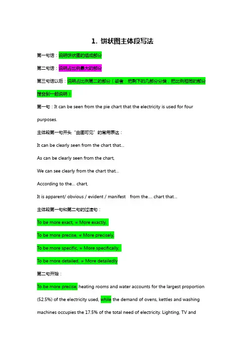
1. 饼状图主体段写法第一句话:说明饼状图的组成部分第二句话:说明占比例最大的部分第三句话以后:说明占比例第二的部分(或者:把剩下的几部分分类,把比例相同的部分捏合到一起说明)第一句:It can be seen from the pie chart that the electricity is used for four purposes.主体段第一句开头“由图可见”的常用表达:It can be clearly seen from the chart that…As can be clearly seen from the chart,We can see clearly from the chart that…According to the… chart,It is apparent/ obvious / evident / manifest from the…. chart that…主体段第一句和第二句的过渡句:To be more exact, = More exactly,To be more precise, = More precisely,To be more specific, = More specifically,To be more detailed, = More detailedly第二句开始:To be more precise, heating rooms and water accounts for the largest proportion (52.5%) of the electricity used, while the demand of ovens, kettles and washing machines occupies the 17.5% of the total need of electricity. Lighting, TV andradio represent the same percentage(15%) as do vacuum cleaners, food mixers and electric tools.饼状图写作要点:1.介绍各扇面及总体的关系2.各个扇面之间的比较,同类扇面在不同时间,不同地点的比较3.重点突出特色最明显的扇面:最大的,最小的,互相成倍的描写句式:1.It is clear that the most +adj. + 主题词is A, which accounts for ___% of all 主题词.2. B is the next largest + 主题词, ___% lower than A of all 主题词and followedclosely by C.3.The above three items of 主题词altogether take about ___%.4.By contrast, D, E and F make the smallest percentage of total 主题词, which are___%, ___% and ___% respectively.模仿例句:In 1950, the urban population represented less than 13% of the total. It is now about 40% and is expected to reach 60% by 2030. (摘自BBC)表示占据的动词或动词短语:form; comprise; make up; occupy; constitute; cover; represent; account for; be shared by倍数和比例的表达:a quarter of ……; half of ……; a majority of ……double (这三个词都可以做名词,动词和形容词); triple; quadruple… be twice as adj. as ……例句:The dining-room is twice as big as the kitchen. … more than ___ times as adj. as …… 例句:There are more than twice as many kangaroos as people in Australia.He is more than three times as rich as I.A has something in common with BA shares some similarity with BThe difference between A and B lies in ……Sentence Patterns:Introduction:The (two) pie charts show (reveal, suggest, illustrate, demonstrate, indicate, describe, relate) the proportion (percentage) of A and B…in (7) (categories), divided into…and…(one is…, another is…)Comparison:1、The biggest difference between (2) groups is in …, where A makes up % while (whereas) B constitutes % (makes up=constitutes=accounts for)the highest percentage / amount of A, which was approximately %, was for…. (=in) /was found in2、The percentage of A in …is more than twice the percentage of B, the ration is % to % (% compared to %)3、In…, while there is (not) a great deal of difference between the percentage of A and B (the former is % and the latter is %).in …, while a greater percentage of A than B are found in…(the former is % and the latter is %).4、There are more A (in …), reaching %, compared with % of B5、By contrast, A has increased (declined), from % in …to % in ….Compared with B, A …Conclusion:To sum up/ In conclusion / It appears that…/ The two charts clearly show…饼状图一例Many women want or need to continue working after they have children. The chart below shows the working after they have children. The chart below shows the working pattern of mothers with young children.the introduction can be written like this:Even just after having a child, a large number women return to work. As the child grows older, the percentage of mothers who choose or need to continue working rises. At least until the child is ten, the larger number of working mothers take part-time occupations. When the child is ten years or older, the number of the full-timers more than doubles while that of the part-timers decrease.Each chart entails / contains instruction, which illustrates what the chart involves rather than the over trends.Paragraph 1:When the youngest child is at most 2 years old, 30% of the women return to work. 19% full-time, and 11% as part-timers.Paragraph 2:The percentage of full timers remains the same until the child turns five and increased slightly to 14% when the child is at most 9 years old, but the percentage of part-time working mothers grows dramatically to 35 and continues growing to 48% by the time the child is 9.Paragraph 3:A change occurs after the child grows to ten. The number of full-time working mothers doubles in percentage to 29, while that of the part-timers is reduced slightly to by 3% to 45%.Conclusion:It appears that, when the child turns to ten, women have much fewer maternal responsibilities than the years before.You should spend about 20 minutes on this task. Write a report for a university lecturer describing the information shown below. You should write at least 150 words.In this analysis we will examine three pie charts. The first one is headed ‘World Spending.’ The second is ‘World Population’ and the third is ‘Consumption ofResources.’In the first chart we can see that people spend most of their income (24%) on food. Transport and then housing are the next major expenses at 18% and 12% respectively. Only 6% of income is spent on clothing.In the second chart entitled ‘World Population’, it is not surprising to find that 57% of people live in Asia. Europe and the Americans account for nearly 30% of the total, whilst 10% of people live in Africa.Finally, the third chart reveals that the USA and Europe consume a huge 60% of the world’s resource.To sum up, the major expenditure is on food, the population figures are the highest for Asia and the major consumers are the USA and Europe. (182 words)范文参考The two graphs show that oil was the major energy source in the USA in both 1980 and 1990 and that coal, natural gas and hydroelectric power remained in much the same proportions. On the other hand, there was a dramatic rise in nuclear power,which doubled its percentage over the ten years.Oil supplied the largest percentage of energy, although the percentage decreased from 42% in 1980 to 33% in 1990. Coal in 1990 was the second largest source of energy, increasing its proportion to 27% from 22% in the previous decade. Natural gas, the second largest source in 1980 at 26%, decreased its share very slightly to provide 25% of America’s energy ten years later. There was no change in the percentage supplied by hydroelectric power which remained at 5% of the total energy used. Nuclear power the greatest change: in 1990 it was 10%, twice that of the 1980s.(152 words)句型套路让“饼图”写作华彩绽放许多考生觉得饼图十分简单,也就是一些百分比及数字的列举,对该类图表不太重视,准备并不充分。
雅思小作文饼图写法全解析雅思小作文饼图写法全解析无论是身处学校还是步入社会,大家都写过作文吧,作文根据体裁的不同可以分为记叙文、说明文、应用文、议论文。
你知道作文怎样写才规范吗?以下是店铺为大家收集的雅思小作文饼图写法全解析,仅供参考,希望能够帮助到大家。
雅思小作文饼图写法全解析在雅思的学术类小作文中我们经常会遇到饼状图写作,不要看着一张一张的图,就退缩了,但是相对来说,这个题型还是比较容易写的一种图形,不过学生们也一定不要当做这是一件简单的事情,想要拿高分还是需要努力的,千万不能掉以轻心,否则不要就是因为这部分得分的不达标而影响到最后的综合得分。
那么下面的文章中,朗阁雅思考试研究中心写作组的专家将要探讨的是饼图中静态数据和动态数据写法中的一些区别,并且将会从高分的角度来对各种写法作一汇总,希望对大家考试的准备有一定的帮助。
首先我们必须搞清楚什么是静态什么是动态数据的饼图:当我们在考试中看到这个图示上的数据都是固定的,没有发生任何变化的时候,那么就能够认定这属于静态数据,搞清楚之后我们就能够开始写作了。
图二:不要以为这里有很多的数据就属于动态的,其实这个图示还是表示是静态的,因为我们看到在途中的各项比重相对来说也是比较稳定的,因此这个饼图的数据也是属于静态的,那么究竟哪种数据属于动态的呢?图三:这个就是动态的图示,为什么这么说呢,因为两张图种的占比数据上出现了很大的差异,这是两个年份的数据,但是各自的所占比重有所不同,所以是动态的数据。
由此,我们可以得出结论,如果我们看到的是一张饼图,而且描述的是一段时间之内比较稳定的数据,那么我们就能基本上断定那就是静态的数据,但是我们如果看到的时候两张饼图,在两个时间段时间的对比,数据出现了明显的变化,那么就能够基本上断定这张图表示的就是动态的题型。
一、静态数据饼图的'主体段写作理论朗阁雅思考试研究中心建议考生可先按照扇形面积大小从大到小排列数据,若遇到饼图中有总数的描述,宜在开头先写。
雅思小作文饼图解题思路饼形图与柱形图或者是线形图所截然不同的是它没有了横轴与纵轴,而以饼形的分割来表示百分比,但我们仍可以依照三步的审题分析法来进行观察:Step 1: 观察共有几张饼图,以及它们之间的关系是什么(一般说来,雅思图表题中极少见到单饼图);Step 2: 观察每张饼图中有哪几个区域,以及各个区域分别代表什么;Step 3: 观察单个饼图中各区域间的百分比差异,以及相同区域在各个饼图间的百分比的比较或发展。
现在我们就来分析一下下面的饼形图:Many women want or need to continue working even after they havechildren. The charts below show the working patterns of mothers withyoung children to care for.Write a report for a university lecturer describing the information on thecharts below.Step 1: 一共有四张饼图,它们分别按照由母亲照料的最年幼孩子的年龄大小来进行排列,从0 ~ 2岁到10岁以上;Step 2: 每张饼图中都有三种区域:白色区、深色区和浅色区。
它们分别表示母亲的工作状态:白色区为“没有工作”,深色区为“兼职工作”,浅色区为“全职工作”;Step 3: 白色区在0 ~ 2岁时处于绝对优势,占70%,而随着孩子年龄的增长,白色区渐渐地变小,在10岁以上时只有26%;深色区在孩子年幼时比例很小:0 ~ 2岁时只有19%。
随着孩子的长大,深色区急剧扩张,在5 ~ 9岁时达到顶峰,占48%,但在10岁以后却轻微下降到45%;而浅色区的变化则是在同一时期内分别占到了11%,11%,14%和29%。
当然,在开始写文章之前,我们还必须决定文章所用的时态。
饼图写作一.饼图Pie Chart的审题过程1. 看文字信息(找出描述对象的谓语的同义词)2. 标题审图标出:中间类/第二大相等/相类似剩余类小的标出:中间类/第二大相等/相类似剩余类小的无变化的/第二大/中间类相等/相类似3. 改写开头段饼图特有本质:The pie chart/graph compares the…….The pie chart/graph shows the comparison ofE.g.:The pie charts shows units of electricity production by fuel source in Australia and France in 1980 and 2000.= The charts compare the source of electricity production by five different sources in Australia and Francein the year 1980 and 2000.二.写作顺序:一个图:(静态描写)先找极端数据的,最大的,再找中间类或第二大的、同类或相类似的,最后看剩余类,即,小的或微不足道的一类的。
两个图:(静态对比描写+ 动态变化描写)1.先写第一个图(静态描述:最大,中间同类,剩余类),再写另一个图,进行对比(动态变化:上升/增长为最大的,下降的为最小,保持不变的或中间类或相等相似类)。
三.饼图写作模板(Body段)一个图:①极端类(最大/多)②中间类(同类/相类似). ③剩余类(小的/微不足道)。
范文E.g.:1.Social skills and education constitute comparatively a majority of their main fields of study, with6.5% and 5.6% respectively, while 2.24%, 1.84% and 2.10% are shared by ad., science and computer.The remaining percentages are in moderation, with 5.53% for science and 7.4% for ads.2.Coal makes up the maximal portion/ the majority of the source/was the biggest instrument of thesources of energy, with 47%, while Nuclear accounted for a tiny share, with only 1%. Furthermore, 28% altogether of the energy was shared by Oil and Hydro. The remaining 24% was due to Natural Gas.结尾1.Through the charts, we can easily draw the conclusion that the new source of energy, particularlyNuclear was given full play while the traditional ones, though still dominant, reached their bottleneck/ceiling to some extent.2.Overall, it is clear that by 2000 these two countries relied on different principal fuel source: Australiarelied on coal and Franc on nuclear power.两个图:一段(静态):①最大的②中间类(同类/相类似). ③剩余类(小的/微不足道)二段(动态):However,①上升/增长为最大的②下降为最小的③保持不变的或中间类或相等相似类)。
雅思小作文:饼状图一例Many women want or need to continue working after they have children. The chart below shows the working after they have children. The chart below shows the working pattern of mothers with young children.作文写作要点:介绍各扇面及总体的关系。
各个扇面之间的比较,同类扇面在不同时间、不同地点的比较。
重点突出特点最明显的扇面:最大的、最小的、互相成倍的。
The basic trends of the four charts:Just after bearing children, back to work.The older child…the more…Most part-time during child 5~9Child 10+, full time double, part-time lessthe introduction can be written like this:Even just after having a child, a large number women return to work. As the child grows older, the percentage of mothers who choose or need to continue working rises. At least until the child is ten, the larger number of working mothers take part-time occupations. When the child is ten years or older, the number of the full-timers more than doubles while that of the part-timers decrease.Each chart entails / contains instruction, which illustrates what the chart involves rather than the over trends.Writing Paragraphs:Information analyzed according to the pie charts.Child 0~2, 30% back to work (19p.t., 11f.t.)3~4, p.t. up dramatically to 35%, f.t. same5~9, p.t. up consistently to 48%, f.t. slight increase to 14%10+, p.t. slightly 3% down, f.t. double to 29%Paragraph 1:When the youngest child is at most 2 years old, 30% of the women return to work. 19% full-time, and 11% as part-timers.Paragraph 2:The percentage of full timers remains the same until the child turns five and increased slightly to 14% when the child is at most 9 years old, but the percentage of part-time working mothers grows dramatically to 35 and continues growing to 48% by the time the child is 9.Paragraph 3:A change occurs after the child grows to ten. The number of full-time working mothers doubles in percentage to 29, while that of the part-timers is reduced slightly to by 3% to 45%.Conclusion:It appears that, when the child turns to ten, women have much fewer maternal responsibilities than the years before.Sentence Patterns:Introduction:The (two) pie charts show (reveal, suggest, illustrate, demonstrate, indicate, describe, relate) the proportion (percentage) of A and B…in (7) (categories), divided into…and…(one is…, another is…)Comparison:1、The biggest difference between (2) groups is in …, where A makes up % while (whereas) B constitutes % (makes up=constitutes=accounts for)the highest percentage / amount of A, which was approximately %, was for…. (=in) /was found in2、The percentage of A in …is more than twice the percentage of B, the ration is % to % (% compared to %)3、In…, while there is (not) a great deal of difference between the percentage of A andB (the former is % and the latter is %).in …, while a greater percentage of A than B are found in…(the former is % and the latter is %).4、There are more A (in …), reaching %, compared with % of B5、By contrast, A has increased (declined), from % in …to % in ….Compared with B, A …Conclusion:To sum upIn conclusionIt appears that…The two charts clearly show…。