雅思折线图写作常用句型
- 格式:doc
- 大小:84.00 KB
- 文档页数:4
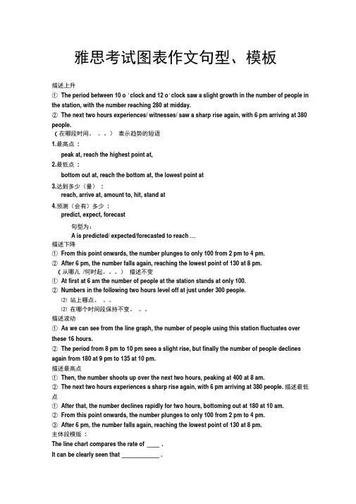
雅思考试图表作文句型、模板描述上升①The period between 10 o 'clock and 12 o'clock saw a slight growth in the number of people in the station, with the number reaching 280 at midday.②The next two hours experiences/ witnesses/ saw a sharp rise again, with 6 pm arriving at 380 people.(在哪段时间。
)表示趋势的短语1.最高点:peak at, reach the highest point at,2.最低点:bottom out at, reach the bottom at, the lowest point at3.达到多少(量):reach, arrive at, amount to, hit, stand at4.预测(会有)多少:predict, expect, forecast句型为:A is predicted/ expected/forecasted to reach …描述下降①From this point onwards, the number plunges to only 100 from 2 pm to 4 pm.②After 6 pm, the number falls again, reaching the lowest point of 130 at 8 pm.(从哪儿/何时起。
)描述不变①At first at 6 am the number of people at the station stands at only 100.②Numbers in the following two hours level off at just under 300 people.⑵ 站上哪点。

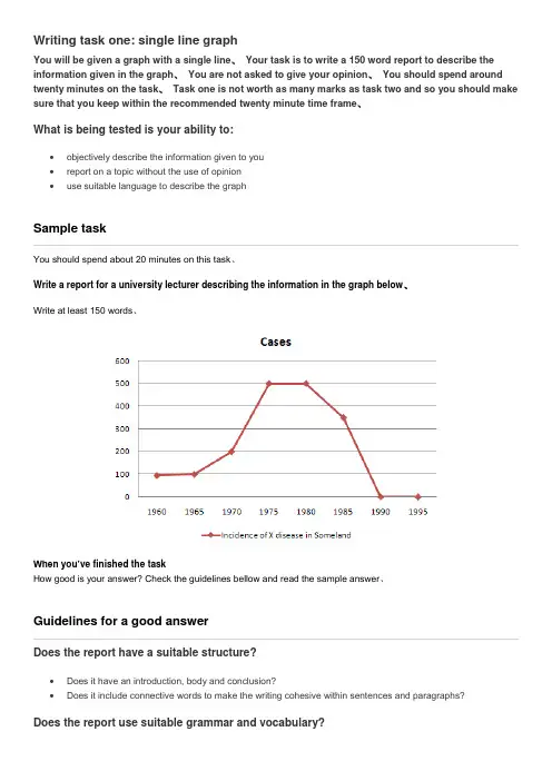
【关键字】雅思Writing task one: single line graphYou will be given a graph with a single line. Your task is to write a 150 word report to describe the information given in the graph. You are not asked to give your opinion. You should spend around twenty minutes on the task. Task one is not worth as many marks as task two and so you should make sure that you keep within the recommended twenty minute time frame.What is being tested is your ability to:•objectively describe the information given to you•report on a topic without the use of opinion•use suitable language to describe the graphSample taskYou should spend about 20 minutes on this task.Write a report for a university lecturer describing the information in the graph below.Write at least 150 words.When you’ve finished the taskHow good is your answer? Check the guidelines bellow and read the sample answer.Guidelines for a good answerDoes the report have a suitable structure?•Does it have an introduction, body and conclusion?•Does it include connective words to make the writing cohesive within sentences and paragraphs?Does the report use suitable grammar and vocabulary?•Does it include a variety of sentence structures?•Does it include a range of appropriate vocabulary?Does the report meet the requirements of the task?•Does it meet the word limit requirements?•Does it describe the whole graph adequately?•Does it focus on the important trends presented in the graphic information?Sample answerThe graph shows the number of cases of X disease in Someland between the years 1960 and 1995. As an overall trend, it is clear that the number of cases of the disease increased fairly rapidly until the mid seventies, remained constant for around a decade at 500 cases before dropping to zero in the late 80s.In 1960, the number of cases stood at approximately 100. That number rose steadily to 200 by 1969 and then more sharply to 500 in 1977. At this point the number of cases remained stable until 1984 before plummeting to zero by 1988. From 1988 to 1995 Someland was free of the disease.In conclusion, the graph shows that the disease was increasingly prevalent until the 1980s when it was eradicated from Someland.What do you think?What is your opinion of this sample answer? How well does it meet the requirements of the guidelines? Read the teacher's comments on this answer.Teacher's comments on the sample answer“The report structure is easy to follow and logical with a clear introduction, body and conclusion. The candidate uses cohesive words to connect pieces of informatio n and make the writing flow such as ‘until’ and ‘before’ in the second sentence. The candidate uses a variety of grammatical structures and vocabulary so that the writing is not repetitive.In terms of task requirements the report is a little short but this is because the simple graph used as an example does not have sufficient information for the candidate to describe. In the real IELTS test the graph will have more information and so the need to look for trends will be even greater than in this example.”Strategies for improving your IELTS scoreSelecting informationIt is important that you describe the whole graph fully. However, this does not mean that you should note every detail. In most cases there will be too much information for you to mention each figure. You will therefore need to summarise the graph by dividing it into its main parts. This is what we mean by describing the trends.For example, in a chronological line graph it might seem sensible to describe the information year by year or period by period. The graph above gives the information in five year sections so we could write our report like this:The number of cases of X disease started at 50 in 1965 and then went up gradually to 100 in 1965 and continued up to 200 in 1970 and then went up more sharply to 380 in 1975.While this way of describing the information may be accurate, it does not meaningfully sum up the information in the graph. In fact, the information in the graph would most meaningfully be described in four chronological sections following the shape of the graph.In the Sample Task, the graph shows four main trends:•first, a gradual increase from 1960 to 1968•second, a steeper increase from 1968 to 1977•third, a plateau from 1977 to 1983•fourth, a drop from 1983 to 1988The structure of the report must show these four main trends clearly.Report structureYour report should be structured simply with an introduction, body and conclusion. Tenses should be used appropriately.IntroductionUse two standard opening sentences to introduce your report. These opening sentences should make up the first paragraph. Sentence one should define what the graph is about; that is, the date, location, what is being described in the graph etc. For example:The graph shows the number of cases of X d isease in Someland between the years 1960 and 1995 …Notice the tense used. Even though it describes information from the past, the graph shows the information in the present time.Notice that the sample opening sentence does not simply copy the words used on the graphic material. Copied sentences will not be assessed by the examiner and so you waste your time including them.Describing the overall trendSentence two (and possibly three) might sum up the overall trend. For example:It can be clearly seen that X disease increased rapidly to 500 cases around the 1980s and then dropped to zero before 1999, while Y disease fell consistently from a high point of nearly 600 cases in 1960 to less than 100 cases in 1995.Notice the tense used. Here we are talking about the occurrence of the disease in the past.Describing the graph in detailThe body of the report will describe the graph or graphs in detail. You will need to decide on the most clear and logical order to present the material.Line graphs generally present information in chronological order and so the most logical order for you to write up the information would, most probably be from earliest to latest. Bar graphs, pie charts are organised in different ways and so you need to decide on the organisation of each one.Concluding sentencesYour report may end with one or two sentences which summarise your report to draw a relevant conclusion. Grammar and vocabularyAvoiding repetitionYou will receive a higher mark if your writing uses a range of structures and vocabulary correctly rather than a limited number. For example, the candidate who writes:The number of cases of X disease started at 50 in 1965 and then went up to 200 in 1970 and then went up to 500 in 1980 and then went down to zero in 1990.will lose marks for being repetitive. You should therefore practise writing reports using a wide variety of terms to describe the different movements in the graphs and different structures to vary your writing.Describing trendsTrends are changes or movements. These changes are normally expressed in numeric items, for example, population, production volumes or unemployment. There are three basic trends:Expressing movement: nouns and verbsFor each trend there are a number of verbs and nouns to express the movement. We can use a verb of change, for example:Unemployment levels fellOr we can use a related noun, for example:There was a fall in unemployment levelsThere has been a slight increase in the value of the dollar (degree of change)Unemployment fell rapidly last year (the speed of change)Remember that we modify a noun with an adjective (a slight increase) and a verb with an adverb (to increase slightly).Describing the degree of changeDescribing the speed of changeslow slowlyExercise 1Use the following terms and any others necessary to describe the graph below.initially, stood at, dip/dipped, peak/peaked, level/levelled outWe can describe a trend by looking at:•the difference between two levels•the end point of the trendDescribing the difference between two levelsThis year unemployment has increased by 20,000 cases (the difference between this year and last year is 20,000 cases).This year there has been an increase in unemployment of 5%.Notice the prepositions. We use to increase by (with the verb) and an increase of (with the noun).Describing the end pointThis year unemployment has risen to 10% (the end result is that unemployment is up to 10%).This year there has been a rise in unemployment to 10%.Notice the prepositions. We use to rise to (with the verb) and a rise to (with the noun).Exercise 2Write 3 sentences describing the graph below using by, of and to.Expressing approximationWe use words to express approximation when the point we are trying to describe is between milestones on the graph.just under well under roughly approximatelyabout just over well over nearly此文档是由网络收集并进行重新排版整理.word可编辑版本!。

Writing task one: single line graphYou will be given a graph with a single line. Your task is to write a 150 word report to describe the information given in the graph. You are not asked to give your opinion. You should spend around twenty minutes on the task. Task one is not worth as many marks as task two and so you should make sure that you keep within the recommended twenty minute time frame.What is being tested is your ability to:∙objectively describe the information given to you∙report on a topic without the use of opinion∙use suitable language to describe the graphSample taskYou should spend about 20 minutes on this task.Write a report for a university lecturer describing the information in the graph below.Write at least 150 words.When you’ve finished the taskHow good is your answer? Check the guidelines bellow and read the sample answer.Guidelines for a good answerDoes the report have a suitable structure?∙Does it have an introduction, body and conclusion?∙Does it include connective words to make the writing cohesive within sentences and paragraphs? Does the report use suitable grammar and vocabulary?∙Does it include a variety of sentence structures?∙Does it include a range of appropriate vocabulary?Does the report meet the requirements of the task?∙Does it meet the word limit requirements?∙Does it describe the whole graph adequately?∙Does it focus on the important trends presented in the graphic information?Sample answerThe graph shows the number of cases of X disease in Someland between the years 1960 and 1995. As an overall trend, it is clear that the number of cases of the disease increased fairly rapidly until the mid seventies, remained constant for around a decade at 500 cases before dropping to zero in the late 80s.In 1960, the number of cases stood at approximately 100. That number rose steadily to 200 by 1969 and then more sharply to 500 in 1977. At this point the number of cases remained stable until 1984 before plummeting to zero by 1988. From 1988 to 1995 Someland was free of the disease.In conclusion, the graph shows that the disease was increasingly prevalent until the 1980s when it was eradicated from Someland.What do you think?What is your opinion of this sample answer? How well does it meet the requirements of the guidelines? Read the teacher's comments on this answer.Teacher's comments on the sample answer“The report structure is easy to follow and logical with a clear introduction, body and conclusion. The candidate uses cohesive words to connect pieces of information and make the writing flow such as ‘until’and ‘before’ in the second sentence. The candidate uses a variety of grammatical structures and vocabulary so that the writing is not repetitive.In terms of task requirements the report is a little short but this is because the simple graph used as an example does not have sufficient information for the candidate to describe. In the real IELTS test the graph will have more information and so the need to look for trends will be even greater than in this example.”Strategies for improving your IELTS scoreSelecting informationIt is important that you describe the whole graph fully. However, this does not mean that you should note every detail. In most cases there will be too much information for you to mention each figure. You will therefore need to summarise the graph by dividing it into its main parts. This is what we mean by describing the trends.For example, in a chronological line graph it might seem sensible to describe the information year by year or period by period. The graph above gives the information in five year sections so we could write our report like this:The number of cases of X disease started at 50 in 1965 and then went up gradually to 100 in 1965 and continued up to 200 in 1970 and then went up more sharply to 380 in 1975.While this way of describing the information may be accurate, it does not meaningfully sum up the information in the graph. In fact, the information in the graph would most meaningfully be described in four chronological sections following the shape of the graph.In the Sample Task, the graph shows four main trends:∙first, a gradual increase from 1960 to 1968∙second, a steeper increase from 1968 to 1977∙third, a plateau from 1977 to 1983∙fourth, a drop from 1983 to 1988The structure of the report must show these four main trends clearly.Report structureYour report should be structured simply with an introduction, body and conclusion. Tenses should be used appropriately.IntroductionUse two standard opening sentences to introduce your report. These opening sentences should make up the first paragraph. Sentence one should define what the graph is about; that is, the date, location, what is being described in the graph etc. For example:The graph shows the number of cases of X disease in Someland between the years 1960 and 1995 …Notice the tense used. Even though it describes information from the past, the graph shows the information in the present time.Notice that the sample opening sentence does not simply copy the words used on the graphic material. Copied sentences will not be assessed by the examiner and so you waste your time including them.Describing the overall trendSentence two (and possibly three) might sum up the overall trend. For example:It can be clearly seen that X disease increased rapidly to 500 cases around the 1980s and then dropped to zero before 1999, while Y disease fell consistently from a high point of nearly 600 cases in 1960 to less than 100 cases in 1995.Notice the tense used. Here we are talking about the occurrence of the disease in the past.Describing the graph in detailThe body of the report will describe the graph or graphs in detail. You will need to decide on the most clear and logical order to present the material.Line graphs generally present information in chronological order and so the most logical order for you to write up the information would, most probably be from earliest to latest. Bar graphs, pie charts are organised in different ways and so you need to decide on the organisation of each one.Concluding sentencesYour report may end with one or two sentences which summarise your report to draw a relevant conclusion. Grammar and vocabularyAvoiding repetitionYou will receive a higher mark if your writing uses a range of structures and vocabulary correctly rather than a limited number. For example, the candidate who writes:The number of cases of X disease started at 50 in 1965 and then went up to 200 in 1970 and then went up to 500 in 1980 and then went down to zero in 1990.will lose marks for being repetitive. You should therefore practise writing reports using a wide variety of terms to describe the different movements in the graphs and different structures to vary your writing.Describing trendsTrends are changes or movements. These changes are normally expressed in numeric items, for example, population, production volumes or unemployment. There are three basic trends:Expressing movement: nouns and verbsFor each trend there are a number of verbs and nouns to express the movement. We can use a verb of change, for example:Unemployment levels fellOr we can use a related noun, for example: There was a fall in unemployment levelsRemember that we modify a noun with an adjective (a slight increase) and a verb with an adverb (to increase slightly).Describing the degree of changeDescribing the speed of changeExercise 1Use the following terms and any others necessary to describe the graph below.initially, stood at, dip/dipped, peak/peaked, level/levelled outWe can describe a trend by looking at:∙the difference between two levels∙the end point of the trendDescribing the difference between two levelsThis year unemployment has increased by20,000 cases (the difference between this year and last year is 20,000 cases).This year there has been an increase in unemployment of5%.Notice the prepositions. We use to increase by(with the verb) and an increase of(with the noun). Describing the end pointThis year unemployment has risen to 10% (the end result is that unemployment is up to 10%).This year there has been a rise in unemployment to 10%.Notice the prepositions. We use to rise to(with the verb) and a rise to(with the noun). Exercise 2Write 3 sentences describing the graph below using by, of and to.Expressing approximationWe use words to express approximation when the point we are trying to describe is between milestones on the graph.just under well under roughly approximatelyabout just over well over nearly。
Writing task one: single line graphYou will be given a graph with a single line、Your task is to write a 150 word report to describe the information given in the graph、You are not asked to give your opinion、You should spend around twenty minutes on the task、Task one is not worth as many marks as task two and so you should make sure that you keep within the recommended twenty minute time frame、What is being tested is your ability to:•objectively describe the information given to you•report on a topic without the use of opinion•use suitable language to describe the graphSample taskYou should spend about 20 minutes on this task、Write a report for a university lecturer describing the information in the graph below、Write at least 150 words、When you’ve finished the taskHow good is your answer? Check the guidelines bellow and read the sample answer、Guidelines for a good answerDoes the report have a suitable structure?•Does it have an introduction, body and conclusion?•Does it include connective words to make the writing cohesive within sentences and paragraphs?Does the report use suitable grammar and vocabulary?•Does it include a variety of sentence structures?•Does it include a range of appropriate vocabulary?Does the report meet the requirements of the task?•Does it meet the word limit requirements?•Does it describe the whole graph adequately?•Does it focus on the important trends presented in the graphic information?Sample answerThe graph shows the number of cases of X disease in Someland between the years 1960 and 1995、As an overall trend, it is clear that the number of cases of the disease increased fairly rapidly until the mid seventies, remained constant for around a decade at 500 cases before dropping to zero in the late 80s、In 1960, the number of cases stood at approximately 100、That number rose steadily to 200 by 1969 and then more sharply to 500 in 1977、At this point the number of cases remained stable until 1984 before plummeting to zero by 1988、From 1988 to 1995 Someland was free of the disease、In conclusion, the graph shows that the disease was increasingly prevalent until the 1980s when it was eradicated from Someland、What do you think?What is your opinion of this sample answer? How well does it meet the requirements of the guidelines? Read the teacher's comments on this answer、Teacher's comments on the sample answer“The report structure is easy to follow and logical with a clear introduction, body and conclusion、The candidate uses cohesive words to connect pieces of in formation and make the writing flow such as ‘until’ and ‘before’ in the second sentence、The candidate uses a variety of grammatical structures and vocabulary so that the writing is not repetitive、In terms of task requirements the report is a little short but this is because the simple graph used as an example does not have sufficient information for the candidate to describe、In the real IELTS test the graph will have more information and so the need to look for trends will be even greater than in this example、”Strategies for improving your IELTS scoreSelecting informationIt is important that you describe the whole graph fully、However, this does not mean that you should note every detail、In most cases there will be too much information for you to mention each figure、You will therefore need to summarise the graph by dividing it into its main parts、This is what we mean by describing the trends、For example, in a chronological line graph it might seem sensible to describe the information year by year or period by period、The graph above gives the information in five year sections so we could write our report like this:The number of cases of X disease started at 50 in 1965 and then went up gradually to 100 in 1965 and continued up to 200 in 1970 and then went up more sharply to 380 in 1975、While this way of describing the information may be accurate, it does not meaningfully sum up the information in the graph、In fact, the information in the graph would most meaningfully be described in four chronological sections following the shape of the graph、In the Sample Task, the graph shows four main trends:•first, a gradual increase from 1960 to 1968•second, a steeper increase from 1968 to 1977•third, a plateau from 1977 to 1983•fourth, a drop from 1983 to 1988The structure of the report must show these four main trends clearly、Report structureYour report should be structured simply with an introduction, body and conclusion、Tenses should be used appropriately、IntroductionUse two standard opening sentences to introduce your report、These opening sentences should make up the first paragraph、Sentence one should define what the graph is about; that is, the date, location, what is being described in the graph etc、For example:The graph shows the number of ca ses of X disease in Someland between the years 1960 and 1995 …Notice the tense used、Even though it describes information from the past, the graph shows the information in the present time、Notice that the sample opening sentence does not simply copy the words used on the graphic material、Copied sentences will not be assessed by the examiner and so you waste your time including them、Describing the overall trendSentence two (and possibly three) might sum up the overall trend、For example:It can be clearly seen that X disease increased rapidly to 500 cases around the 1980s and then dropped to zero before 1999, while Y disease fell consistently from a high point of nearly 600 cases in 1960 to less than 100 cases in 1995、Notice the tense used、Here we are talking about the occurrence of the disease in the past、Describing the graph in detailThe body of the report will describe the graph or graphs in detail、You will need to decide on the most clear and logical order to present the material、Line graphs generally present information in chronological order and so the most logical order for you to write up the information would, most probably be from earliest to latest、Bar graphs, pie charts are organised in different ways and so you need to decide on the organisation of each one、Concluding sentencesYour report may end with one or two sentences which summarise your report to draw a relevant conclusion、Grammar and vocabularyAvoiding repetitionYou will receive a higher mark if your writing uses a range of structures and vocabulary correctly rather than a limited number、For example, the candidate who writes:The number of cases of X disease started at 50 in 1965 and then went up to 200 in 1970 and then went up to 500 in 1980 and then went down to zero in 1990、will lose marks for being repetitive、You should therefore practise writing reports using a wide variety of terms to describe the different movements in the graphs and different structures to vary your writing、Describing trendsTrends are changes or movements、These changes are normally expressed in numeric items, for example, population, production volumes or unemployment、There are three basic trends:Expressing movement: nouns and verbsFor each trend there are a number of verbs and nouns to express the movement、We can use a verb of change, for example:Unemployment levels fellOr we can use a related noun, for example:There was a fall in unemployment levelsDirection Verbs NounsRose (to)Increased (to)Went up (to)Climbed (to)BoomedA riseAn increaseGrowthAn upward trendA boom (a dramatic rise)Fell (to)Declined (to) Decreased (to) Dipped (to) Dropped (to) Went down (to) Slumped (to) Reduced (to)A decreaseA declineA fallA dropA slump (a dramatic fall) A reductionLevelled out (at) Did not changeRemained stable (at) Remained steady (at) Stayed constant (at) Maintained the same level A levelling out No changeFluctuated (around) Peaked (at) Plateaued (at)Stood at (we use this phrase to focus on a particular point, before we mention the movement, for example:In the first year, unemployment stood at … )A fluctuationReached a peak (of) Reached at plateau (at)Describing the movement: adjectives and adverbsSometimes we need to give more information about a trend as follows:There has been a slight increase in the value of the dollar (degree of change)Unemployment fell rapidly last year (the speed of change)Remember that we modify a noun with an adjective (a slight increase) and a verb with an adverb (to increase slightly)、Describing the degree of changeAdjectives Adverbsdramatic dramaticallysharp sharplyhugeenormous enormouslysteep steeplysubstantial substantiallyDescribing the speed of changeExercise 1Use the following terms and any others necessary to describe the graph below、initially, stood at, dip/dipped, peak/peaked, level/levelled outWe can describe a trend by looking at:•the difference between two levels•the end point of the trendDescribing the difference between two levelsThis year unemployment has increased by 20,000 cases (the difference between this year and last year is 20,000 cases)、This year there has been an increase in unemployment of 5%、Notice the prepositions、We use to increase by (with the verb) and an increase of (with the noun)、Describing the end pointThis year unemployment has risen to 10% (the end result is that unemployment is up to 10%)、This year there has been a rise in unemployment to 10%、Notice the prepositions、We use to rise to (with the verb) and a rise to (with the noun)、Exercise 2Write 3 sentences describing the graph below using by, of and to、Expressing approximationWe use words to express approximation when the point we are trying to describe is between milestones on the graph、just under well under roughly approximatelyabout just over well over nearly。
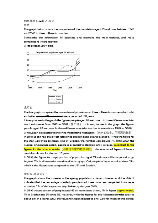
剑桥雅思6-test1-小作文题目:The graph below shows the proportion of the population aged 65 and over between 1940 and 2040 in three different countries.Summarise the information by selecting and reporting the main features, and make comparisons where relevant.Write at least 150 words.我写的The line graph compares the proportion of population in three different countries which is 65 and older over a 100year periodover a period of 100 years.It is easy to see in the graph the figures people aged 65 and over in three different countries tend to increase from 1940 to 2040(整个句子:It is easy to see in the graph the figures people aged 65 and over in three different countries tend to increase from 1940 to 2040), While Japan is expected to show the most drastic fluctuation.(未来的数字,用预测的被动)In 1940, Japan had the lowest rates of population aged 65 and over at 5%, while the figure for the USA was twice as Japan. And in Sweden, the number was around 7%. Until 2030, the number of Japanese elderly people is expected to stand at 10%. However, in contrast to the figures for the other countries(与其他国家的数字相比), the number of Japan will have a considerable rise for the next 10 years.In 2040, the figure for the proportion of population aged 65 and over will be expected to go beyond 23% in all countries mentioned in the graph. Old people in Japan stand at about 28%, which is the highest rate compared to the USA and Sweden.新东方-高分范文:The graph shows the increase in the ageing population in Japan, Sweden and the USA. It indicates that the percentage of elderly people in all three countries is expected to increase to almost 25% of the respective populations by the year 2040.In 1940 the proportion of people aged 65 or more stood at only 5% in Japan, approximately 7% in Sweden and 9% in the US. However, while the figures for the Western countries grew tobefore rising to almost 5% again at the present time.In spite of some fluctuation in the expected percentages, the proportion of older people will probably continue to increase in the next two decades in the three countries. A more dramatic rise is predicted between 2030 and 2040 in Japan, by which time it is thought that the proportion of elderly people will be similar in the three countries.Simon版本范文:The line graph compares the percentage of people(proportion of the population的同义替换)aged 65 or more(over同义替换)in three countries over a period of 100 years(小作文中描述图表涉及的年段就用这个表述,背诵)It is clear that(小作文概览段句型)the proportion of elderly people increases in each country between 1940 and 2040. Japan is expected to see the most dramatic changes in its elderly population.In 1940, around 9% of Americans(知道具体国家人的称呼的时候可以替换国家名词)were aged 65 or over, compared to about 7% of Swedish people and 5% of Japanese people. The proportions of elderly people in the USA and Sweden rose gradually over the next 50 years, reaching just under 15%(表示仅仅少一点)in 1990. By contrast, the figures for Japan remained below 5% until the early 2000s.Looking into the future, a sudden increase in the percentage of elderly people is predicted for Japan, with a jump of over 15% in just 10 years from 2030 to 2040(日本的老年人口比例被预测突然增加突然增加,从2030年到2040年的短短10年时间里,比例将增长15%以上). By 2040, it is thought that around 27% of the Japanese population will be 65 years old or more, while the figures for Sweden and the USA will be slightly lower, at about 25% and 23% respectively(而瑞典和美国的数字则略低,分别约为25%和23%).积累:第一段(改写):小作文中描述图表涉及的一段时间:over a period of 100 years第二段:第一句句型:It is clear that图表中超过三类:in each country,in three countries表示整体趋势是剧烈的增长:see the most dramatic changes数据段:直接描述数据,句子太短则用compare对比其他类别的数据:around 9% of Americans were aged 65 or over,compared to about 7% of Swedish people and 5% of Japanese people.表述剧烈的百分比增长:a sudden increase in the percentage of elderly people is predicted for Japan在一段时间内持续缓慢增长,然后在某一年到达了一个数字:rose gradually over the next 50 years,reaching just under 15% in 1990直到某个时候一直低于某一数字:the figures for Japan remained below 5% until the early 2000sabout 25% and 23% respectively.表示(未来)一段时间内的突然增加(从什么年代到什么年代),从什么数字到什么数字,:a sudden increase in the percentage of elderly people is predicted for Japan, with a jump of over 15% in just 10 years from 2030 to 2040水字数必备短语:与其他国家的数字相比:in contrast to the figures for the other countries图表中有未来的年代,描述未来的第一句:Looking into the future具体数字前面的形容词:不太确定,大概数字:around,approximately,almost,about,nearly表示只有:just over,only多:over,further,少:under,below其他:比例的同义替换:percentage of people,proportion of the population老人的同义替换:elderly people,elderly population进行比较的连接词:while,by contrast,表示未来的数据:it is thought that,is predicted for Japan ,is expected to see the most dramatic changes折线图:关于结构:第一段:第二段:概述段用一般现在时图表中如果有未来的数据,则用“预测”的被动。

雅思图表作文经典句型参考雅思图表作文经典句型参考1.the table shows the changes in the number of...over the period from...to... 该表格描述了在.。
年之.。
年间.。
数量的变化。
2.the bar chart illustrates that... 该柱状图展示了.。
3.the graph provides some interesting data regarding... 该图为我们提供了有关.。
有趣数据。
4.the diagram shows ... 该图向我们展示了.。
5.the pie graph depicts .... 该圆形图提醒了.。
6.this is a cure graph which describes the trend of... 这个曲线图描述了.。
的趋势。
7.the figures/statistics show ... 数据说明.。
8.the tree diagram reveals how... 该树型图向我们提醒了如何.。
9.the data/statistics show ... 该数据可以这样理解.。
10.the data/statistics/figures lead us to the conclusion that... 这些数据资料令我们得出结论.。
11.as is shown/demonstrated/exhibited in thediagram/graph/chart/table... 如下图.。
12.aording to the chart/figures... 根据这些表.。
13.as is shown in the table... 如表格所示.。
14.as can be seen from the diagram,great changes have taken place in... 从图中可以看出,.。
雅思小作文写作模板曲线图题型导语:文考试当中占有很大的比重,它注重考察学生的综合能力。
以下是为大家精心的雅思小作文写作模板:曲线图题型,欢送大家参考!· 先根据横轴分析变化,然后再进行比拟。
· 第一段介绍核心信息(e.g.时间地点研究对象);一句话即可· 第二三段先分析第一个时间点,再分析后一个时间点。
雅思小作文曲线图常用句型&短语:Excel in something = have advantage in something图表描述::The g raph shows/illustrates/displays …表曲线:· 表程度:Felldramatically/significantly/astonishingly/considerably/stead ily to approximately 100 and 200 respectively; noticeable decrease· Slightly/marginally more women than men …· 表上升 The graph showed an upward trend/ something soars to…; Increase/ rise/ grow/ go up/ improve/ climb/ boom/ leap· 表下降:decrease/fall/drop/dip/godown/decline/reduce· Exceed/overtake/outnumber – e.g. Men with postgraduate diplomas clearly outnumbered their female counterparts.· 数值相同:Coal as a source for only 25 units of electricity in 1980, which was matched by natural gas · 数值不方便时可用括号表述。
雅思图表作文模板句Para1. This is a table / chart / (line线状bar柱状pie饼状)graph which demonstrate / illustrate / reveal /depict /privide information about............. Para2. (1)Obvious /Apparent from the graph is that ...rank the first/highest,while/whereas ....turn out to be the lowest(2)It is exhibited/shown in the table that.....(3)It can be seen from the table that.....Para3.(1)饼.柱图A,which accounts for...%,ranks the first;then next is B with...%;followed by C,constituting...%;finally it comes D.E.F at...%...%and...%respectively(2)特殊变化(不变,增长或下降多的)①It is worth mentioning that....②It must be pointed out that....③More striking/suprising is that....Para4.To conclude /In conclusion/overallPara5. this is a graph which illustrates...这个图表向我们展示了...Para6 .this table shows the changing proportion of a &b from...to...该表格描述了...年到...年间a与b的比例关系。
小作文普通图表题开头段改写1.图表形式:Graph-line graphChart-pie chart, bar chartTableProcess diagramMap2.动词形式:Show/Illustrate/indicate/reveal /compare(一般用于静态图)3.数据内容:变化:changes in通用表达:Different kinds of n.→直接罗列具体的n.词性转换:The consumption of n.= the amount of n. consumed地点:In a European country= in a certain/particular European country4.时间段:over a period of x years/from A to B/between A and B/throughout the period of5.常用句型:动态图:The line graph illustrates changes in the amounts of fish lamb, chicken and beef consumed in a certain European country=The line graph illustrates how the consumption of fish, lamb and chicken changed in a European country.静态图:The table compares xx in term of xxx中间段写作动态图(描述趋势)1.变化描述①上升:动词:increase/rise/grow/soar/double/triple名词:increase/rise/growth/upward trend/increment其他:down / up from + 数字+ 时间点②下降:动词:decrease/fall/drop/decline/dip(微小下降)名词:decrease/fall/drop/decline/dip/downward trend③保持稳定:keep/remain/maintain + stable/constant④波动:fluctuate(fluctuation不可数名词)⑤达到顶峰:peak at+data/reach a peak of⑥达到谷底:bottom at+data/reach a bottom of/reach a trough of*顶峰和谷底一定是在波动过程中达到的极值而非最大最小值⑦最大值/最小值:maximum/minimum最大值的其他表达:rank the first/top the list表示某个数据极小:Xx are no longer significant主要数据:Dominant=main剩余的:The remainder⑧相似或相等:be similar to/ be equal with/be matched by⑨放缓:slow (down)⑩开始于/达到/结束于:start at/reach/end at⑪超过:overtake/outnumber(一定是数量上)/surpass⑫数量回落至最初:it was the same to the xxxx(年份)figure⑬波动变化:with some fluctuation/in spite of some fluctuation⑭达到:stand at/reach+数字⑮A和B同时发生:A coincide with B2.修饰词汇的使用:大约:about/around/almost/approximately显著的变化:obvious/significant/noticeable/considerable/dramatic(一定是最显著的变化)微小的变化:slight/insignificant快速变化:sharp/rapid缓慢变化:slow稳定的变化:steady/gradual稳健的增长:robust growth3.主语描述①数量描述:The number of+可数名词The amount of+不可数名词或后缀单位的可数名词(tones, grams, miles, times等)The quantity of+不可数名词或可数名词(无生命的)A figure(用来代替data,data在雅思写作中不常用)for②比例描述:Percentage of:只能是百分比Proportion of:可以是单纯的比例比例占有:account for/share/make up/represent/constitute/take up③状态描述:前三大:top three/the 3 highest ranking xx4.连接词①当段落内部只有一个对象时:And then; after that;②当段落内部有多个对象时:趋势相反或趋势相同A呈现出与B相反的趋势:In contrast; oppositely; conversely; however; A saw an opposed trend; on the other hand与此相同的是:Similarly,……; A saw a similar trend③ What is also worth mentioning is that④To be precise, xx5.常用句型①动词句型写作对象(主语)+趋势+数据范围(第一次写的时候一定要带完整单位)+时间范围Eg.The consumption of chicken increased significantly from about 140 grams per person per week to 250 grams between 1979 and 2004 = The amount of chicken consumed rose dramatically from 140grams per person per week to 250 grams during the period from 1979 to 2004.②名词句型△there be句型There was a significant increase in the consumption of chicken from 140 grams per person per week to 250 grams between 1979 and 2004.△被动句型A dramatic rise can be seen/observed in the consumption of chicken from 140 grams per person per week to 250 grams between 1979 and 2004.静态图(比较差异)比较差异:A最大,while B最小;比较级相似或相等:be similar to/ be equal with/A which is matched by B倍数:xx is twice bigger than that of xx/ xx is twice as big as that of xx数据范围:range from xxx to xxx都大于或小于多少流程图(process program/flow chart/diagram)The depicted diagram outlines the process of xxx内容物:原材料(raw materials)设备(equipment, apparatus)处理办法(be done)产物或中间产物(product)步骤:stage/phase/step设备:equipment/apparatus总结段:一般写有多少个步骤A consists of x distinct steps/stagesIt requires x steps中间段:1.第一句话交代原材料As for cement making, limestone and clay are the raw materials used in this process.2. 任何一个设备的后面都可以跟where从句In the first stage, limestone and clay are sent to a crusher, where they are crushed to produce powder.3. 任何两个步骤之间都可以使用once/after( 一旦…)进行连接Once/after the powder is mixed in a mixer, it is further transported to a rotating heater, where it is heated for sometime.4. 任何两个步骤之间也可以使用after which进行连接Then the powder is mixed in a mixer, after which it is further transported to a rotating heater, where it is heated for some time.5. 任何一个产物的后面都可以跟一个非限制性定语从句(, which)In step four, the mixture is ground by a grinder and at the same time it is manufactured to cement, which also needs to be packed into bags in the final stage.6. 同一个步骤中有两个处理过程while,时间状语从句7. 合理的使用过渡词进行过渡In the first/initial stage,the whole process begins with doing/n.In step two,The second step involves doing…...The whole process ends at…...The resulting xx(产物某某)8.常用动词:运输:transfer/transport/send/pass through/bring/carry结尾段:介绍一下有几个步骤,分别为哪些地图题(map)开头段:用一个地方的变化用change 不同的用compareThe map illustrates /compare changes in the layout/ geographies ofHow xxx transform over a time span of x years between xx and xx概述段:总结最主要的特点Overall, the xxx underwent considerable changes地图的内容:建筑物:building/block道路:road/street/railway功能性设施:car park/ garden地理状况:建筑:1.有什么:there is a A in the east(或其他方位)of B=A is located/sited/situated in the B=A lies in the xxx2.位置关系①in 包含关系; on 接壤关系;to 隔海相望关系②附近:close to/ next to /near by③对面:opposite道路/河流1.位置关系:环绕surround;穿过cross2.沿着:along/alongside3.对面:across the road4.两边:on the road; 离路还有一段距离:off the road5.功能:①连接:link=connect②通向:lead to= provide access to= sb. access to sp. Through the road6.相交:the two road cross in the xxx功能性设施1.停车场:parking space/accommodate car parking地理变迁1.有无的变化(when the building work has been done,xxx)原来的:original拆除:be knocked down/ be demolished/ be removed/be eliminated/be pulled down/there will no longer be/this will be achieved by removing新修(additions):be built/ be constructed/ be established/be added/open up/be installed取代:A is replaced/renovated by B=A is removed to give/make way to the construction of B=A is converted to B(升级)2.大小的变化①扩大:the size of A increase =the car park was expanded/extended/enlarged to the east to the west(有了方位上的延伸)/augmented/②缩小:the size of A decrease=the car park narrow/shrink3.多少的变化:The number of xx increase/decrease/keep unchanged结尾段同一个地方的变化:总结最主要的变化不同地方的比较:总结最主要的差异或共同点。

Useful introductory expressions:The graph shows / indicates / depicts / illustratesFrom the graph it is clearIt can be seen from the graphAs can be seen from the graph,As is shown / illustrated by the graph,Example: The graph shows the percentage of children using supplements in a place over a year。
Useful time expressions:over the next... / for the following... (for the following two months... over the next six months.。
)from ... to / between ... and (from June to August... between June and August.。
)during (during the first three months.。
)Warning!Per cent is the word form of the symbol %. We can write 10% or 10 per cent. Percentage is the noun form: The percentage of children using supplements. NOT The percent of children.。
Note!You can use a combination of adjective + noun, or verb + adverb, to avoid repeating the same phrase。
雅思写作曲线图常用模板雅思小作文曲线图写作步骤:· 先根据横轴分析变化,然后再实行比较。
· 第一段介绍核心信息;一句话即可· 第二三段先分析第一个时间点,再分析后一个时间点。
雅思小作文曲线图常用句型&短语:Excel in something = have advantage in something图表描述::The graph shows/illustrates/displays表曲线:· 表水准:Felldramatically/significantly/astonishingly/considerably/steadil y to approximately 100 and 200 respectively; noticeable decrease· Slightly/marginally more women than men· 表上升 The graph showed an upward trend/ something soars to; Increase/ rise/ grow/ go up/ improve/ climb/ boom/ leap· 表下降:decrease/fall/drop/dip/go down/decline/reduce· Exceed/overtake/outnumber – e.g. Men with postgraduate diplomas clearly outnumbered their female counterparts.· 数值相同:Coal as a source for only 25 units of electricity in 1980, which was matched by natural gas· 数值不方便时可用括号表述。
上升:rise, increase, incline, ascend, surge, rocket up,下降: fall, decrease, decline, descend, fall, plunge幅度大:significantly, dramatically,considerably,noticably, markedly, greatly,幅度小:minorly, slightly慢:slowly, gradually快:rapidly, sharply,中等;moderately,modestly持平:level off, stay constant, stablize波动:fluctuate flctuation达到顶点:peak at, reach the peak of , summit/climax, the highest point, hit a record high,达到低谷: bottom at, reach the bottom of,reach the valley of, lowest point居高不下:reach a plateau of句型:5 v+adv.The rate of crimes increased rapidly from 1990 to 2000.6.There is a +adj +nThere was a rapid increase in the crime rate from 1990 to 2000.7. …show an upward/ downward trendThe crime rate shows an upward trend from 1990 to 2000.8. 时间见证The last decade in the 20th centure witnessed the growth in the rate of crime.加入数据分词形式 The rate of crimes increased rpidly, inclining/ from 15% in 1990 to 25% in 2000.副词形式The rate of crimes increased rpidly, up from 15% in 1990 to 25% in 2000.定语从句The rate of crimes increased rpidly, which inclined from 15% in 1990 to 25% in 2000.…表大概Approximately, roughly, about, nearly/ less than, more than 表推测It can be expected/ predicted/speculated that….It is possible to expect/predict/speculate…表分别是Respectively,seperately, eachA andB ascended gradually, rising from 2to 5 and 3 to 4 respectively.。
2 The first point to note is the huge increase in the number of需要注意的第一点就是…的急剧增长3 The statistics show that这些数据表明4 占百分之几Form/comprise/make up/constitute/ account for ….perce nt5 This cure graph describes the trend of该曲线图描述了…的趋势6 The statistics lead us to the conclusion that由这些数据,我们可以做出如下结论7 As can be seen from the line graph,由线状图我们可以看出8 增加:Increase / raise / rise / go up/ soar/ ascend/ mount/ climb9 减少:Decrease / grow down / drop / fall/ reduce/ descend/ shrink to/decline10 稳定:Remain stable / stabilize / level off/ remain unchanged11 It can be seen from the table that由表格我们可以看出12 The table shows the changes in the number of… over the period from…to…该表格展示了从…到…数据的变化13 The table provides some data of该表格提供了有关…的数据14 As can be seen clearly from the table,从表格中我们可以清楚地看出,15 As can be seen from the table, great changes have taken place in...从表格中可以看出,...发生了巨大变化16 This table illustrates the changing proportion of A and B from...to...该表格描述了...年到...年间a与b的比例关系17 急剧地sharply, steeply, dramatically, drastically, suddenly18 显著地,considerably, significantly, noticeably, remarkably, rapidly19 稳步地, 逐渐地steadily, moderately, gradually, smoothly20 轻微地, 缓慢地slightly, slowly, mildly, moderately21 The following diagram shows the structure of......以下的图展示了...的结构22 The picture illustrates......该图展示了...23 It mainly consists of following steps.它主要包括以下步骤24 The whole procedure can be divided into...stages.整个的过程可以分为...步25 The first step is to第一步是...26 The next step is to接下来的一步是...27 The last step is to最后的一步是...28 The first stage involves第一步包括...29 In the next stage接着,30 In the last stage最后,31 The bar chart illustrates that…该柱状图展示了32 As is shown in the bar chart,如柱状图所示,33 It can be concluded from the bar chart that…从该柱状图我们可以推导出34 The bar chart presents the general trend in…该柱状图描述了……总的趋势35 This bar chart displays the numbers of…该柱状图展示了…的数据36 The number of … increased by %…的数字上升了百分之…37 The number of… dropped by %…的数字下降了百分之…38 The chart reflects several trends.该图展示了几个趋势39 As can be seen clearly from the bar chart, the fluctuation of…took place从该柱状图我们可以清楚地看出:…出现了波动40 Over the period from…to…the…remained level.在……至……期间,…基本不变雅思图表作文经典句型总结(一)一.上升增长1.…add up to… 增加了eg. The total amount of … added up to 14 billion pounds(14%) in 1994.2.to jump to / to soar to.. 一跃达到/ 猛增到…eg. The total working days lost soared to 10 million in 1979.3.…an increase of about…percent as compared with.. 与…相比大约增加了…eg. In August as many as 39 car accidents were reported, indicating an increase of about 79% as compared with the number of January.4.…to experience an increase/incline …有了增长eg. Tobacco consumption is experiencing an incline.二.下降,减少1.…to sink/drop/reduce to… 减少到…eg. The rate of strikes sank/dropped to the lowest point in 1979.2.…to experience a decrease/decline …有了减少eg. Tobacco consumption is experiencing a decrease.注意:修饰上升/减少的副词有:rapidly slowly dramatically respectively 表达上升/减少的最后状态的词有:the highest peak the lowest point 10 million 10%三.起伏1.…to go up and down …起伏不定eg. The strike rate went up and down during the period from 1952 to 1967.2.There be ups and downs …有起有伏eg. Between 1972 and 1979, there were several ups and downs in (某方面).四.稳定1.…to remain steady/level/unchanged …保持稳定,几乎不变eg. The rate of …remained steady(fairly level/almost unchanged) during the four years from 1963 to 1967.2.…to level off (vi.)eg. After a steady decline for a whole decade, the …rate shows signs of leveling off.注意:修饰起伏或稳定状态的副词有:almost fairly 可以用于表达起伏,稳定状态的句子中的词组或句型:the general situation was not worseningshow indications of improvementit can be predictedthat…eg. The rate of …remained stead y during the four years from 1963 to 1967,and it can be predicted that the general situation was not worsening.eg. The rate of …remained steady during the four years from 1963 to 1967,showing signs of improvement in …五.成正比,反比1.…be in direct /inve rse ratio to/with 与…成正比/反比eg. Male illustrations are in direct ratioto /with the advancement of grades, while female illustrations are in inverse ratio.六.占百分之几,几分之几1….to form/comprise/make up/constitute ….percent …占百分之…eg. Women comprise more than 50% of the US.population.eg. Females make up only 24% of the illustrations whereas males constitute 76%.2.…to form/comprise/constitute a half/third/fourth of……占…的1/2,1/3,1/4eg. Female illustrions form less than a fourth of the total.3.…account for…percent占百分之几eg. ……, accounting for approximately 20 percent of…七.倍数1.A be …times as much/many as Beg. The annual rainfall of Hunan is 5 times as much as that of Sichuan.2.A doubles/is half/triples B A是B的两倍,一半,三倍eg. The annual rainfall of Jidda doubles that of Janta, but is only half the amount of rain Kuwait receiveseach year.附一圆盘比例型图表例:一个圆盘显示了大学生在food, books, transportations, entertainment, cl othes, unknown中的开销,它们各自占的比例依次是60%,3%,5%,10%,10%,12%,要求你描叙这个圆盘图。
雅思A类写作TASK 1第一讲折线图与趋势折线图和部分柱状图、饼状图以及表格通常用来显示某一段时间内事物的变化情况以及变化趋势,因此首先我们要先学习如何描述趋势变化。
总体来讲,趋势描写:(1)要总结事物变化的总体趋势;(2)要叙述事物某个时间段内的变化情况。
描写趋势六要素要素含义与难点例子事物要素指的是线条所代表的事物,常由名词、词组或代词体现Tourists, food方向要素上升/增加;下降/减少;保持平稳;反复波动;到达顶点;到达低谷(最基本的六种)Increase, decrease程度要素急剧地/突然地轻微的/逐渐的(主要有两类)Slightly,slowly数据要素难点为数据前所加介词的用法to,by,from...to..,between....and.. . From 50 miles to 200 miles时间要素难点为时间前所加介词的用法:in, on, at,from..to.., during, between..and...In January, at 6.00am连接要素句子间运用对比、比较、递进、增补、时间等连接手段Whereas, whenExample:The graph shows the sales of laptops in a company in 2010.趋势描写常用的词汇Peaked at A peak of FluctuatedaroundA fluctuation around Stood at Plateaued at Reached a plateau at剧烈的dramatically dramatic substantially substantial surprisingly surprising noticeably noticeable strikingly Striking considerably considerable remarkable remarkable obviously obvious enormously enormous significantly significant轻微的moderately moderate gradually gradual slightly Slight slowly slow steadily Steady minimally small最高点Arrived at a climax Reached a maximum number/amount ofHit a peak/peak at Soared/rocketed to a highest point of最低点Hit a historic low Touched/reached the bottom ofHit a trough Reached a lowest point of Exercise 1:1.There was an_______in the number of machines sold in 2012.2.The number of machines sold_________in 2012.3.The number of machines sold________steadily in 2012.4.2012 saw a steady ________in the number of machines sold.5.The number of machines sold_______in 2012.6.There was an obviously ________trend in the number of machines sold in 2012.7.The number of machines sold was_____________(on the .....) on the way up/on the up/on the riseExercise 2: Follow the pattern of Exercise 1 finish 7 sentences describing the chart below.1.__________________________________________________ ___________________________________________________2.__________________________________________________ ___________________________________________________3.__________________________________________________ ___________________________________________________4.__________________________________________________ ___________________________________________________5.__________________________________________________ ___________________________________________________6.__________________________________________________ ___________________________________________________7.__________________________________________________ ___________________________________________________●引入段的写法图表作文第一段要写的成功需要牢记以下几点:➢概括介绍图表的所有要素:图表类型、研究对象、数据形式、地区和时间等。
雅思小作文折线图描述反超的句式下载提示:该文档是本店铺精心编制而成的,希望大家下载后,能够帮助大家解决实际问题。
文档下载后可定制修改,请根据实际需要进行调整和使用,谢谢!本店铺为大家提供各种类型的实用资料,如教育随笔、日记赏析、句子摘抄、古诗大全、经典美文、话题作文、工作总结、词语解析、文案摘录、其他资料等等,想了解不同资料格式和写法,敬请关注!Download tips: This document is carefully compiled by this editor. I hope that after you download it, it can help you solve practical problems. The document can be customized and modified after downloading, please adjust and use it according to actual needs, thank you! In addition, this shop provides you with various types of practical materials, such as educational essays, diary appreciation, sentence excerpts, ancient poems, classic articles, topic composition, work summary, word parsing, copy excerpts, other materials and so on, want to know different data formats and writing methods, please pay attention!当然可以。
以下是我根据题目"雅思小作文折线图描述反超的句式"写的一篇作文: 从折线图中可以看出,A 指标在前期呈现下降趋势,但随后开始逐步上升,超过了 B 指标。
W r i t i n g t a s k o n e:s i n g l e l i n e g r a p hYou will be given a graph with a single line. Your task is to write a 150 word report to describe the information given in the graph. You are not asked to give your opinion. You should spend around twenty minutes on the task. Task one is not worth as many marks as task two and so you should make sure that you keep within the recommended twenty minute time frame.What is being tested is your ability to:•objectively describe the information given to you•report on a topic without the use of opinion•use suitable language to describe the graphSample taskYou should spend about 20 minutes on this task.Write a report for a university lecturer describing the information in the graph below.Write at least 150 words.When you’ve finished the taskHow good is your answer Check the guidelines bellow and read the sample answer.Guidelines for a good answerDoes the report have a suitable structure•Does it have an introduction, body and conclusion•Does it include connective words to make the writing cohesive within sentences and paragraphs Does the report use suitable grammar and vocabulary•Does it include a variety of sentence structures•Does it include a range of appropriate vocabularyDoes the report meet the requirements of the task•Does it meet the word limit requirements•Does it describe the whole graph adequately•Does it focus on the important trends presented in the graphic informationSample answerThe graph shows the number of cases of X disease in Someland between the years 1960 and 1995. As an overall trend, it is clear that the number of cases of the disease increased fairly rapidly until the midseventies, remained constant for around a decade at 500 cases before dropping to zero in the late 80s.In 1960, the number of cases stood at approximately 100. That number rose steadily to 200 by 1969 and then more sharply to 500 in 1977. At this point the number of cases remained stable until 1984 before plummeting to zero by 1988. From 1988 to 1995 Someland was free of the disease.In conclusion, the graph shows that the disease was increasingly prevalent until the 1980s when it was eradicated from Someland.What do you thinkWhat is your opinion of this sample answer How well does it meet the requirements of the guidelines Read the teacher's comments on this answer.Teacher's comments on the sample answer“The report structure is easy to follow and logical with a clear introduction, body and conclusion. The candidate uses cohesive words to connect pieces of information and make th e writing flow such as ‘until’ and ‘before’ in the second sentence. The candidate uses a variety of grammatical structures and vocabulary so that the writing is not repetitive.In terms of task requirements the report is a little short but this is because the simple graph used as an example does not have sufficient information for the candidate to describe. In the real IELTS test the graph will have more information and so the need to look for trends will be even greater than in this example.”Strategies for improving your IELTS scoreSelecting informationIt is important that you describe the whole graph fully. However, this does not mean that you should note every detail. In most cases there will be too much information for you to mention each figure. You will therefore need to summarise the graph by dividing it into its main parts. This is what we mean by describing the trends.For example, in a chronological line graph it might seem sensible to describe the information year by year or period by period. The graph above gives the information in five year sections so we could write our report like this:The number of cases of X disease started at 50 in 1965 and then went up gradually to 100 in 1965 and continued up to 200 in 1970 and then went up more sharply to 380 in 1975.While this way of describing the information may be accurate, it does not meaningfully sum up the information in the graph. In fact, the information in the graph would most meaningfully be described in four chronological sections following the shape of the graph.In the Sample Task, the graph shows four main trends:•first, a gradual increase from 1960 to 1968•second, a steeper increase from 1968 to 1977•third, a plateau from 1977 to 1983•fourth, a drop from 1983 to 1988The structure of the report must show these four main trends clearly.Report structureYour report should be structured simply with an introduction, body and conclusion. Tenses should be used appropriately.IntroductionUse two standard opening sentences to introduce your report. These opening sentences should make up the first paragraph. Sentence one should define what the graph is about; that is, the date, location, what is being described in the graph etc. For example:The graph shows the number of cases of X disease in Som eland between the years 1960 and 1995 …Notice the tense used. Even though it describes information from the past, the graph shows the information in the present time.Notice that the sample opening sentence does not simply copy the words used on the graphic material. Copied sentences will not be assessed by the examiner and so you waste your time including them.Describing the overall trendSentence two (and possibly three) might sum up the overall trend. For example:It can be clearly seen that X disease increased rapidly to 500 cases around the 1980s and then dropped to zero before 1999, while Y disease fell consistently from a high point of nearly 600 cases in 1960 to less than 100 cases in 1995.Notice the tense used. Here we are talking about the occurrence of the disease in the past.Describing the graph in detailThe body of the report will describe the graph or graphs in detail. You will need to decide on the most clear and logical order to present the material.Line graphs generally present information in chronological order and so the most logical order for you to write up the information would, most probably be from earliest to latest. Bar graphs, pie charts are organised in different ways and so you need to decide on the organisation of each one.Concluding sentencesYour report may end with one or two sentences which summarise your report to draw a relevant conclusion.Grammar and vocabularyAvoiding repetitionYou will receive a higher mark if your writing uses a range of structures and vocabulary correctly rather than a limited number. For example, the candidate who writes:The number of cases of X disease started at 50 in 1965 and then went up to 200 in 1970 and then went up to 500 in 1980 and then went down to zero in 1990.will lose marks for being repetitive. You should therefore practise writing reports using a wide variety of terms to describe the different movements in the graphs and different structures to vary your writing.Describing trendsTrends are changes or movements. These changes are normally expressed in numeric items, for example, population, production volumes or unemployment. There are three basic trends:Expressing movement: nouns and verbsFor each trend there are a number of verbs and nouns to express the movement. We can use a verb of change, for example:Unemployment levels fellOr we can use a related noun, for example:There was a fall in unemployment levelsDescribing the movement: adjectives and adverbsSometimes we need to give more information about a trend as follows:There has been a slight increase in the value of the dollar (degree of change)Unemployment fell rapidly last year (the speed of change)Remember that we modify a noun with an adjective (a slight increase) and a verb with an adverb (to increase slightly).Describing the degree of changeDescribing the speed of changesteady steadilygradual graduallyslow slowlyExercise 1Use the following terms and any others necessary to describe the graph below.initially, stood at, dip/dipped, peak/peaked, level/levelled outWe can describe a trend by looking at:•the difference between two levels•the end point of the trendDescribing the difference between two levelsThis year unemployment has increased by?20,000 cases (the difference between this year and last year is 20,000 cases).This year there has been an increase in unemployment?of?5%.Notice the prepositions. We use to increase?by?(with the verb) and an increase?of?(with the noun). Describing the end pointThis year unemployment has risen to 10% (the end result is that unemployment is up to 10%).This year there has been a rise in unemployment to 10%.Notice the prepositions. We use to rise?to?(with the verb) and a rise?to?(with the noun).Exercise 2Write 3 sentences describing the graph below using?by,?of?and?to.Expressing approximationWe use words to express approximation when the point we are trying to describe is between milestones on the graph.just under well under roughly approximatelyabout just over well over nearly。
雅思折线图写作常用句型
Useful introductory expressions:
The graph shows / indicates / depicts / illustrates
From the graph it is clear
It can be seen from the graph
As can be seen from the graph,
As is shown / illustrated by the graph,
Example: The graph shows the percentage of children using supplements in a place over a year。
Useful time expressions:
over the next... / for the following... (for the following two months... over the next six months.。
)
from ... to / between ... and (from June to August... between June and August.。
)
during (during the first three months.。
)
Warning!
Per cent is the word form of the symbol %. We can write 10% or 10 per cent. Percentage is the noun form: The percentage of children using supplements. NOT The percent of children.。
Note!
You can use a combination of adjective + noun, or verb + adverb, to avoid repeating the same phrase。
Example: There was a sharp decrease in the numbers. The numbers decreased sharply。
Language for graphs
remain (-ed, -ed)
unchanged, steady, stable, constant, plateau, fixed/static
From January to March the percentage of children using supplements remained fairly static at approximately 10%。
The percentage of children taking dietary supplements was relatively stable during the first two months of the year。
During the first two months, supplement use remained fairly unchanged。
fall (fell, fallen),decrease (-ed, -ed),drop (dropped, dropped),plunge (-ed, -ed),decline (-ed, -ed)
slight (slightly),steady (steadily),gradual (gradually),gentle (gently),slow (slowly)
downward trend
It then fell gradually in March。
There was a slight decrease in the use of dietary supplements in March。
The graph shows a slight decrease in March。
Supplement use experienced a steady decrease in March。
Supplement use decreased slightly in March。
fluctuate (-ed, -ed)
wildly
It went up and down widely over the next two months。
It fluctuated for the following two months。
rise (rose, risen),grow (grew, grown),climb (-ed, -ed),shoot up (shot up, shot up)
dramatic (dramatically),sharp (sharply),significant (significantly),rapid (rapidly)
upward trend
There was a significant increase in the percentage of children taking dietary supplements between June and August。
The period between June and August saw a dramatic growth in the use of dietary supplements。
Between June and August, the percentage of children taking dietary supplements shot up dramatically。
The greatest rise was from June to August when it rose by 22% for two consecutive months from June to August。
peak (-ed, -ed),reach (-ed, -ed)
The percentage of children taking dietary supplements was at its highest level in April。
Supplement use peaked at close to 25% in April。
It reached a peak of 25% in April。
fall (fell, fallen),decrease (-ed, -ed),drop (-ed, -ed)
dramatic (dramatically),sharp (sharply),significant (significantly),rapid (rapidly)
Between August and October, this figure dropped dramatically to 11%。
From August to October, there was a drop of 14% in the percentage of children taking dietary supplements。
Between August and October, There was a considerable fall in the percentage of children using supplements。
This was followed by a sharp drop of 14% over the next two months。
Supplement use experienced a dramatic fall between August and October。
fall (fell, fallen),decrease (-ed, -ed),drop (dropped, dropped),plunge (-ed, -ed),decline (-ed, -ed),reach (-ed, -ed) its lowest point
slight (slightly),steady (steadily),gradual (gradually),gentle (gently),slow (slowly)
downward trend
Between October and December, the decrease in the use of dietary supplements was at a much slower pace than in the previous two months。
Supplement use continued to fall steadily over the next two months until it reached its lowest point in December。
It fell to a low of only 5% in December。
以上就是关于雅思折线图写法的资料~希望对烤鸭们能有所帮助~小编这里也祝大家考试顺利。