饼状图百分比图模板
- 格式:xlsx
- 大小:16.01 KB
- 文档页数:1

这么漂亮的Excel百分比图表赶紧收藏
Excel王老师 2017-05-11 10:34
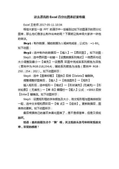
相信大家在一些PPT的演示中一定看到过如下动图演示的百分比图表,那么他们是怎么制作出来的呢?下面就让我来给大家讲一讲他的做法。
Step1:制作数据,辅助数据为1减掉完成率,公式为:=1-B3。
如下动图:
Step2:选中制作的数据后→【插入】→【圆环图】。
如下动图:Step3:选中圆环图→右键→【设置数据系列格式】→将圆环内径大小调整到最小→【填充】→设置圆环图中完成率系列颜色为深色(案例中为:RGB:218;234;4),辅助系列颜色为浅色(案例中RGB:250;254;202)。
如下动图所示:
Step4:选中【图表标题】【图例】后按【Delete】键删除。
调整调整好图表后,【插入】→【自选图形】→【矩形】
插入矩形后,选中矩形→【格式】→【形状填充】(无填充)→【形状轮廓】(无填充)→【单击】编辑栏→【输入】公式:=$B$3后按【Enter】键确定。
如下动图所示:
Step5:设置矩形框的字体颜色及大小,将文矩形框与图表排版到一起,选中文本框和圆环后→【格式】→【组合】。
更新数据后,图表自动更新。
如下动图所示:
最后根据自己的喜欢来美化图表了,是不是很简单,但是又很炫酷啊。
结语:喜欢的朋友点个“赞”哦,关注我的头条号和转发我的文章,非常的感谢!。


probability chart 示例概率图表是用来展示数据中不同事件发生的可能性的一种有效工具。
这些图表可以帮助人们更好地理解数据中的概率分布,以便更好地做出决策。
本文将介绍几种常用的概率图表及其应用场景。
1. 饼图(Pie Chart)。
饼图是一种常见的概率图表,它将整个数据集表示为一个圆形,并将不同类别的数据分成不同的扇形。
每个扇形代表该类别数据的百分比,即该类别数据所占整个数据集的比例。
饼图常用于展示数据中不同类别的占比分布。
2. 条形图(Bar Chart)。
举个例子,假设有一家超市,它想知道其店内各个商品类别的销售情况。
这时,我们可以使用条形图来展示各个商品类别的销售额占总销售额的比例。
3. 散点图(Scatter Plot)。
举个例子,假设有一家银行,它想预测不同客户之间的信用卡使用情况与账户余额之间的关系。
这时我们可以使用散点图来展示不同客户的信用卡使用情况与账户余额之间的关系。
4. 箱线图(Bo某 Plot)。
箱线图是用来展示数据分布情况的一种图表。
它由五条线组成,包括最小值、下四分位数(Q1)、中位数、上四分位数(Q3)和最大值。
箱体内部包含50%的数据,箱体外部则表示剩下的50%数据的分布情况。
箱线图可帮助人们更好地了解数据中的离散程度。
举个例子,假设有一家制药公司,它想研究其生产的某种药品在不同温度下的效果。
这时,我们可以使用箱线图来展示不同温度下药品效果的分布情况。
总之,在数据分析中,概率图表是一种非常有用的工具,可帮助人们更好地理解数据的概率分布,以便做出更好的决策。
在选择适合的概率图表时,需要考虑不同的数据类型及其应用场景。
雅思饼状图:特点:静态数据(百分比或数字)除了最大最小的,还有互相成倍的,一样的写作思路:以C8 p. 53题目为例先审题,再看图几张饼,几种馅哪个馅儿多,哪个馅儿少数字,比率1. 归纳最大值:三个饼图中的最大值集于一身:Teachers’salaries2. 归纳最小值:三个饼图中的最小值集于一身:Insurance注意:此题目中的极值点(最大值和最小值)相当集中,为我们做统一归纳提供了便利。
对比C7 p. 101的饼状图,我们不难发现该题目中极值点较为分散,需要分类归纳。
3.分析变化趋势(增长趋势,下降趋势,波动趋势):此题目中的变化趋势项目也很集中,可以做统一归纳,而C7 p. 101饼状图的变化趋势需要进行分类归纳。
a.呈现增长趋势的项目:Insurance注意:对于Insurance的投入既是最小值,又呈现持续增长趋势,论述中可以使用转折关系衔接过渡(参看下文中的范文分解示例)。
b.呈现下降趋势的项目:Other workers’salariesc.呈现波动趋势的项目:Resources, Furniture and equipment下面是范文示例及步骤分解(文中黑体字部分为模板句型,仅供参考):第一段:导论:概述背景信息+概述整体变化趋势The pie charts make a comparison among three sample years in terms of the changes in annual expenditure on certain items by a particular British school. They exhibit that the figures vary widely from year to year.第二段:主体:关键特征1.导入语“如图所示”As indicated in the charts,2.描述最大值: the annual expense on T eachers’salaries was at the highest point across the three sample years, peaking at 40%, 50% and 45% respectively.3.描述最小值:In contrary, the smallest expenditure occurred in Insurance throughout the three years, which hit bottom at 2%, 3% and 8% accordingly.4. 对于Insurance 的投入既是最小值,同时又呈现持续增长趋势,因此可以使用转折关系将二者串联起来:Despite the fact that the spending on Insurance was at the lowest level, it is worthwhile to note that it exhibited a trend of continuous rise from the year 1981 to 2001.5.继续描述呈现持续下降趋势的项目:By contrast, the expenditure on Other workers’salaries presented a tendency of remarkable decline, which was from 28% in the year 1981 to 22% in 1991 and, ultimately, to 15% in 2001.第三段:归纳总结:归纳总结或者查漏补缺6.可以在这段中简要描述对于其它项目投入的变化趋势:From the figures demonstrated above, it is safe to draw a conclusion that the expenditure on Resources and Furniture and equipment indicated a trend of gradual fluctuation overall.这是饼状图中整体+局部的一种模式,再如:The following two pie charts illustrate the energy use in the U.S.A. Write a report for a university lecturer describing the information given in the pie charts below.第一段:The following two pie charts illustrate the energy use in the U.S.A. The two pie charts describe the data of the energy use and the residential energy use in detail in the United States.第二段:It can be seen from the first pie chart that the energy is used for four purposes.Specifically, industry accounts for the largest proportion(41%) of the used energy while demand of transportation makes up 26% of the total need of energy.The Residential and commercial represent 19% and 14% respectively.第三段:According to the second pie chart, it clearly shows that heating and air conditioning account for the largest proportion (62%) in the residential energy use while the small appliances makes up the least proportion (10%).The heating water and miscellaneous ( including cooking) constitutes 15% and 13% respectively.第四段:From the chart, we may have a basic understanding of the situation of energy use in the United States.三种图的比较:ABC的比较The graphs below show the annual expenditure of university students in three countries in 2003.第一段:The three pie charts show how university students in three countries spent their money in the year 2003.第二段:In general, students in country A spent slightly more than those in country B (US$5000 and US$4500 respectively). In comparison,student expenditure in country C was considerably lower, at only US$1500 per year.(比较总体)第三段:Accommodation and food were the two biggest items of expenditure. Altogether they constituted around 60% of the total students’expenditure in all the three countries.The difference is that in country A and B accommodation spending exceeded food spending, while the reverse was true for country C.(比较较大/最大)第四段:The rest of the students’spending was divided among leisure, books and others.Leisure spending constituted a larger percentage (around 20%) of student expenditure in both country A and country B, while in country C more money was spent on books (21%) than on leisure (12%).(比较较小/最小)第五段:Overall, as wealth decreased, the percentage of students' spending on non-essential went down.(总结一个趋势)饼状图的表达A takes up X% of totalmakes up/ account for/ constitute/ comprise/represent/contributeIt can be seen from/According to the pie chart, it clearly showsmain=significant/ principalThe rest =the remainder/ the remainingBe match by=be similar to/ be equal with/share the same percentage at 90%倍数的表达A 是B的X倍王力宏的眼睛是周杰伦的三倍倍数+that of+名词Leehom’s eyes are three times that of Jay倍数+as...asLeehom’s eyes are three times as large as Jay倍数+比较级+thanLeehom’s eyes are two times larger than Jay练习:女生的数量大约是男生的三倍The number of girls is about 3 times that of boysThe number of girls is about 3 times as high as boysThe number of girls is about twice higher than boys。

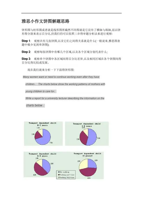
雅思小作文饼图解题思路饼形图与柱形图或者就是线形图所截然不同得就是它没有了横轴与纵轴,而以饼形得分割来表示百分比,但我们仍可以依照三步得审题分析法来进行观察:Step 1: 观察共有几张饼图,以及它们之间得关系就是什么(一般说来,雅思图表题中极少见到单饼图);Step 2: 观察每张饼图中有哪几个区域,以及各个区域分别代表什么;Step 3: 观察单个饼图中各区域间得百分比差异,以及相同区域在各个饼图间得百分比得比较或发展。
现在我们就来分析一下下面得饼形图:Many women want or need to continue working even after they have 6768Schildren、The charts below show the working patterns of mothers with65j1Iyoung children to care for、Write a report for a university lecturer describing the information on the Fm0Gwcharts below、Step 1: 一共有四张饼图,它们分别按照由母亲照料得最年幼孩子得年龄大小来进行排列,从0 ~ 2岁到10岁以上;Step 2: 每张饼图中都有三种区域:白色区、深色区与浅色区。
它们分别表示母亲得工作状态:白色区为“没有工作”,深色区为“兼职工作”,浅色区为“全职工作”;Step 3: 白色区在0 ~ 2岁时处于绝对优势,占70%,而随着孩子年龄得增长,白色区渐渐地变小,在10岁以上时只有26%;深色区在孩子年幼时比例很小:0 ~ 2岁时只有19%。
随着孩子得长大,深色区急剧扩张,在5 ~ 9岁时达到顶峰,占48%,但在10岁以后却轻微下降到45%;而浅色区得变化则就是在同一时期内分别占到了11%,11%,14%与29%。
当然,在开始写文章之前,我们还必须决定文章所用得时态。
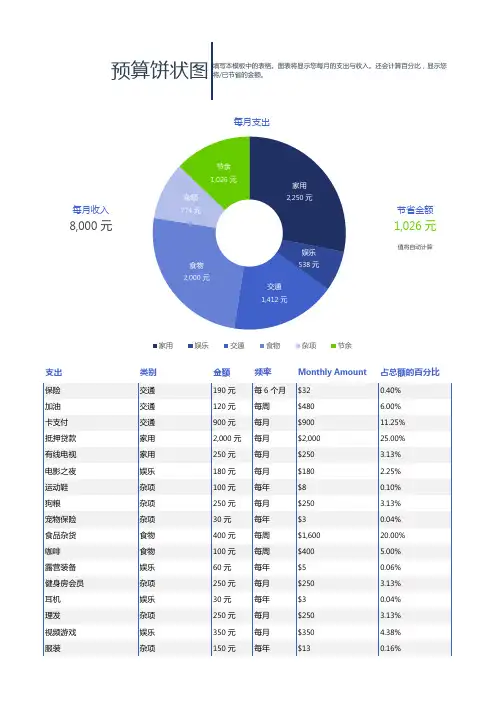
每月收入
节省金额
8,000 元
1,026 元
值将自动计算
支出
类别
金额
频率
Monthly Amount
占总额的百分比
保险交通190 元每 6 个月$320.40%加油交通120 元每周$480 6.00%卡支付交通900 元每月$90011.25%抵押贷款家用2,000 元每月$2,00025.00%有线电视家用250 元每月$250 3.13%电影之夜娱乐180 元每月$180 2.25%运动鞋杂项100 元每年$80.10%狗粮杂项250 元每月$250 3.13%宠物保险杂项30 元每年$30.04%食品杂货食物400 元每周$1,60020.00%咖啡食物100 元每周$400 5.00%露营装备娱乐60 元每年$50.06%健身房会员杂项250 元每月$250 3.13%耳机娱乐30 元每年$30.04%理发杂项250 元每月$250 3.13%视频游戏娱乐350 元每月$350 4.38%服装
杂项
150 元
每年
$13
0.16%
预算饼状图
填写本模板中的表格。
图表将显示您每月的支出与收入。
还会计算百分比,显示您将/已节省的金额。
家用2,250元
娱乐
538元
交通1,412元
食物
2,000元
杂项774元
节余1,026元
每月支出
家用娱乐交通食物杂项节余
支出类别金额频率Monthly Amount占总额的百分比
第 2 页,共 2 页。
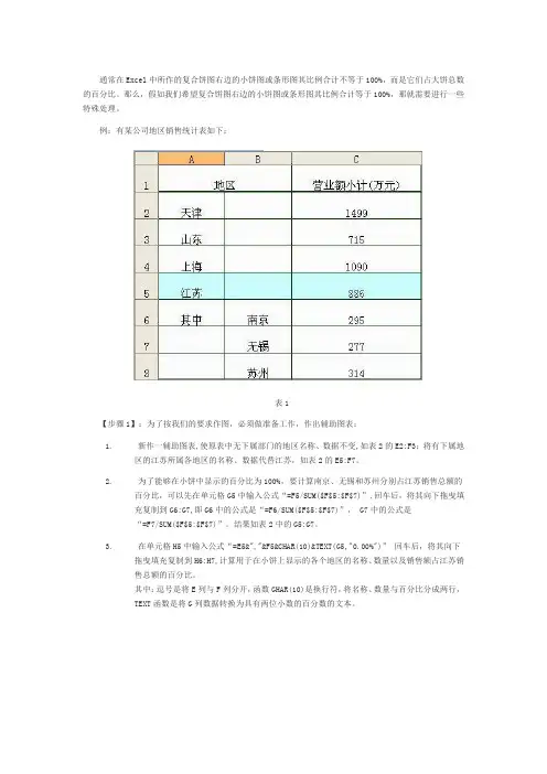
通常在Excel中所作的复合饼图右边的小饼图或条形图其比例合计不等于100%,而是它们占大饼总数的百分比。
那么,假如我们希望复合饼图右边的小饼图或条形图其比例合计等于100%,那就需要进行一些特殊处理。
例:有某公司地区销售统计表如下:表1【步骤1】:为了按我们的要求作图,必须做准备工作,作出辅助图表:1.新作一辅助图表,使原表中无下属部门的地区名称、数据不变,如表2的E2:F3;将有下属地区的江苏所属各地区的名称、数据代替江苏,如表2的E5:F7。
2.为了能够在小饼中显示的百分比为100%,要计算南京、无锡和苏州分别占江苏销售总额的百分比,可以先在单元格G5中输入公式“=F5/SUM($F$5:$F$7)”,回车后,将其向下拖曳填充复制到G6:G7,即G6中的公式是“=F6/SUM($F$5:$F$7)”, G7中的公式是“=F7/SUM($F$5:$F$7)”。
结果如表2中的G5:G7。
3.在单元格H5中输入公式“=E5&","&F5&CHAR(10)&TEXT(G5,"0.00%")”回车后,将其向下拖曳填充复制到H6:H7,计算用于在小饼上显示的各个地区的名称、数量以及销售额占江苏销售总额的百分比。
其中:逗号是将E列与F列分开,函数GHAR(10)是换行符,将名称、数量与百分比分成两行,TEXT函数是将G列数据转换为具有两位小数的百分数的文本。
表2【步骤2】:选择单元格E2:F7,按图表向导的步骤,选择复合饼图,如图1,完成后如图2:图1图2【步骤3】:选择系列1,右键选择“数据系列格式”命令,如图3。
图3【步骤4】:进入“数据系列格式”对话框,切换到“选项”选项卡,在“分割系列”下拉列表框中选择“位置”选项,在“第二绘图区包含最后”数值调节钮中将数值设置为3 。
(因为小饼显示江苏的3个地区)如图4所示。
确定后就得到图5所示图表。
江苏公务员考试资料分析之饼状图详解在本文中,江苏公务员考试网将重点讲解资料分析中饼状图的题型概述、试题特点以及应试技巧。
一、题型概述饼状图是用整个圆表示总体的数量或整体值“1”,用圆内各个扇形的大小表示各部分数量或该部分占总体的百分比。
此种图形不仅考查考生的分析能力,还侧重考查考生的比较计算能力。
饼状图一般是由标题(包括单位)、图例和数据等组成。
如下图所示:饼状图的组成(1)标题——概括介绍图形的主旨,表明图形所描述的对象是什么;(2)数据——图形中的统计数值,包括计量单位,图a中表示的是绝对量,图b中表示的是相对量;(3)图例——具有图形语言的功能,表示图中各类别的具体含义。
二、试题特点饼状图最直接的体现,就是各部分的比重值,这也是该种类型的最主要的考点。
饼状图的数据较为清晰,各部分占总体的比重大小相对直观,尤其是当饼状图表示的是相对量时,可用各部分的实际值来直接表示部分占总体的比重。
饼状图各部分所占比重的大小可以直接用各个扇形的角度来表示,因此,在计算精度允许的条件下,可以借助量角器来求取比重值。
三、应试技巧饼状图是图形资料中较为特殊的一类,它没有横坐标和纵坐标,一个饼状图只能表示一个统计周期的数据,具有其独特的解题、应试技巧。
因此,在解答此类试题时,需要按照以下几步解答:1.快速浏览图形的标题、单位首先浏览饼状图的标题、单位,迅速判断出图形表示的是绝对量还是相对量,当图形表示的绝对量时,要注意单位;其次要注意图例与数据的对应关系,尤其是当图例与数据的排列顺序不一致时,这往往是考试的重点。
2.提取题目关键词,定位、求解快速浏览图形,确定代表的是绝对量还是相对量后,就要阅读试题,提取题干(计算性题目)或选项(综合性题目)中的关键词,更加这些确定解题的相关数据,列出计算式,通过一定的估算技巧,求解出正确答案。
3.注意题目陷阱,使用辅助工具一般来说,饼状图考查的重点是求某部分的比重值,或者是任意两部分的比重之差的问题。
js饼状图(带百分⽐)功能实现,新⼈必懂1 <!DOCTYPE html>2 <html>3 <head>4 <meta charset="utf-8" />5 <title></title>6 <script src="../../js/my/highcharts.js"></script>7 <script src="../../css2/jquery-1.10.2.min.js"></script>8 </head>9 <body>10 <div class="piecleft" id="chart" style="height:350px; width: 350px;">11 </div>12 <script type="text/javascript" charset="utf-8">13 $.ajax({14 url: "/handler/hbtongji.ashx",15 type: "GET",16 data: {},17 success: function (data) {1819var obj = eval('(' + data + ')');20 transfer = parseInt(obj["state"][0]["transfer"]);21 transferNO = parseInt(obj["state"][1]["transferNO"]);22var dataset = [transfer, transferNO];23var chart;24 $(document).ready(function () {25 chart = new Highcharts.Chart({26 chart: {27 renderTo: 'chart'28 },29 title: {30 text: '划拨⼟地饼状图统计'31 },32 plotArea: {33 shadow: null,34 borderWidth: null,35 backgroundColor: null36 },37 tooltip: {38 formatter: function () {39return'<b>' + + '</b>: ' + Highcharts.numberFormat(this.percentage, 1) + '% (' +40 Highcharts.numberFormat(this.y, 0, ',') + ' 个)';41 }42 },43 plotOptions: {44 pie: {45 allowPointSelect: true,46 cursor: 'pointer',47 dataLabels: {48 enabled: true,49 formatter: function () {50if (this.percentage >4) return ;51 },52 color: 'white',53 style: {54 font: '13px Trebuchet MS, Verdana, sans-serif'55 }56 }57 }58 },59 legend: {60 backgroundColor: '#FFFFFF',61 x: 0,62 y: -3063 },64 credits: {65 enabled: false66 },67 series: [{68 type: 'pie',69 name: 'Browser share',70 data: [71 ['未划拨地块', transfer],72 ['已划拨地块', transferNO]73 ]74 }]75 });76 });77 }78 })7980 </script>81 </body>82 </html>html页⾯1 <%@ WebHandler Language="C#" Class="hbtongji" %>23using System;4using System.Web;5using System.Data;6using System.Text;7using System.Runtime.Serialization.Json;8using System.Web.Script.Serialization;9using KangHui.BaseClass;10using mon;111213public class hbtongji : IHttpHandler {1415public void ProcessRequest (HttpContext context) {16string con = ConfigHelper.GetConnectionString("DBConnection");17//这是⼀个显⽰的数据(未出让地块的数量)18string sql = "SELECT COUNT(*) as sum FROM Mhuabo WHERE stateID=4";19//这是⼀个显⽰的数据(已出让地块的数量)20string sql1 = "SELECT COUNT(*) as sum FROM Mhuabo WHERE stateID=5";21 DataSet ds = DbHelperSQL.Query(sql,con);22 DataSet ds1 = DbHelperSQL.Query(sql1,con);2324 StringBuilder str = new StringBuilder();25 str.Append("{\"state\":[{\"transfer\":\"" + ds.Tables[0].Rows[0]["sum"] + "\"},{\"transferNO\":\"" + ds1.Tables[0].Rows[0]["sum"] + "\"}]");26 str.Append("}");27 context.Response.Write(str.ToString());28 }293031public bool IsReusable {32get {33return false;34 }35 }3637 }⼀般处理程序页⾯公司项⽬要做统计,饼状图必不可少,闲⼿之余,写下这篇博客,希望能帮助新⼿的你。
EXCEL饼图的数据表达饼图是EXCEL中最常用的图表之一,主要用来表现事物的整体分布及构成。
例如,银行的客户,从性别构成上可以统计男、女性比例,从年龄上可以统计青年、中年和老年的分布状况;再比如企业的广告投放预算,按渠道可统计电视、广播、报刊、网络、路牌、电影植入等方面的费用分布。
除此以外,饼图也可以用来突出特定的百分比数据。
1 分类数据的构成饼图,最常用的,是用来反映若干个分类的构成情况(如图1)。
分类不宜过多,否则饼图显得过于拥挤,信息无法充分表达。
图12 百分比数据的表达当我们需要突出或强调一个百分比数据时,我们也可以使用饼图。
此时,饼图只包括两个分类:被突出数据及其它,如图4.2所示。
图2这一技巧也适用于环形图,用环形图来表达百分比数据也是恰如其分的,例如图3所示的效果。
图33 多分类数据的展现(1):复合饼图在制作饼图时,如果分类过多,则饼图会被密集地分割,导致图表显示拥挤、模糊,难以区分和辩认,分类信息无法在有限的空间内清晰地展现,如图4的示例。
图4对于这种情况,我们可以使用复合饼图来解决。
打开范例文档“【Excel高手成长笔记】之二:第4章饼图的数据表达.xlsx”,如图5,C5:D16单元格区域为一组模拟的银行业务收入数据。
由于业务类型较多,我们使用复合饼图来制作图表。
图5以下是具体步骤。
Step1 用鼠标选中C5:D16区域,在“插入”选项卡→“图表”区域点击饼图下方箭头,在其中选择二维饼图下的复合饼图,如图6所示。
图6Step2在图中点击饼图,选中数据系列,单击鼠标右键,选择并打开“设置数据系列格式”对话框,如图7。
图7根据需要,我们在左侧的大饼中展示占比较大的几项业务数据,剩余的业务项展示在右侧的小饼中。
在“系列分割依据”中选择:位置,在“第二绘图区包含最后一个值”中进行调整,假定我们在左侧的饼图中包含三个主要的业务类型,则此微调框中可填入9(业务类型总数-3,即12-3=9)。