雅思小作文范文-饼图
- 格式:pdf
- 大小:436.28 KB
- 文档页数:5
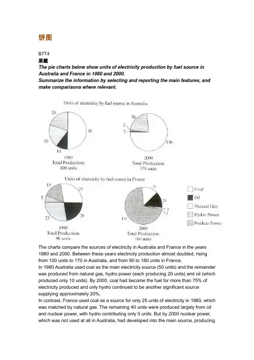
饼图B7T4原题The pie charts below show units of electricity production by fuel source in Australia and France in 1980 and 2000.Summarize the information by selecting and reporting the main features, and make comparisons where relevant.The charts compare the sources of electricity in Australia and France in the years 1980 and 2000. Between these years electricity production almost doubled, rising from 100 units to 170 in Australia, and from 90 to 180 units in France.In 1980 Australia used coal as the main electricity source (50 units) and the remainder was produced from natural gas, hydro power (each producing 20 units) and oil (which produced only 10 units). By 2000, coal had become the fuel for more than 75% of electricity produced and only hydro continued to be another significant source supplying approximately 20%.In contrast, France used coal as a source for only 25 units of electricity in 1980, which was matched by natural gas. The remaining 40 units were produced largely from oil and nuclear power, with hydro contributing only 5 units. But by 2000 nuclear power, which was not used at all in Australia, had developed into the main source, producingalmost 75% of electricity, at 126 units, while coal and oil together produced only 50 units. Other sources were no longer significant.Overall, it is clear that by 20000 these two countries relied on different principal fuel sources: Australia relied on coal and France on nuclear power.分析:题目The pie charts below show units of electricity production by fuel source in Australia and France in 1980 and 2000.•文章谈到的四个要素:units of electricity production, fuel source, Australia and France, 1980 and 2000第一段The charts compare the sources of electricity in Australia and France in the years 1980 and 2000.•四个要素也不能少: sources, electricity, Australia and France, 1980 and 2000 •这次我们也试着将名词性短语改成一个句子, The charts indicate how many units of electricity were produced by different fuel sources in Australia and Francebetween 1980 and 2000.Between these years electricity production almost doubled, rising from 100 units to 170 in Australia, and from 90 to 180 units in France.•说明两个国家从1980到2000的总量的变化•比较一下两个double的用法Ø double [vi]: Electricity production almost doubled.Ø double [vt]: The two countries doubled their electricity production.Ø 这两种用法在雅思图表作文中都很常用,注意一下第二段In 1980 Australia used coal as the main electricity source (50 units) and the remainder was produced from natural gas, hydro power (each producing 20 units) and oil (which produced only 10 units).•说明了澳大利亚1980年情况,•注意同义表达use…as the source, be produced fromBy 2000, coal had become the fuel for more than 75% of electricity produced and only hydro continued to be another significant source supplying approximately 20%.•说明了澳大利亚2000年的情况,注意此处引用了百分数,而非绝对值•这里采用了fuel作为了表达的主语,如Coal had become the fuel, Hydro continued to be another source.第三段In contrast, France used coal as a source for only 25 units of electricity in 1980, which was matched by natural gas. The remaining 40 units were produced largely from oil and nuclear power, with hydro contributing only 5 units.•说明法国1980年的情况•类似于1980年澳大利亚的表达:use…as a source, be produced fromBut by 2000 nuclear power, which was not used at all in Australia, had developed into the main source, producing almost 75% of electricity, at 126 units, while coal and oil together produced only 50 units. Other sources were no longer significant.•说明了法国2000年的情况•类似于2000年澳大利亚的表达:nuclear had developed into the main source第四段Overall, it is clear that by 20000 these two countries relied on different principal fuel sources: Australia relied on coal and France on nuclear power.上文谈到了1980年和2000年两国的发电总量变化(年代变化),这里谈到2000年两国的主要依赖能源(国家对照)词汇句型积累雅思图表作文基本功主要考察的是同义表达,如下面的这句话,就会有多种表达•Australia used coal as the main electricity source•Coal was the main source for electricity in Australia.•The main proportion of electricity was produced from coal in Australia.•Coal became the main fuel to produce electricity in Australia.这个句子中有几个要素coal, electricity, Australia, 你只要将这几个要素所作的句子成分发生变化,句式就会呈现多样性,同义多样表达必须掌握,大家平时可以自己多做这样的练习,以便掌握好这项基本技能。
英语考试作文29日雅思写作考试小作文范文:饼图The pie charts show the class size in primary (elementary) schools in four states in Australia in 2010.本题属于静态多饼图。
考生在处理该类图形时务必多观察内容之间的关联和对比性。
虽然饼图数目比较多,且每个饼图内的成分也较多,但是一定要沉着冷静,多对比,突出图形的主要特征。
此外,本题的语句表述也比较复杂,在写句子时务必需要搞清楚百分比和班级规模之间的关系。
(百分比指的是百分之多少的小学的班级规模是多少)经典推荐:考官级口语写作9分范文资料超级大汇总(史无前例数百篇)真题传送门:2017全年雅思写作真题范文大汇总(第一时间更新)参考范文:The pie charts compare the number of pupils in elementary schools in four states of Australia in the year2010.It is clear to see that there were 21-25 students having a class in most primary schools ( 51%) in Australian Capital Territory, and the second common class size was 20 students or fewer per class, accounting for 38%. The same situation occurred in Western Australia, and New South Wales whose major elementary school’s class size was 21-25 students per class, taking up 42% and 37% respectively.On the contrary, 35% of primary schools in South Australia arranged 20 students or fewer in one class, and its figure exceeded the proportion of class size with 21-25 students (33%). In this state, 26-30 students attended classes together in 28% of primary schools, which was almost matched by that in Western Australia; while only 10% of schools in Australian Capital Territory was with that class size. In contrast, it was another general size in New South Wales, with 33%.Overall, it can be seen that the fewest primary schools in four states had the class size of 30 students or more. However, most of them enrolled 21-25 students in every class范文原创自小站范钰红老师。
两个雅思写作小作文饼图练习题雅思小作文饼图是所有图表中出现次数最多的一个,所以需要大家更为关注。
下面为大家搜集整理了雅思写作小作文饼图的练习题,共有两个,都是比较简单的两个饼图,大家在备考的时候,注意结构和顺序的描写。
1. The following pie charts illustrate the energy use in the USA. Write a report for a u niversity lecturer describing the information given in the pie charts below.2. The following two pies show the average family income of New Zealand in 1990 and 2000 and the way people spend their income. Write a report for a university lecturer describing the information given in the pie charts below.以上就是这两个雅俗写作小作文饼图练习题的全部内容,包括了美国的能源使用和新西兰的平均家庭收入两个话题。
大家在备考雅思写作小作文饼图的时候,可以适当的练习一下上面的这两个题目。
雅思小作文图表描述方式小结雅思小作文的图表描述是有自己的方式和特点的,掌握了这个方式可以让大家的小作文备考更快也更加贴近考试的要求。
下面就为大家整理了雅思小作文图表描述的方式,供大家参考。
1. 与趋势有关的词语:上升(v.):increase, rise, climb, ascend, surge, shoot up下降(v.):decrease, decline, drop, fall, descend, plunge持平(v.):remain stable, keep constant, level off, flatten out波动(v.):fluctuate, wave, go up and down快速(adj./adv.):considerable/considerably, significant/significantly, substantial/subst antially, remarkable/remarkably, dramatic/dramatically稳步(adj./adv.):steady/steadily, stable/stably, moderate/moderately, modest/modestly缓慢(adj./adv.):slight/slightly, minimal/minimally, marginal/marginally顶点(n. /v.):peak趋势 (n.):trend/ tendency2. 与大小相关的词语:Outnumber (v.):在数量上超过The demonstrators were outnumbered by the policeExceed (v.):在数量上超过Triple (v.):变成三倍The figure has tripled.Double (v.):变成两倍The price of houses has virtually doubled over the past few years.Mount to (v.):达到Counterpart (n.):对应的另一方,比较的另一方 this product is better than its counterpart s此外,朗阁海外考试研究中心建议考生还应考虑一下题中数据和百分比有没有联系,如果有的话还应辅以一些关于比例和占据的语句。
第 1 页 共 3 页 雅思写作Task1饼状图考官范文(15) (最新版)
编制人:__________________ 审核人:__________________ 审批人:__________________ 编制学校:__________________ 编制时间:____年____月____日
序言 作文(composition)是经过人的思想考虑和语言组织,通过文字来表达一个主题意义的记叙方法。作文分为小学作文,中学作文,大学作文(论文)。作文体裁包括:记叙文、说明文、应用文、议论文。
作文并不神秘,要想写好一篇文章,首先要多看,多想,勤于观察,积累素材。只有细致的观察生活,积累素材才是写好作文的基础。首先要明确你要写的主题,认真的审题,列出大纲,不要只注意题目中要求的字有多少,要多注意题目的本身,要多读多想,准确的用好词语和修饰语。这是审题的关键,要确立好主题的依据,要精心的选材,布局列题,有的材料,还要分析整理。这就要对材料进行分类,比较,概括,筛选。
我们不要象盖房子那样的把所有的材料都堆砌起来,要合理恰当的组合,具体的说开头和结尾要略写,那么经过就要仔细的推敲,修辞,润色,写好以后不要急于交稿,反复检查认真的修改。
古人说:书读百遍,其义自见。熟读唐诗三百首,不会作诗也会吟。这些都说明一个道理,只要你多看书,多读书对你的写作文有一定的好处。只要你明白这样的一个道理,作文就是要你把生活中喜,怒,哀,乐用文字经过加工,修饰。整理,也就是我们说的作文。 第 2 页 共 3 页
作文内容 英语作文啦www.zuowenla.cn雅思频道特为大家收集整理了雅思写作Task1饼状图考官范文。认真研读一定的雅思范文及作文模板可以帮助我们检验自己的写作水平,并能很好地吸收和应用优秀范文里的优秀内容~更多雅思报名官网的最新消息,最新、最专业的雅思备考资料,英语作文啦www.zuowenla.cn将第一时间为大家发布。 The charts below give Information on the ages of the populations of Yemen and Italy In 2000 and projections for 2050. Summarise the information by selecting and reporting the main features, and make comparisons where relevant.
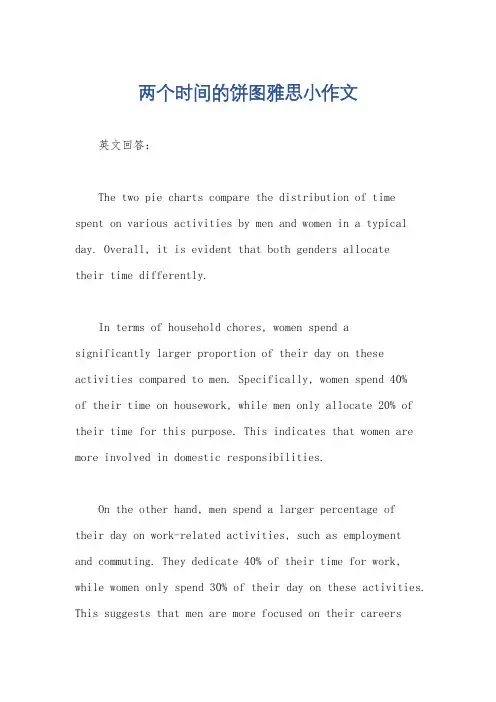
两个时间的饼图雅思小作文英文回答:The two pie charts compare the distribution of time spent on various activities by men and women in a typical day. Overall, it is evident that both genders allocatetheir time differently.In terms of household chores, women spend asignificantly larger proportion of their day on these activities compared to men. Specifically, women spend 40%of their time on housework, while men only allocate 20% of their time for this purpose. This indicates that women are more involved in domestic responsibilities.On the other hand, men spend a larger percentage oftheir day on work-related activities, such as employmentand commuting. They dedicate 40% of their time for work, while women only spend 30% of their day on these activities. This suggests that men are more focused on their careersand professional responsibilities.Regarding leisure activities, both genders allocate a similar amount of time. Men spend 20% of their day on recreational activities, while women spend 30% of theirtime on leisure. This shows that both genders value their free time and engage in activities that bring them joy and relaxation.中文回答:这两个饼图比较了男性和女性在一天中各种活动上所花费的时间分配。

雅思三个饼图作文范文
雅思饼图作文范文(口语化版)。
段落一,聊聊教育支出的那些事儿。
说到教育支出啊,学费可是大头儿,差不多占了一半呢。
这就
说明啊,在咱们现在的教育体系里,学费还是家庭和个人最得掏钱的。
不过呢,课外辅导费也不低,都快三分之一了,这说明家长们
为了孩子的学业和竞争力可是下了血本了。
教材和学习资料虽然比
较稳定,但也占了不小的比例。
其他的像交通、住宿这些费用,虽
然不多,但也是教育支出里不能少的部分。
段落二,大家平时都怎么休闲啊?
说到休闲活动,大家可真是各有各的爱好。
阅读可是个不错的
选择,很多人都喜欢通过阅读来放松和涨知识。
运动也挺受欢迎的,毕竟身体是革命的本钱嘛,大家都挺重视健康的。
不过呢,社交媒
体现在也是大家离不开的了,虽然可能占用的时间不如阅读和运动多,但影响力可不小。
当然啦,还有旅行和其他活动,这些虽然不
常做,但也让大家的休闲生活更加丰富多彩。
段落三,聊聊现在的职业选择。
说到职业选择啊,信息技术这行可是热门得很,基本上占了最
大的份额。
这也难怪,现在可是数字化时代,信息技术发展得飞快,需求也大。
金融服务和教育行业也挺不错的,稳定又有发展前景。
制造业和服务业虽然不如前面几个热门,但也吸引了不少人。
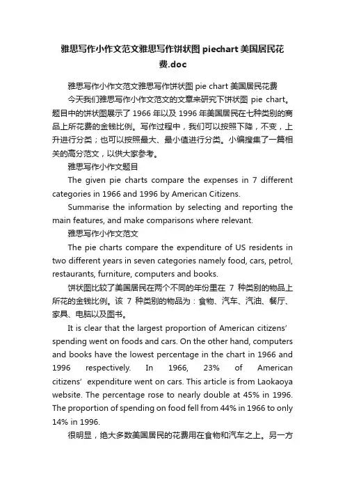
雅思写作小作文范文雅思写作饼状图piechart美国居民花费.doc雅思写作小作文范文雅思写作饼状图pie chart 美国居民花费今天我们雅思写作小作文范文的文章来研究下饼状图pie chart。
题目中的饼状图展示了1966年以及1996年美国居民在七种类别的商品上所花费的金钱比例。
写作过程中,我们可以按照下降,不变,上升进行分类;也可以按照最大、最小值进行分类。
小编搜集了一篇相关的高分范文,以供大家参考。
雅思写作小作文题目The given pie charts compare the expenses in 7 different categories in 1966 and 1996 by American Citizens.Summarise the information by selecting and reporting the main features, and make comparisons where relevant.雅思写作小作文范文The pie charts compare the expenditure of US residents in two different years in seven categories namely food, cars, petrol, restaurants, furniture, computers and books.饼状图比较了美国居民在两个不同的年份里在7种类别的物品上所花的金钱比例。
该7种类别的物品为:食物、汽车、汽油、餐厅、家具、电脑以及图书。
It is clear that the largest proportion of American citizens’ spending went on foods and cars. On the other hand, computers and books have the lowest percentage in the chart in 1966 and 1996 respectively. In 1966, 23% of American citizens’expenditure went on cars. This article is from Laokaoya website. The percentage rose to nearly double at 45% in 1996. The proportion of spending on food fell from 44% in 1966 to only 14% in 1996.很明显,绝大多数美国居民的花费用在食物和汽车之上。
雅思小作文饼状图技巧雅思小作文饼状图技巧在雅思的学术类小作文中我们经常会遇到饼状图写作,不要看着一张一张的图,就退缩了,但是相对来说,这个题型还是比较容易写的一种图形,不过学生们也一定不要当做这是一件简单的事情,想要拿高分还是需要努力的。
以下是店铺整理的雅思小作文饼状图技巧,欢迎阅读。
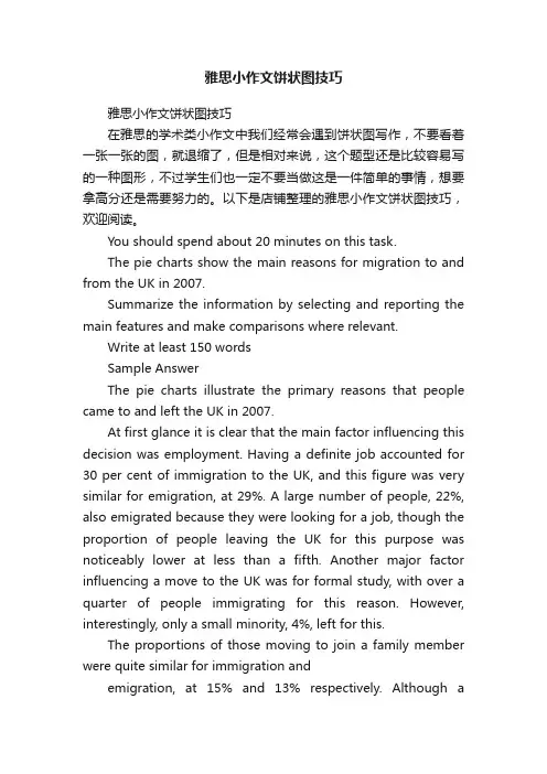
You should spend about 20 minutes on this task.The pie charts show the main reasons for migration to and from the UK in 2007.Summarize the information by selecting and reporting the main features and make comparisons where relevant.Write at least 150 wordsSample AnswerThe pie charts illustrate the primary reasons that people came to and left the UK in 2007.At first glance it is clear that the main factor influencing this decision was employment. Having a definite job accounted for 30 per cent of immigration to the UK, and this figure was very similar for emigration, at 29%. A large number of people, 22%, also emigrated because they were looking for a job, though the proportion of people leaving the UK for this purpose was noticeably lower at less than a fifth. Another major factor influencing a move to the UK was for formal study, with over a quarter of people immigrating for this reason. However, interestingly, only a small minority, 4%, left for this.The proportions of those moving to join a family member were quite similar for immigration andemigration, at 15% and 13% respectively. Although asignificant number of people (32%) gave ‘other’ reasons or did not give a reason why they emigrated, this accounted for only 17% with regards to immigration.通过上面的这道题以及给出的,可以看出饼状图的文章是很好模仿的,或者说是有一个模板的下面是一些如何组织语句的要点:1、选择最重要的一个点放在第一个写从范文中可以看出,换工作,找工作和读书是作者首先提到的,因为这是选择搬家的主要原因。
雅思小作文饼图写作结构解析雅思小作文饼图写作结构许多考生觉得饼图十分简单,也就是一些百分比及数字的列举,对该类图表不太重视,准备并不充分。
笔者根据学生的日常作业来看,很多学生并没能准确把握这一图表的特征。
在实际考试中,真题大多是多个饼图结合出现,如果一味地罗列数据照搬词组,不但文章读起来枯燥无味,句式和词汇也缺少变化,是无法得到理想的分数的。
本文中,写作组的专家将对饼图的分析方法、词汇句型和写作套路进行总结和分类,以帮助考生理清写作思路,更准确地回应题目的要求。
1. 分析思路在实际考试中,一般以三到四个饼图出现为主,最多曾出现过六个饼图的组合,但无论如何变化,多饼图一般可分为以下两种模式,笔者将举出一些实例进行分析:1)无关型饼图三个饼图它们分别介绍了世界上的不同花费比例,世界人口分布及资源消耗的去向,三个饼图涉及的内容和划分标准不尽相同,不可能将三者结合起来一起论述。
对于这种图表,我们的文章框架架构如下:Introduction:分别概述三个饼图所说明的信息如:The three pie charts respectively illustrate some data regarding the distribution in world spending, global population and consumption of resources.Body:分别说明各饼图的内容,辅以数据(段落层次按照个数划分即可,本题就可以分成三个段落)分别进行排序,稍后详细分析。
Conclusion(选用):说明三个饼图的相关含义,如无,可提炼一下每个饼图最典型的特征(如果已达到要求字数且充分说明内容,结尾段可以略去)详细来看,世界花费主要支出在食物方面,交通、房产和穿着次之,其他项目合计占到总数的40%;亚洲是世界人口的主要来源地,欧洲、美洲和非洲均占到10%以上,其他地区人口较少。
这两个饼图都可以用“排序”的方式来列举数据,具体的写法我们会在下面详细说明。

雅思17t2饼图作文范文
雅思17T2饼图作文范文(口语化版本)。
哇,你看这个饼图,A部分真的是大头啊,占到了XX%,太牛了!这足以说明A在这个领域里可是个大佬级别的存在。
不过,B部分也不错,占了XX%,算是个中坚力量。
虽然没A那
么强势,但也不能小瞧了它,它可是给整个领域增加了不少色彩和
多样性呢。
至于C部分,虽然只占了XX%,但也不能说它不重要。
每个小
部分都是整体的一部分,没有它们,整体就不完整了。
所以,C也
是不可或缺的一份子!
话说回来,A为什么能占这么大份额呢?是不是因为它有特殊
技能或者市场需求大?这个得好好琢磨一下。
B和C虽然比例小,但说不定它们就是未来的新星呢!说不定
哪天就崛起了,所以绝对不能忽视它们!
总的来说,这个饼图就像一幅生动的画,展示了每个部分在整体中的位置和重要性。
而这些数字背后的故事,更是让人好奇和期待。
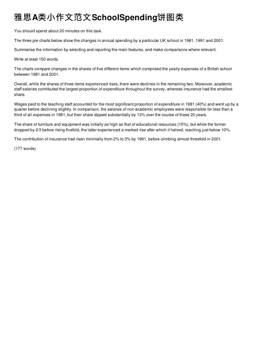
雅思A类⼩作⽂范⽂SchoolSpending饼图类You should spend about 20 minutes on this task.The three pie charts below show the changes in annual spending by a particular UK school in 1981, 1991 and 2001. Summarise the information by selecting and reporting the main features, and make comparisons where relevant.Write at least 150 words.The charts compare changes in the shares of five different items which comprised the yearly expenses of a British school between 1981 and 2001.Overall, while the shares of three items experienced rises, there were declines in the remaining two. Moreover, academic staff salaries contributed the largest proportion of expenditure throughout the survey, whereas insurance had the smallest share.Wages paid to the teaching staff accounted for the most significant proportion of expenditure in 1981 (40%) and went up by a quarter before declining slightly. In comparison, the salaries of non-academic employees were responsible for less than a third of all expenses in 1981, but their share dipped substantially by 13% over the course of these 20 years.The share of furniture and equipment was initially as high as that of educational resources (15%), but while the former dropped by 2/3 before rising fivefold, the latter experienced a marked rise after which it halved, reaching just below 10%. The contribution of insurance had risen minimally from 2% to 3% by 1991, before climbing almost threefold in 2001.(177 words)。
雅思作文饼图范文The chart below gives the percentage of social media users by age in Jamestown in 2018. Summarise the information by selecting and reporting the main features. Write at least 150 words.写作锦囊关于饼状图写作框架,最好采用四段式的写法,具体分为两种常见的模式。
•行文结构1:开头段-主体段1-主体段2-结尾段(总结)•行文结构2:开头段-概述段(总结)-主体段1-主体段2雅思小作文一般要求20分钟内完成150个字的写作,时间紧,分数重。
而开头段一般是对题目的改写。
最常用的方法就是关键词同义替换法:Table:chart / graph / line graph / bar graph / pie graph / statistics / data / diagram / illustration / flow chart / map Give:demonstrate / describe / present / show / compare / illustrateinformation about:The proportion / percentage of… the number / amount of / changes / variations / how 引导的名词性从句写作范文参考开头段The given pie chart illustrates the proportion of customers using digital networking of different age group in Jamestown in the year 2018.概述段Overall, the general trend of Jamestown's social media users in 2018 showed that the older people were, the less likely they would be to use digital networking.主体段1In terms of most significant feature of the chart, the largest category of digital communicators was the group aged 13 to 25 , which accounted for40% of the total users. Additionally, the next major segment of the population using social media included people aged between 26 and 35, which showed a slightly lower contribution at 35%.When added together, these two categories made up three quarters of Jamestown's social media users who used digital platform in 2018.主体段2In stark contrast, the category with lowest percentage of users included people over 55 years old, accounting for minute 2% of all users. This trend was joined by people aged 46 to 55 and people between 36 and 45 years of age, representing8% and 15% respectively. Of particular note is that those aged over 36 years collectively made up only 25% of Jamestown's social media users.。
雅思饼图小作文Like the bar chart illustrates the number of students at different ranges of age received education because of careers or interests, the second chat show the same ranges of age got the proportion of employers’ support(time and fees).We witness the reason for career to receive education an overall downward trend, which was the most choice of students under 26, peaking at 80%. It is noticed that for the age from 40 to 49, the main reasons of getting education was the same(40%). Over 49 years old bottomed out at about 28 percent. Unlike this line , an opposite trend in the figure of interests chosen was an upward line. The lowest number was 10 percent, which under 26 years old. Then experienced a substantial increasing to 70 percent(over 49 years old).The second chart pretends employers supported students’education because of their career purpose, which was at the peak of 62 percent. During 26 to 39 years old, there was a drop to 32 percent. Then increased back to 42 percent after the following years.Overall, it is noted that the employers’ support is relevant to why students study purpose. They prefer to support people could do benefits for companies before 39. But they also support individual interests for study.语法有很多漏洞,如句子不完整缺少主语,感觉自己对句子构成还不太搞得清楚,经常是把几个意思拼在一起,忽视了整体的语法结构,分段是对的,单词拼写也要注意,记准单词,当务之急是好好补补语法,一定要把主谓宾搞清楚。
雅思三个饼图作文范文英文回答:I recently came across three pie charts that depict the distribution of household expenditures in three different countries: the United States, China, and India. The first pie chart shows that in the United States, the largest portion of household expenditures goes towards housing, followed by transportation and food. On the other hand, the second pie chart illustrates that in China, the majority of household expenditures are allocated to food, followed by housing and transportation. Lastly, the third pie chart indicates that in India, the biggest portion of household expenditures is spent on food, followed by transportation and housing.The discrepancy in the distribution of household expenditures among these three countries is quite intriguing. In the United States, housing expenses account for the largest portion of household expenditures, whichmay be attributed to the high cost of living in certain areas. This is further supported by the fact that transportation expenses come in second, as many Americans rely on cars for daily commuting. In contrast, in China, the significant allocation of expenditures towards food reflects the cultural emphasis on dining and culinary traditions. The relatively lower proportion of housing expenses could be due to the availability of affordable housing options in urban areas. Similarly, in India, the substantial portion of household expenditures spent on food aligns with the country's rich culinary diversity and the significance of food in Indian culture. The relatively lower expenses on housing may be indicative of the availability of affordable housing in certain regions.It is noteworthy that despite the differences in the distribution of household expenditures, all three countries allocate a significant portion of their expenses towards transportation. This indicates the universal importance of transportation in daily life, regardless of geographical location or cultural background. Furthermore, therelatively lower proportion of transportation expenses inIndia compared to the United States and China may be attributed to the widespread use of public transportation and lower car ownership rates in India.In conclusion, the distribution of household expenditures varies significantly among the United States, China, and India, reflecting the unique cultural, economic, and social factors at play in each country. The disparities in expenditure patterns shed light on the diversepriorities and lifestyles of individuals and households in different parts of the world.中文回答:最近我看到了三个饼图,分别描述了美国、中国和印度的家庭支出分布情况。
2001 2002These two pie charts show how attitudes of visitors towards this museum changed in these two years before and after the museum redecorated, and the paragraph shows the whole number of visitors in these two years.The table demonstrates the exact number of visitors to Ashdown museum throughout the year before and the year after it was redecorated. Two pie charts illustrate the outcomes of questionaires interviewing visitors how satisfied they were with their trip, during the same two periods.Interviewing visitors how satisfied they were with their trip, questionaires were conducted successfully. Least/mostFrom the first pie chart that shows the opinion/visitors’ opinions before the museum redecorated, the number of people who felt dissatisfied was the most/largest, accounting for 40%. This was followed by the attitude/group of the satisfied and the very satisfied, representing 30% and 15% respectively. The figure/number of citizens who felt very dissatisfied took up the percentage of 10%, and the rest of no response, 5% collectively.It has been observed from two pie charts that in terms of the survey conducted the year before renovation, 40% of respondents were dissatisfied, while only 15% of them were very satisfied. The year after the museum was redecorated indicate that the number of dissatisfied visitors declined and became 15%. Followed by the precentage of respondents who were very dissatisfied, which dropped from 10% to 5%. Comparing the percentage of satisfied visitors, we can see an upward trend. Respondents/interviewees Upward trend, (we can see a postive pattern) downward trend (negative pattern)The second chart shows the views after refurbishing. The number of whom felt satisfied took/accounted for40%. The opinion of very satisfied was 35%, and the following group is the figure of who were dissatisfied, took the number of 15%.That of no response section/group and people who felt very dissatisfied were the same, took thenumber of 5%.We can see that after redecorating, there are more people feel better than before.To sum up, we can say that the redecoration that has been done to attract new visitors to the museum has reached its aim.Refurbishment, renovation, dedecoration。
The two graphs show the main sources of energy in the USA in the 1980s and the 1990s.思路:1. 采用折线模式描述2. 注意重点数据的选取(max, min)3. 注意分段原则:一段写上升,一段写下降,一段写保持不变。
答案:The two graphs show that oil was the major energy source in the USA in both 1980 and 1990 and that coal, natural gas and hydroelectric power remained in much the same proportions. On the other hand, there was a dramatic rise in nuclear power, which doubled its percentage over the ten years.Oil supplied the largest percentage of energy, although the percentage decreased from 42% in 1980 to 33% in 1990. Coal in 1990 was the second largest source of energy, increasing its proportion to 27% from 22% in the previous decade. Natural gas, the second largest source in 1980 at 26%, decreased its share very slightly to provide 25% of America’s energy ten years later. There was no change in the percentage supplied by hydroelectric power which remained at 5% of the total energy used. Nuclear power the greatest change: in 1990 it was 10%, twice that of the 1980s.In conclusion, during the decade, the structure of energy resources remained, and the proportion of 3 aspects varied a lot, except natural gas and hydroelectric power.(180)Information on UAE government spending in 2000. The total budget was AED 315 billion.思路:1. 分段原则较为灵活,可以分,也可以不分;2. 注意数据的描述顺序为:从大到小;3. 描述的过程中注意数据的对比:大小关系,倍数关系等;答案:The graph tells us about the budget of the UAE government in 2000. In general, the most important targets were social security, health, and education.The biggest slice of the pie chart is taken up by social security including pensions, employment assistance and other benefits which made up slightly under one-third of total expenditure. Health and personal social services was the second highest budget cost. Hospital and medical services accounted for AED 53 billion, or about 15% of the budget. Education cost UAE AED 38 billion which comprises almost 12% of the whole budget. The government spent about seven percent of revenue on debt, and roughly similar amounts went towards defence (AED 22 billion) and law and order (AED 17 billion). Spending on housing, transport and industry totalled AED 37 billion. Finally, other expenditure accounted for AED 23 billion.All in all, the bulk of UAE government spending goes on social welfare and health. However, education, defence, and law and order are also major areas of spending.(167)3.消费模式The pie charts show changes in U.S. spending patterns between 1966 and 1996.思路:1. 主要采用折线模式,重点描述数据的改变和趋势2. 留意极值(MAX, MIN)的描述3. 分段的原则可为:上升的一段,下降的一段,保持不变的一段。
答案:The two pie charts above give information about the change of the spending on 6 fundamental aspects of life in U.S from 1966 to 1996.It is noticeable that the proportion of 3 parts, namely Cars, Restaurants and Computers, increased during the period. Specifically, the expenditure on Cars rose sharply from 23% to 45%, becoming the largest in 1996. Similarly, the percentage of Restaurants also doubled. In addition, Computers, which took up the smallest proportion only at 1% in American budget of 1966, soared up by 10 times to 10% by 1996.For the rest 3 areas, however, the 3-decade period saw an opposite downward-trend. For example, in terms of Food which played a dominant role in consumption in 1966, there was a slump from 44% to only 14%. This was followed by Patrol and Furniture, in both of which a slight drop was found. In comparison, Books cost least money in 1996, which amounted to merely 1% in total, only one-sixth of relevant spending in 1966.In conclusion, increased amounts spent on cars, computers, and eating out were made up for by drops in expenditure on food and books.(190)4.大学生开销Three graphs show the annual expenditure of university students in three countries in 2003.思路:1. 该图切不可每个饼一段,此类图形的特点在于类比,所以正确的分段原则为:具有共性的数据项在一组,具有差异性的数据项在一组;2. 注意描述关键数据:最大值,最小值,均值等;3. 注意呈现数据的对比:大小关系,倍数关系等。
答案:The three pie charts show how university students in three countries spent their money in the year 2003.In general, students in country A spent slightly more than those in country B (US$ 5,000 and US$ 4,500 respectively). In comparison, student expenditure in country C was considerably lower, at only US$ 1,500 per year. Accommodation and food were the two biggest items of expenditure. Altogether they constituted around 60% of the total students’ expenditure in all three countries. The difference is that in country A and B accommodation spending exceeded food spending while the reverse was true for country C.The rest of the students’spending was divided among leisure, book and “others”. Leisure spending constituted a larger percentage (around 20%) of student expenditure in both country A and B, while in country C more money was spent on book (21%) than on leisure (12%).Overall, as wealth decreased, the percentage of students’spending on nonessential items went down.(165)5.废物处理The pie charts below show how dangerous waste products are dealt with in three countries.答案:The charts compare Korea, Sweden and the UK in terms of the methods used in each country to dispose of harmful waste.It is clear that in both the UK and Sweden, the majority of dangerous waste products are buried underground. By contrast, most hazardous materials in the Republic of Korea are recycled.Looking at the information in more detail, we can see that 82% of the UK’s dangerous waste is put into landfill sites. This disposal technique is used for 55% of the harmful waste in Sweden and only 22% of similar waste in Korea. The latter country recycles 69% of hazardous materials, which is far more than the other two nations.While 25% of Sweden's dangerous waste is recycled, the UK does not recycle at all. Instead, it dumps waste at sea or treats it chemically. These two methods are not employed in Korea or Sweden, which favour incineration for 9% and 20% of dangerous waste respectively.(159 words, band 9)。