comparative chart
- 格式:doc
- 大小:41.50 KB
- 文档页数:2

有用的金融术语翻译financial markets 金融市场savings and loans 储蓄存款与借款credit unions 信用社mortgages 抵押贷款(指房屋,土地等)auto loans 汽车消费贷款certificates of deposit 存款单银行对存款人将资金存放于银行一定期间所发给的证明文件,可分为可转让定存单(Negotiable CD)与不可转让定存单(Non-negotiable)managerial finance 财务管理wave of mergers 合并风浪,公司或组织的合并Common equity 普通股Par value股票的面值Retained earnings保留盈餘資產負債表中股東權益重要項目之一,表示公司的獲利保留,未以股利方式配發,並將保留盈餘做為公司長期營運資金或固定投資的資金來源。
(又稱未分配盈餘、盈餘公積、累計盈餘或保留淨利)Additional paid-in capital 附加的缴入资本(属于所有者权益)Discounted securities折价证券Treasury bills 国库券Repurchase agreement重购回协定。
Repurchase Agreement。
指资产的卖方同意在某特定日期,以特定价格再买回其所卖出资产的协议。
...Federal funds 联邦资金Banker’s acceptance银行承兑Commercial paper商业票据Certificate of deposit存款单Negotiable CD 可转让存单Eurodollar deposit 欧元存款Money market mutual funds货币市场的开放式资金Term loan定期贷款Coupon rate 票面利率General obligation bond市政债券可分两大类: (1)一般信用担保债券(generalobligation bond): 并无与特别项目挂钩的市政债券,其本息的偿付来自发行当局的综合收入--主要为地方政府的各种税收;Debenture 公司债券Subordinated debenture subordinated debenture次位债券. 一种无担保债券,发行机构万一破产,求偿顺位低于其他债券。


比较级(comparative degree)在比较级中,有超越、相等、差逊三个级别。
1. 超越(superiority)(1)better than: 胜过,优于Doing is better than saying.(百说不如一做。
)(2)more than + 从句。
多余,超过She has talked more than what is necessary.(她说了一些多余的话)(3)“than +关系代词”的从句。
再…… 不过。
He is a scholar than whom no man ever will be more honest.(他是个再诚实不过的学者了。
)(4)superior to :占优势,比……胜一筹。
He is superior to his elder brother.(他比他哥哥强)2. 相等(equality)(1) as …as. 如……一样。
As busy as a bee. ( 忙得不可开交)(2) as well as 。
既…… 又,和……一样。
Pompey, as well as Caesar, was a g reat man.(像恺撒一样,庞培也是一位伟人。
)(3) the same as…. 像……一样。
The same as the past. (一如从前。
)像……一样。
(4) such/ so…as.Such a great poet as Homer was proficient not just in literature but also in history .(像荷马那样的诗人,不仅要精通文学,还要精通历史。
)(5) no sooner than.. 一……就(几乎同时,夸张用法)。
No sooner said than done.(说到做到。
)(6) No more than. 就像,不优于。
You’re no more capable of speaking French than I am.(你我都不会说日语。

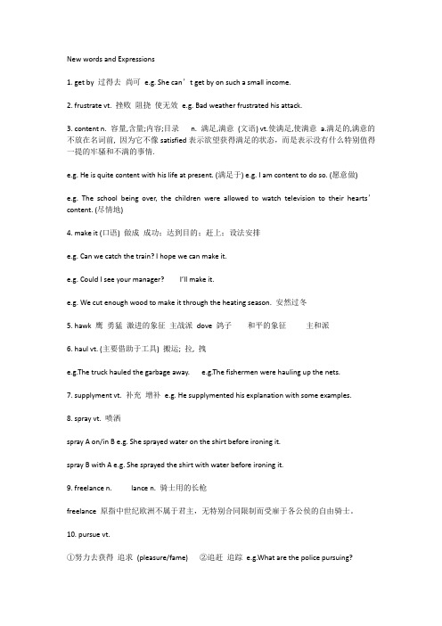
帕累托图(paretochart)1、l帕累托图(Paretochart)双名:帕累托图(Paretodiagram),帕累托分析(Paretoanalysis)方法演化:权重帕累托图、比较帕累托图概述帕累托图是一种条形图,条的长度代表事件发生的频率或本钱〔财力、时间〕,条柱按长短顺序从左到右依次放置。
因此,我们可以从该图直观地看出哪些状况是比较重要的。
适用场合分析过程中表示问题或者缘由发生频率的数据时;当想要关注众多问题或者缘由中最显著的一个时;分析特定要素的主要缘由时;和其他人沟通数据时。
实施步骤1确定分类的根据。
2确定合适的测量对象。
一般的测量对象2、是频数、数量、本钱和时间。
3确定该图包括的时间段。
4收集数据,并记录种类,或汇编已有的数据。
5求每种测量对象的总数。
6为收集的测量数据确定合适的刻度范围。
最大值是步骤5求得的最大的和。
假如执行了备选步骤8和步骤9,最大值是步骤5的全部和的加和。
在图的左边标上刻度。
7画出每一种类的条柱,并加以标柱。
将条柱按长短顺序从左到右依次放置,假如有些类的数值很小,就将其归为一类,用“其他”标注。
尽管步骤8和步骤9是备选的,但是它们对我们分析和沟通特殊有关心。
8计算每一类的百分比:全部类的百分比之和为1,将其在不同类之间进行安排。
3、画一条右竖轴标上百分比。
确保左右两边的刻度相匹配。
例如:左边测量值的一半要对应右边的50%刻度。
9计算并画出累积百分比值:将第一类和第二类的百分比相加,并在第二个条柱的上方画一个点说明前两类的累加值。
在第三个条柱的上方画一个点说明前三类的累加值,继续该过程。
从第一个条柱上方的点开始连接全部点,直到在最终一个条柱上说明全部类的累加值100%。
示例图表5.133和图表5.134是嵌套式的帕累托图。
图表5.133说明五大类中的每一类收到的顾客埋怨数。
图表5.134是将图表5.133中的最大一类“文档管理”分成六个与文档管理4、相关的埋怨的子类,并画出了其累计曲线。
New words and Expressions1. get by 过得去尚可e.g. She can’t get by on such a small income.2. frustrate vt. 挫败阻挠使无效e.g. Bad weather frustrated his attack.3. content n. 容量,含量;内容;目录n. 满足,满意(文语) vt.使满足,使满意a.满足的,满意的不放在名词前, 因为它不像satisfied表示欲望获得满足的状态,而是表示没有什么特别值得一提的牢骚和不满的事情.e.g. He is quite content with his life at present. (满足于) e.g. I am content to do so. (愿意做)e.g. The school being over, the children were allowed to watch television to their hearts’content. (尽情地)4. make it (口语) 做成成功;达到目的;赶上;设法安排e.g. Can we catch the train? I hope we can make it.e.g. Could I see your manager? I’ll make it.e.g. We cut enough wood to make it through the heating season. 安然过冬5. hawk 鹰勇猛激进的象征主战派dove 鸽子和平的象征主和派6. haul vt. (主要借助于工具) 搬运; 拉, 拽e.g.The truck hauled the garbage away. e.g.The fishermen were hauling up the nets.7. supplyment vt. 补充增补e.g. He supplymented his explanation with some examples.8. spray vt. 喷洒spray A on/in B e.g. She sprayed water on the shirt before ironing it.spray B with A e.g. She sprayed the shirt with water before ironing it.9. freelance n. lance n. 骑士用的长枪freelance 原指中世纪欧洲不属于君主,无特别合同限制而受雇于各公侯的自由骑士。
1、绝对优势(Absolute advantage)如果一个国家用一单位资源生产的某种产品比另一个国家多,那么,这个国家在这种产品的生产上与另一国相比就具有绝对优势。
2、逆向选择(Adverse choice)在此状况下,保险公司发现它们的客户中有太大的一部分来自高风险群体。
3、选择成本(Alternative cost)如果以最好的另一种方式使用的某种资源,它所能生产的价值就是选择成本,也可以称之为机会成本。
4、需求的弧弹性(Arc elasticity of demand)如果P1和Q1分别是价格和需求量的初始值,P2 和Q2 为第二组值,那么,弧弹性就等于-(Q1-Q2)(P1+P2)/(P1-P2)(Q1+Q2)5、非对称的信息(Asymmetric information)在某些市场中,每个参与者拥有的信息并不相同。
例如,在旧车市场上,有关旧车质量的信息,卖者通常要比潜在的买者知道得多。
6、平均成本(Average cost)平均成本是总成本除以产量。
也称为平均总成本。
7、平均固定成本( Average fixed cost)平均固定成本是总固定成本除以产量。
8、平均产品(Average product)平均产品是总产量除以投入品的数量。
9、平均可变成本(Average variable cost)平均可变成本是总可变成本除以产量。
10、投资的β(Beta)β度量的是与投资相联的不可分散的风险。
对于一种股票而言,它表示所有现行股票的收益发生变化时,一种股票的收益会如何敏感地变化。
11、债券收益(Bond yield)债券收益是债券所获得的利率。
12、收支平衡图(Break-even chart)收支平衡图表示一种产品所出售的总数量改变时总收益和总成本是如何变化的。
收支平衡点是为避免损失而必须卖出的最小数量。
13、预算线(Budget line)预算线表示消费者所能购买的商品X和商品Y的数量的全部组合。
描述柱状图英文作文英文:When it comes to describing a bar chart, the firstthing that comes to my mind is data visualization. A bar chart is a graphical representation of data that uses rectangular bars to compare values between different categories. It is one of the most commonly used charts in data analysis and presentation.To describe a bar chart, we need to start with the axis. The horizontal axis represents the categories being compared, while the vertical axis represents the values being measured. The bars are then drawn perpendicular tothe axis, with their height or length proportional to the value being measured.For example, let's say we have a bar chart comparingthe sales of different products in a store. The horizontal axis would have the names of the products, while thevertical axis would have the sales figures. The bars would then be drawn for each product, with their height representing the sales figures.When describing a bar chart, it is important to provide context and explain the significance of the data being presented. We can use phrases like "as we can see from the chart" or "it is clear that" to introduce our analysis. We can also use comparative language to highlight the differences between categories, such as "product A had significantly higher sales than product B".Overall, a bar chart is a powerful tool for visualizing and analyzing data. By following a few simple guidelines, we can effectively describe and interpret the information presented in a bar chart.中文:谈到描述柱状图,我首先想到的是数据可视化。
饼状图对比描述英语范文英文回答:Comparative Description of Pie Charts.Pie charts are a type of graphical representation that displays data in the form of a circle divided into sectors. Each sector represents a category or value, and the size of each sector is proportional to the percentage of the whole that it represents.Pie charts are often used to compare different categories of data. For example, a pie chart could be used to compare the sales of different products, the market share of different companies, or the demographics of a population.When comparing pie charts, it is important to consider the following factors:The size of the pie: The size of the pie represents the total amount of data being represented. A larger pie indicates that there is more data to be compared.The number of sectors: The number of sectors in a pie chart represents the number of categories or values being compared. A pie chart with more sectors will be more difficult to compare than a pie chart with fewer sectors.The size of the sectors: The size of each sector represents the percentage of the whole that it represents.A larger sector indicates a larger percentage.中文回答:饼状图对比描述。
柱状图描述与深度解析The bar chart presents a comparative analysis of four distinct categories of data, namely, Category A, Category B, Category C, and Category D. Each category is represented by a separate bar, with its height indicating the respective value or quantity. At a glance, it becomes evident that Category A stands out as the most prominent, followed by Category B, Category D, and finally, Category C, which appears to be the least significant.The bar representing Category A towers above the others, reflecting a significantly higher value than the rest. This suggests that Category A holds a preponderant position among the four categories, potentially indicating itsgreater importance or popularity. On the other hand, thebar for Category C is noticeably shorter, indicating a much lower value compared to the others. This could beinterpreted as Category C being less significant or less prevalent.Category B and Category D occupy intermediate positions on the chart. While both are lower than Category A, theyare higher than Category C. This suggests that these twocategories have a moderate presence or impact within the overall dataset. However, a closer look reveals that Category B is slightly taller than Category D, indicating a marginally higher value or greater significance.The varying heights of the bars not only reflect quantitative differences but also hint at potential qualitative disparities among the categories. For instance, the dominance of Category A may be attributed to its unique characteristics or widespread appeal, while the low profile of Category C could be due to various factors such aslimited availability, lack of awareness, or simply less desirability.Beyond the numerical comparisons, the bar chart also serves as a visual tool for identifying patterns and trends. It allows for a quick and intuitive understanding of the relative strengths and weaknesses of each category, as well as their relative positions within the broader context.Such visualizations are invaluable in making informed decisions and formulating effective strategies in various fields, from business analytics to scientific research.In summary, the bar chart provides a comprehensive overview of the four categories, highlighting their respective strengths and weaknesses. It offers a valuable insight into the relative importance and prevalence of each category, enabling a deeper understanding of the underlying data and its implications.**柱状图描述与深度解析**这幅柱状图呈现了对四个不同类别数据的比较分析,即类别A、类别B、类别C和类别D。