雅思写作高分课件(1)
- 格式:doc
- 大小:438.50 KB
- 文档页数:18

《雅思写作》课件CATALOGUE 目录•雅思写作概述•雅思写作任务类型与技巧•文章结构与段落展开方法•词汇、语法和句式运用指导•观点陈述、论证和批判性思维培养•模拟试题与范文欣赏01雅思写作概述CHAPTER雅思写作考试形式与要求考试形式雅思写作考试分为两部分,第一部分为图表作文(Task 1),第二部分为议论文(Task 2)。
字数要求Task 1要求考生写至少150字,Task2要求考生写至少250字。
时间限制Task 1的建议用时为20分钟,Task 2的建议用时为40分钟。
评分标准及考生常见问题评分标准考生常见问题如何备考雅思写作熟悉考试形式和评分标准积累词汇和句型练习写作请教老师或专业人士02雅思写作任务类型与技巧CHAPTER1 2 3理解图表信息选择重要信息使用适当的语言和结构图表作文写作技巧明确观点提供充分的论据逻辑清晰030201议论文写作技巧混合题型应对策略分别应对识别题型针对不同类型的题目,采用不同的应对策略。
例如,对于包含图表和议论的题目,可以先描述图表,然后提出观点并进行论述。
整合信息03文章结构与段落展开方法CHAPTER引言段写作方法开门见山背景介绍提出疑问论证方法运用举例、对比、因果等论证方法,充分阐述主题句。
主题句每段开头明确主题句,概括该段主要内容。
过渡与衔接使用过渡词和衔接手段,确保段落间逻辑清晰、连贯。
正文段落展开策略结尾段总结技巧重申观点01展望未来02简洁明了0304词汇、语法和句式运用指导CHAPTER高级词汇选用及替换建议使用具体、生动的词汇01避免重复使用同一词汇02注意词汇的准确性和正式程度03复杂句式构造和变换技巧使用从句和复合句变换句子结构注意句子的流畅性和简洁性避免常见语法错误确保主语和谓语在人称和数上保持一致。
注意动词的时态和语态的正确使用,避免混淆。
正确使用标点符号,避免句子结构的混淆和歧义。
例如,避免使用双重否定、注意冠词的正确使用等。


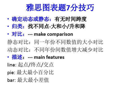
雅思写作Task 1图表小作文第一节简介一.图表简介:图表通常分为两大类。
一类是数据图,包括曲线图(graph/ line chart),柱状图(bar chart/ column chart),饼状图(pie chart)和表格(table)。
另一类是示意图/流程图(diagram/flow chart)。
目前在雅思考试中主要出现的是数据图。
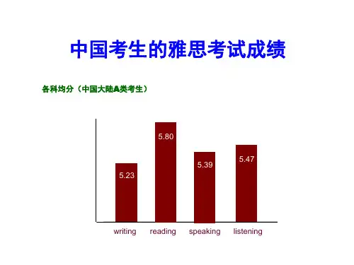
最多柱状图,其次曲线图,再者饼状图,表格。
词汇语法:词汇准确多样,不能重复those who work in = people working in = the employee in句子:结构不能太简单,一句话要同时写两个对象的特征。
逻辑:句子里,句子与句子之间,段与段之间都要使用表示对比,转折,相似的连词或副词。
时态:第一句使用一般现在时,主体部分大多用一般过去式。
二.图表作文审题审题包括审读题目要求或说明以及查看图表及其注解。
题目的文字部分一般提供了有关这个图表的最基本信息,如所涉及的背景、研究的对象、时间和地点。
对于图表部分,我们需要仔细考察,查看纵横轴等,找出值得描述的主要规律和特征、关键点( 最高,最低值,中间值、相似类的)、总体趋势(overall trends)和不规则变化(irregularities 上升,下降,持平的)。
第二节常用基本句式开头段主体段一.描述信息出处二.动态变化描写1)上升/ 下降(用变化动词)2)上升/ 下降(用变化名词)3)上升/ 下降(五个变通句型)1.The percentage of …increases sharply between …and…, going up from...to…. 2.There is a gradual increase in the number of ….over the period of one month. 3.The number/percentage shows an upward / downward trend f rom ….to….. 4.A sharp increase can be found in the number/percentage of , from …to…5.The year of 1999 witnesses a steady fall in the amount of ….4)无变化二.静态数据描写1)最高和最低A was the most popular/dominant/main + n , with + 数据+时间..= A + 动词/被动语态/serves as (is used as) the main n (+ 数据) +时间.= The largest quantity of n + 动词/被动语态from A + 数据+时间.= The proportion of n in A, the highest of all, + 动词+ 数据+时间.=A+ 动词/被动语态in the largest quantity, +数据+时间.2)A 比B 多/少3)A 和B 相等2)A 是B的几分之几或几倍3)A比B多几倍三.导入数据★介词短语1.The consumption of fish also decline but slightly to just below 50 grams.mb and chicken were eaten in the quantities of 5 grams.3.The consumption of fish decline by50 grams.4.The units of electricity doubled, rising from100to 170 i n USA and from 90 to 180 in France.5.Hydro continued to be another significant source, supplying/producing approximately 20%, at 25 units.6.In 1979,beef was by far the most popular of these food, with about 225 grams per person per week.7.The reminding units were produced largely from oil and nuclear power( 20 units and 25 units respectively),with hydro contributing 5 units.★括号8.The remainder was produced from natural gas, hydro power(each producing 25 units) and oil (which produceonly 10 units).mb and chicken were eaten in similar quantities, while much less fish was consumed(just over 50grams.)★分词作状语10.The units of electricity doubled, rising from 100to 170 i n USA and from 90 to 180 in France.11.The greatest amount of water was consumed in the industrial sector, accounting for 70%.12.The largest quantity of water was used for agricultural purpose,whereas hydro continued to be anothersignificant source,supplying approximately 20%.★非限制性定语从句13.The units of electricity doubled, which rose from 100to170 i n USA and from 90 to 180 in France.14.The greatest amount of water was consumed in the industrial sector,which account for 70%.四.对象描述变换方法1.Beef was the most popular of these food s.Beef was consumed as the most popular food.Beef were eaten in similar quantities of 5 grams.The consumption of beef fell dramatically to approximately 100 grams and 55 grams respectively.2.American used coal as the main electricity source for 25%.Coal was used as the most popular source.3.The largest quantity of water was used for agricultural purpose.Water used in the industrial sector also increased, but the consumption was minimal until 1999.4.Nearly 80% students under 26 years old study for their career reason.There are only 10% of students studying out of interest.Those who study for career purpose is 4%.5.90% of those who held a skilled vocational diploma were men.Men holding postgraduate diplomas clearly outnumbered than females.Men with postgraduate diplomas clearly outnumbered than females.6.Britain has spent most heavily on the ranged of goods.Britain’s spending is considerable higher than that of other country.Germany is the lowest spender.五.开头段改写1.(7.1) The table below gives/shows information on consumer spending on different items in five differentcountries in 2002.= The table shows the expenditure on the consumption of three items in 5 nations in 2002, namely, Turkey, Italy, London, New York and Tokyo.2.(7.2) The graph below shows the consumption of fish and some different kinds of meet in a European countrybetween 1997 and 2004.= The line chart illustrates the changes in the amount of fish, beef, lamb and chicken consumed in a particular Europe country over the 15-year period from 1997 to 2004.= The graph illustrates how the consumption of fish, beef, lamb and chicken changed in a particular Europe country over the 15-year period from 1997 to 2004.3.(7.3) The chart shows information about changes in average house prices in five different cities between 1990and 2002 compared with the average house prices in 1989.= The charts shows how the average prices in five different cities changed during the period between 1990 and 2002 in comparison to the average house prices in 1989.4.(6.1) The graph and table gives information about water use worldwide and water consumption tin two differentcountries.= The graph shows how the amount of water used worldwide changed between 1990 and 2000 and the table compares the differences in agricultural consumption in two countries.5.(3.3) The chart below shows the levels of participation in education and science in developing and industrialcountries in 1980 and 1990.= The data compares the differences between developing and industrial countries participation in education and science.第三节高分句式一.同时写两个对象的特征或变化1)平铺直叙法:简单句(respectively, compared with);并列句(however, on the contrary, on the other hand); 复合句(while, whereas)15.The units of electricity doubled, rising from 100 to 170 in USA and from 90 to 180 in France.16.The units of electricity in USA and in Franc rose double from 100 to 170 and from 90 to 180 respectively.17.A double rise could be seen/found in the units of electricity in USA and in Franc from 100 to 170 and from 90 to180 respectively.18.There was a double rise in the units of electricity in USA and in Franc from 100 to 170 and from 90 to 180respectively.19.The consumption of beef and lamb fell dramatically to approximately 100 grams and 55 gramsrespectively.= There was a dramatic fall in the consumption of beef and lamb to approximately 100 grams and 55 grams respectively.= A dramatic fall can be found/seen/noticed in the consumption of beef and lamb to approximately 100 grams and 55 grams respectively.20.The proportion of people aged stood at only 5% in Japan, approximately 7% in Sweden and 9% in USA.21.The length of time people spend at school in industrialized countries was much greater at 8.5 years in 1980,compared to 2.5 years in developing countries.22.10% of those who held a skilled vocational diploma were men, compared with 80% of women.23.Men who held a skilled vocational diploma was 10%,compared with80% of women.24.There are 80% of men holding a skilled vocational diploma in comparison with 80% of women.25.70% of over 49 years old study for interes t in comparison to 18% studying for career reasons.26.Male with postgraduate diplomas clearly outnumbered/overtook female (70% and 30% respectively).1.There was a sharp increase in the consumption of beef. On the other hand,the consumption of chicken,,showed an upward trend.2. A remarkable drop can be found in the price in New York.In/By contrast, the price increased in the rest ofcities.3.Water used in the industrial sector also increased, however/but the consumption was minimal until 1999.4.However, the figures grew to about 15% in around 1990, before rising to almost 5% again in 2000.5.The largest quantity fuel was generated from hydro. On the contrary, coal and oil together produced only 50units.1.In Italy, they got 90%, while/whereas in Japan, they are below 50%.2.Italy spends more on personal stereo than France, while spending the same on toys between the two.3.The quantities of lamb and chicken were similar, while much less fish was consumed (just over 50grams).4.Industrial use grew steadily to just over 5%, while domestic use rose more slowly to only 2%, both far below thelevels of consumption by agriculture.5.The largest quantity of water was used for agricultural purpose,whereas hydro continued to be anothersignificant source, supplying approximately 20%.2) 加减法比较级、平级1.France spends much more on CDs and film but less on tennis than Italy does.=France’s spending is slightly more on CDs and film but less on tennis than that of Italy.2.Italy’s spending on personal stereo is only marginally greater than that of France,while spending on toys is equal between the two.3.Far More males hold postgraduate diplomas than females (70% and 30% respectively).=Males who hold postgraduate diplomas are far more than females do (70% and 30% respectively).=There are more males holding postgraduate diplomas than females (70% and 30% respectively).4.More men than woman hold qualifications at the lower and higher levels of education, while more women reach undergraduate diploma level than men.=Men holding qualifications at the lower and higher levels of education are marginally more than women, while women reaching undergraduate diploma level are more than men.5.France used coal as a source for only 25 units of electricity in 1980,which was matched by natural gas.= France used the same amount of coal and natural gas in 1980, with 25 units of electricity.= In 1980, Coal and natural gas are used in the same quantities o f 25 units of electricity in France,= The quantities of c oal and natural gas consumed in France are equal to e ach other, with 25 units of electricity.6.Lamb and chicken were eaten in similar quantities( about 60 grams), while much less fish was consumed (just over 50grams).7.= The quantities of lamb and chicken were similar,while much less fish was consumed (just over 50grams).8.Italy’s spending on personal stereo is only marginally greater than that of France, while spending on toys is equal between the two.9.The price increased in the rest of cities.10.T he remainder/the reminding sources was produced from nature gas, hydro water and oil.11.N early the same number of over 49 years old study for career and interest reasons.12.T he percentage are nearly similar, which are all approximately 60%.13.L amb and chicken were eaten in similar quantities,while much less fish was consumed (just over 50grams.)14.F rance used coal as a source for only 25 units of electricity in 1980, which was matched by natural gas. 15.T he proportion i s similar in 3 countries.3) 倍数法倍数+平级1.The units of electricity doubled, rising from 100 to 170 in USA and from 90 to 180 in France.mb was consumed twice as much as beef.3.The number of women who hold the undergraduate diploma is three times as much as that of man.4.There are twice as many women who hold the undergraduate diploma as men.二.同时写一个对象的两种变化before / after / followed by1.The number of cases of the X disease remained steady, followed by a slight decrease before the number rosedramatically between 1990 and 1995.2.The number of cases of the X disease remained steady, followed by a slight decrease before rising dramaticallybetween 1990 and 1995.3.The number of cases of the disease reached a peak in 1993, fluctuating slightly until the 1996before it fellsharply over the following years.4.There was a slight increase up to 30 dollars in the price after a fall to 10 dollars.5.There was a slight increase up to 30 dollars in the price after it fell to 10 dollars.六种题型官方范文(体会为什么范文能拿到9分,它的得分点都在哪里?)第一类:表格题目:剑桥7, Test 1 Writing Task 1You should spend about 20 minutes on this task.The table below gives information on consumer spending on different items in five different countries in 2002. Summarise the information by selecting and reporting the main features, and make comparisons where relevant.Write at least 150 words.参考范文:The table gives the breakdown about data on consumer spending on various items (Food/Drink/Tobacco,Clothing/Footwear and Leisure/Education) in five different countries (Ireland, Italy, Spain, Sweden and Turkey)in 2002.Generally, each country consumed much more in food/drink/tobacco where Turkey dominated the first place with 32.14%, standing in marked contrast with Sweden (only 15.77%) than in other 2 categories. In terms of Clothing/Footwear, Italy expectedly spent most with 9% compared with still Sweden seeing the smallest proportion (5.4%). As for Leisure/Education, it was Turkey and Spain that consumed the most and least with 4.35% and 1.98% respectively.Additionally, we can see immediately that in food/drink/tobacco, after Turkey, Ireland, Spain and Italy came in turn with 28.91%, 18.80% and 16.36%. On the contrary, in Clothing/Footwear, we failed to see big gap from Ireland,Spain and Turkey in middle positions which saw different reductions of 2.57%, 2.49% and 2.37% in comparison with Italy, likewise, in Leisure/Education, still small differences were found. To be exact, Turkey was followed by Sweden, Italy and Ireland in a slow falling turn with 3.22%, 3.2% and 2.21%.In conclusion, people prefer to spend on those products directly relating to food. (189 words)第二类:柱状图:剑桥7, Test 3 Writing Task 1You should spend about 20 minutes on this task.The chart below shows information about change in average house prices in five different cities between 1990 and2002 compared with the average house prices in 1989.Summarise the information by selecting and reporting the main features, and make comparisons where relevant.Write at least 150 words.Percentage change in average house prices in five cities1992-2002 compared with 1989The given diagrams offer a glimpse of the real estate market in five major cities around the world over two periods,from 1990 to 1995, and from 1996 to 2002 compared with the average house prices in 1989.Madrid is the only city which saw housing prices climb throughout the ten-year period. In the first five years, a 2%rise was recorded in Madrid. The increase accelerated in subsequent years, with a 3% gain seen. To great surprise,New York and London underwent similar trend, to be exact, compared with 1989, the latter had a fall of 7% in thefirst 5 years but enjoyed an astounding 12% increase over the period between 1996 and 2002 as against the former(5%, 5%).By contrast, the property market of Tokyo was continuously at recession, reflected in an average 6.5% drop. It is a notable that the decrease in the housing price in Frankfurt was narrower, 2% of growth against 1989, but still disappointing, compared to its 3% increase in the first half of 1990s.To recall, there were significant differences in the housing market in those five cities in the last decade of the last century. While some experienced a long period of growth, the rest were subject to price fluctuations. (209 words)第三类:曲线图剑桥雅思5 Test 1 Writing Task 1You should spend about 20 minutes on this task.The graph below shows the proportion of the population aged 65 and over between 1940 and 2040 in three different countries.Summarise the information by selecting and reporting the main features, and make comparisons where relevant.Write at least 150 words.官方范文:The graph shows the increase in the ageing population in Japan, Sweden and the USA. It indicates that the percentage of elderly people in all three countries is expected to increase to almost 25% of the respective populations by the year 2040.In 1940 the proportion of people aged 65 or more stood at only 5% in Japan, approximately 7% in Sweden and 9% in the US. However, while the figures for the Western countries grew to about 15% in around 1990, the figure for Japan dipped to only 2.5% for much of this period, before rising to almost 5% again at the present time.In spite of some fluctuation in the expected percentages, the proportion of older people will probably continue to increase in the next two decades in the three countries. A more dramatic rise is predicted between 2030 and 2040 in Japan, by which time it is thought that the proportion of elderly people will be similar in the three countries. (164 words)第四类:饼状图剑桥7,Test 4 Writing Task 1You should spend about 20 minutes on this task.The pie charts below show units of electricity production by fuel source in Australia and France in 1980 and 2000. Summarise the information by selecting and reporting the main features, and make comparisons where relevant.Write at least 150 words.Units of electricity by fuel source in Australia官方范文:The charts compare the sources of electricity in Australia and France in the years 1980 and 2000. Between these years electricity production almost doubled, rising from 100 units to 170 in Australia, and from 90 to 180 units in France.In 1980 Australia used coal as the main electricity source (50 units) and the remainder was produced from natural gas, hydro power (each producing 20 units) and oil (which produced only 10 units). By 2000, coal had become the fuel for more than 75% of electricity produced and only hydro continued to be another significant source supplying approximately 20%.In contrast, France used coal as a source for only 25 units of electricity in 1980, which was matched by natural gas. The remaining 40 units were produced largely from oil and unclear power, with hydro contributing only 5 units. But by 2000 nuclear power, which was not used at all in Australia, had developed into the main source, producing almost 75% of electricity, at 126 units, while coal and oil together produced only 50 units. Other sources were no longer significant.Overall, it is clear that by 2000 these two countries relied on different principal fuel sources: Australia relied on coal and France on nuclear power. (206 words)第五类:流程图剑桥1, Practice Test 2 Writing Task 1You should spend about 20 minutes on this task.The diagram below shows how the Australian Bureau of Meteorology collects up-to-the-minute information onthe weather in order to produce reliable forecasts.Write a report for a university lecturer describing the information shown below.You should write at least 150 words.The diagram shows in four stages how the Australian Bureau of Meteorology ensures the reliability of the weather forecast.The first stage is called the "incoming information" stage, in which raw materials are collected from outer space, onland, or at sea, using satellites, radars, and drifting buoys respectively. And then, this data is analysed and forecastedby experts in the Australia Bureau of Meteorology. At this stage experts study satellite photos, radar screens, and synoptic charts to determine weather conditions. Stage three of the process is when the information is prepared for broadcast. This is done through computers which send all the necessary data to the fourth stage. At this point the weather data is broadcast to the general public in three channels. That is, people in Australia can receive the relatively reliable weather forecast via TV, radio and telephone (recorded announcement).Overall, the process diagram shows how weather data is collected, studied, prepared, and finally broadcast in Australia. (160 words)第六类:地图题剑桥雅思5 Test 3 Writing Task 1You should spend about 20 minutes on this task.The map below is of the town of Garlsdon. A new supermarket (S) is planned for the town. The map shows two possiblesites for the supermarket.Summarise the information by selecting and reporting the main features, and make comparisons where relevant.Write at least 150 words.官方范文:The map shows two proposed locations for a new supermarket for the town of Garlsdon.The first potential location (S1) is outside the town itself, and is sited just off the main road to the town of Hindon, lying 12 kms to the north-west. This site is in the countryside and so would be able to accommodate a lot of car parking. This would make it accessible to shoppers from both Hindon and Garlsdon who could travel by car. As it is also close to the railway line linking the two towns to Cransdon (25 km to the south-west), a potentially large number of shoppers would also be able to travel by train.In contrast, the suggested location, S2, is right in the town centre, which would be good for local residents. Theoretically the store could be accessed by road or rail from the surrounding towns, including Bransdon, but as the central area is a no-traffic zone, cars would be unable to park and access would be difficult.Overall, neither site is appropriate for all the towns, but for customers in Cransdon, Hindon and Garlsdon, the out-of-town site (S1) would probably offer more advantages. (194 words)。