雅思小作文图表题练习题目
- 格式:doc
- 大小:645.00 KB
- 文档页数:4

雅思小作文表格题汇总篇一:雅思小作文经典句式图表题整理【整个时段最高】...were the highest throughout the period./ over the period/during this 25-year period【起点】In 1940 the proportion of XX stood at (XX)in XX, approximately XX in XX and XX in XX【最高点后回落】After peaking at ...,XX had fallen back o XX by 20XX【最后两年增长放缓】though the growth slowed over the last two years【由X剧烈增长到X】There was a dramatic increasein XX from to【明显缩小】the gap between the three categories narrowed considerably【相等】was equal at【尽管有波动】Despite some initial fluctuation,【尽管有波动】In spite of some f luctuation in the ...【预计】is expected to/ is predicted to【分别始于】From XX and XX respectively【分别是】and % of land affected respectively.【保持稳定】will remain stable at【相对不重要】relatively【经历下降】rose dramatically in 20XX when it represented 23%of the schoolcorresponding drops【不那么明显的下降到】...also declined, but muchless significantly to just below...【表现出下降趋势】showed an upward trend【急剧下降】plummet/ plunge【由xx组成】be made up of /consist of/ be xxposed of【维持在某一水平】remain stable at 、level off at/ hover at【最高点】peak at、reach its peak at /reach the highest level at【最低点】fall to its lowest point at【份额】account for / represent/ make up .......of【持续的】consistent和continuous 表示下降不管中间 gradual和steady表示稳步【大幅的】sharp、rapid、dramatically写准篇二:雅思小作文图表题经典套句雅思小作文图表题经典套句许多考生一直无法顺利地在20分钟内写完小作文,因此拖后了大作文的写作时间,造成交卷时没有写完文章,最终影响考试成绩。
雅思小作文(图表题)题型归纳一.t able 表格题1.剑2 (1)4.剑5(4)6.剑7(1)二.Line graph线图(含直线和曲线图)1.剑3(4)You should spend about 20 minutes on this task.The graph below shows the unemployment rates in the US and Japanbetween March 1993 and March 1999.Write a report for a university lecturer describing the information shownbelow.You should write at least 150 words.You should spend about 20 minutes on this task.The graph below shows the proportion of the population aged 65 and overbetween 1940 and 2040 in three different countries.Summarize the information by selecting and reporting the main features,and make comparisons where relevant.Write at least 150 words.You should spend about 20 minutes on this task.The graph below shows the consumption of fish and some different kinds of meatin a European country between 1979-2004.Summarize the information by selecting and reporting the main features, andmake comparisons where relevant.Write at least 150 words.You should spend about 20 minutes on this task.The graph below shows the quantities of goods transported in the UK between 1974 and 2002 by four different modes of transport.Summarize the information by selecting and reporting the main features, and make comparisons where relevant.Write at least 150 words.5.剑9(4)三.Bar chart 柱状图You should spend about 20 minutes on this task.The chart below shows the amount of leisure time enjoyed by men and women of different employment status.Write a report for a university lecturer describing the information shown below.Write at least 150 words.Leisure time in a typical week: by sex and employment status,1998-99You should spend about 20 minutes on this task.The table below shows the figures for imprisonment in five countries between 1930 and 1980.Write a report for a university lecturer describing the information shown below.You should write at least 150 words.You should spend about 20 minutes on this task.The chart below shows the amount spent on six consumer goods in fourEuropean countries.Write a report for a university lecturer describing the information shown below. You should write at least 150 words.You should spend about 20 minutes on this task.The charts below show the level of participation in education and sciencein developing and industrialized countries in 1980 and 1990Write a report for a university lecturer describing the information shown below. You should write at least 150 words.5.剑4(3)You should spend about 20 minutes on this task.The chart below shows the different levels of post-school qualifications inAustralia and the proportion of men and women who held them in 1999.Summarize the information by selecting and reporting the main features,and make comparisons where relevant.You should write at least 150 words.You should spend about 20 minutes on this task.The charts below show the main reasons for study among students ofdifferent age groups and the amount of support they received from employers.Summarize the information by selecting and reporting the main features,and make comparisons where relevant.You should write at least 150 words.You should spend about 20 minutes on this task.The charts below give information about USA marriages and divorce ratesbetween 1970 and 2000, and the marital status of adult Americans in twoof the years.Summarize the information by selecting and reporting the main features,and make comparisons where relevant.You should write at least 150 words.You should spend about 20 minutes on this task.The chart below shows information about changes in average house prices in fivedifferent cities between 1990 and 2002 compared with the average house prices in 1989.Summarize the information by selecting and reporting the main features, and makecomparisons where relevant.You should write at least 150 words.四.Pie chart饼图1.剑7(4)2.剑8(2)3.剑9(3)五.流程图1.剑1(2)You should spend about 20 minutes on this task.The diagrams below show the life cycle of the silkworm and the stages inthe production of silk cloth.Summarize the information by selecting and reporting the main features,and make comparisons where relevant.Write at least 150 words.六.混合图。

雅思英语图表作文范文第1篇A类雅思各类图表作文要点及范文一.曲线图解题关键1曲线图和柱状图都是动态图,解题的切入点在于描述趋势。
2在第二段的开头部分对整个曲线进行一个阶段式的总分类,使写作层次清晰,同时也方便考官阅卷。
接下来再分类描述每个阶段的specifictrend,同时导入数据作为分类的依据。
3趋势说明。
即,对曲线的连续变化进行说明,如上升、下降、波动、持平。
以时间为比较基础的应抓住“变化”:上升、下降、或是波动。
题中对两个或两个以上的变量进行描述时应在此基础上进行比较,如变量多于两个应进行分类或有侧重的比较。
4极点说明。
即对图表中最高的、最低的点单独进行说明。
不以时间为比较基础的应注意对极点的描述。
5交点说明。
即对图表当中多根曲线的交点进行对比说明。
6不要不做任何说明就机械地导入数据,这不符合雅思的考试目的。
曲线图常用词汇动词—九大运动趋势一:表示向上:increase,rise,improve,grow,ascend,mount,aggrandize,goup,climb, take off, jump,shoot up暴涨,soar,rocket, skyrocket雅思英语图表作文范文第2篇It is said that countries are becoming similar to each other because of the global spread of the same products, which are now available for purchase almost anywhere. I strongly believe that this modern development is largely detrimental to culture and traditions worldwide.A country’s history, language and ethos are all inextricably bound up in its manufactured artefacts. If the relentless advance of international brands into every corner of the world continues, these bland packages might one day completely oust the traditional objects of a nation, which would be a loss of richness and diversity in the world, as well as the sad disappearance of t he manifestations of a place’s character. What would a Japanese tea ceremony be without its specially crafted teapot, or a Fijian kava ritual without its bowl made from a certain type of tree bark?Let us not forget either that traditional products, whether these be medicines, cosmetics, toy, clothes, utensils or food, provide employment for local people. The spread of multinational products can often bring in its wake a loss of jobs, as people urn to buying the new brand,perhaps thinking it more glamorous than the one they are used to. This eventually puts old-school craftspeople out of work.Finally, tourism numbers may also be affected, as travelers become disillusioned with finding every place just the same as the one they visited previously. To see the same products in shops the world over is boring, and does not impel visitors to open their wallets in the same way that trinkets or souvenirs unique to the particular area too.Some may argue that all people are entitled to have access to the same products, but I say that local objects suit local conditions best, and that faceless uniformity worldwide is an unwelcome and dreary prospect.Heres my full answer:The line graphs show the average monthly amount that parents in Britain spent on their children’s s porting activities and the number of British children who took part in three different sports from 2008 to is clear that parents spent more money each year on their children’s participation in sports over the six-year period. In terms of the number of children taking part, football was significantly more popular than athletics and 2008, British parents spent an average of around £20 per month on their children’s sporting activities. Parents’ spending on children’s sports increased gradually over the followi ng six years, and by 2014 the average monthly amount had risen to just over £ at participation numbers, in 2008 approximately 8 million British children played football, while only 2 million children were enrolled in swimming clubs and less than 1 million practised athletics. The figures for football participation remained relatively stable over the following 6 years. By contrast, participation in swimming almost doubled, to nearly 4 million children, and there was a near fivefold increase in the number of children doing athletics.剑桥雅思6test1大作文范文,剑桥雅思6test1大作文task2高分范文+真题答案实感。
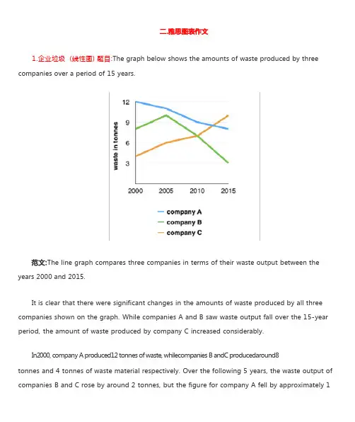
1.企业垃圾 (线性图) 题目:The graph below shows the amounts of waste produced by three companies over a period of 15 years.years 2000 and 2015.It is clear that there were significant changes in the amounts of waste produced by all three companies shown on the graph. While companies A and B saw waste output fall over the 15-year period, the amount of waste produced by company C increased considerably.In2000, company A produced12 tonnes of waste, whilecompanies B andC producedaround8tonnes and 4 tonnes of waste material respectively. Over the following 5 years, the waste output of companies B and C rose by around 2 tonnes, but the figure for company A fell by approximately 1tonne.From 2005 to 2015, company A cut waste production by roughly 3 tonnes, and company B reduced its waste by around 7 tonnes. By contrast, company C saw anincrease inwaste productionof approximately 4 tonnes over the same 10- year period. By 2015, company C’swaste output hadrisento10tonnes, while the respective amounts of waste fromcompanies A andB haddroppedto8 tonnes and only 3 tonnes.(192 words, band 9)这条线图对三家公司的废物产出从 2000 年到 2015 年进行了比较。
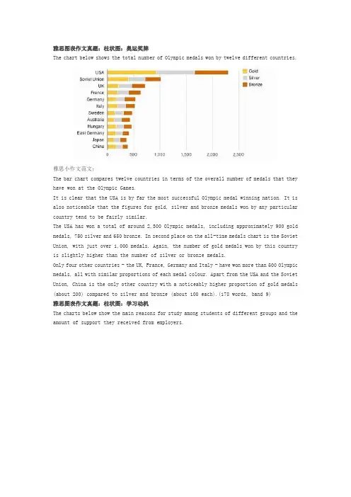
雅思图表作文真题:柱状图:奥运奖牌The chart below shows the total number of Olympic medals won by twelve different countries.雅思小作文范文:The bar chart compares twelve countries in terms of the overall number of medals that they have won at the Olympic Games.It is clear that the USA is by far the most successful Olympic medal winning nation. It is also noticeable that the figures for gold, silver and bronze medals won by any particular country tend to be fairly similar.The USA has won a total of around 2,300 Olympic medals, including approximately 900 gold medals, 750 silver and 650 bronze. In second place on the all-time medals chart is the Soviet Union, with just over 1,000 medals. Again, the number of gold medals won by this country is slightly higher than the number of silver or bronze medals.Only four other countries - the UK, France, Germany and Italy - have won more than 500 Olympic medals, all with similar proportions of each medal colour. Apart from the USA and the Soviet Union, China is the only other country with a noticeably higher proportion of gold medals (about 200) compared to silver and bronze (about 100 each).(178 words, band 9)雅思图表作文真题:柱状图:学习动机The charts below show the main reasons for study among students of different groups and the amount of support they received from employers.参考雅思小作文范文The bar charts compare students of different ages in terms of why they are studying and whether they are supported by an employer.It is clear that the proportion of students who study for career purposes is far higher among the younger age groups, while the oldest students are more likely to study for interest. Employer support is more commonly given to younger students.Around 80% of students aged under 26 study to further their careers, whereas only 10% study purely out of interest. The gap between these two proportions narrows as students get older, and the figures for those in their forties are the same, at about 40%. Students aged over 49 overwhelmingly study for interest (70%) rather than for professional reasons (less than 20%).Just over 60% of students aged under 26 are supported by their employers. By contrast, the 30-39 age group is the most self-sufficient, with only 30% being given time off and help with fees. The figures rise slightly for students in their forties and for those aged 50 or more.(178 words, band 9)雅思图表作文真题:柱状图:The chart below shows numbers of incidents and injuries per 100 million passenger miles travelled (PMT) by transportation type in 2002.雅思小作文范文The bar chart compares the number of incidents and injuries for every 100 million passenger miles travelled on five different types of public transport in 2002.It is clear that the most incidents and injuries took place on demand-response vehicles. By contrast, commuter rail services recorded by far the lowest figures.A total of 225 incidents and 173 injuries, per 100 million passenger miles travelled, took place on demand-response transport services. These figures were nearly three times as high as those for the second highest category, bus services. There were 76 incidents and 66 people were injured on buses.Rail services experienced fewer problems. The number of incidents on light rail trains equalled the figure recorded for buses, but there were significantly fewer injuries, at only 39. Heavy rail services saw lower numbers of such events than light rail services, but commuter rail passengers were even less likely to experience problems. In fact, only 20 incidents and 17 injuries occurred on commuter trains.(165 words, band 9)雅思图表作文真题:柱状图:各地房价The chart below shows information about changes in average house prices in five different cities between 1990 and 2002 compared with the average house prices in 1989.雅思小作文范文:The bar chart compares the cost of an average house in five major cities over a period of 13 years from 1989.We can see that house prices fell overall between 1990 and 1995, but most of the cities saw rising prices between 1996 and 2002. London experienced by far the greatest changes in house prices over the 13-year period.Over the 5 years after 1989, the cost of average homes in Tokyo and London dropped by around 7%, while New York house prices went down by 5%. By contrast, prices rose by approximately 2% in both Madrid and Frankfurt.Between 1996 and 2002, London house prices jumped to around 12% above the 1989 average. Homebuyers in New York also had to pay significantly more, with prices rising to 5% above the 1989 average, but homes in Tokyo remained cheaper than they were in 1989. The cost of an average home in Madrid rose by a further 2%, while prices in Frankfurt remained stable. (165 words)雅思图表作文真题:饼状图:垃圾处理The pie charts below show how dangerous waste products are dealt with in three countries.雅思小作文范文:The charts compare Korea, Sweden and the UK in terms of the methods used in each country to dispose of harmful waste.It is clear that in both the UK and Sweden, the majority of dangerous waste products are buried underground. By contrast, most hazardous materials in the Republic of Korea are recycled.Looking at the information in more detail, we can see that 82% of the UK’s dangerous waste is put into landfill sites. This disposal technique is used for 55% of the harmful waste in Sweden and only 22% of similar waste in Korea. The latter country recycles 69% of hazardous materials, which is far more than the other two nations.While 25% of Sweden's dangerous waste is recycled, the UK does not recycle at all. Instead, it dumps waste at sea or treats it chemically. These two methods are not employed in Korea or Sweden, which favour incineration for 9% and 20% of dangerous waste respectively.(159)。
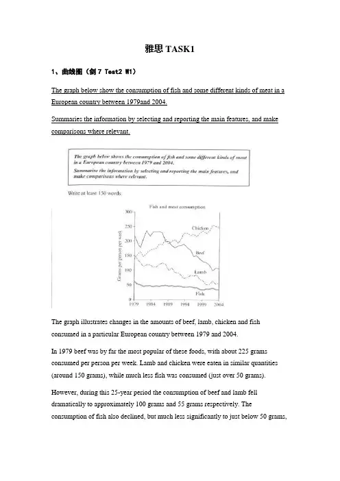
雅思TASK11、曲线图(剑7 Test2 W1)The graph below show the consumption of fish and some different kinds of meat in a European country between 1979and 2004.Summaries the information by selecting and reporting the main features, and make comparisons where relevant.The graph illustrates changes in the amounts of beef, lamb, chicken and fish consumed in a particular European country between 1979 and 2004.In 1979 beef was by far the most popular of these foods, with about 225 grams consumed per person per week. Lamb and chicken were eaten in similar quantities (around 150 grams), while much less fish was consumed (just over 50 grams).However, during this 25-year period the consumption of beef and lamb fell dramatically to approximately 100 grams and 55 grams respectively. The consumption of fish also declined, but much less significantly to just below 50 grams,so although it remained the least popular food, consumption levels were the most stable.The consumption of chicken, on the other hand, showed an upward trend, overtaking that of lamb in 1980 and that of beef in 1989. By 2004 it had soared to almost 250 grams per person per week.Overall, the graph shows how the consumption of chicken increased dramatically while the popularity of these other foods decreased over the period.2、柱状图(C3T3W1)You should spend about 20 minutes on thistask.Thecharts below show the levels of participation in education and science indeveloping and industrialized countries in 1980 and 1990.Write a report a university lecturer describing the information shownbelow.You should write at least 150 words.The data shows the differences between developing and industrialized countries’ participation in education and science.In terms of the number of years of schooling received, we see that the length of time people spend at school in industrialized countries was much greater at 8.5 years in 1980, compared to 2.5 years in developing countries. The gap was increased further in 1900 when the figures rose to 10.5 years and 3.5 years respectively.We can see a similar pattern in the second graph, which shows that the number of people working as scientists and technicians in industrialized countries increased from 55 to 85 per 1,000 people between 1980 and 1990, while the number in developing countries went from 12 to 20.Finally, the figures for spending on research and development show that industrialized countries more than doubled their spending, from $200bn to$420bn, while developing countries decreased theirs , from$75bn down to $25bn.Overall we can see that not only are there very large differences between the two economies but that there gaps are widening.3、饼状图(C7T4W1)The charts compare the sources of electricity in Australia and France in the years 1980 and 2000. Between these years, electricity production almost doubled, rising from 100 units to 170 in Australia, and from 90 to 180 units in France.In 1980 Australia used coal as the main electricity source (50 units) and the remainder was produced from natural gas, hydro power (each producing 20 units) and oil (which produced only 10 units). By 2000, coal had become the fuel for more than 75% of electricity produced and only hydro continued to be another significant source supplying approximately 20%.In contrast, France used coal as a source for only 25 units of electricity in 1980, which was matched by natural gas. The remaining 40 units were produced largely from oil and nuclear power, with hydro contributing only 5 units. But by 2000, nuclear power, which was not used at all in Australia, had developed into the main source, producing almost 75% of electricity, at 126 units, while coal and oil together produced only 50 units. Other sources were no longer significant.Overall, it is clear that by 2000 these two countries relied on different principal fuel sources: Australia relied on coal and France on nuclear power.4、表格类(C5T4W1)The take below gives information about the underground railway systems in six cities.Summarise the information by selecting and reporting the main features, and make comparisons where relevant. You should write at least 150 words.The table shows the detailed information regarding the underground railway systems in six cities, namely, London, Paris, Tokyo ,Washington DC, Kyoto and Los Angeles.London has the oldest underground railway system among the six cities which was opened in 1863. AndParis is the second oldest, and it was opened in 1900. This was then followed by other four cities, namely,Tokyo,WashingtonDC andKyoto with the opening date of 1927, 1976, and 1981 respectively. As forLos Angeles, it is the last one in this table to have its own underground railway system (opened in 2001).In terms of the size of the railway system, Londonenjoys the largest underground railway systems, with 394 kilometres of route in total, which is nearly twice as large as that in Paris(199 kilometres). Kyoto, in contrast, has the smallest system, for it only has 11 kilometres of route, which is nearly 1/36 of the route of London. The other three cities(Tokyo, Washington DC, and Los Angeles) have 155, 126 and 28 kilometres respectivelyInterestingly, Tokyo, which only has 155 kilometres of route, enjoys the greatest number of passengers per year, at 1927 million passengers. The system inParis has the second greatest number of passengers, at 1191 millions passengers per year. Thesmallest underground railway system,Kyoto, serves the smallest number (only 45 people).In conclusion, the underground railway systems in different cities vary a lot in the opening date, the size as well as the number of passengers served per year.5、地图题(真题)The following two maps show the development of a coastal city from 1950 to 2007.Summarize the information by selecting and reporting the main features, and make comparisons where relevant.The two maps illustrate the changes of a coastal city between 1950 and 2007. We can see clearly that the city became more and more modern.1n 1950, the city was like a small village, with vast grassland areas all over the city. There was a sea in the north of this city, with a park to the west. In front of the park, there was a big building area where things were under construction. By that time, three large areas were all grasslands, with a cross road dividing them.However, when it comes to 2007, things experienced significant changes. A new apartment had been built where the park was, and the original building areas were converted into industry buildings such as parks, parking lots and swimming pools. The most obvious changes were that the former grasslands disappeared, becomingcinemas in the southwest, shops in the southeast, and houses in the northeast. On the north side, although the sea was still there, a wharf was built in it so people could travel more easily by sea.Finally, although there was still a cross road in the city, the horizontal road was moved to the south. By doing so, industry buildings and houses could be left more places to develop. Anyway, the city had experienced tremendous changes throughout the 57-year period.6、流程图(C6T3W1)The first diagram shows that there are four main stages in the life of the silk worm.First of all, eggs are produced by the moth and it takes ten days for each egg to become a silkworm larva that feeds on mulberry leaves. This stage lasts for up to six weeks until the larva produces a cocoon of silk thread around itself. After a period of about three weeks, the adult moths eventually emerge from these cocoons and the life cycle begins again.The cocoons are the raw material used for the production of silk cloth. Once selected, they are boiled in water and the threads can be separated in the unwinding stage. Each thread is between 300 and 900 metres long, which means they can be twisted together, dyed and then used to produce cloth in the weaving stage.Overall, the diagrams show that the cocoon stage of the silkworm can be used to produce silk cloth through a very simple process.。
雅思小作文 T A S K 1 图表题规律注意事项:1 . Task1 是客观写作,要求客观真实。
2 . 客观性:不应该有任何图里没有而靠自己主观想象加入的成分。
结尾段针对图形做出的总结性结论也应该是根据图表的实际内容做出的符合逻辑的总结。
准确性:图表里面的数据介绍要力求精确,不能抄错数字。
但当一个特征点没有落在一个准确的坐标值上时,允许进行合理的目测或估计一个大概数值。
详尽性:要有层次感,并不需要把所有的数字都推到文章里。
3 . 类型Table 表格题Line Graph 线图Bar Chart 柱状图Pie Chart 饼状图Process Chart 流程图4 . 看图要注意单位,标题和图例。
5 . 对于多数小作文题,题中给出了几个图就对应的写出几个主体段。
题目里只给出一个图,根据图中包含几类图形元素写几个主体段。
图中只给了一个图,但图中所含图形元素很多,则分类。
题目中出现多线多柱多饼,用“对应提取法“,把每组里的对应元素提出来组织主体段。
6 . 时态和发生时间意义对应。
陈述永恒事实的句型,其主句的谓语动词必定用一般现在时。
若题目里没有出现时间,则全文都使用一般现在时。
7 . 结构开头段(1~2句)改写原题主体段1 总体概括具体介绍数字主体段N 总体概括具体介绍数字结尾段(1~2句)介绍总数(若图里并没有明确的给出总数,则省略)结论(根据图里的数据得出有一定合理性的结论)8 . 开头段的改写题目中ShowProportion InformationThe number/amount of FamilyMalesFemaleInfluence改写成illustrate /compare percentagedatathe figure for householdmenwomenaffect/effectCategories kinds/typesSubway system Storeunderground railway/train system shop9 . 介绍数据或描述变化趋势的常用词。

雅思图表题范例雅思TASK11、曲线图(剑7 Test2 W1)The graph below show the consumption of fish and some different kinds of meat in a European country between 1979and 2004.Summaries the information by selecting and reporting the main features, and make comparisons where relevant.The graph illustrates changes in the amounts of beef, lamb, chicken and fish consumed in a particular European country between 1979 and 2004.In 1979 beef was by far the most popular of these foods, with about 225 grams consumed per person per week. Lamb and chicken were eaten in similar quantities (around 150 grams), while much less fish was consumed (just over 50 grams).However, during this 25-year period the consumption of beef and lamb fell dramatically to approximately 100 grams and 55 grams respectively. The consumption of fish also declined, but much less significantly to just below 50grams, so although it remained the least popular food, consumption levels were the most stable.The consumption of chicken, on the other hand, showed an upward trend, overtaking that of lamb in 1980 and that of beef in 1989. By 2004 it had soared to almost 250 grams per person per week.Overall, the graph shows how the consumption of chicken increased dramatically while the popularity of these other foods decreased over the period.2、柱状图(C3T3W1)You should spend about 20 minutes on thistask.Thecharts below show the levels of participation in education and science indeveloping and industrialized countries in 1980 and 1990.Write a report a university lecturer describing the information shownbelow. You should write at least 150 words.The data shows the differences between developing and industrialized countries’ participation in education and science.In terms of the number of years of schooling received, we see that the length of time people spend at school in industrialized countries was much greater at 8.5 years in 1980, compared to 2.5 years in developing countries. The gap was increased further in 1900 when the figures rose to 10.5 years and 3.5 years respectively.We can see a similar pattern in the second graph, which shows that the number of people working as scientists and technicians in industrialized countries increased from 55 to 85 per 1,000 people between 1980 and 1990, while the number in developing countries went from 12 to 20.Finally, the figures for spending on research and development show that industrialized countries more than doubled their spending, from $200bnto$420bn, while developing countries decreased theirs , from$75bn down to $25bn.Overall we can see that not only are there very large differences between the two economies but that there gaps are widening.3、饼状图(C7T4W1)The charts compare the sources of electricity in Australia and France in the years 1980 and 2000. Between these years, electricity production almost doubled, rising from 100 units to 170 in Australia, and from 90 to 180 units in France.In 1980 Australia used coal as the main electricity source (50 units) and the remainder was produced from natural gas, hydro power (each producing 20 units) and oil (which produced only 10 units). By 2000, coal had become the fuel for more than 75% of electricity produced and only hydro continued to be another significant source supplying approximately 20%.In contrast, France used coal as a source for only 25 units of electricity in 1980, which was matched by natural gas. The remaining 40 units were produced largely from oil and nuclear power, with hydro contributing only 5 units. But by 2000, nuclear power, which was not used at all in Australia, had developed into the main source, producing almost 75% of electricity, at 126 units, while coal and oil together produced only 50 units. Other sources were no longer significant.Overall, it is clear that by 2000 these two countries relied on different principal fuel sources: Australia relied on coal and France on nuclear power.4、表格类(C5T4W1)The take below gives information about the underground railway systems in six cities.Summarise the information by selecting and reporting the main features, and make comparisons where relevant. You should write at least 150 words.The table shows the detailed information regarding the underground railway systems in six cities, namely, London, Paris, Tokyo ,Washington DC, Kyoto and Los Angeles.London has the oldest underground railway system among the six cities which was opened in 1863. AndParis is the second oldest, and it was opened in 1900. This was then followed by other four cities, namely,Tokyo,WashingtonDC andKyoto with the opening date of 1927, 1976, and 1981 respectively. As forLosAngeles, it is the last one in this table to have its own underground railway system (opened in 2001).In terms of the size of the railway system, Londonenjoys the largest underground railway systems, with 394 kilometres of route in total, which is nearly twice as large as that in Paris(199 kilometres). Kyoto, in contrast, has the smallest system, for it only has 11 kilometres of route, which is nearly 1/36 of the route of London. The other three cities(Tokyo, Washington DC, and Los Angeles) have 155, 126 and 28 kilometres respectivelyInterestingly, Tokyo, which only has 155 kilometres of route, enjoys the greatest number of passengers per year, at 1927 million passengers. The system inParis has the second greatest number of passengers, at 1191 millions passengers per year. The smallest underground railway system,Kyoto, serves the smallest number (only 45 people).In conclusion, the underground railway systems in different cities vary a lot in the opening date, the size as well as the number of passengers served per year.5、地图题(真题)The following two maps show the development of a coastal city from 1950 to 2007.Summarize the information by selecting and reporting the main features, and make comparisons where relevant.The two maps illustrate the changes of a coastal city between 1950 and 2007. We can see clearly that the city became more and more modern.1n 1950, the city was like a small village, with vast grassland areas all over the city. There was a sea in the north of this city, with a park to the west. In front of the park, there was a big building area where things were under construction. By that time, three large areas were all grasslands, with a cross road dividing them.However, when it comes to 2007, things experienced significant changes. A new apartment had been built where the park was, and the original building areas were converted into industry buildings such as parks, parking lots and swimming pools. The most obvious changes were that the former grasslands disappeared, becoming cinemas in the southwest, shops in the southeast, and houses in the northeast. On the north side, although the sea was still there, a wharf was built in it so people could travel more easily by sea.Finally, although there was still a cross road in the city, the horizontal road was moved to the south. By doing so, industry buildings and houses could be left more places to develop. Anyway, the city had experienced tremendous changes throughout the 57-year period.6、流程图(C6T3W1)The first diagram shows that there are four main stages in the life of the silk worm.First of all, eggs are produced by the moth and it takes ten days for each egg to become a silkworm larva that feeds on mulberry leaves. This stage lasts for up to six weeks until the larva produces a cocoon of silk thread around itself. After a period of about three weeks, the adult moths eventually emerge from these cocoons and the life cycle begins again.The cocoons are the raw material used for the production of silk cloth. Once selected, they are boiled in water and the threads can be separated in the unwinding stage. Each thread is between 300 and 900 metres long, which meansthey can be twisted together, dyed and then used to produce cloth in the weaving stage.Overall, the diagrams show that the cocoon stage of the silkworm can be used to produce silk cloth through a very simple process.。


雅思写作小作文线形图表题(附范文)雅思写作– LINE GRAPHWRITING TASK 1 (Test 2, Cambridge IELTS 7)You should spend about 20 minutes on this task. This graph below shows the consumption of fish and some different kinds of meat in a European country between 1979 and 2004.Summarise the information by selecting and reporting the main features, and make comparisons where relevant.Write at least 150 words.范文The graph illustrates changes in the amount of beef, lamb, chicken and fish consumed in a particular European country between 1979 and 2004.In 1979, beef was by far the most popular of these foods, with about 225 grams consumed per person per week. Lamb and chicken were eaten in similar quantities (around 150 grams), while much less fish was consumed (just over 50 grams).However, during this 25-year period the consumption of beef and lamb fell dramatically to approximately 100 grams and 55 grams respectively. The consumption of fish also declined, but much less significantly to just below 50 grams, so although it remained the least popular food, consumption levels were the most stable.The consumption of chicken, on the other hand, showed an upward trend, overtaking that of lamb in 1980 and that of beef in 1989. By2004 it had soared to almost 250 grams per person per week.Overall, the graph shows how the consumption of chicken increased dramatically while the popularity of these other foods decreased over the period.(173 words)WRITING TASK 1 (Test 4, Cambridge IELTS 8)范文The graph illustrates the quantities of goods transported in the United Kingdom by four different modes of transport between the time period of 1974 and 2002. Over this span of 28 years, the quantities of goods transported by road, water and pipeline have all increased while the quantity transported by rail has remained almost constant at about 40 million tonnes.The largest quantity of goods transported both in 1974 and 2002 was by road (70 million tonnes and 98 million tonnes respectively) while the lowest both in 1974 and 2002 was by pipeline (about 5 million tonnes and 22 million tonnes respectively). The amount of goods transported by water was constant from 1974 to 1978, where it showed an exponential growth, rising to almost 60 million tones after which it plateaued for about 20 years before starting to rise gradually again.The amount of goods transported by rail is almost constant at 40 million tonnes in 1974 and 2002, with decreases in quantity in between the years. It is also interesting to note that almost all showed a decrease in 1994 in amount of goods transported except for the pipeline, which actually peaked in that year. In conclusion the road remains the most popular method of transporting goods in the UK while water and pipelines are becoming increasingly used. In contrast, rail has not become more popular as a method of transport.WRITING TASK 1 (Test 4, Cambridge IELTS 9)范文The graph shows energy consumption in the US from 1980 to 2012, and projected consumption to 2030.Petrol and oil are the dominant fuel sources throughout this period, with 35 quadrillion (35q) units used in 1980, rising to 42q in 2012. Despite some initial fluctuation, from 1995 there was a steady increase. This is expected to continue, reaching 47q in 2030.Consumption of energy derived from natural gas and coal is similar over the period. From 20q and 15q respectively in 1980, gas showed an initial fall and coal a gradual increase, with the two fuels equal between 1985 and 1990. Consumption has fluctuated since 1990 but both now provide 24q. Coal is predicted to increase steadily to 31q in 2030, whereas after 2014, gas will remain stable at 25q.In 1980, energy from nuclear, hydro- and solar/wind power was equal at only 4q. Nuclear has risen by 3q, and solar/wind by 2. After slight increases, hydropower has fallen back to the 1980 figure. It is expected to maintain this level until 2030, while the others should rise slightly after 2025.Overall, the US will continue to rely on fossil fuels, with sustainable and nuclear energy sources remaining relatively insignificant.。
题型1——Table(表格)Cambridge IELTS 4TEST 1:The table below shows the proportion of different categories of families living in poverty in Australia in 1999.Summarise the information by selecting and reporting the main features, and make comparisons where relevant.TEST 4:The table below gives information about the underground railway systems in six cities.Summarise the information by selecting and reporting the main features, and make comparisons where relevant.TEST 2:The table below gives information about changes in modes of travel in England between 1985 and 2000.Summarise the information by selecting and reporting the main features, and make comparisons where relevant.TEST 1:The table below gives information on consumer spending on different items in five different countries in 2002.Summarise the information by selecting and reporting the main features, and make comparisons where relevant.题型2——Line Graph(线性图)Cambridge IELTS 5TEST 1:The graph blew shows the proportion of the population aged 65 and over between 1940 and 2040 in three different countries.Summaries the information by selecting and reporting the main features, and make comparisons where relevant.TEST 4:TEST 2:The pargh below shows the consumption of fish and some different kinds of meat in European country between 1979 and 2004.Summarise the information by selecting and reporting the main features, and make comparisons where relevant.TEST 4:The graph below shows the quantities of goods transport in the UK between 1974 and 2002 by four different modes of transport.Summarise the information by selecting and reporting the main features and make comparisons where relevant.题型3——Bar Chart(条形图/柱状图)Cambridge IELTS 4TEST 3:The chart below shows the different levels of post-school qualifications in Australia and the proportion of men and women who held them in 1999.Summaries the information by selecting and reporting the main features, and make comparisons where relevant.Cambridge IELTS 5TEST 2:The charts below show the main reasons for study among students of different age groups and amount of support they received from employers.Summarise the information by selecting and reporting the main features, and make comparisons where relevant.TEST 4:The charts below give information about USA marriage and divorce rates between 1970 and 2000, and the marital status of adult America in two of the years. Summarise the information by selecting and reporting the main features, and make comparisons where relevant.TEST 3:The chart below shows information about changes in average house prices in five different cities between 1990 and 2002 compared with average house prices in 1989. Summarise the information by selecting and reporting the main features, and make comparisons where relevant.TEST 2:题型4——Pie Chart(饼图)Cambridge IELTS 7TEST 4:The pie charts below show units of electricity production by fuel source in Australia and France in 1980 and 2000.Summarise the information by selecting and reporting the main features, and make comparisons where relevant.Cambridge IELTS 8TEST 2:The three pie charts below show the changes in annual spending by a particular UK school in 1981, 1991, and 2001.Summarise the information by selecting and reporting the main features, and make comparisons where relevant.题型5——混合图Cambridge IELTS 4TEST 2:The graph blew shows the demand electricity in Engliand during typical days in winter and summer.The pie chart shows how electricity is used in an average English home.Summarise the information by selecting and reporting the main features and make comparisions where ralevant.TEST 4:The charts below give information about travel to and from the UK, and about the most popular countries from UK residents to visit.Summarise the information by selecting and reporting the main features, and make comparisons where relevant.TEST 1:The graph and table below give information about water use worldwide and water consumption in two different countries.Summarise the information by selecting and reporting the main features, and make comparisons where relevant.TEST 1:The pie chart below shows the main reasons why agricultural land becomes less productive. The table shows how these causes affected three regions of the world during the 1990s.Summarise the information by selecting and reporting the main features, and make comparisons where relevantTEST 3:题型6——Process Diagram(流程图)Cambridge IELTS 6TEST 3:The diagrams below show the life cycle of the silkworm and the stages in the production of silk cloth.Summarise the information by selecting and reporting the main features, and make comparisons where relevant.Cambridge IELTS 8TEST 3:The diagrams below show the stages and equipment used in the cement-making process, and how cement is used to produce concrete for building purpose. Summaries the information by selecting and reporting the main features, and make comparisons where relevant.题型7——Map(地图题)Cambridge IELTS 5TEST 3:The map below is of the town of Garlsdon. A new supermarket(s) is planned for the town. The map shows two possible sites for the supermarket.Summarise the information by selecting and reporting the main features, and make comparisons where relevant.Cambridge IELTS 9 Test 1。
雅思小作文线图题库英文回答:The line graph illustrates the changes in the number of international students studying in Australia from 2000 to 2010. Overall, the number of international students increased significantly during this period.In 2000, there were around 300,000 international students studying in Australia. This number gradually increased to about 400,000 in 2005. However, there was a sharp rise in the number of international students in 2008, reaching a peak of approximately 600,000. After that, the number slightly decreased to around 550,000 in 2010.There are several possible reasons for this trend. Firstly, the reputation of Australian universities has been growing globally, attracting more international students to pursue higher education in the country. Secondly, the Australian government has implemented various policies toencourage international students to study in Australia, such as offering scholarships and providing work opportunities during and after their studies. Lastly, the global economic situation may have also played a role, as students from developing countries seek better education and job prospects abroad.In my opinion, the increase in the number of international students studying in Australia has both positive and negative impacts. On the positive side, international students contribute to the cultural diversity of the country and bring in economic benefits through their tuition fees and living expenses. They also contribute to the local community by participating in various activities and events. Moreover, international students often bring new perspectives and ideas to the classrooms, enriching the learning experience for both domestic and international students.However, there are also some challenges associated with the influx of international students. For example, language barriers and cultural differences may affect theirintegration into the local society. Additionally, the increased competition for resources and accommodation can put pressure on local students. It is important for universities and the government to provide support services and create a welcoming environment for international students to ensure their successful integration and overall well-being.中文回答:这条线图展示了2000年至2010年期间在澳大利亚学习的国际学生人数的变化。
【雅思写作真题】剑桥9Test3饼图类小作文实例参考【雅思写作真题】剑桥9 Test3 饼图类小作文实例参考“真题:剑桥9 Test3 图表类小作文”The charts below give information on the ages of the populations of Yemen and Italy in 2000 and projections for 2050.Summarise the information by selecting and reporting the main features, and make comparisons where relevant.考生原文These pie charts illustrates what proportion are accounted by human in respective age group of Yemen and Italy in 2002, and predicting the future changes to 2050.In Yemen, 0-14 years old young children were the domain group in 2000, at 50.1%. And smaller proportion of 15-19 years old person in the same period, which was 46.3%. While 50 years past, 15-59 years old people will become the most group of people, rising to 57.3%. Although there is a increase in old peoplewho are over 60 years old. But they still the least group of person, which were rising from 3.6% in 2000 to 5.7% in 2005.In terms of Italy, according to projection, 15-59 years old people experience a dramatic decrease, declining from 61.6% in 2000 to 46.2% in 2050. While it still the most group of people. In 2000, the proportion of over 60 years old was 24.1%, which doubled the percentage in 2050 through projection. Contrary to Yemen, the percentage of people who are 15-59 years old is the least no matter what period.Overall, there are decrease of young children in both countries. Even in Italy, the percentage of children is much smaller than those in Italy.批改By 晟睿 Anna本次批改严格按照IELTS小作文评分标准进行。
雅思小作文线图题库【篇一:雅思线图小作文题目1】the graph below shows average carbon dioxide (co2) emission per person in theunited kingdom, sweden, italy and portugal between 1967 and 2007.【篇二:雅思小作文题库练习集锦】1.writing task 1you should spend about 20 minutes on this task.the pie charts below show units of electricity productionby fuel source in australia and france in 1980 and 2000. summa rise the information by selecting and reporting the main features, and make comparisons where relevant.write at least 150 words.writing task 1you should spend about 20 minutes on this task.the pie charts below show units of electricity productionby fuel source in australia and france in 1980 and 2000. summa rise the information by selecting and reporting the main features, and make comparisons where relevant.write at least 150 words.he charts compare the sources of electricity in australia and france in the years 1980 and 2000. between these years electricity production almost doubled,risingfrom 100 units to 1970 in australia, and from 90 to 180 units in france.in contrast, france used coal as a source for only 25 units of electricity in 1980, which was matched by natural gas. the remaining 40 units were produced largely from oil and nuclear power, with hydro contributing only 5 units. but by 2000 nuclear power, which was not used at all in australia, had developed into the main source, producing almost 75% of electricity, at 126 units, while coal and oil together produced only 50 units. other sources were no longer significant.overall, it is clear that by 20000 these two countries relied ondifferent principal fuel sources: australia relied on coal andfrance on nuclear power.这些图比较了1980 年和 2000 年澳大利亚和法国的电的根源。