色彩三要素的对比运用共32页文档
- 格式:ppt
- 大小:3.73 MB
- 文档页数:32
色彩的三要素:明度、色相、彩度。
明度:表示色所具有的亮度和暗度被称为明度。
计算明度的基准是灰度测试卡。
黑色为0,白色为10,在0—10之间等间隔的排列为9个阶段。
色彩可以分为有彩色和无彩色,但后者仍然存在着明度。
作为有彩色,每种色各自的亮度、暗度在灰度测试卡上都具有相应的位置值。
彩度高的色对明度有很大的影响,不太容易辨别。
在明亮的地方鉴别色的明度比较容易模糊。
色相:色彩是由于物体上的物理性的光反射到人眼视神经上所产生的感觉。
色的不同是由光的波长的长短差别所决定的。
作为色相,指的是这些不同波长的色的情况。
波长最长的是红色,最短的是紫色。
把红、黄、绿、蓝、紫和处在它们各自之间的黄红、黄绿、蓝绿、蓝紫、红紫这5种中间色——共计10种色作为色相环。
在色相环上排列的色是纯度高的色,被称为纯色。
这些色在环上的位置是根据视觉和感觉的相等间隔来进行安排的。
用类似这样的方法还可以再分出差别细微的多种色来。
在色相环上,与环中心对称,并在180度的位置两端的色被称为互补色。
彩度(饱和度):用数值表示色的鲜艳或鲜明的程度称之为彩度。
有彩色的各种色都具有彩度值,无彩色的色的彩度值为0,对于有彩色的色的彩度(纯度)的高低,区别方法是根据这种色中含灰色的程度来计算的。
彩度由于色相的不同而不同,而且即使是相同的色相,因为明度的不同,彩度也会随之变化的。
色彩模式:RGB模式:如图<1>就是按照自然界里三种基本色混合的原理而做的一种模式。
就是red(红)、green (绿)、blue(蓝)混合,通过三种基本颜色亮度值从0~255不同产生出其他各种颜色,这种模式叫加色模式。
为什么叫加色模式呢,举个例子好了,我们通常使用的电视屏幕和电脑屏幕上的显示就是这样的模式,在没有图象时,屏幕是黑的,若R,G,B三色亮度都为255时混合叠加打在屏幕上时则显示成白色。
就是加起来是白色的意思,叫加色模式。
CMYK模式:如图<2>这是种印刷模式,是用Cyan(青色)、Megenta(品红),Yellow(黄)、Black(黑)四种颜色混合,其实就是四种颜色的油墨混合,印刷当然是使用油墨了。
色彩三要素和色彩的视觉效果所谓的“色彩三要素”就是指分别和比较各种标准和尺度,即色相明度彩度,并把它们用来研究色彩的视觉效果。
(一)色相色相也称色别——不同色彩的原貌,它反映不同色彩各自具有的品格,并以各种色彩。
通常所说的红、橙、黄、绿、青、紫等色彩名称就是色相的符号。
世间万物,色彩缤纷,人们的肉眼所能识别的色相是很少的。
如何提高辫色力,事艺术领域的工作人员搞好设计创作至关重要,只有善于去比较,善于从大致相似彩中,发现其间的差别,如红色有朱红(红偏黄)、大红(红偏橙)、曙红(红偏紫)、深红(红偏青),绿色则有黄绿(绿偏黄)、青绿(绿偏青)等差别,它们的种种色差造成的环境给人的心理和生理上产生各种情调。
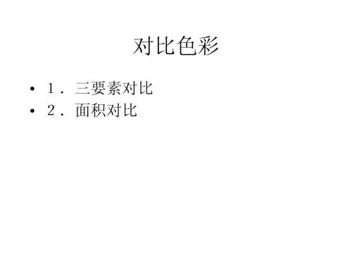
图3-1-2是以三原色为核的色环,包括三个原色、六个标准色以及介于这标准色之间的中间色,即红、橙、黄、绿、青、紫等以及红橙、橙黄、黄绿、青绿、青紫和红紫十二种颜色的物质色十二色相。
这十二色相以及由它们调合变化出来的大量颜色相,彩色。
图3-1-3为光色十二色相环,以及色彩中的黑、白二极色再加上介于黑白之间中灰色通称无彩色;金、银光泽耀眼,称为光泽色。
前面阐述的物体的颜色是要依靠光来显示,但光色与物质是不同的,光色的原色为红、绿、青混合之后近于白(图3-1-4);物质色的原色为红、黄、青,混合之后近于黑,(二)明度明度,即色彩明暗的程度。
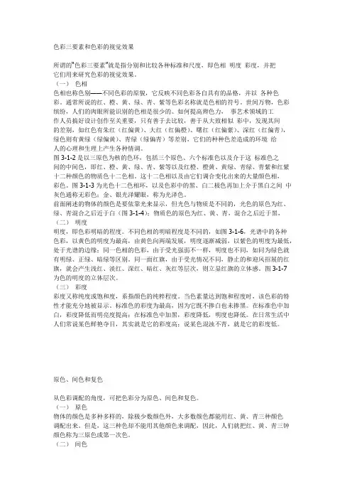
不同色相的明暗程度是不同的,如图3-1-6,光谱中的各种色彩,以黄色的明度为最高,由黄色向两端发展,明度逐渐减弱,以紫色的明度为最低,处于光谱的边缘;同一色相的色彩,由于受光强弱不一样,明度也不同,如同为绿色就有明绿、正绿、暗绿等区别。
同一面红旗,由于受光情况不同,静止的和迎风招展的红旗,就会产生浅红、淡红、深红、暗红、灰红等层次,则立显红旗的立体感。
图3-1-7 为色的明度的立体层次。
(三)彩度彩度又称纯度或饱和度,系指颜色的纯粹程度。
当色素量达到饱和程度时,该色彩的特性才能充分地被显示。
4.第二章色彩的属性纯度对比2.色彩的三要素对比构成2.3纯度对比又称彩度、饱和度(IntensitySaturation)、艳度、即色的含灰(浊)程度或鲜艳(清)程度。
工艺设计系2.色彩的三要素对比构成2.3.1降低色彩纯度的四种方法加白:纯色混合白色,可以降低纯度,提高明度,同时也会因白色的混合使其色相的色性偏冷。
加黑:纯色混合黑色,在降低明度的同时也降低了色彩的纯度,所有色相都会因加入黑色后而失去原有的光彩,变得沉稳、幽暗。
加灰:纯色加入同等明度的灰色后,降低纯度而保持原来的明度,纯色的特征立即消失,色彩变得浑厚、含蓄,虽然不如原来活泼,但具有柔和、软弱和古朴、典雅之感。
加互补色:纯色混合相对应的补色,使鲜色变为浊色,因为一定比量说的互补色混合会产生灰色,相当于纯色混合无彩度灰色的效果。
工艺设计系2.色彩的三要素对比构成纯色混合白色纯色混合黑色工艺设计系2.色彩的三要素对比构成纯色混合灰色纯色混合补色工艺设计系2.色彩的三要素对比构成2.3.2纯度九级调建立在纯度因素差别基础上的色彩对比方式称为纯度对比,这一对比的强弱感取决于色的鲜艳与灰浊的差别程度。
在色立体中愈接近“球心轴”的色纯度愈低;反之,愈接近“赤道”外沿的色纯度愈高。
低纯度调区:灰感强而色相朦胧、暧昧、乏力;中纯度调区:有柔软、静谧、温和的色感;高纯度调区:包括鲜艳的纯色与略含灰味的艳色,鲜艳、明快、刺激而稳健。
纯度对比的强弱取决于色彩的纯度差别跨度的大小。
借助明度对比中的9等级分级概念,我们按色阶分为纯度弱对比、纯度中对比、纯度强对比。
工艺设计系2.色彩的三要素对比构成2.3.3纯度强对比是指纯度差间隔七~八级的对比,是低纯度色与高纯度色的配合,其中以纯色与无彩色黑、白、灰的对比最为强烈。
纯度强对比具有色感强、明确、刺激、生动、华丽的特点,有较强的色彩表现力。
色彩的模糊与生动是纯度对比所引起的,在大面积的纯色与小面积的灰色对比中,灰色会倾向于该纯色的补色,纯度对比越强,纯色的色感就越鲜明,灰色就越显柔和,画面效果就有明快,富有变化而统一之感。
色彩三要素及色彩对比(The three elements of color and colorcontrast)"The basic type of the contrast of hue.More than two kinds of colors, color contrast effect due to the formation of different hue called hue contrast. It is a fundamental aspect of color contrast, the contrast degree depends on the distance between the hue in the hue on the ring (angle), distance (angle) the smaller the contrast is weak and more strong contrast.1. zero contrast(1) no color contrast color contrast although colorless phase, but their combination with great value in practical. Such as black and white, black and gray, gray and light gray, or black and white and grey, black and dark gray and light gray etc.. Effect of contrast, feeling generous, solemn, elegant and modern, but also easy to produce too sober sense of monotony.(2) no color and contrast color such as black and red, grey and purple, or black and white with yellow, white and blue and grey. Effect of contrast feeling both elegant and lively, no color area, is elegant and dignified, color size lively sense of strengthening.(3) different brightness or different purity change compared to the same hue contrast a hue, commonly known as sister color combination. Such as blue and blue (blue and white) color contrast, orange and coffee (orange + grey or green) and powdergreen (green + white) and green (green + Black) color contrast. Effect of contrast feel unified, quiet, elegant, subtle, and stable, but also easy to produce defects of dull and stiff.(4) no color with the same colour as compared to white with dark blue and light blue, black and orange and brown contrast, the effect of the (2) and (3) types of advantages. You can have a certain level, and generous, lively and stable.2. harmonic contrast(1) compared to two to adjacent color contrast color hue central adjacent hue, a distance of about 30 degrees, for the weak contrast type. Such as orange and orange and yellow orange contrast etc.. The effect of feeling soft, harmonious, elegant, quiet, but also feel monotonous and boring, fuzzy, weakness, must be adjusted to enhance the effect of lightness difference.(2) a similar hue contrast hue contrast distance of about 60 degrees, for the weak contrast type, such as red and yellow orange contrast etc.. The effect is rich, lively, yet unified, elegant, harmonious feeling.(3) the difference in color than the color contrast relative to a distance of about 90 degrees, in contrast to the type, such as yellow and green contrast effect, bright, lively, full, exciting feeling, interest, are compared with the considerable efforts, but not disorder and sense.3. strong contrast(1) contrast color relative colorimetric relative distance of about 120 degrees, strong contrast type, such as yellow and purple red contrast etc.. The effect of strong, bold, strong, lively and rich, but also not easy to unity and sense of confusion, irritation, cause visual fatigue. The general need to adopt various means to improve the harmonic contrast effect.(2) contrast color hue contrast distance 180 degrees, extreme contrast type, such as red and blue green, yellow and blue purple contrast etc.. The effects of the strong, dazzling, loud, very powerful, but if handled properly, easy to produce immature, primitive, vulgar, unstable, uncoordinated and bad feelings.< > two basic types of brightness contrastMore than two kinds of color combination,Because of the color contrast effect of different brightness formed called brightness contrast. It is an important aspect of color contrast, color scheme is decided to feel bright, clear, dull, soft, strong, hazy and the key.The contrast depends on the color in the color brightness arithmetic series, usually 1 - 3 designated as low brightness area, 8 - 10 as 4 - 7 of Gaoming District, designated as in lightness area. (Figure) in the choice of color combination, when the base color and contrast color distance in 5 level and above, called long (strong) comparison, 3 - level 5 called in contrast, 1 - level 2 called short (weak) contrast. It can be divided into nine basic types of brightness contrast(1) high long tones such as 10:8:1, of which 10 were shallow base color, large area, 8 with light color, area is larger, 1 dark contrast color, the area should be small. The light and dark contrast, sensory stimulation, lively, active, lively, strong.(2) high school profile such as 10:8:5, the brightness contrast is moderate, the feeling is bright and pleasant, clear and bright, stability.(3) high short tones such as 10:8:7, the weak light and dark contrast, image resolution, feeling less pale, soft, elegant, noble, soft, hazy, feminine.(4) in long tones such as 4:6:10 or 7:6:1, the adjustable in lightness color tone, with color, compared with light or dark, feeling strong, steady, vivid masculine.(5) in regulating such as 4:6:8 or 7:6:3, the notes in contrast, feeling rich.(6) in the short tone such as 4:5:6, the adjustment for weak lightness contrast, subtle, flat, fuzzy feeling.(7) low long tones such as 1:3:10, the dark and strong contrast, feel magnificent, deep, alert, explosive.(8) low notes such as 1:3:6, the dark contrast medium, feel heavy, simple, conservative, male.(9) low short tones such as 1:3:4, the dark and weak contrast, dull, melancholy, loneliness, mystery, horror.In addition, there is a comparison of the strongest 1:10 the most long, strong feeling, simple, blunt and sharp glare, etc..< > three basic types of purity contrastMore than two kinds of color combinations, the color contrast effect of different purity formed called the purity of comparison. It is another important aspect of color contrast, but because of the more subtle, intrinsic, so it is easy to be. In the color design, the purity of comparison is gorgeous, elegant, decided tone feel simple, vulgar, implicit and not key.The contrast depends on the color distance in the color purity arithmetic, the longer the distance between the stronger and weaker contrast.If the gray to bright color is divided into 10 pure arithmetic series usually 1 - 3 classified as low purity, 8 - 10 designated as high purity, 4 - 7 as in pure region (Figure). In the choice of color combinations, when the base color and contrast color distance in 5 level and above, is called a strong contrast; 3 - level 5 - 1 called in contrast; Level 2 is called weak contrast. It can be divided into nine basic types of purity.(1) fresh stresses such as 10:8:1,The feeling is bright, vivid and lively, beautiful and strong.(2) fresh notes such as 10:8:5, feel more stimulation, more vivid.(3) fresh weak tone such as 10:8:7, because of the color purity are high, after the combined comparison each plays a role to resist, collision, feeling so harsh, vulgar, childish, primitive, hot. If the distance from each other, this effect will be more obvious and intense.(4) stressed that such as 4:6:10 or 7:5:1, feel appropriate and popular.(5) in regulating such as 4:6:8 or 7:6:3, feel the gentle, static and comfortable.(6) the weak regulation such as 4:5:6, flat, vague, monotonous feeling.(7) grey stressed such as 1:3:10, feeling generous, elegant and lively.(8) the grey tone such as 1:3:6, quiet, more generous, feeling each other.(9) grey stressed such as 1:3:4, feel elegant, delicate, beautiful, subtle, hazy, weak.In addition, there is a weak contrast color, such as white: black, dark gray, light gray, color purity due to the contrast is zero, so the feeling is very generous, dignified, elegant,simple.< four > position area and contrast colorAs the carrier of the visual form of color, always has a certain area, therefore, in this sense, the characteristics of the area is also an indispensable color. Although there are more suitable for color selection often in practice of art design, but because of the size, position control caused by improper fault conditions.The relationship between 1. color contrast and area(1) color combination, only the same area of the color can be compared to the actual difference, confrontation between each other, relatively strong contrast effect.(2) between the two sides of the same attribute, a large area, the area has advantages, and the other side to narrow the area, will weaken the color contrast.(3) the color property unchanged, as the area increases, to strengthen the visual stimulus strength, otherwise weakened. Therefore, a large area of contrast color can cause glare effect. As in the environmental art design, general building exterior wall, interior walls are used sophisticated, low purity of color, in order to reduce the contrast intensity caused by bright and comfortable effect.(4) large area color stability, in contrast, the color of illusion effect; on the contrary, the color illusion effect.(5) the same properties and the area of the color, and the shape of the accumulation and dispersion state relationship is its great stability, high degree of aggregation by its shape color effect, a high degree of attention, and vice versa. Such as outdoor advertising and posters, general colors are more concentrated, in order to achieve remarkable effect.The relationship between 2. color contrast and position(1) between the two sides of the color contrast effect is more closer, although, whereas the more weak.(2) a mutual contact, the starting state, the contrast effect is stronger.(3) all surrounded by another color, the strongest contrast effect.(4) in the work, usually will focus on color settings in the visual center, the most conspicuous. Such as the 4 intersection points of well shaped composition.< five > texture contrast colorThe properties of the material and the color and the image of an object surface texture is close, color feeling is the surface effect of tactile texture and visual feeling.(1) between the two sides of the color, such as the use of different texture of the material, then compare the effect oftemperament and more.(2) the same color or similar color matching, texture material changes can be used to compensate for the monotony of heterogeneity. If the same red roses printed on thin nylon sand windows and thick sofa fabric, which is composed of decorative effect, as in series, and the charm of color change of material.(3) painting and color performance, application of various pigments and painted out can produce different texture effects, such as painting, watercolor, gouache, acrylic and other colored pigments and crayons, McDonald's, pen, brush and other various types of brushes.(4) the same pigment with different ways to create many wonderful texture effects, to enhance the color of interest, feeling. Such as extension, cracked, and anti pull, and sprinkle, sprinkle, coating, coating, dye, hook, spray, tie, ice, brush, etc., including color technique.< > six successive contrast color(1) occurred within the same time, with a view of color contrast is called color and contrast. In this case, comparison and contrast, rejection and effect of color are interdependent. As in the yellow paper on a bit of gray, this feeling is stronger, the so-called color illusion. Another example of black paper coated with a grey white box, with the same area and shades of gray squares, and contrast visual feel is gray black paper more bright, forming a so-called lightness illusion.(2) color contrast occur at different time and different perspective, but also has fast time continuity, continuous natural numbers as color contrast.The human eye has the same look at the second color, second color illusion will happen. When the first look longer, the greater the effect. Second color illusion tend to have the complementary color before. This phenomenon is visual afterimage and visual physiological and psychological self balancing instincts. Such as the environment of operation room hospital surgery and medical and nursing staff work clothes are selection of blue and green, apparently in order to "and" blood red, a continuous contrast the clever use of color, the doctor looked at the blue green, not only can reduce fatigue, restore vision, but also easy to see the small blood vessels and nerves, thus to ensure the accuracy and safety of the operation.。
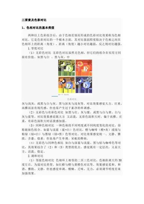
三要素及色彩对比1、色相对比的基本类型两种以上色彩组合后,由于色相差别而形成的色彩对比效果称为色相对比。
它是色彩对比的一个根本方面,其对比强弱程度取决于色相之间在色相环上的距离(角度),距离(角度)越小对比越弱,反之则对比越强。
1.零度对比(1)无彩色对比无彩色对比虽然无色相,但它们的组合在实用方同很有价值。
如黑与白、黑与灰、中色彩对比灰与浅灰,或黑与白与灰、黑与深灰与浅灰等。
对比效果感觉大方、庄重、高雅而富有现代感,但也易产生过于素净的单调感。
(2)无彩色与有彩色对比如黑与红、灰与紫,或黑与白与黄、白与灰与蓝等。
对比效果感觉既大方又活泼,无彩色面积大时,偏于高雅、庄重,有彩色面积大时活泼感加强。
(3)同种色相对比一种色相的不同明度或不同纯度变化的对比,俗称姐妹色组合。
如蓝与浅蓝(蓝+白)色对比,橙与咖啡(橙+灰)或绿与粉绿(绿+白)与墨绿(绿+黑)色等对比。
对比效果感觉统一、文静、雅致、含蓄、稳重,但也易产生单调、呆板的弊病。
(4)无彩色与同种色相比如白与深蓝与浅蓝、黑与桔与咖啡色等对比,其效果综合了(2)和(3)类型的优点。
感觉既有一定层次,又显大方、活泼、稳定。
2.调和对比(1)邻接色相对比色相环上相邻的二至三色对比,色相距离大约30度左右,为弱对比类型。
如红橙与橙与黄橙色对比等。
效果感觉柔和、和谐、雅致、文静,但也感觉单调、模糊、乏味、无力,必须调节明度差来加强效果。
(2)类似色相对比色相对比距离约60度左右,为较弱对比类型,如红与黄橙色对比等。
效果较丰富、活泼,但又不失统一、雅致、和谐的感觉。
(3)中差色相对比色相对比距离约90度左右,为中对比类型,如黄与绿色对比等,效果明快、活泼、近似调和饱满、使人兴奋,感觉有兴趣,对比既有相当力度,但又不失调和之感。
3.强烈对比(1)对比色相对比色相对比距离约120度左右,为强对比类型,如黄绿与红紫色对比等。
效果强烈、醒目、有力、活泼、丰富,但也不易统一而感杂乱、刺激、造成视觉疲劳。
色彩要素的对比运用通过感知自然界瞬间的色彩变化,依然带有一定的主观性。
色彩的感觉会因人而异,写实色彩的主观色彩运用,作为一个整体色调是首要的。
其次才是色彩相互关系的配置,如对色相、明度、纯度、冷暖等问题的认识和把握。
在青少年的色彩教学中,如何让他们由儿童对色彩的简单认识和经验,逐渐扩大和丰富他们对色彩的知觉能力,并逐渐掌握色彩表现的规律呢?我们认为在引导学生认识色彩时,必要的色彩知识还是应该了解的。
色彩是由光线、物体和眼睛三方面条件引发视神经感觉而形成的。
科学家研究色彩,将光谱分解为12色相环与24色相环。
如图:环中的红、黄、蓝三色为原色,它们之间的混合色为间色。
红-绿、黄-紫、蓝-橙是三对补色。
这三对补色结合形成最鲜艳刺激的色彩感受,经常会在表现性色彩画中出现,儿童也常喜欢用补色关系涂色。
色彩分为无彩色和有彩类两大色系。
黑、白、灰为无彩色系。
有彩色系有三种属性,即色相、明度、纯度。
我们称为色彩三要素。
色相是指色彩的名称。
常用色有柠檬黄、淡黄、中黄、土黄、桔黄、朱红、大红、玫瑰红、深红、土红、熟褐、淡绿、翠绿、橄榄绿、紫罗蓝、湖蓝、钴蓝、群青、普蓝,另外还加黑色和白色。
明度是指色彩的明亮程度,也就是色彩深浅不同,色彩中黄色明度最高、最亮,紫色明度最低最暗。
明度高的色向前抢,明度低的色有向后退的感受。
法国画家斯塔埃尔的《瑟塞奥克森的公园》明度归纳彩度和色相归纳纯度。
绘画中写生色彩很少直接用纯色表现,一般需要调成复色,又叫灰性色。
调和复色的方法有以下几种基本方法。
1、补色相加绘画中如果想降低某个色相的纯度,可以取该色在色相环上相对应的色,进行不等量混合,,因为等量会使色彩混浊。
如画绿树可以在绿色中加少量红色,或紫色太艳就加少许黄色。
2、纯色中加复色在成品颜料中哪些是复色呢?有土黄、土红、褐色、橄榄绿、土绿等。
在纯色与复色混合时也不可等量相加,因为会使色彩倾向不明确变得混浊。
比如,用橄榄绿画树可以加蓝画暗面,加黄画亮面,色彩容易协调。