origin 绘制矢量图画法
- 格式:doc
- 大小:187.00 KB
- 文档页数:4
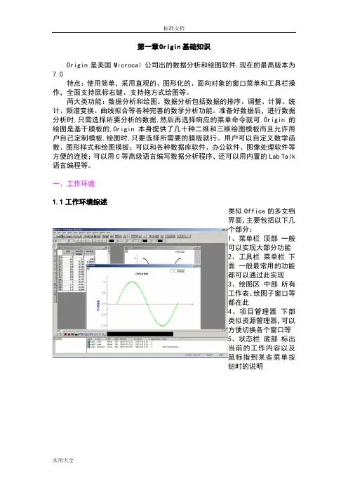
第一章Origin基础知识Origin是美国Microcal公司出的数据分析和绘图软件,现在的最高版本为7.0特点:使用简单,采用直观的、图形化的、面向对象的窗口菜单和工具栏操作,全面支持鼠标右键、支持拖方式绘图等。
两大类功能:数据分析和绘图。
数据分析包括数据的排序、调整、计算、统计、频谱变换、曲线拟合等各种完善的数学分析功能。
准备好数据后,进行数据分析时,只需选择所要分析的数据,然后再选择响应的菜单命令就可.Origin的绘图是基于膜板的,Origin本身提供了几十种二维和三维绘图模板而且允许用户自己定制模板.绘图时,只要选择所需要的膜版就行。
用户可以自定义数学函数、图形样式和绘图模板;可以和各种数据库软件、办公软件、图像处理软件等方便的连接;可以用C等高级语言编写数据分析程序,还可以用内置的Lab Talk 语言编程等。
一、工作环境1.1工作环境综述类似Office的多文档界面,主要包括以下几个部分:1、菜单栏顶部一般可以实现大部分功能2、工具栏菜单栏下面一般最常用的功能都可以通过此实现3、绘图区中部所有工作表、绘图子窗口等都在此4、项目管理器下部类似资源管理器,可以方便切换各个窗口等5、状态栏底部标出当前的工作内容以及鼠标指到某些菜单按钮时的说明工作表矩阵绘图1.2 菜单栏菜单栏的结构取决于当前的活动窗口工作表菜单绘图菜单矩阵窗口菜单简要说明:File文件功能操作打开文件、输入输出数据图形等Edit编辑功能操作包括数据和图像的编辑等,比如复制粘贴清除等,特别注意undo功能View视图功能操作控制屏幕显示,Plot绘图功能操作主要提供5类功能:1、几种样式的二维绘图功能,包括直线、描点、直线加符号、特殊线/符号、条形图、柱形图、特殊条形图/柱形图和饼图2、三维绘图3、气泡/彩色映射图、统计图和图形版面布局4、特种绘图,包括面积图、极坐标图和向量5、膜板:把选中的工作表数据到如绘图模板Column列功能操作比如设置列的属性,增加删除列等Graph图形功能操作主要功能包括增加误差栏、函数图、缩放坐标轴、交换X、Y轴等Data数据功能操作Analysis分析功能操作对工作表窗口:提取工作表数据;行列统计;排序;数字信号处理(快速傅里叶变换FFT、相关Corelate、卷积Convolute、解卷Deconvolute);统计功能(T-检验)、方差分析(ANOAV)、多元回归(Multiple Regression);非线性曲线拟合等对绘图窗口:数学运算;平滑滤波;图形变换;FFT;线性多项式、非线性曲线等各种拟合方法Plot3D 三维绘图功能操作根据矩阵绘制各种三维条状图、表面图、等高线等Matrix矩阵功能操作对矩阵的操作,包括矩阵属性、维数和数值设置,矩阵转置和取反,矩阵扩展和收缩,矩阵平滑和积分等Tools工具功能操作对工作表窗口:选项控制;工作表脚本;线性、多项式和S曲线拟合对绘图窗口:选项控制;层控制;提取峰值;基线和平滑;线性、多项式和S曲线拟合Format格式功能操作对工作表窗口:菜单格式控制、工作表显示控制,栅格捕捉、调色板等对绘图窗口:菜单格式控制;图形页面、图层和线条样式控制,栅格捕捉,坐标轴样式控制和调色板等Window窗口功能操作控制窗口显示Help帮助二、基本操作作图的一般需要一个项目Project来完成,File→New保存项目的缺省后缀为:OPJ自动备份功能:Tools→Option→Open/Close选项卡→“Backup Project Before Saving”添加项目:File→Append刷新子窗口:如果修改了工作表或者绘图子窗口的内容,一般会自动刷新,如果没有请Window→Refresh第二章简单二维图2-1输入数据一般来说数据按照X Y坐标存为两列,假设文件为sindata.dat,如下格式:X sin(x)0.0 0.0000.1 0.1000.2 0.1990.3 0.296…………输入数据请对准data1表格点右键调出如下窗口,然后选择Inport ASCII找到sindata.dat文件打开就行2-2、绘制简单二维图按住鼠标左键拖动选定这两列数据,用下图最下面一排按钮就可以绘制简单的图形,按从左到右三个按钮做出的效果分别如下:2-3设置列属性双击A列或者点右键选则Properties,这里可以设置一些列的属性。
使用origin绘图得简单教程每年到修改论文得时候,发现很多同学不懂图形与数据处理,出来得图形惨不忍睹。
有得人想学没处学,有得根本不想学,最后得结果就是研究生给本科生干活,老师给学生干活。
所以有空得时候,想以这种方式写一点数据处理技术,给自己得未来减负.1.Origin如何输出图表以及在word中如何插入在word中插入origin得图表,一种就是携带数据得,就就是说点击它可以进入origin进行修改,这种适合文章还没定稿之前;另外一种直接就就是图片格式得图表,无法进行数据修改,只能进行图片编辑,适合投稿得时候使用,这样别人就无法窥探您得数据。
1、携带数据方式最简单得方法就就是在origin图表页面直接按ctrl+c,然后在word里按ctrl +v,也就就是万能得粘贴-复制=_=还可以点击origin菜单栏edit-copypage,然后在word里粘贴第三种方法稍微麻烦点,origin直接保存project,在word里插入—对象-由文件创建—浏览,选择刚刚保存得、opj格式得文件即可。
2、图片格式origin菜单栏page,保存得时候可以选择您要保存得类型,可以选择需要得格式,比如jpg、gif图片格式等,DPI分辨率一般设置为300就足够了。
(我用得中文绿色版得,嘿嘿)下面在word里直接插入图片,相信这一步大家都会,呵呵.PS:用ORIGIN编制了一个曲线图,将图标添加进WORD里面之后,曲线中得汉字说明都变成了“?”。
解决方法就是在origin中选择得汉字字体不就是宋体,改为宋体就可以了另外,建议用高版本得origin2.origin软件如何对jpg图片添加文字ﻫ首先把JPG图片导入origin中,在origin中新建个Layout,然后File >ImportImage……将图片导入到Layout,将图片调整好大小比例。
ﻫ点击左侧工具栏上得“T”(Text Tool)按钮,在图片上您要插入文字得位置点击,此时可以输入文字了。
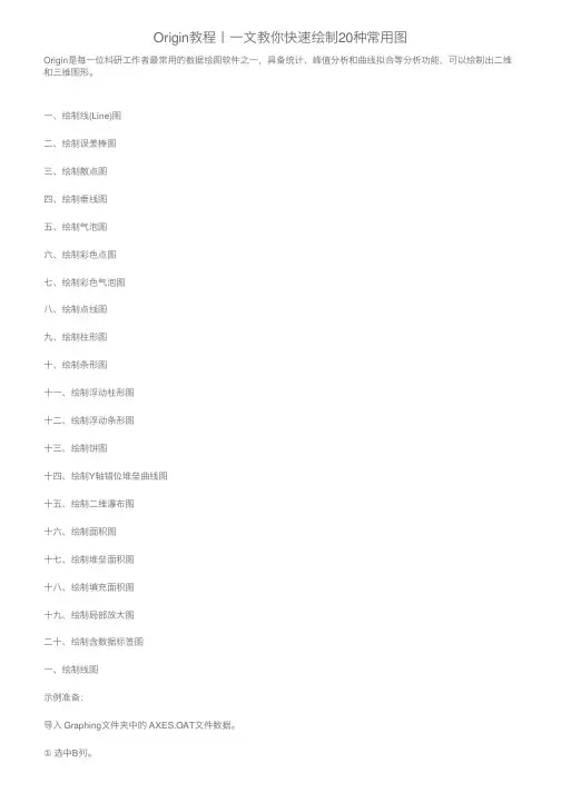
Origin教程⼁⼀⽂教你快速绘制20种常⽤图Origin是每⼀位科研⼯作者最常⽤的数据绘图软件之⼀,具备统计、峰值分析和曲线拟合等分析功能,可以绘制出⼆维和三维图形。
⼀、绘制线(Line)图⼆、绘制误差棒图三、绘制散点图四、绘制垂线图五、绘制⽓泡图六、绘制彩⾊点图七、绘制彩⾊⽓泡图⼋、绘制点线图九、绘制柱形图⼗、绘制条形图⼗⼀、绘制浮动柱形图⼗⼆、绘制浮动条形图⼗三、绘制饼图⼗四、绘制Y轴错位堆垒曲线图⼗五、绘制⼆维瀑布图⼗六、绘制⾯积图⼗七、绘制堆垒⾯积图⼗⼋、绘制填充⾯积图⼗九、绘制局部放⼤图⼆⼗、绘制含数据标签图⼀、绘制线图⽰例准备:导⼊ Graphing⽂件夹中的 AXES.OAT⽂件数据。
①选中B列。
②单击菜单命令【Plot】→【Line】→【Line】或2D Graphs⼯具栏的【Line】。
2D Graphs⼯具栏:如下图所⽰:⼆、绘制误差棒图形在Book1数据空⽩处,单击右键,选择“Add New Column ”,增加2列新的数据单元格“C(Y)”和“D(Y)”两列数据。
如下图所⽰:将计算得到的X轴数据,平均值,2列标准偏差分别输⼊origin的Book1数据表中,然后选中标准偏差所在列的数据,右键单击,选择”set as“,将“C(Y)列数据设置为“ Xerror ”,将“D(Y)列数据设置为“ Y error ”将如下图所⽰:三、绘制散点图选中数据,点击点击“Plot”——“Symbol”。
或者直接点击下⾯的⼯具栏选项。
各个选项的意思:Scatter(散点图); Scatter Central(中⼼散点图); Y Error(Y 误差); XY Error(XY 误差) Vertical Drop Line (垂线);Bubble (⽓泡);Color Mapped (彩标);Bubble + CM (⽓泡+彩标) 。
①选择Scatter,做出的图形如下:②选择Scatter Central,做出的图形如下:③选择Vertical Drop Line ,做出的图形如下:④选择 Bubble ,做出的图形如下:⑤选择Color Mapped ,做出的图形如下:⑥选择 Bubble + CM,做出的图形如下:四、绘制垂线图⽰例准备:导⼊ Graphing⽂件夹中的 AXES .DAT⽂件数据。


使用origin绘图的简单教程每年到修改论文的时候,发现很多同学不懂图形和数据处理,出来的图形惨不忍睹。
有的人想学没处学,有的根本不想学,最后的结果是研究生给本科生干活,老师给学生干活。
所以有空的时候,想以这种方式写一点数据处理技术,给自己的未来减负。
1.Origin如何输出图表以及在word中如何插入在word中插入origin的图表,一种是携带数据的,就是说点击它可以进入origin 进行修改,这种适合文章还没定稿之前;另外一种直接就是图片格式的图表,无法进行数据修改,只能进行图片编辑,适合投稿的时候使用,这样别人就无法窥探你的数据。
1.携带数据方式最简单的方法就是在origin图表页面直接按ctrl+c,然后在word里按ctrl+v,也就是万能的粘贴-复制=_=还可以点击origin菜单栏edit-copy page,然后在word里粘贴第三种方法稍微麻烦点,origin直接保存project,在word里插入-对象-由文件创建-浏览,选择刚刚保存的.opj格式的文件即可。
2.图片格式origin菜单栏file-export page,保存的时候可以选择你要保存的类型,可以选择需要的格式,比如jpg、gif图片格式等,DPI分辨率一般设置为300就足够了。
(我用的中文绿色版的,嘿嘿)下面在word里直接插入图片,相信这一步大家都会,呵呵。
PS:用ORIGIN编制了一个曲线图,将图标添加进WORD里面之后,曲线中的汉字说明都变成了“?”。
解决方法是在origin中选择的汉字字体不是宋体,改为宋体就可以了另外,建议用高版本的origin2.origin软件如何对jpg图片添加文字首先把JPG图片导入origin中,在origin中新建个Layout,然后File >Import Image……将图片导入到Layout,将图片调整好大小比例。
点击左侧工具栏上的“T”(Text Tool)按钮,在图片上你要插入文字的位置点击,此时可以输入文字了。
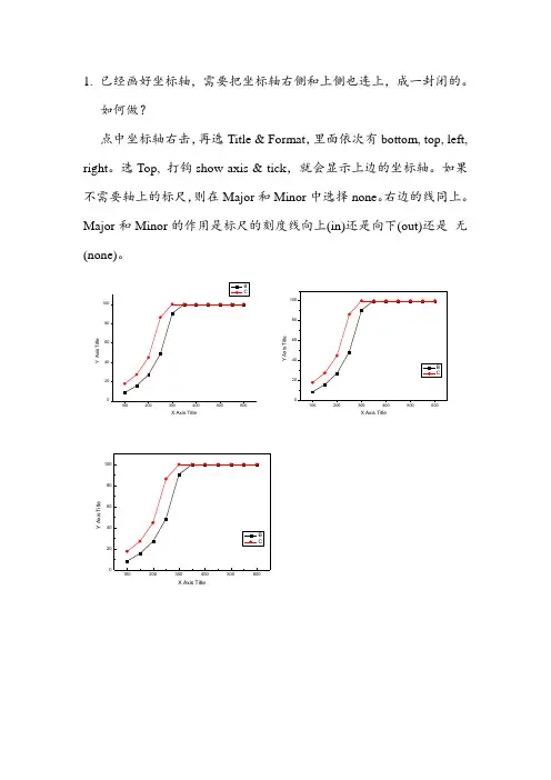
1. 已经画好坐标轴,需要把坐标轴右侧和上侧也连上,成一封闭的。
如何做?点中坐标轴右击,再选Title & Format ,里面依次有bottom, top, left, right 。
选Top, 打钩show axis & tick ,就会显示上边的坐标轴。
如果不需要轴上的标尺,则在Major 和Minor 中选择none 。
右边的线同上。
Major 和Minor 的作用是标尺的刻度线向上(in)还是向下(out)还是 无(none)。
Y A x i s T i t l eX Axis TitleY A x i s T i t l eX Axis TitleY A x i s T i t l eX Axis Title,2.画好图之后,菜单栏—Edit---Copy page (编辑—复制页面),之后到word直接粘贴即可。
Word里的图直接双击,可以直接打开origin,重新编辑和修改图。
修改好之后,菜单栏--文件—更新***.doc,即可同步到word。
此时出现的文件是可以用Origin打开的,如果不想别人打开,将Word中的图片Ctrl+C,再Ctrl+V 就可以了。
双击图片,看看图片大小效果吧,ps. 1 inch = 2.54 centimeter。
用origin做完图后,怎么导出放在word中呢,用cope page 还是export page啊,论文中都是用什么形式的呢?cope page,粘到word中双击还可以修改。
论文写作中使用tiff格式比较多,如果图表已经完成,可以直接输出为tiff格式的图片,再插入到文档中。
export比较好,可以输出多种格式的图片:bmp,jpg, eps,pdf等等,几乎什么格式都有了。
当然,你如果想在word 里还对图进行修改,copy是最好了,这样在word里面双击就可以修改图了。
正式刊发的论文大多偏爱eps的,清晰而又不大。
1、 新建一个工作表格Worksheet3、用Plot →Vector XY AMYX3、 如果图像超过了坐标轴,则用= You might notice at this point that the vectors extend outside the axes (layer frame). To limit their display to the layer frame only, enable the Clip Data to Frame check box on the Display tab at the Layer level in Plot Details. Select Format: Layer => Layer property →Clip Data to Frame附:直角坐标与矢量的转换关系Tutorial:Vector GraphFrom Howto WikiJump to: navigation, searchContents [hide]1 Summary2 What you will learn3 Steps3.1 Vector XYAM3.2 Vector XYXYSummaryA vector plot is a multidimensional graph used in industries such as meteorology, aviation, research, and construction that illustrate flow patterns (e.g. of wind, water, magnetic fields, etc.). Both direction and magnitude are represented in a vector graph. Origin includes two types of vector plots:Vector XYAM - takes a starting XY location for the vector tail (by default), an angle and a magnitude.Vector XYXY - takes two XY positions and connects them with a vector.What you will learnTwo data organizing mode to plot a vector graph.Use Plot Setup to assign plot dataStepsThis tutorial is associated with the sample project: \Samples\Samples.opj.To create a vector plot, you need four data columns, and organize your data into two modes:Vector XY AMXY AM means X, Y, Angle and Magnitude, respectively. Vectors will start from point (X, Y), and rotate an angle you specified. The following example uses XYAM data mode to create a vector graph.Browse the folder Graphing: Vector: 2D Vector in the Project Explorer. Active the data worksheet Book8E. Without highlighting any columns, select Plot: Specialized: Vector XY AM to open the Plot Setup dialog. And assign column A, B, D, C to X, Y, A, M as below, then click OK to plot the graph.Select Format:Plot to go to the plot level of the Plot Details dialog. Go to the V ector tab and change the Magnitude Multiplier in Vector Data group to 75. Click Ok button to close Plot Details dialog.Double-click X or Y axis to open the Axis dialog. Active the Title & Format tab, and check/enable the Show Axis & Ticks option for the Right axis. And set the Major Ticks and Minor Ticks to Out. Show the Top axis either in this tab.Go to Tick Labels tab, and check the Show Major Labels box for both Right and Top axis. Vector XYXYAnother data organizing mode is XYXY, where the first X, Y is the vector starting point, while the last X, Y is the ending point.To create such vector graph, active the Graphing: V ector: 2D Vector folder in the OPJ, highlight all of the four data columns of Book9E, and select Plot: Specialized: Vector XYXY from menu. Delete the axis titles if necessary.Retrieved from "/~originla/howto/index.php?title=Tutorial:Vector_Graph"。
1、 新建一个工作表格Worksheet
3、用Plot →Vector XY AM
Y
X
3、 如果图像超过了坐标轴,则用
= You might notice at this point that the vectors extend outside the axes (layer frame). To limit their display to the layer frame only, enable the Clip Data to Frame check box on the Display tab at the Layer level in Plot Details. Select Format: Layer => Layer property →Clip Data to Frame
附:直角坐标与矢量的转换关系
Tutorial:Vector Graph
From Howto Wiki
Jump to: navigation, search
Contents [hide]
1 Summary
2 What you will learn
3 Steps
3.1 Vector XYAM
3.2 Vector XYXY
Summary
A vector plot is a multidimensional graph used in industries such as meteorology, aviation, research, and construction that illustrate flow patterns (e.g. of wind, water, magnetic fields, etc.). Both direction and magnitude are represented in a vector graph. Origin includes two types of vector plots:
Vector XYAM - takes a starting XY location for the vector tail (by default), an angle and a magnitude.
Vector XYXY - takes two XY positions and connects them with a vector.
What you will learn
Two data organizing mode to plot a vector graph.
Use Plot Setup to assign plot data
Steps
This tutorial is associated with the sample project: \Samples\Samples.opj.
To create a vector plot, you need four data columns, and organize your data into two modes:
Vector XY AM
XY AM means X, Y, Angle and Magnitude, respectively. Vectors will start from point (X, Y), and rotate an angle you specified. The following example uses XYAM data mode to create a vector graph.
Browse the folder Graphing: Vector: 2D Vector in the Project Explorer. Active the data worksheet Book8E. Without highlighting any columns, select Plot: Specialized: Vector XY AM to open the Plot Setup dialog. And assign column A, B, D, C to X, Y, A, M as below, then click OK to plot the graph.
Select Format:Plot to go to the plot level of the Plot Details dialog. Go to the V ector tab and change the Magnitude Multiplier in Vector Data group to 75. Click Ok button to close Plot Details dialog.
Double-click X or Y axis to open the Axis dialog. Active the Title & Format tab, and check/enable the Show Axis & Ticks option for the Right axis. And set the Major Ticks and Minor Ticks to Out. Show the Top axis either in this tab.
Go to Tick Labels tab, and check the Show Major Labels box for both Right and Top axis. Vector XYXY
Another data organizing mode is XYXY, where the first X, Y is the vector starting point, while the last X, Y is the ending point.
To create such vector graph, active the Graphing: V ector: 2D Vector folder in the OPJ, highlight all of the four data columns of Book9E, and select Plot: Specialized: Vector XYXY from menu. Delete the axis titles if necessary.
Retrieved from "/~originla/howto/index.php?title=Tutorial:Vector_Graph"。