Loadrunner分析结果图说明
- 格式:doc
- 大小:174.00 KB
- 文档页数:6

Loadrunner 结果分析基础教程Loadrunner测试结果分析如下:1、Analysis Summary 结果及分析如下:此次测试我用了30个用户,但有1个failed,5个error。
所以实际参与测试的虚拟用户总共有24个。
其中,总的吞吐量为3448691bytes,平均吞吐量为12965bytes,总的请求量为720,平均每秒请求量为2.707。
从该图可以看出,该系统存在一定的问题,在失败和错误的数量来看占到了总虚拟用户的20%,该比例还是挺大的,所以从这个方面可以看出在系统登录方面还存在一定问题。
2、Running Vusers结果及分析如下:通过上面图形结果可知,在刚开始虚拟用户为0,30秒多时突然达到24个用户访问,一直到4:17秒将为16个用户,到4:25秒24个用户全部访问结束。
3、Hits perSecond结果及分析如下:该图为每秒点击次数,即使运行场景过程中虚拟用户每秒向Web服务器提交的HTTP请数。
通过它可以评估虚拟用户产生的负载量,如将其和“平均事务响应时间”图比较,可以查看点击次数对事务性能产生的影响。
通过对查看“每秒点击次数”,可以判断系统是否稳定。
系统点击率下降通常表明服务器的响应速度在变慢,需进一步分析,发现系统瓶颈所在。
由上图不难看出:分别在0s、40s、1:12s三个时间点点击数最大,到后面基本处于稳定状态。
4、Througput结果分析如下:该图和上面第三个图恰好相识,由上图不难看出:分别在0s、40s、1:12s三个时间点吞吐量最大,到后面基本处于稳定状态,这不难看出是由于点击数引起的。
5、Transaction Summary 结果分析如下:有该图不难看出,该系统处于正常运行状态。
6、Vuser Summary 结果分析如下:由该图不难看出:虚拟用户通过的占96%,失败的占4%。
所以,从整体上来看,大部分用户运行正常。
7、Error Statistics 结果分析如下:从上图不难看出:错误数据只有1个,所以也可以看出系统基本运行正常。
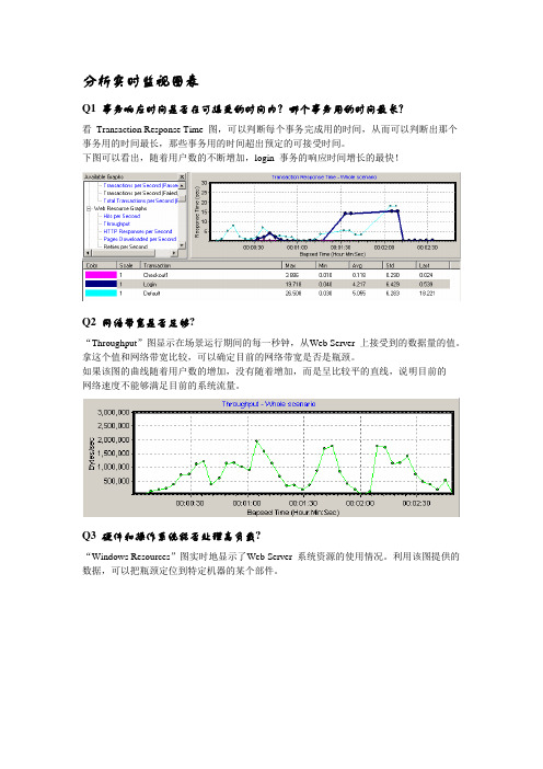
分析实时监视图表Q1 事务响应时间是否在可接受的时间内?哪个事务用的时间最长?看Transaction Response Time 图,可以判断每个事务完成用的时间,从而可以判断出那个事务用的时间最长,那些事务用的时间超出预定的可接受时间。
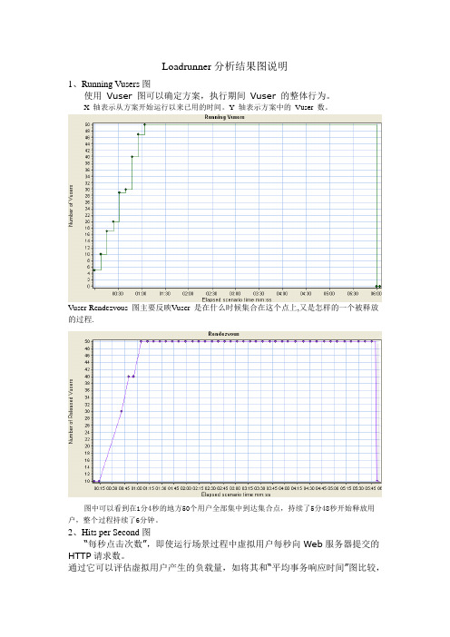
下图可以看出,随着用户数的不断增加,login 事务的响应时间增长的最快!Q2 网络带宽是否足够?“Throughput”图显示在场景运行期间的每一秒钟,从Web Server 上接受到的数据量的值。
拿这个值和网络带宽比较,可以确定目前的网络带宽是否是瓶颈。
如果该图的曲线随着用户数的增加,没有随着增加,而是呈比较平的直线,说明目前的网络速度不能够满足目前的系统流量。
Q3 硬件和操作系统能否处理高负载?“Windows Resources”图实时地显示了Web Server 系统资源的使用情况。
利用该图提供的数据,可以把瓶颈定位到特定机器的某个部件。
9 利用Analysis 分析结果场景运行结束后,需要使用Analysis 组件分析结果。
Analysis 组件可以在“开始程序”菜单中启动,也可以在Controller 中启动。
由于我本人对怎样分析结果最有效没有进行比较多的实践,所以这里只能按照常规的方法进行简单介绍。
注意:这里介绍的分析方法只适用于Web 测试。
9.1 分析事务的响应时间第一步,看“Transaction Performance Summary”图,确认那个事务的响应时间比较大,超出了我们的标准。
看下图,login 事务的平均响应时间最长。
然后我们再看“Average Transaction Response Time”,观察login 在整个场景运行中每一秒的情况。
从图中可以看出,login 事务的响应时间并不是一直都比较高,只是随着用户数的增加,响应时间才明显增加的。
然后我们再看“Average Transaction Response Time”,观察login 在整个场景运行中每一秒的情况。

LoadRunner常见测试结果分析(转)
在测试过程中,可能会出现以下常见的几种测试情况:
一、当事务响应时间的曲线开始由缓慢上升,然后处于平衡,最后慢慢下降这种情形表明:
* 从事务响应时间曲线图持续上升表明系统的处理能力在下降,事务的响应时间变长;
* 持续平衡表明并发用户数达到一定数量,在多也可能接受不了,再有请求数,就等待;
* 当事务的响应时间在下降,表明并发用户的数量在慢慢减少,事务的请求数也在减少。
如果系统没有这种下降机制,响应时间越来越长,直到系统瘫痪。
从以上的结果分析可发现是由以下的原因引起:
1. 程序中用户数连接未做限制,导致请求数不断上升,响应时间不断变长;
2. 内存泄露;
二、CPU的使用率不断上升,内存的使用率也是不断上升,其他一切都很正常;
表明系统中可能产生资源争用情况;
引起原因:
开发人员注意资源调配问题。
三、所有的事务响应时间、cpu等都很正常,业务出现失败情况;
引起原因:
数据库可能被锁,就是说,你在操作一张表或一条记录,别人就不能使用,即数据存在互斥性;
当数据量大时,就会出现数据错乱情况。
Loadrunner分析结果图说明1、Running Vusers图使用Vuser 图可以确定方案,执行期间Vuser 的整体行为。
X 轴表示从方案开始运行以来已用的时间。
Y 轴表示方案中的Vuser 数。
Vuser-Rendezvous 图主要反映Vuser 是在什么时候集合在这个点上,又是怎样的一个被释放的过程.图中可以看到在1分4秒的地方50个用户全部集中到达集合点,持续了5分48秒开始释放用户,整个过程持续了6分钟。
2、Hits per Second图“每秒点击次数”,即使运行场景过程中虚拟用户每秒向Web服务器提交的HTTP请求数。
通过它可以评估虚拟用户产生的负载量,如将其和“平均事务响应时间”图比较,可以查看点击次数对事务性能产生的影响。
通过对查看“每秒点击次数”,可以判断系统是否稳定。
系统点击率下降通常表明服务器的响应速度在变慢,需进一步分析,发现系统瓶颈所在。
3、Throughput图“吞吐率”显示的是场景运行过程中服务器的每秒的吞吐量。
其度量单位是字节,表示虚拟用在任何给定的每一秒从服务器获得的数据量。
可以依据服务器的吞吐量来评估虚拟用户产生的负载量,以及看出服务器在流量方面的处理能力以及是否存在瓶颈。
X 轴表示从方案开始运行以来已用的时间。
Y 轴表示服务器的吞吐量(以字节为单位)。
“吞吐率”图和“点击率”图的区别:“吞吐率”图,是每秒服务器处理的HTTP申请数。
“点击率”图,是客户端每秒从服务器获得的总数据量。
4、Transaction Summary图对事务进行综合分析是性能分析的第一步,通过分析测试时间内用户事务的成功与失败情况,可以直接判断出系统是否运行正常。
5、Average Transaction Response Time图“事务平均响应时间”显示的是测试场景运行期间的每一秒内事务执行所用的平均时间,通过它可以分析测试场景运行期间应用系统的性能走向。
例:随着测试时间的变化,系统处理事务的速度开始逐渐变慢,这说明应用系统随着投产时间的变化,整体性能将会有下降的趋势。

LoadRunner中对图的分析说明(一)在Vusers(虚拟用户状态)中1.Running Vusers(负载过程中的虚拟用户运行情况)说明——系统形成负载的过程,随着时间的推移,虚拟用户数量是如何变化的,描述为(用户在几分钟左右到达了组在峰值多少个虚拟用户,负载的生成是大约每分钟增加几个用户,峰值负载持续为几分几秒)。
2.Rendezvous(负载过程中集合点下的虚拟用户数)说明——随着时间的推移各个时间点上并发用户的数目,方便我们了解并发用户数的变化情况。
描述(刚开始的几分钟内,负载的并发用户都是几个,而后面变化为几个用户并发)。
(二)在Transactions(事务)中这里给出了所有和事务相关的数据统计,方便了解被测试系统业务处理的响应时间和吞吐量。
1.Average Transaction Response Time(平均事务响应时间)说明——反映随着时间的变化事务响应时间的变化情况,时间越小说明处理的速度越快。
如果和前面的用户负载生成图合并在一起看,就可以发现用户负载增加对系统事务响应时间的影响规律。
描述(看到响应时间是如何增长的,随着时间的推移响应时间逐渐变长,并且在不到多少时间的时候突然出现响应时间大幅下降的情况)另外事务的响应时间也不应该超过用户的最大接受范围,否则会出现系统响应过慢的问题。
2.Transactions per Second(每秒事务数)说明——数据反映了系统在同一时间内能处理业务的最大能力,这个数据越高,说明系统处理能力越强。
描述(看到系统的TPS随着时间的变化逐渐变大,而在不到多少分钟的时候系统每秒可以处理多少个事务。
这里的最高值并不一定代表系统的最大处理能力,TPS会受到负载的影响,也会随着负载的增加而逐渐增加,当系统进入繁忙期后,TPS会有所下降。
而在几分钟以后开始出现少量的失败事务)3.Transaction Summary(事务概要说明)说明——通过的事务数越多,说明系统的处理能力越强;失败的事务越少,说明系统越可靠。
Loadrunner_结果分析向导L o a d r u n n e r R e s u l t s A n a l y s i s:C o n t e n t sAnalysis Summary Page (4)Running Vusers (6)Running Vusers (6)Hits per Second (7)Throughput (8)Hits per Second - Throughput (9)Average Transaction Response Time (10)Transactions per Second (Passed/Failed) (11)Total Transactions per Second (12)Transaction Summary Graph (13)Transaction Performance Summary (14)Transaction Response Time (Under Load) (15)Transaction Response Time (Under Load) (15)Transaction Response Time (Percentile) (16)HTTP Status Code Summary (17)HTTP Responses per Second (18)Retries per Second (19)Connections (20)Connections per Second (21)______________________________________________ ___________________________- 2 -Error Statistics (22)Error Statistics (by Description) (19)Errors per Second (24)Errors per Second (by Description) (25)Errors per Second (by Description) (25)Errors per Second – Running Vusers (26)Glossary (27)______________________________________________ ___________________________- 3 -A n a l y s i s S u m m a r y P a g eThe Analysis Summary page is divided into three main sections, the statistics summary, transaction summary, and HTTP responses summary. The statistics summary lists overall statistics of interest in the scenario.You can compare maximum running Vusers and the total duration of the scenario (here the duration is 17:08:38 – 17:54:35, or 46 minutes) against throughput and hits statistics. Based on Vusers and duration, was the performance of theserver/application acceptable given the throughput and hits/second statistics? You will have to have some knowledge of your server/database capabilities and configuration to make this decision.The next section of the Analysis Summary is the Transaction Summary, containing statistics on individual transactions, their response times (minimum, average, maximum, and standard deviation).The “90 Percent” statistic indicates the maximum response time of ninety percent for the transactions in that row. Based on the statistics above, you could say that ______________________________________________ ___________________________- 4 -90% of the “A_MainPage_AFI…” transactions had a maximum response time of 94.845 seconds.Passed and failed transactions are also listed in this section. Transactions with the “Z_” prefix contain the sum of all statistics for transactions used in that script. The total passed transactions in the “Z_” transaction will be at most equal to the single transaction with the fewest passes, excluding vuser_init/end transactions. This is because the “Z_” transaction records statistics for the entire scr ipt flow, not just a single transaction. If a Vuser successfully executes all the steps in a script, from start to finish, only then will the number of passes for the “Z_” transaction increase. However, if failures occur at any point in the script, the number of failures for the transaction in which the failure occurred will increase, and the number of failures for the “Z_” transaction will increase as well.In the statistics above, the total number of passes in the “Z_” transaction was 776, corresponding to the single transaction with the fewest passes,“E_ResultsDisplay…”, whereas the total number of failures for “Z_” is the sum of failures for the entire group.The final section in the Analysis Summary is the HTTP Responses Summary, which contains the total and per second statistics for all HTTP responses recorded during the test. The most common response codes will be HTTP 200, indicating success. For a list of all HTTP response codes and their meanings see the attached document in the glossary.Back to Contents______________________________________________ ___________________________- 5 -R u n n i n g V u s e r sThe Running Vusers graph displays the number of virtual users currently executing scripts in the test scenario. A Vuser performs a sequence of tasks defined in a test script until the test has completed its duration, the Vuser has executed the script for a required number of iterations, or the test controller manually stops the Vuser. Vusers will usually be added to the scenario in what i s called a “gradual ramp-up,” unlike the graph above where all Vusers are added to the scenario simultaneously. After the number of Vusers reaches a level set in the stress test plan, that load is maintained for a set duration before a gradual ramp-down is initiated. Theramp-down is usually faster than the ramp-up, because removing users from the scenario will almost never adversely affect server performance.Whenever a problem occurs during a test, you should always be aware of the number of Vusers currently running in the scenario. The purpose of a stress test is to diagnose problems in an application under a simulated load, so in an unstable application it is typical to see a decrease in some performance measure when the number of Vusers passes a certain level. A sudden negative shift in performance usually means the number of running Vusers has increased.The graph above follows a typical test schedule, with a ramp-up of 10 users per minute to a peak load of 250 users, then the test was run at peak load for 10 minutes, and a ramp-down of approximately 25 users per minute.Back to Contents______________________________________________ ___________________________- 6 -H i t s p e r S e c o n dThe Hits per Second graph shows the number of hits on the Web server over time. This graph can display the entire scenario, or the last 60, 180, 600 or 3600 seconds. You can compare this graph to the Transaction Response Time graph to see how the number of hits affects transaction performance.An increase in hits per second indicates an increased load on the server, so comparing hits per second with transaction response time and throughput can give you a good idea of how the server is performing under increased stress. When a web server is functioning correctly, hits per second will often mirror the number of successful HTTP response codes. In the graph above there is a spike in hits per second around 25 minutes into the test. This can be explained by comparing hits per second with the results of other graphs like running Vusers, throughput, and transaction response time.Back to Contents______________________________________________ ___________________________- 7 -T h r o u g h p u tThe Throughput graph shows the amount of data, measured in bytes, transmitted by the Web server during each second of the scenario run. Throughput is measured in bytes/second and represents the amount of data transmitted by the web server over the network at any given time. Ideally throughput should increase as hits per second increases, which indicates that there is sufficient bandwidth to process user requests.You can gain information on server performance by comparing Throughput and Hits per Second. If the server is performing as expected as hits per second increase, then throughput should also increase. This is expected behavior because an increase in hits will require the server to transmit more data back to the users. However, if the number of hits per second increases and throughput stays constant or decreases, this signifies that the server cannot process the increase in requests (hits per second), resulting in an increase in transaction response time.The graph above exhibits a general decrease in throughput during the entire test, with a slight but noticeable decrease just before 25 minutes, corresponding to the spike in hits per second in the previous graph. To compare these statistics it is best to overlay the graphs.Back to Contents______________________________________________ ___________________________- 8 -H i t s p e r S e c o n d-T h r o u g h p u tThis graph contains an overlay of hits per second and throughput. We can see here that the spike in hits per second coincides with a decrease in throughput at around 25 minutes. If a server is operating below peak load, then hits per second usually mirrors throughput. The result in the graph above is most likely due to an increase in user load, because more users will cause an increase in hits per second, and when the server can no longer process the number of requests coming in there will be a decrease in throughput.Referring back the Running Vusers graph, we know that the peak load of 250 users was reached just before 25 minutes, resulting in an expected increase in hits per second and a decrease in throughput, indicating that the load on the server was approaching its maximum. We can guess from this graph that transaction response time and possibly errors per second will spike around 25 minutes as well.Back to Contents______________________________________________ ___________________________- 9 -A v e r a g e T r a n s a c t i o n R e s p o n s e T i m eThe Average Transaction Response time graph shows the average response time of individual transactions over time. Response time is the amount of time between a client request and server response. Often response time will correspond to the number of Vusers currently running in the test scenario.The most common cause for an increase in response time is an increase in running Vusers. This occurs because as more Vusers enter the test scenario the amount of work the server must perform increases. With an increased load it takes more time for the server to respond to an individual request, so average response time increases as well.In the graph above we should expect an increase in response time corresponding to the change in behavior in other graphs at around 25 minutes. Looking at the response time for the “Z_” transaction is the easiest way to analyze general behavior, and here total response time increased to an average of around 110 seconds by 10 minutes into the scenario. At 10 minutes the number of running Vusers was 120, so it is likely that the server was operating at high capacity from this time onwards.______________________________________________ ___________________________- 10 -Back to ContentsT r a n s a c t i o n s p e r S e c o n d(P a s s e d/F a i l e d)The Transactions per Second graph shows the number of successful/unsuccessful transactions over time. A transaction represents a single step or group of steps executed by a Vuser. For example, the process of entering and submitting login information on a web page could be grouped as a single transaction.The number of transactions per second should correspond to the number of Vusers running in the test scenario at a given time, and typically as more Vusers are added to the scenario the number of transactions per second will increase. If the number of transactions per second decreases with an increase in Vusers, then there is probably some problem occurring in the scenario. You should first compare the number of running Vusers with transactions per second to verify that an increase in Vusers is the likely cause of the increase, as well as hits per second, transaction response time, and throughput. Taking all these statistics into account will help you pin-point the cause of the problem.Back to Contents______________________________________________ ___________________________T o t a l T r a n s a c t i o n s p e r S e c o n dTotal transaction per second displays the total number of passed and failed transaction during the test scenario. Here we have a clearer picture of the general status of all transaction, and like the previous, more specific transactions per second graph above, the total failed transactions in red in this graph indicate the server was operating with a user load exceeding its maximum capacity.The red line in the graph above indicates the total number of failed transactions. The spike occurs as expected at around 25 minutes, indicating that the server was exceeding its maximum capacity for user load. Note the sharp decrease in errors just before 35 minutes, which directly corresponds to the beginning of theramp-down (decrease in Vusers) in the test.Back to Contents______________________________________________ ___________________________T r a n s a c t i o n S u m m a r y G r a p hThe Transaction Summary graph displays a record of all passed, failed, and stopped transactions from the test scenario. Passed transactions are those that were completed successfully, failed transactions are those that were not completed because of an unexpected occurrence (a page failed to load, login failed, etc.), and stopped transactions were those that did not reach a point at which a pass/fail condition could be determined.By analyzing this graph you can see the ratio of passed/failed transactions and by determining which transactions need to receive further attention. A high number of failures for a single transaction indicate that there is some type of problem occurring at that point in the test scenario, which could be caused by the page related to that transaction or a server issue. Again, analyzing other results will help determine the specific cause of transaction failures.For example, the right-most transaction above failed 91.47% of the time, which is obviously an unacceptable ratio. By looking at other graphs above you can see which statistic most accurately explains the failures for this transaction. Single transactions that had both passes and failures suggest that a problem occurred at some point during the scenario, so a comparison with the number of running Vusers would be useful, as well as response time and throughput.Note that this is the “Z_” transaction and contains the sum of all failed transactions, which will always be larger than any individual number of failed transactions. Back to Contents______________________________________________ ___________________________T r a n s a c t i o n P e r f o r m a n c e S u m m a r yThe transaction performance summary graph is similar to the transaction summary graph, except it gives the minimum, average, and maximum response times for all transactions in the test scenario.The right-most tra nsaction in the graph above is the “Z_” transaction, which should have the highest values in the graph because it is a sum of all transactions. Here no single transaction exhibits an unusually high maximum response time when compared to the other transactions, but the transaction 2nd from the left has an average response time of 30.2 seconds. If more information is available about the resources required by this transaction (which database operations are performed, which servers is it hitting?), then you may find an explanation for the higher average response time.In this case the transactions with response times of zero are the initialization and termination transactions recorded when a Vuser enters or exits the test scenario and can be ignored. The initialization and termination actions can contain multiple actions if required by the test plan. For example, a scenario that would require transactions in all three sections would be logging in to the application once (initialization), executing the action section for a set number of iterations (action or “Z_”), and logging out of the application (termination).Back to Contents______________________________________________ ___________________________T r a n s a c t i o n R e s p o n s e T i m e(U n d e r L o a d)The Transaction Response Time (Under Load) graph is a combination of the Running Vusers and Average Transaction Response Time graphs. It indicates transaction times relative to the number of Vusers running at any point during the test scenario. This graph helps you view the general impact of Vuser load on response time and is most useful when analyzing a scenario with a gradual load.With a gradual load you can detect at which quantity of Vusers an adverse change in transaction response time occurred. By comparing the test schedule with the statistics from this graph you can determine whether a spike in response time coincided with an increase in Vusers or if you need to look for the cause of the problem elsewhere.In the graph above the average response time from the load of 0-20 users can be disregarded, since the test began with 20 users. The unusually high response times are due to resource usage by the Loadrunner test software itself and from 0-20 users this has no impact on the results of the test. After user initialization, average response time decreases sharply at 40 Vusers. This is most likely due to the load of 40 users being redistributed among different web/application servers, and occurs again at 60 users.Back to Contents______________________________________________ ___________________________T r a n s a c t i o n R e s p o n s e T i m e(P e r c e n t i l e)Transaction response time by percentile displays the percentage of transactions with a given response time. In the graph above, the average response time of transactions in the 90th percentile of response time (the green line) had response times greater than 200 seconds. It is difficult to make any conclusions based on this graph, other than general observations. For instance, transactions in the 90th percentile had response times higher than transactions in the 10th percentile. It is also impossible to directly overlay this graph with any other because of the units of measurement (Percent of transactions) on the x axis, making it difficult to draw comparative conclusions on based on these results.Back to Contents______________________________________________ ___________________________H T T P S t a t u s C o d e S u m m a r yThe HTTP status code summary contains a pie chart displaying the number of HTTP responses grouped by status code. The majority of response codes in most tests will be 200, indicating success. In the graph above about 50% of the response codes indicated success (200), 25% indicated failure (500), and 25% indicated a requested page was not found (404). For a detailed listing of HTTP response codes and their meanings view the attached document in the glossary.Back to Contents______________________________________________ ___________________________H T T P R e s p o n s e s p e r S e c o n dThe HTTP Responses per Second graph shows the number of HTTP status codes, which indicate the status of HTTP requests. The most common codes include 200 (success), 302 (redirect), 404 (not found), and 500 (internal server error). A higher number of HTTP responses indicates that the server is processing more requests and successfully sending the user an HTTP response.In the grap h above “successful” response codes and “page not found” response codes remained relatively steady throughout the test. There was a spike in response code 503, indicating that a requested service was unavailable, starting about 18 minutes into the test. At 25 minutes the responses per second for code 503 are quite high, at 16 per second, indicating that the server has exceeded its maximum capacity at this point in the test, a conclusion supported by other results. Back to ContentsBack to Contents______________________________________________ ___________________________R e t r i e s p e r S e c o n dThe retries per second graph displays the number of connections closed by the server at any given point in the test. In the graph above the number of connections closed was zero for most of the test, except at 35 minutes, where 0.016 of the total connections were closed.It is difficult to make any conclusions from the graph above, since the spike in retries was most likely a single incident that may not be related to any other results.Back to Contents______________________________________________ ___________________________C o n n e c t i o n sThe connections graph shows the number of open TCP/IP connections in the scenario over time. One HTML page may cause the browser to open several connections, when links on the page go to different Web addresses. Two connections are opened for each Web server. Ideally, the number of open connections should mirror running Vusers.This graph is useful in indicating when additional connections are needed. For example, if the number of connections reaches a plateau, and the transaction response time increases sharply, adding connections would probably cause a dramatic improvement in performance (reduction in the transaction response time). In the graph above the number of open connections is continually increasing until ramp-down begins, indicating that the number of connections is adequate for a load of even 250 users. Therefore, the problem occurring at around 25 minutes into the test must have some other cause.Back to Contents______________________________________________ ___________________________C o n n e c t i o n s p e r S e c o n dThe connections per second graph displays the number of new connections opened and the number of connections shutdown every second. Usually new connections will mirror shutdown connections, as is the case in this graph. Note the spike in both measures from 20 minutes to 35 minutes, corresponding to the number of Vusers at peak duration during the test. Again, the number of connections does not seem to be a problem judging by these results.Back to Contents______________________________________________ ___________________________E r r o r S t a t i s t i c sThe Error Statistics graph displays the number of errors that occurred during the test, grouped by error code. Errors connecting to the server and locating pages are most common. Here the error codes with the highest counts are code -26366 and -26609. In the following graphs we will get a description of these errors.______________________________________________ ___________________________E r r o r S t a t i s t i c s(b y D e s c r i p t i o n)The Error Statistics (by Description) graph displays the number of errors that accrued during scenario or session step execution, grouped by error description. The error description is displayed in the legend. Errors should not be confused with failed transactions, since a single error may not cause a transaction failure, although this is usually the case. Sometimes multiple errors may occur, resulting in a single failed transaction. For instance, Loadrunner searches for specific words on each page during a test run to verify that those pages are being displayed correctly, but if that page does not display the words will not be found and a text check error will be recorded. The cause of the page failing to display is not the text check, but is some other error which will also be recorded by Loadrunner.In the graph above the largest blue section of errors corresponds to a failed text check for the word “search”. The 2nd largest beige section corresponds to an HTTP status code of 503, or “service temporarily unavailable”. To determine the cause of the errors the next step would be to e xamine at what point in the script the “search” text check occurs and analyze which resources are requested by the Vuser at that point. Searching for server response codes of 503 in any web server log files, if available, may help to identify the cause of the response.Back to Contents______________________________________________ ___________________________E r r o r s p e r S e c o n dThe Errors per Second graph displays the average number of errors that occurred during each second of the test scenario, grouped by error code. During the analysis of test results, the errors per second graph can be very useful in identifying specific instances of stress on an application.The graph above exhibits the expected spike in errors from 20 minutes to 35 minutes, corresponding to the problem areas in other graphs. Again, the description of the errors is not given, but knowing where the bulk of the errors occured gives a specific time period to focus on to diagnose unexpected behavior. Here the next step would be to examine various log files generated by the application or database team for the period of time between 20 and 35 minutes. Back to Contents______________________________________________ ___________________________E r r o r s p e r S e c o n d(b y D e s c r i p t i o n)The Errors per Second (by Description) graph displays the average number of errors that occurred during each second of the scenario or session step run, grouped by error description. The error description is displayed in the legend.Here the errors in dark blue correspond to the same failed text check for the word “search”, and the errors in light blue correspond to the same HTTP status code 503. The same enquires should be made to diagnose the cause of these errors.Back to Contents______________________________________________ ___________________________E r r o r s p e r S e c o n d–R u n n i n g V u s e r sThe errors per second – running Vusers graph displays an overlay or errors per second and running Vusers on the same graph, with their Y-axes displayed on opposite sides of the graph. You can use this graph to see if there is any relationship between the number of Vusers and the number of errors per second in the test.Here there is a definite relationship from 20 minutes to 35 minutes in the test. Starting from about 200 Vusers the number of errors spiked to a maximum of 15 per second and hovered at that level until the peak load duration ended and ramp-down began at 35 minutes. Judging from these results the next step in diagnosing the error would be to examine all available log files during this time period and make any configuration file or physical changes/upgrades to existing hardware if it is likely that will improve performance. A retest would be required to verify that changes made had the desired effect.Back to Contents______________________________________________ ____________________________________________________________________________________________________G l o s s a r yError - An error recorded by Loadrunner during a stress test indicates some type ofunexpected behavior. Each error will have an associated description. Most of the time when an error is detected the Vuser will stop running their script for that iteration, and a failed transaction will be recorded in addition to the error.Gradual Load – Load refers to the total number of Vusers currently running in a testscenario. A gradual load refers to a series of small increments in the number of Vusers in a test scenario.HTTP – Hyper Text Transfer Protocol, or HTTP, is the standard protocol used forclient/server communication over the internet. For a list of HTTP responsecodes and their meanings view the attached document:HTTP Response Codes.docIteration – an iteration is a single repetition of a process. A stress test comprisesmultiple Vusers executing predefined test scripts a certain number of times, or iterations.Test Schedule –a test schedule is the plan used in a test scenario. It is composed oframp-up, duration, and ramp-down phases in which Vusers are added to the scenario (ramp-up), run scripts for a set period of time when a maximum number of Vusers has been reached (duration), and when Vusers are removed from the scenario (ramp-down).Text Check – a text check is a statement in a Loadrunner script the searches for aspecific word or phrase on a single page of an application. Text checks are used to verify that the page that is expected to appear is actually the page that appears. If a text check fails then the Vuser executing the check will stop running, the transaction will be counted as a failure, and the Vuser will reset and move on to its next iteration.Transaction – in the context of Loadrunner, a transaction is a single step or a logicalgroup of steps executed by a Vuser. For example, the first transaction in any test script will be the initial page load, and the second will probably beentering a user ID and password to log in to the application.At its smallest level a transaction encompasses a single step, clicking ahyperlink for example, but within that step there may be several eventsoccurring. In the instance of clicking a link there may be multiple redirections to different servers before the final page loads on the user’s screen. It is possible to manually break down a transaction into even smaller transactions if that may help to identify the specific cause of a performance issue.。
LoadRunner测试结果分析一、LoadRunner测试结果分析之我见LoadRunner生成测试结果并不代表着这次测试结果的结束,相反,这次测试结果的重头戏才刚刚开始。
如何对测试结果进行分析,关系着这次测试的成功与否。
网上关于LoadRunner测试结果如何分析的介绍相当匮乏,在总结他人的观点和自己的实验体会基础上来介绍如何进行LoadRunner测试结果分析。
1. LoadRunner测试结果分析的第一步应该是查看分析综述(Analysis Summary),其包括统计综述(Statistics Summary)、事务综述(Transaction Summary)、HTTP 响应综述(HTTP Responses Summary)三部分。
在统计综述中查看Total Errors的数量,HTTP 响应综述中查看HTTP 404数量,若数值相对较大(HTTP 404则相对于HTTP 200),则说明系统测试中出错较多,系统系能有问题;另外查看事务的平均响应时间和其90%的事务平均响应时间,若时间过长,超过测试计划中的要求值,则说明系统的性能不满足我们的要求。
2. 第二步对LoadRunner测试结果图进行分析,首先对事务综述(Transaction Summary)进行分析,该图可以直观地看出在测试时间内事务的成功与失败情况,所以比第一步更容易判断出被测系统运行是否正常。
3. 接着分析事务平均响应时间(Average Transaciton Response Time),若事务平均响应时间曲线趋高,则说明被测系统处理事务的速度开始逐渐变慢,即被测系统随着运行时间的变化,整体性能不断下降。
当系统性能存在问题时,该曲线的走向一般表现为开始缓慢上升,然后趋于平稳,最后缓慢下降。
原因是:被测系统处理事务能力下降,事务平均响应时间变长,在曲线上表现为缓慢上升;而并发事务达到一定数量时,被测系统无法处理多余的事务,此时曲线变现为趋于平稳;当一段时间后,事务不断被处理,其数量减少,在曲线上表现为下降。
1.1 分析事务的响应时间第一步,看“Transaction Performance Summary”图,确认那个事务的响应时间比较大,超出了我们的标准。
看下图,login 事务的平均响应时间最长。
为了定位问题,明白为什么login 事务的响应时间比较长,现在我们要分解login 事务,分析该页面上每一个元素的性能。
在上图中,选择要分解的事务曲线,然后点鼠标右键,选择“Web Page Breakdown for login”1.2 分解页面通过分解页面可以得到:比较大的响应时间到底是页面的哪个组件引起的?问题出在服务器上还是网络传输上。
这里为了解说各个时间(比如:DNS 解析时间、连接时间、接受时间等)下面简单说一下浏览器从发送一个请求到最后显示的全过程。
1.浏览器向Web Server 发送请求,一般情况下,该请求首先发送到DNS Server 把DNS名字解析成IP 地址。
解析的过程的时间就是。
这个度量时间可以确定DNS 服务器或者DNS 服务器的配置是否有问题。
如果DNS Server 运行情况比较好,该值会比较小。
2.解析出Web Server 的IP 地址后,请求被送到了Web Server,然后浏览器和WebServer 之间需要建立一个初始化连接,建立该连接的过程就是。
这个度量时间可以简单的判断网络情况,也可以判断Web Server 是否能够响应这个请求。
如果正常,该值会比较小。
3. 建立连接后,从Web Server 发出第一个数据包,经过网络传输到客户端,浏览器成功接受到第一字节的时间就是。
这个度量时间不仅可以表示WebServer 的延迟时间,还可以表示出网络的反应时间。
4. 从浏览器接受到第一个字节起,直到成功收到最后一个字节,下载完成止,这段时间就是。
这个度量时间可以判断网络的质量(可以用size/time 比来计算接受速率)其他的时间还有SSL Handshaking(SSL 握手协议,用到该协议的页面比较少)、ClientTime (请求在客户端浏览器延迟的时间,可能是由于客户端浏览器的think time 或者客户端其他方面引起的延迟)、Error Time(从发送了一个HTTP 请求,到Web Server 发送回一个HTTP 错误信息,需要的时间)。
LoadRunner性能测试结果分析性能测试的需求指标:本次测试的要求是验证在30分钟内完成2000次⽤户登录系统,然后进⾏考勤业务,最后退出,在业务操作过程中页⾯的响应时间不超过3秒,并且服务器的CPU使⽤率、内存使⽤率分别不超过75%、70%LoadRunner性能测试结果分析内容:1、结果摘要LoadRunner进⾏场景测试结果收集后,⾸先显⽰的该结果的⼀个摘要信息,如图1- 2所⽰。
概要中列出了场景执⾏情况、“Statistics Summary(统计信息摘要)”、“Transaction Summary(事务摘要)”以及“HTTP Responses Summary(HTTP响应摘要)”等。
以简要的信息列出本次测试结果。
图1- 2性能测试结果摘要图场景执⾏情况:该部分给出了本次测试场景的名称、结果存放路径及场景的持续时间,如图1- 3所⽰。
从该图我们知道,本次测试从15:58:40开始,到16:29:42结束,共历时31分2秒。
与我们场景执⾏计划中设计的时间基本吻合。
图1- 3场景执⾏情况描述图Statistics Summary(统计信息摘要)该部分给出了场景执⾏结束后并发数、总吞吐量、平均每秒吞吐量、总请求数、平均每秒请求数的统计值,如图1- 4所⽰。
从该图我们得知,本次测试运⾏的最⼤并发数为7,总吞吐量为842,037,409字节,平均每秒的吞吐量为451,979字节,总的请求数为211,974,平均每秒的请求为113.781,对于吞吐量,单位时间内吞吐量越⼤,说明服务器的处理能越好,⽽请求数仅表⽰客户端向服务器发出的请求数,与吞吐量⼀般是成正⽐关系。
图1- 4统计信息摘要图Transaction Summary(事务摘要)该部分给出了场景执⾏结束后相关Action的平均响应时间、通过率等情况,如图1- 5所⽰。
从该图我们得到每个Action的平均响应时间与业务成功率。
注意:因为在场景的“Run-time Settings”的“Miscellaneous”选项中将每⼀个Action当成了⼀个事务执⾏,故这⾥的事务其实就是脚本中的Action。
Loadrunner分析结果图说明
1、Running Vusers图
使用Vuser 图可以确定方案,执行期间Vuser 的整体行为。
X 轴表示从方案开始运行以来已用的时间。
Y 轴表示方案中的Vuser 数。
Vuser-Rendezvous 图主要反映Vuser 是在什么时候集合在这个点上,又是怎样的一个被释放的过程.
图中可以看到在1分4秒的地方50个用户全部集中到达集合点,持续了5分48秒开始释放用户,整个过程持续了6分钟。
2、Hits per Second图
“每秒点击次数”,即使运行场景过程中虚拟用户每秒向Web服务器提交的HTTP请求数。
通过它可以评估虚拟用户产生的负载量,如将其和“平均事务响应时间”图比较,
可以查看点击次数对事务性能产生的影响。
通过对查看“每秒点击次数”,可以判断系统是否稳定。
系统点击率下降通常表明服务器的响应速度在变慢,需进一步分析,发现系统瓶颈所在。
3、Throughput图
“吞吐率”显示的是场景运行过程中服务器的每秒的吞吐量。
其度量单位是字节,表示虚拟用在任何给定的每一秒从服务器获得的数据量。
可以依据服务器的吞吐量来评估虚拟用户产生的负载量,以及看出服务器在流量方面的处理能力以及是否存在瓶颈。
X 轴表示从方案开始运行以来已用的时间。
Y 轴表示服务器的吞吐量(以字节为单位)。
“吞吐率”图和“点击率”图的区别:
“吞吐率”图,是每秒服务器处理的HTTP申请数。
“点击率”图,是客户端每秒从服务器获得的总数据量。
4、Transaction Summary图
对事务进行综合分析是性能分析的第一步,通过分析测试时间内用户事务的成功与失败情况,可以直接判断出系统是否运行正常。
5、Average Transaction Response Time图
“事务平均响应时间”显示的是测试场景运行期间的每一秒内事务执行所用的平均时间,通过它可以分析测试场景运行期间应用系统的性能走向。
例:随着测试时间的变化,系统处理事务的速度开始逐渐变慢,这说明应用系统随着投产时间的变化,整体性能将会有下降的趋势。
可以将事务平均响应时间图与“正在运行的Vuser”图进行比较,了解正在运行的Vuser
的数目对事务执行时间产生的影响。
例如:如果平均事务响应时间图显示执行时间逐渐改善,则
可以将其与“正在运行的Vuser”图进行对比,看执行时间是否因为Vuser 负载减少而得到改
善。
如果定义了可以接受的最小和最大事务性能时间,则可以使用此图确定服务器性能是否在可以接受的范围内。
Transaction Response Time—percentile(事务响应时间的百分比图)用于分析在给定时间内执行的事务百分数,有助于确定满足了所定义的性能标准的事务的百分比,最大反应时间可能非常的长,但如果大多数定义的事务访问时间可以接受,系统总体也就满足了需求。
X轴代表在总事务数所占百分比,Y轴代表执行事务消耗的时间。
Transaction pesponse time—summay(事务响应时间摘要)
6、Windows Resources图
X 轴表示已用时间。
Y 轴表示资源使用率。
如果Process\Private Bytes计数器和Process\Working Set计数器的值在长时间内持续升高,同时Memory\Available bytes计数器的值持续降低,则很可能存在内存泄漏。
内存资源成为系统性能的瓶颈的征兆:
很高的换页率(high pageout rate);进程进入不活动状态;
交换区所有磁盘的活动次数可高;可高的全局系统CPU利用率;
内存不够出错(out of memory errors)
如果System\Processor Queue Length大于2,而处理器利用率(Processor Time)一直很低,则存在着处理器阻塞。
CPU资源成为系统性能的瓶颈的征兆:
很慢的响应时间(slow response time) ;CPU空闲时间为零(zero percent idle CPU)
过高的用户占用CPU时间(high percent user CPU);过高的系统占用CPU时间(high percent system CPU)
长时间的有很长的运行进程队列(large run queue size sustained over time)
最大并发用户数:
应用系统在当前环境(硬件环境、网络环境、软件环境(参数配置))下能承受的最大并发用户数。
如果出现了服务器shutdown的情况,则说明在当前环境下,系统承受不了当前并发用户的负载压力,那么最大并发用户数就是前一个没有出现这种现象的并发用户数。
如果测得的最大并发用户数到达了性能要求,且各服务器资源情况良好,业务操作响应时间也达到了用户要求,那么OK。
否则,再根据各服务器的资源情况和业务操作响应时间进一步分析原因所在。
首先你的确定你所监视的服务器与你的测试机是在同一个局域网内,
、监控windows系统:
1、监视连接前的准备工作
1)进入被监视windows系统,开启以下二个服务Remote Procedure Call(RPC) 和Remote Registry Service (开始—)运行中输入services.msc,开启对应服务即可)。
2)在被监视的WINDOWS机器上:右击我的电脑,选择管理->共享文件夹->共享在这里面要有C$这个共享文件夹 (要是没有自己手动加上)。
3)在安装LR的机器上,开始—》运行,输入 \\被监视机器IP\C$ 然后输入管理员帐号和密码,如果能看到被监视机器的C盘了,就说明你得到了那台机器的管理员权限,可以使用LR去连接了。
(LR要连接WINDOWS机器进行监视要有管理员帐号和密码才行。
)问题:在执行步骤3)时,输入 \\被监视机器IP\C$,出现不能以administrator身份访问被监控系统(若采用这种方式用LR对其监控的话,会提示:“找不到网络路径”)的情况,现象就是用户名输入框是灰色的,并且默认用户是guest。
解决办法:这是安全策略的设置问题(管理工具 -> 本地安全策略 -> 安全选项 -> "网络访问:本地帐户的共享和安全模式")。
默认情况下,XP的访问方式是"仅来宾"的方式,如果你访问它,当然就固定为Guest来访问,而guest账户没有监控的权限,所以要把访问方式改为“经典”模式,这样就可以以administrator的身份登陆了。
修改后,再次执行步骤3),输入管理员用户名和密码,就可以访问被监控机器C盘了
若这样都不行的话(可能是其它问题引起的),那只好采取别的方法了。
在服务器的机子上,通过windows自带的“性能日志和警报”下的“计数器日志”中新增加一个监控日志(管理工具—)性能—)性能日志和警报),配置好日志,也能监控服务器的cpu、memory、disk等计数器。
当然,这种方法就不是用LR来监控了。
2、用LR监视windows的步骤
在controller 中,Windows Resources窗口中右击鼠标选择Add Measurements,添加被监控windows的IP地址,选择所属系统,然后选择需要监控的指标就可以开始监控了。
录制脚本中关于验证码的问题?
关于集合点:
插入集合点是为了衡量在加重负载的情况下服务器的性能情况。
譬如:在测试计划中,可能会要求系统能够承受1000 人同时提交数据,在LoadRunner 中可以通过在提交数据操作前面加入集合点,这样当虚拟用户运行到提交数据的集合点时,LoadRunner 就会检查同时有多少用户运行到集合点,如果不到1000 人,LoadRunner 就会命令已经到集合点的用户在此等待,当在集合点等待的用户达到1000 人时,LoadRunner 命令1000 人同时去提交数据,从而达到测试计划中的需求。
注意:集合点经常和事务结合起来使用。
集合点只能插入到Action 部分,vuser_init 和vuser_end 中不能插入集合点。
关于事务:
事务(Transaction):为了衡量服务器的性能,我们需要定义事务。
比如:我们在脚本中有一个数据查询操作,为了衡量服务器执行查询操作的性能,我们把这个操作定义为一个事务,这样在运行测试脚本时,LoadRunner 运行到该事务的开始点时,LoadRunner 就会开始计时,直到运行到该事务的结束点,计时结束。
这个事务的运行时间在结果中会有反映。
插入事务操作可以在录制过程中进行,也可以在录制结束后进行。
LoadRunner 运行在脚本中插入不限数量的事务。
注意:事务的名称最好要有意义,能够清楚的说明该事务完成的动作。