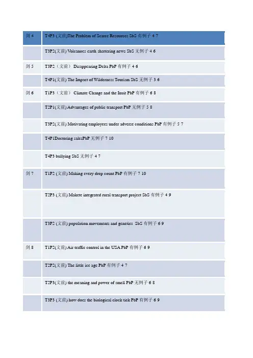
最全雅思示意图题写作
- 格式:doc
- 大小:789.50 KB
- 文档页数:12
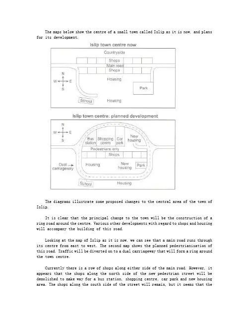
The maps below show the centre of a small town called Islip as it is now, and plans for its development.The diagrams illustrate some proposed changes to the central area of the town of Islip.It is clear that the principal change to the town will be the construction of a ring road around the centre. Various other developments with regard to shops and housing will accompany the building of this road.Looking at the map of Islip as it is now, we can see that a main road runs through its centre from east to west. The second map shows the planned pedestrianisation of this road. Traffic will be diverted on to a dual carriageway that will form a ring around the town centre.Currently there is a row of shops along either side of the main road. However, it appears that the shops along the north side of the new pedestrian street will be demolished to make way for a bus station, shopping centre, car park and new housing area. The shops along the south side of the street will remain, but it seems that thetown’s park will be reduced in size so that more new houses can be built within the ring road.(187 words, band 9)。
雅思写作万能模板:流程图题型最全汇总本文来自雅思作文网《流程图题型最全汇总》。
1.《蚕丝制作》Sample:As is displayed in the first diagram, the life cycle of the silkworm can be categorized into 4 main stages. First, the life of the silkworm starts from eggs propagated by the moth, and it takes 10 days for each egg to become a silkworm larva that feeds on mulberry leaves. Silkworm larva continues to grow in 4 to 6 weeks, then wrapping itself with silk thread to construct a cocoon in the next 3 to 8 weeks. A moth can be produced from the cocoon in 16 days. The life cycle begins again from then on.Focusing on the second diagram, it illustrates the 5 main steps of the procedure of producing silk cloth. Well generated cocoons will be selected firstly. Before the silk thread can be unwound, cocoons have to be boiled in hot water. One cocoon can produce approximately 300 to 900 metres of silk thread. The unwound thread will be dyed afterwards to be weaved into silk cloth.Overall, the two diagrams reveal the stage of producing cocoons in the life cycle of the silkworm can be used to make silk cloth through 5 simple steps.Cambridge IELTS 6 Version:The first diagram shows that there are four main stages in the life of the silk worm.First of all, eggs are produced by the moth and it takes ten days for each egg to become a silkworm larva that feeds on mulberry leaves. This stage lasts for up to six weeks until the larva produces a cocoon of silk thread around itself. After a period ofabout three weeks, the adult moths eventually emerge from these cocoons and the life cycle begins again.The cocoons are the raw material used for the production of silk cloth. Once selected, they are boiled in water and the threads can be separated in the unwinding stage. Each thread is between 300 and 900 metres long, which means they can be twisted together, dyed and then used to produce cloth in the weaving stage.Overall, the diagrams show that the cocoon stage of the silkworm can be used to produce silk cloth through a very simple process.2. 《户外取水》The chart describes how water is obtained outdoors.According to the figure, the first step of obtaining water outdoors is to find a hole with green plants on its bottom. Next, remove the green plants in the middle and put a container there. Then, cover the hole with a plastic sheet and place two stones on both ends of it to secure its position. A third stone is laid on the middle of the plastic sheet so that the middle part is also the lowest part.When the sun shines on the green plants in the hole, water evaporates from these plants. The vapor rises up and then cools down to form water drops on the plastic sheet. When there is more and more water, it flows along the sheet to accumulate on the lowest part. Finally, water falls down into the container directly under the middle stone.Thus, water is collected successfully through evaporation from green plants.3.《房屋不同季节的构造》As to the situation of cool climate, we adopt the high-angledroof in order to be nearly parallel with the direction of the sun so that the direct exposition to the heat of sun is lessened as much as we can. By this, the temperature of the material won’t fluctuate within a large range. Meanwhile, thermal building material could enhance the heat storage insulation, preventing outflow, thus reduction of heat.Adversely, in warm climate, reflective building material is indispensable with overhands for shade. The direction of the roof is almost vertical to the direction of the sun to lead to external insulation reflection. By this, ventilation would result in the removal of heat storage rather than reduction.Through the different working principles of ventilation, we are fascinated by the masterpieces of modern science and technology.4.《超市建造地点选择》As is unfolded in the map, Place M and N have their unique pros and cons as to the place for building the supermarket.First of all, Place N is located in the urban area of the G town, which may have more population and business. This advantage is incomparable with Place M. What’s more, Main road runs across the center area with convenience in traffic and logistics for the market afterwards. However, the place is equally far away from the neighborhood and the suburb area and cannot attract the residents in the outskirts.As a double-edged sword, Place M is more specifically customer-oriented. In spite of its comparably remote location with Place N, it would attract more customers in the outskirts, for they are reluctant to make a long trip for shopping. On the other hand, the train line nearby will also bring convenience in traffic to the urban-dwellers. Situated to the north-west of Place N,Place M is near the A and B Town with total population of 23 million, far outnumbering the overall population of D and E town, with 12 million.What’s worthy of being mentioned is that fierce competition in Place N and probable monopoly in Place M should also be taken into account when building the supermarket.5.《玻璃的再生》As is displayed in the flow chart, the recycling process of glass is really a complex one.The overall process can be categorized into 3 stages. First, glass products in various forms are gathered in the Collection point, so that they are easily transported by special trucks or vans to the Cleaning plant, where they get sterilization by high-pressured water. There are three different channels in the Recycling plant, namely Brown, Green and Clear, which represent the colors of glass. After recycled in the furnace, glass products are melted into recycled liquid glass. Mixed with new liquid glass, the compound is finally moulded into solid glass, which, afterwards, will be sent to various customer supermarkets for selling. Thus, the glass will go to the customers for different purposes.6.《化肥的制作》As is shown in the flow chart, the process of recycling organic waste to produce compost is really a complex one.The whole process can be categorized into five stages. First of all, prepare a plastic container which has four holes for ventilating the air. There is a rule when putting waste into the container, food at the bottom within 15 centimeters high, grass at the middle and newspaper at the top within 15 centimeters high altogether, in order to make a optimum environment fordifferent bacteria reproducing. In the following stage, we can witness nitrogen and water being put into the container. What's worth mentioning is that water is only added in a hot weather. Next, heat the waste and let the bacteria reproduce fastly, with which the organic waste can be decomposed and became garden fertiliser after 6 months. Subsequently, we can carry the compost out and move it to the garden, thus a new recycling can begin.In conclusion, using this way to turn the organic waste into garden fertiliser is environmentally friendly. By enlarging the number or volume of the container, we can dispose more waste at the same time.7.《美国黄石公园植被恢复》(暂无范文)8.《咖啡的制作》(暂无范文)雅思写作网站(https://m./ielts/zuowen/)欢迎您再来拜读《流程图题型最全汇总》一文.。

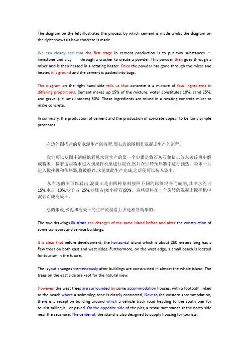
The diagram on the left illustrates the process by which cement is made whilst the diagram on the right shows us how concrete is made.We can clearly see that the first stage in cement production is to put two substances –limestone and clay –through a crusher to create a powder. This powder then goes through a mixer and is then heated in a rotating heater. Once the powder has gone through the mixer and heater, it is ground and the cement is packed into bags.The diagram on the right hand side tells us that concrete is a mixture of four ingredients in differing proportions. Cement makes up 15% of the mixture, water constitutes 10%, sand 25%, and gravel (i.e. small stones) 50%. These ingredients are mixed in a rotating concrete mixer to make concrete.In summary, the production of cement and the production of concrete appear to be fairly simple processes.左边的图描述的是水泥生产的流程,而右边的图则是混凝土生产的流程。
雅思小作文地图题给分【篇一:雅思小作文地图题】雅思小作文题型多样,其中就包括地图题,本文将详细讲解雅思小作文地图题写作技巧。
评分标准?ta – task achievement 任务完成情况?cc – coherence and cohesion 意合与形合?lr – lexical resource 词汇资源?gra – grammatical range and accuracy 语法广度与精确度审题the map below shows the development of the village of ryemouth between 1995 and present.文章结构第一段第二段描述1995年的地图第三段拿现在的地图和95年的做比照第四段总结全文第一段this report compares how the village of ryemouth has developed and changed since the year of 1995.题目:the map below shows the development of the village of ryemouth between 1995 and present.第二段as is clearly described in the first picture, ryemouth was a coastal city which was divided into three parts by two roads. in the southern part, there was a fishing port on the sea, with a fish market located in the north and a coffee shop in the north-east. a block of shops was situated on the opposite side of the market?第三段in the second picture, the village changed a lot. the fishing port has been removed and the fish market is replaced by apartments. several restaurants also occupy the place of the shops on the roadside. moreover, a parking lot is newly built on the east of the hotel. in addition, ?第四段overall, based on the brief description above, it is clear that the general layout of the village does not change a lot, while some newly-built facilities and housing has ornamented the small village.writing task 1you should spend about 20 minutes on this task.the diagram below shows the development of the village of kelsby between 1780 and 2000.summarise the information by selecting and reporting the main features, and make comparisons where relevant.write at least 150 words.新东方樊黎明:a类雅思地图题写作攻略首先注意两个点:1. 时态:本文的时间是明确的,是三个过去的时间,因此全文应当使用一般过去时。
雅思小作文流程图类题目范文及解析雅思小作文流程图类题目范文及解析,一起来学习一下吧,下面就和大家分享,来欣赏一下吧。
雅思小作文流程图类题目范文及解析雅思小作文流程图类题目范文及解析为大家带来雅思小作文当中一类较有难度的图表——流程图类的小作文的范文以及解析。
流程图顾名思义就是对某一有时间和步骤先后顺序的行为进行步骤的拆解,并配上相应的文字和解说而生成的图表。
我们在处理流程图类图表作文是应该怎么写,请看下文。
上图来自网络主题:家居设计题型:流程图The diagrams below show some principles of house design for cool and for warm climates.满分范文:The diagrams show how house designs differ according to climate.这些图表显示房子的设计因气候而不同。
The most noticeable difference between houses designed for cool and warm climates is in the shape of the roof. The designs also differ with regard to the windows and the use of insulation.为凉爽和温暖气候设计的房子之间最明显的区别是屋顶的形状。
在窗户和保温材料的使用方面,设计也有所不同。
We can see that the cool climate house has a high-angled roof, which allows sunlight to enter through the window. By contrast, the roof of the warm climate house has a peak in the middle and roof overhangs to shade the windows. Insulation and thermal building materials are used in cool climates to reduce heat loss, whereas insulation and reflective materials are used to keep the heat out in warm climates.我们可以看到凉爽的气候房子有一个高角度的屋顶,它允许阳光通过窗户进入。
一.图表写作常用模板Para1. This is a table / chart / (line线状bar柱状pie饼状)graph which demonstrate / illustrate / reveal /depict /privide information about.............Para2. (1)Obvious /Apparent from the graph is that ...rank thefirst/highest,while/whereas ....turn out to be the lowest(2)It is exhibited/shown in the table that.....(3)It can be seen from the table that.....Para3.(1)饼.柱图A,which accounts for...%,ranks the first;then next is B with...%;followed by C,constituting...%;finally it comes D.E.F at...%...%and...%respectively(2)特殊变化(不变,增长或下降多的)①It is worth mentioning that....②It must be pointed out that....③More striking/surprising is that....Para4.To conclude /In conclusion/overall雅思写作图表作文标准化结构样本仅供参考Para 1, 两句话:第一句:This is a _____chart, which demonstrates the number of_____ from ____ to ____. 如果两个图,则:There are two charts below. The _____ chart describes the number of _____, and the _____ chart illustrates the figure of ____. 第二句:(所有题目适用),From the chart we can see that the number of ______ varies constantly/greatly in _____.Para 2, As we can see from the chart,/or It is clear from the chart that ____.如果有两个图:则:The _____ chart shows that ______./or As we can see from the first chart, _______Para 3, (如果两个图的话,) It is clear from the second chart that …Para 4 结尾:From the figures/statistics above, we can see/conclude/draw a conclusion that …二.应注意事项DON'T copy any part of the question in your answer. This is not your own work and therefore will be disregarded by the examiner and deducted from the word count. You can use individual words but be careful of using long "chunks" of the question text.Don't repeat yourself or the same ideas. This gives a bad impression and the examiner realises that it isn't adding to the content of your report.If you are weak at English grammar, try to use short sentences. This allows you to control the grammar and the meaning of your writing much more easily and contributes to a better cohesion and coherence mark. It's much easier to make things clear in a foreign language if you keep your sentences short!Think about the tenses of your verbs. If you're writing about something that happened in the past, your verbs will need to be in the past tenses. If you're describing the future, you will need to use the future tenses. If it's a habitual action, you'll need the present simple tense and so on. If you have time, a quick check of your verbs at the end of the exam can help you find errors. For describing graphs you will probably need past tenses whereas, for describing a process, you will probably need the present simple. Think about the verbs while practising and then it will become easier when you do the exam.As I just said, if you have finished the exam with time to spare, DON'T just sit there!! Check what you have done. If you have time after the check, check again. And so on……Don't be irrelevant. Although you can use your imagination to expand on your answer, if any part of your report is totally unrelated to the question and put in to just put up the word count, then the examiner will not take it into account and deduct it from the word count.If you want to improve, there's no secret. Practice. Practice. Practice. You won't get better sitting and doing nothing. Even good English users need practice for the IELTS exam. It could make all the difference between your getting the band that you need, and getting half a band less than you need and having to wait 3 months to do the exam again.三.写作范文雅思TASK1图表写作套句精选50句1.the table shows the changes in the number of...over the period from...to...该表格描述了在...年之...年间...数量的变化。
雅思写作小作文范文雅思写作地图题map 楼层改造今天我们雅思写作小作文范文的文章来研究下地图题。
题目中展示了某家画廊同一楼层在整修之前和整修之后的平面图。
在整体面积不变的情况下,永久展示区的面积明显增大,临时展示区彻底消失,添加了新的特别展示区,并且改变了入口的位置。
那么如何用英语描述这些改变呢?小编搜集了一篇相应的考官范文,以供大家参考。
雅思写作小作文题目The diagrams below are existing and proposed floor plans for the redevelopment of an art gallery.Summarise the information by selecting and reporting the main features, and make comparisons where relevant.雅思写作小作文范文The first picture shows the layout of an art gallery, and the second shows some proposed changes to the gallery space.第一张图片展示了一个画廊的布局,第二张图片展示了画廊空间一些建议的改变。
It is clear that significant changes will be made in terms of the use of floor space in the gallery. There will be a completely new entrance and more space for exhibitions.很明显,在如何使用画廊空间上有巨大的改变。
将会有一个崭新的入口,同时展览也会有更多的空间。
At present, visitors enter the gallery through doors which lead into a lobby. However, the plan is to move the entrance to the Parkinson Court side of the building, and visitors will walk straight into the exhibition area. In place of the lobby and office areas, which are shown on the existing plan, the new gallery plan shows an education area and a small storage area.现在,游客通过通向大厅的门来进入画廊。
雅思图表作文雅思图表作文讲义李燕飞I. 雅思图表的5种类型:1)table 表格题2)line graph 线图(直线图和曲线图)3)bar chart 柱状图(条形图)4)pie chart 饼状图5)process diagram 流程图II. 雅思图表写作的文体特点:1.Examples:1) Consumption has fluctuated since 1990 but both now provide 24q. Coal is predicted to increase steadily to 31q in 2030, whereas after 2014, gas will remain stable at 25 q.2) These causes affected different regions differently in the 1990s, with Europe having as much as 9.8% of degradation due to deforestation, while the impact of this on Oceaniaand North America was minimal, with only 7.1% and 0.2% of land affected respectively.Europe, with the highest overall percentage of land degraded (23%), also suffered fromover-cultivation (7.7%) and over-grazing (5.5%). By contrast, Oceania had 13% ofdegraded farmland and this was mainly due to over grazing (11.3%).2.Model writing:The line graph shows the information aboutUK radio and TV audience over 4 years old through the day (6am to 6am the next day) in the period from October to December, 1992.As can be seen from the line graph, the size of the TV audience fluctuated over the 24 hours. From 6am to 8am it experienced a slight rise from around 4% of the UK population over four years old to about 7%. From 8am to midday, the figure remained stable. After that, thee proportion of people watching TV in the UK rose sharply until 8pm, peaking at just over 43%. The figure then fell back to around 4% by 6am the next morning.The size of the radio audience also experienced significant fluctuations over the same period. However, unlike the TV audience, the size of the radio audience increased rapidly from 6am (with about 7% of the British population over 4 years old listening to the radio) to 8am, reading its peak at 27%. Over the next 22 hours, the figure saw a consistent decrease, with the exception of a slight rise from 11% at4pm to 14% at 5pm.It is clear that before 2pm, the proportion of people listening to the radio in the UK was higher than the proportion of people watching TV. After that, more people in the UK watched TV. Overall, in these 24 hours, the size of the TV audience was lager than that of the radio audience.2. 图表写作的特点:1)客观性:2)准确性:数据力求精确;合理目测和估计。
. . 一 The diagram below shows how a water tower works.
Summarise the information by selecting and reporting the main features and make comparisons where relevant.
A water tower consists of a large tank (D), which contains water and which is raised high enough above ground to provide the necessary level of water pressure for a community. The tank is connected to the water system's primary feeder pipes (C) by a vertical pipe. Drinking water for a town is first treated in a water treatment plant (A) to remove sediment and bacteria. A pump (B) then sends it via the primary feeder pipes to the customers (E). If the community demands more water than the pump can supply, the water flows out of the tank to meet the need. . . 二 The diagram below shows how a thermos flask works.
Summarise the information by selecting and reporting the main features and make comparisons where relevant.
The thermos flask is used to keep the liquids and remain the temperature. Its most common use is to keep hot drinks, for example coffee, hot but you can also use it to keep things like milk cold.
A thermos flask is a cylinder-shaped object between 30 and 40 cm high. The inside of the thermos flask is a flask made of glass. There is . . nearly no air inside this glass, so it is a very poor conductor. In addition, the glass is silvered, which reduces infrared radiation. This vacuum flask is surrounded by another cylinder made of metal or plastic, which protects the fragile glass inside.
The top is a plug or cap, usually made of cork or plastic, which is covered by a plastic cup. This is taken off and used to drink the liquid from. Some heat escapes from the cap but the special design of the thermos flask means that liquid maintains its temperature for several hours.
三 The diagrams below show some principles of house design for
cool and for warm climate.
Summarise the information by selecting and reporting the main features and make comparisons where relevant. .
. The diagrams illustrate how climate influences the design of houses. It can be noticed that the roof, windows and building materials of houses in cool and warm climates are considerably different.
In cool climates, special attention is given to the use of building materials that can store heat, and insulation is used on the outside of the house to avoid heat loss. Careful positioning of the building and large windows facing winter sunlight also assist to passively heat the house. The roof has an extreme angle to assist the snow to run off and roof overhang does not interfere with sunlight. . . Houses in warm climates require the opposite approach. Insulation and reflective roof material aim to keep heat from the sun out. Windows are placed under a wider roof overhang so that they are shaded from direct light in the day and so that cooler night air can move through the house when the windows are open.
四 The diagram below shows how river speed affects the pollution
in the river.
Summarise the information by selecting and reporting the main features and make comparisons where relevant. .
. The diagram shows the ways in which the pollution in the river is affected by river speed.
In the upper stream of the river where water moves fast, pollutants from both industry and farming tend to float and are carried downstream by the rushing river water. Because of the fast speed at which these pollutants travel in the river, they cannot reach the bottom and therefore become part of the silt on the river bed.
At the mouth of the river, however, due to the low speed at which they travel, pollutants from industry and farming are forced to descend and deposit in the mud at the river bottom. Pollutants from industry are obviously heavier and therefore can be found at the far side from the sea, while agricultural pollutants are lighter and are carried further to the part of the river mouth where they are absorbed by sea grasses and become part of the food or nutrients for those plants.
五 The diagrams below show how humans and plats interact to
produce oxygen and carbon dioxide.
Summarise the information by selecting and reporting the main features and make comparisons where relevant.