如何用英语阐述图表信息
- 格式:docx
- 大小:12.93 KB
- 文档页数:1
大学英语写作“图表描写”常用句型第一篇:大学英语写作“图表描写”常用句型大学英语写作“图表描写”常用句型大学英语写作“图表描写”常用句型描写图表不是要考生把图表中的数据全部写出来。
由于数据只起说明问题的材料作用,因此要对其有所挑选。
一个不漏地描述数据,不仅会让读者感到你的表达冗长、枯燥,而且会感觉你的表述不得要领,偏离重点。
因此,只要把最能说明问题的数据描述出来就可以了。
要做到对数据的描写有针对性,就必须用一句话把图表中所反映的问题或现象或趋势归纳出来,尽量放在文章开头表达清楚,这样做有一针见血之功能,也便于下面引用数据来阐述。
1.According to(As can be seen from / As shown in / It is clear / apparent from)the chart(graph / table / diagram / figure / statistics), ……2.The chart(graph / table / diagram)reveals(shows / suggests)that ……3.From the statistics(information)given in the table(graph / chart), we can estimate(see / conclude)t hat ……4.The number(percentage / figure)of …… nearly(almost)doubled, as compared withthat of last year.5.The figure(number / percentage)increased(dropped / decreased)more than(almost / about)six times(twice)compared with…6.The percentage(number)is twice(4 times / half)as much as that(those)of 1990.7.The rate(number)was X percent, less(more)than a half(third / quarter)of the 1998total.8.By comparison with 1990, it shot up(jumped / increased / rose / decreased / dropped /fell)by X percent(from X to Y percent / to X percent).9.By 1998, less than(more than / almost / about / over / as many as / nearly)three-quarters of(X percent of / one out of five / one in four / one half of)housewives(graduates / young couples / the number of students).10.A has almost(nearly / about / over)a quarter / half / twice / one third)as manystudents as(as much money as)B.11.During the period 1970—1999(From 1910 to 1974 / Since 1980 / Since the early 1980s)there was(has been)sudden jump(sharp rise / dramatic increase / a marked fluctuation / steady decrease / slight decline / gradual reduction / fall)in the number of people who… / personal income / college population.第二篇:考研英语写作漫画图表常用句型九.考研英语写作漫画图表常用句型列举几个常用于描述漫画的句式:1.The cartoon/picture briefs/depicts/shows...例句:The cartoon briefs the history of commercial fishing in the 20th century.2. In the picture,...例句:In the picture, an American girl looks so pleased in the richly decorated Chinese national costumes.3.Looking at the picture,...例句:Looking at the picture, many people cannot help laughing....4....。
学术英语图表描述范文英文回答:Chart Description.The provided chart illustrates the average number of visitors to a particular national park over a six-year period. The data is presented in a bar graph, with the X-axis representing the year and the Y-axis representing the number of visitors in millions.The chart reveals a steady increase in the number of visitors to the park over the six-year period. In 2015, the park received approximately 2 million visitors. This number rose to around 2.5 million in 2016 and continued to increase each year thereafter. In 2020, the park welcomed an estimated 3.5 million visitors, marking a significant increase from the previous year.It is evident from the chart that the number ofvisitors to the park has grown substantially since 2015. This growth trend suggests that the park is becoming increasingly popular, possibly due to factors such as improved accessibility, increased marketing efforts, or the introduction of new attractions and facilities.中文回答:图表描述。
图表型说明文英语范文英文回答:## The Power of Charts: Unveiling the Insights in Data.Charts are visual representations of data that simplify complex information and make it more accessible and understandable. They play a crucial role in data analysis, enabling us to identify patterns, trends, and relationships that would otherwise be difficult to discern from raw data alone.### Types of Charts.There are numerous types of charts, each suited to specific data types and analysis purposes. Some common types include:Bar charts: Represent data as vertical or horizontal bars, with the length of the bars indicating the value ofthe data points.Line charts: Connect data points with lines, showing the trend or progression of data over time or with respect to other variables.Pie charts: Divide data into slices representing different categories' proportions.Scatter plots: Plot individual data points as dots on a coordinate plane, highlighting the relationship between two variables.Histograms: Display the distribution of data bydividing the range into bins and showing the frequency of occurrence within each bin.### Benefits of Using Charts.Charts offer several advantages over raw data:Improved comprehension: Visualizing data makes iteasier to understand patterns, trends, and relationships than reading numerical tables.Easy identification of outliers: Charts can highlight unusual data points that may represent errors orsignificant deviations from the norm.Facilitate comparisons: Charts allow for quick and easy comparisons between different datasets or data subsets.Enhance presentations: Charts can make presentations more visually appealing and engaging, enhancing the audience's understanding of the data.### How to Create Effective Charts.Creating informative and visually effective charts requires careful attention to the following principles:Choose the right chart type: Select the chart type that best suits the data and analysis objectives.Use clear labels: Label axes, titles, and legendsclearly and concisely to guide readers through the chart.Ensure appropriate scale: Use a scale that accurately represents the range of data and avoids distorting the patterns.Highlight important features: Use color, size, or other visual cues to emphasize key insights or areas of interest.### Conclusion.Charts are a powerful tool for data analysis and communication. They transform complex numerical data into visual representations that reveal insights, facilitate understanding, and support informed decision-making. By understanding the different types of charts, their benefits, and best practices for creating them, we can harness the power of charts to unlock valuable insights from data.中文回答:## 图表的力量,揭示数据中的见解。
1.我们可以从图表上看出:托雅的女生比例远远高于男生所占比例。
As can be seen from the chart, the percentage of female students was far higher than that of male students at Toya.2.从图表反映的情况来看:读雅思的人数远远超过读托福的,同时,读托福的人数一直呈现平稳上升趋势。
As can be seen from the chart, those who chose to study for IELTS far outnumbered those choosing to study for TOEFL. Meanwhile, the number of those who chose to study for TOEFL was on a steady rise.3.从图表反映的情况来看:托雅学生在饭店用餐的频率在不同的月份呈现出了相应的波动趋势。
As can be seen from the diagram, the frequency of Toya students eating at restaurants revealed a trend of fluctuations in different months.4.从图表反映的情况来看:托雅男教师所承担的每周工作量要高于女教师的。
As can be seen from the charts, the weekly workload borne by male teachers outweighed that of female teachers at Toya.5.从整个图表反映的情况来看:托雅总部以及五个分校的营业收入都呈现出了快速的增长趋势。
As can be seen from the chart, the sales of Toya Headquarter and the five branch schools all revealed a trend of fast increase across the board.6.从整个图表反映的情况来看:托雅教师的收入状况呈现出了稳步增长的总态势。
如何用英语描述统计图范文Describing a Statistical Graph in English.Statistical graphs are visual representations of numerical data that allow us to quickly identify patterns, trends, and relationships between different variables. They are a crucial tool in data analysis, research, and presentations. Describing a statistical graph effectively in English requires clarity, precision, and the ability to communicate complex information in a simple and understandable manner.1. Introducing the Graph.Begin by briefly introducing the graph and its purpose. Describe the type of graph it is (e.g., bar chart, line graph, pie chart, scatter plot) and the general topic or dataset it represents. For example:"In this line graph, we can see a visual representationof the annual sales figures for a particular company over a five-year period. The graph illustrates the fluctuations in sales over time and allows us to identify any patterns or trends in the data."2. Describing the Axes.Next, describe the axes of the graph, explaining what each axis represents and the units used. This is crucialfor understanding the scale and context of the data. For instance:"The horizontal axis, labeled 'Year,' represents the time period over which the sales data was collected, ranging from 2018 to 2022. The vertical axis, labeled'Sales Amount,' shows the total sales figures in millions of dollars. Each bar on the graph corresponds to a specific year, and its height indicates the sales amount for that year."3. Describing the Data Points.Describe the data points presented in the graph, highlighting any significant changes, patterns, or outliers. Use specific examples and quantitative details to support your analysis. For example:"In 2018, the company recorded sales of approximately $15 million. Over the next few years, sales gradually increased, peaking at $22 million in 2020. However, in 2021, sales dipped slightly to $20 million, possibly due to external factors such as market competition or economic fluctuations. Despite this dip, the overall trend suggestsa steady growth in sales over the five-year period."4. Analyzing Trends and Patterns.Analyze any trends or patterns in the data, discussing possible reasons or implications. Link these trends to the overall context or purpose of the graph. For instance:"The upward trend in sales from 2018 to 2020 could be attributed to effective marketing strategies, new product launches, or an expanding customer base. However, theslight dip in 2021 might indicate a need for the company to reevaluate its marketing strategies or consider new approaches to maintain and grow its sales."5. Drawing Conclusions.Conclude by summarizing the key findings and insights from the graph. Link these findings to the broader context or purpose of the analysis. For example:"Overall, this line graph provides valuable insights into the sales performance of the company over a five-year period. The steady growth in sales, despite a slight dip in 2021, suggests that the company is heading in a positive direction. However, to sustain this growth, it might need to continuously innovate and adapt its strategies to changing market conditions."Remember, when describing a statistical graph in English, it's important to maintain clarity and precision while also ensuring that your language is accessible and engaging. Use specific examples, quantitative details, andanalytical insights to support your description and make the graph come alive for your reader.。
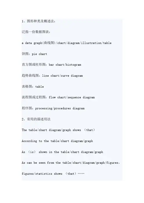
1、图形种类及概述法:泛指一份数据图表:a data graph(曲线图)/chart/diagram/illustration/table饼图:pie chart直方图或柱形图:bar chart/histogram趋势曲线图:line chart/curve diagram表格图:table流程图或过程图:flow chart/sequence diagram程序图:processing/procedures diagram2、常用的描述用法The table/chart diagram/graph shows (that)According to the table/chart diagram/graphAs (is) shown in the table/chart diagram/graphAs can be seen from the table/chart/diagram/graph/figures,figures/statistics shows (that)……It can be seen from the figures/statisticsWe can see from the figures/statisticsIt is clear from the figures/statisticsIt is apparent from the figures/statisticstable/chart/diagram/graph figures (that)……table/chart/diagram/graph shows/describes/illustrates 3、图表中的数据(Data)具体表达法数据(Data)在某一个时间段固定不变:fixed in time在一系列的时间段中转变:changes over time持续变化的data在不同情况下:增加:increase/raise/rise/go up ……减少:decrease/grow down/drop/fall ……波动:fluctuate/rebound/undulate/wave ……稳定:remain stable/stabilize/level off ……二、相关常用词组1、主章开头图表类型:table(表格)、chart(图表)、diagram(图标)、graph(多指曲线图)、column chart(柱状图)、pie graph(饼图)、tree diagram(树形图)描述:show、describe、illustrate、can be seen from、clear、apparent、reveal、represent内容:figure、statistic、number、percentage、proportion2、表示数据变化的单词或者词组rapid/rapidly 迅速的,飞快的,险峻的dramatic/dramatically 戏剧性的,生动的significant/significantly 有意义的,重大的,重要的sharp/sharply 锐利的,明显的,急剧的steep/steeply 急剧升降的steady/steadily 稳固的,坚定不移的gradual/gradually 渐进的,逐渐的slow/slowly 缓慢的,不活跃的slight/slightly 稍微的、略微地stable/stably 稳定的3、其它在描述中的常用到的词significant changes 图中一些较大变化noticeable trend 明显趋势during the same period 在同一时期grow/grew 增长distribute 分布unequally 不相等地in the case of 在……的情况下in terms of/in respect of/regarding 在……方面in contrast 相反,大不相同government policy 政府政策market forces 市场力量measuren n.尺寸,方法,措施v.估量,调节forecast n.先见,预见v.猜测三、图表描述套句精选1.the table shows the changes in the number of……over the period from……to……该表格描述了在……年之……年间……数量的变化。
图表描述英语范文描述图表的英语写作是怎么写的,不妨看看别人的写作情况。
下面是店铺给大家整理例文的图表英语范文,供大家参阅!图表描述英语范文:Investment in Beijing不同国家和地区在京投资Investment in Beijing from different countries and regions From the pie chart given above, we can observe that it reflects the statistics of investmentin Beijing from different countries and regions. The proportion of investment from Hong Kongaccounts for 44%, ranking first. The percentage of investment from other 23 countries andregions ranks second among all, making up 20.8 %. Japan occupies 19.2%, ranking third. Whenit comes to the U.S.A., we can find that it takes up 16% , 28% lower than that of Hong Kong.The pie chart reveals the phenomenon that most of the investment in Beijing stem fromHong Kong. What exactly contribute to this phenomenon? Reasons can be listed as follows:in the first place, China's investment policy provide preferential treatment to investors fromHong Kong. They are more likely to be immune to high taxes and other charges. Moreover,quite a few Hong Kong investors hold the opinion that, with the same language, cultures,traditions and customs, mainland is an ideal and promising investment resort which will bebound to generate considerable profits. Last but not least, it will not take a long time tocommute between Hong Kong and Chinese mainland, the region advantage also has attractedmore Hong Kong investors to locate their companies and factories in the mainland.The public can benefit a lot from Hong Kong investment.People can buy products withsuperior quality at a comparatively cheaper price. However, balancing the investmentproportion from different countries is also a issue needed to be put at the top of relevantadministration departments’ agenda. Thus, people can be exposed to a greater variety ofproducts and have more purchasing options. (272 words)图表描述英语范文:坐下来餐厅发展趋势快餐和坐下来餐厅发展趋势The development tendency of fast food and sitdown restaurantFrom the curve chart given above, we can observe that the number meals of fast food andsitdown restaurant experienced some changes during the past several years. The number ofmeals of fast food increased slowly from 20 in 1970 to nearly 30 in 1980. From 1980 to 2000, itascended rapidly from 30 to approximately 90. On the contrary, when observing thestatistics of sitdown restaurant meals, we can find that it increased slowly from 20 in 1970 toroughly 50 in 2000.The curve chart informs us of the phenomenon that there exists some difference in thedevelopment tendency between fast food and sitdown restaurants. What exactly contributeto this phenomenon? Reasons can be listed as follows: for one thing, with the pace of modernlife quickening, people barely have much time to waste in lining up for restaurant meals, on thecontrary, fast food meals can do help busy people save a great deal of time. Additionally, theauthorities have issued some preferential policies to protect and encourage the rapidextension of fast food industry , thus the public can buy fast food at shops scattering aroundthe city. On the contrary , people in diminishing numbers are willing to eat at sitdownrestaurant. They think that eating atrestaurant is always time-consuming and inconvenient.Besides, food at restaurant is comparatively expensive than fast food.by observing the trend of the past, we may forecast that the number of fast food mealswill continue to rise in the years to come. However, we should also take the detrimental impactof fast food into consideration. Do remember that fast food is one of the main causing factorsof diseases such as heart attack, obesity and diabetes.图表描述英语范文:The changes of Chinese中国职业的变化The changes of Chinese professionsFrom the pie chart given above, we can observe that the professions structure of Chinesepeople experienced some changes during the past several years. From 1980 to 1999, thepercentage of agricultural professions decreased by 30% from 68% to 38%. During the sameperiod, however, service sectors increased rapidly from 5% to 22%. When it comes to themanufacturing professions, its percentage rose markedly from 27% in 1980 to 40% in 1999.The pie chart reveals the phenomenon that there exists some difference in thedevelopment tendency among different professions in China. What exactly contribute to thisphenomenon ? reasons can be listed as follows: for one thing, with the rapid process ofurbanization, people in mounting numbers, especially youngster, have left their village homes,moved into big cities and thus been out of agricultural industries. Moreover, quite a few people,especially college graduates hold that it is comparatively easy for them to make more money inthe service industry. When it comes to the manufacturing industry, its transformation mightbe attributed tothe adjustment of industrial structure: the authorities have issued somepreferential policies to promote the rapid extension of manufacturing industry, thus, moreworkforces are required.By observing the change over the past several years, we may forecast that theproportion of professions of service and manufacture will continue to rise. However, a highvalue should be placed on the development of agricultural industry by the public and theauthorities. Otherwise, with the number of people who are engaged in agriculture diminishing,we will one day have nothing to eat! (262words)图表描述英语范文:Different job inclination between boys and girls职业选择Different job inclination between boys and girlsFrom the bar chart given above, we can find that it reflects the statistics of professioninclination between girls and boys. Most obviously, 40% of boys intend to be a manager, withonly 15% of girls choosing this job. When it comes to the profession of teacher, we canobserve that 45% of girls prefer to take this job, while the proportion of boys only accountfor 5%, 40% lower than that of girls.The bar chart informs us of the phenomenon that there exists some difference inprofession inclination between boys and girls. What exactly contribute to this phenomenon? reasons can be listed as follow: for one thing, quite a few boys regard being a manager as asymbol of success. As this profession stands for promising futures, fat pay and competence.Moreover, boys’ decision to be a manager can also be attributed to the power of so-called“group dynamics”: whe n members of their social network prefer to be a manager aftergraduation, they are easilyinfluenced and imitate others’ behavior unconsciously orconsciously. When it comes to girls, the are more inclined to be a teacher. As this professionfeatures stability and respect. Take social and biological factors into account, we know that itis reasonable for girl to choose teacher as their ideal profession goals.Both girls and boys have rights to choose their profession. However, one thing we shouldbear in mind is that there exists no better or worse, superior or inferior jobs, but suitableand satisfactory ones. (254words).图表描述英语范文:大气污染空气污染范文Writing (图画提纲式议论文)1. Describe the picture2. Deduce the purpose of the drawer of the picture3. Suggest your counter – measures范文:The cartoon presents the Earth with a personified human face that seems quite unhappy.A examination of the picture immediately reveals that the source of its mood is the airpollution resulting from a huge number of automobiles spread around its surface.The cartoon, no doubt, aims at alarming humans of the heavy load we have exerted onEarth by our insatiable production and usage of automobiles. However, the majority of peoplemerely indulge in the celebration of the convenience brought by cars, while forgetting orsimply neglecting their harmful impact on the atmosphere. Admittedly, there are various factorscontributing to the current worldwide air pollution, but it is undeniable that the exhaustfrom automobiles is categorized asone of the major elements.I would like to make the following proposals to solve this problem: firstly, we should applythe most cutting-edge technologies in order to adopt new forms of energy as substitutes forfossil fuels. It should also be guaranteed that the clean energy be inexpensive so that it can bewidely accepted. Besides, there should be attempts to develop possible transportation means,so that citizens can be diverted from dependence on cars. In short, it is humans'responsibility to resume clean air for Earth.译文:这幅漫画以拟人的方式呈现地球,它的脸显得非常不高兴。
从图表中提取信息的英语作文Well, let's dive straight into the chart details.First up, that bar graph is really easy to digest. It shows the sales of different products over the past year. Look at that, the blue bar representing smartphones is way taller than the others. That tells me people are reallyinto their mobile technology.Moving on to the pie chart, I see how the budget is distributed. Education takes a big slice, which is good to see. But that entertainment section is quite substantial too. Maybe we should rethink how we're spending our money.Now, this line graph is quite interesting. It shows the temperature changes over the past decade. See how it's been steadily increasing? That's a clear sign of climate change, and we need to do something about it.And finally, the scatter plot. It's a bit more complex,but I can see a pattern here. As the number of hours spent on social media increases, so does the level of stress. Hmm, maybe we should all take a break from scrolling sometimes.So, in summary, the charts give us a lot of insightinto different areas of our lives. Whether it's sales data, budget allocation, climate trends, or social media habits, these visual representations make it easy to spot trendsand patterns that might otherwise be missed.。
图表英文作文描述1. The bar chart shows the percentage of students participating in different extracurricular activities. It's clear that the most popular activity among students is sports, with nearly 60% of students participating. This is followed by music, which attracts around 30% of students. Other activities, such as art, drama, and debate, have much lower participation rates, ranging from 5% to 10%.2. The line graph illustrates the changes in average temperature over the course of a year. As expected, there is a clear seasonal pattern, with temperatures peaking in the summer months and dropping to their lowest point in winter. However, what's interesting is the gradual increase in average temperature over the years. This suggests along-term warming trend, which is a cause for concern regarding climate change.3. The pie chart provides a breakdown of the sources of air pollution in a city. It's alarming to see that themajority of pollution comes from transportation, accounting for over 50%. This is followed by industrial emissions, which contribute around 30% to the overall pollution. Other sources, such as residential activities and agriculture, make up the remaining percentage. This data highlights the need for stricter regulations on transportation andindustry to improve air quality.4. The scatter plot displays the relationship between hours of studying and exam scores. Interestingly, there seems to be a positive correlation between the two variables. As the number of hours spent studying increases, so does the exam score. However, it's important to notethat this correlation does not imply causation. Other factors, such as natural aptitude or study techniques, may also play a role in determining exam performance.5. The table presents the statistics on population growth in different countries. It's evident that some countries are experiencing rapid population growth, while others are facing population decline. For example, China and India have the largest populations and continue to growsteadily, while Japan and Germany have negative growth rates. This data underscores the need for effective population management policies to address the challenges associated with population growth or decline.6. The line graph depicts the fluctuations in stock prices over a certain period of time. It's clear that the stock market is highly volatile, with prices constantly fluctuating. This volatility can be attributed to various factors, such as economic conditions, investor sentiment, and geopolitical events. As a result, investing in the stock market carries inherent risks and requires careful analysis and decision-making.7. The pie chart shows the distribution of household expenses. It's evident that the largest portion of expenses goes towards housing, accounting for nearly 40%. This is followed by transportation, which takes up around 20% of the budget. Other significant expenses include food, healthcare, and entertainment. This data highlights the importance of budgeting and making informed financial decisions to ensure a balanced and sustainable lifestyle.。

英语图表作文模板在英语学习中,图表作文是一种常见的题型。
通过图表作文,我们可以学会如何描述图表、分析数据、比较差异、总结规律等。
下面是一个英语图表作文的模板,希望能够帮助大家更好地应对这类题型。
首先,我们需要介绍图表的来源和类型。
例如,我们可以说,“Thechart/table/diagram provides information about…”接着,我们可以简要描述图表的主要特点,包括横纵坐标的单位、数据的范围、时间跨度等。
然后,我们可以用一两句话来总结图表呈现的主要趋势或规律。
接下来,我们需要详细描述图表中的数据。
这时,我们可以使用一些形容词和副词来描述数据的变化趋势,比如“increase, decrease, rise, fall, sharply, steadily”等。
同时,我们也可以使用一些连接词来引导句子,比如“while, whereas, on the other hand, in contrast”等,来进行数据的对比和分析。
在描述数据的过程中,我们还可以引用一些具体的数字和比例来支撑我们的观点。
比如,“the number/percentage of…has increased/decreased from…to…”或者“…is twice/three times as much/many as…”这样的句式可以让我们的描述更加具体和可信。
最后,我们需要对图表中的数据进行总结和归纳。
我们可以用一两句话来概括图表所展现的主要特点和规律,同时也可以对未来的趋势进行预测或者提出建议。
比如,“Based on the data/figures/statistics provided, it can be concluded that…”或者“According to the trend/pattern shown in the chart, it is likely that…”这样的句式可以让我们的总结更加有力和有说服力。
如何用英语描述图表2.the bar chart illustrates that……该柱状图展示了……3.the graph provides some interesting data regarding……该图为我们提供了有关……有趣数据。
4.the diagram shows (that)……该图向我们展示了……5.the pie graph depicts (that)……该圆形图揭示了……6.this is a cure graph which describes the trend of……这个曲线图描述了……的趋势。
18.the graph,presented in a pie chart,shows the general trend in……该图以圆形图形式描述了……总的趋势。
19.this is a column chart showing……这是个柱型图,描述了……20.as can be seen from the graph,the two curves show the flutuation of……如图所示,两条曲线描述了……的波动情况。
……月(年)至……月(年)……的数量基本不变。
26.the number sharply went up to……数字急剧上升至……27.the percentage of……stayed the same between……and…………至……期间……的。
如何用英语描述图表2.the bar chart illustrates that……该柱状图展示了……3.the graph provides some interesting data regarding……该图为我们提供了有关……有趣数据。
4.the diagram shows (that)……该图向我们展示了……5.the pie graph depicts (that)……该圆形图揭示了……6.this is a cure graph which describes the trend of……这个曲线图描述了……的趋势。
图表类英语作文范文图表类型的英语写作如果不擅于观察漫画的话,作文写出来可能会偏题。
下面是小编给大家带来图表类英语作文,供大家参阅!图表类英语作文范文篇 1 第一段:说明图表开篇句:As the bar chart shows, ____ during the years of ____to____.扩展句:1、As early as _____.2、Then _____ years later, ____.3、And arriving in the year ____, ____.第二段:解释图表变化原因主题句:Several factors contribute to _____.扩展句:1、______. 原(因1)2、And ______.(原因2)3、Furthermore, ______ ( 原因3)4、All these result in ____.第三段:提出解决办法结尾句:However, ____ is faced with some problems.扩展句:1、With _____, ____, the effect of which is not only discouraging, but also challenging.2、So my principle is to pay due attention to ___, but notjustto____.示范第一段:说明图表开篇句:As the bar chart shows, the number of people below the poverty line decreased dramatically during the years of 1978 to1997.扩展句:1、As early as 1978, about 250 million people were under the poverty line.2、Then seven years later, the number became three fifthsthatof1978.3、And arriving in the year 1997, the number was reducedto50millions.第二段:解释图表变化原因主题句:Several factors contribute to the sharp decrease ofthe below-poverty population.扩展句:1、The reform and opening following 1978 enabledthe peasants to become much better off. ( 原因1)2、And with the development of Chinese economy, that policy also improved city dwellers lives greatly. ( 原因2)3、Furthermore, the high-tech introduced made it possiblefor the countrys economy as a whole to take off. ( 原因3)4 、All these result in the great fall of theChinesepopulationbelow the poverty line.第三段:提出解决办法结尾句:However, a further decrease in the number of poverty-stricken people is faced with some problems.扩展句:1、With quite few employees being laid off, the effect of which is not only discouraging, but also challenging.2 、So my principle is to pay due attention to the newcomers, but not just to care for the poor, say, in remote mountain areas.范文As the bar chart shows, the number of people below thepoverty line decreased dramatically during the years of 1978to 1997. Asearly as 1978, about 250 million people were underthe poverty line.Then seven years later, the number became three fifths that of 1978.And arriving in the year 1997, the number was reduced to 50 millions.Several factors contribute to the sharp decrease of the below-poverty population. The reform and opening following1978 enabled the peasants to become much better off. And with the development of Chinese economy, that policy also improved city dwellers lives greatly. Furthermore, the high-tech introduced made it possible for the countryseconomy as a whole to take off. All these result in the great fallof the Chinese population below the poverty line.However, a further decrease in the number of poverty-stricken people is faced with some problems. With quite few employees being laid off, the effect of which is notonly discouraging, but also challenging. So my principle is topay due attention to the newcomers, but not just to care forthe poor, say, in remote mountain areas.图表类英语作文范文篇2The past years have witnessed a mounting number of Chinese scholars returning from overseas. As is lively illustrated by the column chart, the number of returnees climbed from a mere 69.3 thousand in 2008 to over 272.9 thousand in 2012, at an annual increase rate of around 50%.A multitude of factors may have led to the tendency revealed by the chart, but the following are the critical ones from my perspective. First and foremost, along with the development of Chinese economy and society, the number ofChinese studying abroad has been soaring in the past years,which has provided an expanding base for the number of returnees. In the second place, the government has enacted aseries of preferential policies to attract overseas Chinesescholars back home. Last but not least, the booming economy, science and technology in this country have generated moreattative job opportunites for scholars returning from overseas.The waves of returnees will definitely contribute to this nation’s development, since they have brought back not only advanced science and technology but also pioneering concepts of education and management. With more scholarscoming back from overseas, and with the concerted efforts ofthe whole nation, we have reasons to expect a faster rejuvenation of this country.图表类英语作文范文篇 3 一、图表类型基本单词图表类型:table( 表格)、chart( 图表)、diagram( 图标)、graph( 多指曲线图) 、column chart( 柱状图) 、pie graph( 饼图) 、tree diagram( 树形图)、饼图:pie chart 、直方图或柱形图:bar chart/histogram 、趋势曲线图:line chart/curve diagram 、表格图:table 、流程图或过程图:flow chart/sequence diagram 、程序图:processing/procedures diagram二、图表描述基本词语1、描述:show 、describe 、illustrate 、can be seen from 、clear 、apparent 、reveal 、represent2、内容:figure 、statistic 、number 、percentage 、proportion三、常用的描述句型The table/chart diagram/graph shows (that)According to the table/chart diagram/graphAs (is) shown in the table/chart diagram/graphAs can be seen from the table/chart/diagram/graph/figures ,figures/statistics shows (that)……It can be seen from the figures/statisticsWe can see from the figures/statisticsIt is clear from the figures/statisticsIt is apparent from the figures/statisticstable/chart/diagram/graph figures (that) ……table/chart/diagram/graph shows/describes/illustrates看过图表类英语范文的人还。
图表类英语作文范文图表类型的英语写作如果不擅于观察漫画的话,作文写出来可能会偏题。
下面是小编给大家带来图表类英语作文,供大家参阅!图表类英语作文范文篇1第一段:说明图表开篇句:As the bar chart shows, ____ during the years of ____to____.扩展句:1、As early as _____.2、Then _____ years later, ____.3、And arriving in the year ____, ____.第二段:解释图表变化原因主题句:Several factors contribute to _____.扩展句:1、______. (原因1)2、And ______.(原因2)3、Furthermore, ______ (原因3)4、All these result in ____.第三段:提出解决办法结尾句:However, ____ is faced with some problems.扩展句:1、With _____, ____, the effect of which is not only discouraging, but also challenging.2、So my principle is to pay due attention to ___, but notjustto____.示范第一段:说明图表开篇句:As the bar chart shows, the number of people below the poverty line decreased dramatically during the years of 1978 to1997.扩展句:1、As early as 1978, about 250 million people were under the poverty line.2、Then seven years later, the number became three fifths thatof1978.3、And arriving in the year 1997, the number was reduced to50millions.第二段:解释图表变化原因主题句:Several factors contribute to the sharp decrease of the below-poverty population.扩展句:1、The reform and opening following 1978 enabled the peasants to become much better off. (原因1)2、And with the development of Chinese economy, that policy also improved city dwellers lives greatly. (原因2)3、Furthermore, the high-tech introduced made it possible for the countrys economy as a whole to take off. (原因3)4、All these result in the great fall of theChinesepopulationbelow the poverty line.第三段:提出解决办法结尾句:However, a further decrease in the number of poverty-stricken people is faced with some problems.扩展句:1、With quite few employees being laid off, the effect of which is not only discouraging, but also challenging.2、So my principle is to pay due attention to the newcomers, but not just to care for the poor, say, in remote mountain areas.范文As the bar chart shows, the number of people below the poverty line decreased dramatically during the years of 1978 to 1997. Asearly as 1978, about 250 million people were under the poverty line.Then seven years later, the number became three fifths that of 1978.And arriving in the year 1997, the number was reduced to 50 millions.Several factors contribute to the sharp decrease of the below-poverty population. The reform and opening following 1978 enabled the peasants to become much better off. And with the development of Chinese economy, that policy also improved city dwellers lives greatly. Furthermore, the high-tech introduced made it possible for the countryseconomy as a whole to take off. All these result in the great fall of the Chinese population below the poverty line.However, a further decrease in the number of poverty-stricken people is faced with some problems. With quite few employees being laid off, the effect of which is not only discouraging, but also challenging. So my principle is to pay due attention to the newcomers, but not just to care for the poor, say, in remote mountain areas.图表类英语作文范文篇2The past years have witnessed a mounting number of Chinese scholars returning from overseas. As is lively illustrated by the column chart, the number of returnees climbed from a mere 69.3 thousand in 2008 to over 272.9 thousand in 2012, at an annual increase rate of around 50%.A multitude of factors may have led to the tendency revealed by the chart, but the following are the critical ones from my perspective. First and foremost, along with the development of Chinese economy and society, the number of Chinese studying abroad has been soaring in the past years, which has provided an expanding base for the number of returnees. In the second place, the government has enacted a series of preferential policies to attract overseas Chinesescholars back home. Last but not least, the booming economy, science and technology in this country have generated more attative job opportunites for scholars returning from overseas.The waves of returnees will definitely contribute to this nation’s development, since they have brought back not only advanced science and technology but also pioneering concepts of education and management. With more scholars coming back from overseas, and with the concerted efforts of the whole nation, we have reasons to expect a faster rejuvenation of this country.图表类英语作文范文篇3一、图表类型基本单词图表类型:table(表格)、chart(图表)、diagram(图标)、graph(多指曲线图)、column chart(柱状图)、pie graph(饼图)、tree diagram(树形图)、饼图:pie chart、直方图或柱形图:bar chart/histogram、趋势曲线图:line chart/curve diagram、表格图:table、流程图或过程图:flow chart/sequence diagram、程序图:processing/procedures diagram二、图表描述基本词语1、描述:show、describe、illustrate、can be seen from、clear、apparent、reveal、represent2、内容:figure、statistic、number、percentage、proportion三、常用的描述句型The table/chart diagram/graph shows (that)According to the table/chart diagram/graphAs (is) shown in the table/chart diagram/graphAs can be seen from the table/chart/diagram/graph/figures,figures/statistics shows (that)……It can be seen from the figures/statisticsWe can see from the figures/statisticsIt is clear from the figures/statisticsIt is apparent from the figures/statisticstable/chart/diagram/graph figures (that) ……table/chart/diagram/graph shows/describes/illustrates看过图表类英语范文的人还。
如何用英语阐述图表信息想在职场混,PPT得过关;想在外企混,PPT英语少不了。
不管你是普通职工还是公司高层,多多少少总会用到PPT做汇报,做图表,那么,如何用英语阐述会更有说服力呢?下面来学学职场中,如何恰当地阐述图表中的信息吧:描述图表信息常用表达句型:First quarter: Sales remained fairly steady throughout the months of January to March.第一季度:销售额从1月份到3月份一直都保持平稳。
Second quarter: There was a downturn in the second quarter with the sales falling to…in June.第二季度:销售额出现下降趋势,6月份降到…Third quarter: Sales rocketed in July and reached a peak in September.第三季度:7月份销售额陡增并于9月份达到峰值。
Fourth quarter: With the beginning of October, sales plummeted due to a significant drop in demands. A further decline continued into November and leveled off through the end of the year.第四季度:从10月初开始,由于需求的显著减少,销售额骤然下跌。
11月份销售额持续下降,在年底趋于平稳。
描述图表信息常用表达词Increase slightly 略微增长Increase dramatically 显著增长Decrease slowly 缓慢减少Decrease abruptly 急速减少Fluctuate mildly 轻微波动Fluctuate wildly 大幅度波动Nosedive to an all-time low 暴跌到空前最低点Reach a record high 达到历史最高点Start a spectacular ascension 开始惊人的上升/上涨Continue to skyrocket 继续飞涨Slide 逐渐降低Go up 上升;增长Go down 下降;减少原文来自必克英语/studydetail_49466682.html。
概括图表信息英语作文英文回答:The provided chart illustrates the performance of a sales team across various regions over a six-month period. The data is presented in terms of total sales volume, average deal size, and customer satisfaction ratings.Total Sales Volume.Region A consistently outperformed all other regions in terms of total sales volume. Over the six-month period, Region A generated a total of $600,000 in sales, representing approximately 45% of the team's total sales. Region B followed closely with $450,000 in sales, while Region C and Region D contributed $300,000 and $150,000, respectively.Average Deal Size.In terms of average deal size, Region D outpaced all other regions. The average deal size for Region D was approximately $5,000, compared to $4,500 for Region A,$4,000 for Region B, and $3,500 for Region C. Thisindicates that Region D was able to secure larger deals on average.Customer Satisfaction Ratings.When it comes to customer satisfaction, Region B stood out. Region B had an average customer satisfaction ratingof 4.5 out of 5, while Regions A, C, and D had ratings of4.2, 4.0, and 3.8, respectively. This suggests that RegionB was able to provide a more positive customer experience.Overall Performance.By combining the data on total sales volume, average deal size, and customer satisfaction, it can be concluded that Region A was the overall top performer. Region A not only generated the highest total sales volume but also hada strong average deal size and customer satisfaction rating.Region B came in as the second-best performer, while Region D and Region C lagged behind.中文回答:图表展示了一个销售团队在六个月内的不同地区的表现,数据包括总销售额、平均交易规模以及客户满意度评级。
概括图表信息英语作文英文回答:The given chart provides information about the numberof hours spent on various activities by people in the UK in 2019. The activities include sleeping, personal care, work, leisure and other activities. It is evident from the chart that the majority of the time is spent on sleeping and work, while personal care and leisure activities account for a relatively smaller portion of the day.According to the chart, people in the UK spend an average of 8.8 hours per day sleeping, which is the highest among all activities. This is followed by work, with an average of 7.9 hours per day. Personal care, including activities like grooming, bathing, and dressing, takes up around 1.2 hours per day. Leisure activities, such as watching TV, socializing, and hobbies, occupy approximately 3.9 hours per day. Lastly, other activities, which include commuting, household chores, and miscellaneous tasks,consume around 2.2 hours per day.It is interesting to note that the amount of time spent on work is almost equal to the time spent on sleeping. This suggests that work plays a significant role in the lives of people in the UK and takes up a considerable portion of their day. On the other hand, personal care and leisure activities, though important, are given relatively less priority in terms of time allocation.In conclusion, the chart reveals that people in the UK prioritize sleeping and work, spending the most time on these activities. Personal care and leisure activities are given less time, while other activities also consume a significant portion of the day.中文回答:给定的图表提供了2019年英国人在各种活动上花费的时间。
如何用英语阐述图表信息
想在职场混,PPT得过关;想在外企混,PPT英语少不了。
不管你是普通职工还是公司高层,多多少少总会用到PPT做汇报,做图表,那么,如何用英语阐述会更有说服力呢?下面来学学职场中,如何恰当地阐述图表中的信息吧:
描述图表信息常用表达句型:
First quarter: Sales remained fairly steady throughout the months of January to March.
第一季度:销售额从1月份到3月份一直都保持平稳。
Second quarter: There was a downturn in the second quarter with the sales falling to…in June.
第二季度:销售额出现下降趋势,6月份降到…
Third quarter: Sales rocketed in July and reached a peak in September.
第三季度:7月份销售额陡增并于9月份达到峰值。
Fourth quarter: With the beginning of October, sales plummeted due to a significant drop in demands. A further decline continued into November and leveled off through the end of the year.
第四季度:从10月初开始,由于需求的显著减少,销售额骤然下跌。
11月份销售额持续下降,在年底趋于平稳。
描述图表信息常用表达词
Increase slightly 略微增长
Increase dramatically 显著增长
Decrease slowly 缓慢减少
Decrease abruptly 急速减少
Fluctuate mildly 轻微波动
Fluctuate wildly 大幅度波动
Nosedive to an all-time low 暴跌到空前最低点
Reach a record high 达到历史最高点
Start a spectacular ascension 开始惊人的上升/上涨
Continue to skyrocket 继续飞涨
Slide 逐渐降低
Go up 上升;增长
Go down 下降;减少
原文来自必克英语/studydetail_49466682.html。