作文范文之雅思小作文真题模拟汇总
- 格式:docx
- 大小:27.87 KB
- 文档页数:21
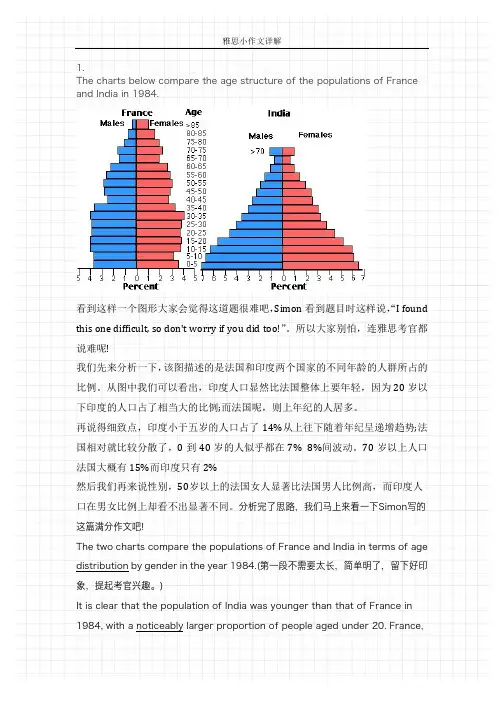
1.The charts below compare the age structure of the populations of France and India in 1984.看到这样一个图形大家会觉得这道题很难吧,Simon看到题目时这样说,“I found this one difficult, so don't worry if you did too!”。
所以大家别怕,连雅思考官都说难呢!我们先来分析一下,该图描述的是法国和印度两个国家的不同年龄的人群所占的比例。
从图中我们可以看出,印度人口显然比法国整体上要年轻,因为20岁以下印度的人口占了相当大的比例;而法国呢,则上年纪的人居多。
再说得细致点,印度小于五岁的人口占了14%从上往下随着年纪呈递增趋势;法国相对就比较分散了,0到40岁的人似乎都在7% 8%间波动。
70岁以上人口法国大概有15%而印度只有2%然后我们再来说性别,50岁以上的法国女人显著比法国男人比例高,而印度人口在男女比例上却看不出显著不同。
分析完了思路,我们马上来看一下Simon写的这篇满分作文吧!The two charts compare the populations of France and India in terms of age distribution by gender in the year 1984.(第一段不需要太长,简单明了,留下好印象,提起考官兴趣。
)It is clear that the population of India was younger than that of France in 1984, with a noticeably larger proportion of people aged under 20. France,on the other hand, had a significantly larger percentage of elderly inhabitants.(先介绍两个国家整体上最明显的对比)In India, close to 14% of people were aged 5 or under, and each five-year age bracket above this contained an increasingly smaller proportion of the population. France’s population, by contrast, was more evenly distributed across the age ranges, with similar figures (around 7% to 8% of all people) for each five-year cohort between the ages of 0 and 40. Somewhere between 10% and 15% of all French people were aged 70 or older, but the equivalent figure for India was only 2%.(详细分析两个国家差别最明显的年龄群体并以详实的数据进行描述)Looking more closely at gender, there was a noticeably higher proportion of French women than men in every cohort from age 50 upwards. For example, almost 3% of French 70- to 75-year-olds were women, while just under 2% were men. No significant gender differences can be seen on the Indian population chart.(最后不忘从性别的角度去分析人口比例的差距。
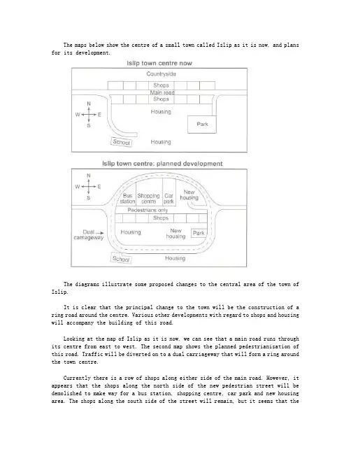
The maps below show the centre of a small town called Islip as it is now, and plans for its development.The diagrams illustrate some proposed changes to the central area of the town of Islip.It is clear that the principal change to the town will be the construction of a ring road around the centre. Various other developments with regard to shops and housing will accompany the building of this road.Looking at the map of Islip as it is now, we can see that a main road runs through its centre from east to west. The second map shows the planned pedestrianisation of this road. Traffic will be diverted on to a dual carriageway that will form a ring around the town centre.Currently there is a row of shops along either side of the main road. However, it appears that the shops along the north side of the new pedestrian street will be demolished to make way for a bus station, shopping centre, car park and new housing area. The shops along the south side of the street will remain, but it seems that thetown’s park will be reduced in size so that more new houses can be built within the ring road.(187 words, band 9)。
A类雅思写作小作文共计41篇,篇篇9分,完整覆盖了雅思a类小作文的pie,bar,line,table, diagram, map, combination7大题型,范文皆雅思前考官英国曼城人simon的手笔,此人行文风格推崇简洁明快,适合烤鸭研读模仿。
他的雅思小作文几乎都是4段式,字数一般在160左右。
一、柱状图(10)_________________________________________ 31. 柱状图:年龄分布 ___________________________________ 32. 柱状图:电子游戏 ___________________________________ 43. 柱状图:奥运奖牌 ___________________________________ 54. 柱状图:学习动机 ___________________________________ 55. 柱状图:交通事故 ___________________________________ 76. 柱状图:各地房价 ___________________________________ 77. 柱状图:日常消费 ___________________________________ 99. 柱状图:网聊耗时 __________________________________ 1110. 柱状图:电话耗时 _________________________________ 12二、饼图(4)___________________________________________ 131. 饼图-垃圾处理 _____________________________________ 132. 饼图:三地用水 ____________________________________ 153. 饼图:服务问卷 ____________________________________ 154. 饼图:游客分析 ____________________________________ 16三、流程图(8)_________________________________________ 171. 流程图:房屋保护 __________________________________ 172. 流程图:太阳能发电 ________________________________ 185. 流程图:房屋设计 __________________________________ 216. 流程图:水循环 ____________________________________ 237. 流程图:天气预报 __________________________________ 238. 流程图:三文鱼一生 ________________________________ 25四、表格(7)___________________________________________ 261. 表格:垃圾制造 ____________________________________ 262. 表格:骑车上班 ____________________________________ 273. 表格:消费开支 ____________________________________ 274. 表格:贫困家庭 ____________________________________ 285. 表格:地下铁 ______________________________________ 296. 表格:手机用途 ____________________________________ 30五、地图(3)___________________________________________ 331. 地图:村庄变迁 ____________________________________ 332. 地图:超市变迁 ____________________________________ 343. 地图:学校变迁 ____________________________________ 35六、线图(5)___________________________________________ 361. 线图:手机变迁 ____________________________________ 362. 线图:老龄人口 ____________________________________ 373. 线图:价格变动 ____________________________________ 384. 线图:企业垃圾 ____________________________________ 395. 线图:网络人口 ____________________________________ 40七、混合图(5)_________________________________________ 411. 混合图:温度与降水 ________________________________ 412. 混合图:英国移民 __________________________________ 423. 混合图:水消耗 ____________________________________ 434. 混合图:运动开支 __________________________________ 445. 混合图:独居人口 __________________________________ 45一、柱状图(10)1. 柱状图:年龄分布The charts below compare the age structure of the populations of France and India in 1984.The two charts compare the populations of France and India in terms of age distribution by gender in the year 1984.It is clear that the population of India was younger than that of France in 1984, with a noticeably larger proportion of people aged under 20. France, on the other hand, had a significantly larger percentage of elderly inhabitants.In India, close to 14% of people were aged 5 or under, and each five-year age bracket above this contained an increasingly smaller proportion of the population. France’s population, by contrast, was more evenly distributed across the age ranges, with similar figures (around 7% to 8% of all people) for each five-year cohort between the ages of 0 and 40. Somewhere between 10% and 15% of all French people were aged 70 or older, but the equivalent figure for India was only 2%.Looking more closely at gender, there was a noticeably higher proportion of French women than men in every cohort from age 50 upwards. For example, almost 3% of French 70- to 75-year-olds were women, while just under 2% were men. No significant gender differences can be seen on the Indian population chart.(199 words, band 9)2. 柱状图:电子游戏The bar graph shows the global sales (in billions of dollars) of different types of digital games between 2000 and 2006.The bar chart compares the turnover in dollars from sales of video games for four different platforms, namely mobile phones, online, consoles and handheld devices, from 2000 to 2006.It is clear that sales of games for three out of the four platforms rose each year, leading to a significant rise in total global turnover over the 7-year period. Sales figures for handheld games were at least twice as high as those for any other platform in almost every year.In 2000, worldwide sales of handheld games stood at around $11 billion, while console games earned just under $6 billion. No figures are given for mobile or online games in that year. Over the next 3 years, sales of handheld video games rose by about $4 billion, but the figure for consoles decreased by $2 billion. Mobile phone and online games started to become popular, with sales reaching around $3 billion in 2003.In 2006, sales of handheld, online and mobile games reached peaks of 17, 9 and 7 billion dollars respectively. By contrast, turnover from console games dropped to its lowest point, at around $2.5 billion.(187)3. 柱状图:奥运奖牌The chart below shows the total number of Olympic medals won by twelve different countries.范文:The bar chart compares twelve countries in terms of the overall number of medals that they have won at the Olympic Games.It is clear that the USA is by far the most successful Olympic medal winning nation. It is also noticeable that the figures for gold, silver and bronze medals won by any particular country tend to be fairly similar.The USA has won a total of around 2,300 Olympic medals, including approximately 900 gold medals, 750 silver and 650 bronze. In second place on the all-time medals chart is the Soviet Union, with just over 1,000 medals. Again, the number of gold medals won by this country is slightly higher than the number of silver or bronze medals.Only four other countries - the UK, France, Germany and Italy - have won more than 500 Olympic medals, all with similar proportions of each medal colour. Apart from the USA and the Soviet Union, China is the only other country with a noticeably higher proportion of gold medals (about 200) compared to silver and bronze (about 100 each).(178 words, band 9)4. 柱状图:学习动机The charts below show the main reasons for study among students of different groups and the amount of support they received from employers.参考范文The bar charts compare students of different ages in terms of why they are studying and whether they are supported by an employer.It is clear that the proportion of students who study for career purposes is far higher among the younger age groups, while the oldest students are more likely to study for interest. Employer support is more commonly given to younger students.Around 80% of students aged under 26 study to further their careers, whereas only 10% study purely out of interest. The gap between these two proportions narrows as students get older, and the figures for those in their forties are the same, at about 40%. Students aged over 49 overwhelmingly study for interest (70%) rather than for professional reasons (less than 20%).Just over 60% of students aged under 26 are supported by their employers. By contrast, the 30-39 age group is the most self-sufficient, with only 30% being given time off and help with fees. The figures rise slightly for students in their forties and for those aged 50 or more.(178 words, band 9)5. 柱状图:交通事故The chart below shows numbers of incidents and injuries per 100 million passenger miles travelled (PMT) by transportation type in 2002.范文The bar chart compares the number of incidents and injuries for every 100 million passenger miles travelled on five different types of public transport in 2002.It is clear that the most incidents and injuries took place on demand-response vehicles. By contrast, commuter rail services recorded by far the lowest figures.A total of 225 incidents and 173 injuries, per 100 million passenger miles travelled, took place on demand-response transport services. These figures were nearly three times as high as those for the second highest category, bus services. There were 76 incidents and 66 people were injured on buses.Rail services experienced fewer problems. The number of incidents on light rail trains equalled the figure recorded for buses, but there were significantly fewer injuries, at only 39. Heavy rail services saw lower numbers of such events than light rail services, but commuter rail passengers were even less likely to experience problems. In fact, only 20 incidents and 17 injuries occurred on commuter trains.(165 words, band 9)6. 柱状图:各地房价The chart below shows information about changes in average house prices in five different cities between 1990 and 2002 compared with the average house prices in 1989.范文:The bar chart compares the cost of an average house in five major cities over a period of 13 years from 1989.We can see that house prices fell overall between 1990 and 1995, but most of the cities saw rising prices between 1996 and 2002. London experienced by far the greatest changes in house prices over the 13-year period.Over the 5 years after 1989, the cost of average homes in Tokyo and London dropped by around 7%, while New York house prices went down by 5%. By contrast, prices rose by approximately 2% in both Madrid and Frankfurt.Between 1996 and 2002, London house prices jumped to around 12% above the 1989 average. Homebuyers in New York also had to pay significantly more, with prices rising to 5% above the 1989 average, but homes in Tokyo remained cheaper than they were in 1989. The cost of an average home in Madrid rose by a further 2%, while prices in Frankfurt remainedstable.(165 words)7. 柱状图:日常消费The bar chart below shows money spent on consumer goods in different countries.范文:The bar chart compares consumer spending on six different items in Germany, Italy, France and Britain.It is clear that British people spent significantly more money than people in the other three countries on all six goods. Of the six items, consumers spent the most money on photographic film.People in Britain spent just over £170,000 on photographic film, which is the highest figureshown on the chart. By contrast, Germans were the lowest overall spenders, with roughly the same figures (just under £150,000) for each of the six products.The figures for spending on toys were the same in both France and Italy, at nearly £160,000. However, while French people spent more than Italians on photographic film and CDs, Italians paid out more for personal stereos, tennis racquets and perfumes. The amount spent by French people on tennis racquets, around £145,000, is the lowest figure shown on the chart.(150)8. 柱状图:教育水平The charts below show the levels of participation in education and science in developing and industrialised countries in 1980 and 1990.The three bar charts show average years of schooling, numbers of scientists and technicians, and research and development spending in developing and developed countries. Figures are given for 1980 and 1990.It is clear from the charts that the figures for developed countries are much higher than those for developing nations. Also, the charts show an overall increase in participation in education and science from 1980 to 1990.People in developing nations attended school for an average of around 3 years, with only a slight increase in years of schooling from 1980 to 1990. On the other hand, the figure for industrialised countries rose from nearly 9 years of schooling in 1980 to nearly 11 years in 1990.From 1980 to 1990, the number of scientists and technicians in industrialised countries almost doubled to about 70 per 1000 people. Spending on research and development also saw rapid growth in these countries, reaching $350 billion in 1990. By contrast, the number of science workers in developing countries remained below 20 per 1000 people, and research spending fell from about $50 billion to only $25 billion.(184 words)9. 柱状图:网聊耗时The chart below shows the amount of time that 10 to 15-year-olds spend chatting on the Internet and playing on games consoles on an average school day in the UK.IntroductionThe bar chart compares the time spent by 10 to 15-year-olds in the UK on two activities, namely chatting online and playing computer games.OverviewOverall, we can see that playing computer games is marginally more popular than chatting on the Internet. However, completely different trends can be seen if we look at the specific figures for boys and girls.Boys aged between 10 and 15 clearly favour playing on games consoles over chatting online. According to the chart, while 85% of boys play computer games every day, only 55% chat online daily. Furthermore, the majority of boys play on their consoles for more than one hour each day, and 10% do this activity for four hours or more.By contrast, girls prefer chatting online. Close to 70% of 10 to 15-year-old girls engage in online conversation each day, compared to about 50% of this cohort who play computer games. Of the girls who do play on consoles, most of them play for less than an hour, whereas most girls who chat online do so for more than one hour, and nearly 10% chat for four hours or more.(188)10. 柱状图:电话耗时The chart below shows the total number of minutes (in billions) of telephone calls in the UK, divided into three categories, from 1995-2002.提纲:Introduction: rewrite the question statement in your own words.Overview: point out which category was highest in each year, which was lowest, and which saw the biggest changes.Details: compare the 3 categories in 1995, then say what happened up until 1999.Details: notice what happened to local calls from 1999 onwards, and contrast this with the other 2 categories. Finish with a comparison of the figures in 2002.范文:The bar chart compares the amount of time spent by people in the UK on three different types of phone call between 1995 and 2002.It is clear that calls made via local, fixed lines were the most popular type, in terms of overall usage, throughout the period shown. The lowest figures on the chart are for mobile calls, but this category also saw the most dramatic increase in user minutes.In 1995, people in the UK used fixed lines for a total of just over 70 billion minutes for local calls, and about half of that amount of time for national or international calls. By contrast, mobile phones were only used for around 4 billion minutes. Over the following four years, the figures for all three types of phone call increased steadily.By 1999, the amount of time spent on local calls using landlines had reached a peak at 90 billion minutes. Subsequently, the figure for this category fell, but the rise in the other two types of phone call continued. In 2002, the number of minutes of national / international landline calls passed 60 billion, while the figure for mobiles rose to around 45 billion minutes.(197 words, band 9)二、饼图(4)1. 饼图-垃圾处理The pie charts below show how dangerous waste products are dealt with in three countries.范文:The charts compare Korea, Sweden and the UK in terms of the methods used in each country to dispose of harmful waste.It is clear that in both the UK and Sweden, the majority of dangerous waste products are buried underground. By contrast, most hazardous materials in the Republic of Korea are recycled.Looking at the information in more detail, we can see that 82% of the UK’s dangerous waste is put into landfill sites. This disposal technique is used for 55% of the harmful waste in Sweden and only 22% of similar waste in Korea. The latter country recycles 69% of hazardous materials, which is far more than the other two nations.While 25% of Sweden's dangerous waste is recycled, the UK does not recycle at all. Instead, it dumps waste at sea or treats it chemically. These two methods are not employed in Korea or Sweden, which favour incineration for 9% and 20% of dangerous waste respectively.(159)2. 饼图:三地用水The pie charts below compare water usage in San Diego, California and the rest of the world.范文The pie charts give information about the water used for residential, industrial and agricultural purposes in San Diego County, California, and the world as a whole.It is noticeable that more water is consumed by homes than by industry or agriculture in the two American regions. By contrast, agriculture accounts for the vast majority of water used worldwide.In San Diego County and California State, residential water consumption accounts for 60% and 39% of total water usage. By contrast, a mere 8% of the water used globally goes to homes. The opposite trend can be seen when we look at water consumption for agriculture. This accounts for a massive 69% of global water use, but only 17% and 28% of water usage in San Diego and California respectively.Such dramatic differences are not seen when we compare the figures for industrial water use. The same proportion of water (23%) is used by industry in San Diego and worldwide, while the figure for California is 10% higher, at 33%.(168 words, band 9)3. 饼图:服务问卷The charts below show the results of a questionnaire that asked visitors to the Parkway Hotel how they rated the hotel's customer service. The same questionnaire was given to 100 guests in the years 2005 and 2010.范文The pie charts compare visitors’ responses to a survey about customer service at the Parkway Hotel in 2005 and in 2010.It is clear that overall customer satisfaction increased considerably from 2005 to 2010. While most hotel guests rated customer service as satisfactory or poor in 2005, a clear majority described the hotel’s service as good or excellent in 2010.Looking at the positive responses first, in 2005 only 5% of the hotel’s visitors rated its customer service as excellent, but this figure rose to 28% in 2010. Furthermore, while only 14% of guests described customer service in the hotel as good in 2005, almost three times as many people gave this rating five years later.With regard to negative feedback, the proportion of guests who considered the hotel’s customer service to be poor fell from 21% in 2005 to only 12% in 2010. Similarly, the proportion of people who thought customer service was very poor dropped from 15% to only 4% over the 5-year period. Finally, a fall in the number of ‘satisfactory’ ratings in 2010 reflects the fact that more people gave positive responses to the survey in that year.(193 words, band 9)4. 饼图:游客分析The chart below shows the results of a survey of people who visited four types of tourist attraction in Britain in the year 1999.范文The pie chart compares figures for visitors to four categories of tourist attraction and to five different theme parks in Britain in 1999.It is clear that theme parks and museums / galleries were the two most popular types of tourist attraction in that year. Blackpool Pleasure Beach received by far the highest proportion of visitors in the theme park sector.Looking at the information in more detail, we can see that 38% of the surveyed visitors went to a theme park, and 37% of them went to a museum or gallery. By contrast, historic houses and monuments were visited by only 16% of the sample, while wildlife parks and zoos were the least popular of the four types of tourist attraction, with only 9% of visitors.In the theme park sector, almost half of the people surveyed (47%) had been to Blackpool Pleasure Beach. Alton Towers was the second most popular amusement park, with 17% of the sample, followed by Pleasureland in Southport, with 16%. Finally, Chessington World of Adventures and Legoland Windsor had each welcomed 10% of the surveyed visitors.(181 words, band 9)三、流程图(8)1. 流程图:房屋保护The diagrams below show how houses can be protected in areas which are prone to flooding.范文The diagrams compare two different methods of defence for homes which are at risk of being flooded.The key difference between the diagrams is that they show flood protection with and without a stopbank. In either case, the at-risk home is raised on stilts above ground level.The first diagram shows how a stopbank acts as a flood barrier to stop river water from flooding homes. The stopbank is a small mound of land next to the river that is higher than the 100-year flood level, and prevents the river from bursting its banks. Nearby houses can be built on stilts to prevent flooding from rainwater, and a floodgate beneath the stopbank can be opened to allow this ‘ponding’ to drain off into the river.When there is no stopbank, as shown in the second diagram, there will be nothing to stop the river from flooding. In this case, the solution is to put buildings on stilts. The height of the stilts is measured so that the floor of the house is 300mm above the 100-year flood level. This measurement is called the ‘freeboard’.(184)2. 流程图:太阳能发电The diagram below shows how solar panels can be used to provide electricity for domestic use.范文The picture illustrates the process of producing electricity in a home using solar panels.It is clear that there are five distinct stages in this process, beginning with the capture of energy from sunlight. The final two steps show how domestic electricity is connected to the external power supply.At the first stage in the process, solar panels on the roof of a normal house take energy from the sun and convert it into DC current. Next, this current is passed to an inverter, which changes it to AC current and regulates the supply of electricity. At stage three, electricity is supplied to the home from an electrical panel.At the fourth step shown on the diagram, a utility meter in the home is responsible for sending any extra electric power outside the house into the grid. Finally, if the solar panels do not provide enough energy for the household, electricity will flow from the utility grid into the home through the meter.(163)3. 流程图:废纸回收9. The chart below shows the process of waste paper recycling.The flow chart shows how waste paper is recycled. It is clear that there are six distinct stages in this process, from the initial collection of waste paper to the eventual production of usable paper.At the first stage in the paper recycling process, waste paper is collected either from paper banks, where members of the public leave their used paper, or directly from businesses. This paper is then sorted by hand and separated according to its grade, with any paper that is not suitable for recycling being removed. Next, the graded paper is transported to a paper mill.Stages four and five of the process both involve cleaning. The paper is cleaned and pulped, and foreign objects such as staples are taken out. Following this, all remnants of ink and glue are removed from the paper at the de-inking stage. Finally, the pulp can be processed in a paper making machine, which makes the end product: usable paper.(160 words, band 9)4. 流程图:蜜蜂一生The diagram shows the life cycle of the honey bee. Two things to consider are:范文The diagram illustrates the various stages in the life of a honey bee. We can see that the complete life cycle lasts between 34 and 36 days. It is also noticeable that there are five main stages in the development of the honey bee, from egg to mature adult insect.The life cycle of the honey bee begins when the female adult lays an egg; the female typically lays one or two eggs every 3 days. Between 9 and 10 days later, each egg hatches and the immature insect, or nymph, appears.During the third stage of the life cycle, the nymph grows in size and sheds its skin three times. This moulting first takes place 5 days after the egg hatches, then 7 days later, and again another 9 days later. After a total of 30 to 31 days from the start of the cycle, the young adult honey bee emerges from its final moulting stage, and in the space of only 4 days it reaches full maturity.(169 words, band 9)5. 流程图:房屋设计The diagrams below show some principles of house design for cool and for warm climates.范文:The diagrams show how house designs differ according to climate.The most noticeable difference between houses designed for cool and warm climates is in the shape of the roof. The designs also differ with regard to the windows and the use of insulation.We can see that the cool climate house has a high-angled roof, which allows sunlight to enter through the window. By contrast, the roof of the warm climate house has a peak in the middle and roof overhangs to shade the windows. Insulation and thermal building materials are used in cool climates to reduce heat loss, whereas insulation and reflective materials are used to keep the heat out in warm climates.Finally, the cool climate house has one window which faces the direction of the sun, while the warm climate house has windows on two sides which are shaded from the sun. By opening the two windows at night, the house designed for warm climates can be ventilated.(162 words, band 9)6. 流程图:水循环The diagram below shows the water cycle, which is the continuous movement of water on, above and below the surface of the Earth.范文The picture illustrates the way in which water passes from ocean to air to land during the natural process known as the water cycle.Three main stages are shown on the diagram. Ocean water evaporates, falls as rain, and eventually runs back into the oceans again.Beginning at the evaporation stage, we can see that 80% of water vapour in the air comes from the oceans. Heat from the sun causes water to evaporate, and water vapour condenses to form clouds. At the second stage, labelled ‘precipitation’ on the diagram, water falls as rain or snow.At the third stage in the cycle, rainwater may take various paths. Some of it may fall into lakes or return to the oceans via ‘surface runoff’. Otherwise, rainwater may filter through the ground, reaching the impervious layer of the earth. Salt water intrusion is shown to take place just before groundwater passes into the oceans to complete the cycle.(156 words, band 9)7. 流程图:天气预报The diagram shows the process of weather forecast by Australian Bureau of Meteorology范文The figure illustrates the process used by the Australian Bureau of Meteorology to forecast the weather.There are four stages in the process, beginning with the collection of information about the weather. This information is then analysed, prepared for presentation, and finally broadcast to the public.Looking at the first and second stages of the process, there are three ways of collecting weather data and three ways of analysing it. Firstly, incoming information can be received by satellite and presented for analysis as a satellite photo. The same data can also be passed to a radar station and presented on a radar screen or synoptic chart. Secondly, incoming information may be collected directly by radar and analysed on a radar screen or synoptic chart. Finally, drifting buoys also receive data which can be shown on a synoptic chart.At the third stage of the process, the weather broadcast is prepared on computers. Finally, itis delivered to the public on television, on the radio, or as a recorded telephone announcement.(170)8. 流程图:三文鱼一生The diagram below shows the life cycle of a salmon, from egg to adult fish.范文The diagram illustrates the stages in the life of the salmon, from birth to maturity.It is clear that there are six* main stages as the salmon develops from egg to mature adult. We can also see that salmon spend time in three distinct locations during the cycle, moving from river to estuary to ocean and then back upstream.Salmon begin their lives in rivers where the adult fish lay and incubate their eggs. After emerging from eggs, the young salmon spend the next stage of their lives being reared in freshwater areas. Then, at some point in their development, the fish swim downstream to river estuaries where rearing continues.。

雅思小作文范文10篇英文回答:1. Write a letter to your friend describing your new house.Dear [Friend's Name],。
I hope this letter finds you well. I'm writing to you today to tell you all about my new house! I'm so excited to finally have a place of my own, and I know you're going to love it too.The house is located in a quiet neighborhood, and it's just a short walk from the beach. It's a two-story house with three bedrooms and two bathrooms. The kitchen is spacious and has all the appliances I need. The living room is cozy and has a fireplace. The backyard is fenced in and has a patio and a fire pit.I've been living in the house for about a month now, and I'm really starting to feel at home. I love cooking in the kitchen, and I've been spending a lot of time reading in the living room. The backyard is perfect for entertaining, and I've already had a few friends over for BBQs.I know you're coming to visit next month, and I can't wait to show you my new house. I think you're going to love it as much as I do.Love,。

雅思小作文考官范文(精选6篇)(经典版)编制人:__________________审核人:__________________审批人:__________________编制单位:__________________编制时间:____年____月____日序言下载提示:该文档是本店铺精心编制而成的,希望大家下载后,能够帮助大家解决实际问题。
文档下载后可定制修改,请根据实际需要进行调整和使用,谢谢!并且,本店铺为大家提供各种类型的经典范文,如工作总结、工作计划、合同协议、条据文书、策划方案、句子大全、作文大全、诗词歌赋、教案资料、其他范文等等,想了解不同范文格式和写法,敬请关注!Download tips: This document is carefully compiled by this editor. I hope that after you download it, it can help you solve practical problems. The document can be customized and modified after downloading, please adjust and use it according to actual needs, thank you!Moreover, our store provides various types of classic sample essays for everyone, such as work summaries, work plans, contract agreements, doctrinal documents, planning plans, complete sentences, complete compositions, poems, songs, teaching materials, and other sample essays. If you want to learn about different sample formats and writing methods, please stay tuned!雅思小作文考官范文(精选6篇)雅思小作文考官范文第1篇第一段:复述文章主题+引出论点典型的大作文文章开篇,中规中矩,不失为实战中最好用也是最稳妥的写法。
雅思写作真题⼩作⽂范⽂.docThe diagram presents the process of producing smoked fish.The chart below shows the international applicants for a European country from 2004 to 2008.The table below shows the income and expenditure of Harckley Hall, a public place for hiring over the period of three years.The chart below shoes the reasons why people stay in UK and leave UK.The chart below shows the percentage of adults not doing physical exercise in Australia in 2005.The chart below shoes the percentage of international students in Canada and USA, also compare the three top source of countries in Canada and USA.The first chart shows the number of people per kilometer square of six countries in 2003. The second chart shows the percentage change of population in urban area of the six countries from 2003 to 2005.The diagram presents the process of producing smoked fish.The chart shows the percentage of dependents in total population in 5 countries, compared the number in 2000 and the projection in 2050.The chart shows the percentages of both males and females who ate 5 kinds of fruits and vegetables per day of 7 age groups in the UK 2006.The table below shows the employment rate and average annual salary of graduates from the Australian University.The chart below shows the percentage of people using internet for different activities in an UK city of year 2007 and 2009.This diagram shows the online activities of a particular city in Britain in the year of 2007 and 2009.The diagrams below show the changes of a town called Bridgetown in 1700 and 2000.The chart below gives information about the possession of newer technologies by different age groups in UK in 2009. Summarize important information and make comparison and contrast.The diagrams shows a museum and its surroundings in 1900 and 2010.The graph below shows the percentage of workers in 5 different European countries with a days or more illness absence from 1991 to 2001.。
雅思小作文地图题给分【篇一:雅思小作文地图题】雅思小作文题型多样,其中就包括地图题,本文将详细讲解雅思小作文地图题写作技巧。
评分标准?ta – task achievement 任务完成情况?cc – coherence and cohesion 意合与形合?lr – lexical resource 词汇资源?gra – grammatical range and accuracy 语法广度与精确度审题the map below shows the development of the village of ryemouth between 1995 and present.文章结构第一段第二段描述1995年的地图第三段拿现在的地图和95年的做比照第四段总结全文第一段this report compares how the village of ryemouth has developed and changed since the year of 1995.题目:the map below shows the development of the village of ryemouth between 1995 and present.第二段as is clearly described in the first picture, ryemouth was a coastal city which was divided into three parts by two roads. in the southern part, there was a fishing port on the sea, with a fish market located in the north and a coffee shop in the north-east. a block of shops was situated on the opposite side of the market?第三段in the second picture, the village changed a lot. the fishing port has been removed and the fish market is replaced by apartments. several restaurants also occupy the place of the shops on the roadside. moreover, a parking lot is newly built on the east of the hotel. in addition, ?第四段overall, based on the brief description above, it is clear that the general layout of the village does not change a lot, while some newly-built facilities and housing has ornamented the small village.writing task 1you should spend about 20 minutes on this task.the diagram below shows the development of the village of kelsby between 1780 and 2000.summarise the information by selecting and reporting the main features, and make comparisons where relevant.write at least 150 words.新东方樊黎明:a类雅思地图题写作攻略首先注意两个点:1. 时态:本文的时间是明确的,是三个过去的时间,因此全文应当使用一般过去时。
雅思写作饼图小作文满分雅思写作饼图小作文满分范文(通用20篇)饼图写作也是雅思写作常见的作文类型之一。
下面,店铺就为大家送上两篇雅思写作饼图小作文满分范文,希望对大家有用。
雅思写作饼图小作文满分篇1The pie charts compare visitors’ responses to a survey about customer service at the Parkway Hotel in 2005 and in 2010.It is clear that overall customer satisfaction increased considerably from 2005 to 2010. While most hotel guests rated customer service as satisfactory or poor in 2005, a clear majority described the hotel’s service a s good or excellent in 2010.Looking at the positive responses first, in 2005 only 5% of the hotel’s visitors rated its customer service as excellent, but this figure rose to 28% in 2010. Furthermore, while only 14% of guests described customer service in the hotel as good in 2005, almost three times as many people gave this rating five years later.With regard to negative feedback, the proportion of guests who considered the hotel’s customer service to be poor fell from 21% in 2005 to only 12% in 2010. Similarly, the proportion of people who thought customer service was very poor dropped from 15% to only 4% over the 5-year period. Finally, a fall in the number of ‘satisfactory’ ratings in 2010 reflects the fact that more people gave positive responses to the survey in that year. 雅思写作饼图小作文满分篇2The charts compare Korea, Sweden and the UK in terms of the methods used in each country to dispose of harmful waste.It is clear that in both the UK and Sweden, the majority of dangerous waste products are buried underground. By contrast,most hazardous materials in the Republic of Korea are recycled.Looking at the information in more detail, we can see that 82% of the UK’s dangerous waste is put into landfill sites. This disposal technique is used for 55% of the harmful waste in Sweden and only 22% of similar waste in Korea. The latter country recycles 69% of hazardous materials, which is far more than the other two nations.While 25% of Sweden's dangerous waste is recycled, the UK does not recycle at all. Instead, it dumps waste at sea or treats it chemically. These two methods are not employed in Korea or Sweden, which favour incineration for 9% and 20% of dangerous waste respectively.雅思写作饼图小作文满分篇3Dear Sir or Madam,I’m writing in response to the advertisement you placed in Shanghai Daily for the position of overseas mechanical engineer on Mon. Feb.23.I would like to apply for this post. I graduated with a Master’s degree in Machine-Building and Electronics Industries in Tsinghua University in 1999 and began my career in Zhongshan ABB Company as a young mechanical engineer. In 20XX, I was promoted to be the chief engineer, taking charge of the projects in Southeast Asia. I have been seeking for chances overseas in my majored domain in the hope that I can develop my potential further.If possible, I would like to choose a mechanical company with good reputation located in Chicago. I would also prefer small private companies which allow me to enjoy a larger space of promotion.The reason I made the decision above is that my husbandhas recently been relocated to Chicago by his company and I am, therefore, seeking a position in the same area in Chicago.I have enclosed my resume that outlines in detail my qualifications and experience as well as an open letter of recommendation from my former employer.Please give me a feedback at your earliest convenience if my qualifications meet your requirements.I look forward to hearing from you soon.Yours sincerely,Lucy Liu雅思写作饼图小作文满分篇4As a result of constant media attention, sports professionals in my country have become stars and celebrities, and those at the top are paid huge salaries. Just like movie stars, they live extravagantlifestyles with huge houses and cars.Many people find their rewards unfair, especially when comparing these super salaries with those of top surgeons or research scientists, or even leading politicians who have the responsibilityof governing the country. However, sports salaries are not determined by considering the contribution to society a person makes, or the level of responsibility he or she holds. Instead, they reflect the public popularity of sport in general and the level of public support that successful stars can generate. So the notion of ‘fairness’ is not the issue.Those who feel that sp orts stars’ salaries are justified might argue that the number of professionals with real talent are very few, and the money is a recognition of the skills and dedication a person needs to be successful. Competition is constant and a player is tested every time they perform. in their relatively short career. The pressure from the media is intense and there is littleprivacy out of the spotlight. So all of thesefactors may justify the huge earnings.Personally, I think that the amount of money such sports stars make is more justified than the huge earnings of movie stars, but at the same time, it indicatesthat our society places more value on sport than on more essential professions and achievements.译文在媒体不断地推波助澜下,我国的许多职业运动员已成为了明星和名人。
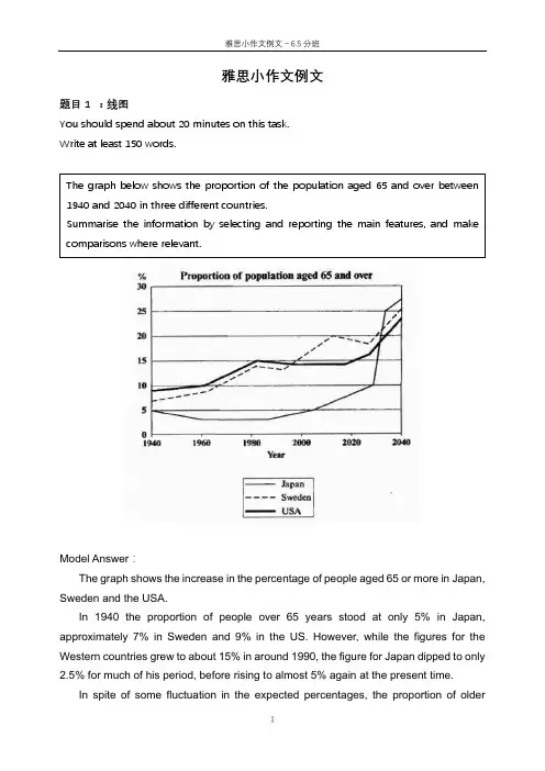
雅思小作文例文题目1 :线图You should spend about 20 minutes on this task.Write at least 150 words.Model Answer :The graph shows the increase in the percentage of people aged 65 or more in Japan, Sweden and the USA.In 1940 the proportion of people over 65 years stood at only 5% in Japan, approximately 7% in Sweden and 9% in the US. However, while the figures for the Western countries grew to about 15% in around 1990, the figure for Japan dipped to only2.5% for much of his period, before rising to almost 5% again at the present time.In spite of some fluctuation in the expected percentages, the proportion ofolder The graph below shows the proportion of the population aged 65 and over between 1940 and 2040 in three different countries.Summarise the information by selecting and reporting the main features, and make comparisons where relevant.people will probably continue to increase in the next two decades in the three countries.A more dramatic rise is predicted between 2030 and 2040 in Japan, by which time it is thought that the proportion of elderly people will besimilar in the three countries.Overall, it indicates that the percentage of elderly people in all three countries is expected to increase to almost 25% of the respective populations by the year 2040.题目2: 饼图The charts below give information about the ages of the populations of Yemen and Italy in 2000 and projections for 2050.Summarise the information by selecting and reporting the main features, and make comparisons where relevant.The pie charts below show the percentages of different age groups in Italy and Yemen in 2000 and its prediction for 2050. The age groups can be divided into 0-14 years, 15-59 years and 60+years.In 2000, the population aged under 14 accounted for the largest proportion of the overall population in Yemen, at 50.1%. This figure is expected to drop to 37% in 2050. Yemen is expected to see a slight increase in the proportion of people over 60 years from 3.6% to 5.7% in 2050, despite the fact that this age group will still represent the smallest section of the population. There will also be an increase in the percentage of the 15-59 age group from 46.3% to 57.3%.In contrast, most of the population in Italy was between 15-19 in 2000, at 61.6%. This figure is expected to drop to 46.2% in 2050. Those aged under 14 are projected to dip from 14.3% to 11.5%, representing the least proportion of the total population in both years. While the percentage of people aged over 60 will almost double to 42.3% in 2050.Overall, the projection is that the populations of both countries will become older. Italy had an older population than Yemen in the year 2000, and the same is predicted in 2050.题目3 柱状图The charts below give information about the ages of the populations of Yemen and Italy in 2000 and projections for 2050.Summarise the information by selecting and reporting the main features, and make comparisons where relevant.The bar charts given show the amount of marriages and divorces every ten yearsfrom 1970 to 2000 as well as the specific information about the percentages of different marital status in the U.S. in 1970 and 2000.The first chart gives statistic information on marriages and divorces each decade between 1970 and 2000. The number of marriages remained higher than that of divorces throughout this period. There were 2.5 million marriages in both 1970 and 1980, higher than the rest two years. The figure then continued to decrease to around 2.3 million in 1990 and 2 million in 2000. In contrast, there were 1 million divorces in 1970, representing the lowest point between 1970 and 2000. The number increased to almost 1.5 million in 1980 before it dropped all the way down to 1 million in 2000.The second chart compares the proportion of adult Americans in 4 different marital status: never married, married, widowed and divorced. In 1970, the most common marital status of adult Americans was married, which took up the largest proportion at 70%. In contrast, the percentage of people in the rest three marital status remained much lower. Despite a slight decrease occurred in the percentage of the widowed, both figures for the divorced and never married saw moderate increases of less than 10 percentage point.Overall, with years, the marriage rate of adult Americans decreased while the opposite trend was apparent in the divorce rate.题目4 表格1The table below shows the changes in the average distance measured in milestravelled by different modes of transport per person per year in 1985 and 2000 in England. Overall, the distance travelled in all modes of transportation significantly increased from 4740 miles in 1985 to 6475 miles in 2000. Car travelled the longest distance for everyone in both 1985 and 2000, increasing from 3199 miles to 4899 miles. Taxi, the least popular mode of transportation in 1985, only travelled for 13 miles and this figure slightly increased to 42 in 2000. The amount of the travelling distance of long distance bus doubled from 1985 (54 miles) to 2000 (124 miles). However, the figure for local bus in 2000 was almost half of the figure for 1985. The other ways of transport including bicycle, train and walking barely changed in these two years in terms of travelling distance.In summary, the modes of transport which allow the travelling for relatively long distance such as car, long distance bus and train remained popular in both these two years.The table below gives information about changes in modes of travel in England between 1985 and 2000.Average distance in milestravelled per person peryear, by mode of travel题目5 表格2The table below gives information about the underground railway system in six cities.Summarise the information by selecting and reporting the main features and make comparisons where relevant.The table presents statistic information about six countries’ underground systems regarding the time of opening, the length of route measured in kilometres and the yearly number of passengers measured in millions.London has the oldest underground railway system among the six cities, which was opened in 1863 while the railway system in Los Angeles is the newest, opened in the year 2001. For the rest four cities, that is, Paris, Tokyo, Washington DC and Kyoto, the opening dates were all in the 20th century.Next, in terms of the length of route measured in kilometres, the underground system in London is the longest at 394, almost double the size of the second largest one located in Paris, while the figure for Kyoto is the smallest at 11, followed by Los Angeles at 28.Lastly, when it comes to the yearly amount of passengers travelled by the underground system in these six cities, Tokyo has the largest number of passengers at 1927 million followed by Paris at 1191 million. On the contrary, the numbers for Kyoto and Los Angeles are the smallest at 45 million and 50 million respectively.Overall, the underground systems in different cities vary a lot regarding the opening date, the size and the number of passengers. Tokyo and Paris use it as the main mode of transport while in Kyoto and Los Angeles the metro system was less popular.雅思小作文例文-信息图表1.流程图The diagrams below show the life cycle of the silkworm and the stages in the production of silk cloth.Summarise the information by selecting and reporting the main features, and make comparisons where relevant.The flow chart illustrates the life cycle of the silkworm and the making process of silk cloth.In the first stage, a moth lays eggs and it takes 10 days for eggs to grow into larva which feeds on mulberry leaves. This stage lasts for 4-6 weeks until the larva produces silk thread. 3-8 days later, a number of cocoons are produced. 16 days later, the adult moths emerge from these cocoons, where a new cycle begins.The cocoons are the raw material used for the production of silk cloth. Once selected, they are boiled in water and the threads can be separated in the unwinding stage. Each thread is between 300 and 900 metres long, which means they can either be twisted together, dyed and then directly used to produce cloth in the weaving stage, or the threads can first go through the steps of twisting and weaving before the dyeing procedure.Overall, the diagrams show that the cocoon stage of the silkworm can be used to produce silk cloth through a very simple process.2.地图The two maps illustrate how the island has changed before and after the construction of some tourist equipment.Looking first at the map before construction, we can see a huge island with a beach in the west. The island was almost bare despite a few trees in the western and eastern area.Looking at the maps in more detail, we can see that small huts have been built to accommodate visitors to the island. The other physical structures that have been added are a reception building, in the middle of the island, and a restaurant to the north of the reception. As well as the buildings mentioned above, the new facilities on the island include a pier, where boats can dock. There has also been a vehicle track linking the pier with the reception and restaurant, and some footpaths connecting the huts. Finally, a swimming area has been designated for tourists on the western tip of the island.Overall, the island has become more tourism focused after the construction of some tourist facilities.。

c10t4写作范文雅思c7t4小作文求范文The pie charts below show units of electricity production by fuel source in Australia and France in 1980 and 2000.考官范文:The charts pare the sources of electricity in Australia and France in the years 1980 and 2000. During these years electricity production almost doubled, rising from 100 units to 170 in Australia, and from 90 to 180 units in France.In 1980 Australia used coal as the main electricity source (50 units) and the remainder was produced from natural gas, hydro power (each producing 20 units) and oil (which produced only 10 units). By 2000, coal had bee the fuel for more than 75% of electricity produced and only hydro power continued to be another significant source supplying approximately 20%.In contrast, France used coal as a source for only 25 units of electricity in 1980, which was matched by natural gas. The remaining 40 units were produced largely from oil and nuclear power, with hydro power contributing only 5 units. But by 2000 nuclear power, which was not used at all in Australia, had developed into the main source, producing almost 75% of electricity, at 126 units, while coal and oil together produced only 50 units. Other sources were no longer significant.Overall, it is clear that by 2000 these two countries relied on different principal fuel sources: Australiarelied on coal and France on nuclear power.宣城属九华山余脉,古时统称陵阳山区。
2016年1月9日雅思写作真题之雅思小作文TASK1男女同学在课外参加体育运动的时常比例。
difference in the percentage of sports in outdoor school hours2016年1月14日雅思写作真题之雅思小作文TASK1The number of people taking part in a wildlife survey in Britain between 2001 and 2009.2016年1月23日雅思写作真题之雅思小作文TASK1The three pie charts below show the production, consumption of coffee and where the profit goes around the world.(数据仅供参考)2016年1月30日雅思写作真题之雅思小作文TASK1Task 1The diagram shows how an office building looks at present and the plan for its future development.2016年2月18日雅思写作真题之雅思小作文TASK1Changes of average monthly salary and prices of black and white TV inJapanese Yen from 1953 to 19732016年2月20日雅思写作真题之雅思小作文TASK1The chart and graph show the categories of workforce in Australia and the unemployment within 3 groups.2016年2月27日雅思写作真题之雅思小作文TASK1Task 1The graph below shows the unemployment rate in Ireland and the number ofpeople leaving the country between 1998 and 2008.2016年3月5日雅思写作真题之雅思小作文TASK1The graph shows the size of the Ozone layer hole in Antarctic and three productions of damaged gases to the Antarctic Ozone from 1980 to 2000.2016年3月12日雅思写作真题之雅思小作文TASK1The table below shows the information of the employment of students from four countries in UK after their first courses in 2001。
雅思真题剑12t8 小作文范文IELTS Writing Task 1 Sample Answer: Cambridge 12 Test 8 The provided diagrams illustrate the complete life cycle of the silkworm, from egg to moth, alongsidethe process of silk cloth production. The life cycle of the silkworm commences with a cluster of minuscule, yellow eggs laid upon a mulberry leaf. After a 10-day period, these eggs hatch into silkworm larvae, identifiable by their white, worm-like appearance. The larvae then embark on a 4-6 week feeding frenzy, consuming vast quantities of mulberry leaves. This sustained consumption fuels their growth, with the larvae molting four times during this stage. Following the feeding period, the fully-grown larvae, now significantly larger, commence the process of cocoon construction. They spin a silken thread around themselves for approximately 3-8 days, forming a protective oval-shaped cocoon. The cocoon itself comprises a single, continuous strand of silk, which can reach lengths of up to 915 meters. Within the cocoon, the silkworm undergoes metamorphosis, transforming into a pupa. This dormant stage lasts for about 16 days, after which a fully developed moth emerges from the cocoon, signaling the completion of the life cycle. The diagram also depicts the silk cloth production process, closely tied to the silkworm's lifecycle. Cocoons are meticulously selected for silk production, leaving some to hatch and ensure the continuation of the silkworm population. The selected cocoons are then boiled in water, a process that softens the silk and allows for the unwinding of the single, long silk thread. Once unwound, several silk threads are twisted together to create a yarn of sufficient strength and thickness for weaving. The final stage involves weaving the yarn on a loom, culminating in the production of exquisite silk cloth, highly prized for its luxurious texture and aesthetic appeal. In conclusion, the diagrams provide a comprehensive visual representation of the interconnectedness between the silkworm's lifecycle and the intricate process of silk cloth production. The entire cycle highlights the remarkable journey of the silkworm and the skillful human intervention that transforms a natural fiber into a highly sought-after material.。
雅思作文范文大全(含小作文)v105some people claim that the disadvantages of the car are more than the advantages,do you agre e or disagree?范文1the birth of cars have made an enormous change to our life.in the past,we travel from one pl ace to another only by foot,nowaday,cars can do it .its goes withour saying that the inventi on of cars bring great benefit to all of us.but as proverb goes:no garden without weeds.car is not exception.owing a car has a lot of advantages.for one thing,car provide us the most convient way of tr ansportation.we can get around freely without spenting a lot of time.emotionally,i always fo und driving is so exciting.for another,its the comfortable to drive a car.In winter.drivers always can stay warm and dry even in rainy whether,in addition,drivers are usually safe i n their cars when they are out at night.Cars bring the human merits,their side-effects graudually come to the surface.firstly,to ru n a car need a lot of oil,which is getting less and less.the increasing number of cars contr ibute the lacking of energy.secondlly,as more and more cars are used,the traffic ecpeciall y in big cities is getting heaver and heavier,which lead to the serious social problem--traf fic jam.in addition,the inceasing numbers of cars ,which excaust sent a huge quantities of c arbon monoxide into atmosphere.it make the air of cities unbreathabe,it strip people contac t with frensh air.therefore,the new energy should be explored to replace the oil so that our envionmental poll ution can be avioded .and the strick law should be issued to keep the numbers of cars under control.thus,our heavier traffic can be solluted!范文2Private cars vs Public trafficAs traffic problems become more and more serious in many cities of developed and developing countries, their governments have to try hard and loads of money and energy have been spen t to deal with them.Firstly, it is not efficient for the commuters to use their private cars to and back from th eir workplaces. Occasionally we can see they have to sit on the wheels wasting time and fue l in a heavy traffic jam. At the same time, through burning the fossil fuels, green house ga s CO2, CO1, acid rain gas SO2, fumes and dusts are being released into the atmosphere, all o f which heavily overload the environment. Thirdly, with the increase of private cars, the ro ad traffic accidents are also rise dramatically. For example, in a city with 5000 cars, ther e will be at least 250 accidents happening everyday, which also burden the public healthy se rvices.On the contrary, expected public traffic may be an ideal solution to these problems. For exa mple city buses and railways are widely used or being constructed by many cities. People ca n take buses easily, which can be found every 10 minutes or less in the peak time. Actuall y, Nottingham Transport Company is building its own light railway in the city, which is anno unced by the speak man of the company, “It will be completed in the next year, the tickets w ill be very competitive and at the same time the travel will be very safe and comfortab le.”On the other hand, public traffic had its own disadvantages. Usually it cannot provide door-to-door service. It is inconvenient to go shopping by public vehicles. Sometimes you must wa it a long time for the train. And quite a lot of people prefer to enjoy driving.In conclusion, developing the public traffic is a useful approach to deal with these difficu lties. One possible way, if not the best, is to taxi private cars heavily and use these reve nues to provide citizens cheaper public traffic services.范文3With the development of science and technology, the cars have already become the important c omponent in our daily life gradually. Cars make our life convenient and swift. However, too many cars have caused very serious social problems. Some people claim that the disadvantag es of car are more than the advantages. I doubt whether the argument can bear much analysi s.Since one century [ago], the auto industry has [been] developed at full speed worldwide, an d has brought the enormous progresses to our life. For example, the car is the most convenie nt tool of transportation. We can [be] on and off duty by car every day, we can go to trave l by car on the vacation, we can utilize the cars to deal with some emergency too. The car [is] playing an important role in our daily life. They make our rhythm of life faster and faster, make our business become more and more efficient.On the other hand, the development of the automobile has brought a lot of infant industry t o people, Give people countless employment opportunities too. Such as, manufacturing industr y, repairing industry and maintaining industry. We are enjoying the convenience that the car s bring to us; at the same time we can utilize the auto industry to support ourselves.Howeve r, we can not ignore that too many cars cause enormous social problems, for example, traffi c jam, air pollution, traffic accident, to which we have to find a solution.In a word, the cars have brought enormous change to our life; the advantages are far more th an the disadvantages. We should recognize the merit of the cars, and do our best to solve th e problems. If so, our life will be brighter.Version 00106范文1Nowhere in the world has the issue of tobacco been so much debated as inour society. Nowadays, tobacco is more harmful than drug to people’shealth, therefore many people think that smoking is legal that is a direct andprimary reason to induce this kind of problem. The above point is certainlytrue; this essay will outline three reasons.The main reason is that tobacco is a silent killer to smokers. Tobacco isknown to be the probable cause of some 25 different diseases, and for some,such as lung cancer, bronchitis and emphysema, it is the main cause.According to a WHO report four million people die yearly from tobacco-related diseases, that is one death every eight seconds. Tobacco is significantlybecoming a greater cause of death and disability than any other single cause.Another reason is that more and more young people are under 18 years old who smoke cigarett e have been blinded by the deceit of tobacconists. Tobacco among adolescents remains stubbor nly persistent. Smoking among adolescents rose in the 1990s in several developed countrie s, such as China,Vietnam and Thailand . While new markets are being opened by the tobacco i ndustry actions, old markets have not been closed. Tobacco is a global threat.Last but not the least reason is the increase in cigarette smuggling. Becauseof tobacco smuggling, the legal retailing and distribution systems are badlyaffected, and faced with increased lawlessness and heavy tax losses. This behavior severely affects the economy.In conclusion, the tobacco should be considered illegal. Perhaps a pack ofcigarettes is less harmful than another drug, but tobacco is actually thebiggest killer of all the drugs.=================================================范文2Advertisements of tobacco and those of “smoking is harmful”are often seentogether. But there has been an on-going argument about whether or nottobacco should be forbidden and made illegal. I have always believed thatsmoking should be illegal for the following reasons.First, smoking does great harm to human health and causes many diseases.It is reported that more than 70% of lung cancer sufferers are smokers, andthe average life-span of smokers is seven years less than that of non-smokers. Moreover, it hurts not only smokers, but also the ones around thesmokers. Many researchers claim that breathing “second-hand smoke” maybe even more harmful than smoking.Second, many social problems and disasters can be attributed to smoking.For instance, many wives cannot bear their husbands’ smoking all the time,which causes many quarrels, or even divorces. Furthermore, the biggest firedisaster in China, the Daxinganling fire disaster, was caused by a burningcigarette end, and the cost of the resulting loss was unimaginable.Last, smoking tobaccos is a main source of air pollution.A magazine said thatfor every cigarette smoked each day,a whole tree is needed to clean the air.In other words, smoking one less cigar every day equals planting a tree. Itis a brilliant contribution to the earth we are living on.In a word, all the above demonstrate that smoking harms yourselves as wellas your neighbors, pollutes the air we ourselves are breathing, and evenagitates the social peace. So, in my opinion, tobacco should be strictlyforbidden, and smoking should be made illegal.范文3there has long been controversy over the legality and apparent acceptance of tobacco in soci ety .some hold that cigarettes and other tobacco containing products should be banned, that is, treated as narcotics.personally,i agree with this point of view for the following reas ons:although cigarettes do not offer as intense an effect as drugs like heroin and cocaine,they rank higher in the level of dependence it creates in the user.thousands of smokers try to rid themselves of cigarettes but cannot,because of the physiological dependence they devel oped,chiefly imputable to its chemical nicotine.this explains why smokers continue their hab it despite the numerous health warnings. furthermore,medical science has now proved beyond a doubt that smoking kills.with all the other causes of preventable deaths such as alcohol, illegal drugs,aids,suicide,road accidents,fire,and guns,cigarettes still account for more pr eventable deaths than all of those combined.more disturbingly,whilst the use of heroin is dangerous solely to the users,the use of tobac co endangers those who are in their vicinity as well. this phenomenon, known as passive smok ing, nulls the counter-argument that putting one's own health at risk through smoking should be up to one's own individual choice.reports have shown that the amount of second-hand smo ke inhaled by a typical nonsmoker is equivalent to one cigarette smoked per day,and what is more,passive smoking can increase a nonsmoker's chance of getting cancer by ten to thirty two per cent.there are those who will say that the black market created by outlawing tobacco will produce deadlier cigarettes because the product standards of the bootleggers are not as high.howev er,we should all bear in mind that legal cigarettes cause roughly four hundred thousand deat hs a year.it is hard to imagine the limited distribution provided by the criminal underworld could compete with this tragic figure.to sum up, the harm visited upon our society by tobacco usage is substantial.there will be n o solution other than to control tobacco much in the same way that the government now contro ls drugs which could allow people to remain attentive to the seriousness of the effects of t hese substances,and hopefully to prohibit their usage.范文4Apparently, it would seem that tobacco is totally different substance from drugs, and it ca n be used freedom by public. In fact, however, our authority should make tobacco illegal as well as drugs, and using of tobacco should be controlled strictly.Tobacco only can be used for research and medical purpose. As far as I am concerned, as a ki nd of dope, tobacco has been widely used to help patients alleviate their pain in surgery. A t the same time, ordinary people should not be allowed to access it legally for two main rea sons.Among countless factors which influence my inclination, there is a most conspicuous one: it is harmful that smokers addict to tobacco. Many decades ago, scientists have already foun d that there is a definite link between smoking and bronchial troubles, cardiac disease an d lung cancer. More seriously, it not only has negative influence for smokers, but others li ving or working in same surrounding, even the next generation of a smoking pregnant women ma y be harmed by so-called “second hand smoking”. Research shows that sometimes “second han d smoking” is more dangerous than smoking directly, because, at least smokers can get the p rotection from filter tips to some extent. Thus, compared to the hazard of drugs, tobacco ca n involve more other innocent people and harm their health unknowingly.The second aspect relates to the problem that our natural resources and money are wasted sen selessly during the course of planting, transporting and manufacturing tobacco. In light of a statistics, China consumes nearly 1,000 tons of wood fibers to produce cigarettes annual ly. Besides, the investment absorbed by tobacco manufacturers every year, is enough to solv e all financial troubles that higher education have to face. Obviously, if tobacco is banne d by our governments, it means that considerable money will be saved.In summary, judging from all the evidence offered, we may safely arrive at the conclusion th at tobacco should be forbidden as well as drugs except for a few special purposes, such as r esearch and medicine.补充With the development of society, our life and working pressure are greater and greater. In t his way, a lot of people have become smokers. Tobacco, as a kind of drugs, prevails in the s ociety. Some people hold the opinion that tobacco should be given freedom be use, but other s, in contrast, deem it should be made illegal as the same way as other drugs and that is al so my point.Medical science proves that smoking can cause the heart diseases, lung cancer, and the immun e system diseases. These diseases are all mankind's healthy enemies. The statistics have showed that people who die of the lung cancer, over 90% are smokers. In these smokers, 85% are chain smoker. So, obviously, there is enormous danger to the human health in smoking.In addition, smoking not only dangerous to smoker, but also do harm to people at smoker's si de. The tobacco contains a large number of noxious substances, such as nicotine. Just as a f amous physician says, smoking is equivalent to commit suicide chronically.However, the cigarette can really relax our nervous nerve, within short time. People, especi ally, who have heavy working pressure, are prone to produce sense of relying on to cigarett e. Moreover, as everyone knows, a lot of countries impose the heavy taxation to tobacco manu facturer and seller, thus, if the tobacco business is considered as the illegal activitie s, the revenues of the country will be reduced correspondingly.In a word, the danger to people of cigarette is obvious. Though it can help us flee away fro m pressure, this to use health as cost. Our government should forbid the production of the t obacco, make our world fresh and nonpoisonous.With the development of society, our life and working pressure are [getting] greater and gre ater.In this way, a lot of people have become smokers. Tobacco, as a kind of drugs, prevails in t he society. Some people hold the opinion that tobacco should be given freedom [to] be [use d, but others, in contrast, deem [that] it should be made [as] illegal as the same way as ot her drugs and that is also my point.Medical science proves that smoking can cause the heart diseases, lung cancer, and the immun e system diseases. [all of these diseases are enemies of mankind's healthy] . The statistic s have showed that people who die of the lung cancer, over 90%, are smokers. [Among] these s mokers, 85% are chain smokers. So, obviously, there is enormous danger to the human health i n smoking.In addition, smoking not only dangerous to smokers, but also [does] harm to people at smoker 's side. The tobacco contains a large number of noxious substances, such as nicotine. Just a s a famous physician says, smoking is equivalent to commit suicide chronically.However, the cigarette can really relax our nervous nerve, within short time. People, especi ally, who have heavy working pressure, are prone to produce sense of relying on to cigarett e. Moreover, as everyone knows, a lot of countries impose the heavy taxation to tobacco manu facturer and seller, thus, if the tobacco business is considered as the illegal activitie s, the revenues of the country will be reduced correspondingly.To sum up, the danger to people of cigarette is obvious. Though it can help us flee away fro m pressure, this to use health as cost. Our government should forbid the production of the t obacco, make our world fresh and nonpoisonous.Although it is a freedom to use tobacco{烟草} while some people think it should be made ille gal as the same way as other drugs. To what extent do you agree or disagree?What’s your o pinion?A:Tobacco should be made illegal, I agree with this idea personally. I hope most drugs can be made illegal, because, as far as I know, they are bad to our health. However, currently mo st countries still keep it free to use tobacco, and this situation seems to be very hard to change in a short time.From my own experience, using tobacco is not a good thing, especially using is for a long ti me. It will lead to many kinds of diseases, more importantly, many of them are fatale. One o f my friends died from using too much tobacco, and it is believed there are many more peopl e like this. The other thing that I am concerned of is, if a country doesn’t make using tob acco illegal, many young people will have a chance to use it, i.e. students. It is very dang erous, because if someone gets addicted to this when he is very young, he will then almost s urely have a big health problem when he is old.I am happy to see that, although it is free to use tobacco in many countries, most of those countries still somehow try not to encourage people using it. For example, tobacco adverti sement is banned in many countries, and for many countries, smoking is banned in public plac es. Overall, most countries are trying to stop the use of tobacco, though it will take somet ime. In my opinion, it is essential to limit the use of tobacco, and I hope everyone doesn’t use.Version 00108Some people said the government shouldn't put money on building theatersand sports stadiums; they should spend more money on medical care andeducation. Agree or not agree?=================================================范文1Nowadays, the gap between the city and the countryside becomes more and more overt, which ar ouses colossal concerns. To understand the solution, let’s take a closer look at the cause s of the gap at first.The main reason of the gap is the unequal investment between city and rural area. China is a typical example. While more and more money is being invested to the coastal areas and bi g cities, such as Beijing and Shanghai, the lack of investment barriers greatly the society development of rural area and western regionsThe low education level partly sharps the gap. There is no doubt that the prime force of pro ductivity is education. However, because of poverty, thousands of people go to work without graduating from primary school. The poorer, the few children go to school. This bad cycle finally leads to the dream of rich becoming a dream that is hard to realize.Moreover, the rural area is short of people with high quality. A survey proved that most of university students, whether they come from city or countryside, choose big cities instea d of poor areas to work. The rural area can neither adept talent man nor attract talent ma n. No wonder the gap is increasing largely.Hence, The government ought to knock itself out to decrease the gap as soon as possible. First, balance the investment between city and rural area. In addition, the education level sho uld be improved, especially pay attention on raising high quality people. Besides, let more people realize the latent capacity of rural area in order to attract talent and investmen t. The set up of CCTV channel12-western region channel is a good example.Only when the ways mentioned above are realized step by step, can the gap between the cities and the countryside be bridged.范文2Nowadays, many people argue against the government putting money onbuilding theaters and sports stadiums. They have claimed that medical careand education would benefit the citizens and the country much more.However, I believe it is worth building more theaters and arenas.First, stadiums and arenas provide ideal places for people to have physicalexercises and entertainment. After a whole week’s hardworking, people canenjoy a wonderful football game in the weekend, and refresh themselveswith a good relaxation there. Moreover, the physical exercises are good forpeople’s health, which will ease the pressure of medical care.Second, theaters and museums can be used as base areas of culture and history education. The British Museum, which is the largest one in the world,provides visitors with knowledge about the world culture and the arts. Thevisitors to the museum are all overwhelmed by the magnificence of thecultural and historical displays featuring mankind’s achievements. In addition, the performances shown in the theaters will also greatly enrich the lives of citizens. People can enjoy ballet, symphony, and Peking Opera in a theater,which contain the soul of Chinese and western cultures.Third, running theaters and stadiums can earn much money.And this amountof money can do great contribution in other fields, including medical care,and education. After winning the Olympic 2008,Beijing made a plan to spend160 billion RMB building an Olympic Village. This will surely attract manysports fans to China, which would be much rewarded, not only in economybut the whole society.You can tell form my commentary above,since building theaters and stadiumsbenefit not only individuals but also the state, it is very worthy of theseexpenses.And the government should speed up the pace of the constructions.范文3An argument often heard these days is that whether or not the government should put money o n building theaters and stadiums. Some believe that instead of spending money on this area, Medical care and education, both of which are basic developing factors of one country sho uld be spent more money on. After weighting the pros and cons, I disagree with this opinion. Firstly, theaters and stadiums are best choice for people relaxing. Most of workers, especia lly white collar who often feel nervous after one da y’s hard work, need to relax both menta lly and physically. Compared with staying at home, it is much better way to stay in comforta ble theater and listen to a wonderful concert.In addition, going to theaters and stadiums affect the same effect as education and medica l care. Having more chances to go to theaters can help them mold character. There is no bett er way to keep healthy than doing proper sports in the daily. In this way, the culture and h ealth will be improved greatly, which plays the same role of education and medical care. Moreover, theaters and stadiums are basis essential facilities to a developed city. Take hol ding an Olympic games as an example, it is no doubt it will take millions of money to build stadiums. Why the winner country is proud of that. Because this is a confirmation given b y whole world.Of course I don’t mean that the more theaters and stadiums, the better society will be, aft er all, nothing can take the important place of medical care and education.In summary, the key point is to keep both of this two part developing. Only in this way, ca n all people live better in future.V108Some people said the government shouldn't put money on building theaters and sports stadium s; they should spend more money on medical care and education. Agree or not agree? Recently, a criticism often heard is that the government tends to put too much money on buil ding theaters and sports stadiums. They maintain that medical care and education would benef it the citizens and the country much more. However, I advocate building more theaters and ar enas. Numerous circumstances lead to the worth of building theaters and arenas, but here ar e two main reasons:What strikes me most of all is that theaters and sports stadiums provide ideal places for pe ople to build up a world of relaxation. After five days of hardworking, people can refresh t hemselves by taking physical exercises and enjoining a football game there. Meanwhile, exerc ises is to health what water is to fish. The physical exercises can benefit peopl e’s healt h, which will surely ease the pressure of medical care. Moreover, it provides people a good opportunity to enter into communion with each other, which will benefit people’s mental h ealth.Beyond this, it is also of paramount importance to use theaters and museums as the “social c lassroom” of culture and history education. The Sydney Opera House, which is the mother an d father of all modern landmark buildings, has come to define not only a city, but also an e ntire nation and continent. The opera house shows the concept of modernism and the never pro perly finished inside provides visitors with a story of its creator Jorn Utzon. In additio n, the performances which contain the soul of human civilization shown in the theaters will also greatly enrich the lives of people from all over the world.Certainly, medical care and education both play dominant roles, but building theaters and sp orts stadiums will benefit not only the individual both mentally and physically, but a natio n and continent permanentlyV108Some people said the government shouldn't put money on building theaters and sports stadium s; they should spend more money on medical care and education. Agree or not agree?Recently, a criticism often heard is that the government tends to put too much money on buil ding theaters and sports stadiums. They maintain that medical care and education would benef it the citizens and the country much more. However, I advocate building more theaters and ar enas. Numerous circumstances lead to the worth of building theaters and arenas, but here ar e two main reasons:What strikes me most of all is that theaters and sports stadiums provide ideal places for pe ople to build up a world of relaxation. After five days of hardworking, people can refresh t hemselves by taking physical exercises and enjoining a football game there. Meanwhile, exerc ises is to health what water is to fish. The physical exercises can benefit people’s healt h, which will surely ease the pressure of medical care. Moreover, it provides people a good opportunity to enter into communion with each other, which will benefit people’s mental h ealth.Beyond this, it is also of paramount importance to use theaters and museums as the “social c lassroom” of culture and history education. The Sydney Opera House, which is the mother an d father of all modern landmark buildings, has come to define not only a city, but also an e ntire nation and continent. The opera house shows the concept of modernism and the never pro perly finished inside provides visitors with a story of its creator Jorn Utzon. In additio n, the performances which contain the soul of human civilization shown in the theaters will also greatly enrich the lives of people from all over the world.Certainly, medical care and education both play dominant roles, but building theaters and sp orts stadiums will benefit not only the individual both mentally and physically, but a natio n and continent permanentlyV108Some people said the government shouldn't put money on building theatres and sports stadium s, they should spend more money on medical care and education. Agree or not agree?Government, as the controller of the macroeconomy, usually put large amount of money on buil ding theatres and sports stadiums to stimulate the consumption. Especially when globle econ omy is in recession, stimulation is one of the methods for government to catch the economy’s fall. However, to my opinion, government should spend more money on medical care and educ ation.For men, health and education are the basic elements for development. We often say health i s the best wealth. Without health, even if you are a millionaire you will not enjoy your li fe. The society needs more medical care to ensure people to live happily and create more fo rtune. This is a physical base for development of society. The spiritual foundation shoul d be obtained from education. Only with more knowledge, can we catch up with the improvemen t of economy, society and technology. We need healthy people and brilliant minds to change our world into a better one. Theatres and sports stadiums are signs for higher standard of living. Compared with the basic development factors, they are minor.。
雅思小作文范文10篇1. 表格题型。
The bar chart illustrates the amount of money spent on fast food by people of different income groups in a particular country in 2019. It is evident from the chart that the highest expenditure on fast food is made by people in the middle income group, while the lowest expenditure is made by those in the low income group.2. 饼图题型。
The pie chart depicts the percentage of different types of leisure activities engaged in by people in a certaincity in 2020. It is clear from the chart that the most popular leisure activity is watching movies, followed by sports and outdoor activities, while the least popular activity is reading.3. 流程图题型。
The process diagram illustrates the various stages involved in the production of chocolate. Overall, the process consists of six main stages, starting from the harvesting of cocoa beans to the packaging of the final product. Each stage is crucial in ensuring the quality and taste of the chocolate.4. 表格题型。
雅思作文真题范文coffee题目:In many countries, coffee has become a very popular drink. Discuss the reasons for its popularity and the possible effects on health.范文:Coffee has indeed gained tremendous popularity around the world in recent decades. There are several reasons behind this phenomenon.Reasons for Popularity.One of the main reasons for coffee's popularity is its taste. The rich and diverse flavors of coffee, ranging from the mild and smooth to the strong and bitter, can satisfy different palates. For example, some people prefer the light flavored Arabica coffee, while others like the more intense and full bodied Robusta. Additionally, coffee has a distinct aroma that is both inviting and relaxing. Just the smell of freshly brewed coffee in the morning can start a person's day on a positive note.Another factor contributing to its popularity is the energy boost it provides. Coffee contains caffeine, which is a natural stimulant. When consumed, caffeine can increase alertness, reduce fatigue, and improve concentration. This makes it a popular choice among students who need to stay awake during long study sessions, as well as workers who have to be productive throughout the day. For instance, many office workers rely on a cup of coffee in the morning or during breaks to enhance their performance.Social and cultural aspects also play a role. Coffee shops have become a common gathering place in many societies. People like to meet friends, have business meetings, or simply relax in a coffee shop environment. Thecoffee drinking culture has been promoted through various media, such as movies and television shows, where characters are often depicted enjoying a cup of coffee.Possible Effects on Health.In terms of health, coffee has both positive and negative aspects. On the positive side, moderate coffee consumption has been associated with several health benefits. Some studies suggest that it may reduce the risk of certain diseases, such as type 2 diabetes, Parkinson's disease, andliver cirrhosis. The antioxidants present in coffee may contribute to these protective effects. For example, polyphenols in coffee can help fight oxidative stress in the body.However, excessive coffee consumption can have negative impacts on health. High levels of caffeine intake may lead to problems such as insomnia, increased heart rate, and jitters. Also, adding too much sugar and cream to coffee can contribute to an increased calorie intake, which may be a concern for those trying to maintain a healthy weight.In conclusion, coffee's popularity can be attributed to its taste, energy providing properties, and social significance. While it can offer certain health benefits when consumed in moderation, excessive intake may pose risks.解析:一、结构方面。
小站雅思写作范文精选为了让大家高效备考雅思,提高写作成绩,下面小编为大家整理了几篇小站雅思的写作范文,希望对大家有所帮助。
小站雅思书信写作范文之写给经理的请辞信You have decided to leave your current job even though you enjoy it. Write a letter to inform your manager of your decision. In your letter tell the manager about your decision and the reason for itdescribe what you learnt in your current job and ask the manager to write a reference letter to help you with future employment.即使你喜欢现在的工作,你还是决定离开。
写信告诉你的经理你的决定。
在你的信中告诉经理你的决定和原因描述你在目前的工作中学到了什么,让经理写一封推荐信来帮助你未来的工作。
范文Dear Mr Smith,I am writing to inform you Of my decision to leave Smith Industries when my Current contract comes to an end next month.I have thoroughly enjoyed my three years here. However, I feel that now is the time for me to broaden my horizons and gain experience Of different working environments and practices Within our industry. Iwould also like the chance to travel more as part Of my job.Over the course of my three years at Smith Industries, I have learnt an incredible amount. Not only am I now proficient with the key software programs that are used across the industry, but I have also learntvaluable interpersonal skills, such as how to organise a team or delegate tasks.I would be extremely grateful if you could provide me with a letter of reference for future employers.Thank you for all Of your help and support.Yours sincerely,Paul Jones范文译文亲爱的史密斯先生,我写这封信是想告诉您,我决定在下个月现有合同期满时离开史密斯工业公司。
The line graph compares average yearly spending by Americans on mobile and landline phone services from 2001 to 2010.It is clear that spending on landline phones fell steadily over the 10-year period, while mobile phone expenditure rose quickly. The year 2006 marks the point at which expenditure on mobile services overtook that for residential phone services.In 2001, US consumers spent an average of nearly $700 on residential phone services, compared to only around $200 on cell phone services. Over the following five years, average yearly spending on landlines dropped by nearly $200. By contrast, expenditure on mobiles rose by approximately $300.In the year 2006, the average American paid out the same amount of money on both types of phone service, spending just over $500 on each. By 2010, expenditure on mobile phones had reached around $750, while the figure for spending on residential services had fallen to just over half this amount.The diagram illustrates the various stages in the life of a honey bee. We can see that the complete life cycle lasts between 34 and 36 days. It is also noticeable that there are five main stages in the development of the honey bee, from egg to mature adult insect.The life cycle of the honey bee begins when the female adult lays an egg; the female typically lays one or two eggs every 3 days. Between 9 and 10 days later, each egg hatches and the immature insect, or nymph, appears.During the third stage of the life cycle, the nymph grows in size and sheds its skin three times. This moulting first takes place 5 days after the egg hatches, then 7 days later, and again another 9 days later. After a total of 30 to 31 days from the start of the cycle, the young adult honey bee emerges from its final moulting stage, and in the space of only 4 days it reaches full maturity.(169 words, band 9)The chart compares average figures for temperature and precipitation over the course of a calendar year in Kolkata.It is noticeable that monthly figures for precipitation in Kolkata vary considerably, whereas monthly temperatures remain relatively stable. Rainfall is highest from July to August, while temperatures are highest in April and May.Between the months of January and May, average temperatures in Kolkata rise from their lowest point at around 20°C to a peak of just over 30°C. Average rainfall in the city also rises over the same period, from approximately 20mm of rain in January to 100mm in May.While temperatures stay roughly the same for the next four months, the amount of rainfall more than doubles between May and June. Figures for precipitation remain above 250mm from June to September, peaking at around 330mm in July. The final three months of the year see a dramatic fall in precipitation, to a low of about 10mm in December, and a steady drop in temperatures back to the January average. (173 words, band 9)Posted by Simon in IELTSThe bar charts compare students of different ages in terms of why they are studying and whether they are supported by an employer.It is clear that the proportion of students who study for career purposes is far higher among the younger age groups, while the oldest students are more likely to study for interest. Employer support is more commonly given to younger students.Around 80% of students aged under 26 study to further their careers, whereas only 10% study purely out of interest. The gap between these two proportions narrows as students get older, and the figures for those in their forties are the same, at about 40%. Students aged over 49 overwhelmingly study for interest (70%) rather than for professional reasons (less than 20%).Just over 60% of students aged under 26 are supported by their employers. By contrast, the 30-39 age group is the most self-sufficient, with only 30% being given time off and help with fees. The figures rise slightly for students in their forties and for those aged 50 or more.(178 words, band 9)The bar chart compares the number of incidents and injuries for every 100 million passenger miles travelled on five different types of public transport in 2002.It is clear that the most incidents and injuries took place on demand-response vehicles. By contrast, commuter rail services recorded by far the lowest figures.A total of 225 incidents and 173 injuries, per 100 million passenger miles travelled, took place on demand-response transport services. These figures were nearly three times as high as those for the second highest category, bus services. There were 76 incidents and 66 people were injured on buses.Rail services experienced fewer problems. The number of incidents on light rail trains equalled the figure recorded for buses, but there were significantly fewer injuries, at only 39. Heavy rail services saw lower numbers of such events than light rail services, but commuter rail passengers were even less likely to experience problems. In fact, only 20 incidents and 17 injuries occurred on commuter trains.(165 words, band 9)The line graph compares the percentage of people aged 65 or more in three countries over a period of 100 years.It is clear that the proportion of elderly people increases in each country between 1940 and 2040. Japan is expected to see the most dramatic changes in its elderly population.In 1940, around 9% of Americans were aged 65 or over, compared to about 7% of Swedish people and 5% of Japanese people. The proportions of elderly people in the USA and Sweden rose gradually over the next 50 years, reaching just under 15% in 1990. By contrast, the figures for Japan remained below 5% until the early 2000s. Looking into the future, a sudden increase in the percentage of elderly people is predicted for Japan, with a jump of over 15% in just 10 years from 2030 to 2040. By 2040, it is thought that around 27% of the Japanese population will be 65 years oldor more, while the figures for Sweden and the USA will be slightly lower, at about 25% and 23% respectively.(178 words, band 9)The table shows percentages of consumer expenditure for three categories of products and services in five countries in 2002.It is clear that the largest proportion of consumer spending in each country went on food, drinks and tobacco. On the other hand, the leisure/education category has the lowest percentages in the table.Out of the five countries, consumer spending on food, drinks and tobacco was noticeably higher in Turkey, at 32.14%, and Ireland, at nearly 29%. The proportion of spending on leisure and education was also highest in Turkey, at 4.35%, while expenditure on clothing and footwear was significantly higher in Italy, at 9%, than in any of the other countries.It can be seen that Sweden had the lowest percentages of national consumer expenditure for food/drinks/tobacco and for clothing/footwear, at nearly 16% and just over 5% respectively. Spain had slightly higher figures for these categories, but the lowest figure for leisure/education, at only 1.98%.The charts compare the amount of water used for agriculture, industry and homes around the world, and water use in Brazil and the Democratic Republic of Congo.It is clear that global water needs rose significantly between 1900 and 2000, and that agriculture accounted for the largest proportion of water used. We can also see that water consumption was considerably higher in Brazil than in the Congo.In 1900, around 500km³ of water was used by the agriculture sector worldwide. The figures for industrial and domestic water consumption stood at around one fifth of that amount. By 2000, global water use for agriculture had increased to around 3000km³, industrial water use had risen to just under half that amount, and domestic consumption had reached approximately 500km³.In the year 2000, the populations of Brazil and the Congo were 176 million and 5.2 million respectively. Water consumption per person in Brazil, at 359m³, was much higher than that in the Congo, at only 8m³, and this could be explained by the fact that Brazil had 265 times more irrigated land.(184 words, band 9)The bar chart compares the cost of an average house in five major cities over a period of 13 years from 1989.We can see that house prices fell overall between 1990 and 1995, but most of the cities saw rising prices between 1996 and 2002. London experienced by far the greatest changes in house prices over the 13-year period.Over the 5 years after 1989, the cost of average homes in Tokyo and London dropped by around 7%, while New York house prices went down by 5%. By contrast, prices rose by approximately 2% in both Madrid and Frankfurt.Between 1996 and 2002, London house prices jumped to around 12% above the 1989 average. Homebuyers in New York also had to pay significantly more, with prices rising to 5% above the 1989 average, but homes in Tokyo remained cheaper than they were in 1989. The cost of an average home in Madrid rose by a further 2%, while prices in Frankfurt remained stable.(165 words)The table gives information about poverty rates among six types of household in Australia in the year 1999.It is noticeable that levels of poverty were higher for single people than for couples, and people with children were more likely to be poor than those without. Poverty rates were considerably lower among elderly people.Overall, 11% of Australians, or 1,837,000 people, were living in poverty in 1999. Aged people were the least likely to be poor, with poverty levels of 6% and 4% for single aged people and aged couples respectively.Just over one fifth of single parents were living in poverty, whereas only 12% of parents living with a partner were classed as poor. The same pattern can be seen for people with no children: while 19% of single people in this group were living below the poverty line, the figure for couples was much lower, at only 7%.(150 words, band 9)The map shows two potential locations (S1 and S2) for a new supermarket in a town called Garlsdon.The main difference between the two sites is that S1 is outside the town, whereas S2 is in the town centre. The sites can also be compared in terms of access by road or rail, and their positions relative to three smaller towns.Looking at the information in more detail, S1 is in the countryside to the north west of Garlsdon, but it is close to the residential area of the town. S2 is also close to the housing area, which surrounds the town centre.There are main roads from Hindon, Bransdon and Cransdon to Garlsdon town centre, but this is a no traffic zone, so there would be no access to S2 by car. By contrast, S1 lies on the main road to Hindon, but it would be more difficult to reach from Bransdon and Cransdon. Both supermarket sites are close to the railway that runs through Garlsdon from Hindon to Cransdon.The bar chart compares consumer spending on six different items in Germany, Italy, France and Britain.It is clear that British people spent significantly more money than people in the other three countries on all six goods. Of the six items, consumers spent the most money on photographic film.People in Britain spent just over £170,000 on photographic film, which is the highest figure shown on the chart. By contrast, Germans were the lowest overall spenders, with roughly the same figures (just under £150,000) for each of the six products. The figures for spending on toys were the same in both France and Italy, at nearly £160,000. However, while French people spent more than Italians on photographic film and CDs, Italians paid out more for personal stereos, tennis racquets and perfumes. The amount spent by French people on tennis racquets, around £145,000, is the lowest figure shown on the chart.The diagrams show how house designs differ according to climate.The most noticeable difference between houses designed for cool and warm climates is in the shape of the roof. The designs also differ with regard to the windows and the use of insulation.We can see that the cool climate house has a high-angled roof, which allows sunlight to enter through the window. By contrast, the roof of the warm climate house has a peak in the middle and roof overhangs to shade the windows. Insulation and thermal building materials are used in cool climates to reduce heat loss, whereas insulation and reflective materials are used to keep the heat out in warm climates.Finally, the cool climate house has one window which faces the direction of the sun, while the warm climate house has windows on two sides which are shaded from the sun. By opening the two windows at night, the house designed for warm climates can be ventilated.(162 words, band 9)The picture illustrates the way in which water passes from ocean to air to land during the natural process known as the water cycle.Three main stages are shown on the diagram. Ocean water evaporates, falls as rain, and eventually runs back into the oceans again.Beginning at the evaporation stage, we can see that 80% of water vapour in the air comes from the oceans. Heat from the sun causes water to evaporate, and water vapour condenses to form clouds. At the second stage, labelled ‘precipitation’ on the diagram, water falls as rain or snow.At the third stage in the cycle, rainwater may take various paths. Some of it may fall into lakes or return to the oceans via ‘surface runoff’. Otherwise, rainwater may filter through the ground, reaching the impervious layer of the earth. Salt water intrusion is shown to take place just before groundwater passes into the oceans to complete the cycle.(156 words, band 9)The first picture shows the layout of an art gallery, and the second shows some proposed changes to the gallery space.It is clear that significant changes will be made in terms of the use of floor space in the gallery. There will be a completely new entrance and more space for exhibitions. At present, visitors enter the gallery through doors which lead into a lobby. However, the plan is to move the entrance to the Parkinson Court side of the building, and visitors will walk straight into the exhibition area. In place of the lobby and office areas, which are shown on the existing plan, the new gallery plan shows an education area and a small storage area.The permanent exhibition space in the redeveloped gallery will be about twice as large as it is now because it will occupy the area that is now used for temporary exhibitions. There will also be a new room for special exhibitions. This room is shown in red on the existing plan and is not currently part of the gallery.(178 words, band 9)The table shows data about the underground rail networks in six major cities.The table compares the six networks in terms of their age, size and the number of people who use them each year. It is clear that the three oldest underground systems are larger and serve significantly more passengers than the newer systems. The London underground is the oldest system, having opened in 1863. It is also the largest system, with 394 kilometres of route. The second largest system, in Paris, is only about half the size of the London underground, with 199 kilometres of route. However, it serves more people per year. While only third in terms of size, the Tokyo system is easily the most used, with 1927 million passengers per year.Of the three newer networks, the Washington DC underground is the most extensive, with 126 kilometres of route, compared to only 11 kilometres and 28 kilometres for the Kyoto and Los Angeles systems. The Los Angeles network is the newest, having opened in 2001, while the Kyoto network is the smallest and serves only 45 million passengers per year.(185 words)Cambridge IELTS book 7, page 101:The pie charts compare the amount of electricity produced using five different sources of fuel in two countries over two separate years.Total electricity production increased dramatically from 1980 to 2000 in both Australia and France. While the totals for both countries were similar, there were big differences in the fuel sources used.Coal was used to produce 50 of the total 100 units of electricity in Australia in 1980, rising to 130 out of 170 units in 2000. By contrast, nuclear power became the most important fuel source in France in 2000, producing almost 75% of the country’s electricity.Australia depended on hydro power for just under 25% of its electricity in both years, but the amount of electricity produced using this type of power fell from 5 to only 2 units in France. Oil, on the other hand, remained a relatively important fuel source in France, but its use declined in Australia. Both countries relied on natural gas for electricity production significantly more in 1980 than in 2000.(170 words)The chart gives information about UK immigration, emigration and net migration between 1999 and 2008.Both immigration and emigration rates rose over the period shown, but the figures for immigration were significantly higher. Net migration peaked in 2004 and 2007.In 1999, over 450,000 people came to live in the UK, while the number of people who emigrated stood at just under 300,000. The figure for net migration was around 160,000, and it remained at a similar level until 2003. From 1999 to 2004, the immigration rate rose by nearly 150,000 people, but there was a much smaller rise in emigration. Net migration peaked at almost 250,000 people in 2004.After 2004, the rate of immigration remained high, but the number of people emigrating fluctuated. Emigration fell suddenly in 2007, before peaking at about 420,000 people in 2008. As a result, the net migration figure rose to around 240,000 in 2007, but fell back to around 160,000 in 2008.It is clear from the charts that the figures for developed countries are much higher than those for developing nations. Also, the charts show an overall increase in participation in education and science from 1980 to 1990.People in developing nations attended school for an average of around 3 years, with only a slight increase in years of schooling from 1980 to 1990. On the other hand, the figure for industrialised countries rose from nearly 9 years of schooling in 1980 to nearly 11 years in 1990.From 1980 to 1990, the number of scientists and technicians in industrialised countries almost doubled to about 70 per 1000 people. Spending on research and development also saw rapid growth in these countries, reaching $350 billion in 1990. By contrast, the number of science workers in developing countries remained below 20 per 1000 people, and research spending fell from about $50 billion to only $25 billion.(187 words)The diagram below shows how the Australian Bureau of Meteorology collectsup-to-the-minute information on the weather in order to produce reliable forecasts.The figure illustrates the process used by the Australian Bureau of Meteorology to forecast the weather.There are four stages in the process, beginning with the collection of information about the weather. This information is then analysed, prepared for presentation, and finally broadcast to the public.Looking at the first and second stages of the process, there are three ways of collecting weather data and three ways of analysing it. Firstly, incoming information can be received by satellite and presented for analysis as a satellite photo. The same data can also be passed to a radar station and presented on a radar screen or synoptic chart. Secondly, incoming information may be collected directly by radar and analysed on a radar screen or synoptic chart. Finally, drifting buoys also receive data which can be shown on a synoptic chart.At the third stage of the process, the weather broadcast is prepared on computers. Finally, it is delivered to the public on television, on the radio, or as a recorded telephoneannouncement.The line graph compares the percentage of people in three countries who used the Internet between 1999 and 2009.It is clear that the proportion of the population who used the Internet increased in each country over the period shown. Overall, a much larger percentage of Canadians and Americans had access to the Internet in comparison with Mexicans, and Canada experienced the fastest growth in Internet usage.In 1999, the proportion of people using the Internet in the USA was about 20%. The figures for Canada and Mexico were lower, at about 10% and 5% respectively. In 2005, Internet usage in both the USA and Canada rose to around 70% of the population, while the figure for Mexico reached just over 25%.By 2009, the percentage of Internet users was highest in Canada. Almost 100% of Canadians used the Internet, compared to about 80% of Americans and only 40% of Mexicans.The map shows the growth of a village called Chorleywood between 1868 and 1994.It is clear that the village grew as the transport infrastructure was improved. Four periods of development are shown on the map, and each of the populated areas is near to the main roads, the railway or the motorway.From 1868 to 1883, Chorleywood covered a small area next to one of the main roads. Chorleywood Park and Golf Course is now located next to this original village area. The village grew along the main road to the south between 1883 and 1922, and in 1909 a railway line was built crossing this area from west to east. Chorleywood station is in this part of the village.The expansion of Chorleywood continued to the east and west alongside the railway line until 1970. At that time, a motorway was built to the east of the village, and from 1970 to 1994, further development of the village took place around motorway intersections with the railway and one of the main roads.。
作文范文之雅思小作文真题汇总
雅思小作文真题汇总
【篇一:剑桥雅思4-9小作文题目分类汇总】
题型1——table(表格)
cambridge ielts 4
test 1:
the table below shows the proportion of different categories of families living in poverty in australia in 1999.
summarise the information by selecting and reporting the main features, and make
comparisons where relevant.
test 4:
the table below gives information about the underground railway systems in six cities.
summarise the information by selecting and reporting the main features, and make
comparisons where relevant.
test 2:
the table below gives information about changes in modes of travel in england between 1985 and .
summarise the information by selecting and reporting the main features, and make
comparisons where relevant.
test 1:
the table below gives information on consumer spending on different items in five different countries in .
summarise the information by selecting and reporting the main features, and make
comparisons where relevant.
题型2——line graph(线性图)
cambridge ielts 5
test 1:
the graph blew shows the proportion of the population aged 65 and over between 1940 and 2040 in three different countries.
summaries the information by selecting and reporting the main features, and make comparisons where relevant.
【篇二:雅思小作文题库练习集锦】
1.
writing task 1
you should spend about 20 minutes on this task.
the pie charts below show units of electricity production by fuel source in australia and france in 1980 and .
summa rise the information by selecting and reporting the main features, and make comparisons where relevant.
write at least 150 words.
he charts compare the sources of electricity in australia and france in the years 1980 and . between these years electricity production almost doubled,
rising
from 100 units to 1970 in australia, and from 90 to 180 units in france.
in 1980 australia used coal as the main electricity source (50 units) and the remainder was produced from natural gas, hydro power (each producing 20 units) and oil (which produced only 10 units). by , coal had become the fuel for more than 75% of electricity produced and only hydro continued to be another significant source supplying approximately 20%.
overall, it is clear that by 0 these two countries relied on different principal fuel sources: australia relied on coal and france on nuclear power.
这些图比较了1980年和澳大利亚和法国的电的来源。
在这些年间,电的产量几乎翻了一番,澳大利亚从100单位增长到170单位,而法国则从90增长到180。
在1980年,澳大利亚用煤炭作为主要的发电来源(50单位),其它的则来自于天然气、水力(分别生产20单位)和石油(只生产10单位)。
到,煤炭占到电能生产的75%以上,只有水力继续成为另一个重要的发电来源,提供约20%的电力。
与之相反,1980年在法国,作为电的来源的煤炭只产生25单位电,天然气与此相似。
剩下的40单位主要来源于石油和核能,水力只提供了5单位。
但到澳大利亚从未使用过的核能在法国成为主要来源,生产126单位,约为总电量的75%,而煤炭和石油一共才生产50单位。
其它来源不再重要。
ielts writing task 1: living alone charts
cook -01-15 18:42:13
the bar chart below shows the proportions of english men and women of different ages who were living alone in . the pie chart compares the numbers of bedrooms in these one-person households.
living alone in england by age and gender,
number of bedrooms in one-person households (england, )范文:
the two charts give information about single-occupant households in england in the year . the bar chart compares figures for occupants age and gender, and the pie chart shows data about the number of bedrooms in these homes.
overall, females made up a higher proportion of people living alone than males, and this difference is particularly noticeable in the older age categories. we can also see that the most common number of bedrooms in a single-occupant home was two.
a significant majority of the people aged 65 or over who were living
alone in england in were female. women made up around 72% of single occupants aged 75 to 84, and 76% of those aged 85 or over. by contrast, among younger adults the figures for。