最新雅思Task1写作满分范文
- 格式:doc
- 大小:16.00 KB
- 文档页数:9
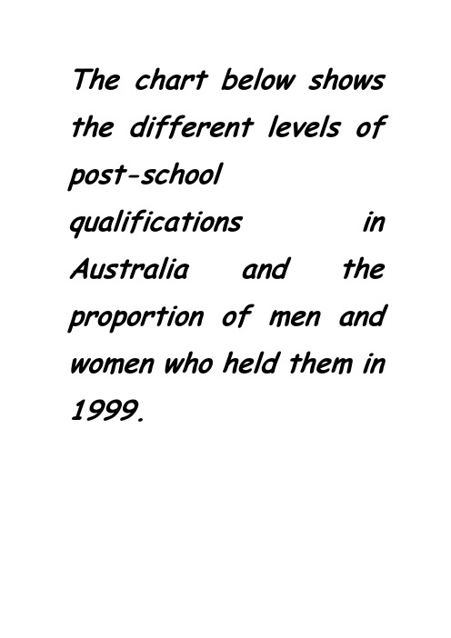
The chart below shows the different levels of post-school qualifications in Australia and the proportion of men and women who held them in 1999.对于男性,持有skilled-vocational diploma的人数比例是最高的,而女性,在持有undergraduate diploma 的人比例为最大。
最大比例的男性,大约90%,持有skilled-vocational diploma,而对于女性,仅仅为男性比例的1/9。
有70%的女性持有undergraduate diploma, 相比较于40%的男性。
对于持有postgraduate以及master的人群而言,男性多于女性。
最大的比例的差距体现在持有postgraduate人群,男性为70%,女性为30%。
有60%的男性持有master degree而女性的比例仅仅为40%。
相反的是,持有bachelor degree的人女性要高于男性,但是差值却最小,仅仅为10%。
处理方式二:总体而言,对于高学历人群而言,持有postgraduate以及master男性的比例要高于女性。
30%的女性获得postgraduate diploma,比持有同种学历的男性低了40%。
对于获得master的女性,与postgraduate的女性比例相比,出现了一个小幅度的增长,增长了10%。
而相反的是,男性的比例减少了10%。
对于持有skilled-vocational的人而言,与持有高学历的人相同的,男性的比例高于女性,但是,差距却是最明显的。
有90%的男性获得这个学历,是女性的9倍。
而对于获得undergraduate 以及bachelor学历的人而言,情况相反。
在所有女性,持有undergraduate的人的比例是最高的,为70%,相反的是男性的比例为最低的,仅仅为大约40%。

Writing task 1Sample 1Y ou should spend about 20 minutes on this task.The map below is of the town of Garlsdon. A new supermarket(S) is planned for the town. The map shows two possible sites for the supermarket.Summarise the information by selecting and reporting the main features and make comparisons where relevant.MODEL ANSWERThe map shows two proposed locations for a new supermarket for the town of Garlsdon.The first potential location (S1)is outside the town itself, and is sited just off the main road to the town of Hindon, lying 12Kms to the north-west. This site is in the countryside and so would be able to accommodate a lot of car parking. This would make it accessible to shoppers from both Hindon and Garlsdon who could travel by car. As it is also close to the railway line linking the twotowns to Cransdon(25km to the south-east), a potentially large number of shoppers would also be able to travel by train.In contrast, the suggested location, S2, is right in the town centre, which would be good of local residents. Theoretically the store could be accessed by road or rail from the surrounding towns, including Bransdon, but as the central area is a no-traffic zone, cars would be unable to park and access would be difficult.Overall, neither site is appropriate for all the towns, but for customers in Cransdon, Hindon and Garlsdon, the out-of-town site (S1) would probably offer more advantages.Sample 2The table below gives information about the underground railway systems in six cities.Summarise the information by selecting and reporting the main features, and make comparisons where relevant.Underground Railway SystemsMODEL ANSERThe table shows the details regarding the underground railway systems in six cities.London has the oldest underground railway systems among the six cities. It was opened in the year 1863, and it is already 140 years old. Paris is the second oldest, in which it was opened in the year 1900. This was then followed by the opening of the railway systems in Tokyo, Washington DC and Kyoto. Los Angeles has the newest underground railway system, and was only opened in the year 2001. In terms of the size of the railway systems, London, for certain, has the largest underground railway systems. It has 394 kilometers of route in total, which is nearly twice as large as the system in Paris. Kyoto, in contrast, has the smallest system. It only has 11 kilometers ofroute, which is more than 30 times less than that of London.Interestingly, Tokyo, which only has 155 kilometers of route, serves the greatest number of passengers per year, at 1927 millions passengers. The system in Paris has the second greatest number of passengers, at 1191 millions passengers per year. The smallest underground railway system, Kyoto, serves the smallest number of passengers per year as predicted.In conclusion, the underground railway systems in different cities vary a lot in the size of the system, the number of passengers served per year and in the age of the system.Sample 3The graph and table below give information about water use worldwide and water consumption in two different countries.Summarise the information by selecting and reporting the main features, and make comparisons where relevant.MODEL ANSWERThis model has been prepared by an examiner as an example of a very good answer. However, please note that this is just one example out of many possible approaches.The graph shows how the amount of water used worldwide changed between 1900 and 2000.Throughout the century, the largest quantity of water was used for agricultural purposes, and this increased dramatically from about 500 km3 to around 3,000 km3 in the year 2000. Water used in the industrial and domestic sectors also increased, but consumption was minimal until mid-century. From 1950 onwards, industrial uses grew steadily to just over 1,000 km3, while domestic use rose more slowly to only 300 km3oth far below the levels of consumption by agriculture.The table illustrates the differences in agricultural consumption in some areas of the world by contrasting the amount of irrigated land in Brazil (26,500 km3 ) with that in the D.R.C. (100 km3). This means that a huge amount of water is used in agriculture in Brazil, and this is reflected on the figures for water consumption per person: 359 m3 compared with only 8 m3 in the Congo. With a population of 176 million, the figures for Brazil indicate how high agricultural water consumption can be in some countries.Sample 4The table below gives information about changes in modes of travel in England between 1985 and 2000.Summarise the information by selecting and reporting the main features and make comparisons where relevant.A verage distance in miles traveled per person per year, by mode of travelSAMPLE ANSERThis is an answer written by a candidate who achieved a Band 6score. Here is the examiner’scomment:This answer does not introduce the information in the table, nor does it report it accurately. The figures are misinterpreted as representing the number of people rather than the average number of miles traveled per person per year. Consequently the information about the increase in total travel is simply not mentioned, so not all key information is covered. There is an attempt to summarise trends in the figures, but the reader cannot get a clear overall picture of the information because of the fundamental confusionNevertheless, the information is organized and the writing flows quite well because of good use of referencing and other connectors, but there are occasional errors in these and the links between ideas are slightly confusing at times.The strong feature in this answer is the range of vocabulary which is used with some flexibility and good control. A good range of structures is also used, but there are still some fairly basic mistakes, such as in the choice of tense, subject/verb agreement and inappropriate use of the passive.In 2000 the most preferred mode of travel is by car with 4,860 people. There’s a noticeable decrease in public transportation locally where it dropped from 429 people in 1985 to 274 people in 2000. However the long distance bus rides is much more preferred by people as its figures are more than doubled in the last 15 years. People who chose to walk or cycle are decreased slightly in 2000, which probable made people take the train more often. There is a significant increase in the numbers of people who traveled by train. It jumped from 289 in 1985 to 366 in 2000. This makes the train second popular mode of transportation. The biggest leap in the chart is the increase of taxi users who are tripled in 2000 with 42 people where it was only 13 in 1985.Apart from all this modes of travel, there are some more different types of travel as well of course. Number of people choosing different modes of travel is rapidly increased from 450 to 585 in 2000.Sample 5The diagrams below show the life cycle of the silkworm and the stages in the production of silk cloth.Summarise the information by selecting and reporting the main features, and make comparisons where relevant.MODEL ANSWERThis model has been prepared by an examiner as an example of a very good answer. However, please note that this is just one example out of many possible approaches.The first diagram shows that there are four main stages in the life of the silkworm. First of all, eggs are produced by the moth and it takes ten days for each egg to become a silkworm larva that feeds on mulberry leaves. This stage lasts for up to six weeks until the larva produces a cocoon of silk thread around itself. After a period of about three weeks, the adult moths eventually emerge from these cocoons and the life cycle begins again.The cocoons are the raw material used for the production of silk cloth. Once selected, they are boiled in water and the threads can be separated in the unwinding stage. Each thread is between 300 and 900 metres long, which means they can be twisted together, dyed and then used toproduce cloth in the weaving stage.Overall, the diagrams show that the cocoon stage of the silkworm can be used to produce silk cloth through a very simple process.Sample 6The charts below give information about USA marriage and divorce rates between 1970 and 2000, and the marital status of adult Americans in two of the years.Summarise the information by selecting and reporting the main features and make comparisons where relevant.SAMPLE ANSWERThis is an answer written by a candidate who achieved a Band 6.5 score. Here is the examiner’s comment:The task Achievement is the weak point in this answer. Some of the data is summarized but the points are not well-selected to convey the key trends shown in the charts. The main features of the first chart are not adequately presented and the overall conclusion does not summarise the main information. No figures are given to illustrate the points made.The information is well-organised, however, with clear paragraphing and well-signaled sections. The accurate use of a range of sequencers and other linkers makes it easy to follow the writing. There are examples of errors but they are not frequent and do not cause confusion.A range of vocabulary is used with flexibility, in spite of some inappropriate collocations and awkward phrasing. Structures are varied and generally accurate, while any mistakes do not make the message unclear.We are given two charts which show us a few sets of data about the marital status of the Americans between 1970 and 2000.The first chart compares the number of marriages and divorces in the United States of America between 1970 and 2000. We can see that data is given for each decade; the number of people who are getting married decreased slightly since 1980, as well as the divorces one. Nevertheless, divorces increased between 1970 and 1980.The second chart is more precise about the different marital status of the Americans between 1970 and 2000. The number of divorced people has risen more than the double during this two years, and the data for the never married people has also increased significantly. However, less and less people are married, as the first chart showed us; the widowed American number is also decreasing.As a conclusion, we can say that the marital status background of the Americans has maybe known the greatest change it had ever seen.Sample 7The graph below shows the demand for electricity in England during typical days in winter and summer. The pie chart shows how electricity is used in an average English home.Summarise the information by selecting and reporting the main features, and make comparisons where relevant.SAMPLE ANSWERThis is an answer written by a candidate who achieved a Band 6score. Here is the examiner’s comment:This answer focuses too closely on the details in the graph but fails to compare trends or general differences between figures of winter and summer. Some comparisons are made, but these are about details, and it is difficult to get a clear idea of the information from this description.Similarly, information in the pie chart is simply listed using the language from the chart and there is no attempt to relate this to information in the graph.The description is not well organized, although a range of linkers are used, and the use of paragraphs does not reflect the different sections of information covered.There is a suitable range of vocabulary for this task, although some words are misused and there are several spelling errors. The range and control of grammatical structures is the strong point ofthe main part of this response. There are examples of complex structures that are used with accuracy and some flexibility.The use of electricity in England is indispensed with demand for electricity in England during typical days in wither and summer is illustrated in the graph. The use of electricity in an average English home is shown in the pie chart. From the graph, it is generally obvious that the demand is in its maximum around 2100 in winter times, and in its minimum around 400, being almost constant between 1200 and 2100 in winter times. During summer times, on the other hand, the demand reaches its top point around 1300, and the bottom point around 900, being almost constant between 1550 and 2000.In wither times, the curve gradually increases to reach 40,000 units of electricity by 3 o’clock in the morning. This is followed by gradual decline to its lowest limit of 30,000 units at 9 o’clock. A gradual rise is obvious again to reach a stationary level between 3 o'clock and 9 o’clock of about 40,000 units again. Then, there is a sharp rise in the next hour to reach its maximum before collapsing again to a a lower level by the end of the day.In summer time, the curve gradually decrease to reach its lower limit around 9 o’clock of a bit more that 10,000 units. A gradual increase is noticed to reach its top of 20,000 after which a stationary phase is obvious between 3 o’clock and 10 o’clock at night of about 15,000 units.The pie chart, on the other hand, shows that 52.5% of the electricity is used for heating rooms and water. 17.5% is consumed for ovens, kettles and washing machines, 15% is used in lighting, TV and radio, and finally 15% is consumed in the sue of vacuum cleaners, food mixtures and electric tools.。

雅思写作Task1饼状图考官范文(4)The table below shows CO2 emissions for different forms of transport in the European Union. The Pie Chart shows the percentage of European Union funds being spent on different forms of transport.Write a report for a university lecturer describing the information in the graph below.Sample Answer:The given graphs provide information on the amount of Carbon dioxide emission per person from different vehicles in the European Union and also show the expenditures on different modes of transportations. As is observed from the given illustration, the highest amount of CO2 per person is emitted by the Air transports and European Union spends highest percentage of funds for the road transportation system.According to the bar graph, a single passenger of a personal cars emit around 130 gm of CO2 per kilometer while a passenger in a bus contribute to 65 gm of emission per kilometer. Coaches, maritime and rail passengers emit the lowest amount of CO2which is about 50 grams per passenger in a kilometer. Finally a single passenger of airplane contributes to 370 km of CO2 per kilo which is the highest amount of CO2 emission among the given transportations.Based on the pie chart, the European Union spent the highest amount (52%) on the road transportation system while spent only 1% or 2% on ports, waterway airport intermodal and other transport systems. They spent 31% on rail system and 10% on public transportation system. This indicates the European Union spent the majority of the budget on public transportations.In summary, Airplanes and personal car using passengers per person cause more CO2 emission than other mode of public transportation and European Union spend more on road and railways than other mode of transports.(Approximately 238 words)( This model answer can be followed as an example of a very good answer. However, please note that this is just one example out of many possible approaches.)。
雅思写作Task1曲线图考官范文(12)(最新版)编制人:__________________审核人:__________________审批人:__________________编制学校:__________________编制时间:____年____月____日序言作文(composition)是经过人的思想考虑和语言组织,通过文字来表达一个主题意义的记叙方法。
作文分为小学作文,中学作文,大学作文(论文)。
作文体裁包括:记叙文、说明文、应用文、议论文。
作文并不神秘,要想写好一篇文章,首先要多看,多想,勤于观察,积累素材。
只有细致的观察生活,积累素材才是写好作文的基础。
首先要明确你要写的主题,认真的审题,列出大纲,不要只注意题目中要求的字有多少,要多注意题目的本身,要多读多想,准确的用好词语和修饰语。
这是审题的关键,要确立好主题的依据,要精心的选材,布局列题,有的材料,还要分析整理。
这就要对材料进行分类,比较,概括,筛选。
我们不要象盖房子那样的把所有的材料都堆砌起来,要合理恰当的组合,具体的说开头和结尾要略写,那么经过就要仔细的推敲,修辞,润色,写好以后不要急于交稿,反复检查认真的修改。
古人说:书读百遍,其义自见。
熟读唐诗三百首,不会作诗也会吟。
这些都说明一个道理,只要你多看书,多读书对你的写作文有一定的好处。
只要你明白这样的一个道理,作文就是要你把生活中喜,怒,哀,乐用文字经过加工,修饰。
整理,也就是我们说的作文。
作文内容英语作文啦雅思频道特为大家收集整理了雅思写作Task1曲线图考官范文。
认真研读一定的雅思范文及作文模板可以帮助我们检验自己的写作水平,并能很好地吸收和应用优秀范文里的优秀内容~更多雅思报名官网的最新消息,最新、最专业的雅思备考资料,英语作文啦将第一时间为大家发布。
The graph below shows the rate of smoking per 1000 people in Someland from 1960 to 2000.Write a report for a university lecturer describing the information in the graph below.Sample Answer:The provided graph compares the male and female smokers between the years 1960 to 2000 in Someland. As is observed from the given presentation, over the 40 years the number of male smokers dropped significantly while the number of female smokers increased.Initially in 1960, 600 male out of 1000 smoked and the female smokers were less 100 in number in this year. Over the next 40 years the number of male smokers decreasedsteadily and reached to just over 200 out of 1000 people. On the contrary, though the number of female smokers was always less than the male smokers, their number increased over time. In 2000, the male and female smokers’ number both got at around 200 in 1000 people.In summary, Male smokers were higher in number than female smokers from 1960 to 2000 but while the number of male smokers decreased steadily, female smoker’s number increased and in 2000, the percentage or male and female smokers got almost same.(Approximately 163 words)。

You should spend about 20 minutes on this task.The graph below compares the number of visits to two new music sites on the web.Write a report for a university lecturer describing the information shown below.You should write at least 150 words.model answer:The graph shows people using new music places on the Internet in fifteen days period of time namely personal choice and trendy pop music.The overall trend shows fluctuation with slight Increased towards the end of the period.Starting with Music Choice websites; 40,000 poeple went on this new site on first-day. Half of them backed out the next day. In Contrast to this Pop Parade net sites were visited by 120,000 music lovers on day one which decreased slightly on the next day thereafter regaining the same fame on 3rd day.After 3rd day the enthusiasm for both music lines on Internet dropped slowly- reaching maximum fall of 40,000 on 7th day. Whereas Music choice gained popularity, slightly Improoving to get the original strength of 30,000 viewers on screen, but was getting still less visiters than their opponent Pop group i.e. 40,000 on day 7.In the biegining of the next week both gained remarkable recovery after a few fluctuations for8th and 9th day having 40,000 and 50,000 visiters respectively, reaching to their peaks of one and a half thousand new viewers for Pop Parade on 11th day showing a contrast of very few people visiting Music choice for the same day. Thereafter Music choice gained popularity on 12th day for having more than 120,000 new visiters on web.In the end of the period Pop sites were visited by maximum viewers of 180,000 whereas sites located to Music choice were not explored by more than 80,000 explorers on the last day of the report.This is an answer written by a candidate who achieved a Band 6 score. Here is the examiner's comment:Well organized with some good linking devices and collocations (gain popularity, remarkable recovery, decrease slightly) and some valid comparison of the music sites. However, some sentences are long and confusing (paragraph 5), some collocations are inaccurate (slight increased, reaching to their peaks) and there is some repetition (7th day, 3rd day, 11 th day). Some words are spelt incorrectly (poeple, Improoving, visiters, biegining).You should spend about 20 minutes on this task.The table below shows the proportion of different categories of families living in poverty in Australia in 1999.Summarise the information by selecting and reporting the main features, and make comparisons where relevant.You should write at least 150 words.Give reasons for your answer and include any relevant examples from your own knowledge or experience.model answer:The table gives a breakdown of the different type of family who were living in poverty in Australia in 1999.On average, 11% of all households, comprising almost two million people, were in this position. However, those consisting of only one parent or a single adult had almost doubt this proportion of poor people, with 21% and 19% respectively.Couples generally tended to be better off, with lower poverty levels for couples without children (7%) than those with children (12%). It is noticeable that for both types of household with children, a higher than average proportion were living in poverty at this time.Older people were generally less likely to be poor, though once again the trend favoured eldery couples (only 4%) rather than single eldery people (6%).Overall the table suggests that households of single adults and those with children were more likely to be living in poverty than those consisting of couples.(154 words)You should spend about 20 minutes on this task.The charts below show the percentage of their food budget the average family spent on restaurant meals in different years. The graph shows the number of meals eaten in fast food restaurants and sit-down restaurants.You should write at least 150 words.Give reasons for your answer and include any relevant examples from your own knowledge or experience.model answer:Over the past 30 years, the average family has dramatically increased the number of meals that they eat at restaurants. The percentage of the family's food budget spent on restaurant meals steadily climbed. Just 10 percent of the food budget was spent on restaurant meals in 1970, and 15 percent in 1980. That percentage more than doubled in 1990, to 35 percent, and rose again in 2000 to 50 percent.Where families eat their restaurant meals also changed during that 30-year period. In 1970,families ate the same number of meals at fast food and sit-down restaurants. In 1980,fam¬ilies ate slightly more frequently at sit-down restaurants. However, since 1990, fast food restaurants serve more meals to the families than do the sit-down restaurants. Most of the restaurant meals from 2000 were eaten at fast food restaurants. If this pattern continues, eventually the number of meals that families eat at fast food restaurants could double the number of meals they eat at sit-down restaurants.(164 words)You should spend about 20 minutes on this task.The table below shows CO2 emissions for different forms of transport in the European Union.The Pie Chart shows the percentage of European Union funds being spent on different forms of transport.You should write at least 150 words.Give reasons for your answer and include any relevant examples from your own knowledge or experience.model answer:The chart shows CO2 emissions per passenger kilometre for variuos methods of transport in the European Union while the pie chart shows European Union spending on transport. Flying by air produces by far the greatest CO2 emissions, approximately three times as much as passenger cars which are the next largest producers. Very little is spent by the EU on air travel while roads make up more than half of the EU transport budget.Trains produce about three times less CO2 emissions per passenger kilometre than passenger cars and eight times less than air travel. Nearly a third of EU transport funds are spent on railways.Ships are a clean form of transport and produce about the same amount of CO2 per passenger kilometre as trains do. However, only 2 percent of EU funds are spent on ports. A further one percent is spent on inland waterways.Coaches are the cleanest form of transport. Emissions of CO2 per passenger kilometre from coaches are half those of buses. Buses emit less than half as much CO2 per passenger kilometre as cars. The European Union spends 10 percent of its transport budget on public transport, such as buses and coaches.(197 words)You should spend about 20 minutes on this task.The table below shows the sales at a small restaurant in a downtown business district.Summarize the information by selecting and reporting the main features, and make comparisons where relevant.You should write at least 150 words.Give reasons for your answer and include any relevant examples from your own knowledge or experience.Fulfilling the Work Experience RequirementCredits will be awarded when the final report is submitted.ApplicationChoose potential workplaces from approved list and arrangeinterviews. Submit applications to places of interest.ApprovalWhen acceptance letter is received, submit itto professor for approval.Arrange schedule to work a minimum of 10hours/ week over 20 weeks.ReportsComplete weekly Report Form and submit toprofessor every Friday.EvaluationDuring final workweek, participate in evaluation meeting with worksupervisor. Supervisor submits Evaluation Form.Submit Final Report before last week of spring term.model answer:Gaining work experience prior to graduation helps university students to succeed in getting their first job. For this reason, some universities insist that all students must complete a Work Experience Requirement. Completing the following six stages results in the requirements’ fulfillment.The process begins with the Application stage. A student reviews an approved list of workplaces and submits applications to places where he would like to work. Next is the Approval stage. When a student receives an acceptance letter, he gives it to the professor for approval. The third stage, Schedule, requires a student to arrange his work schedule. The student should work at least 10 hours/week over 20 weeks. Reports are next. The student must complete a Weekly Report Form and turn it in to the professor every Friday.The fifth stage, Evaluation, takes place during the final work week. A student participates in an evaluation meeting with his work supervisor, who submits an Evaluation Form. The last stage requires that a student submit a Final Report before the last week of spring semester.By following these stages and subsequently submitting the final report, the student receives credit from the university.(192 words)。

剑11Test3雅思写作task1题目+范文-CO2排放趋势图剑11Test3雅思写作task1题目:The graph below shows average carbon dioxide (CO2) emissions per person in the United Kingdom, Sweden, Italy and Portugal between 1967 and 2007. Summarise the information by selecting and reporting the main features, and make comparisons where relevant.a)解析:包括回答中需要讨论的主要特征、需要进行的对比以及考生可能对题目产生的错误理解。
8要点1.学生应该写出在四个欧洲国家中二氧化碳人均排放量的变化趋势。
2.学生应该对这些趋势做出相应的比较。
8错误理解1.学生在写作的时候可能会用现在时而不是过去时。
2.学生写作时有可能过多地注意细节而不是主要特征。
3.学生有可能忘记写单位。
b) 雅思写作范文(一):The graph shows the average CO2 each person emits in four different countries: the UK, Sweden, Italy and Portugal over a 40- year period beginning in 1967. From the chart we can clearly see that Sweden and the UK have had a general downward trend. In Sweden, however, between the years 1967 and 1977 it did increase slightly from a little over 8 metric tonnes to over 10 metric tonnes. The Swedish decline was considerably more than that of the UK and actually nearly halved its output with the figure in 2007 showing a little under 6 metric tonnes. Both Italy and Portugal, steadily increased the emissions, with Portugal showing the greatest rise from a little under 2 metric tonnes in 1967, to nearly 6 metric tonnes by 2007. In summary, we can see that the overall amount of emissions recorded in 1967 is less than those of 2007.这个图表描述的是四个国家的人均二氧化碳排放量,即英国、瑞典、意大利和葡萄牙从1967年起的40年间的数据。
剑桥雅思1-4 Writing_Task_1小作文范文剑一--Test 3―Task1 (bar chart combined with line graph)The chart below shows the amount of money per week spent on fast foods in Britain. The graph shows the trends in consumption of fast-foods.Write a report for a university lecturer describing the information shown below.(Model answer 165 words)The chart shows that high income earners consumed considerably more fast foods than the other income groups, spending more than twice as much on hamburgers (43 pence per person per week) than on fish and chips or pizza(both under 20 pence). Average income earners also favoured hamburgers,spending 33 pence per person per week, followed by fish and chips at 24 pence,then pizzaat 11 pence. Low income earners appear to spend less than otherincome groupson fast foods, though fish and chips remains their most popularfast food, followed by hamburgers and then pizza.From the graph we can see that in 1970, fish and chips were twice as popularasburgers, pizza being at that time the least popular fast food. The consumption ofhamburgers and pizza has risen steadily over the 20 year periodto 1990 while theconsumption of fish and chips has been in decline over that same period with aslight increase in popularity since 1985.剑二-Test1-Task1(Table)The table below shows the consumer durables (telephone, refrigerator, etc.) owned in Britain from 1972 to 1983.Write a report for a university lecturer describing the information shown below.The chart shows that the percentage of British households with a range of consumer durables steadily increased between 1972 and 1983. The greatestincrease was in telephone ownership, rising from 42% in 1972 to 77% in 1983. Next camecentral heating ownership, rising from 37% of households in 1972 to 64% in 1983. The percentage of households with a refrigerator rose 21% over the same period and of those with a washing machine by 14%. Households with vacuum-cleaners, televisions and dishwashers increased by 8%, 5% and 2%, respectively. In 1983, theyear of their introduction, 18% of households had a video recorder.The significant social changes reflected in the statistics are that over the period the proportion of British houses with central heating rose from one to two thirds, and of those with a phone from under a half to over three-quarters. Together with the big increases in the ownership of washing machines and refrigerators, they are evidence of both rising living standards and the trend to lifestyles based on comfort and convenience.(173 words)剑二-Test2-Task1(Bar chart)The chart below shows the amount of leisure time enjoyed by men and women of different employment status.Write a report for a university lecturer describing the information shown below.The chart shows the number of hours of leisure enjoyed by men and women in a typical week in 1998-9, according to gender and employment status.Among those employed full-time, men on average had fifty hours to leisure, whereas women had approximately thirty-seven hours. There were no figures given for male part-time workers, but female part-time had forty hours of leisure time, only slightly more than women in full-time employment, perhaps reflecting their work inthe home.In the unemployed and retired categories, leisure time showed an increase for both sexes, as might have been expected. Here too, men enjoyed moreleisure time―over eighty hours, compared with seventy hours for women, perhaps once again reflecting the fact that women spend more time working in the home than men.Lastly, housewives enjoyed approximately fifty-four hours of leisure, on average. There were no figures given for househusbands! Overall, the chart demonstrates that in the categories for which statistics on male leisure time were available, men enjoyed at least ten hours of extra leisure time. (173 words)剑二-Test3-Task1(Table)Band 7剑二-Test4-Task1(Bar chart)The table below shows the figures for imprisonment in five countries between 1930 and 1980.Write a report for a university lecturer describing the information shown below.感谢您的阅读,祝您生活愉快。
雅思写作Task1曲线图考官范文(10)(最新版)编制人:__________________审核人:__________________审批人:__________________编制学校:__________________编制时间:____年____月____日序言作文(composition)是经过人的思想考虑和语言组织,通过文字来表达一个主题意义的记叙方法。
作文分为小学作文,中学作文,大学作文(论文)。
作文体裁包括:记叙文、说明文、应用文、议论文。
作文并不神秘,要想写好一篇文章,首先要多看,多想,勤于观察,积累素材。
只有细致的观察生活,积累素材才是写好作文的基础。
首先要明确你要写的主题,认真的审题,列出大纲,不要只注意题目中要求的字有多少,要多注意题目的本身,要多读多想,准确的用好词语和修饰语。
这是审题的关键,要确立好主题的依据,要精心的选材,布局列题,有的材料,还要分析整理。
这就要对材料进行分类,比较,概括,筛选。
我们不要象盖房子那样的把所有的材料都堆砌起来,要合理恰当的组合,具体的说开头和结尾要略写,那么经过就要仔细的推敲,修辞,润色,写好以后不要急于交稿,反复检查认真的修改。
古人说:书读百遍,其义自见。
熟读唐诗三百首,不会作诗也会吟。
这些都说明一个道理,只要你多看书,多读书对你的写作文有一定的好处。
只要你明白这样的一个道理,作文就是要你把生活中喜,怒,哀,乐用文字经过加工,修饰。
整理,也就是我们说的作文。
作文内容英语作文啦雅思频道特为大家收集整理了雅思写作Task1曲线图考官范文。
认真研读一定的雅思范文及作文模板可以帮助我们检验自己的写作水平,并能很好地吸收和应用优秀范文里的优秀内容~更多雅思报名官网的最新消息,最新、最专业的雅思备考资料,英语作文啦将第一时间为大家发布。
The graph and table below give information about water use worldwide and water consumption in two different countries.Summarize the information by selecting and reporting the main features, and make comparisons where relevant.Sample Answer:The graph shows how the amount of water used worldwide changed between 1900 and 2000 and water consumptions of two countries compared to their population.Throughout the century, the largest quantity of water was used for agricultural Purposes, and this increased dramatically from about 500 km³ to around 3,000km³ in the year 2000. Water used in the industrial and domestic sectors also increased, but consumption was minimal until mid-century. From 1950 onwards, industrial use grew steadily to just over 1,000 km³, while domestic use rose more slowly to only 300 km³, both far below the levels of consumption by agriculture.The table illustrates the differences in agriculture consumption in some areas of the world by contrasting the amount of irrigated land in Brazil (26,500 km³) with that in the D.R.C. (100 km²). This means that a huge amount of water is used in agriculture in Brazil, and this is reflected in the figures for water consumption per person: 359 m³ compared with only 8 m³ in the Congo. With a population of 176 million, the figures for Brazil indicate how high agriculture water consumption can be in some countries.(Approximately 275 words)。
The chart and graph below give information about sales and share prices for Coca-Cola.Write a report for a university lecturer describing the information shown below.You should write at least 150 words.You should spend about 20 minutes on this task.Model answer:The pie chart shows the worldwide distribution of sales of Coca-Cola in the year 2000 and the graph shows the change in share prices between 1996 and 2001.In the year 2000, Coca-Cola sold a total of 17.1 billion cases of their fizzy drink product worldwide. The largest consumer was North America, where 30.4 per cent of the total volume was purchased. The second largest consumer was Latin America. Europe and Asia purchased 20.5 and 16.4 per cent of the total volume respectively, while Africa and the Middle East remained fairly small consumers at 7 per cent of the total volume of sales.Since 1996, share prices for Coca-Cola have fluctuated. In that year, shares were valued at approximately $35. Between 1996 and 1997, however, prices rose significantly to $70 per share. They dipped a little in mid-1997 and then peaked at $80 per share in mid-98. From then until 2000 their value fell consistently but there was a slight rise in mid-2000.Written by Rad DaneshThe chart below gives information about global sales of games software, CDs and DVD or video. Write a report for a university lecturer describing the information.You should write at least 150 words.You should spend about 20 minutes on this task.Model answer:The chart shows the changes in the sales of video material / DVDs, games software and CDs around the world in billions of dollars over a three-year period. It can be seen that the sales of videos / DVDs and games software have increased, while the sales of CDs have gone down slightly.Between 2000 and 2003, the sale of videos and DVDs rose by approximately 13 billion dollars. In 2000, just under 20 billion dollars worth of these items were sold, but in 2003, this figure had risen to a little over 30 billion dollars.The sales of games software also rose during this period, but less sharply. Sales increased from about 13 billion dollars in 2000 to just under 20 billion dollars three years later. By contrast, during the same time period, the sale of CDs fell from 35 billion dollars in 2000 to about 32.5 billion dollars in 2003.Written by Rad DaneshThe graphs below show the types of music albums purchased by people in Britain according to s3x and age.Write a report for a university lecturer describing the information shown below.You should write at least 150 words.You should spend about 20 minutes on this task.Model answer:The three graphs provide an overview of the types of music people purchase in the UK. At first glance we see that classical music is far less popular than pop or rock music.While slightly more women than men buy pop music, the rock market is dominated by men with 30% buying rock, compared to 17% of women. From the first graph we see that interest in pop music is steady from age 16 to 44 with 20% of the population continuing to buy pop CDs after the age of 45.The interest in rock music reaches its peak among the 25 to 34 year olds, though it never sells as well as pop. Interest also drops off after the age of 35 with an even sharper fall from age 45 onwards, a pattern which is the opposite to the classical music graph.雅思A类TASK1(图表)官方范文(4)You should spend about 20 minutes on this task.The graphs below show the numbers of male and female workers in 1975 and 1995 in several employment sectors of the republic of Freedonia.Write a report for a university teacher describing the information shown.You should write at least 150 words.The two decades between 1975 and 1995 brought significant changes in the representation of women in Freedonia's work force, according to the graphs.In 1975, for example, some 300 000 men and 250 000 women worked in the communications sector. Twenty years later, though the number of men remained unchanged, the number of women rose to 550 000.A similar situation was seen in the wholesale and retail trade sector, where the number of women rose from about 550 000 in 1975 to almost 800 000 two decades later. The number of men in this sector remained stable over the period, at around 700 000.Women also made gains in both the finance/banking industries and in the defence-related public sector. Whereas some 125 000 women worked in finance and banking institutions in 1975, the number increased to 450 000 by 1995. The number of men grew only marginally from 425 000 to 480 000 over the same period. In defence, the number of men declined from 225 000 to 200 000, while the number of women rose from 25 000 to over 100 000.Two sectors that retained stable employment numbers for both men and women were manufacturing, which had about 300 000 women and 650 000 men in both surveyed years, and the public sector (non-defence), which employed 650 000 women and 850 000 men.Thus, women appear to have made gains in the Freedonian work force but not at the expense of men.Written by Rad DaneshYou should spend about 20 minutes on this task.Eating sweet foods produces acid in the mouth, which can cause tooth decay. (High acid levels are measured by low pH values)Describe the information below and discuss the implications for dental health.You should write at least 150 words.model answer:Anyone who has visited a dentist has been told that eating excessive amounts of sweets risks harming the teeth. This is because sweets lower pH levels in the mouth to dangerous levels.When the pH level in the mouth is kept above 5.5, acidity is such that teeth are unlikely to be in danger of decay. Sweet foods, however, cause pH in the mouth to drop for a time, and the longer pH levels remain below 5.5, the greater the opportunity for decay to occur.By comparing fruit sugar, cane sugar and honey, which are all common ingredients of sweet foods, we find that cane sugar lowers pH levels for the longest period, thus producing the greatest risk of the three. Approximately five minutes aftfter consuming cane sugar, pH levels drop to as little as pH 3.5. They then begin to rise slowly, but do not rise above pH 5.5 until at least 30 minutes have elapsed. By contrast, fruit sugar, which causes the mouth's acidity to fall to just above pH 4, poses a danger for a shorter period: tooth decay is unlikely 20 minutes after consumption. Honey appears an even less risky substance. Though acidity falls to about pH 4.75 within five minutes of consumption, it returns to above pH 5.5 in under fifteen minutes.The implications, then, are that people who insist on eating sweet foods should be aware of the ingredients, and that fruit sugar or honey appear preferable to cane sugar.Written by Rad DaneshThe diagram below shows the typical stages of consumer goods manufacturing, including the process by which information is fed back to earlier stages to enable adjustment.Write a report for a university lecturer describing the process shown.You should write at least 150 words.You should spend about 20 minutes on this task.Model answer:Most consumer goods go through a series of stages before they emerge as finished products ready for sale.Raw materials and manufactured components comprise the initial physical input in the manufacturing process. Once obtained, these are stored for later assembly. But assembly first depends upon the production planning stage, where it is decided how and in what quantities the stored materials will be processed to create sufficient quantities of finished goods. The production planning stage itself follows the requirements of the goods' design stage that proceeds from extensive research. After assembly, the products are inspected and tested to maintain quality control l Those units that pass the inspection and testing stages are then packaged, despatched and offered for sale in retail outlets. The level of sales, which is the end point of the manufacturing process, helps determine production planning.A product's design is not only the result of product research, but is also influenced by testing and market research. If the testing stage (after assembly and inspection) reveals unacceptable problems in the finished product, then adjustments will have to be made to the product's design. Similarly, market research, which examines the extent and nature of the demand for products, has the role of guiding product design to suit consumer demands which may change with time. Market research, while influenced by product sales, also serves to foster future sales by devising suitable advertising for the goods.Thus the reality of consumer goods manufacturing goes well beyond a simple linear production process.Written by Rad Danesh雅思A类TASK1(图表)官方范文(7)The table below shows social and economic indicators for four countries in 1994, according to United Nations statistics.Describe the information shown below in your own words. What implications do the indicators have for the countries?You should write at least 150 words.Allow yourself 20 minutes for this task.雅思A类TASK1(图表)官方范文(8)The diagram below shows the average hours of unpaid work per week done by people in different categories. (Unpaid work refers to such activities as childcare in the home, housework and gardening.)Describe the information presented below, comparing results for men and women in the categories shown. Suggest reasons for what you see.You should write at least 150 words.You should spend about 20 minutes on this task.Model answer:The diagram reveals that the number of hours per week spent in unpaid work is unequally distributed between men and women.In households where there are no children, women are reported to work some 30 hours per week in such tasks as housework and gardening. Men's contribution to these unpaid jobs averages a considerably lower 18 hours.When children enter the household, however, the inequality becomes even more pronounced. In families of 1 - 2 children, men maintain approximately the same number of hours of unpaid work as in childless households, but the number of hours women work in the home rises to 52 per week, much of it, on doubt, due to childcare responsibilities.Interestingly, when there are three or more children in the household, men are found to work even fewer hours around the house than before the appearance of the third child. Whereas women'sunpaid hours rise to approximately 56 per week, the corresponding figure for men, 16, actually represents a decrease.The data suggest that the increased presence of women in the paid work force has yet to lead to an increased role for men in the home.Written by Rad Danesh雅思A类TASK1(图表)官方范文(9)The chart below shows the amount of leisure time enjoyed by men and women of different employment status.Write a report for a university lecturer describing the information shown below.You should write at least 150 words.Allow yourself 20 minutes for this task.Model answer:The chart shows the number of hours of leisure enjoyed by men and women in a typical week in 1998-9, according to gender and employment status.Among those employed full-time, men on average had fifty hours of leisure, whereas women had approximately thirty-seven hours. There were no figures given for male part-time workers, but female part-timers had forty hours of leisure time, only slightly more than women in full-time employment, perhaps reflecting their work in the home.In the unemployed and retired categories, leisure time showed an increase for both sexes, as mighthave been expected. Here too, men enjoyed more leisure time over eighty hours, compared with seventy hours for women, perhaps once again reflecting the fact that women spend more time working in the home than men.Lastly, housewives enjoyed approximately fifty-four hours of leisure, on average. There were no figures given for househusbands! Overall, the chart demonstrates that in the categories for which statistics on male leisure time were available, men enjoyed at least ten hours of extra leisure time.Written by Rad Danesh雅思A类TASK1(图表)官方范文(10)Write a report for a university lecturer describing the information in the graph below.You should write at least 150 words.Allow yourself 20 minutes for this task.Model answer:The graph compares the rate of smoking in men and women in Someland between the years 1960 and 2000. It can be clearly seen that the rate of smoking for both men and women is currently declining and that fewer women have smoked throughout the period.In 1960, 600 men in every 1,000 was smoking. This number decreased gradually to 500 by 1974 and continued to decrease but more steeply to 250 in 2000. In contrast, the rate of smoking in women in 1960 was very low at only 80 in every 1,000. By 1968 this increased to 170, and increased again but more steeply to 320 in 1977. The rate of female smokers then remained stable at 320 until 1984 at which point the figures began to decline and had dropped to 200 by 2000.In conclusion we can see that the rate of smoking in men dropped throughout the whole period but was always at a higher level than the female figures. The rate of smoking in women increased until 1977 but then decreased for the rest of the period.Written by Rad Danesh雅思A类TASK1(图表)官方范文(11)Write a report for a university lecturer describing the information in the graphs below.You should write at least 150 words.Allow yourself 20 minutes for this task.Model answer:The graphs compare the number of deaths caused by six diseases in Someland in 1990 with the amount of research funding allocated to each of those diseases. It can be clearly seen that the amount of research funding in many cases did not correlate with the seriousness of the disease in terms of numbers of deaths.In 1990 there were around 0.2 million deaths from AIDS, 0.1 million deaths from leprosy, 0.3 million deaths from tropical diseases, 0.5 million deaths from diarrhoea, 0.4 million deaths from malaria and 1.8 million deaths from TB. These figures can be contrasted with the amount of funding allocated for each disease. In 1990 AIDS received 180 million dollars in research funding, leprosy 80 million dollars in research funding, tropical diseases 79 million dollars in research funding, diarrhoea 60 million dollars in research funding, malaria 50 million dollars and TB 20 million dollars in research funding.In conclusion it is clear that funding allocation for disease research in Someland is not wholly determined by the number of deaths for which each disease is responsible in a given year.Written by Rad Danesh雅思A类TASK1(图表)官方范文(12)(2010-07-20 19:05:26)Write a report for a university lecturer describing the information in the two graphs below.You should write at least 150 words.Allow yourself 20 minutes for this task.Model answer:The pie charts compare the highest level of education achieved by women in Someland across two years, 1945 and 1995. It can be clearly seen that women received a much higher level of education in Someland in 1995 than they did in 1945.In 1945 only 30% of women completed their secondary education and 1% went on to a first degree. No women had completed post-graduate studies. This situation had changed radically by 1995. In 1995, 90% of women in Someland had completed secondary education and of those, half had graduated from an initial degree and 20% had gone on to postgraduate studies. At the other end of the scale we can see that by 1995 all girls were completing lower secondary, although 10% ended their schooling at this point. This is in stark contrast with 1945 when only 30% of girls completed primary school, 35% had no schooling at all and 35% only completed the third grade.In conclusion, we can see that in the 50 years from 1945 to 1995 there have been huge positive developments to the education levels of women in Someland.Written by Rad雅思A类TASK1(图表)官方范文(13)Write a report for a university lecturer describing the information in the table below.You should write at least 150 words.Allow yourself 20 minutes for this task.Model answer:The table shows how people in different age groups spend their leisure time in Someland over the course of a year. It can be clearly seen that the amount of leisure time available varies considerably across the age groups and that people of different age levels have very different ways of spending their leisure time.According to the figures, as people age in Someland their social lives reduce. Teenagers and people in their twenties spend on average 500 hours per year on socialising and 350 hours of that time is with a group of more than 4 people. Although the total hours of socialising in their 30s, 40s,50s and 60s is fairly constant (between 300-350), socialising with more than 4 people drops dramatically to 50 hours in the 30s and 40s age groups and only 25 from 50 years old. Group and individual exercise follow a similar pattern.People of all ages spend a good part of their leisure time on entertainment such as TV/video viewing and cinema. In both cases, teenagers and retired people spend around twice as much time as those who are at working age. Home entertainment ranges from just over a thousand hours for teenagers and retired people and an average of 600 hours for everyone else. Cinema accounts for 100 hours of the teenagers and retired people’s leisure time and 25-50 hours for the rest.In conclusion we can see there is a significant trend towards solitary and smaller group activities as people grow older and that teenagers and retired people spend a lot more time on entertainment than those of working age do.雅思A类TASK1(图表)官方范文(14)Write a report describing the information in the graph below.You should write at least 150 words.You should spend about 20 minutes on this task.Model answer:The chart shows striking differences in the level of computer and Internet penetration in the Arab world.The UAE and Kuwait are by far the most computerized countries, with Lebanon a distant third. The UAE has over 150 computers for every 1000 inhabitants, compared to Kuwait's 130 and Lebanon's 60. In contrast, countries such as Egypt, Morocco and Syria have less than 20 computers per 1000 inhabitants.There are also great differences in Internet use and availability. The UAE has by far the highest proportion of users, with more than one-third of its population using the Internet. Kuwait and Lebanon are second and third again, with 100 users per thousand in Kuwait and 80 in Lebanon. In some countries the number using the Internet is negligible: Saudi Arabia has less than 20 users per thousand, and there are fewer than 5 users per thousand in Syria.One unusual feature of the graph is that Internet use does not seem to be directly related to the number of computers. In several countries (the UAE, Lebanon, Jordan and Oman), there are more Internet users per thousand people than computers. However, in other countries, such as Kuwait, Saudi Arabia and Syria, the number of Internet users is lower than the number of computers.In summary, there are major differences between computer use and Internet use in the Arab world, but the UAE clearly leads the area in both number of computers and number of internet users per capita.雅思A类TASK1(图表)官方范文(15)The graph below shows the different modes of transport used to travel to and from work in one European city in 1960, 1980 and 2000.Write a report for a university lecturer describing the information below.You should write at least 150 words.You should spend about 20 minutes on this task.model answer:The graph shows the changing patterns in commuting by train, car, tube or bus for commuters in London in the years 1960, 1980 and 2000.The number of people using trains at first rose from just under 20% in 1960 to about 26% in 1980, but then fell back to about 23% in 2000.Use of the tube has been relatively stable, falling from around 27% of commuters in 1960 to 22% in 1980, but climbing back to reach 25% by 2000.On the other hand, the use of cars increased steadily from just over 5% in 1960 to 23% in 1980, reaching almost 40% by 2000, whereas the popularity of buses has declined since 1960, falling from just under 35% in 1960 to 27% in 1980 and only 15% in 2000.The graph indicates the growing use of cars for commuting to work between 1960 - 2000, and the corresponding decline in the popularity of buses from being the most popular mode of transport in 1960 to the least popular in 2000.雅思A类TASK1(图表)官方范文(16)Write a report for a university lecturer describing the information below.You should write at least 150 words.You should spend about 20 minutes on this task.Model answer:The graphs show health and education spending and changes in life expectancy and infant mortality in the UAE. Overall, as the percentage spent on health and education increases, infant mortality and life expectancy improve.Graph 1 shows the percentage of GDP spent on health and education between 1985 and 1993. There were big increases in both areas. Health spending stood at about 8% in 1985 but rose to 9% in 1990 and 10% in 1993. Spending on education was even higher. It was 10% in 1985, and shot up to 14% in 1990 and 15% in 1993, a 50% increase in just 8 years.Graph 2 shows improvements in life expectancy and infant mortality between 1970 and 1992. Lifeexpectancy was just 60 in 1970 but rose to almost 72 in 1992. In contrast, the number of babies dying dropped dramatically, from 60 per 1000 in 1970 to only 22 in 1992.In conclusion, people in the UAE are living longer and healthier lives because of the government's spending on education and medical facilities.Written by Rad Danesh雅思A类TASK1(图表)官方范文(17)Write a report for a university lecturer describing the information below.You should write at least 150 words.You should spend about 20 minutes on this task.Model answer:The graph shows weekly expenditure on fast food in Britain by food and income group. There are two main trends. First, the expenditure is directly related to income. Secondly, there are differences in the types of fast food eaten by each group.The amount of money spent on fast food is related to income. People in the high-income group spent the most - over 85 pence per person per week. People in the low-income group spent the least - less than half of what the high-income earners spent.The type of fast food eaten also depends on the group. High-income earners spent 3 times more onhamburgers than people in the low-income group. Pizza was generally the least favorite food. Fish and chips was the most popular food with the low-income group but consumption was fairly similar among all groups.Written by Rad Danesh雅思A类TASK1(图表)官方范文(18)Write a report for a university lecturer describing the information below.You should write at least 150 words.You should spend about 20 minutes on this task.Model answer:The pie charts show changes in American spending patterns between 1966 and 1996.Food and cars made up the two biggest items of expenditure in both years. Together they comprised over half of household spending. Food accounted for 44% of spending in 1966, but this dropped by two thirds to 14% in 1996. However, the outlay on cars doubled, rising from 23% in 1966 to 45% in 1996.Other areas changed significantly. Spending on eating out doubled, climbing from 7% to 14%. The proportion of salary spent on computers increased dramatically, up from 1% in 1996 to 10% in 1996. However, as computer expenditure rose, the percentage of outlay on books plunged from 6% to 1%.Some areas remained relatively unchanged. Americans spent approximately the same amount of salary on petrol and furniture in both years.In conclusion, increased amounts spent on cars, computers, and eating out were made up for by drops in expenditure on food and books.雅思A类TASK1(图表)官方范文(19)Write a report for a university lecturer describing the information below.You should write at least 150 words.You should spend about 20 minutes on this task.Model answer:The graph shows changes in the amount of fast food consumed in the UK between 1970 and 1990. Several trends are apparent. First, Britons are eating more and more fast food. Secondly, the type of fast food has changed.In 1970, the most popular fast food was fish and chips. Over 300g were consumed each week. By 1990, however, this had fallen to just over 200g - a 50% drop. Consumption of other fast foods such as pizza and hamburgers increased, however. The amount of pizza eaten shot up from about 20g a week to more than 270g, overtaking fish and chips in the late 1980s. Hamburger consumption also increased, rising from about 80g in 1970 to almost 300g in 1990.Accompanying this change in the choice of foods was an increase in the amount of fast food consumed. In 1970, British consumers ate about 450g a week of fast food. In 1990, on the other hand, this had more than doubled, to 1000g.Alternative answer:The graph shows the amount of fast food eaten between 1970 and 1990 in grams per person per week. Overall, the amount of fast food eaten more than doubled.The amount of fish and chips eaten declined slightly. In 1970, the consumption was about300g/week. This fell to 220g/week in 1990.In contrast, sales of hamburger and pizza rocketed. In 1970, very little pizza was eaten - less than 50g/week. This rose to 280g/week by 1990. In the same period, hamburger sales shot up by more than 500%, from 100g/week in 1970 to 500 grams in 1990.In conclusion, although there was a big increase in the consumption of pizza and hamburger, sales of fish and chips decreased.Written by Rad Danesh雅思A类TASK1(图表)官方范文(20)Write a report describing the information in the graph below.You should write at least 150 words.You should spend about 20 minutes on this task.model answer:The chart shows striking changes in the fertility rate of women in six Gulf countries – Saudi Arabia, the UAE, Oman, Qatar, Kuwait and Bahrain between 1990 and 2000.In the ten year period, there was a decline in the number of births per woman in all countries. The biggest declines were in two countries which had low fertility rates at the start of the decade, Bahrain and the UAE.Fertility rates vary greatly between the six countries. Oman and Saudi Arabia had the highest rates, with over seven births per woman in 1990. This compared with around 4 births per woman in Bahrain and the UAE, and just 3.75 in KuwaitBy 2000, the rate had fallen below three births per woman in Kuwait, Bahrain and the UAE, with a drop of over 25% in a decade in the UAE. However, in Saudi Arabia and Oman, the rates fell by just 20%, from 7.0 to 5.5.In summary, there were major decreases in birth rates in all countries, but some countries in the region have double the fertility rate of others.Written by Rad Danesh雅思A类TASK1(图表)官方范文(21)The chart below shows the amount spent on six consumer goods in four European countries. Write a report for a university lecturer describing the information shown below.You should write at least 150 words.You should spend about 20 minutes on this task.Model answer:The chart shows that Britain, among the four European countries listed, has spent most heavily on the range of consumer goods included. In every case, British spending is considerably higher than that of other countries; only in the case of tennis racquets does another country, Italy, come close.In contrast, Germany is generally the lowest spender. This Is most evident in photographic film, where Germany spends much less than Britain. Germany only spends more than another country, France, in two cases; tennis racquets and perfumes.Meanwhile, France and Italy generally maintain middle positions, averaging approximately similar spending overall. Specifically, France spends more on CDs and photographic film but less on tennis racquets than Italy does. Italys spending on personal stereos is only marginally greater than that of France, while spending on toys is equal between the two.。
最新雅思Task1写作范文最新雅思Task1写作范文,地图题之村庄变迁,今天就给大家带来了最新雅思Task1写作范文,希望能够帮助到大家,下面就和大家分享,来欣赏一下吧。
最新雅思Task1写作范文地图题之村庄变迁The map shows the village of Chorleywood showing development between 1868 and 1994该地图展示村庄Chorleywood 在1868到1994年间的发展。
请作答。
雅思图表小作文地图型9分范文:The map shows the growth of a village called Chorleywood between 1868 and 1994.It is clear that the village grew as the transport infrastructure was improved. Four periods of development are shown on the map, and each of the populated areas is near to the main roads, the railway or the motorway.From 1868 to 1883, Chorleywood covered a small area next to one of the main roads. Chorleywood Park and Golf Course is nowlocated next to this original village area. The village grew along the main road to the south between 1883 and 1922, and in 1909 a railway line was built crossing this area from west to east. Chorleywood station is in this part of the village.The expansion of Chorleywood continued to the east and west alongside the railway line until 1970. At that time, a motorway was built to the east of the village, and from 1970 to 1994, further development of the village took place around motorway intersections with the railway and one of the main roads.(174) 附雅思小作文考官范文基本套路段一:话题重述段二:概括话题数据的主要特征或规律段三:详述特征规律一段四:详述特征规律二注意:simon考官主张雅思小作文无须总结!大家可留心这一点。
最新雅思Task1写作满分范文 最新雅思Task1写作满分范文,今天就给大家带来了雅思Task1写作满分范文,希望能够帮助到大家,下面就和大家分享,来欣赏一下吧。
The line graph shows the average annual expenditures on cell phone and residential phone services between xx and xx.
该线图展示美国xx-xx年间年均花在手机和座机上的开支。请作答。
雅思图表小作文线图9分范文: The line graph pares average yearly spending by Americans on mobile and landline phone services from xx to xx.
It is clear that spending on landline phones fell steadily over the 10-year period, while mobile phone expenditure rose quickly. The year xx marks the point at which expenditure on mobile services overtook that for residential phone services. In xx, US consumers spent an average of nearly $700 on residential phone services, pared to only around $200 on cell phone services. Over the following five years, average yearly spending on landlines dropped by nearly $200. By contrast, expenditure on mobiles rose by approximately $300.
In the year xx, the average American paid out the same amount of money on both types of phone service, spending just over $500 on each. By xx, expenditure on mobile phones had reached around $750, while the figure for spending on residential services had fallen to just over half this amount.(162 words, band 9)
附雅思小作文考官范文基本套路 段一:话题重述 段二:概括话题数据的主要特征或规律 段三:详述特征规律一 段四:详述特征规律二 注意:simon考官主张雅思小作文无须总结!大家可留心这一点。当然小作文是否需要写总结段,无定论。
The graph below shows the proportion of the population aged 65 and over between 1940 and 2040 in three different countries.
该线图展示日本瑞典和美国三国在1940-2040年间65岁以上人口所占比例的变化情况。请作答。
雅思图表小作文线图9分范文: The line graph pares the percentage of people aged 65 or more in three countries over a period of 100 years.
It is clear that the proportion of elderly people increases in each country between 1940 and 2040. Japan is expected to see the most dramatic changes in its elderly population. In 1940, around 9% of Americans were aged 65 or over, pared to about 7% of Swedish people and 5% of Japanese people. The proportions of elderly people in the USA and Sweden rose gradually over the next 50 years, reaching just under 15% in 1990. By contrast, the figures for Japan remained below 5% until the early 2000s.
Looking into the future, a sudden increase in the percentage of elderly people is predicted for Japan, with a jump of over 15% in just 10 years from 2030 to 2040. By 2040, it is thought that around 27% of the Japanese population will be 65 years old or more, while the figures for Sweden and the USA will be slightly lower, at about 25% and 23% respectively.(178 words, band 9)
附雅思小作文考官范文基本套路 段一:话题重述 段二:概括话题数据的主要特征或规律 段三:详述特征规律一 段四:详述特征规律二 注意:simon考官主张雅思小作文无须总结!大家可留心这一点。当然小作文是否需要写总结段,无定论。
The graph below shows the amounts of waste produced by three panies over a period of 15 years.
该线图展示15年间3公司每年生产的垃圾量的变化情况。请作答。 雅思图表小作文线图9分范文: The line graph pares three panies in terms of their waste output between the years 2000 and xx.
It is clear that there were significant changes in the amounts of waste produced by all three panies shown on the graph. While panies A and B saw waste output fall over the 15-year period, the amount of waste produced by pany C increased considerably. In 2000, pany A produced 12 tonnes of waste, while panies B and C produced around 8 tonnes and 4 tonnes of waste material respectively. Over the following 5 years, the waste output of panies B and C rose by around 2 tonnes, but the figure for pany A fell by approximately 1 tonne.
From xx to xx, pany A cut waste production by roughly 3 tonnes, and pany B reduced its waste by around 7 tonnes. By contrast, pany C saw an increase in waste production of approximately 4 tonnes over the same 10-year period. By xx, pany C’s waste output had risen to 10 tonnes, while the respective amounts of waste from panies A and B had dropped to 8 tonnes and only 3 tonnes.(192 words, band 9)
附雅思小作文考官范文基本套路 段一:话题重述 段二:概括话题数据的主要特征或规律 段三:详述特征规律一 段四:详述特征规律二 注意:simon考官主张雅思小作文无须总结!大家可留心这一点。当然小作文是否需要写总结段,无定论。
The graph below shows Inter users as percentage of population between 1999 and xx in three different countries.
该线图展示1999到xx年的10年间美加墨三国网民所占人口比例的变化趋势。请作答。
雅思图表小作文线图9分范文: The line graph pares the percentage of people in three countries who used the Inter between 1999 and xx.
It is clear that the proportion of the population who used the Inter increased in each country over the period shown. Overall, a much larger percentage of Canadians and Americans had aess to the Inter in parison with Mexicans, and Canada experienced the fastest growth in Inter usage.