雅思柱状图小作文写作模板
- 格式:docx
- 大小:19.79 KB
- 文档页数:6

雅思小作文范文柱状图1.四国人口The chart below shows the percentage of population in India, China, the USA and Japan in 1950 and 2002.思路:【首段】转述题目+补充信息【二段】中国的人口规律和未来趋势【三段】印度的【四段】美国和韩国的【尾段】总结,重申全图最主要趋势,印度将取代中国成人口第一大国答案:The bar chart compares the changes in the proportion of population in India, China, the USA and Japan in 1950 and 2002. And it also indicates the projections for 2050.In 1950. China accounted for one fourth of the world population. Although this figure decreased slightly, it still ranked the first in 2002, compared to other three countries. It is estimated that the population in China will continue to drop to 19 per cent in the middle of this century.India ranked the second in terms of the population in the table, which made up 15 percent in 1950, but since then, there was a dramatic increase, climbing to approximately 19 percent. The percentage is expected to increase slightly to 21 per cent in 2050 and will probably exceed that in China.When it comes to the population in the USA and Japan, both of which witnessed a decrease from 1950 to 2002. It is predicted that in 2050, the percentage will remain the same in the USA, andin Japan, the percentage is likely to keep falling.Overall, it seems that India will become the country with the largest population although there is still a huge number of people in China.2.通勤工具Different modes of transport used to travel to and from work in one European city in 1960, 1980 and 2000.思路:1. 分段原则为:上升的一段,下降的一段,波动的一段。

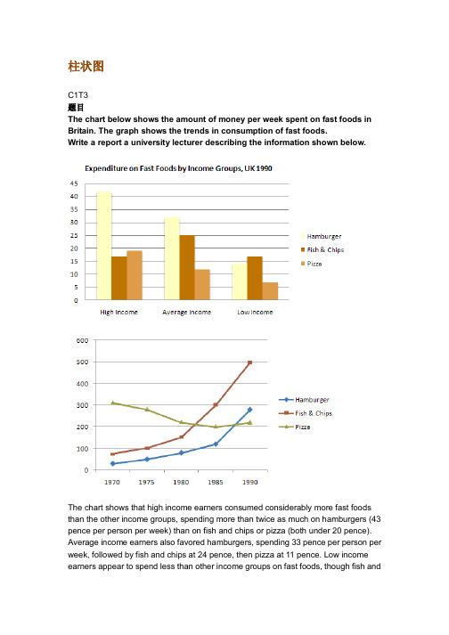
柱状图C1T3题目The chart below shows the amount of money per week spent on fast foods in Britain. The graph shows the trends in consumption of fast foods.Write a report a university lecturer describing the information shown below.The chart shows that high income earners consumed considerably more fast foods than the other income groups, spending more than twice as much on hamburgers (43 pence per person per week) than on fish and chips or pizza (both under 20 pence). Average income earners also favored hamburgers, spending 33 pence per person per week, followed by fish and chips at 24 pence, then pizza at 11 pence. Low income earners appear to spend less than other income groups on fast foods, though fish andchip remains their most popular fast food, followed by hamburgers and then pizza. From the graph we can see that in 1970, fish and chips were twice as popular as burgers, pizza being at that time the least popular fast food. The consumption of hamburgers and pizza has risen steadily over the 20 year period to 1990 while the consumption of fish and chips has been in decline over that same period with a slight increase in popularity since 1985.分析:题目The chart below shows the amount of money per week spent on fast foods in Britain. The graph shows the trends in consumption of fast foods.两句话,两个图第一段The chart shows that high income earners consumed considerably more fast foods than the other income groups, spending more than twice as much on hamburgers (43 pence per person per week) than on fish and chips or pizza (both under 20 pence).•说明了高收入人群的两个特点,第一是消耗快餐最多,第二是人群中hamburger, fish and chips, pizza的特点•spending more than twice as much on hamburgers than on fish and chip and chips or pizza 这是一句令人费解的句子,含义应为“消耗的汉堡是薯片或匹萨的两倍多”,应用的句型应当为典型的表示倍数关系的句型“n times as…as”,比如✓This airplane flies two times as fast as that one. 这家飞机的飞行速度是那架的两倍。
雅思英语图表作文范文第1篇A类雅思各类图表作文要点及范文一.曲线图解题关键1曲线图和柱状图都是动态图,解题的切入点在于描述趋势。
2在第二段的开头部分对整个曲线进行一个阶段式的总分类,使写作层次清晰,同时也方便考官阅卷。
接下来再分类描述每个阶段的specifictrend,同时导入数据作为分类的依据。
3趋势说明。
即,对曲线的连续变化进行说明,如上升、下降、波动、持平。
以时间为比较基础的应抓住“变化”:上升、下降、或是波动。
题中对两个或两个以上的变量进行描述时应在此基础上进行比较,如变量多于两个应进行分类或有侧重的比较。
4极点说明。
即对图表中最高的、最低的点单独进行说明。
不以时间为比较基础的应注意对极点的描述。
5交点说明。
即对图表当中多根曲线的交点进行对比说明。
6不要不做任何说明就机械地导入数据,这不符合雅思的考试目的。
曲线图常用词汇动词—九大运动趋势一:表示向上:increase,rise,improve,grow,ascend,mount,aggrandize,goup,climb, take off, jump,shoot up暴涨,soar,rocket, skyrocket雅思英语图表作文范文第2篇It is said that countries are becoming similar to each other because of the global spread of the same products, which are now available for purchase almost anywhere. I strongly believe that this modern development is largely detrimental to culture and traditions worldwide.A country’s history, language and ethos are all inextricably bound up in its manufactured artefacts. If the relentless advance of international brands into every corner of the world continues, these bland packages might one day completely oust the traditional objects of a nation, which would be a loss of richness and diversity in the world, as well as the sad disappearance of t he manifestations of a place’s character. What would a Japanese tea ceremony be without its specially crafted teapot, or a Fijian kava ritual without its bowl made from a certain type of tree bark?Let us not forget either that traditional products, whether these be medicines, cosmetics, toy, clothes, utensils or food, provide employment for local people. The spread of multinational products can often bring in its wake a loss of jobs, as people urn to buying the new brand,perhaps thinking it more glamorous than the one they are used to. This eventually puts old-school craftspeople out of work.Finally, tourism numbers may also be affected, as travelers become disillusioned with finding every place just the same as the one they visited previously. To see the same products in shops the world over is boring, and does not impel visitors to open their wallets in the same way that trinkets or souvenirs unique to the particular area too.Some may argue that all people are entitled to have access to the same products, but I say that local objects suit local conditions best, and that faceless uniformity worldwide is an unwelcome and dreary prospect.Heres my full answer:The line graphs show the average monthly amount that parents in Britain spent on their children’s s porting activities and the number of British children who took part in three different sports from 2008 to is clear that parents spent more money each year on their children’s participation in sports over the six-year period. In terms of the number of children taking part, football was significantly more popular than athletics and 2008, British parents spent an average of around £20 per month on their children’s sporting activities. Parents’ spending on children’s sports increased gradually over the followi ng six years, and by 2014 the average monthly amount had risen to just over £ at participation numbers, in 2008 approximately 8 million British children played football, while only 2 million children were enrolled in swimming clubs and less than 1 million practised athletics. The figures for football participation remained relatively stable over the following 6 years. By contrast, participation in swimming almost doubled, to nearly 4 million children, and there was a near fivefold increase in the number of children doing athletics.剑桥雅思6test1大作文范文,剑桥雅思6test1大作文task2高分范文+真题答案实感。

雅思作文真题解析及范文分享为了让大家更好的备考雅思写作,我给大家整理了雅思作文真题,下面我就和大家共享,来观赏一下吧。
2022年11月1日雅思小作文真题解析及范文:柱状图小作文题目是:The chart below shows the average time 16-22-year olds spent on playing video games in four different countries between 1992 and 2022.Summarize the details. Select and report the main features and make comparisons where relevant.范文解析该柱状图难度中等偏下,数字相对较少,共有8个数字。
让我们先来看一下3w(when, where, what)。
When是过去的两个年份1992和2022,切记用过去时态。
Where为四个国家,what为16-22岁的年轻人花费在视频嬉戏上的时间。
可以看出when和where两个变量,要求我们描述这十年间的变化趋势和国家之间的静态对比。
所以考生可以根据时间为主线去分段,也可以根据国家去分段。
雅思小作文真题范文:The bar chart compares the amount of time spent on video games on average by youngsters aged between 16-22 years old from four countriesin two years 1992 and 2022.该柱状图对比了1992年至2022年期间,来自四个国家、年龄在16岁至22岁之间的青少年平均花在电子嬉戏上的时间。
It is evident that in 1992, the largest amount of time (85 hours) allocated to video games was from young people in country B. This was narrowly followed by country C and country A where respectively 78 hours and 76 hours were spent while it took the minimal hours for thisage group to play video games in country D, standing at merely 50.很明显,在1992年,最大的时间(85小时)安排给视频嬉戏是年轻人的国家。

雅思英语柱状图作文Title: Analyzing the Trends in [Your Topic] Through a Bar Chart.In this essay, we will delve into the intricacies of [Your Topic], examining the patterns and trends revealed through a bar chart. The chart presents valuable insights into the distribution and comparison of various categories, highlighting significant differences and similarities across the dataset.Firstly, let's take a moment to appreciate the simplicity yet effectiveness of the bar chart. It's a popular visualization tool that enables quickidentification of patterns and trends. In this case, the chart effectively illustrates the distribution of [specific data points] across [different categories or time periods]. The vertical bars represent the quantitative values, while the horizontal axis labels provide context and categorization.At first glance, the chart reveals some intriguing patterns. The tallest bar, representing [specific category or data point], stands out as the most prominent,indicating a significant concentration of [specific value or trend]. This is particularly noteworthy given the significant gap between this bar and the others, suggesting a clear leader in the dataset.Contrastingly, the shorter bars towards the left of the chart indicate lower concentrations or values in those categories. It's interesting to note that even though these categories may not be as dominant, they still play an important role in the overall distribution. They contribute to the diversity and balance of the dataset, providing valuable insights into the nuances of [Your Topic].When comparing the bars side by side, we can observe patterns and trends across categories. For instance, the steady increase in the heights of bars from left to right suggests a gradual growth or increase in [specific value or trend] over time. Conversely, a sudden dip in the barheights might indicate a sudden change or event that affected the distribution.The spacing between the bars also provides valuable insights. Wider gaps suggest larger disparities between categories, indicating that certain categories are more distinct and separate from others. Narrower gaps, on the other hand, suggest closer relationships or similarities between categories, indicating a more uniform distribution across the dataset.The color scheme chosen for the chart further enhances its readability and visual appeal. The contrasting colors make it easy to distinguish between different categories, while the neutral background does not distract from the main focus of the chart. This attention to detail ensures that the chart is both visually appealing and functionally effective.In conclusion, the bar chart presents a comprehensive overview of [Your Topic], revealing patterns and trendsthat would be difficult to discern from raw data. It allowsus to quickly identify the most prominent categories and values, while also providing insights into the relationships and similarities between different datasets. This analysis is crucial for understanding the nuances of [Your Topic] and making informed decisions based on empirical evidence.Moreover, the chart encourages further exploration and analysis. It acts as a starting point for deeper investigations into the factors that influence the distribution and trends observed. By examining the chart closely and asking pertinent questions, we can gain a deeper understanding of the underlying mechanisms and factors that shape [Your Topic].In summary, the bar chart is a powerful tool for visualizing and analyzing data. It enables us to identify patterns and trends, compare categories, and make informed decisions based on empirical evidence. By leveraging this tool effectively, we can gain a deeper understanding of [Your Topic] and use this knowledge to guide our future actions and decisions.。
雅思写作小作文范文雅思写作柱状图bar chart 六种商品的花费今天我们雅思写作大作文范文的文章来研究下柱状图bar chart。
该柱状图给出了英国,法国,德国和意大利等四国人口在六种消费品上的花费,包括电影、玩具、CD、香水、网球拍、个人音响等。
可以很明显的看出,英国人在这几方面的消费较高,而德国人的消费则较低。
小编搜集了一篇相关的高分范文,以供大家参考。
雅思写作小作文题目The chart below shows the amount spent on six consumer goods in four European countries.Summarise the information by selecting and reporting the main features, and make comparisons where relevant.雅思写作小作文范文The bar chart compares the expenditure on different consumer goods by the people of four European countries; namely Britain, France, Italy, and Germany. At first glance, the British spent more money on consumer goods while the Germans spent the least.该柱状图比较了欧洲四个国家的人们(英国,法国,意大利和德国)在不同消费物品上的花费。
乍看起来,英国人在消费物品上花的钱较多,而德国人花的钱最少。
It is worth noticing that, the British spent more than 170 thousand pound sterling on photographic films which is the highest amount spent on any consumer goods. British also spent more than 160 thousand for purchasing Toys and CDs, which is higher than that of by any other nation. For perfumes, this translation is from Laokaoya website, tennis racquets and personal stereos, they spent more than other nations as well. On the other hand, French people spent around 165 thousand for purchasing photographic films, which makes it the highest amount they spent on consumer goods.值得注意的是,英国人在电影上的花费超过十七万英镑,这在所有消费物品中的花费是最高的。
雅思小作文–柱状图题目1:The chart below contains information provided by Australia’s tertiary institutions about the percentage of male and female students enrolled in different subjects in 1995.Summarize the information by selecting and reporting the main features, and make comparisons where relevant.范文:1/ 4题目2:The chart below contains information about USA marriage and divorce rates between 1970 and 2000, and the marital status of adult Americans in two of the years.Summarize the information by selecting and reporting the main features, and make comparisons where relevant.2/ 4读图:动态图【因为有时间】,需要描述变化趋势These two graphs illustrate the change of marital status of American between 1970 and 2000.【改写题目】According to the first graph,there were 2.5m marriages in both 1970 and 1980, and then this figure decreased gradually during the next two decades, reaching to 2m in 2000. By comparison, the number of divorces first increased from 1m in 1970 to around 1.4 in 1980 and then slowly declined back to 1m in 2000.【分类描述第一幅柱状图,时态:一般过去时】As can be seen from the second bar chart,the percentage of married American adults dropped by more than 10% , from 70% in 1970 to less than 60% in 2000. Meanwhile, the percentage of adult Americans who were never married increased from about 15% in 1970 to20% in 2000, and despite still less than 10% , the proportion of divorced adults significantly went up from 1970 to 2000. Moreover, the percentages of the widowed in 1970 and 2000 accounted for less than 10% respectively, and showed a slight drop.【分类描述第二幅柱状图,时态:一般过去时】In conclusion, marital status of Americans in 2000 was not as optimistic as that of three decades ago. (1781.如果有两幅图表,则分成2段分别一一描述2.表示数值上升下降的常用句式有:•The number of …dropped from … to …•The percentage of …increased from about … to less than…•The proportion of … significantly went up from … to …3.切忌没有结论。
雅思写作小作文范文雅思写作柱状图bar chart 影响工作表现的因素今天我们雅思写作小作文范文的文章来研究下柱状图bar chart。
该图表展示的内容为某大型公司人力资源部门所进行的调查研究的结果,即影响工人表现的因素有哪些。
该研究的对象为两组工人,一组年龄分布在18到30岁,另一组年龄位于45到60岁之间。
小编搜集了一篇高分范文,以供大家参考。
雅思写作小作文题目The bar chart below shows the results of a survey conducted by a personnel department at a major company.Summarise the information by selecting and reporting the main features, and make comparisons where relevant.雅思写作小作文范文The bar graph shows the results of a survey which was conducted by a company and gives data on the important factors that determine the work performance of employees. As is observed, chances for personal development, relaxed working environment, opportunities for promotion and salary are the main motivating factors for young people for their work performance while comparatively aged people’s work performance is affected by the factors like money, competent boss and team spirit.该柱状图展示了某公司进行的调查研究的结果,并给出了决定员工工作表现的重要因素。
两个数据柱状图雅思作文模板Two Data Bar Charts IELTS Essay Template Bar charts are a common feature in the IELTS writing task 1, often presenting data from two different sets for comparison. This essay will provide a template and demonstrate its application through an example, equipping you with the necessary skills to tackle such tasks effectively. Firstly, it is crucial to accurately understand the information presented in the bar charts. This includes identifying the key variables on both axes, understanding the units of measurement used, and noting any trends or significant differences between the data sets. A clear and concise introductory paragraph is essential, paraphrasing the information presented in the chart'stitle and outlining the key variables involved. For example, if the charts depict the average daily calorie intake of men and women in two different countries, the introductory paragraph should clearly state this, mentioning the countries and the variables being compared (calorie intake and gender). The second paragraph should focus on highlighting the most significant trends or differences observed in the data. This requires careful observation and selection of the most striking features, avoiding the temptation to merely list all the data points. Using comparative language is crucial here. For instance, one might state that "men in country A consume significantly more calories than women, a trend mirrored in country B, albeit with a smaller discrepancy." Such statements draw attention to the key comparisons and provide an overall picture of the data's main message. Next, it is important to delve into specific details, supporting the general trends outlined earlier with concrete evidence from the charts. This section should focus on specific data points that best illustrate the observed trends. For example, "While men in country A averaged 3000 calories daily, women consumed only 2200, a difference of 800 calories." This provides precise numerical data to support the earlier statement about the significant difference in calorie intake between genders in country A. However, avoid simply listing every data point, as this leads to a monotonous and less impactful analysis. Having discussed thefirst data set, the subsequent paragraph should shift focus to the second, again employing comparative language to highlight similarities or differences with the first. For instance, "In contrast to country A, the calorie intake in country Bwas generally lower for both genders. Men consumed an average of 2500 calories, while women averaged 2000." This clearly establishes the overall trend in country B and contrasts it with the previous data, demonstrating an understanding of the comparative nature of the task. When comparing data sets, it is essential to avoid generalizations or assumptions. Stick to the information presented in the charts and refrain from speculating about reasons behind the observed trends. While you might be tempted to offer explanations for why men consume more calories than women, such deductions are beyond the scope of the task. The focus should remain solely on accurately describing and comparing the provided data. Finally, a concise concluding paragraph should summarize the key findings without introducing any new information. This paragraph should reiterate the main trends observed in both data sets, highlighting the most significant similarities or differences. For example, "In conclusion, both charts reveal a consistent trend of higher calorie intake among men compared to women. However, country A exhibits a significantly larger gap between the genders, while country B shows a more moderate difference." This succinct summary effectively encapsulates the key message conveyed by the data presented in the bar charts. In conclusion, effectively analyzing and comparing data presented in two bar charts requires a structured approach. By following the template outlined above, you can ensure a clear, concise, and accurate response that addresses all aspects of the task. Remember to prioritize clarity, focus on significant trends, use comparative language, support your observations with specific data points, and avoid generalizations or speculations. By diligently practicing and refining your analytical skills, you can confidently tackle any bar chart comparison task in the IELTS writing exam.。
雅思柱状图小作文写作模板雅思小作文柱状图是考试中最常见的一类图形,柱状图如何描述写成为大家棘手的问题。
下面为大家分享雅思柱状图小作文写作模板。
大家可以参考学习。
雅思柱状图写作模板1The bar chart compares the proportion of employees of both genders employed in executive positions in ACNE Oil Company within a one-year period between July 1993 and June 1994.As can be seen from the chart, the percentage of male employees generally increased with the rise of the job categories from Grade E to Grade A while the opposite was true with that of women.Grade A, which was reported as the highest position, was a male dominated one in which only one-tenth of the staff were female while male employees accounted for the rest.When it comes to Grade B and C, men also took up over half of the employees, accounting for 80% and 60%, which are 50% and 10% higher than that of women respectively.However, the situation in the other two jobs categories, which were relatively lower in rank, was totally reversed, with women taking up relatively larger proportion. Men constituted roughly 40% in Grade D, 20% less than that if women and most of the working staff in Grade E were women (over 70%) , twice the percentage of men.To sum up, on the rank ladder of ACME Oil Company, male employees took up a higher and higher proportion than the weaker sex as it gradually went up to the peak -------- Grade A.雅思柱状图写作模板2The chart below shows the amount of money per week spenton fast foods in Britain. The graph shows the trends in consumption of fast foods.Write a report for a university lecturer describing the information shown below.柱状图显示的是1970-1990二十年间英国人每周在快餐上花费了多少钱;曲线图展示的是这二十年间快餐消费的趋势。
The bar chart shows how much money was spent on fast foods per week in the UK over a span of 20 years from 1970 to 1990 while the graph reveals the trend of fast food consumption over the same period of time.从柱状图看,各收入阶层在汉堡和鱼煎薯条这两种快餐上的支出相对高于在皮萨上的消费;曲线图反映出汉堡与皮萨的消费呈现上升趋势,鱼煎薯条则呈现出波动趋势。
As we can see from the chart, the weekly expenses of people of different income levels on hamburgers and fish and chips were relatively higher than that on pizza. The graph indicates that while hamburger and pizza consumption both revealed a general trend of increase, fish and chips showed a trend of fluctuation.首先,高收入阶层和中等收入阶层每周在汉堡上的平均消费分别是每人42便士和33便士,比低收入阶层的14便士搞出了很多。
在鱼煎薯条方面,高收入阶层的支出略低,是17便士,但中等及低收入阶层的支出都分别达到了25便士和18便士,相对于在皮萨方面支出的12便士和8便士高出了很多。
值得一提的是高收入阶层在皮萨上的消费高于鱼煎薯条2便士,为20便士。
First, the weekly average expenses of high-income people and middle-income people were 42 pence and 33 pence respectively, a lot higher than that of low-income people which was 14 pence. As for fish and chips, high-income people spent relatively less, only 17 pence, but the expenses of middle-income and low-income groups reached 25 pence and 18 pence, muchhigher than their expenses on pizza which stood at 12 pence and 8 pence respectively. What is worth mentioning is the amount of money spent on pizza by high-income people which showed only 20 pence, 2 pence more than their expense on fish and chips.第二,从1970年的每周平均85克开始,人们在汉堡上的消费缓步增长到了1975年的100克,然后,消费量加大增速,到1983年左右已经达到了200多克。
接下来,我们看到的是更强势的增长,到1990年达到了图表上的最高峰550克。
Second, starting from averagely 85 grams per week in 1970, people’s consumption of hamburgers gradually grew to 100 grams in 1975 and was then followed by a faster growth, reaching more than 200 grams in around 1983. From then on, the growth gained a stronger momentum, hitting the peak across the board at 550 grams in 1990.第三,皮萨的消费趋势与汉堡相仿,也是很明显的三个增长阶段,但是增幅没有汉堡那么大。
1970年至1980年,皮萨的消费从平均每周40克慢慢增长到80克;1980年至1985年,增长加快,从80克增加到了130克;1985年至1990年,增幅加大,从130克快速增长到了280克。
Third, the consumption of pizza revealed a similar trend of growth as that of hamburgers and could also be clearly cut into three periods, though the growth rate was not that fast. It rose slowly from 40 grams per week in 1970 to 80 grams in 1980 and then grew faster from 80 grams in 1980 to 130 grams in 1985. From 1985, the growth rate was even faster and we see a big increase from 130 grams to 280 grams.第四,鱼煎薯条的消费趋势在波动中呈现了三种状态。
1970年至1975年一直是缓慢的下降,从平均每周300克降至280克;之后,从1975年至1985年,下降速度稍有加快,从280克降至200克;自此,开始逐渐回升,到1990年攀升到了240克。
Fourth, the consumption of fish and chips showed three changes in the general trend of fluctuation. From 1970 to 1975, it dropped slowly from the original 300 grams per week in 1970 to 280 grams in 1975. Later on, from 1975 to 1985, it dropped a little bit faster when it fell from 280 grams to 200 grams. From then on, it began to rise gradually and till 1990, it had climbed back to 240 grams.总之,英国人在上述所提及的三种快餐方面的消费在图表所标识的二十年里都发生了或增或降的某些变化。