雅思小作文饼图写作结构解析
- 格式:doc
- 大小:19.03 KB
- 文档页数:9
雅思小作文饼图写法全解析雅思小作文饼图写法全解析无论是身处学校还是步入社会,大家都写过作文吧,作文根据体裁的不同可以分为记叙文、说明文、应用文、议论文。
你知道作文怎样写才规范吗?以下是店铺为大家收集的雅思小作文饼图写法全解析,仅供参考,希望能够帮助到大家。
雅思小作文饼图写法全解析在雅思的学术类小作文中我们经常会遇到饼状图写作,不要看着一张一张的图,就退缩了,但是相对来说,这个题型还是比较容易写的一种图形,不过学生们也一定不要当做这是一件简单的事情,想要拿高分还是需要努力的,千万不能掉以轻心,否则不要就是因为这部分得分的不达标而影响到最后的综合得分。
那么下面的文章中,朗阁雅思考试研究中心写作组的专家将要探讨的是饼图中静态数据和动态数据写法中的一些区别,并且将会从高分的角度来对各种写法作一汇总,希望对大家考试的准备有一定的帮助。
首先我们必须搞清楚什么是静态什么是动态数据的饼图:当我们在考试中看到这个图示上的数据都是固定的,没有发生任何变化的时候,那么就能够认定这属于静态数据,搞清楚之后我们就能够开始写作了。
图二:不要以为这里有很多的数据就属于动态的,其实这个图示还是表示是静态的,因为我们看到在途中的各项比重相对来说也是比较稳定的,因此这个饼图的数据也是属于静态的,那么究竟哪种数据属于动态的呢?图三:这个就是动态的图示,为什么这么说呢,因为两张图种的占比数据上出现了很大的差异,这是两个年份的数据,但是各自的所占比重有所不同,所以是动态的数据。
由此,我们可以得出结论,如果我们看到的是一张饼图,而且描述的是一段时间之内比较稳定的数据,那么我们就能基本上断定那就是静态的数据,但是我们如果看到的时候两张饼图,在两个时间段时间的对比,数据出现了明显的变化,那么就能够基本上断定这张图表示的就是动态的题型。
一、静态数据饼图的'主体段写作理论朗阁雅思考试研究中心建议考生可先按照扇形面积大小从大到小排列数据,若遇到饼图中有总数的描述,宜在开头先写。
雅思小作文饼状图英文回答:The pie chart illustrates the percentage of various sources of energy consumed in a particular region during a specific year. The data is presented in a clear and concise manner, with each slice of the pie representing a different energy source.Upon examining the pie chart, it becomes evident that non-renewable energy sources dominate the region's energy consumption. Fossil fuels, including coal, natural gas, and oil, account for a substantial 80% of the total energy usage. This heavy reliance on non-renewable resources highlights the region's dependence on finite energy sources, which raises concerns about future energy security and environmental sustainability.In contrast, renewable energy sources play a relatively minor role in the region's energy mix. Solar and wind powercombined contribute a mere 10% to the total energy consumption. This low percentage suggests a lack of investment in renewable energy infrastructure and a reluctance to transition towards cleaner and more sustainable energy sources.Hydroelectricity stands out as the most significant renewable energy source, accounting for 5% of the region's energy consumption. However, this figure is stillrelatively low compared to the potential hydroelectric resources that the region may possess. The untapped potential of hydroelectricity presents an opportunity for the region to increase its reliance on renewable energy and reduce its dependence on fossil fuels.Overall, the pie chart provides valuable insights into the region's energy consumption patterns. The dominance of non-renewable energy sources raises concerns about the region's long-term energy security and environmental sustainability. The underutilization of renewable energy sources, particularly hydroelectricity, suggests a need for increased investment and a shift towards a more sustainableenergy future.中文回答:此饼状图展示了某个地区在某一年中各种能源消耗所占的百分比。
雅思小作文写作技巧及范文一.图表类型饼状图,直方图或柱形图趋势曲线图表格图流程图或过程图程序图二.解题技巧A. 表格图1 横向比较: 介绍横向各个数据的区别,变化和趋势2 纵向比较:介绍横向各个数据的区别,变化和趋势3 无需将每一个数据分别说明,突出强调数据最大值和最小值,对比时要总结出数据对比最悬殊的和最小的说明:考察例举数字的能力和方法。
注意怎样通过举一些有代表性的数据来有效地说明问题。
B. 曲线图1 极点说明: 对图表当中最高的,最低的点要单独进行说明2 趋势说明: 对图表当中曲线的连续变化进行说明,如上升,下降,波动,持平3 交点说明: 对图表当中多根曲线的交点进行对比说明说明:关键是把握好曲线的走向和趋势,学会 general classification, 即在第二段的开头部分对整个曲线进行一个阶段式的总分类,使写作层次清晰。
接下来在分类描述每个阶段的 specific trend, 同时导入数据作为你分类的依据。
注意不要不做任何说明就机械性的导入数据!可以使用一些比较 native 的单词和短语来描述 trend。
C. 饼状图1 介绍各扇面及总体的关系2 各个扇面之间的比较,同类扇面在不同时间,不同地点的比较3 重点突出特点最明显的扇面:最大的,最小的,互相成倍的D. 柱状图1. 比较 : similarity2.对比 : difference)3.横向总结所有柱状图表的共性特征 & 分别描写各个柱子的个性特征E.流程图1.首先说明:做什么工作的过程,目的是什么 2.准备工作 3.按时间/过程先后描述4.结果 5.简单总结说明:注意流程图里的“因果关系” 或每一流程的“承前启后” 关系;表达每一流程的主体内容,阐明这种关系;揭示其内在联系或规律;最后,给予简要归纳和总结。
F. 实物/器具工作过程 1.实物的名称,功能 2.基本结构 3.工作过程 4.简单总结G. 综合图1 不求甚解,不拘泥于细节2 分门别类,分段落详细介绍各个图表3 不画蛇添足,主观臆断或猜测图表之间的关系三.写作结构框架结构1.开头:该图阐述的是______ 的______.共有以下几个部分组成。
解析雅思小作文中线图+饼图的写作构思及例题示范雅思小作文多图写作是一个大的趋势,越来越多的组合图出现更加证明了这一点。
在此,我们先来介绍最常见的一种组合图,线图+饼图的写作构思及例题示范,帮助大家顺利攻克雅思小作文。
看到题目是由线图和饼图组成的多图组合,我们可以按以下3个思路构思:1. 饼图和曲线图各自展示了什么数据在哪个时间点或段的变化特征?2. 在饼图中,数据总值为多少?它由几部分组成?每一部分各代表什么?各自所占百分比又是多少?百分比从大到小如何排列的?谁最大?谁最小?3. 曲线图有何特征?根据特征,曲线可以分成几段来描述?起点值、终点值、峰值、谷值多少?各自对应的时间点又是什么?现在,我们再来看一道例题:WRITING TASK 1:You should spend about 20 minutes on this task.* The chart and graph below give information about sales and share prices for Coca-Cola.* Summarise the information by selecting and reporting the main features, and make comparisons where relevant.You should write at least 150 words.范文:The pie chart shows the worldwide distribution of sales of Coca-Cola in the year 2000 and the graph shows the change in share prices between 1996 and 2001.In the year 2000, Coca-Cola sold a total of 17.1 billion cases of their fizzy drink product worldwide. The largest consumer was North America, where 30.4 per cent of the total volume was purchased. The second largest consumer was Latin America. Europe and Asia purchased 20.5 and 16.4 per cent of the total volume respectively, while Africa and the Middle East remained fairly small consumers at 7 per cent of the total volume of sales.ince 1996, share prices for Coca-Cola have fluctuated. In that year, shares were valued at approximately $35. Between 1996 and 1997, however, prices rose significantly to $70 per share. They dipped a little in mid-1997 and then peaked at $80 per share in mid-98. From then until 2000 their value fell consistently but there was a slight rise in mid-2000.。

多个饼图比较雅思小作文各位烤鸭们!今天咱们来唠唠雅思小作文里那种有多个饼图的情况。
这就像是一场饼图大聚会,每个饼图都有自己的小秘密要告诉我们呢。
比如说,我们拿到了三个饼图,分别是关于不同年份一个小镇居民的消费习惯的。
首先呢,咱得先整体扫一眼这几个饼图,看看有没有那种特别突出的部分,就像是人群里那个特别高的大个儿,一眼就能瞧见。
咱们先看第一个饼图,可能会发现住房支出占了最大的一块儿,就像一个大饼里最大的那块儿披萨。
也许有百分之四十呢,这说明啥?这就表示这个小镇的居民把相当大一部分钱都花在住的地方啦,可能这个小镇的房价或者房租不便宜呀。
再看第二个饼图,可能是几年后的情况了。
这时候你发现,哟呵,住房支出那块儿变小了一点,变成了百分之三十五。
而娱乐支出那块儿呢,变大了不少,从之前的百分之十涨到了百分之十五。
这就有点意思了,这可能意味着这个小镇的居民生活水平提高了一点,开始有更多的闲钱去享受生活了,去看个电影啦,唱个K啦之类的。
然后看第三个饼图,情况又有了新变化。
食品支出的占比突然增加了,从原来的百分之二十变成了百分之二十五。
这时候我们就得琢磨琢磨为啥了。
也许是这个小镇新开了好多美食店,各种美味的食物在诱惑居民们的味蕾,让他们忍不住把更多的钱花在吃上了呢。
在比较这些饼图的时候啊,咱们还得注意那些占比一直比较小的部分。
比如说教育支出,在这三个饼图里可能一直都只占百分之五左右,就像个小不点儿。
这可能反映出这个小镇在教育资源方面有一些状况,也许是教育资源比较有限,居民们也没太多钱投入到教育上,或者是这个小镇有一些比较便宜的公立教育体系,不需要居民花太多钱。
而且啊,我们描述的时候可不能干巴巴地只说数字。
比如说“食品支出在第三个饼图里是百分之二十五”,这可太无聊了。
咱们得说“哇塞,你看第三个饼图里,食品支出就像个突然膨胀的小气球,一下子占到了百分之二十五呢,比之前多了不少,感觉这个小镇的居民都变成吃货啦!”另外,我们在比较的时候还可以按照占比的大小顺序来说。
两个时间的饼图雅思小作文英文回答:The two pie charts compare the distribution of time spent on different activities by men and women in a typical day. Overall, it is clear that both men and women spend the majority of their time on three main activities: work, sleep, and personal care. However, there are some notable differences between the two genders.In terms of work, men spend a significantly larger proportion of their day on this activity compared to women. The pie chart shows that men spend 45% of their time working, while women only spend 30%. This suggests that men are more likely to be employed full-time or have longer working hours compared to women.On the other hand, women allocate a larger portion of their day to personal care activities such as grooming, dressing, and taking care of household chores. The chartreveals that women spend 35% of their time on personal care, whereas men only spend 25%. This indicates that women tendto take on more responsibilities related to maintaining the household and their personal appearance.When it comes to sleep, both genders allocate a similar amount of time for rest. Men spend 30% of their day sleeping, while women spend 28%. This suggests that both men and women prioritize getting enough rest and recognize the importance of sleep for their overall well-being.中文回答:这两个饼图比较了男性和女性在一天中不同活动上所花费的时间分配。
一:题型特点:1.饼图是所有图表题中最好写的一种,唯一值得注意的地方在于如何丰富百分比的表达和“占”的表达,要采取多样性的表达,如25%=a quarter of, 50%=half of, >50%=a/the majority of.2.描写饼状图中的比例构成就是饼状图图表作文的重点,但也应注意,这种描述并不是对图形的简单重复,对各项数据比例的描述应建立在归纳整理的基础上有条理地进行。
考生不仅要善于找数据,更重要的是要善于从数据或比例中升华出来,找到规律和本质。
3.文字中要表达出总量与分量的关系;在两个以上的pie中,要注意各个pie间的比较。
饼图所给出的比例总和一定是100%。
题目中给出的多半都是一些比例数字。
数字的分布往往具有一定的规律,具有一定的代表性。
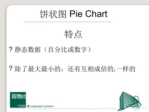
4.注意各扇面及总体的关系。
各个扇面之间的比较,同类扇面在不同时间、不同地点的比较。
重点突出最明显的扇面:最大的、最小的、互相成倍的。
二:常用经典例句展示:1 常用词:percentage, proportion, make up, constitute, account for,take up, ..is divided in to…parts, consume the largest/smallest portion.2.例句:1 The graph, presented in a pie chart, shows the general trend in…..2 The percentage of A in … is more than twice than that of B.3 The biggest loss was to A area.4 There is not a great deal of difference between A and B.5 In general positions, females outnumber males.6 A much greater percentage of men than women are found in managerial positions.7 The profit of company A doubled from May to September.三:常用模板:1.The two pie charts describe ………………………2.The first point to note is …………………………paring the graphs, …………………………….4.The graphs also suggest that ………………………5.In conclusion, it can be seen from the data that …………………..饼状图作文模型一The two pie charts illustrate the significant changes in peopl e’s ways of communication from 1970 to 1995.The first graph shows that in 1975, the most popular way to communicate was letter writing, with the percentage of 50%. Others ___________________________, the figures are 32% and 18% respectively.It can be seen from the second graph that ways of communication changed a lot in two decades. By 1995, ______________________________. By contrast, ________________________________.Comparing the two pie charts, we can see that the use of the phones and computers during the same period had both risen considerably. However, letter writing became less popular among the people.In general, people inclined to use more modernized mediums to communicate with others, while the traditional way became less employed.二The pie chart depicts the proportion of ___________________________.It consists of six segments, the largest one representing _________, which account for 26% of the total. _____________ takes up 21%, becoming the second largest.__________________________________. The rest proportions, 15% of all, constituting 5% and 10% respectively.From the chart it can be seen clearly that ________________________.。
雅思小作文 T A S K 1 图表题规律注意事项:1 . Task1 是客观写作,要求客观真实。
2 . 客观性:不应该有任何图里没有而靠自己主观想象加入的成分。
结尾段针对图形做出的总结性结论也应该是根据图表的实际内容做出的符合逻辑的总结。
准确性:图表里面的数据介绍要力求精确,不能抄错数字。
但当一个特征点没有落在一个准确的坐标值上时,允许进行合理的目测或估计一个大概数值。
详尽性:要有层次感,并不需要把所有的数字都推到文章里。
3 . 类型Table 表格题Line Graph 线图Bar Chart 柱状图Pie Chart 饼状图Process Chart 流程图4 . 看图要注意单位,标题和图例。
5 . 对于多数小作文题,题中给出了几个图就对应的写出几个主体段。
题目里只给出一个图,根据图中包含几类图形元素写几个主体段。
图中只给了一个图,但图中所含图形元素很多,则分类。
题目中出现多线多柱多饼,用“对应提取法“,把每组里的对应元素提出来组织主体段。
6 . 时态和发生时间意义对应。
陈述永恒事实的句型,其主句的谓语动词必定用一般现在时。
若题目里没有出现时间,则全文都使用一般现在时。
7 . 结构开头段(1~2句)改写原题主体段1 总体概括具体介绍数字主体段N 总体概括具体介绍数字结尾段(1~2句)介绍总数(若图里并没有明确的给出总数,则省略)结论(根据图里的数据得出有一定合理性的结论)8 . 开头段的改写题目中ShowProportion InformationThe number/amount of FamilyMalesFemaleInfluence改写成illustrate /compare percentagedatathe figure for householdmenwomenaffect/effectCategories kinds/typesSubway system Storeunderground railway/train system shop9 . 介绍数据或描述变化趋势的常用词。
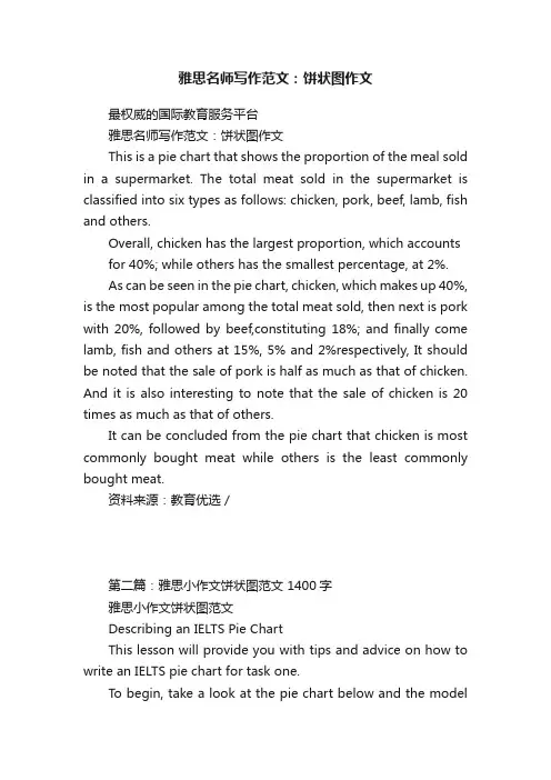
雅思名师写作范文:饼状图作文最权威的国际教育服务平台雅思名师写作范文:饼状图作文This is a pie chart that shows the proportion of the meal sold in a supermarket. The total meat sold in the supermarket is classified into six types as follows: chicken, pork, beef, lamb, fish and others.Overall, chicken has the largest proportion, which accounts for 40%; while others has the smallest percentage, at 2%.As can be seen in the pie chart, chicken, which makes up 40%, is the most popular among the total meat sold, then next is pork with 20%, followed by beef,constituting 18%; and finally come lamb, fish and others at 15%, 5% and 2%respectively, It should be noted that the sale of pork is half as much as that of chicken. And it is also interesting to note that the sale of chicken is 20 times as much as that of others.It can be concluded from the pie chart that chicken is most commonly bought meat while others is the least commonly bought meat.资料来源:教育优选 /第二篇:雅思小作文饼状图范文 1400字雅思小作文饼状图范文Describing an IELTS Pie ChartThis lesson will provide you with tips and advice on how to write an IELTS pie chart for task one.To begin, take a look at the pie chart below and the modelanswer. You should spend about 20 minutes on this task.The pie charts show the main reasons for migration to and from the UK in 2007.Summarize the information by selecting and reporting the main features and make comparisons where relevant.Write at least 150 wordsSample AnswerThe pie charts illustrate the primary reasons that people came to and left the UK in 2007.At first glance it is clear that the main factor influencing this decision was employment.Having a definite job accounted for 30 per cent of immigration to the UK, and this figure was very similar for emigration,at 29%. A large number of people, 22%, also emigrated because they were looking for a job, though the proportion of people leaving the UK for this purpose was noticeably lower at less than a fifth. Another major factor influencing a move to the UK was for formal study, with over a quarter of people immigrating for this reason. However, interestingly, only a small minority, 4%, left for this.The proportions of those moving to join a family member were quite similar for immigration and emigration, at 15% and 13% respectively. Although a significant number of people (32%) gave ‘other’ reasons or did not give a reason why they emigrated, this accounted for only 17% with regards to immigration.。
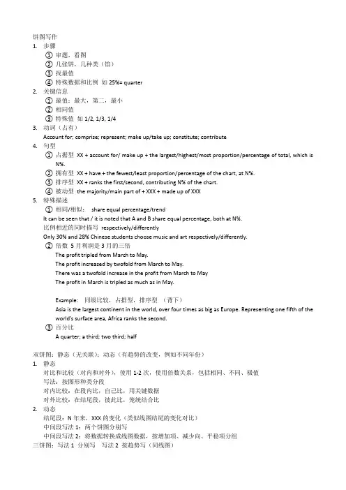
1.步骤①审题,看图②几张饼,几种类(馅)③找最值④特殊数据和比例如25%= quarter2.关键信息①最值:最大,第二,最小②相同值③特殊值如1/2, 1/3, 1/43.动词(占有)Account for; comprise; represent; make up/take up; constitute; contribute4.句型①占据型XX + account for/ make up + the largest/highest/most proportion/percentage of total, which isN%.②拥有型XX + have + the fewest/least proportion/percentage of the chart, at N%.③排序型XX + ranks the first/second, contributing N% of the chart.④被动型the majority/main part of + XXX + made up of XXX5.特殊描述①相同/相似:share equal percentage/trendIt can be seen that / it is noted that A and B share equal percentage, both at N%.比例相近的同时描写respectively/differentlyOnly 30% and 28% Chinese students choose music and art respectively/differently.②倍数5月利润是3月的三倍The profit tripled from March to May.The profit increased by twofold from March to May.There was a twofold increase in the profit from March to MayThe profit in March is tripled as much as in May.Example: 同级比较,占据型,排序型(背下)Asia is the largest continent in the world, over four times as big as Europe. Representing one fifth of the world’s surface area, Africa ranks the second.③百分比A quarter; a third; two third; half双饼图:静态(无关联);动态(有趋势的改变,例如不同年份)1.静态对比和比较(对内和对外),使用1-2次,使用倍数关系,包括相同、不同、极值写法:按图形种类分段对内比较:在段内比,自己比,用关键数据对外比较:在结尾段,彼此比,笼统结合比2.动态结尾段:N年来,XXX的变化(类似线图结尾的变化对比)中间段写法1:两个饼图分别写中间段写法2:将数据转换成线图数据,按增加项、减少向、平稳项分组三饼图:写法1 分别写写法2 按趋势写(同线图)The table compares the difference in the ratio of both males and females who received a diploma in 1993. Obviously, males and females varied considerably in level of education.In 1993, 60% of males graduated with a master’s degree in comparison with 40% of females. When it comes to the ratio of postgraduate diploma, the gap between the males and females become even more significant, the figure of males was more than twice that of females (70% and 30% respectively). In contrast, females outnumbered males in the next two categories. A slightly higher percentage of females at 53% than males at 47% was recorded in the completion of bachelor’s degree. The rise in female rate was also witnessed in the proportion of undergraduate study where females with 65% nearly doubled males with 35%.In conclusion, more males than females received higher degree.段落的描述:美国人民的消费情况In 1996, Americans spent most money on the cars consumption, which was 45%. Restaurant and food shared the same percentages (14%), following the cars. Books accounted for the least proportion of the total, only at 1%.。
雅思小作文饼图写作结构解析雅思小作文饼图写作结构许多考生觉得饼图十分简单,也就是一些百分比及数字的列举,对该类图表不太重视,准备并不充分。
笔者根据学生的日常作业来看,很多学生并没能准确把握这一图表的特征。
在实际考试中,真题大多是多个饼图结合出现,如果一味地罗列数据照搬词组,不但文章读起来枯燥无味,句式和词汇也缺少变化,是无法得到理想的分数的。
本文中,写作组的专家将对饼图的分析方法、词汇句型和写作套路进行总结和分类,以帮助考生理清写作思路,更准确地回应题目的要求。
1. 分析思路在实际考试中,一般以三到四个饼图出现为主,最多曾出现过六个饼图的组合,但无论如何变化,多饼图一般可分为以下两种模式,笔者将举出一些实例进行分析:1)无关型饼图三个饼图它们分别介绍了世界上的不同花费比例,世界人口分布及资源消耗的去向,三个饼图涉及的内容和划分标准不尽相同,不可能将三者结合起来一起论述。
对于这种图表,我们的文章框架架构如下:Introduction:分别概述三个饼图所说明的信息如:The three pie charts respectively illustrate some data regarding the distribution in world spending, global population and consumption of resources.Body:分别说明各饼图的内容,辅以数据(段落层次按照个数划分即可,本题就可以分成三个段落)分别进行排序,稍后详细分析。
Conclusion(选用):说明三个饼图的相关含义,如无,可提炼一下每个饼图最典型的特征(如果已达到要求字数且充分说明内容,结尾段可以略去)详细来看,世界花费主要支出在食物方面,交通、房产和穿着次之,其他项目合计占到总数的40%;亚洲是世界人口的主要来源地,欧洲、美洲和非洲均占到10%以上,其他地区人口较少。
这两个饼图都可以用“排序”的方式来列举数据,具体的写法我们会在下面详细说明。
雅思作文饼图范文The chart below gives the percentage of social media users by age in Jamestown in 2018. Summarise the information by selecting and reporting the main features. Write at least 150 words.写作锦囊关于饼状图写作框架,最好采用四段式的写法,具体分为两种常见的模式。
•行文结构1:开头段-主体段1-主体段2-结尾段(总结)•行文结构2:开头段-概述段(总结)-主体段1-主体段2雅思小作文一般要求20分钟内完成150个字的写作,时间紧,分数重。
而开头段一般是对题目的改写。
最常用的方法就是关键词同义替换法:Table:chart / graph / line graph / bar graph / pie graph / statistics / data / diagram / illustration / flow chart / map Give:demonstrate / describe / present / show / compare / illustrateinformation about:The proportion / percentage of… the number / amount of / changes / variations / how 引导的名词性从句写作范文参考开头段The given pie chart illustrates the proportion of customers using digital networking of different age group in Jamestown in the year 2018.概述段Overall, the general trend of Jamestown's social media users in 2018 showed that the older people were, the less likely they would be to use digital networking.主体段1In terms of most significant feature of the chart, the largest category of digital communicators was the group aged 13 to 25 , which accounted for40% of the total users. Additionally, the next major segment of the population using social media included people aged between 26 and 35, which showed a slightly lower contribution at 35%.When added together, these two categories made up three quarters of Jamestown's social media users who used digital platform in 2018.主体段2In stark contrast, the category with lowest percentage of users included people over 55 years old, accounting for minute 2% of all users. This trend was joined by people aged 46 to 55 and people between 36 and 45 years of age, representing8% and 15% respectively. Of particular note is that those aged over 36 years collectively made up only 25% of Jamestown's social media users.。
The two graphs show the main sources of energy in the USA in the 1980s and the 1990s.思路:1. 采用折线模式描述2. 注意重点数据的选取(max, min)3. 注意分段原则:一段写上升,一段写下降,一段写保持不变。
答案:The two graphs show that oil was the major energy source in the USA in both 1980 and 1990 and that coal, natural gas and hydroelectric power remained in much the same proportions. On the other hand, there was a dramatic rise in nuclear power, which doubled its percentage over the ten years.Oil supplied the largest percentage of energy, although the percentage decreased from 42% in 1980 to 33% in 1990. Coal in 1990 was the second largest source of energy, increasing its proportion to 27% from 22% in the previous decade. Natural gas, the second largest source in 1980 at 26%, decreased its share very slightly to provide 25% of America’s energy ten years later. There was no change in the percentage supplied by hydroelectric power which remained at 5% of the total energy used. Nuclear power the greatest change: in 1990 it was 10%, twice that of the 1980s.In conclusion, during the decade, the structure of energy resources remained, and the proportion of 3 aspects varied a lot, except natural gas and hydroelectric power.(180)Information on UAE government spending in 2000. The total budget was AED 315 billion.思路:1. 分段原则较为灵活,可以分,也可以不分;2. 注意数据的描述顺序为:从大到小;3. 描述的过程中注意数据的对比:大小关系,倍数关系等;答案:The graph tells us about the budget of the UAE government in 2000. In general, the most important targets were social security, health, and education.The biggest slice of the pie chart is taken up by social security including pensions, employment assistance and other benefits which made up slightly under one-third of total expenditure. Health and personal social services was the second highest budget cost. Hospital and medical services accounted for AED 53 billion, or about 15% of the budget. Education cost UAE AED 38 billion which comprises almost 12% of the whole budget. The government spent about seven percent of revenue on debt, and roughly similar amounts went towards defence (AED 22 billion) and law and order (AED 17 billion). Spending on housing, transport and industry totalled AED 37 billion. Finally, other expenditure accounted for AED 23 billion.All in all, the bulk of UAE government spending goes on social welfare and health. However, education, defence, and law and order are also major areas of spending.(167)3.消费模式The pie charts show changes in U.S. spending patterns between 1966 and 1996.思路:1. 主要采用折线模式,重点描述数据的改变和趋势2. 留意极值(MAX, MIN)的描述3. 分段的原则可为:上升的一段,下降的一段,保持不变的一段。
雅思小作文饼图解题思路饼形图与柱形图或者是线形图所截然不同的是它没有了横轴与纵轴,而以饼形的分割来表示百分比,但我们仍可以依照三步的审题分析法来进行观察:Step 1: 观察共有几张饼图,以及它们之间的关系是什么(一般说来,雅思图表题中极少见到单饼图);Step 2: 观察每张饼图中有哪几个区域,以及各个区域分别代表什么;Step 3: 观察单个饼图中各区域间的百分比差异,以及相同区域在各个饼图间的百分比的比较或发展。
现在我们就来分析一下下面的饼形图:Many women want or need to continue working even after they havechildren. The charts below show the working patterns of mothers withyoung children to care for.Write a report for a university lecturer describing the information on thecharts below.Step 1: 一共有四张饼图,它们分别按照由母亲照料的最年幼孩子的年龄大小来进行排列,从0 ~ 2岁到10岁以上;Step 2: 每张饼图中都有三种区域:白色区、深色区和浅色区。
它们分别表示母亲的工作状态:白色区为“没有工作”,深色区为“兼职工作”,浅色区为“全职工作”;Step 3: 白色区在0 ~ 2岁时处于绝对优势,占70%,而随着孩子年龄的增长,白色区渐渐地变小,在10岁以上时只有26%;深色区在孩子年幼时比例很小:0 ~ 2岁时只有19%。
随着孩子的长大,深色区急剧扩张,在5 ~ 9岁时达到顶峰,占48%,但在10岁以后却轻微下降到45%;而浅色区的变化则是在同一时期内分别占到了11%,11%,14%和29%。
当然,在开始写文章之前,我们还必须决定文章所用的时态。
雅思小作文饼图写法全解析The IELTS writing task 1 often requires test-takers to describe and analyze visual data, such as graphs, charts, and diagrams. One common type of visual data is the pie chart, which presents data in a circular form, divided into segments to represent proportions of a whole. In this essay, I will provide a comprehensive guide to writing a successful IELTS task 1 essay using a pie chart as the visual data.First and foremost, it is crucial to understand the basic structure of a pie chart. A pie chart typically consists of several segments, each representing a different category or component of the whole. The size of each segment corresponds to the proportion of the whole that it represents. When describing a pie chart, it is important to provide an overview of the data by identifying the main categories and their respective proportions. This can be done by stating the total number of categories and highlighting the largest and smallest segments.Following the initial overview, the next step is to provide specific details about each category represented in the pie chart. This includes describing the data in each segment, comparing the proportions of different categories, and identifying any significant trends or patterns. For example, if the pie chart represents the distribution of household expenses, the writer should describe the percentage of income spent on categories such as housing, transportation, food, and leisure activities. Additionally, the writer should compare the proportions of these categories to highlight any notable differences or similarities.In addition to describing the data, it is important to analyze the information presented in the pie chart. This involves interpreting the significance of the proportions and identifying any implications or conclusions that can be drawn from the data. For instance, if the pie chart illustrates the market share of different smartphone brands, the writer should analyze which brand has the largest share and what this indicates about consumer preferences. Furthermore, the writer shouldconsider any potential reasons for the observed patterns and offer explanationsfor the data presented in the pie chart.When writing an IELTS task 1 essay based on a pie chart, it is essential to use a variety of language and grammatical structures to effectively convey the information. This includes using appropriate vocabulary to describe the data, such as 'the majority,' 'a significant proportion,' 'a small fraction,' and 'a negligible amount.' Additionally, the writer should utilize comparative and superlative forms to compare the proportions of different categories, as well as adverbs and adjectives to emphasize the significance of certain data points.Furthermore, it is important to organize the information in a clear andlogical manner, using cohesive devices to connect ideas and guide the reader through the essay. This can be achieved by using transition words and phrases, such as 'furthermore,' 'in addition,' 'moreover,' and 'on the other hand,' to indicate relationships between different aspects of the data. Additionally, the writer should use appropriate grammatical structures, such as passive voice and conditional sentences, to convey the information in a formal and academic tone.In conclusion, writing a successful IELTS task 1 essay based on a pie chart requires a thorough understanding of the structure and content of the visual data. By providing an overview, describing the details, analyzing the information, and using a variety of language and grammatical structures, test-takers caneffectively convey the information presented in the pie chart. This guide serves as a comprehensive resource for approaching and mastering the task of writing a pie chart-based IELTS task 1 essay.。
雅思小作文饼图写作结构解析
雅思小作文饼图写作结构一文总结了出现在雅思学术类考试的小作文中,4种不同的饼图的处理方式和写作思路。
今天给大家带来了雅思小作文饼图写作结构,希望能够帮助到大家,一起来学习吧。
雅思小作文饼图写作结构
许多考生觉得饼图十分简单,也就是一些百分比及数字的列举,对该类图表不太重视,准备并不充分。
笔者根据学生的日常作业来看,很多学生并没能准确把握这一图表的特征。
在实际考试中,真题大多是多个饼图结合出现,如果一味地罗列数据照搬词组,不但*读起来枯燥无味,句式和词汇也缺少变化,是无法得到理想的分数的。
*中,写作组的专家将对饼图的分析方法、词汇句型和写作套路进行总结和分类,以帮助考生理清写作思路,更准确地回应题目的要求。
1. 分析思路
在实际考试中,一般以三到四个饼图出现为主,最多曾出现过六个饼图的组合,但无论如何变化,多饼图一般可分为以下两种模式,笔者将举出一些实例进行分析:
1)无关型饼图
三个饼图它们分别介绍了世界上的不同花费比例,世界人口分布及资源消耗的去向,三个饼图涉及的内容和划分标准不尽相同,不可能将三者结合起来一起论述。
对于这种图表,我们的*框架架构如下:
Introduction:分别概述三个饼图所说明的信息
如:The three pie charts respectively illustrate some data regarding the distribution in world spending, global population and consumption of resources.
Body:分别说明各饼图的内容,辅以数据(段落层次按照个数划分即可,本题就可以分成三个段落)分别进行排序,稍后详细分析。
Conclusion(选用):说明三个饼图的相关含义,如无,可提炼一下每个饼图最典型的特征(如果已达到要求字数且充分说明内容,结尾段可以略去)
详细来看,世界花费主要支出在食物方面,交通、房产和穿着次之,其他项目合计占到总数的40%;亚洲是世界人口的主要****地,欧洲、美洲和非洲均占到10%以上,其他地区人口较少。
这两个饼图都可以用“排序”的方式来列举数据,具体的写法我们会在下面详细说明。
最后一个图表可以用比较的办法突出美国欧洲等发达地区耗费了世界上五分之二的资源。
由于无关型饼图没有什么分类思路可言,句式和词汇会显得相对单一,考生在写作时特别要注意变化,避免单调。
2)相关型饼图
这类饼图组合之间常常有一定关联,只要细心观察不难发现其中的联系点。
我们先来看看下面这两个饼图组合:两个饼图比较了不同年份世界人口的数量及分布情况的变化,数量和分布地区就是我们所找到的两图之间的联系。
根据这一思路我们可以将*架构如下:
Introduction:说明各饼图的联系,此时可以选取如“compare, reveal”之类的动词来突出其关联。
如:The two pie charts reveal the variation in the global population and distribution between 1900 and 2000.
Body:根据各饼图之间的联系,进行分别比较和说明。
以本图为例:
1. 数量联系:The world population quadrupled during the past century, from 1.5 to 6 billion.
2. 地区联系:Despite some changes in region distribution, Asia and Europe were still the two areas where the majority of people came from, altogether accounting for over 60% of the total.
当然,一些细节的内容也要详细说明,如其他地区的比例变化有升有降,新统计地区的出现。
本图的主线是时间变化,考生可以将其转化成为线图。
Conclusion:相关图表之间一般都有比较明显的联系,可以作为结尾段的总述,如:The majority of people were from Asia and Europe, where a decline in percentage can be found.
再来看看一个相同的例子:
这几个饼图主要比较了十年间人们所选用能源的变化,和上文的思路基本相同,也是以时间为主线进行对比,我们可以根据比例的变化方式进行分类:
比例上升:There was a minimal growth in the proportion of coal and nuclear power, with the former from 22% in 1980 to 27% in 1990 and the latter 5% to 10% over the same course.
比例下降:An opposite change can be seen in the percentage of natural gas, oil and hydroelectric power.
值得注意的是,石油一直是人们依赖的主要能源。
我们再来看另外一种相关型图表
这类图表不是以时间为走向的,而是比较了不同产品在不同地区的市场份额。
虽然产品有差异,但地区的分类是一致的。
我们的基本思路是观察各图表之间的异同,进行归类。
Introduction:说明各饼图的联系,如:The three pie charts compare the market share of three products in some areas including North America, Europe, Asia, Africa, Australia and South America.
Body:根据各饼图之间的联系,进行分别比较和说明。
以本图为例:
1. 相同点:A similar pattern can be found in the distribution of sales for Product X and Y. 两者的排序是一致的
2. 不同点:和Product X和Y相比,Product Z的市场分布比较均匀。
Conclusion:总结异同点即可。
相关型饼图的分析思路关键在于找出图表之间的关系,特别是联系点及分类点,前者常见的有时间变化、类别对比;后者常见的有地区、不同事物项等。
把握好了这些要点,再辅以适当数据进行说明就能轻松化解饼图。
以上就是雅思小作文饼图写作结构的内容。
饼图是一种表达部分数据与整体数据之间的占比关系或者不同数据之间的占比。