演讲稿2017年雅思写作真题小作文.doc
- 格式:doc
- 大小:1.85 MB
- 文档页数:20


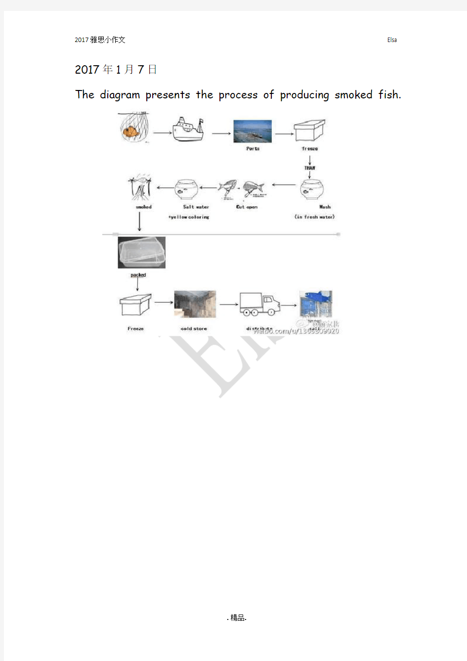
The diagram presents the process of producing smoked fish.
The chart below shows the international applicants for a European country from 2004 to 2008.
The table below shows the income and expenditure of Harckley Hall, a public place for hiring over the period of three years.
The chart below shoes the reasons why people stay in UK and leave UK.
The chart below shows the percentage of adults not doing physical exercise in Australia in 2005.
The chart below shoes the percentage of international students in Canada and USA, also compare the three top source of countries in Canada and USA.
The first chart shows the number of people per kilometer square of six countries in 2003. The second chart shows the percentage change of population in urban area of the six countries from 2003 to 2005.
The diagram presents the process of producing smoked fish.
The chart shows the percentage of dependents in total population in 5 countries, compared the number in 2000 and the projection in 2050.
The chart shows the percentages of both males and females who ate 5 kinds of fruits and vegetables per day of 7 age groups in the UK 2006.
The table below shows the employment rate and average annual salary of graduates from the Australian University.
The chart below shows the percentage of people using internet for different activities in an UK city of year 2007 and 2009.
This diagram shows the online activities of a particular city in Britain in the year of 2007 and 2009.
The diagrams below show the changes of a town called Bridgetown in 1700 and 2000.
The chart below gives information about the possession of newer technologies by different age groups in UK in 2009. Summarize important information and make comparison and contrast.
The diagrams shows a museum and its surroundings in 1900 and 2010.
The graph below shows the percentage of workers in 5 different European countries with a days or more illness absence from 1991 to 2001.
The chart below shows the destinations of students graduated from physics courses and Art & Design in a European country in 2007.