设计海报说明书
- 格式:doc
- 大小:231.50 KB
- 文档页数:2
美工岗位说明书一、岗位背景美工,即美术设计师,是指担任对产品、广告、图片等进行美术设计、平面设计等工作的专业人员。
他们通过运用色彩、构图、排版等美术原理和技术手段,为企业、机构、个人等提供视觉表达方面的服务,帮助宣传品更加出色,加强品牌形象的传播。
二、岗位职责1. 制作平面设计:负责设计公司品牌标志、宣传册、海报、展示板等各类平面设计,确保设计效果达到企业要求。
2. 进行排版设计:负责宣传物料的文字、图片、图形等元素的排版设计,确保版面有较好的整体效果。
3. 图片处理和优化:负责对图片进行选取、处理和优化,确保图片在各类媒体和平台上的表现效果最佳。
4. 滤镜和特效设计:负责为宣传品添加各种滤镜、特效等,以强化宣传品的视觉效果和吸引力。
5. 图片和设计物料管理:负责管理和维护公司的设计物料库,确保设计素材的有效性和可用性。
6. 参与团队合作:与其他相关职能部门和团队成员密切配合,共同完成项目设计任务。
7. 掌握设计趋势:关注设计领域的最新动态和趋势,提出创造性和有推动力的设计方案。
三、任职要求1. 学历:美术相关专业本科及以上学历,有相关工作经验者优先考虑。
2. 熟练掌握设计工具:熟练使用Photoshop、Illustrator、InDesign等设计软件,对电脑操作和图形处理有一定的了解。
3. 具备良好的审美能力:具备扎实的美术功底,对色彩、构图、排版等有较高的审美追求。
4. 较强的创意能力:能够独立思考,提出具有创造性和实施性的设计方案。
5. 团队合作能力:具备良好的沟通能力和协作精神,能够与不同背景的团队成员和相关部门紧密合作,共同完成项目。
6. 抗压能力和执行力:能够在较高的工作压力下保持良好的心态,按时高质量地完成设计任务。
四、职业发展1. 初级美工:从事平面设计等基础工作,熟练掌握设计软件和基本设计原理,增强对企业品牌形象的理解和表达能力。
2. 中级美工:能够独立设计和完成较为复杂的设计任务,具备较高的审美能力和创意能力,对企业品牌形象进行深入思考和推动。
Contents1. Introduction1. Starting Publisher2. Create a Poster Template5. Aligning your images and text 7. Apply a background12. Add text to your poster14. Add pictures to your poster 17. Add graphs and tables from ExcelCreate a Poster Using PublisherIntroductionThis document is a Step‐by‐Step guide to preparing a poster using Microsoft Publisher.[refer to guidelines document]Starting Publisher∙Double click the Publisher Icon on your desktop.∙You will be taken to the ‘getting started’ area of PublisherCreate a Poster TemplateBefore you start creating posters, you need to create a poster template. Conferences and research seminars will usually give a specification of thesize and orientation of the poster to be submitted. The most common size of poster is A0.∙Click Blank Page Sizes∙You will see a screen similar to the one below.∙Click Create custom page size∙A dialog box will appear :∙Enter ”A0 Poster Portrait” in the name box.∙Enter “84.1cm” for the width and “118.9cm” for the height,∙Enter ”0.5cm” in each of the boxes under margin guides (left,right,top,bottom)This will set the page size to that of an A0 landscape poster with a 5mm margin. If you wish your poster to be portrait, switch the numbers for the height and width.∙Press OK.The dialog box will disappear and a new icon will appear under Blank page sizesClicking this new icon will open a Publisher workspaceEdit the Page size of a templateIf you have made a mistake, or you wish to change the page size or change the margins:∙Click the Change Page Size button in the left hand menu,∙Hover over the A0 poster template, click the blue arrow,∙Click Edit from the menu,∙The custom page size dialog box should appear, make your changes then click OK.Aligning your images and textThe two most popular ways to align your images and text are using layout guides and ruler guides.Layout GuidesLayout guides give you the option to divide the poster up into sections to help you place your various elements.To turn the Layout Guides on:∙On the Task menu, click Arrange∙Click Layout Guides from the drop down menu.∙Replicate the settings as shown in the image below:In this example the page is divided into nine sections in a 3x3 grid. Each section has a 5mm margin or padding, and 3 pictures have been added to highlight the usage of such a layout. The Layout guides are represented by dotted blue lines.Ruler GuidesRuler guides are another way on aligning our elements either horizontally or vertically.In the example below, two ruler guides have been used to align a picture and a text box. The guides are represented by two thin green lines.To add a ruler guide :∙Click Arrange∙Select Ruler Guides and select from the menu, Add Horizontal Ruler Guide or Add Vertical Ruler Guide.Apply a BackgroundThe 4 most popular backgrounds for posters are:GradientPatternSolid Single ColourPictureTo apply a backgroundOn the Task menu, click Format and then Background.A column of options will appear on the left, this is called the Background Task Pane.You can select a background from any of the options presented, or you can choose to create one from associated dialog boxes.Apply as solid colour∙Click on the More Colors link in the Background Task pane to bring up the colour gamut dialog box.∙Select a base colour from the graphic in this dialog box and press ok. All the colours in the Format Backgrounds Task Pane on the left will change to reflect the new colour.∙Choose the square with the one solid colour from this panel to apply the fill to the background.Apply a gradientYou can choose from one of the many gradients available from the Format Background task pane or you can make a custom gradient.To select a custom gradient:∙Click the More backgrounds link from the task pane, this will bring up the Fill Effects box∙Click the Gradient tabThere are many different gradients which can be achieved using different combinations of options available in this dialog. The sample box in the bottom right hand corner of the dialog box will give you an indication to what your gradient will look like.Apply a TextureAs with the gradients options, you can choose a texture from the task pane. If there aren’t any to suit you, there is the option to select your own from file.To select a Custom Texture :∙Click the link for More backgrounds....∙In the Fill Effects dialog box, click the Texture tabYou can select a texture from the many listed or you can use the other texture button to select a picture file to base your own texture on. Again the sample box will give you a quick preview of what the background will look likeApply a picture as a backgroundPublisher will tile a picture set as a background picture depending on the physical size of the picture, i.e. the smaller the picture, the greater the number of tiles. You set the background picture this way by the following steps :∙Click the link named More backgrounds....., and click the Picture tab∙Next, click the Select Picture button. A browser dialog box will pop up, navigate to where your picture is stored, click on it, and click OK∙Click OK on the fill effects dialog box.The picture you used tiled on the backgroundIf this is not a suitable background for the poster and a single picture is preferred, follow the steps outlined below.∙Click Insert , Picture ,From file...,∙This will bring up a browser window, navigate to and select the file you wish to use click OKThe picture you have chosen will be placed in the centre of the work area as shown :∙Use the mini circles around the edge of the picture to resize the picture to the extent of the margins as illustrated in the next graphic below/∙Next, right click on the picture, in the Context menu, select Order then left click Send to backThe image will now lay behind everything else in the work area.Add Text to your Poster.The most effective way to read text on a poster is to break it down into small manageable chunks. This is best achieved using text boxes.To insert a text box∙Click insert∙From the drop down menu click Text Box.∙The cursor will change to a cross, left click to place the cursor on the Publisher workspace.∙Click inside the box to enter your text.∙If you find that you do not have enough room to display all of your text, you will see the following symbol underneath the text box: , In this case you will need to resize the text box.∙Left click and drag the small circles on the text box corners to resize the textbox.RotateYou can also rotate the text box by, clicking on the green control at the top of the textbox and dragging in a circular motion.Text InputTo insert text into a text box:∙Click inside it and a flashing cursor will appear. The text box is ready to accept typing.∙You can also copy and paste text from Word documents or Internet Explorer into text boxes.∙The way to change the font, size, and colour of text is very similar to that of Microsoft Word.∙All the controls are in the formatting toolbar under the menu bar.Adding Pictures to your PosterThere are 2 ways to add pictures to a Publisher document.You can either drag an image from the desktop orYou can use the Insert Picture function.Insert a Picture∙Click insert∙In the drop down menu hover over Picture and from the menu select From File∙This will open a browser window to ‘pictures’. You can however, navigate to other folders from here.∙Select the picture file that you want to use and click the Insert button.ResizeResize the picture using the small circular picture size controls on each corner and edge of the box surrounding the picture.Note : Try to avoid resizing small pictures and thumbnails to a large size as this may distort the image.Movement and RotationWhen you move your mouse over the middle of the picture, the cursor changes to look like this means that you can move your picture over the workspace by left click and dragging the picture.You can rotate the picture by clicking and holding the green control at the top of the picture and dragging around it.Rotated To the Right :Add Graphs and Tables From Excel.Insert a TableYou can copy and paste charts and tables from Excel into Publisher, or you can ‘link’ the files so that any updates to the Excel spreadsheet will be reflected in the Publisher document.Link an Excel file∙To link a table in Publisher to an Excel file:∙Select and copy the cells in Excel.∙Open your Publisher document∙Click Edit and click Paste Special from the drop down list.∙Click the radio button marked ‘Paste Link’∙Make sure the “Microsoft office Excel worksheet object link” is highlighted∙Click OKThe selected spreadsheet will appear in the Publisher document.Insert a ChartYou can copy and paste charts from Excel into Publisher.Note : to make it easier to discern which charts are being inserted, give each chart its own sheet in Excel. To do this, follow the steps below.∙Open Excel∙Make the worksheet with the chart in it active.∙Right click in the box containing the chart∙Select Move chart from the menu∙Click New sheet and insert a suitable name for the sheet∙Click OKYou should have a new sheet in the Excel work book that you have appropriately named.NOTE : You may see a warning in Excel disabling data connections in yellow at the top of the workbook. Please click the button and click ‘enable content’To Insert the chart into Publisher:∙Click Insert∙Click ‘Object’ from the drop down menu∙Click the radio button called ‘Create from file’∙Put a check in the box called ‘Link’∙Click the Browse button∙Navigate and select your Excel file∙Click Open∙Click OKYour chart will appear in the middle of the workspace.Just resize and move as you would a picture or a text box.。
设计师岗位说明书(通用9篇)设计师岗位说明书篇11、负责公司的形象设计,产品宣传的设计,公司对外宣传活动的设计;2、了解客户对各类宣传资料、广告的设计制作要求,配合协助市场推广专员、广告商和媒体按时完成设计制作;3、根据广告内容,进行构思、策划和平面与立体形象设计;4、设计广告美术图稿;5、进行广告美术的制作监督的检查。
设计师岗位说明书篇2a) 首先准确绘制原始平面结构图,复核结构与测量数据之间的关系,同时标明各项相关数据,包括客户姓名及联系方式等,然后再进入下一步工作。
b) 结合各方面要求,特别是客户要求以及自己的专业知识进行设计,尽快完成平面布局方案,有问题及时与同事或客户讨论解决。
c) 与客户勾通联系,落实设计方案,包括基本用料、色调及风格等。
d) 根据设计内容的基本框架,设计师通过各种方式表现(展现)设计作品,以便与客户良好交流。
如:(二、三围空间图纸、像片、历史资料、图片、动画等)e) 落实设计具体细节方案,包括各种说明和备忘(与客户交流过程中的有关细则)等。
f) 完善设计图纸,细化施工图,完成的设计图稿必须包括以下图纸:原始平面结构图、平面布局方案图、开关插座位置图、天花灯位图、天花剖面图、强电线路控制图、有关施工详图(含相关剖面、大样、平面、立面及放样图等);区域说明图、施工进度空表(由其它部们填定)、图表索引、水路走向图、强电线走向图、弱电线路走向图、实地放样图及结构变更图等可结合实际情况而定,但所出的图纸必须能清晰表示施工内容。
g) 绘图时,注意尺度比例及准确性,相关专业符号必须符合行业标准,如:区域、管井、断切符号的使用;实虚线与粗细线的代表性等。
如果设计方案需装订成册,所有图纸必须标明图号。
h) 为了使cad图面具有生动性和吸引力,其它图标可自行补充添加,如:人物、软装饰物、走向标志等,但同时注意图面的主次之分。
i) 关于cad文件的对象属性(如图层、颜色等)不做硬性规定,但打印出图效果必须与下一项打印出图要求一致。
常用纸张尺寸说明标准定义iso 216定义了a、b、c三个系列的纸张尺寸。
c系列纸张尺寸主要使用于信封。
iso 216的格式遵循着的比率;放在一起的两张纸有着相同的长宽比和侧边。
例如:把两张a4纸张缩小影印成一张a4纸张;把一张a4纸张放大影印到一张a3纸张;影印并放大a4纸张的一半到一张a4纸张等等。
a系列纸张格式a系列a系列纸张尺寸的长宽比都是,然后舍去到最接近的毫米值。
a0定义成面积为一平方公尺,长宽比为的纸张。
接下来的a1、a2、a3......等纸张尺寸,都是定义成将编号前一号的纸张沿着长边对折,然后舍去到最接近的毫米值。
最常用到的纸张尺寸是a4,它的大小是210乘以297毫米。
b系列b系列纸张尺寸是编号相同与编号前一号的a系列纸张的几何平均。
例如,b1是a1和a0的几何平均。
同样地,c系列纸张尺寸是编号相同的a、b系列纸张的几何平均。
举例来说,c2是b2和a2的几何平均。
此外,日本有一种不兼容的b系列纸张尺寸,是用算术平均而不是用几何平均来定义的。
c系列c系列纸张尺寸主要使用于信封。
一张a4大小的纸张可以刚好放进一个c4大小的信封。
如果你把a4纸张对折变成a5纸张,那它就可以刚好放进c5大小的信封,如此类推。
篇二:印刷尺寸常规以及印刷工艺说明正度纸张:787×1092mm 开数(正度) 尺寸单位(mm)全开 781×10862开 530×760 3开 362×7814开 390×543 6开 362×3908开 271×39016开 195×271注:成品尺寸=纸张尺寸-修边尺寸大度纸张:850*1168mm开数(正度) 尺寸单位(mm)全开 844×11622开 581×844 3开 387×8444开 422×581 6开 387×4228开 290×422注:成品尺寸=纸张尺寸-修边尺寸正度:大度:8k:370*260420*2854k:520*370570*4202k:740*520840*570一、一般海报尺寸(普通海报尺寸)42cm × 57cm (宽×高),大度四开57cm × 84cm (宽×高),大度对开二、宣传海报尺寸、商用海报尺寸50cm × 70cm (宽×高)57cm × 84cm (宽×高),大度对开三、标准海报尺寸13cm × 18cm19cm × 25cm42cm × 57cm50cm × 70cm60cm × 90cm70cm × 100cm42cm × 57cm50cm × 70cm四、电影海报尺寸50cm × 70cm (宽×高)57cm × 84cm (宽×高),大度对开 78cm × 100cm (宽×高)五、招聘海报尺寸90cm × 120cm (宽×高)六、印刷纸张规格正度纸张:787×1092mm开数(正度) 尺寸单位(mm)全开 781×10862开 530×7603开 362×7814开 390×5436开 362×3908开 271×39016开 195×271注:成品尺寸=纸张尺寸-修边尺寸大度纸张:850*1168mm开数(正度) 尺寸单位(mm)全开 844×11622开 581×8443开 387×8444开 422×5816开 387×4228开 290×422注:成品尺寸=纸张尺寸-修边尺寸常见开本尺寸(单位:mm)开本尺寸:787 x 1092对开:736 x 5204开:520 x 3688开:368 x 26016开:260 x 18432开:184 x 130开本尺寸(大度):850 x 1168对开:570 x 8404开:420 x 5708开:285 x 42016开:210 x 28532开:203 x 140正度纸张:787×1092mm开数(正度) 尺寸单位(mm)全开 781×10862开 530×7603开 362×7814开 390×5436开 362×3908开 271×39016开 195×271注:成品尺寸=纸张尺寸-修边尺寸大度纸张:850*1168mm开数(正度) 尺寸单位(mm)全开 844×11622开 581×8443开 387×8444开 422×5816开 387×4228开 290×422注:成品尺寸=纸张尺寸-修边尺寸16开大度:210×285 正度:185×2608开大度:285×420 正度:260×3704开大度:420×570 正度:370×5402开大度:570×840 正度:540×740全开大:889×1194 小:787×1092正四开纸张的算法公式正规纸张尺寸:1092mm x 787mm; 切掉毛边后尺寸:1088mm x 783mm 正四开就是:544mm x 391mm 最大可印刷面积:540mm x 377mm(解释同上)。
美工岗位说明书美工岗位说明书一、职位概述美工是负责设计和制作各类平面广告、海报、宣传册、展板等视觉传达材料的专业人员。
其工作内容包括根据需求进行创意设计、图形制作和后期处理等环节,以实现企业形象的宣传和产品的推广。
二、岗位职责1.根据客户需求和市场调研,独立进行创意设计并提出合理化建议;2.负责平面广告、海报、宣传册、展板等创意设计和制作;3.进行图形处理和排版,以及图像修饰和后期处理;4.与印刷厂商合作,确保作品在印刷过程中的质量控制;5.与市场部门紧密合作,及时根据需求进行设计修改和优化;6.对设计作品进行管理和归档,确保作品的原始文档和版权的保护;7.关注行业动态和设计趋势,不断提升设计水平和创新能力。
三、任职资格1.美术相关专业本科及以上学历,具备良好的美术功底和审美观;2.熟练使用Photoshop、Illustrator等设计软件,熟悉CorelDRAW等设计工具为佳;3.具备一定的设计规范和版面设计的基础知识,熟悉印刷工艺和制作流程;4.良好的沟通能力和团队协作意识,能够与不同部门进行有效的配合;5.具备一定的创新能力和快速学习能力,能够及时关注行业动态和趋势;6.工作积极主动,责任心强,能够承受较大的工作压力。
四、工作地点及薪资待遇1.工作地点:美工岗位通常在公司的设计部门或广告创意部门。
2.薪资待遇:具体薪资面议,根据应聘者的经验和能力进行商议。
五、附件本文档涉及的附件包括.1、美工作品展示;2、美工岗位培训课程;3、美工技术规范。
六、法律名词及注释1.版权:指对于创造性的思想、创作性的作品享有完全的、或者以某种方式限制他人使用的权利。
版权可以是著作权、表演权、录音录像制作者权等。
2.商标:指作为商品、服务的标识,能够与其他商品、服务相区分,并能够识别其来源的符号,包括商标、服务标志和集体商标等。
3.知识产权:指对于人类知识和智慧的产出所享有的权利,包括专利权、著作权、商标权、专有技术、商业秘密等。
海报制作要素范文海报制作是一门综合性的艺术设计,通过图文并茂的方式,向观众传达信息,激发观众的兴趣和购买欲望。
一个成功的海报设计不仅要具备吸引眼球的外观,还要有合适的布局、色彩搭配、字体选择等要素。
在下文中,我将详细介绍海报制作的要素,以及如何利用这些要素来创作一个有效的海报。
首先,海报的主题和目标是设计的起点。
一个好的海报应该有一个明确的主题,以及一个明确的目标受众。
无论是宣传一项活动还是推销一种产品,都需要通过海报来传达信息。
因此,在开始设计之前,我们需要明确海报的主题和目标,以便于更好地布局和传达信息。
其次,布局是海报设计中的重要要素之一、布局要素包括图像、文字、标志等在海报上的位置、大小和相对关系。
一个好的布局可以使信息更清晰、易读,并将视觉焦点引导到最重要的元素上。
常见的布局方式有层次感布局、对称布局和不规则布局等。
通过选择合适的布局,可以让海报更富有吸引力和艺术感。
其次,色彩搭配是海报设计中的重要要素之一、颜色是一种强有力的视觉语言,可以产生不同的情感和联想。
在设计海报时,选择合适的色彩搭配,可以突出主题和目标,吸引观众的注意力。
例如,明亮的色彩可以传达积极、活力的感觉,而暗淡的色彩可以传达沉静、严肃的感觉。
在选择颜色时,需要考虑色彩的互补和对比,以达到更好的视觉效果。
字体选择也是一个重要的要素。
字体是海报设计中传达信息的重要工具之一,通过选择合适的字体,可以突出主题和目标,并吸引观众的注意。
例如,宣传一场音乐会的海报可以选择一种潮流而大胆的字体,而推销一种高档产品的海报可以选择一种华丽而精致的字体。
在选择字体时,需要考虑字体的易读性和与主题的契合程度。
此外,图像是海报设计中不可或缺的要素之一、通过选择合适的图像,可以突出主题和目标,并吸引观众的注意。
例如,宣传一场足球比赛的海报可以选择一张激动人心的比赛瞬间的照片,而推销一种时尚品牌的海报可以选择一张时装模特展示服装的照片。
在选择图像时,需要考虑图像的质量、内容和与主题的契合程度。
10 simple steps to createan awesome scientific posterintroductionAn awesome scientific poster is a work of art. It success-fully combines two rather unrelated fields: science and graphic design. Not only should everything on a poster be accurate and correct, it should also be easy to under-stand and pleasing to look at.Unfortunately, experience learns us that most scientific posters fail on the latter two criteria. It is common to see posters crammed with text and data, often illegibly small. Figures lack legends or labels, and are copied straight from an article. A clear introduction or conclusion is missing. All of this forces viewers to quickly lose their attention and move away.In this short manual, we offer some very simple tips and advice to craft an awesome scientific poster yourself. Having a clear story and a simple layout will help you to successfully spread your message to a broad audience. Good luck!#1tell a storyDon’t use your computer to start making your poster, but start on a blank piece of paper instead. Before opening your favorite software and jumping into the lay-out, take enough time to think about the story you want to tell your audience.Define a single key message you want your audience to remember. If someone would ask them: “What did you learn today?”, what would you want them to say? Remember, your message should be relevant not only to you, but also to your audience!Around this key message, add layers of context as if you were writing an abstract: an introductory sentence, a problem you want to solve, and your methodology to do so. Add your main results, and the conclusion you can draw from them. In what way did you solve the initial problem? This is the story your poster should tell. Nothing more, nothing less.#2provide contextWhen crafting your story, don’t forget to add context. Why are you doing this research? What is the scientific and societal relevance? What is the current situation, and in which ways does it differ from the ideal situation? This is the need, the problem (or one of the problems) you are trying to solve with your research.Without the relevant context, your audience will not know why your research is important, and they will not be motivated to learn about your results and conclu-sions.#3draw meaningful conclusionsEnd your story with a meaningful conclusion. Refer back to the context: in what way did you solve the initial problem? Which steps did you take towards a solution? Did you raise additional questions, which should be tackled in further research?Don’t forget to add a message to your conclusions, rather than sticking to mere numbers. A 10% increase of something is nice, but is it good or bad? Is it something you expected, or is it unusually large or small?#4removethe unnecessary+People never have enough time. At a conference poster session with tens, often hundreds of posters, they are not willing to spend fifteen minutes reading your poster from A to Z. Therefore, remove everything which is not relevant for the story you want to tell. Keep the focus on your key message. Use short, compact sentences.Sure, you have done a massive amount of great work, but if you try to put all of it on your poster, the amount of information will be so huge that nobody will bother to read it. They will lose their attention and move on to the next poster.A great way to save some space on your poster is byremoving your references and putting them on aseparate handout page. If people are interestedenough to look up your references, they don't have towrite them down or take a picture.pro tip#5choose a descriptive titleThe title is your first and best way to get your audience's attention. In just a few seconds, they should know what your story is about. Make sure to avoid difficult words or abbreviations, keep it clear, concise and simple. Don't be afraid to choose a title that gives away your key message. If the title is all your viewers read, make sure it will be one they will remember.#6make your layout match your storyNow it is time to open your favourite software and create a layout. The simplest design is often the most effective, for example: white rectangular blocks on a lightly colored background.Make sure not to put blocks where they fit, but keep the flow of your story in mind. Create a logical structure starting with your introduction and working your way towards your conclusions.Finding the right colors can be one of the hardesttasks when designing your poster. Several websitesand tools are available to help you in finding a greatcolor scheme.pro tip One of my favourite examples is coolors.co .#7optimize your visualsPictures say more than thousand words... and therefore they are invaluable on a great poster - just like in a jour -nal article. But don't be tempted to simply copy figures from an article onto your poster. They are completely different media, with completely different requirements. Take your time to craft your poster figures from scratch . Pay attention to readability and simplicity. Use a large enough font, remove unnecessary details, don't forget your legend. Again, make sure that every figure supports your story and helps to convey your key message.Write meaningful captions. Rather than a descriptionof what’s on the figure, provide an interpretation. Inthis way, readers can follow the story simply bymoving from figure to figure, caption to caption.pro tip#8make it easyfor the readerThe quick fox jumps over the lazy dog.Pack my box with five dozen liquor jugs.How quickly daft jumping zebras vex.Your audience is lazy. It’s your job to ensure they don’t have a hard time reading the text on your poster. To achieve this, the key to success lies in the details, most importantly the font size and the linewidth (the distance between two consecutive lines).Other important factors to optimize: the line length, which should ideally be around 50 characters (that’s twice the alphabet) and the whitespace around your titles and paragraphs. As a rule of thumb, if you print your poster on an A4 sheet, and you hold it at arm’s length, it should be easy and comfortable to readeverything – yes, that includes axis labels, legends and references!Research has shown that – for printed media such asposters – serif fonts (e.g. Times New Roman , Cambria or Garamond ) are easier to read than sans-serif fonts (e.g. Arial , Calibri or Verdana ). The various small lines at the end of the strokes help our brain to quicklyidentify the right letters. Use this to your advantage!pro tip#9practice your presentationPresenting a poster is not very different from presenting a speech. However, your time is usually much morelimited, since people want to visit several tens of posters in a single session. Also, you receive a lot more questions from your audience.Imagine that someone asks you the following question: “I don’t have time to read everything on your poster, but can you tell me in 30 seconds what it’s about?”. There’s even a good chance you will actually get this question!As always, keep in mind who you are talking to . Is it a specialist in your field, or maybe in a related field, or is it someone with a completely different background? How would you explain your poster to your mother?For people who are very interested in your research,provide some handouts: a handy copy of your posteron an A4-sized sheet of paper.pro tip On the back, list your contact details and relevantreferences. Not only does this help people rememberyour name and your work, but it also saves somespace on your poster itself!#10preparefor questionsWhen people come to your poster, they will have ques -tions for you. Of course, you can’t always predict what people will ask, and you cannot know everything. But you can be prepared.Take some time to come up with questions your audi -ence might have after seeing your poster. Ask some colleagues to take a look at your poster and come up with questions. Show your poster to your friends, family or partner and let them ask questions. Think about further research, the details of your methodology, alter -native approaches to achieve the same thing,…Together with your handouts, bring supplementarymaterial! Remember step number 4, where youremoved everything which was not strictly necessary?This is the time to bring all your extra figures and datawith you, just to be sure. And if you are really feelingconfident, why don’t you bring a few copies of yourlatest article?pro tipCreated by Koen Van den Eeckhout for Baryon.We offer graphic design and advice for scientists and academics.Come visit us at www.baryon.be!。
图文设计师职务说明书图文设计师是指运用图片和文字等多媒体元素,进行整体设计、排版和编辑的专业人员。
他们通过运用设计软件和技术,将信息以视觉的形式表达出来,为企业和个人提供独特的品牌形象和传播方案。
以下是对图文设计师职务的说明书:职位概述:图文设计师主要负责根据客户需求,进行设计方案策划和实施,包括产品宣传册、广告海报、网站UI设计、品牌形象设计等方面的工作。
他们需具备良好的审美能力和创意思维,可以通过图像和文字来传达客户的信息和理念,并将设计成果转化为实际应用。
职责与要求:1. 根据客户需求,进行设计方案的策划和创作,包括平面设计、网页设计、产品设计等;2. 使用设计软件和技术进行整体设计排版和编辑,保证设计风格与客户需求一致;3. 设计并制作各类广告宣传材料,如宣传册、海报、展板等,以展现客户的品牌形象和产品特点;4. 参与团队讨论和项目汇报,与团队成员协作,保证设计成果的质量和截止日期;5. 关注设计和行业的最新趋势和发展,进行学习和创新,提高自身的专业水平和设计能力;6. 与客户保持良好的沟通和合作关系,根据客户的反馈进行设计修改和调整。
任职要求:1. 本科及以上学历,美术、设计等相关专业背景;2. 具备良好的审美能力和设计创意,对色彩、形状和布局有敏锐的感觉;3. 精通设计软件和工具,如Adobe Photoshop、Adobe Illustrator等;4. 具有良好的沟通能力和团队合作精神,能够与不同部门和团队成员协作完成各项工作;5. 具备较强的自学能力和学习意愿,关注最新的设计理念和技术趋势;6. 有一定的项目经验和作品集展示,能够在面试中展示自己的设计风格和创作能力;7. 具备较强的时间管理和工作效率,能够在规定的时间内完成设计任务。
工作环境:图文设计师主要在办公室内工作,需要使用设计软件和技术进行设计和编辑工作。
他们可能与客户和团队成员进行沟通和合作,也可能面对较大的工作压力和紧张的工作截止日期。
创意设计岗位说明书一、岗位概述创意设计岗位是指从事创意设计工作的专业人士。
主要负责根据需求和任务要求,进行创意构思、设计方案制作,以及设计作品的呈现和推广工作。
此岗位要求有较强的审美能力、创造力和表达能力,能够独立完成设计项目,为公司的产品和品牌形象提供多样化的视觉解决方案。
二、岗位职责1. 负责参与公司项目的整体创意构思和设计方案制作;2. 根据产品需求和市场定位,独立完成设计作品的创意设计、排版、制作等工作;3. 负责公司相关活动的视觉设计,包括海报、宣传册、展览等项目的设计;4. 参与公司产品品牌形象的设计和推广工作,提升企业形象和知名度;5. 协助其他部门完成与设计相关的工作,如网站UI设计、APP界面设计等。
三、岗位要求1. 具有相关设计专业本科或以上学历,有2年以上相关工作经验者优先;2. 精通设计软件,如Photoshop、Illustrator、InDesign等,熟悉网页设计软件者优先;3. 具有扎实的美术功底和设计理念,熟悉平面设计、包装设计、广告设计等相关知识;4. 具有良好的团队合作精神和沟通能力,能够承担工作压力,有较强的创新意识和学习能力;5. 对设计行业有激情和追求,有良好的职业道德和责任心。
四、薪酬福利1. 薪资待遇:根据个人能力和工作表现,提供有竞争力的薪资待遇;2. 福利待遇:提供五险一金、带薪年假、员工培训等福利待遇;3. 发展空间:公司提供良好的晋升机制和职业发展空间,欢迎有能力和潜力的员工加入。
五、应聘方式有意应聘该岗位者,请将个人简历及作品集发送至公司邮箱(邮箱地址),并注明应聘岗位名称。
公司将对简历进行筛选和面试通知。
以上为创意设计岗位的相关说明,欢迎符合条件的应聘者加入我们的团队,共同创造美好的设计作品。
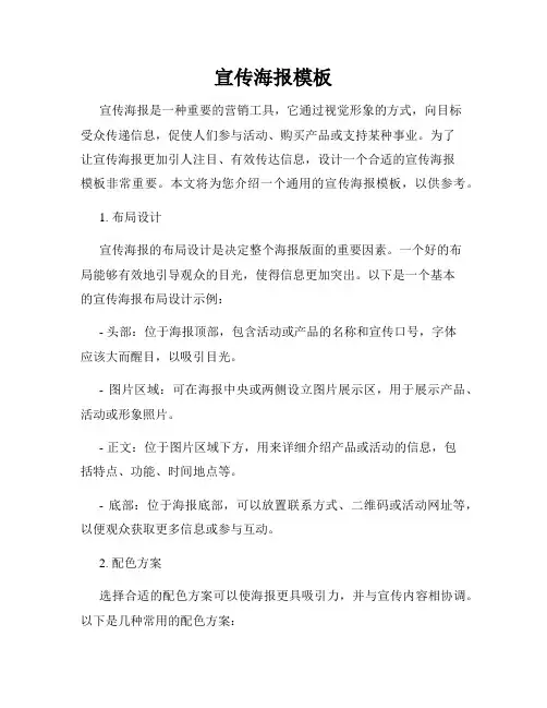
宣传海报模板宣传海报是一种重要的营销工具,它通过视觉形象的方式,向目标受众传递信息,促使人们参与活动、购买产品或支持某种事业。
为了让宣传海报更加引人注目、有效传达信息,设计一个合适的宣传海报模板非常重要。
本文将为您介绍一个通用的宣传海报模板,以供参考。
1. 布局设计宣传海报的布局设计是决定整个海报版面的重要因素。
一个好的布局能够有效地引导观众的目光,使得信息更加突出。
以下是一个基本的宣传海报布局设计示例:- 头部:位于海报顶部,包含活动或产品的名称和宣传口号,字体应该大而醒目,以吸引目光。
- 图片区域:可在海报中央或两侧设立图片展示区,用于展示产品、活动或形象照片。
- 正文:位于图片区域下方,用来详细介绍产品或活动的信息,包括特点、功能、时间地点等。
- 底部:位于海报底部,可以放置联系方式、二维码或活动网址等,以便观众获取更多信息或参与互动。
2. 配色方案选择合适的配色方案可以使海报更具吸引力,并与宣传内容相协调。
以下是几种常用的配色方案:- 高对比色:选择两种颜色进行对比,如红色和黑色、蓝色和白色等,用于突出活动或产品的特点。
- 柔和色彩:选择柔和的颜色搭配,如粉色和淡蓝色、浅绿色和灰色等,用于营造轻松和谐的氛围。
- 渐变色:使用颜色渐变效果,从一种颜色平滑过渡到另一种颜色,增加视觉层次感和艺术感。
3. 字体选择字体是宣传海报中的重要元素之一,合适的字体选择能够增强海报的整体效果。
以下是几个常见的字体选择原则:- 简洁明快:选择简单明了的字体,易于阅读和理解。
- 差异化:选择具有个性和差异化的字体,以吸引观众注意。
- 搭配对比:使用不同字体组合,如粗体和细体、大写和小写等,以增加版面变化和视觉冲击力。
4. 图片和图标应用宣传海报中的图片和图标能够直观地传达信息,引起观众的兴趣。
以下是几种常见的图片和图标应用方式:- 产品展示:使用产品的照片或效果图展示产品的外观和功能。
- 活动形象:使用具有代表性的图片或插画,展示活动的主题或性质。
美工岗位说明书一、岗位概述美工是负责为公司的各类产品、服务或项目进行视觉设计和创意表现的专业人员。
他们通过运用各种设计工具和技术,将创意和想法转化为具有吸引力和影响力的视觉作品,以提升品牌形象、用户体验和营销效果。
二、岗位职责1、视觉设计负责公司网站、电商平台、社交媒体等渠道的页面设计,包括整体布局、色彩搭配、图标设计、图片处理等,确保页面美观、简洁、易用。
设计公司产品的宣传海报、画册、宣传单页、名片等各类印刷品,以及电子文档,如 PDF、PPT 等。
参与公司品牌形象的设计和维护,包括标志设计、品牌色彩规范、字体选择等,确保品牌形象的一致性和独特性。
2、图形图像处理对公司提供的产品图片进行优化和处理,包括裁剪、调色、去背景、添加水印等,以提高图片质量和可用性。
设计和制作各类图标、按钮、导航栏等界面元素,确保其符合用户习惯和设计规范。
为公司的营销活动和推广项目制作相关的图形素材,如活动海报、优惠券、广告图片等。
3、创意与策划与市场、销售、产品等部门密切合作,了解业务需求和目标,提供创意和设计方案,以支持营销和推广活动。
参与公司的产品设计和研发过程,提供关于用户界面和用户体验的设计建议,提升产品的竞争力。
关注行业设计趋势和流行元素,不断创新和改进设计风格,为公司带来新颖的视觉体验。
4、素材管理与整理收集、整理和管理各类设计素材,如图库、字体库、模板库等,以便在设计过程中能够高效地调用和使用。
对设计文件进行分类、归档和备份,确保设计文件的安全性和可追溯性。
5、其他工作协助其他部门完成与设计相关的工作任务,如为公司内部活动制作宣传资料、为员工设计名片等。
参与公司的设计团队建设和培训工作,分享设计经验和技巧,提高团队整体设计水平。
三、任职要求1、教育背景美术、设计相关专业,大专及以上学历。
2、工作经验具有X年以上美工设计工作经验,有成功案例者优先。
3、技能要求熟练掌握 Photoshop、Illustrator、CorelDRAW 等设计软件,具备扎实的设计功底和良好的手绘能力。
美工岗位说明书一、岗位概述美工岗位是指负责进行平面设计、图形设计、广告设计等相关工作的职位。
美工人员在各种媒体平台上负责设计制作宣传资料、广告画面及产品图册等,通过精准的视觉传达方式传递信息,提升企业形象和产品价值。
二、岗位职责1. 制作设计方案:根据客户需求和品牌形象,进行设计方案的构思与创作,包括logo设计、广告牌设计、宣传海报设计等。
2. 图形设计:负责进行平面设计、图标设计、海报设计等相关工作,确保设计作品与企业形象和产品风格相符。
3. 排版编辑:负责文字和图片的排版、编辑与处理,包括字体选择、字号调整、图片修饰等,以确保版面效果的美观和易读性。
4. 协作沟通:与客户和团队成员进行良好的沟通和协作,了解需求并提供专业的设计建议和技术支持,保证设计作品的质量和效果。
5. 案例分析:研究市场上同类产品的设计案例,进行分析和总结,提出创新的设计思路和方案。
6. 制作和输出:使用专业设计软件进行设计制作,如Adobe Creative Suite系列软件,确保设计作品的原创性和高质量输出,同时能够适应不同媒体平台的需求。
三、任职要求1. 具备良好的审美能力和设计思维,对色彩、构图、版式、形象等方面有敏锐的把握和独特的创意。
2. 熟练掌握平面设计软件和工具,如Photoshop、Illustrator等,能够灵活运用各种设计技巧和效果。
3. 具备较强的沟通能力和团队合作意识,能够有效地与客户和同事进行沟通和协作。
4. 具备一定的市场和行业分析能力,能够根据不同产品的特点和目标受众进行设计创作。
5. 具备较强的时间管理和工作效率,能够按时完成设计任务并保持高品质的设计作品。
6. 对新兴设计趋势和技术有一定的关注和了解,不断学习和提升设计能力。
四、发展前景美工岗位在现代社会信息传递中具有重要的地位,随着互联网和移动互联网的快速发展,对优秀美工人员的需求日益增加。
在广告、媒体、互联网等行业中,都需要美工人员进行创意设计和宣传推广,为企业和产品提供视觉形象和品牌价值。
Poster-making for 11” x 17” PosterEssential information for preparing a poster for the poster printer1.Poster size: You will be creating a single large slide in PowerPoint.2.Before adding any content to your slide, go to the Design ribbon and click Page Setup tochange the height and width.3.Required dimensions: 11” x 17”Once you have the proper size, you may begin adding content to your poster. You may do this by inserting textboxes, images, graphs, etc. If you change the page size after you already have content, you will distort all of the objects on the page.4.Margins: It is essential to leave at least a 1 inch margin around the edges of the poster. The easiest way to see whether your margins are correct is to use the Grid and Guidelines features. Go to the View ribbon and check out the three checkboxes to turn on the Ruler, Grid, and/or Guidelines features.The Grid will superimpose a grid with one inch squares on your slide. You can turn the grid off again by unchecking the appropriate box. The Guidelines can help you judge the horizontal and vertical center of your poster. These can be dragged to other locations using the mouse. Holding Ctrl while dragging will create a copy of an existing guideline instead of moving it. Important: The Grid and Guidelines features have inexplicably been left out of some version of PowerPoint for Mac.5.No dark backgrounds: It is absolutely essential that the background of your slide uses light colors. Most of the preset Design Templates in Powerpoint are created for on-screen presentation and are way too dark to print. To use a different color background from the default white, right-click on your slide (but not on any objects such as an image or textbox) and choose Background.... On the Fill tab in the color dropbox, select More Colors.... You will see the following window:White is the center of the wheel. The best colors to use are the onesimmediately around the white center. If you stray too far away fromthe center (i.e. more than two shades), your background will be toodark to print.NAME:In one corner of your poster, include the following:1. Your name2. Your mentor’s name3. The college’s nameZOOM:Use the zoom slider in lower right corner of PowerPoint to view your poster at differentresolutions. Use the "Fit slide to current window" button to see the entire poster.FONTSHere are some suggestions for types of fonts and sizes. For reference, a 100 point font is about an inch high.▪ For the title, consider using a large, bold san-serif font, such as Arial Black, Franklin Gothic Heavy, Tahoma, Trebuchet, or Verdana. Make the font size between 72-120 points.▪ For the subtitles (authors' names, school name, etc.), use the same font as your title but make the font size smaller than the title. A font size between 48-80 points usually works best.▪ For the section headers (Abstract, Introduction, Results, etc.), use the same font as your title and subtitle. Make the font size approximately 50% larger than the body text, between 36-72 points. Make sure that all section headers are the same font size.▪ For the body text, choose a serif type that is very readable, like Garamond, Book Antigua or Bookman Old Style. Make the font size between 24-48 points. Make sure that the body text is the same font throughout the entire posters.▪DON'T USE ALL CAPS for any portion of your poster. It is harder to read and it looks like you are shouting.FORMATTING AND REARRANGING OBJECTS▪To format a text box, right-click anywhere inside it, then select Format Text Box from the pop-up menu. To select a background color with which to fill your object, click the Colors and Lines tab. Then in the Fill area, click the arrow to the right of the Color entry box. You may select from the colors that initially appear or click on More Colors for a wider range of options.▪To create a border around a text-box, right-click anywhere inside it, then select Format Text Box from the pop-up menu. In the dialog box that appears, select options in the Lines area to choose your preferred line color, type of dash, style, and weight. (The default weight of .75 points is usually much too small for posters. Try 3-6 points for a border.) ▪To move an object, first select it by clicking inside it. For text boxes, a second click on the border with diagonal lines will yield the border of find dots that is appropriate forrepositioning. For object other than text boxes, a single click creates a solid border that isappropriate for repositioning. Then, position the cursor over a border location other than awhite square (handle) under the cursor becomes a four-headed arrow. Click and hold the left mouse button. Move the cursor to drag the object to a new location.▪Grouping objects together: To facilitate rearrangement of objects on your poster, it may be advantageous to group some of them into a single object so they can be moved as a unit,retaining their relative position to each other. To group objects, select one by right-clicking on it. When a border with the white squares appears, hold down the Shift key, then select thenext object. Click Draw on the Drawing toolbar, then select Group from the pop-up menu. To confirm that objects are grouped, check that the objects are surrounded by a single set ofwhite boxes, rather than individual sets of handles for each object. To reverse the grouping procedure, click any object in the group. Click Draw on the Drawing toolbar, then selectUngroup from the pop-up menu.▪Resizing images of any kind: The best way to resize animage is to select it and then drag the corner handle. Ifyou hold down the Shift key while resizing it, theheight-width ratio will be maintained so that the image isn'tdistorted. To check whether an image is distorted or not,right click on it and choose Format Picture.... Change tothe Size tab. If the height and width percentages underScale are not equal, the image is distorted. This dialog isso useful for resizing an image to an exact size so that youcan align multiple images.WORKING WITH GRAPHSFor best results, graphs should be created in Excel and then copied and pasted into Powerpoint. To do this, select your graph in Excel. Right-click on it and choose Copy. Then return to Powerpoint and choose Edit: Paste. (The shortcut keys ctrl-C and ctrl-V work, too!)You will probably want to resize your graph in Powerpoint. Select the graph and drag one of the corner handles (not the ones on the sides, top or bottom). If you change the relative height and width of your graph while resizing in Powerpoint, all text in the graph will be distorted. If you want to change the proportions of your graph, do it in Excel before inserting it in Powerpoint. If you have already imported your graph, simply delete the graph in Powerpoint, change the proportions in Excel, and copy and paste the revised graph back into Powerpoint.Once a graph is imported, you can still make changes to it by double-clicking on the graph. This will give you almost all of the options thatyou have in Excel for changing the text and look of the graph.Sometimes you may want to add additional information to a graphbesides the basic axis labels, legend, etc. The best approach is tocreate the the basic graph in Excel, copy and paste it into PowerPoint, and then use PowerPoint to add additional lines, labels, etc.TIPS FOR TITLESThe title is the first thing that your reader will look at (and hopefully not the only thing!) Your title should be interesting, easy to understand, and encourage the reader to check out your poster in more detail.FULL JUSTIFYIf you have blocks of text, a quick way to give your poster a cleaner look is to do a full justify on the text. The default left justify will make the left margin of your text even, whereas a full justify makes both sides even. Highlight the text you'd like to change and go to Format: Alignment: Justify.PRINT A MINI-POSTEREven though your PowerPoint slide is designed to print at a very large scale, it is possible to print the whole thing on a letter-sized piece of paper. It will be easierto proofread, check layout issues, and share drafts with others when it is on paper instead of just inPowerPoint.•Go to File: Print•Make sure that the Scale to Fit Paper option ischecked.•Now select your favorite printer and click OK.Think About Your AudienceDuring a typical poster presentation, you will be expected to stand near your poster to talk to people attending the poster session. There are at least three different types of people that will visit your poster.THE SKIMMERThe Skimmer is a person who comes by and reads the basics about your project. They will certainly read your title along with any other text that is written in a prominent font. They will look at your pictures, tables, and graphs and possibly the accompanying captions. Then they will move on.THE READERThe Reader is somebody who has an intrinsic interest in your topic or discipline. They will spend more time with your poster and read most or all of the text.THE CHATTERThe Chatter can be the most aggravating or the most interesting type of person that you will encounter. They will walk up and (sometimes without even reading your title) ask "What did you study?" You will be expected to explain the basics of your project multiple times during a poster session.。
趣味平面设计说明书
《趣味平面设计说明书》
嘿,大家好呀!今天我来给你们讲讲趣味平面设计这档子事儿。
就说有一次我去逛街,看到一家店铺的海报,那可真是让我印象深刻啊!那张海报的颜色搭配简直绝了,特别鲜艳夺目,一下子就抓住了我的眼球。
上面画了一个超级可爱的卡通形象,圆滚滚的脸蛋,大大的眼睛,还咧着嘴笑呢,看着就特别喜庆。
然后呢,这个卡通形象的手里还举着一个牌子,上面写着“大减价”三个大字,哇,这效果,太吸引人啦!
我走近仔细一瞧,那线条勾勒得也太细腻了吧,每一笔都恰到好处,把这个卡通形象刻画得栩栩如生。
背景的图案也设计得很有意思,有各种小元素点缀其中,像是星星啦、花朵啦,让整个画面变得丰富多彩。
再看看那字体的设计,又大又醒目,而且还特别有创意,不是那种死板的常规字体哦。
这张海报就让我深刻体会到了平面设计的魅力呀。
它不仅仅是一张纸或者一个图像,它是能传递信息、引发情感的神奇存在呢。
好的平面设计就像一个魔法棒,能把普通的东西变得超级有趣、超级吸引人。
再想想我们平时看到的那些广告啊、包装啊之类的,很多不都是靠优秀的平面设计来吸引我们的注意嘛。
比如一个零食的包装,设计得好看又有趣,你是不是就更有兴趣去尝试一下呢?或者一个活动的宣传海报,设计得特别有创意,是不是就让你更想去参加了呢?
所以说呀,趣味平面设计真的很重要呢!它可以让我们的生活变得更加丰富多彩,让我们看到更多美好的东西。
下次你们再看到那些有意思的平面设计作品,可一定要好好欣赏欣赏哦,说不定就能给你们带来不少乐趣和启发呢!哈哈,这就是我对趣味平面设计的一点小小感受啦,希望你们也能喜欢!。
一、实训背景随着信息时代的快速发展,海报作为一种视觉传达的重要手段,在宣传、教育、活动推广等方面发挥着重要作用。
为了提高学生的视觉传达设计能力,培养实际操作技能,我校特举办海报实训课程。
本报告旨在总结实训过程,分析实训成果,并对实训过程中遇到的问题进行反思。
二、实训目的1. 培养学生对海报设计的兴趣和审美能力。
2. 提高学生运用视觉元素进行创意表达的能力。
3. 锻炼学生团队协作和沟通能力。
4. 使学生掌握海报设计的软件操作技巧。
三、实训内容1. 实训课程安排实训课程共分为四个阶段:(1)理论讲解:介绍海报设计的基本概念、原则、风格和分类,以及设计软件的使用方法。
(2)案例分析:分析优秀海报作品,学习其设计理念和技巧。
(3)实战演练:学生分组,根据实训要求设计海报,并进行修改和完善。
(4)成果展示与评价:学生展示作品,互相评价,教师点评。
2. 实训要求(1)设计主题明确,内容积极向上。
(2)构图合理,色彩搭配和谐。
(3)字体规范,版式美观。
(4)注重创意,体现个性。
四、实训过程1. 理论学习在实训初期,教师通过讲解和演示,使学生了解海报设计的基本知识,包括设计原则、风格、分类等。
同时,介绍常用设计软件的使用方法,如Photoshop、Illustrator等。
2. 案例分析教师选取了多幅优秀海报作品,带领学生分析其设计理念和技巧。
通过对比分析,使学生掌握海报设计的核心要素。
3. 实战演练学生分组,根据实训要求设计海报。
在实训过程中,教师巡回指导,解答学生疑问,帮助学生解决设计难题。
4. 成果展示与评价实训结束后,学生展示作品,互相评价,教师点评。
学生通过评价和反馈,了解自己的不足,为今后设计水平的提高奠定基础。
五、实训成果本次实训,学生共完成海报作品XX份。
作品内容丰富,形式多样,充分展现了学生的创意和设计能力。
六、实训反思1. 学生对海报设计有了更深入的了解,提高了审美能力和设计水平。
2. 学生在实训过程中,学会了团队合作和沟通,锻炼了实际操作能力。
广告策划科物料制作的岗位说明书一、岗位概述广告策划科物料制作是一个充满创意和挑战的岗位。
该岗位主要负责制作各类广告宣传物料,包括海报、折页、DM单、宣传册、展示板等。
工作内容需要具备创意思维和审美能力,同时需要有较强的执行力和团队协作能力。
二、岗位职责1. 根据客户需求和公司要求,进行宣传物料的内容策划和设计;2. 负责宣传物料的原创设计和排版工作,确保视觉效果和文字信息的统一性和准确性;3. 跟进宣传物料的制作过程,与印刷、制作等部门进行沟通协作,保证宣传物料的质量和进度;4. 根据项目要求进行宣传物料的制作和修图,保证效果图与实物的一致性;5. 及时更新和维护相关设计资料和文档,为后续项目提供可靠的参考。
三、岗位要求1. 本科及以上学历,平面设计、艺术设计等相关专业优先;2. 有2年以上广告策划或物料制作相关工作经验,有较强的创意和执行力;3. 熟练掌握Photoshop、Illustrator等设计软件,能够进行图像处理、插画绘制等工作;4. 对色彩、结构、版式有一定的敏感度和审美能力,有较好的设计风格和创作能力;5. 具备良好的沟通技巧和团队协作能力,能够与其他部门进行有效的沟通和合作;6. 有较强的责任心和抗压能力,能够在项目周期内保持高效率的工作状态。
四、薪酬待遇1. 本岗位的薪酬待遇从5千到8千元不等,具体视个人经验和能力而定;2. 公司为员工提供良好的福利待遇,包括五险一金、年度调薪、带薪年假等;3. 优秀员工还可获得额外的奖金和晋升机会,公司注重员工的发展和成长。
五、发展前景在互联网和移动互联网的快速发展下,广告策划和物料制作行业也逐渐呈现出多元化和新颖化的发展趋势。
本岗位可以为员工提供广阔的发展空间,有机会在广告设计、品牌推广、节目制作等领域深耕细作。
六、联系方式有意者请将简历发送至公司邮箱,或拨打公司电话进行咨询。
以上为工作招聘广告策划科物料制作的岗位说明书,希望对应聘者有所帮助。
TRB Annual Meeting Poster Session GuidelinesPoster sessions are a valuable opportunity for authors to present papers and meet with interested attendees for in-depth technical discussions. TRB poster sessions are very well attended and a popular feature of the Annual Meeting. Good planning can make your presentation clear, effective and rewarding.The goals in designing a poster should be:∙To attract attention,∙To provide a clear overview of your work,∙To provide enough material to explain the research without an oral explanation, and∙To provide enough material to initiate discussion and questions without overwhelming the audience.What TRB ProvidesPoster sessions are scheduled for 1 hour and 45 minutes in a large hall at the Convention Center. Several poster sessions will be taking place at once, with hundreds of papers being presented in each session time slot.TRB provides a display board that is four feet tall (4 ft. or 122 cm.) and eight feet wide (8 ft. or 244 cm.). A narrow table (6 ft. long and 10 in. wide) is provided in front of the display board that may be used for material or a laptop computer.TRB provides thumbtacks for presenters to use to attach posters made of paper or lightweight poster board. Each poster display board is numbered for easy identification by both authors and attendees.No electrical outlets will be provided. Please come with your computer charged!What Authors Should Bring∙ A single sheet poster made of heavyweight poster paper or similar material, approximately 4 ft. X 8 ft. in size.∙Heavy duty fasteners or tacks as back up to the thumbtacks. Bring tape or other materials as determined necessary.∙Authors may bring additional written material of a non-commercial nature that supplements the material presented on the poster.∙Business cards. This is a GREAT networking opportunity.∙Comfortable shoes. Two hours on your feet can be tiring!Poster Session Rules∙Computers without audio may be used to run demonstrations and display additional information or illustrations.Telephone connections and other equipment are not allowed.∙Commercial advertising of products or services is not permitted.∙Internet will be available at the conference center, but presenters should be prepared in case the reception is poor due to overuse.∙There are no provisions for making posters at the meeting, nor for receiving, storing or returning posters to authors.∙Poster display boards are rented and cannot be written on or defaced.Poster Design Guidelines∙Prepare poster on a SINGLE sheet of heavy duty paper or similarly flexible material. The poster should be about4 ft. X 8 ft. in size. Do not tack individual pages of a PowerPoint presentation or a text manuscript onto a posterboard.∙Keep content SIMPLE. A poster is a visual communication tool, not a manuscript. The viewer should be able to easily identify the primary concepts of the project without wading through a lot of text or complex formulas.Identify 3 or 4 main points or concepts to communicate.∙Present text in bullets or small chunks broken up by subheadings. Use at least 28–36 point bold sans serif font(e.g., Arial or Helvetica) for headers and 18–24 point font for text.∙Present information in columns.Arrange material in a logical sequence, from left top to bottom right. Three columns is a good target to shoot for.∙Offer a balanced mix of text and graphics.Too many words will result in people glossing over or simply bypassing your poster. A good rule of thumb is 50% text, 50% graphics and photos.∙Avoid acronyms and jargon.Simple language is best.∙Avoid dark-colored e light colored backgrounds with black or very dark colored text. Graphics should similarly provide a stark contrast to be readable.∙Use simple graphics.Charts, drawings and illustrations should be limited to a 2-3 color palette at a resolution of at least 300 dpi. Visuals should be large enough to be comfortably read from 3 feet away.∙Provide author name(s), organization logos and/or other acknowledgements to give credit to those who have done the work.∙Prepare a brief (up to 5 minutes) oral presentation for delivering to small audiences gathered around the poster.。