初中英语作文模板:图表作文写作
- 格式:doc
- 大小:37.50 KB
- 文档页数:2
中考英语图表类作文范文In the realm of English language examinations, particularly the middle school entrance exams, graph-based essays have become a common sight. These essays not only test the student's ability to interpret visual data but also evaluate their proficiency in expressing ideas coherently in written English. Let's delve into a typical example:The provided graph illustrates the changes in the consumption of three major beverages, namely Cola, Milk, and Orange Juice, in a certain country over the span of a decade from 2010 to 2020.Beginning with Cola consumption, it's apparent that it held the lion's share in the initial year, accounting for approximately 45% of the total beverage consumption. However, as the years progressed, there was a gradual decline in its popularity, reaching a nadir of around 30% by the year 2017. Subsequently, there was a slight uptick in its consumption, but it remained below the levels observed in the early years.Contrastingly, Milk consumption displayed an upward trajectory throughout the depicted period. In 2010, it stood at a mere 25%, but it witnessed a steady rise, surpassing the consumption of Cola around 2016 and maintaining a dominant position thereafter. By the end of the decade, Milk consumption constituted approximately 40% of the total.Orange Juice, though fluctuating, experienced a relatively stable trend. It began at a moderate 30% in 2010, experienced a dip in the mid-2010s, but rebounded swiftly, reaching its pinnacle in 2019 at nearly 35%. Despite minor fluctuations, Orange Juice consumption remained the second most preferred beverage throughout the period.Analyzing the data, several trends emerge. Firstly, there's a discernible shift in consumer preferences away from carbonated drinks like Cola towards healthier alternatives like Milk and Orange Juice. This trend likely reflects a growing awareness of health consciousness among the populace, influenced by various public health campaigns and educational initiatives.Secondly, the steady rise in Milk consumption underscores its status as a dietary staple, potentially driven by its nutritional benefits and cultural significance in many societies.Thirdly, while Orange Juice didn't witness as dramatic a rise as Milk, its resilience in maintaining a significant share of the market indicates a consistent demand for fruit-based beverages.In conclusion, the graph paints a vivid picture of evolving beverage consumption patterns in the depicted country. It serves as a reflection of broader societal trends towards healthier lifestyles and dietary choices. As we move forward, understanding and adapting to these changing preferences will be crucial for businesses in the beverage industry to remain relevant and competitive.。
初中英语作文图表类模板及范文In the realm of English essay writing for junior high students, the chart and graph essay genre poses a unique challenge. This type of essay requires students to analyze and interpret data presented visually, translate it into meaningful insights, and then communicate these insights clearly and coherently. To assist students in this endeavor, a template and sample essay are provided below.**Template for Chart/Graph Essay**1. **Introduction**:* Briefly introduce the chart/graph and its purpose.* State the main trend or observation. 2. **Body Paragraph 1**:* Describe the data related to the first key aspect of the chart/graph. * Analyze the reasons behind the trend or observation. * Discuss the significance or implicationsof this trend. 3. **Body Paragraph 2**:* Describe the data related to the second key aspect of the chart/graph. * Analyze the reasons behind the trend orobservation. * Discuss the significance or implications of this trend. 4. **Conclusion**:* Summarize the main trends and observations. * Provide a closing thought or recommendation based on the analysis.**Sample Essay****Title**: Interpreting Trends in Teenage Sleep Habits In the chart below, we see a comparison of average sleep hours among teenagers in different countries. The chart reveals a concerning trend: the majority of teenagers in these countries are not getting enough sleep.In the United States, the average teenager sleeps just over 7 hours per night, which is below the recommended 8-10 hours. This could be due to various factors, such as late-night social media use, academic pressure, or extracurricular activities. The lack of sufficient sleep among American teenagers could have serious implicationsfor their health and academic performance.In contrast, teenagers in China sleep an average of over 8 hours per night. This could be attributed tocultural differences in sleep habits or the relatively lighter academic workload compared to their peers in the United States. The higher sleep hours among Chinese teenagers might explain their better performance in international academic competitions.Overall, the chart highlights the need for a global effort to improve sleep habits among teenagers. Parents, educators, and policymakers should work together to create an environment that encourages healthy sleep patterns. For example, schools could implement earlier start times and provide more breaks during the day to encourage better sleep habits among students. Additionally, parents can set limits on screen time before bedtime and ensure a quiet and comfortable sleep environment for their children. By prioritizing sleep, we can help teenagers achieve theirfull potential both academically and physically.**解析**:这篇图表类英语作文围绕“青少年睡眠习惯的趋势”展开。
初二图表类英语作文范文{z}Title: Sample English Essay on Charts for Grade 8Introduction:In this essay, we will analyze and discuss the data presented in a bar chart.The bar chart illustrates the spending habits of people in our city.This essay will provide a detailed analysis of the data and draw conclusions based on the information presented.Body:The bar chart consists of five categories of spending: clothing, food, housing, entertainment, and transportation.The data shows that the highest spending category is food, with an average expenditure of 3000 yuan per month.This is followed by housing, with an average expenditure of 2500 yuan per month.Clothing accounts for the third highest spending category, with an average expenditure of 1500 yuan per month.Entertainment and transportation spending are relatively lower, with average expenditures of 1000 yuan and 500 yuan per month, respectively.From this data, it is evident that food and housing are the primary expenses for people in our city.This is not surprising, as food is a basic necessity and housing is a significant financial commitment.The high spending on food can be attributed to the diverse food culture in our city, with numerous restaurants and food options available.The relatively high spending on housing can be attributed to the rising property prices in our city.As the cost of living increases, more and more people are spending a significant portion of their income on housing.On the other hand, the lower spending on clothing can be attributed to the availability of affordable clothing options in our city.With numerous shopping malls and street vendors, people have easy access to a wide range of clothing at low prices.Similarly, the relatively low spending on transportation can be attributed to the well-developed public transportation system in our city.The availability of buses, taxis, and地铁makes commuting convenient and affordable for people.Conclusion:In conclusion, the bar chart illustrates the spending habits of people in our city.Food and housing are the primary expenses, followed by clothing, entertainment, and transportation.The data reflects the diverse food culture, rising property prices, and well-developed public transportation system in our city.This information provides valuable insights into the financial priorities and lifestyle of people in our city.。

英语作文图表作文(五篇范文)第一篇:英语作文图表作文图表分析作文1As is clearly shown in the table/ figure/ graph / chart, 图表总体描述 between 年代 and 年代.Especially, 突出的数据变化.There are three reasons for 具体表示急剧上升、下降或特殊现象的词.To begin with, 原因一.In addition / Moreover, 原因二.For example, 具体例证.Last but no least, 原因三.In short,总结上文.As far as I am concerned, / For my part, / As for me,作者自己的观点.On the one hand, 理由一.On the other hand, 理由二.In brief,总结上文.图表分析作文2The table / figure / graph / chart shows that 图表总述from 年代to年代.It is self-evident that突出的数据变化.Three possible reasons contribute to 具体表示急剧上升、下降或特殊现象的词或代词代替上文内容.One reason is that原因一.Another reason is that 原因二.For instance,举例证.What’s more原因三.As a result, 重述上文之趋势.However, in my opinion 作者观点.For one thing,理由一.For another, 理由二.T o sum up,总结上文.图表分析作文3It can be seen from the table / figure / graph / chart that图表总述between年代and年代.Especially,突出的数据变化.Why are there such great changes during 图表涉及的年头数years? There are mainly two reasons explaining具体表示急剧上升、下降或特殊现象的词或代词代替上文内容.First,原因一.In the old days,比较法说明过去的情况.But now,说明现在的情况.Second,原因二.As a result,总结上文.In my viewpoint,作者自己的观点.On the one hand,论点一.On the other hand,论点二.图表分析作文4As the table / figure / graph / chart shows,图表总述in the past years年代.Obviously,突出的数据变化.Why are there suchsharp contrasts during 图表涉及的年头 years?Two main factors contribute to具体表示急剧上升、下降或特殊现象的词或代词代替上文内容.First of all,原因一.In the past,比较法说明过去的情况.But now 说明现在的情况.Moreover,原因二.Therefore,总结上文.As I see it,作者自己的观点.For one thing,论点一.For another,论点二.图表作文补充句型• As is shown in the graph…如图所示…•The graph shows that…图表显示…•As can be seen from the table,…从表格中可以看出…•From the chart, we know that…从这张表中,我们可知…• All these data clearly prove the fact that… 所有这些数据明显证明这一事实,即…• The increase of ….In the ci ty has reached to 20%.….在这个城市的增长已达到20%.• In 1985, the number remained the same.1985年,这个数字保持不变.• There was a gradual decline in 1989.1989年,出现了逐渐下降的情况.第二篇:英语图表作文图表描述专题训练(一)这类作文时,注意以下几点:第一,审题时,除了要把握好图表的表层信息外,还要分析图标的深层含义,如原因、根源、可能的发展趋势等。

英语图表作文模板及精选4篇(经典版)编制人:__________________审核人:__________________审批人:__________________编制单位:__________________编制时间:____年____月____日序言下载提示:该文档是本店铺精心编制而成的,希望大家下载后,能够帮助大家解决实际问题。
文档下载后可定制修改,请根据实际需要进行调整和使用,谢谢!并且,本店铺为大家提供各种类型的经典范文,如总结报告、合同协议、规章制度、条据文书、策划方案、心得体会、演讲致辞、教学资料、作文大全、其他范文等等,想了解不同范文格式和写法,敬请关注!Download tips: This document is carefully compiled by this editor. I hope that after you download it, it can help you solve practical problems. The document can be customized and modified after downloading, please adjust and use it according to actual needs, thank you!Moreover, our store provides various types of classic sample essays, such as summary reports, contract agreements, rules and regulations, doctrinal documents, planning plans, insights, speeches, teaching materials, complete essays, and other sample essays. If you want to learn about different sample formats and writing methods, please pay attention!英语图表作文模板及精选4篇学而不思则罔,思而不学则殆,以下是本店铺给大伙儿收集整理的英语图表作文模板及精选4篇,欢迎参考。
图表类英语作文初中1. The bar chart shows the distribution of students' favorite subjects in our school. Math is the most popular subject, followed by English and Science. History and Art are the least favorite subjects among students.2. The line graph illustrates the trend of global temperature over the past century. It clearly shows a steady increase in temperature, especially in the last few decades. This is a concerning trend that requires immediate action to address climate change.3. The pie chart displays the breakdown of household expenses in a typical family. The largest portion goes to housing, followed by transportation and food. Other expenses include utilities, healthcare, and entertainment.4. The scatter plot indicates a positive correlation between hours of study and exam scores. Students who study more tend to achieve higher grades. However, it's importantto note that other factors, such as study habits and learning environment, also play a significant role in academic performance.5. The radar chart compares the performance ofdifferent countries in terms of economic growth, education, healthcare, and environmental sustainability. Each country has its strengths and weaknesses, highlighting the need for global cooperation to address these challenges.。
图表类英语作文范文中考Graph-based English essays often appear in middle school examinations. These essays require students to analyze a given graph and present their findings in a coherent and structured manner. To write a high-scoring graph-based essay, students must follow specific steps, including understanding the graph, identifying key information, and presenting their analysis clearly and logically.The first step in writing a graph-based essay is to thoroughly understand the graph provided. This involves identifying the type of graph (bar graph, line graph, pie chart, etc.), the variables represented, and the time frame or context of the data. For instance, if the graph shows the annual sales of different products over five years, students should note the products, the years, and any trends or patterns in the sales data.Once the graph is understood, the next step is to identify the key pieces of information that need to be highlighted in the essay. This includes:Trends and Patterns: Are there any noticeable trends over time? For example, is there a product whose sales have consistently increased or decreased?Comparisons: How do different variables compare to each other? For example, which product had the highest sales in a particular year?Significant Changes: Are there any significant changes or anomalies in the data? For example, a sudden spike or drop in sales for a particular product.By focusing on these elements, students can ensure that their essay covers the most important aspects of the graph.A well-structured essay is crucial for clear communication.A typical structure for a graph-based essay includes an introduction, body paragraphs, and a conclusion.The introduction should provide a brief overview of the graph, mentioning its type, the variables represented, and the overall context. For example:“In the graph provided, we observe the annual sales data of three different products—Product A, Product B, and Product C—over a period of five years from 2015 to 2020. This bar graph provides insights into the sales trends and patterns of these products during this time frame.”The body paragraphs should delve into the details of the graph. Each paragraph can focus on a specific aspect, such as overall trends, detailed comparisons, and significant changes.Paragraph 1: Overall Trends“In examining the overall trends, it is evident that Product A’s sales have shown a steady increase from 2015 to 2020. Starting at 100 units in 2015, the sales gradually rose to 250 units by 2020. In contrast, Product B experienced fluctuating sales, with a peak in 2017 at 200 units, followed by a decline to 150 units in 2020. Product C maintained relatively stable sales, hovering around the 180-unit mark throughout the five years.”Paragraph 2: Detailed Comparisons“When c omparing the products, it is clear that Product A outperformed the others in terms of growth rate. By 2020, Product A not only had the highest sales but also exhibited the most consistent upward trend. Product B’s sales, while initially strong, did not sustain the growth seen in Product A, showing a downward trajectory after 2017. Meanwhile, Product C’s sales, despite being stable, did not match the growth momentum of Product A, indicating a different market performance.”Paragraph 3: Significant Changes“O ne significant change observed in the graph is the sharp increase in Product A’s sales between 2018 and 2019, where the units sold jumped from 180 to 230. This could be attributed to factors such as a new marketing strategy or an improvement in product fea tures. Conversely, Product B’s decline post-2017 suggests potential issues like market saturation or increased competition. These changes highlight the dynamic nature of the market for these products.”The conclusion should summarize the key points discussed and provide a final insight or opinion. For example:“In conclusion, the graph highlights distinct sales patterns for the three products over the five-year period. Product A’s steady growth and eventual market dominance contrast sharply with Product B’s fluctuating sales and decline. Product C’s stable performance suggests a consistent market presence but lacks the growth seen in Product A. These insights underscorethe importance of analyzing market trends to understand product performance and inform s trategic decisions.”To enhance clarity and coherence, students should use transitional phrases to connect their ideas smoothly. Phrases such as “in contrast,” “similarly,” “for example,” and “as a result” help guide the reader through the essay. Additionally, maintaining a formal tone and avoiding colloquial language ensures that the essay meets academic standards.Like any skill, writing graph-based essays improves with practice. Students should regularly practice analyzing different types of graphs and writing essays based on them. Seeking feedback from teachers and peers can provide valuable insights and help identify areas for improvement.Writing a high-scoring graph-based essay involves understanding the graph, identifying key information, andpresenting the analysis clearly and logically. By following a structured approach and practicing regularly, students can develop the skills needed to excel in this type of essay. With careful attention to detail and a focus on clear communication, they can effectively convey their understanding of the data and achieve success in their middle school examinations.。
图表描述类英语作文(4篇)图表描述类英语作文篇一The above bar chart informs us of the phenomenon that there exist some differences in additional working hours among diverse careers, especially between self-employed businessmen and civil servants. Self-employed businessmen spend nearly 2 hours per day in working overtime. On the contrary, civil servants’ additional working hours is the shortest, only less than 50 minutes per day. The overtime of scientific researchers, cultural and sports workers and teachers is 80 minutes, 70 minutes and 55 minutes respectively.Ample reasons can account for this phenomenon. Firstly, to make more profits, self-employed businessmen have to spend more time in manufacturing products, attracting customers, providing after-sale services and managing staff. Moreover, with the competition becoming fiercer, they have no alternative but to work overtime to avoid being eliminated by the market and their rivals. When it comes to civil servants, things have gone otherwise. Confronted with less risks as well as pressures and leading a steady and routine life, they don’t have to work overtime frequently.Working overtime is a two-bladed sword. Surely, it will generate considerable benefits. However, it will give rise to some damages, especially to our health. We should balance our work, life and health or we will eventually become a machine and salve of work.四级英语作文图表类篇二图片模板:It seems to me that the cartoon / drawing issending a message about ____________(图画内容),which reveals ____________(稍作评价).In myperspective of view, ____________ (表明个人观点)。
图表英语作文范文带翻译Title: The Importance of Graphs and Charts in Presenting Information。
Graphs and charts play a crucial role in conveying complex information effectively. In today's data-driven world, they are indispensable tools for analyzing trends, making comparisons, and illustrating relationships. This essay will explore the significance of graphs and charts in presenting information, examining their various types, and discussing their advantages and limitations.To begin with, graphs and charts offer a visual representation of data, which enhances understanding and interpretation. For instance, a line graph can illustrate changes over time, such as fluctuations in stock prices or temperature variations throughout the year. Similarly, a bar chart can depict comparisons between different categories, like sales figures for various products or the population distribution across different regions. Bypresenting data visually, graphs and charts simplify complex information, making it easier for audiences to grasp key insights at a glance.Moreover, graphs and charts facilitate data analysis by highlighting patterns and trends. Through visualizations, researchers and analysts can identify correlations, outliers, and other significant features in the data. For example, a scatter plot can reveal the relationship between two variables, such as the correlation between study hours and exam scores. By plotting data points on a graph, patterns emerge, enabling researchers to draw conclusions and make informed decisions based on evidence.Furthermore, graphs and charts aid in effective communication by presenting information in a clear and concise manner. In presentations or reports, visual aids like pie charts or histograms can convey key findings more compellingly than lengthy text or numerical tables. Visual representations engage audiences and help them absorb information more readily. Additionally, graphs and charts can be customized with colors, labels, and annotations toemphasize important points or differentiate between data sets, enhancing clarity and impact.However, it is essential to acknowledge the limitations of graphs and charts. While they excel at summarizing large datasets and identifying trends, they can also oversimplify complex phenomena. Misleading visualizations, such as distorted scales or truncated axes, can distort the true nature of the data and lead to erroneous conclusions. Therefore, it is crucial to critically evaluate the design and accuracy of graphs and charts to ensure they accurately represent the underlying information.In conclusion, graphs and charts are invaluable tools for presenting information effectively in various fields, from scientific research to business analytics. They offer visual clarity, facilitate data analysis, and enhance communication by simplifying complex concepts. However, it is essential to use them judiciously and critically evaluate their accuracy to avoid misinterpretation. Ultimately, when used appropriately, graphs and charts are powerful instruments for conveying insights and drivinginformed decision-making.标题,图表在呈现信息中的重要性。
图表英文作文格式范文1. The bar chart shows the percentage of students participating in extracurricular activities in different grades. It's interesting to see that the participation rate decreases as students get older.2. Looking at the line graph, we can see a clear upward trend in the sales of smartphones over the past five years. This reflects the growing popularity of mobile technologyin our society.3. The pie chart illustrates the distribution of household expenses in a typical family. It's not surprising to see that the largest portion goes towards housing, followed by transportation and food.4. In the scatter plot, each point represents a different country and its GDP per capita. It's evident that there is a positive correlation between GDP and life expectancy, highlighting the importance of economicdevelopment in improving quality of life.5. The table provides information on the top five tourist destinations in the world. It's fascinating to see how many millions of visitors each location attracts annually, showcasing the diversity of travel preferences among global tourists.6. The radar chart compares the performance of different departments within a company across various metrics. It's clear that each department has its strengths and weaknesses, emphasizing the need for collaboration and resource allocation.7. The histogram displays the distribution of test scores among students in a class. It's evident that the majority of students fall within the average range, with fewer outliers on either end of the spectrum.8. The line graph compares the changes in temperature over the four seasons in a particular region. It's interesting to note the fluctuations in temperaturethroughout the year, reflecting the dynamic nature of climate patterns.。
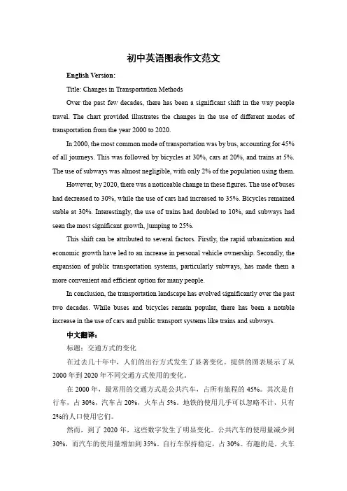
初中英语图表作文范文English Version:Title: Changes in Transportation MethodsOver the past few decades, there has been a significant shift in the way people travel. The chart provided illustrates the changes in the use of different modes of transportation from the year 2000 to 2020.In 2000, the most common mode of transportation was by bus, accounting for 45% of all journeys. This was followed by bicycles at 30%, cars at 20%, and trains at 5%. The use of subways was almost negligible, with only 2% of the population using them.However, by 2020, there was a noticeable change in these figures. The use of buses had decreased to 30%, while the use of cars had increased to 35%. Bicycles remained stable at 30%. Interestingly, the use of trains had doubled to 10%, and subways had seen the most significant growth, jumping to 25%.This shift can be attributed to several factors. Firstly, the rapid urbanization and economic growth have led to an increase in personal vehicle ownership. Secondly, the expansion of public transportation systems, particularly subways, has made them a more convenient and efficient option for many people.In conclusion, the transportation landscape has evolved significantly over the past two decades. While buses and bicycles remain popular, there has been a notable increase in the use of cars and public transport systems like trains and subways.中文翻译:标题:交通方式的变化在过去几十年中,人们的出行方式发生了显著变化。
英语图表作文模板及范文(通用12篇)英语图表作文模板及范文第1篇The table/chart diagram/graph shows (that)According to the table/chart diagram/graphAs (is) shown in the table/chart diagram/graphAs can be seen from the table/chart/diagram/graph/figures,figures/statistics shows (that)……It can be seen from the figures/statisticsWe can see from the figures/statisticsIt is clear from the figures/statisticsIt is apparent from the figures/statisticstable/chart/diagram/graph figures (that) ……table/chart/diagram/graph shows/describes/illustrates图表类英语作文范文The past years have witnessed a mounting number of Chinese scholars returning from overseas. As is lively illustrated by the column chart, the number of returnees climbed from a mere thousand in 2023 to over thousand in 2023, at an annual increase rate of around 50%.A multitude of factors may have led to the tendency revealed by the chart, but the following are the critical ones from my perspective. First and foremost, along with the development of Chinese economy andsociety, the number of Chinese studying abroad has been soaring in the past years, which has provided an expanding base for the number of returnees. In the second place, the government has enacted a series of preferential policies to attract overseas Chinese scholars back home. Last but not least, the booming economy, science and technology in this country have generated more attative job opportunites for scholars returning from overseas.The waves of returnees will definitely contribute to this nation’s development, since they have brought back not only advanced science and technology but also pioneering concepts of education and management. With more scholars coming back from overseas, and with the concerted efforts of the whole nation, we have reasons to expect a faster rejuvenation of this country.更多培训课程:苏州个人提升英语更多学校信息:苏州虎丘区朗阁教育机构咨询电话:英语图表作文模板及范文第2篇Students tend to use computers more and more frequently nowadays. Reading this chart, we can find that the average number of hours a student spends on the computer per week has increased sharply. In 1990, it was less than 2 hours; and in 1995, it increased to almost 4 hours, and in 2000, the number soared to 20 hours.Obviously computers are becoming increasingly popular. There areseveral reasons for this change. First, computers facilitate us in more aspects of life. Also, the fast development of the Internet enlarges our demands for using computers. We can easily contact with friends in remote places through the Internet. Besides, the prices of computers are getting lower and lower, which enables more students to purchase them. However, there still exist some problems, such as poor quality, out-of-date designs and so on. And how to balance the time between using computers and studying is also a serious problem. Anyhow, we will benefit a lot from computers as long as we use them properly.英语图表作文模板及范文第3篇As can be clearly seen from the graph/table/chart (As is shown in the table/figure), great changed have taken place in_______, The_________ have/has skyrocketed/jumped from _____ to _____. When it comes to the reasons for the changes, different people give different explanations. Here I shall just give a begin with, ______What’s more,___________, Last but not least, ________. While it is desirable that ___________, there are still some problems and difficulties for __________ Firstly, __________ ,In addition, __________ ,In a word, __________ .以上就是为大家整理的英语专四图表作文范文模板,希望能够对大家有所帮助。
[英语作文]初中英语图表作文范文Title: Changes in Student Population at a High SchoolThe bar chart provided illustrates the changes in the student population at a high school over a period of five years. The data shows a significant increase in the number of students from Year 1 to Year 5.In Year 1, the student population was recorded at 500. This number increased steadily over the years, reaching 600 in Year 2, 700 in Year 3, and 800 in Year 4. By Year 5, the student population had risen to 900, marking a 400-student increase from the initial year.This trend could be attributed to various factors such as the growing popularity of the school, an increase in the local population, or improvements in the school's facilities and academic programs. It is also possible that the school has expanded its enrollment capacity to accommodate more students.Regardless of the reasons behind this growth, it is clear that the high school has experienced a substantial rise in its student population over the past five years. This trend may have implications for the school's resources, infrastructure, and teaching staff, as they may need to adjust toaccommodate the larger student body.In conclusion, the bar chart effectively demonstrates the upward trend in the student population at this high school. It will be interesting to see if this trend continues in the coming years and how the school adapts to these changes.。
图表作文英语中考范文The following is a sample essay for a middle school English test, focusing on the description and analysis of a chart:Introduction:In recent years, the widespread adoption of technology has significantly transformed the way we engage with literature. The chart below provides a comparative analysis of the reading habits of students in 2010 and 2020, highlighting the influence of technological advancements on their preferences.Body:The chart presents two pie charts, each representing a different year. The first pie chart for 2010 shows that 60% of students preferred reading physical books, while only 40% opted for digital reading materials. In contrast, the pie chart for 2020 reveals a stark shift in preferences, with 70% of students choosing digital reading platforms and a mere 30% favoring traditional books.This shift can be attributed to several factors. Firstly, the proliferation of smartphones and tablets has made digital reading more accessible and convenient. Students can now carry a vast library in their pockets, allowing them to read anytime, anywhere. Secondly, the affordability and variety ofe-books have also contributed to the decline in physical book readership. Digital platforms often offer a wider range of titles at lower prices, making them an attractive option for budget-conscious students.Moreover, the interactive features of digital reading, such as adjustable font sizes, built-in dictionaries, and note-taking capabilities, have enhanced the reading experience for many. These tools cater to individual preferences and learning styles, making reading more personalized and engaging.Conclusion:The data from the chart clearly indicates a trend towards digital reading among students. While the charm of physical books cannot be entirely replaced, technology has undoubtedly reshaped the landscape of reading habits. It is essential for educators and parents to adapt to these changes and explore ways to integrate technology into reading practices without compromising the value of traditional reading experiences.This essay provides a structured analysis of the given chart, starting with an introduction that sets the context, followed by a body that presents the data and explores possible reasons behind the observed trends, and concluding with a summary that reflects on the implications of the findings.。
关于图表类的英语作文初三80字全文共3篇示例,供读者参考篇1Title: The Importance of Understanding Graphs in Junior High SchoolGraphs are an essential part of our everyday lives, whether we realize it or not. In junior high school, students are frequently introduced to various types of graphs such as bar graphs, line graphs, and pie charts. Understanding how to read and interpret graphs is a crucial skill that students need to develop.Firstly, graphs help to visualize data and make it easier to understand complex information. For example, a bar graph can show the comparison of different quantities, while a line graph can demonstrate the trend of a particular data set over time. By looking at a graph, students can quickly grasp the main points without having to read through a lengthy report or article.Secondly, graphs allow students to analyze and interpret data effectively. By examining the relationship between variables presented in a graph, students can draw conclusions and makepredictions about possible outcomes. This critical thinking skill is crucial for academic success and real-life decision-making.Moreover, graphs can help students communicate their findings and insights with others. Whether presenting a research project or reporting on a scientific experiment, the use of graphs can enhance the clarity and impact of the information being conveyed. Being able to create and interpret graphs is a valuable skill that students can use in various subjects and future careers.In conclusion, understanding graphs is essential for junior high school students as it helps them visualize, analyze, and communicate data effectively. By mastering this skill, students can improve their academic performance and develop critical thinking skills that will benefit them throughout their lives.篇2Title: An Overview of Types of ChartsCharts are graphical representations of data, used to illustrate and simplify complex information. They are an essential tool for visualizing trends, patterns, and relationships in data. There are several types of charts commonly used in data analysis:1. Bar Charts: Bar charts are used to compare different categories or groups of data. They consist of vertical or horizontal bars that represent the values of each category.2. Line Charts: Line charts are used to show trends over time. They consist of a series of data points connected by lines, which show how values change over a period.3. Pie Charts: Pie charts are used to show the proportion of each category in a whole. They consist of a circle divided into slices, with each slice representing a different category.4. Scatter Plots: Scatter plots are used to show the relationship between two variables. Each data point on the plot represents a pair of values for the two variables.5. Histograms: Histograms are used to show the frequency distribution of a continuous variable. They consist of vertical bars that represent the number of data points within each interval.6. Area Charts: Area charts are similar to line charts, but the area below the line is filled in to show the cumulative total. They are used to show how a quantity changes over time.Overall, charts are a powerful tool for visualizing data and making it easier to understand complex information. Bychoosing the right type of chart for your data, you can effectively communicate your findings and insights to others.篇3Title: The Importance of Using Charts and Graphs in Data InterpretationCharts and graphs are essential tools for interpreting data and presenting information in a visual and easy-to-understand format. They help to organize data in a way that is clear and concise, making it easier for readers to grasp complex concepts and trends.One of the main benefits of using charts and graphs is that they can quickly convey information that would be difficult to interpret from raw data alone. For example, a line graph can show the trend of a variable over time, while a bar graph can compare different categories side by side. By using these visual representations, researchers and decision-makers can quickly identify patterns, outliers, and correlations within the data.In addition, charts and graphs provide a more engaging and memorable way to present information. People are naturally drawn to visuals, and are more likely to pay attention to and retain information when it is presented in a graphical format.This can be especially important when trying to communicate complex data or statistics to a non-expert audience.Furthermore, charts and graphs can help to identify errors and inconsistencies in the data. By visualizing the data in various ways, researchers can quickly spot discrepancies and outliers that may have been overlooked in a table of numbers. This can lead to a more accurate analysis and interpretation of the data.In conclusion, charts and graphs play a crucial role in data interpretation and presentation. They help to organize complex data, engage the audience, and identify errors in the data. By using these visual tools, researchers and decision-makers can communicate their findings more effectively and makebetter-informed decisions.。
中考英语图表类作文范文In recent years, the use of social media platforms has become increasingly prevalent among teenagers.近年来,社交媒体平台的使用在青少年群体中变得日益普遍。
Many adolescents spend a significant amount of time on platforms such as Instagram, TikTok, and Snapchat, often at the expense of other important activities, such as studying, exercising, or spending time with family and friends.许多青少年在Instagram、TikTok、Snapchat等平台上花费大量时间,往往是以牺牲其他重要活动为代价,比如学习、锻炼或和家人朋友相处。
While social media can provide a sense of connectedness and facilitate communication with others, it also has the potential to negatively impact teenagers' mental health and overall well-being.尽管社交媒体可以提供一种联系感,并促进与他人的交流,但它也有可能对青少年的心理健康和整体健康产生负面影响。
For instance, studies have shown that excessive use of social media is associated with higher levels of anxiety, depression, and feelings of inadequacy among teenagers.例如,研究表明,过度使用社交媒体与青少年更高水平的焦虑、抑郁和自卑感有关联。
初中英语图表作文写作指南与示例**Title: Interpreting Charts and Graphs in Junior High English**In junior high school, learning to write about charts and graphs is a crucial skill that helps students develop their analytical and communication abilities. Masteringthis skill requires a structured approach and practice with various types of charts. This article aims to provide a template and examples for writing English chart essays effectively in junior high.**Template for Writing about Charts and Graphs in Junior High English:**1. **Introduction:** Begin by briefly describing the chart or graph and its purpose. Mention the main findings or trends that immediately catch your attention.2.**Description of the Chart:** Describe the chart in detail, focusing on the key features such as titles, labels, legends, and data points. Explain the types of data represented (e.g., quantitative, qualitative) and the scale used. 3. **Analysis of the Data:** Analyze the data,looking for patterns, trends, or comparisons. Use specific examples from the chart to support your analysis. Link the data to real-world scenarios or applications. 4.**Interpretation:** Interpret the meaning behind the data, considering possible reasons or explanations for the trends observed. Relate the findings to broader topics or issues. 5. **Conclusion:** Summarize your main points and provide a closing statement that ties everything together. Consider making recommendations or predictions based on the chart's findings.**Example: Interpreting a Bar Chart about Teenage Sleep Habits****Introduction:** The bar chart below represents the average hours of sleep per night among teenagers indifferent countries. The chart highlights significant variations in sleep habits among teenagers across the globe, which have important implications for their health andwell-being.**Description of the Chart:** The chart is divided into several bars, each representing a different country. The heights of the bars indicate the average number of hours ofsleep per night among teenagers in those countries. The chart includes labels for each country and numerical values for the average sleep hours.**Analysis of the Data:** From the chart, we can see that there is a wide range of sleep habits among teenagers across different countries. For example, teenagers in Country A sleep for an average of 9 hours per night, while those in Country B sleep for only 6 hours per night. This significant difference suggests that there may be varying cultural, social, or lifestyle factors influencing sleep habits among teenagers.**Interpretation:** The varying sleep habits among teenagers could have profound effects on their physical and mental health. Sufficient sleep is crucial for cognitive function, memory, and emotional well-being. Therefore, the significant differences observed in this chart raise concerns about the potential health implications for teenagers in some countries.**Conclusion:** In conclusion, the bar chart reveals significant variations in sleep habits among teenagers across different countries. These findings highlight theimportance of promoting healthy sleep habits amongteenagers to support their overall well-being. Futurestudies could further explore the factors that influence sleep habits among teenagers and their impact on health outcomes.**初中英语图表作文写作指南与示例****标题:初中英语图表作文解读**在初中阶段,学习如何撰写关于图表和图形的作文是一项至关重要的技能,它有助于学生发展他们的分析和沟通能力。
3-18岁纯英式素质教育领航者:纯英式资深外教,纯英式国际领先教材,纯英式学习环境!
优尼全能英语:初中英语作文模板:图表作文写
作
as is shown/indicated/illustrated by the figure/percentage in the table(graph/picture/pie/chart), ___作文题目的议题_____ has been on rise/ decrease (goesup/increases/drops/decreases),
significantly/dramatically/steadily rising/decreasing from______ in _______
to ______ in _____. From the sharp/marked decline/ rise in the chart, it
goes without saying that ________.
There are at least two good reasons accounting for ______.
On the one hand, ________. On the other hand,_______ is
due to the fact that ________.In addition, ________ is
responsible for _______.Maybe there are some other reasons
to show ________.But it is generally believed that the above mentioned reasons are commonly convincing.
As far as I am concerned,I hold the point of view that _______.
I am sure my opinion is both sound and well-grounded.
中考英语作文英语作文模板:实用性写作(申请信)
Your address
Month, Date, year
Receiver’s address
Dear ...,
I am extremely pleased to hear from you./ to see your advertisement for the position in .... And I would like to write a letter to tell you that.../ I am confident that I am suitable for the kind of the job you are advertising.
.../ I feel I am competent to meet the requirements you have listed. On the
one hand, .... On the other hand, .... I am enclosing my resume for your kind consideration and reference.
I shall be much obliged if you will offer me a precious opportunity to an interview. I will greatly appreciate a response from you at your earliest convenience/ I am looking forward to your replies at your earliest convenience. Best regards for your health and success.
Sincerely yours,
X X X。