雅思写作小作文范文 雅思写作饼状图pie chart 电力来源.doc
- 格式:doc
- 大小:26.50 KB
- 文档页数:2
2019-2020-雅思写作范文:饼状图范文-优秀word范文本文部分内容来自网络整理,本司不为其真实性负责,如有异议或侵权请及时联系,本司将立即删除!== 本文为word格式,下载后可方便编辑和修改! ==雅思写作范文:饼状图范文下面雅思为大家整理了雅思写作范文:饼状图范文,供考生们参考,以下是详细内容。
This is a pie chart that shows the proportion of the meal soldin a supermarket . The total meat sold in the supermarket isclassified into six types as follows : chicken , pork , beef , lamb , fish and others .Overall , chicken has the largest proportion , which accountsfor 40%; while others has the smallest percentage , at 2%.As can be seen in the pie chart , chicken , which makes up 40%,is the most popular among the total meat sold , then next is porkwith 20%, followed by beef , constituting 18%; and finally come lamb , fish and others at 15%, 5% and 2% respectively , It should be noted that the sale of pork is half as much as that of chicken . And it is also interesting to note that the sale of chicken is 20 times as much as that of others .It can be concluded from the pie chart that chicken is most commonly bought meat while others is the least commonly bought meat .以上就是雅思为大家整理的雅思写作范文:饼状图范文,非常实用。
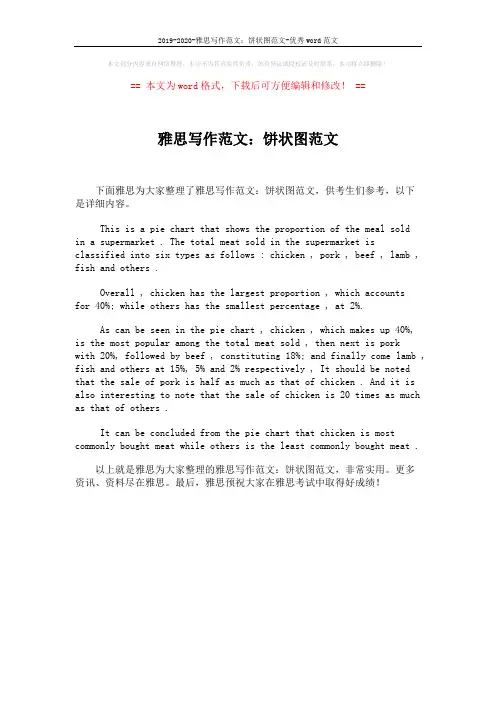
1.The charts compare the sources of electricity in Australia and France in the years 1980 and 2000. Between these years, electricity production almost doubled, rising from 100 units to 170 in Australia, and from 90 to 180 units in France.2.In 1980 Australia used coal as the main electricity source (50 units) and the remainder was produced from natural gas, hydro power (each producing 20 units) and oil (which produced only 10 units). By 2000, coal had become the fuel for more than 75% of electricity produced and only hydro continued to be another significant source supplying approximately 20%.3.In contrast, France used coal as a source for only 25 units of electricity in 1980, which was matched by natural gas. The remaining 40 units were produced largely from oil and nuclear power, with hydro contributing only 5 units. But by 2000, nuclear power, which was not used at all in Australia, had developed into the main source, producing almost 75% of electricity, at 126 units, while coal and oil together produced only 50 units. Other sources wereno longer significant.4.Overall, it is clear that by 2000 these two countries relied on different principal fuel sources: Australia relied on coal and France on nuclear power.分析:第一段:1 The charts compare the sources of electricity in Australia and France in the years 1980 and 2000Compare是“对比”,因为本文有两个国家四幅图,所以用compare就比较合适。


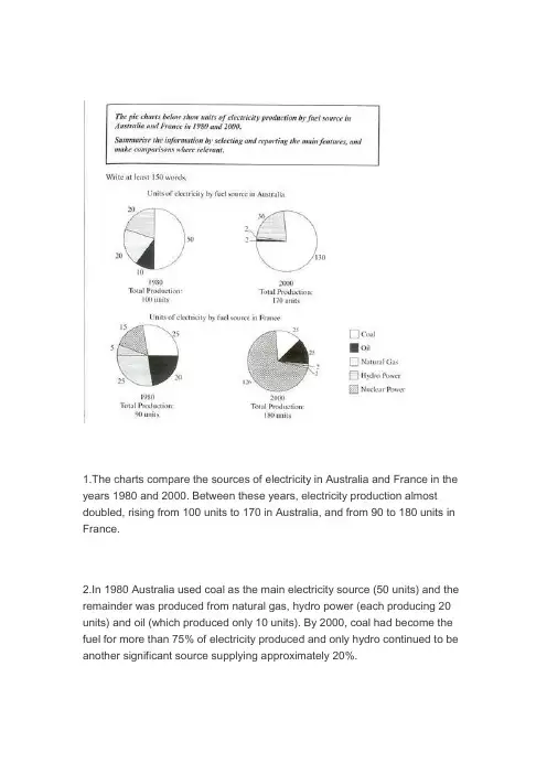
The two graphs show the main sources of energy in the USA in the 1980s and the 1990s.思路:1. 采用折线模式描述2. 注意重点数据的选取(max, min)3. 注意分段原则:一段写上升,一段写下降,一段写保持不变。
答案:The two graphs show that oil was the major energy source in the USA in both 1980 and 1990 and that coal, natural gas and hydroelectric power remained in much the same proportions. On the other hand, there was a dramatic rise in nuclear power, which doubled its percentage over the ten years.Oil supplied the largest percentage of energy, although the percentage decreased from 42% in 1980 to 33% in 1990. Coal in 1990 was the second largest source of energy, increasing its proportion to 27% from 22% in the previous decade. Natural gas, the second largest source in 1980 at 26%, decreased its share very slightly to provide 25% of America’s energy ten years later. There was no change in the percentage supplied by hydroelectric power which remained at 5% of the total energy used. Nuclear power the greatest change: in 1990 it was 10%, twice that of the 1980s.In conclusion, during the decade, the structure of energy resources remained, and the proportion of 3 aspects varied a lot, except natural gas and hydroelectric power.(180)Information on UAE government spending in 2000. The total budget was AED 315 billion.思路:1. 分段原则较为灵活,可以分,也可以不分;2. 注意数据的描述顺序为:从大到小;3. 描述的过程中注意数据的对比:大小关系,倍数关系等;答案:The graph tells us about the budget of the UAE government in 2000. In general, the most important targets were social security, health, and education.The biggest slice of the pie chart is taken up by social security including pensions, employment assistance and other benefits which made up slightly under one-third of total expenditure. Health and personal social services was the second highest budget cost. Hospital and medical services accounted for AED 53 billion, or about 15% of the budget. Education cost UAE AED 38 billion which comprises almost 12% of the whole budget. The government spent about seven percent of revenue on debt, and roughly similar amounts went towards defence (AED 22 billion) and law and order (AED 17 billion). Spending on housing, transport and industry totalled AED 37 billion. Finally, other expenditure accounted for AED 23 billion.All in all, the bulk of UAE government spending goes on social welfare and health. However, education, defence, and law and order are also major areas of spending.(167)3.消费模式The pie charts show changes in U.S. spending patterns between 1966 and 1996.思路:1. 主要采用折线模式,重点描述数据的改变和趋势2. 留意极值(MAX, MIN)的描述3. 分段的原则可为:上升的一段,下降的一段,保持不变的一段。
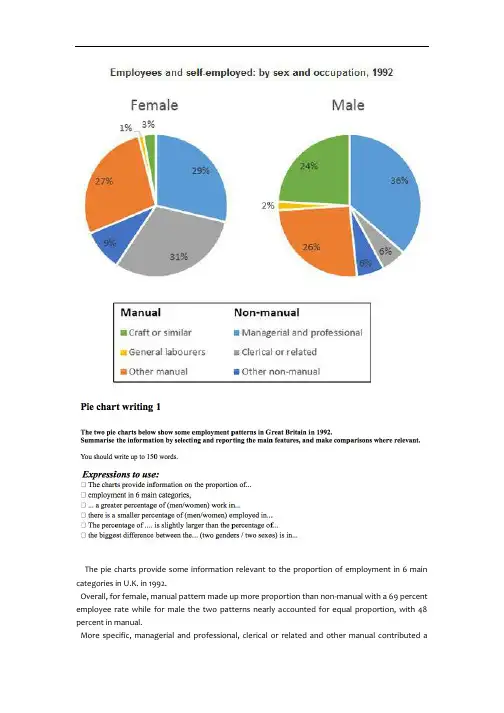
The pie charts provide some information relevant to the proportion of employment in 6 main categories in U.K. in 1992.Overall, for female, manual pattern made up more proportion than non-manual with a 69 percent employee rate while for male the two patterns nearly accounted for equal proportion, with 48 percent in manual.More specific, managerial and professional, clerical or related and other manual contributed asubstantial part of all female employee, at 87 percent. However, for male employee managerial and professional, craft or similar and other manual had a significant percentage in the pie chart, at 86 percent.Apparently, managerial and professional and other manual had a great proportion in all employed persons. And the biggest difference between two genders was in clerical or related pattern and craft or similar pattern because only 6 percent of men chosen clerical or related pattern while there were approximately 5 times of women chosen it. When there were a quarter of man do craft or similar pattern, just 3 percent female did these.There were some small percentages of both men and women who employed in other non-manual job, craft or similar job, respectively in 9 percent and 3 percent. As for male employee, clerical or related and other non-manual jobs share the same small proportion with 6 percent. General laborers pattern is the least popular job pattern with only 1 percent women chosen it and 2 percent men chosen .。

饼图写作一.饼图Pie Chart的审题过程1. 看文字信息(找出描述对象的谓语的同义词)2. 标题审图标出:中间类/第二大相等/相类似剩余类小的标出:中间类/第二大相等/相类似剩余类小的无变化的/第二大/中间类相等/相类似3. 改写开头段饼图特有本质:The pie chart/graph compares the…….The pie chart/graph shows the comparison ofE.g.:The pie charts shows units of electricity production by fuel source in Australia and France in 1980 and 2000.= The charts compare the source of electricity production by five different sources in Australia and Francein the year 1980 and 2000.二.写作顺序:一个图:(静态描写)先找极端数据的,最大的,再找中间类或第二大的、同类或相类似的,最后看剩余类,即,小的或微不足道的一类的。
两个图:(静态对比描写+ 动态变化描写)1.先写第一个图(静态描述:最大,中间同类,剩余类),再写另一个图,进行对比(动态变化:上升/增长为最大的,下降的为最小,保持不变的或中间类或相等相似类)。
三.饼图写作模板(Body段)一个图:①极端类(最大/多)②中间类(同类/相类似). ③剩余类(小的/微不足道)。
范文E.g.:1.Social skills and education constitute comparatively a majority of their main fields of study, with6.5% and 5.6% respectively, while 2.24%, 1.84% and 2.10% are shared by ad., science and computer.The remaining percentages are in moderation, with 5.53% for science and 7.4% for ads.2.Coal makes up the maximal portion/ the majority of the source/was the biggest instrument of thesources of energy, with 47%, while Nuclear accounted for a tiny share, with only 1%. Furthermore, 28% altogether of the energy was shared by Oil and Hydro. The remaining 24% was due to Natural Gas.结尾1.Through the charts, we can easily draw the conclusion that the new source of energy, particularlyNuclear was given full play while the traditional ones, though still dominant, reached their bottleneck/ceiling to some extent.2.Overall, it is clear that by 2000 these two countries relied on different principal fuel source: Australiarelied on coal and Franc on nuclear power.两个图:一段(静态):①最大的②中间类(同类/相类似). ③剩余类(小的/微不足道)二段(动态):However,①上升/增长为最大的②下降为最小的③保持不变的或中间类或相等相似类)。
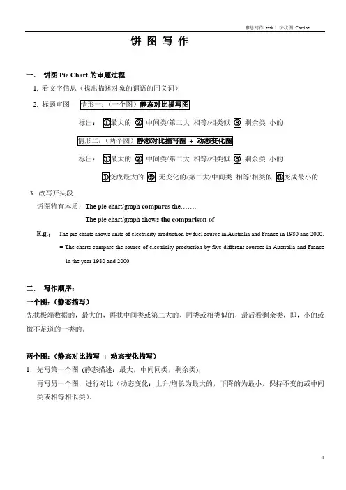
2001 2002These two pie charts show how attitudes of visitors towards this museum changed in these two years before and after the museum redecorated, and the paragraph shows the whole number of visitors in these two years.The table demonstrates the exact number of visitors to Ashdown museum throughout the year before and the year after it was redecorated. Two pie charts illustrate the outcomes of questionaires interviewing visitors how satisfied they were with their trip, during the same two periods.Interviewing visitors how satisfied they were with their trip, questionaires were conducted successfully. Least/mostFrom the first pie chart that shows the opinion/visitors’ opinions before the museum redecorated, the number of people who felt dissatisfied was the most/largest, accounting for 40%. This was followed by the attitude/group of the satisfied and the very satisfied, representing 30% and 15% respectively. The figure/number of citizens who felt very dissatisfied took up the percentage of 10%, and the rest of no response, 5% collectively.It has been observed from two pie charts that in terms of the survey conducted the year before renovation, 40% of respondents were dissatisfied, while only 15% of them were very satisfied. The year after the museum was redecorated indicate that the number of dissatisfied visitors declined and became 15%. Followed by the precentage of respondents who were very dissatisfied, which dropped from 10% to 5%. Comparing the percentage of satisfied visitors, we can see an upward trend. Respondents/interviewees Upward trend, (we can see a postive pattern) downward trend (negative pattern)The second chart shows the views after refurbishing. The number of whom felt satisfied took/accounted for40%. The opinion of very satisfied was 35%, and the following group is the figure of who were dissatisfied, took the number of 15%.That of no response section/group and people who felt very dissatisfied were the same, took thenumber of 5%.We can see that after redecorating, there are more people feel better than before.To sum up, we can say that the redecoration that has been done to attract new visitors to the museum has reached its aim.Refurbishment, renovation, dedecoration。
刚刚结束的12月21日雅思考试中,小作文考到了柱状图和饼状图,很多同学对于饼状图的写作并不是很有把握,让我们一起来看看上海环球雅思写作老师给出的小作文饼状图范文,希望能对2014年准备考试的同学有所帮助。
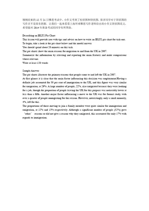
Describing an IELTS Pie ChartThis lesson will provide you with tips and advice on how to write an IELTS pie chart for task one. To begin, take a look at the pie chart below and the model answer.You should spend about 20 minutes on this task.The pie charts show the main reasons for migration to and from the UK in 2007.Summarize the information by selecting and reporting the main features and make comparisons where relevant.Write at least 150 wordsSample AnswerThe pie charts illustrate the primary reasons that people came to and left the UK in 2007.At first glance it is clear that the main factor influencing this decision was employment.Having a definite job accounted for 30 per cent of immigration to the UK, and this figure was very similar for emigration, at 29%. A large number of people, 22%, also emigrated because they were looking for a job, though the proportion of people leaving the UK for this purpose was noticeably lower at less than a fifth. Another major factor influencing a move to the UK was for formal study, with over a quarter of people immigrating for this reason. However, interestingly, only a small minority, 4%, left for this.The proportions of those moving to join a family member were quite similar for immigration and emigration, at 15% and 13% respectively. Although a significant number of people (32%) gave ‘other’reasons or did not give a reason why they emigrated, this accounted for only 17% with regards to immigration.。
饼状图作文英语作文范文英文回答:The pie chart presented illustrates the distribution of energy consumption across various sectors in a particular country during a specified year. The data is visually represented in the form of a pie chart, where each sectoris assigned a portion of the circle proportional to its share of the total energy consumption.The primary energy source in this country is clearly coal, which accounts for a significant 40% of the total consumption. This indicates that the country relies heavily on traditional fossil fuels to meet its energy needs. The second-largest contributor is natural gas, with a share of 25%. This suggests that the country is also making efforts to diversify its energy mix and transition towards cleaner sources.Renewable energy sources, such as solar and wind power,play a relatively minor role, collectively accounting for only 15% of the total energy consumption. This highlightsthe need for the country to invest more in renewable energy technologies and reduce its dependence on fossil fuels.The transportation sector is the largest consumer of energy, accounting for 30% of the total. This is primarily due to the extensive use of gasoline and diesel-powered vehicles in the country. The industrial sector, which includes manufacturing and construction, accounts for the second-largest share (25%) of energy consumption. This indicates that the country has a strong industrial base and requires significant energy to power its industries.The residential and commercial sectors collectively account for 20% of the total energy consumption. This suggests that households and businesses are alsosignificant contributors to the country's energy demand. It is important to note that these sectors often rely on electricity for various purposes, such as lighting, heating, and cooling.The pie chart provides a clear and concise overview of the energy consumption patterns in the specified country. It highlights the dominance of traditional fossil fuels, the growing importance of natural gas, and the need for further investments in renewable energy sources. The data can serve as a valuable foundation for policymakers and energy planners to develop strategies for addressing the country's energy needs while promoting sustainability.中文回答:饼状图作文范文。
雅思小作文饼状图英文回答:The pie chart illustrates the percentage of various sources of energy consumed in a particular region during a specific year. The data is presented in a clear and concise manner, with each slice of the pie representing a different energy source.Upon examining the pie chart, it becomes evident that non-renewable energy sources dominate the region's energy consumption. Fossil fuels, including coal, natural gas, and oil, account for a substantial 80% of the total energy usage. This heavy reliance on non-renewable resources highlights the region's dependence on finite energy sources, which raises concerns about future energy security and environmental sustainability.In contrast, renewable energy sources play a relatively minor role in the region's energy mix. Solar and wind powercombined contribute a mere 10% to the total energy consumption. This low percentage suggests a lack of investment in renewable energy infrastructure and a reluctance to transition towards cleaner and more sustainable energy sources.Hydroelectricity stands out as the most significant renewable energy source, accounting for 5% of the region's energy consumption. However, this figure is stillrelatively low compared to the potential hydroelectric resources that the region may possess. The untapped potential of hydroelectricity presents an opportunity for the region to increase its reliance on renewable energy and reduce its dependence on fossil fuels.Overall, the pie chart provides valuable insights into the region's energy consumption patterns. The dominance of non-renewable energy sources raises concerns about the region's long-term energy security and environmental sustainability. The underutilization of renewable energy sources, particularly hydroelectricity, suggests a need for increased investment and a shift towards a more sustainableenergy future.中文回答:此饼状图展示了某个地区在某一年中各种能源消耗所占的百分比。
饼图雅思英语作文Pie charts are a common type of data visualization that represent the distribution of a categorical variable. They consist of a circle divided into sectors, with each sector representing a proportion of the whole. Pie charts are often used to show the relative sizes of different categories within a dataset.One advantage of pie charts is that they can easily convey the overall distribution of a categorical variable at a glance. The size of each sector is proportional to the percentage it represents, making it easy to compare the relative sizes of different categories. This can be especially useful when presenting data to a non-technical audience, as it allows for quick and intuitive understanding of the data.However, pie charts also have some limitations. For example, they can become difficult to read when there are too many categories, as the sectors become small and hardto distinguish. In addition, it can be challenging to accurately compare the sizes of different sectors, especially when they are similar in size. This can make it difficult to accurately interpret the data, especially when the differences between categories are small.In conclusion, pie charts are a useful tool forvisually representing the distribution of categorical data. They provide a quick and intuitive way to understand the relative sizes of different categories within a dataset. However, they also have limitations, such as difficulty in comparing small differences and becoming cluttered with too many categories. As with any data visualization, it's important to consider the specific characteristics of the data and the audience when deciding whether to use a pie chart.。
Pie Chart Analysis in English Essay Templatefor CET-4In the modern era of data-driven decision-making, the ability to interpret and present information visually is crucial. Among various chart types, the pie chart stands out as a popular tool for showing the proportional distribution of data. In this article, we will explore an English essay template tailored for the CET-4 examination, focusing on the analysis of a pie chart.**Essay Template:****Introduction:*** Begin by stating the topic or the subject matter of the pie chart. * Briefly introduce the chart and its purpose in context. * Mention the key takeaways or highlights from the chart.**Body Paragraph 1 (Description of the Chart):*** Describe the overall structure and appearance of the pie chart. * Discuss the different categories represented and their respective sizes. * Use appropriate vocabulary and expressions to describe the chart's details.**Body Paragraph 2 (Analysis and Interpretation):*** Analyze the data presented in the chart. * Compare and contrast the sizes of different categories. * Discuss possible reasons or factors that may have influenced the distribution. * Link the chart's findings to real-world scenarios or related theories.**Conclusion:*** Summarize the main points discussed in the essay. * Highlight the significance of the pie chart and its implications. * Provide a closing statement that ties everything together.**Sample Essay:****Analyzing the Distribution of Favorite Sports Among Students**In the modern era of sports mania, understanding the preferences of students towards different sports is crucial for educational institutions seeking to promote physical activity. A recent survey conducted among students in a local school revealed interesting insights into their favorite sports. This essay aims to analyze thedistribution of favorite sports among students using a pie chart.The pie chart, depicting the favorite sports of students, is divided into several sections, each representing a different sport. The overall structure of the chart is easy to comprehend, with each category clearly labeled and color-coded. The sizes of the sections indicate the proportion of students preferring each sport.Upon analysis, it is evident that football holds the largest proportion of student preferences, followed closely by basketball. This could be attributed to the popularity of these sports in the region, as well as the availability of facilities and resources for these sports in the school. On the other hand, sports like cricket and tennis, although popular globally, have a smaller fan base among the students surveyed. This could be due to the lack of exposure or availability of these sports in the school environment.The findings of this pie chart have important implications for educational institutions. By understanding the sports preferences of students, schools can betterallocate resources and facilities, ensuring that the needs of the majority are met. Additionally, promoting a diverse range of sports can help inculcate a culture of inclusivity and healthy competition among students.In conclusion, the pie chart provides valuable insights into the distribution of favorite sports among students. By analyzing the chart, we can gain a better understanding of student preferences and the factors that influence them. This information can be used by educational institutions to improve their sports programs and promote a healthier, more inclusive school environment.。
雅思饼图范文The given pie chart illustrates the percentages of different types of garbage disposed of in a particular residential area in 2018. Overall, it is clear that the majority of the garbage was organic waste, followed by paper and plastics, while the smallest proportion consisted of glass.Organic waste accounted for the largest share of garbage, at 45%. This is not surprising, as organic waste includes things such as food scraps and yard trimmings, which are generated daily in households. It is worth noting that this type of waste can be easily decomposed or recycled, making it a potential source of renewable energy if properly managed.The second largest proportion of garbage was paper, which made up 30% of the total. Paper waste includes items such as newspapers, cartons, and packaging materials. This figure may be attributed to the widespread use of paper products in everyday life, such as for writing, printing, and packaging. While paper can be recycled, it is important to reduce its consumption and promote the use of digital alternatives to minimize waste.Plastics constituted a significant portion of the garbage, accounting for 20%. Plastics are known for their durability and resistance to degradation, making them major contributors to environmental pollution. Single-use plastics, such as water bottles and food packaging, are particularly concerning due to their short lifespan and inefficient recycling rate. Efforts should be made to reduce plastic production and promote the use of eco-friendly alternatives, such as reusable containers and biodegradable materials.Finally, glass waste represented the smallest percentage, at just 5%. This may be because glass is a relatively heavy and durable material, making it less likely to be discarded frequently. Additionally, glass can be easily recycled and reused, reducing its overall environmental impact. However, initiatives to encourage the use of refillable glass containers and reduce the consumption of single-use glass products should still be implemented.In conclusion, the pie chart demonstrates the distribution of different types of garbage in a residential area. Organic waste constituted the largest proportion, followed by paper and plastics. The smallest share was attributed to glass waste. Efforts should be made to manage and reduce the generation of these various typesof waste to promote environmental sustainability.。
雅思小作文饼图雅思小作文饼图模板雅思小作文饼图向我们展示的一般是数据间的比例关系。
下面是店铺分享的雅思小作文的.饼图作文模板,欢迎大家阅读!雅思小作文饼图模板In this analysis we will examine three pie charts. The first one is headed ‘World Spending.’ The second is ‘World Population’ and the third is ‘Consumption of Resources.’In the first chart we can see that people spend most of their income (24%) on food. In some countries this percentage would obviously be much higher. Transport and then housing are the next major expenses at 18% and 12% respectively. Only 6% of income is spent on clothing.In the second chart entitled ‘World Population’, it is not surprising to find that 57% of people live in Asia. In fact China and India are two of the most populated countries in the world and they are both situated on this continent. Europe and the Americans account for nearly 30% of the total, whilst 10% of people live in Africa.Finally, the third chart reveals that the USA and Europe consume a huge 60% of the worl d’s resource.To sum up, the major expenditure is on food, the population figures are the highest for Asia and the major consumers are the USA and Europe.雅思小作文句型模板1.比较,占据,百分数Form, comprise, make up, occupyConstitute, cover, represent, account forBe shared byIn 1950, the urban population represented less than 13% of the total. It isnow about 40% and is expected to reach 60% by 2030. (摘自BBC)2.比例,倍数A quarter of…Half of…A majority of…A has something in common with bA shares some similarity with bThe difference between a and b lies in…Double, triple, quadruple (v, n, adj)原来的2倍-double,50→100原来的3倍-triple,50→150原来的4倍-quadruple,50→2003.描述It is clear that the most (adj.) xx is A, which accounts for m% of all x .B is the next largest(adj.)xx ,n% lower than A of all x and followed closely byC . The above three items of xx take uo about o% of the x%By contrast D E andF make uo the smallest percentage of total x , which arep% q% and r% ,respectively.The regions can be divided into two groups-one w here … and the other wherethe reverse is the case.【雅思小作文饼图模板】。
雅思小作文饼图范文在雅思小作文中,饼图是一种常见的数据呈现方式。
接下来我们将会给大家提供一篇关于饼图范文的示例,希望能够帮助大家更好地理解和掌握这种写作方式。
饼图范文示例:The pie chart illustrates the proportion of different types of energy production in a certain country in 2018. Overall, it can be seen that the majority of energy production comes from fossil fuels, while renewable energy sources contribute a relatively small portion.Fossil fuels, including coal, natural gas, and oil, accounted for the largest share of energy production at 65%. Among them, oil was the most dominant, making up 35% of the total energy production. Natural gas and coal followed, with 20% and 10% respectively. This indicates that traditional energy sources still play a crucial role in meeting the country's energy demands.In contrast, renewable energy sources only contributed to 20% of the total energy production. Among them, hydroelectric power was the primary source, accounting for 15%. Meanwhile, wind and solar energy made up 3% and 2% respectively. Despite the growing global emphasis on renewable energy, it is clear that in this particular country, the reliance on fossil fuels remains significantly higher.Nuclear energy, on the other hand, made up the remaining 15% of the energy production. This suggests that while it is not as dominant as fossil fuels, nuclear energy still plays a substantial role in the country's energy mix.In conclusion, the pie chart provides a clear overview of the energy production composition in the given country. It highlights the dominance of fossil fuels, the relatively small contribution of renewable energy sources, and the significant role of nuclear energy. This information is crucial for policymakers and stakeholders in making informed decisions about the country's energy future.。
雅思写作小作文范文雅思写作饼状图pie chart 电力来源
今天我们雅思写作小作文范文的文章来研究下饼状图pie chart。
该图表展示了1980年和2000年,澳大利亚和法国在发电过程中使用的不同燃料的状况。
具体燃料类型有:煤,石油,天然气,水能和核能。
需要注意的是,该饼状图中的数字并不表示百分比,而是赋予了具体的数字。
小编搜集了一篇相关的考官范文,以供大家参考。
雅思写作小作文题目
The pie charts below show units of electricity production by fuel source in Australia and France in 1980 and 2000.
Summarise the information by selecting and reporting the main features, and make comparisons where relevant.
雅思写作小作文范文
The pie charts compare the amount of electricity produced using five different sources of fuel in two countries over two separate years.
该饼状图比较了两个国家在不同的年份使用五种不同燃料来源所产生的电能数量。
Total electricity production increased dramatically from 1980 to 2000 in both Australia and France. While the totals for both countries were similar, there were big differences in the fuel sources used.
从1980年到2000年,澳大利亚和法国的电能总产量都急剧上升。
虽然两个国家的总量比较相似,但在其所使用的燃料上存在巨大差异。
Coal was used to produce 50 of the total 100 units of electricity in Australia in 1980, rising to 130 out of 170 units in 2000. By contrast, nuclear power became the most important fuel source in France in 2000, producing almost 75% of the country’s electricity.
1980年,澳大利亚总计100单位的电力中,用煤发电占到其中的50单位。
这一数字在2000年上升到130单位(总量为170单位)。
相比之下,核能在2000年的法国成为最主要的燃料来源,产生整个国家电力的百分之75左右。
Australia depended on hydro power for just under 25% of its electricity in both years, but the amount of electricity produced using this type of power fell from 5 to only 2 units in France. Oil, on the other hand, remained a relatively important fuel source in France, but its use declined in Australia. Both countries relied on natural gas for electricity production significantly more in 1980 than in 2000.
在这两年中,澳大利亚的水力发电量不到总发电量的百分之25。
但法国使用该能源产生的电力数量从5单位降到了2单位。
另一方面,石油仍然是法国电力的重要来源之一,但其使用量在澳大利亚有所下降。
两个国家在1980年利用天然气发电的数量都明显比2000年要多。
雅思写作小作文高分范文,快速提升写作成绩。