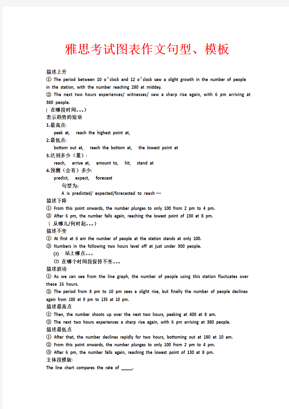

雅思考试图表作文句型、模板
描述上升
①The period between 10 o’clock and 12 o’clock saw a slight growth in the number of people in the station, with the number reaching 280 at midday.
②The next two hours experiences/ witnesses/ saw a sharp rise again, with 6 pm arriving at 380 people.
( 在哪段时间。。。)
表示趋势的短语
1.最高点:
peak at, reach the highest point at,
2.最低点:
bottom out at, reach the bottom at, the lowest point at
3.达到多少(量):
reach, arrive at, amount to, hit, stand at
4.预测(会有)多少:
predict, expect, forecast
句型为:
A is predicted/ expected/forecasted to reach…
描述下降
①From this point onwards, the number plunges to only 100 from 2 pm to 4 pm.
②After 6 pm, the number falls again, reaching the lowest point of 130 at 8 pm.
( 从哪儿/何时起。。。)
描述不变
①At first at 6 am the number of people at the station stands at only 100.
②Numbers in the following two hours level off at just under 300 people.
⑵站上哪点。。。
⑵在哪个时间段保持不变。。。
描述波动
①As we can see from the line graph, the number of people using this station fluctuates over these 16 hours.
②The period from 8 pm to 10 pm sees a slight rise, but finally the number of people declines again from 180 at 9 pm to 135 at 10 pm.
描述最高点
①Then, the number shoots up over the next two hours, peaking at 400 at 8 am.
②The next two hours experiences a sharp rise again, with 6 pm arriving at 380 people.
描述最低点
①After that, the number declines rapidly for two hours, bottoming out at 180 at 10 am.
②From this point onwards, the number plunges to only 100 from 2 pm to 4 pm.
③After 6 pm, the number falls again, reaching the lowest point of 130 at 8 pm.
主体段模版:
The line chart compares the rate of _____.
It can be clearly seen that _____________.
Male smokers…. In contrast, female smokers….
To conclude, we can see that_____________.
★A comparison of …shows that …while ….
☆A comparative study of …shows that …while ….
图表引用数据句型:
1. The number picked up in June, rocketing
by almost 500% .
2. There was a marked improvement in July with the number of visitors surging 400% .
3. The period between May and September saw a steady growth in the number of visitors from 70,000 to 140,000 .
4. The gradual rise in visitor numbers from 30,000 to approximately 45,000 in the first four months was followed by a sharper increase in May.
There was a slight rise in the number of TV audiences from about 3% at 6:00 am to about 7% at 8 am.从早上6点到8点看电视的人数有个小小的增长,由3%到7%。
The percentage declined substantially until 8:00 am, bottoming out at about 45%.
百分率一直大幅下滑,到早上8点最低降到约45%。
The next two hours witnessed a dramatic rise in the number again, with the number reaching 280 at midday.
接下来的两个小时,数字又巨幅攀升,中午时分最高达到280。
However, for the rest of the day, the percentage of radio was much lower than that of TV.
然而在一天其他的时间,听收音机的百分比要比看电视的百分比低很多。
However, for the rest of the day, the percentage of radio was much lower than that of TV.
然而在一天其他的时间,听收音机的百分比要比看电视的百分比低很多。
The price plunged dramatically in 1994, but then it regained its previous level, before soaring to a new peak.
价格在1994年急剧下挫,不过很快恢复到了原来水平,最后冲上新的高点。
In spite of the sharp fluctuations in the price, the trend was obviously upwards.
尽管价格波动很大,但趋势明显向上。
Throughout the century, the largest quantity of water was used for agricultural purposes, and this increased dramatically from about 500 km3 to around 3,000 km3 in the year 2000.(介绍农业用水情况-最高值)Water used in the industrial and domestic sectors also increased, but consumption was minimal until mid-century. (工业和家庭用水情况-相似值)From 1950 onwards, industrial use grew steadily to just over 1,000 km3, while domestic use rose more slowly to only 800 km3, both far below the levels of consumption by agriculture. (工业和家庭,与农业相比较)
The proportion of population aged above 65 in USA were increasing slowly from 1940 to 1962(from 9% to 10%), after which there is a sudden rise to 15% in 1980s. After that, the percentage began to fall gradually until 2020, the number at that time is estimately 14%. The next several years will see a increase to about 17%, and then rocket to 23% in the last 10 years. The proportion of aged population in USA increased slowly from 1940 to 1960 (from 9% to 10%). Then there was a sudden rise to 15% in 1980. After that, the percentage began to fall gradually until 2020(14%). The next 20 years can be seen a drastic increase, rocketing to 23% in the year 2040.
The trend of Sweden,at first,is similar to that of USA. With its starting percentage at 7% in 1940, a bit less than that of USA, it increased to 14% in 1980. Then, unlike the downward trend of USA, the Sweden proportion continued to climb, until it reached 15% in 2000 and 17% in 2020. Afterwards, the Sweden curve soared, peaking at 24% in 2040.
Japan curve saw a slight decrease form 5% in 1940 to 3% in 1960, and remained stable until 1980. Then, the proportion began to pick up, reaching 5% in 2000, and 8% in 2020. After that, there is a dramatic rise in the next 20 years, leading the percentage to 27% in 2040. ( 能出画图。)
These curves indicate us the percentage of the people above 65 in some countries during the period from 1940 to 2040. We can draw some conclusions from certain evident patterns.
The proportion of population aged above 65 in USA were increasing slowly from 1940 to 1962(from 9% to 10%), after which there is a sudden rise to 15% in 1980s. After that, the percentage began to fall gradually until 2020, the number at that time is estimately 14%. The next several years will see a increase to about 17%, and then rocket to 23% in the last 10 years. The trend in Sweden is similar to that of USA, it began at 7% in 1940, a bit less than that of USA, and increased to 9% until 1962. Then, just like the change of USA, the proportion climbed more fast and plateaued at 15% in 1980s. Yes there's a little difference from the States that the curve sores after a short period gradual decline until 2010 and reach 20%, which is much higher than the USA at same time. In the last 10 years, elder Swedes increased rapidly after a 10 year decline, and will peak at 26%.
Japanese saw a consistant decrease form 5% in 1940 to 3% in 1960, and kept this level for 25 years. Then began to rise gradually to 10% until 2030 prospectively. A dramatically rising will be seen in the next 2 years which will lead the percentage to 25%. Finally, the proportion of Japanese will end at 27% in 2040.
To a sum, all the 3 countries keep the up rising trend ganerally. But the proportion of Japanese will take the lead finally, though it began with a very low level. After all, these
These curves indicate us the percentage of the people above 65 in some countries during the period from 1940 to 2040. We can draw some conclusions from certain evident patterns.
The proportion of population aged above 65 in USA were increasing slowly from 1940 to 1962(from 9% to 10%), after which there is a sudden rise to 15% in 1980s. After that, the percentage began to fall gradually until 2020, the number at that time is estimately 14%. The next several years will see a increase to about 17%, and then rocket to 23% in the last 10 years. The trend in Sweden is similar to that of USA, it began at 7% in 1940, a bit less than that of USA,
and increased to 9% until 1962. Then, just like the change of USA, the proportion climbed more fast and plateaued at 15% in 1980s. Yes there's a little difference from the States that the curve sores after a short period gradual decline until 2010 and reach 20%, which is much higher than the USA at same time. In the last 10 years, elder Swedes increased rapidly after a 10 year decline, and will peak at 26%.
Japanese saw a consistant decrease form 5% in 1940 to 3% in 1960, and kept this level for 25 years. Then began to rise gradually to 10% until 2030 prospectively. A dramatically rising will be seen in the next 2 years which will lead the percentage to 25%. Finally, the proportion of Japanese will end at 27% in 2040.
To a sum, all the 3 countries keep the up rising trend ganerally. But the proportion of Japanese will take the lead finally, though it began with a very low level. After all, these countries are all getting in to the AGED society in prospect.(302 words, 22mins)
# 43. You should spend about 20 minutes on this task. The table below shows CO2 emissions for different forms of transport in the European Union. The Pie Chart shows the percentage of European Union funds being spent on different forms of transport. You should write at least 150 words.
model answer: The chart shows CO2 emissions per passenger kilometre for variuos methods of transport in the European Union while the pie chart shows European Union spending on transport. Flying by air produces by far the greatest CO2 emissions, approximately three times as much as passenger cars which are the next largest producers. Very little is spent by the EU on air travel while roads make up more than half of the EU transport budget. Trains produce about three times less CO2 emissions per passenger kilometre than passenger cars and eight times less than air travel. Nearly a third of EU transport funds are spent on railways. Ships are a clean form of transport and produce about the same amount of CO2 per passenger kilometre as trains do. However, only 2 percent of EU funds are spent on ports. A further one percent is spent on inland waterways. Coaches are the cleanest form of transport. Emissions of CO2 per passenger kilometre from coaches are half those of buses. Buses emit less than half as much CO2 per passenger kilometre as cars. The European Union spends 10 percent of its transport budget on public transport, such as buses and coaches. (197 words)
作文范文之雅思小作文table
雅思小作文table 【篇一:雅思小作文表格图实例分析】 雅思小作文表格图实例分析 朗阁海外考试研究中心 表格图是雅思小作文的常考图形之一,也是烤鸭们在备考时必须要准备的一类题型。那么烤鸭们具体应该如何准备表格图呢?下面,朗阁海外考试研究中心的专家将以一道具体的实例,就这一题型的解题思路和步骤做出详尽的分析和解答。 the table below shows personal savings as a percentage of personal income for selected countries in 1989, 1999 and 2009. personal savings as a percentage of personal income 一、审题,决定大体写作方式 首先,读题目,了解到这幅表格图是关于“几个国家的人民个人收入中存款的百分比”以及三个时间点(据此,正文部分描述存款率是时态基调为过去时)。表格上方的title和题目表述一样,没有额外信息,因此,读一遍即可。 然后,审具体表格,决定大致写作方向和方式,即分段方式。表格的审图需要注意以下几个方面:横轴,纵轴和总体数据特征。此图中的横纵轴分别是时间和7个研究对象——7个国 家。横纵轴中间有一栏为时间,那说明,此图原则上应该按曲线图原理来写——即,描述7个国家存款率上升或下降趋势;但是,经过下一步对表格中数据总体特征的总结发现:7个国家的存款率在这一段时间内总体呈现下降趋势。这一发现说明,如果继续按照曲线图原理描述,文章会非常单调,而且对比的空间也不大;相反,同一年份里,
雅思小作文模板句必备50句型 A 1.the table shows the changes in the number of...over the period from...to... 该表格描述了在...年之...年间...数量的变化。 2.the bar chart illustrates that... 该柱状图展示了... 3.the graph provides some interesting data regarding... 该图为我们提供了有关...有趣数据。 4.the diagram shows (that)... 该图向我们展示了... 5.the pie graph depicts (that).... 该圆形图揭示了... 6.this is a cure graph which describes the trend of... 这个曲线图描述了...的趋势。 7.the figures/statistics show (that)... 数据(字)表明... 8.the tree diagram reveals how... 该树型图向我们揭示了如何... 9.the data/statistics show (that)... 该数据(字)可以这样理解... 10.the data/statistics/figures lead us to the conclusion that... 这些数据资料令我们得出结论... 11.as is shown/demonstrated/exhibited in the diagram/graph/chart/table... 如图所示... 12.according to the chart/figures... 根据这些表(数字)... 13.as is shown in the table... 如表格所示... 14.as can be seen from the diagram, great changes have taken place in... 从图中可以看出,...发生了巨大变化。 15.from the table/chart/diagram/figure, we can see clearly that...or it is clear/apparent from the chart that... 从图表我们可以很清楚(明显)看到... 16.this is a graph which illustrates... 这个图表向我们展示了... 17.this table shows the changing proportion of a & b from...to... 该表格描述了...年到...年间a与b的比例关系。 18.the graph, presented in a pie chart, shows the general trend in... 该图以圆形图形式描述了...总的趋势。 19.this is a column chart showing... 这是个柱型图,描述了...
英语考试作文 9分雅思图表写作范文全集之地图篇滨海 村庄 9分雅思图表小作文范文全集之地图滨海村庄The map below shows the development of a seaside village between 1995 and present.Write a short report for a university lecturer describing the information shown below.Write at least 150 words. 范文集结:全部9篇9分雅思写作地图范文汇总放送 参考范文: The two maps show the layout of the same seaside village in 1995 and at present. Overall, it is evident that the infrastructure for housing and recreation has increased at the expense of agricultural land and commercial fishing. The most notable changes are the disappearance of the fishing port and adjacent fish market, as well as the creation of a golf course and tennis courts in the north-east, where
farmland and a forest park were still found in 1995. furthermore, a new housing development containing apartments is now found on the waterfront at the former site of the fish market, and a number of restaurants have been built on the opposite side of the road where shops used to be. There was also an increase in the total number of houses, from 12 in 1995 to 16 at present. In addition, the road encircling a small housing development west of the main road has been extended further westward. The hotel and cafe in the south-east have remained as is. A new car park has been added next to the hotel. Total Words: 180 Task Achievement: 9 Coherence & Cohesion: 9 Lexical resources: 9 Grammar: 9 Overall Score: Band 9
2 The first point to note is the huge increase in the number of 需要注意的第一点就是…的急剧增长 3 The statistics show that 这些数据表明 4 占百分之几Form/comprise/make up/constitute/ account for ….percen t 5 This cure graph describes the trend of 该曲线图描述了…的趋势 6 The statistics lead us to the conclusion that 由这些数据,我们可以做出如下结论 7 As can be seen from the line graph, 由线状图我们可以看出 8 增加:Increase / raise / rise / go up/ soar/ ascend/ mount/ climb 9 减少:Decrease / grow down / drop / fall/ reduce/ descend/ shrink to/decline 10 稳定:Remain stable / stabilize / level off/ remain unchanged 11 It can be seen from the table that 由表格我们可以看出 12 The table shows the changes in the number of… over the period from…to…该表格展示了从…到…数据的变化 13 The table provides some data of 该表格提供了有关…的数据 14 As can be seen clearly from the table, 从表格中我们可以清楚地看出, 15 As can be seen from the table, great changes have taken place in... 从表格中可以看出,...发生了巨大变化 16 This table illustrates the changing proportion of A and B from...to... 该表格描述了...年到...年间a与b的比例关系 17 急剧地sharply, steeply, dramatically, drastically, suddenly 18 显著地,considerably, significantly, noticeably, remarkably, rapidly 19 稳步地, 逐渐地steadily, moderately, gradually, smoothly 20 轻微地, 缓慢地slightly, slowly, mildly, moderately 21 The following diagram shows the structure of...... 以下的图展示了...的结构 22 The picture illustrates...... 该图展示了... 23 It mainly consists of following steps. 它主要包括以下步骤 24 The whole procedure can be divided into...stages. 整个的过程可以分为...步 25 The first step is to 第一步是...
二.雅思图表作文 1.企业垃圾(线性图) 题目:The graph below shows the amounts of waste produced by three companies over a period of 15 years. 范文:The line graph compares three companies in terms of their waste output between the years 2000 and 2015. It is clear that there were significant changes in the amounts of waste produced by all three companies shown on the graph. While companies A and B saw waste output fall over the 15-year period, the amount of waste produced by company C increased considerably. In 2000, company A produced 12 tonnes of waste, while companies B and C produced around 8 tonnes and 4 tonnes of waste material respectively. Over the following 5 years, the waste output of companies B and C rose by around 2 tonnes, but the figure for company A fell by approximately 1 tonne. From 2005 to 2015, company A cut waste production by roughly 3 tonnes, and company B reduced its waste by around 7 tonnes. By contrast, company C saw an increase
英语考试作文 9分雅思图表写作范文全集之混合图篇英 国移民 9分雅思图表小作文范文全集之混合图题型:英国移民The chart below shows long-term international migration in UK. 范文集结:全部9篇9分雅思写作混合图范文汇总放送 真题传送门:2017全年雅思写作真题范文大汇总(第一时间更新) 范文: The chart gives information about UK immigration, emigration and net migration between 1999 and 2008. Both immigration and emigration rates rose over the period shown, but the figures for immigration were significantly higher. Net migration peaked in 2004 and 2007. In 1999, over 450,000 people came to live in the UK, while the number of people who emigrated stood at just under 300,000. The figure for net migration was around 160,000, and
it remained at a similar level until 2003. From 1999 to 2004, the immigration rate rose by nearly 150,000 people, but there was a much smaller rise in emigration. Net migration peaked at almost 250,000 people in 2004. After 2004, the rate of immigration remained high, but the number of people emigrating fluctuated. Emigration fell suddenly in 2007, before peaking at about 420,000 people in 2008. As a result, the net migration figure rose to around 240,000 in 2007, but fell back to around 160,000 in 2008.(159)
10个雅思小作文的万能模板 雅思小作文对很多考生来说都是一个非常复杂而重要的任务,事前准备雅思小作文模版可以为大家节省很多的时间。现在就为大家总结了10个雅思小作文的万能模板,希望会对大家有所帮助。 1、通过第一个曲线图,我们可以知道____,也说明了结果是___ According to the first graph, it can be seen that ______________, it can also be concluded from it that ______________. 2、一张有趣、有教育意义的、(内容)的图片(这句模板在雅思小作文中的应用非常的广泛。) There is an interesting and instructive picture which goes like this: __________. 3、当前有一张涉及______的增长曲线图,许多人______,然而其他人倾向于___ Nowadays there is a growing concern over ______________. Many people like ______________, while others are inclined to ______________. 4、目前,共同之处是_________,许多人喜欢______因为_______除此之外还由于_____ Nowadays, it is common to ______________. Many people like______________ because ______________. Besides, ______________. 5、(图表所示)_____,就像许多其他事物,被____更加喜爱,然而这一观点正被________所抨击,一些人认为_________,他们指出___________ ______________, just like many other things, are preferred by ____________. While being attacked by the idea that ______________, some people consider ______________. They point that ______________. 6、每种事物都有两面性和________,是没有异议的,包括利和弊 Everything has two sides and ______________ is not an exception, it has both advantages and disadvantages. 7、_____作为_____被观察了许多年,但是人们现在像发现新大陆一样注视着它 For years ______________ had been viewed as ______________. But people are taking a fresh look at it now. 8、政府保证________,对于这份保证,大多数人做出了强烈地回应,因为_____ It has stipulated by the government that ______________. To this stipulation, many people respond actively because ______________.
#45. The charts below show the percentage of their food budget the average family spent on restaurant meals in different years. The graph shows the number of meals eaten in fast food restaurants and sit-down restaurants. You should write at least 150 words. Give reasons for your answer and include any relevant examples from your own knowledge or experience.
Over the past 30 years, the average family has dramatically increased the number of meals that they eat at restaurants. The percentage of the family's food budget spent on restaurant meals steadily climbed. Just 10 percent of the food budget was spent on restaurant meals in 1970, and 15 percent in 1980. That percentage more than doubled in 1990, to 35 percent, and rose again in 2000 to 50 percent. Where families eat their restaurant meals also changed during that 30-year period. In 1970, families ate the same number of meals at fast food and sit-down restaurants. In 1980, fam?ilies ate slightly more frequently at sit-down restaurants. However, since 1990, fast food restaurants serve more meals to the families than do the sit-down restaurants. Most of the restaurant meals from 2000 were eaten at fast food restaurants. If this pattern continues, eventually the number of meals that families eat at fast food restaurants could double the number of meals they eat at sit-down restaurants. (164 words)
图表:99%的雅思学生都会犯的图表作文问题 1.一般没有had a decrease/ increase的说法,一般是saw a decrease/increase。 2. Increased, decreased, declined 这些上升和下降的词都没有被动语态。 3.当the number, the amount, the figure, the proportion做句子的主语的时候,不能用account for。 4.The proportion of 后面不能加句子,譬如说 the proportion of people worked in the healthcare sector是错的,要写成the proportion of people who worked in the healthcare sector 5.Make up, account for, constitute这些词一般只用于出现了分数或者百分比的题目,不用于描述其他数据。 6. The amount不能替换the number; the number of后面一定要加可数名词复数 7. Ratio和rate一般不能替代proportion和percentage 8. Picture 不能替换graph 或者chart 9. 不要用定语从句读数据,譬如说 the crime rate in the US was highest, which was 0.3%. 这里的which was 直接省略。 10. 结尾段一般不写in conclusion 11. 结尾段不能写数据 12. 一般是compared with,而不是comparing with 13. Followed by后面要写名词,而且这个名词要和主句的主语性质差不多 14. Reach 读数据的时候不能加to或者at, 直接加数据就可以 15. 说人年龄的时候应该是aged,譬如说people aged from 15 to 24 16. 一般不会用过去进行时态,也就是was increasing/decreasing 是错的 17. While, whereas一定要连接两个独立的句子,不能够单独存在 18. While 一般用于两个不同东西的对比,很少用于描述一个对象自己的上升和下降 19. 副词slightly不能修饰名词,应该是slight increase, drop 20. 小作文一般用不到minimum这个词,minimal的意思不是“最小的”,而是“基本上可以忽略不计的” 21. 尽量不要用套句,如果用,要注意不要写错,it is worth noting that, it should be noted that 22. 图表作文一般用不到on the contrary, 用in contrast, by contrast即可 23. 表示波动可以说fluctuated,不要写saw a fluctuation 24. Reduce和raise这两个词小作文用不到,因为是及物动词;arise也不能替代rise;“ascent/descent”不能用在小作文里。 25. remained 后面只能加形容词,也就是“remain constantly”是错的,只有“remain constant” 26. 在动态图里,一般是rose “数字”-fold,譬如说是”rose fivefold”而不是“rose five times” 27. Doubled(增长一倍)不及物动词,没有被动 28. “outnumber”的主语一般是可数名词的复数,不能是不可数名词;表示超过的时候,一般是用overtake/surpass 29. “millions”或者“thousands”在句子中出现时不能加复数,只有“数字+million or thousand”的说法 30. 动态图过分注重数据和小的波动,而忽视趋势。所谓趋势,就是一个区间内最主要的一个变化(譬如说,如果大部分时候是上升,就是上升趋势) 31. 静态图过分侧重读数据,没有将数据归类和归纳(具备类似特征的数据要放在一起) 32. 图表作文最好不要出现in addition, moreover这些连接词 33. 要么就between… and…,要么就from… to…, 没有between… to…的说法 34. 用same的时候,一般前面有一个the,譬如说the same trend;形容词或者副词最高级前面也一般都
2011雅思小作文写作万能模板 1、通过第一个曲线图,我们可以知道____,也说明了结果是___ According to the first graph, it can be seen that ______________, it can also be concluded from it that ______________. 2、一张有趣、有教育意义的、(内容)的图片(这句模板在雅思小作文中的应用非常的广泛。) There is an interesting and instructive picture which goes like this: __________. 3、当前有一张涉及______的增长曲线图,许多人______,然而其他人倾向于___ Nowadays there is a growing concern over ______________. Many people like ______________, while others are inclined to ______________. 4、目前,共同之处是_________,许多人喜欢______因为_______除此之外还由于_____ Nowadays, it is common to ______________. Many people like______________ because ______________. Besides, ______________. 5、(图表所示)_____,就像许多其他事物,被____更加喜爱,然而这一观点正被________所抨击,一些人认为_________,他们指出___________ ______________, just like many other things, are preferred by ____________. While being attacked by the idea that ______________, some people consider ______________. They point that ______________. 6、每种事物都有两面性和________,是没有异议的,包括利和弊 Everything has two sides and ______________ is not an exception, it has both advantages and disadvantages. 7、_____作为_____被观察了许多年,但是人们现在像发现新大陆一样注视着它 For years ______________ had been viewed as ______________. But people are taking a fresh look at it now. 8、政府保证________,对于这份保证,大多数人做出了强烈地回应,因为_____ It has stipulated by the government that ______________. To this stipulation, many people respond actively because ______________. 9、_______出现在我们日常生活中是很平常的,无论我们做什么,_______都是不可避免的______________ is a common occurrence in our daily life. Whatever we do, ______________ can't be avoided. 10、_____在人群中已经成为热门话题,特别是在年轻人中,激烈的争论无休止______________ has become a hot topic among people, especially among the young, and heated debates are right on their way. 1 according to the chart```
雅思小作文常用句型50句 雅思小作文常用句型50句 寄语:在雅思复习的时候,要根据自身情况针对性的进行复习,说到写作文这个方面是很多人苦恼的事情,不要害怕,今天小编为各位读者收录了雅思小作文常用句型50句,希望能帮助到大家,欢迎阅读。 1. Practice makes perfect.熟能生巧。 2. the figures peaked at...in(month/year) ...的数目在...月(年)达到顶点,为... 3. To him that does everything in its proper time, one day is worth three.事事及时做,一日胜三日。 4. All time is no time when it is past.光阴一去不复返。 5. An investigation shows that female workers tend to have a favorable attitude toward retirement.一项调查显示妇女欢迎退休。 6. The latest surveys show that quite a few children have unpleasant associations with homework.最近的调查显示相当多的孩子对家庭作业没什么好感。 7. Proper measures must be taken to limit the number of foreign tourists and the great efforts should be made to protect local
智课网 IELTS 备考资料 雅思写作图表题解题思路 摘要:雅思写作图表题的解题思路有哪些 ? 无论什么样的考试,事先了解考试的范围内容,以及解题思路就会给考生带来很大的帮助,这也是取得好成绩的重要条件,下面小马过河就帮帮助大家进行详细的讲解雅思写作图表题的解题思路。 第一步:雅思写作改写题目 在考场上,时间是最宝贵的,当考生拿到作文题目,首先通过改写题目完成作文的第一段, “ 同义转换” 是其核心方法,包括两个步骤,第一同义词置换,第二句式变换,也就是说用不同的词、不同的句式表达相同的意思。 第二步:分析时态 1. 图表小作文大部分时候使用过去时态,因为出现的数据一般都是以往的统计数据,过去的情形和现在的情形很有可能完全不一样,因此用过去时态比较恰当。 2. 如果图表里没有出现明显的时间标志,那么用一般现在时态就可以了。 3. 某些情况下,图表作文也会出现将来时间,这个时候用将来时态。 第三步:分析图中数字的含义以及单位 很多同学由于急于完成文章,所以忽略了对图中数据的分析,比如说,有些题目中会在角落里标明百分号和单位,很多同学没有注意到,就认为图中的数字是表示个数或者弄错单位,这样整篇文章的分数就会受到很大的影响。因此先不要急于动笔写,先分析好了,再动笔也不迟。更加值得注意的是,小作文也会走题。 第四步:分析图表
一个图表包含的数据非常多,不能够把每一个数据都列出来,而要描述关键的数据,题目中要求总结,因此作文中必须包含概括性,总结性的语句,除了 specific information,更加需要加入 general information. 通过这四个雅思写作图表题解题步骤,考生可以轻松地在 20分钟内完成小作文,也可以避免出现时态、走题等重大错误。从容的面对小作文,顺利地在 20分钟内完成高质量的小作文是取得雅思写作高分的关键。 相关字搜索:雅思写作
雅思图表类英语作文模板 【篇一:雅思图表作文模板】 1 according to the chart``` 2 the date lead us to the conclusion that``` 3 the date show``` 4 the tree diagram reveals how``` 5 the figures show``` 6 this is a cure graph which describes the trend of``` 7 the pie graph depicts``` 8 the graph provides some interesting date regrarding``` 9 the table shows the changes in the number of ``` over the period from ```to ``` 10 as is shown in the table ``` 11 from the table ,we can clearly see that ``` 12 this table shows the changing proportion of x and y from ``` to ```` 13 the graph,presented in a pie chart, shows the general trend in``` 14 as can be seen from the grape ,the two curves show the flutuation of ``` 15 over the period from ```to ```the```remained level. 16 in the year between ```and ```. 17 in the 3 years spanning from 2005 through 2008. 18 the number of ``` remained steady from ```to ````. 19 the number sharply went up to ``` 20 the percentage of ``` stayed the same between ``` and ``` 21 the percentage remainede steady at``` 22 the percentage of ```is sightly large than that of. 23 there is not a great deal of differece between ```and ``` 24 the graphs show a three fold increase in the number of ``` 25 ```decreased year by year while ```increased steadily. 26 there is an upward trend in the number of ``` 27 a considerable increase occurred from ```to ``` 28 from ```to ```the rate of decrease slow down. 29 from this year on,there was a gradual declinel reduction in the ```reaching a figure of. 30 be similar to ```be the same as 31 there are a lot similarities between ```and ```