雅思写作图表作文讲义
雅思图表作文可分6类,四类与数字有关。与数字有关的三图一表:线,柱,饼,表。
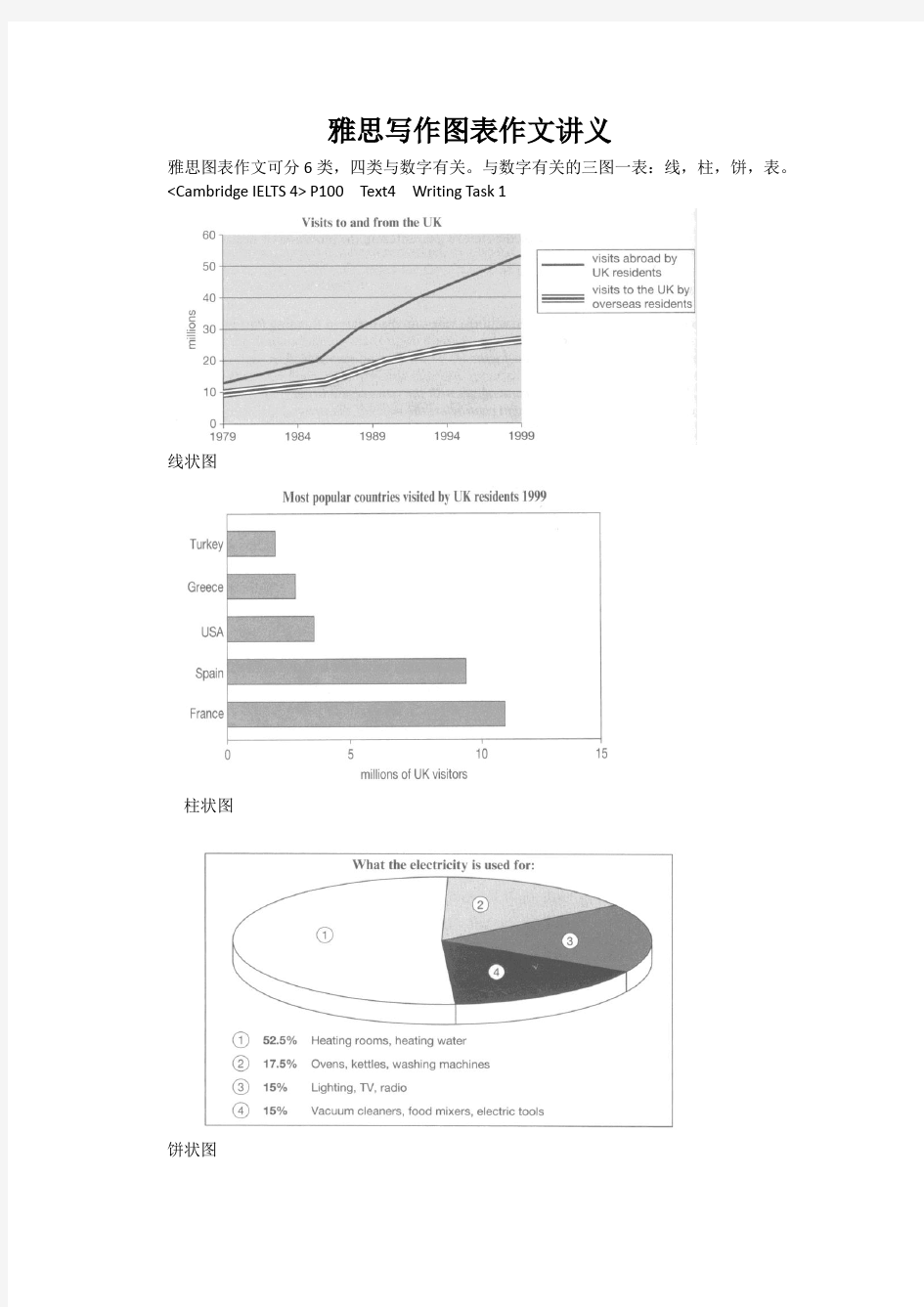
线状图
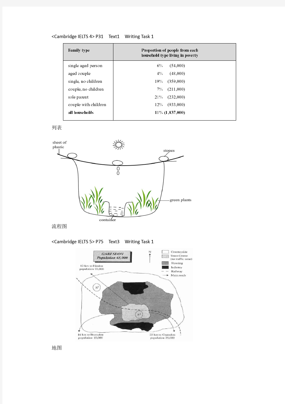
柱状图
饼状图
列表
流程图
地图
425
202
125
American Consumer’s Expenditure Russian Consumer’s Expenditure
对于这样的曲线确实很难讲清楚,
终点较接近,可说成
falls evenly.
涨幅和跌幅相同,起落同幅。
★考试高分必备表 3——Phrase
雅思写作Task1曲线图考官范文(5) 本文为大家收集整理了雅思写作Task1曲线图考官范文(5)。认真研读一定的雅思范文及作文模板可以帮助我们检验自己的写作水平,并能很好地吸收和应用优秀范文里的优秀内容。 The chart and graph below give information about sales and share prices for Coca-Cola. Write a report for a university lecturer describing the information shown below. Sample Answer: The given pie chart and line graphs show the data on sales volume and share price of Coca-Cola. As is given in the illustration, in the year 2000, Coca-Cola was sold most in America where it had more than 55% sales volume. The share price of Coca-Cola was highest in 1998 and reached to around 55 in 2001 with some fluctuation.
As is presented in the pie chart, in 2000, Coca-Cola had more than 55% sales in Latin and North America. In Europe it had more than 20% sales volume, in Asia 16.45% and in Africa it had 7% sales volume. This indicates that American continent has the largest market for Coca-Cola while this market is least in African Continent. Again, the share price of Coca-Cola was only $ 33 in 1996 and this price increased to $ 68 in 1997. The price reached to the highest in 1998 when it was $ 80 per share. The price then started dropping and with some fluctuations it reached it around $ 60 in 2001. In summary, the American Continent was the largest market for Coca-Cola in 2000 and the average share price of it is $60 though this price varies year to year. (Approximately 202 words)
两个雅思写作小作文饼图练习题 雅思小作文饼图是所有图表中出现次数最多的一个,所以需要大家更为关注。下面为大家搜集整理了雅思写作小作文饼图的练习题,共有两个,都是比较简单的两个饼图,大家在备考的时候,注意结构和顺序的描写。 1. The following pie charts illustrate the energy use in the USA. Write a report for a u niversity lecturer describing the information given in the pie charts below. 2. The following two pies show the average family income of New Zealand in 1990 and 2000 and the way people spend their income. Write a report for a university lecturer describing the information given in the pie charts below.
以上就是这两个雅俗写作小作文饼图练习题的全部内容,包括了美国的能源使用和新西兰的平均家庭收入两个话题。大家在备考雅思写作小作文饼图的时候,可以适当的练习一下上面的这两个题目。 雅思小作文图表描述方式小结 雅思小作文的图表描述是有自己的方式和特点的,掌握了这个方式可以让大家的小作文备考更快也更加贴近考试的要求。下面就为大家整理了雅思小作文图表描述的方式,供大家参考。 1. 与趋势有关的词语: 上升(v.):increase, rise, climb, ascend, surge, shoot up 下降(v.):decrease, decline, drop, fall, descend, plunge 持平(v.):remain stable, keep constant, level off, flatten out 波动(v.):fluctuate, wave, go up and down
线图讲解 I.背景: A.雅思小作文主要考查两个方面的能力 1.图表分析、数据归纳总结能力 a.总体趋势 b.数据筛选 c.描述的主次、顺序 d.数据的比较 e.各图、数据间的关联 2.语言能力 a.比较:最高级、比较级、同比、对比 b.数据引用的表达方式 B.区别于其他图形的语言要求: 1.对变化的描述 II.分析、归纳能力及语言能力要求 A.图表分析、数据归纳能力 1.主要分类: a.单线图 b.多线图
c.混合图 d.类线图(随时间变化的图) 2.写作要点: a.单线:纵向变化+纵向比较 1.体现变化的点:峰值、谷值、转折点、交点、起点、终点 2.描述变化的词汇(动词、名词)
3.变化的幅度(副词、形容词)
4.描述变化的高频句型:adj. + n.; v + adv. a.练习:句型改写 5.各阶段数值的关系(比较、倍数) a.比较级、最高级 b.对比、类比 c.表达方式及连词 b.多线: 1.解题思路: a.纵向变化+纵向比较(辅)+横向比较(主);各图间的联系 b.若能相互联系则对比、归纳起来写 c.如果联系不大,则分开写,结束段将其联系起来。
d.要点及写作顺序: i.从总到分 ii.从最受欢迎到不受欢迎 iii.从上升/上涨到下降 iv.从最大值到最小值 v.从最主要特征到不重要特征 2.真题分析: 剑桥4,5 线图题 剑桥4 第二套 The graph blew shows the demand electricity in Engliand during typical days in winter and summer.The pie chart shows how electricity is used in an average English home key point: 冬天整体比夏季用电量高,冬季基本比夏季用电量多出2000,冬季的高峰在22点,夏季的高峰在14点, 2季用电低峰期都在9点左右
上升:rise, increase, incline, ascend, surge, rocket up, 下降: fall, decrease, decline, descend, fall, plunge 幅度大:significantly, dramatically,considerably,noticably, markedly, greatly, 幅度小:minorly, slightly 慢:slowly, gradually 快:rapidly, sharply, 中等;moderately,modestly 持平:level off, stay constant, stablize 波动:fluctuate flctuation 达到顶点:peak at, reach the peak of , summit/climax, the highest point, hit a record high, 达到低谷: bottom at, reach the bottom of,reach the valley of, lowest point 居高不下:reach a plateau of 句型: 5 v+adv. The rate of crimes increased rapidly from 1990 to 2000. 6.There is a +adj +n There was a rapid increase in the crime rate from 1990 to 2000.
7. …show an upward/ downward trend The crime rate shows an upward trend from 1990 to 2000. 8. 时间见证 The last decade in the 20th centure witnessed the growth in the rate of crime. 加入数据 分词形式 The rate of crimes increased rpidly, inclining/ from 15% in 1990 to 25% in 2000. 副词形式The rate of crimes increased rpidly, up from 15% in 1990 to 25% in 2000. 定语从句The rate of crimes increased rpidly, which inclined from 15% in 1990 to 25% in 2000. …表大概 Approximately, roughly, about, nearly/ less than, more than 表推测 It can be expected/ predicted/speculated that…. It is possible to expect/predict/speculate… 表分别是 Respectively, seperately, each A and B ascended gradually, rising from 2to 5 and 3 to 4 respectively.
雅思写作Task1饼状图考官范文(4) 本文为大家收集整理了雅思写作Task1饼状图考官范文(4)。认真研读一定的雅思范文及作文模板可以帮助我们检验自己的写作水平,并能很好地吸收和应用优秀范文里的优秀内容。 The table below shows CO2 emissions for different forms of transport in the European Union. The Pie Chart shows the percentage of European Union funds being spent on different forms of transport. Write a report for a university lecturer describing the information in the graph below.
Sample Answer: The given graphs provide information on the amount of Carbon dioxide emission per person from different vehicles in the European Union and also show the expenditures on different modes of transportations. As is observed from the given illustration, the highest amount of CO2 per person is emitted by the Air transports and European Union spends highest percentage of funds for the road transportation system. According to the bar graph, a single passenger of a personal cars emit around 130 gm of CO2 per kilometer while a passenger in a bus contribute to 65 gm of emission per kilometer. Coaches, maritime and rail passengers emit the lowest amount of CO2which is about 50 grams per passenger in a kilometer. Finally a single passenger of airplane contributes to 370 km of CO2 per kilo which is the highest amount of CO2 emission among the given transportations. Based on the pie chart, the European Union spent the highest amount (52%) on the road transportation system while spent only 1% or 2% on ports, waterway airport
雅思写作Task1饼状图考官范文(3) 本文为大家收集整理了雅思写作Task1饼状图考官范文(3)。认真研读一定的雅思范文及作文模板可以帮助我们检验自己的写作水平,并能很好地吸收和应用优秀范文里的优秀内容。 The charts below show the percentage of food budget the average family spent on restaurant meals in different years. The graph shows the number of meals eaten in fast food restaurants and sit-down restaurants. Write a report for a university lecturer describing the information in the graph below.
Sample Answer: The given illustration compares the amounts spent on restaurant foods and on home cooking foods in four different years and gives data on the number of meals eaten in two different restaurant types. As is presented in the pie chart, initially in 1970, 90% of total food budget was spent on home-made foods while only 10% was spent on restaurant foods. The amount spent on restaurant meals increased to 15% in 1980 while it reached to 35% in 1990. Finally in 200 average family spent half of the total budget in restaurant meals and that shows a rapid increase on the people’s habit of having meals in restaurants. In the line graph, we can observe that in 1970, the fast foods and sit-down restaurant meals were taken 20 thousand times each and over time these numbers kept increasing. Finally in 2000, more than 90 thousands fast food meals were eaten while the sit-down restaurant meals were eaten 50 thousand times a year. This indicates the changes of
《Line Graph》慧通养德案 【化】化德能养气度 教育目标: 本章节属于雅思写作TASK1图表题线形图这一章节。其相应课标如下:化:学生对于小作文是有一定了解的,但是并没有系统学习。基本的技巧已在暑期培训时教授,这一章节目的在于让学生真正做到会看图、会分析、会写作。 觉: 1.了解小作文文章结构 2.掌握每一部分的写法 3.掌握线图趋势描述的语言 炼:1.能够自己分析线图 2.能够对各部分进行仿写 3.能够运用所学词汇和短语、句型进行表述 悟:引导学生体悟line graph的写作规律 修:引导学生养成善于分析的能力,培养分析和解决问题的能力。 【觉】觉身智知精度 教育计划: 本章节五字导航: 化:学生对于小作文是有一定了解的,但是并没有系统学习。基本的技巧已在暑期培训时教授,这一章节目的在于让学生真正做到会看图、会分析、会写作。 觉: 1.了解小作文文章结构 2.掌握每一部分的写法 3.掌握线图趋势描述的语言 炼:1.能够自己分析线图 2.能够对各部分进行仿写 3.能够运用所学词汇和短语、句型进行表述 悟:引导学生体悟line graph的写作规律 修:引导学生养成善于分析的能力,培养分析和解决问题的能力。
本章节的课时分配方案、课型以及基本教育策略 【炼】炼命能增强度 教育行动: 课前、课中、课后教学环节设计、学生活动设计及效果预设 课前—前置性任务单 1.请同学们以小组为单位列出你们知道的有关表达线图趋势的词汇。 分别为:上升&急剧上升、下降&急剧下降、保持稳定&波动、幅度大&幅度小、极值表达&超过 2.同学们,你们知道task1文章的结构以及各部分的组成内容吗?请列出。 3.开头段如何改写? 4.同学们,line graph主体段要描写哪些细节呢?你们又是如何找出他们并进行合理描述的呢? 5.结尾段要写些什么?可以进行主观描述吗? 学习参考材料:《新东方雅思写作强化培训》(电子版通过kindle推送)、推荐网站。 课中教学—环节设计
条形图两篇新航道正 The chart below shows the percentage of commuters using different modes of transport in London in 1960, 1980 and the information by selecting and reporting the main features and make comparisons where relevant. The graph shows the changing patterns in commuting by train, car, tube or bus for commuters in London in the years 1960, 1980 and 2000. The number of people using trains at first r ose fro m just under 20% in 1960 to about 28% in 1980, but then fell back to about 23% in 2000. Use of the tube has been relatively stable, falling from around 27% of commuters in 1960 to 22% in 1980, but climbing back to reach 25% by 2000. On the other hand, the use of cars increased steadily from just over 5% in 1960 to 23% in 1980, reaching almost 40% by 2000, whereas the popularity of buses has declined since 1960, falling from just under 35% in 1960 to 27% in 1980 and only 15% in 2000. The figure also reveals the popularity of transportation means from another perspective. In 1960, tubes and buses were the most popular commuter transports, among which the latter was of greater popularity,whereas automobiles substituted them in 2000 to become the first mode of transport used by people. (179 words)
雅思写作Task1饼状图考官范文(4) The table below shows CO2 emissions for different forms of transport in the European Union. The Pie Chart shows the percentage of European Union funds being spent on different forms of transport. Write a report for a university lecturer describing the information in the graph below. Sample Answer: The given graphs provide information on the amount of Carbon dioxide emission per person from different vehicles in the European Union and also show the expenditures on different modes of transportations. As is observed from the given illustration, the highest amount of CO2 per person is emitted by the Air transports and European Union spends highest percentage of funds for the road transportation system.
雅思写作Task1曲线图考官范文(1) 这是一篇雅思写作Task1曲线图考官范文。认真研读一定的雅思范文及作文模板可以帮助我们检验自己的写作水平,并能很好地吸收和应用优秀范文里的优秀内容。 The graphs below show the numbers of male and female workers in 1975 and 1995 in several employment sectors of the republic of Freedonia. Write a report for a university teacher describing the information shown.
Sample Answer: The provided line graphs compare the employment history of men and women in 1975 and 1995 dividing in six major sectors namely: manufacturing, communications, finance/ banking, wholesale & retail trade, non-defence public sectors and defence public sectors. As is observed from the given illustration, significant changes have been made in women's employment and women appear to have made remarkable improvements in almost the entire job sectors in Freedonia and in some sectors women went well ahead of men. Initially in 1975, men were notably ahead of women in every sector of employment. For example, in communication sector about 260 men worked against 220 women in every thousand employees. Twenty years later, though the number of men remained unchanged, the number of women rose to over 550 in one thousand. A similar trend can be seen in the wholesale and retail trade sector, where the number of women rose from about 550 to almost 800 in every 1000 employees of this sector two decades later. The number of men in this sector remained stable over the period, at around 700 / thousand.
图表作文讲解2:柱状图和饼状图
分析思路: 1.第一幅柱状图的描述单位是百万,即人数;第二幅则是百分比。 2.第二幅柱状图仅显示了1970年和2000年的信息,而第一幅柱状图显示了1970、1980、 1990、2000年的信息。 3.由第一幅柱状图可以看出,从1980年到2000年,结婚人数和离婚人数的变化趋势相似。 4.从第二幅图可以看出,在2000年,结婚和寡居的成年人的比例有所降低而从未结婚过 和离婚的比例则有所上升。 文分析 One chart①shows the number of marriages and divorces in the USA in 1970, 1980, 1990 and 2000.The other②shows the marital status of adult Americans in 1970 and 2000. 首段概述图表信息,对题目进行改写,注意动词的用法和时态。 ?描述类的常用词有:show/describe/illustrate/demonstrate/indicate;
分析思路 1.四个饼状图可以分为两组,一组是澳大利亚,一组是法国; 2.饼状图由五部分组成:coal, oil, natural gas, hydro power, nuclear power; 3.图中的时间是1980年和2000年 4.单位是units 文分析 The charts①compare the sources of electricity in Australia and France in the years 1980 and 2000. Between these years electricity production almost②doubled, ③rising from 100 units to 170 in Australia, and from 90 to 180 units in France. ①对比:compare ②翻番:double ③从多少增长到多少:rise from……to…… In 1980 Australia used coal as the main electricity source (50 units) and the①remainder was produced from natural gas, hydro power (each producing 20 units) and oil (which produced only 10 units). By 2000, coal had become the fuel for more than 75% of electricity produced and only hydro②continued to be another significant
雅思A类柱形图小作文范文 The chart shows the division of household tasks by gender in Great Britain. Write a report for a university lecture describing the information shown below. You should write at least 150 words. Source: Office for National Statistics on behalf of the Controller of Her Majesty's Stationery Office. Study these three sentences and then write three similar sentences about other parts of the chart. 1 Women spend over twice as much time doing kitchen tasks as men. 2 Men spend 30 minutes a day doing kitchen tasks whereas / while women spend 74 minutes a day. 3Women are more active in the kitchen than men (74 minutes a day for women as opposed to 30 minutes for men). Sample Report Look at the following sample answer to the writing task.
2011雅思小作文写作万能模板 1、通过第一个曲线图,我们可以知道____,也说明了结果是___ According to the first graph, it can be seen that ______________, it can also be concluded from it that ______________. 2、一张有趣、有教育意义的、(内容)的图片(这句模板在雅思小作文中的应用非常的广泛。) There is an interesting and instructive picture which goes like this: __________. 3、当前有一张涉及______的增长曲线图,许多人______,然而其他人倾向于___ Nowadays there is a growing concern over ______________. Many people like ______________, while others are inclined to ______________. 4、目前,共同之处是_________,许多人喜欢______因为_______除此之外还由于_____ Nowadays, it is common to ______________. Many people like______________ because ______________. Besides, ______________. 5、(图表所示)_____,就像许多其他事物,被____更加喜爱,然而这一观点正被________所抨击,一些人认为_________,他们指出___________ ______________, just like many other things, are preferred by ____________. While being attacked by the idea that ______________, some people consider ______________. They point that ______________. 6、每种事物都有两面性和________,是没有异议的,包括利和弊 Everything has two sides and ______________ is not an exception, it has both advantages and disadvantages. 7、_____作为_____被观察了许多年,但是人们现在像发现新大陆一样注视着它 For years ______________ had been viewed as ______________. But people are taking a fresh look at it now. 8、政府保证________,对于这份保证,大多数人做出了强烈地回应,因为_____ It has stipulated by the government that ______________. To this stipulation, many people respond actively because ______________. 9、_______出现在我们日常生活中是很平常的,无论我们做什么,_______都是不可避免的______________ is a common occurrence in our daily life. Whatever we do, ______________ can't be avoided. 10、_____在人群中已经成为热门话题,特别是在年轻人中,激烈的争论无休止______________ has become a hot topic among people, especially among the young, and heated debates are right on their way. 1 according to the chart```
雅思小作文:饼图写法全解析 朗阁雅思考试研究中心 在雅思的学术类小作文中我们经常会遇到饼状图写作,不要看着一张一张的图,就退缩了,但是相对来说,这个题型还是比较容易写的一种图形,不过学生们也一定不要当做这是一件简单的事情,想要拿高分还是需要努力的,千万不能掉以轻心,否则不要就是因为这部分得分的不达标而影响到最后的综合得分。那么下面的文章中,朗阁雅思考试研究中心写作组的专家将要探讨的是饼图中静态数据和动态数据写法中的一些区别,并且将会从高分的角度来对各种写法作一汇总,希望对大家考试的准备有一定的帮助。 首先我们必须搞清楚什么是静态什么是动态数据的饼图: 当我们在考试中看到这个图示上的数据都是固定的,没有发生任何变化的时候,那么就能够认定这属于静态数据,搞清楚之后我们就能够开始写作了。 图二:
不要以为这里有很多的数据就属于动态的,其实这个图示还是表示是静态的,因为我们看到在途中的各项比重相对来说也是比较稳定的,因此这个饼图的数据也是属于静态的,那么究竟哪种数据属于动态的呢? 图三:
这个就是动态的图示,为什么这么说呢,因为两张图种的占比数据上出现了很大的差异,这是两个年份的数据,但是各自的所占比重有所不同,所以是动态的数据。 由此,我们可以得出结论,如果我们看到的是一张饼图,而且描述的是一段时间之内比较稳定的数据,那么我们就能基本上断定那就是静态的数据,但是我们如果看到的时候两张饼图,在两个时间段时间的对比,数据出现了明显的变化,那么就能够基本上断定这张图表示的就是动态的题型。
一、静态数据饼图的主体段写作理论 朗阁雅思考试研究中心建议考生可先按照扇形面积大小从大到小排列数据,若遇到饼图中有总数的描述,宜在开头先写。主体段在描写各个扇形数据的时候,要注意详略,即最大和第二大的扇形要重点描述。下面我们先以图一作为例子来详细解读这种写作套路: 首先,我们可以看到,在图中央有一个总数,因此我们先在开头段将其预先作交代:Overall, Coca-cola sold a total of 17.1 billion cases of their fizzy drink product worldwide in the year 2000. 或者我们还可以这样写: Overall, a total of 17.1 billion cases of Coca-cola fizzy drink were sold worldwide in the year 2000. 接着,我们就可以直接来写主体段了: The largest consumer was North America, where 30.4 percent of the total volume was purchased. The second biggest consume r was Latin America, taking up slightly over a quarter. Europe and Asia purchased 20.5 and 16.4 percent of the total volume respectively while Africa and the Middle East remained fairly small consumers at 7 percent of the total volume of sales. 以下我们来解读一下这种写法:图中一共有5块扇形区域,最大和第二大的扇形区域我们分别使用主系表的简单句引导数据的含义,请大家注意划线的部分。其中,两个句子的主语和表语其实都是可以互换的,这个可以让句子成分再多变些,另外,两个句子后面接续的数据描写的句型我们也要做到不同,比如第1个句子后面我们用的是定语从句,而第2个句子后面我们就用分词结构来描写了。接下来第3大的数据由于处于中间的位置,既非最大也非最小,不是很重要,因此就直接用简单句描写了。最小的那块扇形面积可以和前面的连起来组合成一个并列句,也可以单独写,若是单独写的话还可以用主系表的简单句引导,但是表语一般用insignificant,如:The figure for Africa and Middle East was insig nificant,…后面再接续数据即可。 在描写最大的两块扇形面积区域的时候,我们也是用相似的句式,即主系表来描述,然后接续定语从句或者介宾短语来说明数据。饼图中所占份额相对较小的我们就采用略写的方式交
0107 国内 A 类小作文流程图大作文:需不需要把艺术课列为高中必修课。 澳洲 A 类小作文柱图,大作文 Many universities offer online courses to student instead of delivering on campus. 积极还是消极 development 0112 国内小作文柱图大作文 Some cities have vehicle-free days, when private cars, trucks, motorcycles are banned in the city center. Public transportations like buses, taxis and metros are advised. To what extent do you think the advantages outweigh the disadvantages. 澳洲 A 类小作文柱图,大作文 is it neither possible nor useful for a country to provide university places for 一大批年轻人? 0114 国内 A 类小作文 table 三年的 income output profit 大作文 Some people say job satisfaction is more important than job security, others think people cannot always enjoy their jobs. So having a permanent job is more important. Discuss both views and give your own opinion. 澳洲 A 类小作文饼图,大作文 some girls tend to choose arts subjects, but boys choose to study science subjects. What are the reasons? Do you think this trend should be changed? 0121 国内 A 类小作文饼图留在英国和离开的原因大作文:The best way for the government to solve traffic congestion is to provide free public transport 24 hours a day and 7 days a week. AD? 澳洲 A 类 3 个饼图关于中学生毕业后就业率,失业率和继续读书。大作文:很多年轻人花太多的课余时间在买东西上,这是不好的影响,agree or disagree。 0211 国内 A 类小作文柱图,大作文 In modern society, ambition is more and more important. How important is ambition for being successful in life ? Is ambition a positive or negative characteristic? 澳洲 A 类小作文柱图买 food and other goods in three European countries