2020雅思小作文考官范文(线形图题型)
主题:老年人口
题型:线图
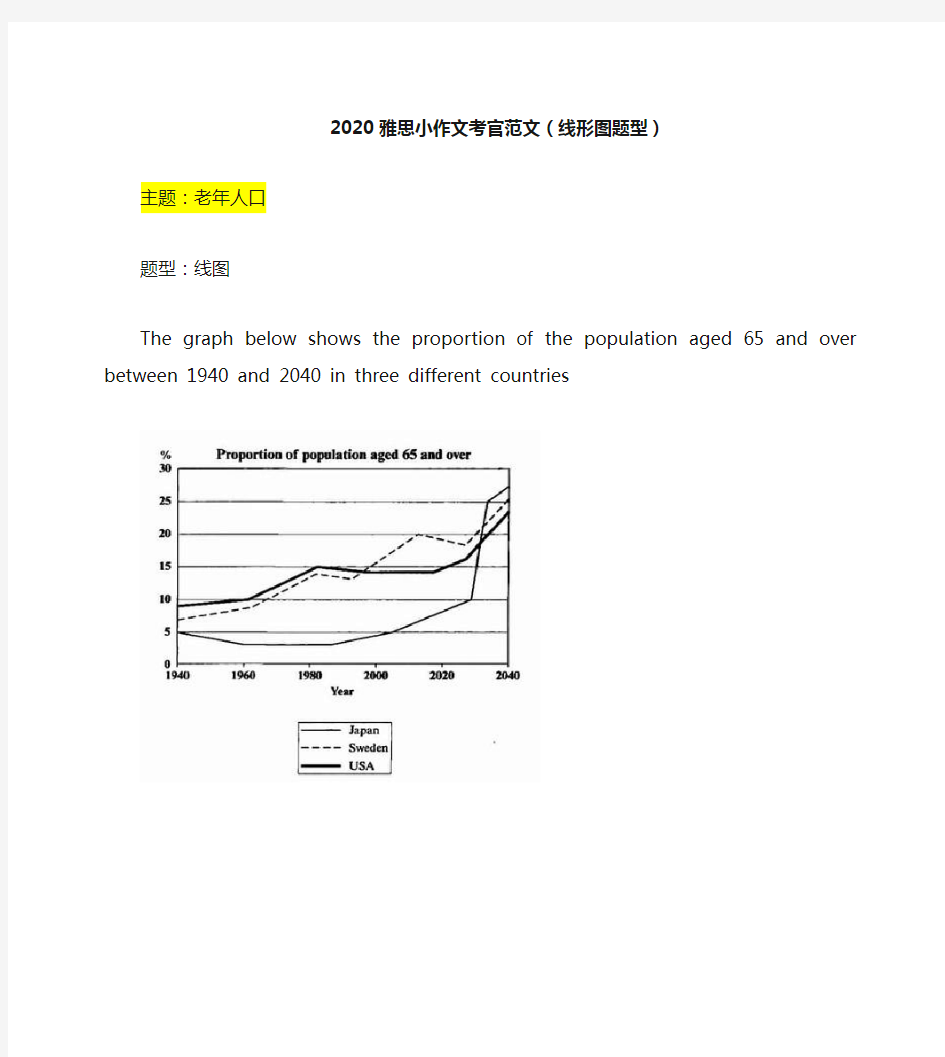
The graph below shows the proportion of the population aged 65 and over between 1940 and 2040 in three different countries
满分范文:
The line graph compares the percentage of people aged 65 or more in three countries over a period of 100 years.
It is clear that the proportion of elderly people increases in each country between 1940 and 2040. Japan is expected to see the most dramatic changes in its elderly population.
In 1940, around 9% of Americans were aged 65 or over, compared to about 7% of Swedish people and 5% of Japanese people. The proportions of elderly people in the USA and Sweden rose gradually over the next 50 years, reaching just under 15% in 1990. By contrast, the figures for Japan remained below 5% until the early 2000s.
Looking into the future, a sudden increase in the percentage of elderly people is predicted for Japan, with a jump of over 15% in just 10 years from 2030 to 2040. By 2040, it is thought that around 27% of the Japanese population will be 65 years old or more, while the figures for Sweden and the USA will be slightly lower, at about 25% and 23% respectively.
主题:手机变迁
题型:线图
The line graph shows the average annual expenditures on cell phone and residential phone services between 2001 and 2010.
范文:
The line graph compares average yearly spending by Americans on mobile and landline phone services from 2001 to 2010.
It is clear that spending on landline phones fell steadily over the 10-year period, while mobile phone expenditure rose quickly. The year 2006 marks the point at which expenditure on mobile services overtook that for residential phone services.
In 2001, US consumers spent an average of nearly $700 on residential phone services, compared to only around $200 on cell phone services. Over the following five years, average yearly spending on landlines dropped by nearly $200. By contrast, expenditure on mobiles rose by approximately $300.
In the year 2006, the average American paid out the same amount of money on both types of phone service, spending just over $500 on each. By 2010, expenditure on mobile phones had reached around $750, while the figure for spending on residential services had fallen to just over half this amount.
主题:网络使用
题型:线图
The line graph below shows internet usage in different countries.
范文:
The line graph compares the percentage of people in three countries who used the Internet between 1999 and 2009.
It is clear that the proportion of the population who used the Internet increased in each country over the period shown. Overall, a much larger percentage of Canadians and Americans had access to the Internet in comparison with Mexicans, and Canada experienced the fastest growth in Internet usage.
In 1999, the proportion of people using the Internet in the USA was about 20%. The figures for Canada and Mexico were lower, at about 10% and 5% respectively. In 2005, Internet usage in both the USA and Canada rose to around 70% of the population, while the figure for Mexico reached just over 25%.
By 2009, the percentage of Internet users was highest in Canada. Almost 100% of Canadians used the Internet, compared to about 80% of Americans and only 40% of Mexicans.
上升:rise, increase, incline, ascend, surge, rocket up, 下降: fall, decrease, decline, descend, fall, plunge 幅度大:significantly, dramatically,considerably,noticably, markedly, greatly, 幅度小:minorly, slightly 慢:slowly, gradually 快:rapidly, sharply, 中等;moderately,modestly 持平:level off, stay constant, stablize 波动:fluctuate flctuation 达到顶点:peak at, reach the peak of , summit/climax, the highest point, hit a record high, 达到低谷: bottom at, reach the bottom of,reach the valley of, lowest point 居高不下:reach a plateau of 句型: 5 v+adv. The rate of crimes increased rapidly from 1990 to 2000. 6.There is a +adj +n There was a rapid increase in the crime rate from 1990 to 2000.
7. …show an upward/ downward trend The crime rate shows an upward trend from 1990 to 2000. 8. 时间见证 The last decade in the 20th centure witnessed the growth in the rate of crime. 加入数据 分词形式 The rate of crimes increased rpidly, inclining/ from 15% in 1990 to 25% in 2000. 副词形式The rate of crimes increased rpidly, up from 15% in 1990 to 25% in 2000. 定语从句The rate of crimes increased rpidly, which inclined from 15% in 1990 to 25% in 2000. …表大概 Approximately, roughly, about, nearly/ less than, more than 表推测 It can be expected/ predicted/speculated that…. It is possible to expect/predict/speculate… 表分别是 Respectively, seperately, each A and B ascended gradually, rising from 2to 5 and 3 to 4 respectively.
雅思饼图小作文的高频词汇表达 雅思小作文是雅思作文中很多考生认为相对比较轻松的一项,但是还有相当一部分考生在这方面得分不佳,主要是一些表达非常的不专业,在词汇选择上存在很大的问题,其实这个问题并不大,天道小编觉得掌握一些基本的雅思作文词汇表达可以解决这些问题。 由于雅思小作文饼图主要以比例说明和数字列举为主,我们需要在考前准备好以下模板: ① 动词“占”的表达: account for, hold, make up, take up, constitute, comprise, represent ② 百分比的表达 percentage,proportion, share, 某些情况下可以用rate,如literacy rate ③ 约数表达 the majority of, most of, a considerable number of, a minority of , just over…, slightly more than…/less than…, nearly half… 等 ④ 确切数字表达 分数与百分比的转化:one third, two fifths,one tenth 常见表达:a quarter, a half ⑤ 句式 要灵活运用以上的词汇结合一定的句子,变换表达方式。 例:亚洲人口占世界比例近50%。 — Asia accounts for almost a half of world population. — Nearly 50% of people in the world come from Asia. — The percentage of Asian in the world population is slightly less than a half. — Asia has the largest percentage of population in the world( approximately 50%). ⑥ 排序段 在列举饼图数据时,为了防止单调枯燥,我们常常运用排序的方式进行说明,所以下面的关于排序的模板也是大家需要记忆的:
雅思写作小作文范文雅思写作饼状图pie chart 宾馆服务满意度 今天我们雅思写作小作文范文的文章来研究下饼状图pie chart。该题目包含两个图形,显示了某项调查问卷在2005年和2010年的结果。该调查要求顾客对Parkway宾馆的客户服务给出评价,并将评价结果分为很差,差,满意,良好,优秀五个等级。小编搜集了一篇相关的考官范文,以供大家参考。 雅思写作小作文题目 The charts below show the results of a questionnaire that asked visitors to the Parkway Hotel how they rated the hotel’s customer service. The same questionnaire was given to 100 guests in the years 2005 and 2010. Summarise the information by selecting and reporting the main features, and make comparisons where relevant. 雅思写作小作文范文 The pie charts compare visitors’ responses to a survey about customer service at the Parkway Hotel in 2005 and in 2010. 饼状图比较了2005年和2010年游客对Parkway宾馆客户服务满意度的调查结果。 It is clear that overall customer satisfaction increased considerably from 2005 to 2010. While most hotel guests rated customer service as satisfactory or poor in 2005, a clear majority described the hotel’s service as good or excellent in 2010. 很明显,从2005年到2010年,整体的客户满意度有了很大的提升。虽然大多数酒店顾客在2005年将客户服务评为满意或者质量差,但在2010年,绝大多数人都形容酒店服务为良好或者优秀。 Looking at the positive responses first, in 2005 only 5% of the hotel’s visitors rated its customer service as excellent, but this figure rose to 28% in 2010. Furthermore, while only 14% of the guests described customer service in the hotel as good in 2005, almost three times as many people gave this rating five years later. 首先来看下积极的评价。2005年,只有百分之五的酒店顾客评价其客户服务为优秀,但该数字在2010年上涨到了百分之28。此外,2005年只有百分之14的客人将客户服务描述为良好,而5年后,三倍以上的人给出这一评价。 With regard to negative feedback, the proportion of guests who considered the hotel’s customer service to be poor fell from 21% in 2005 to only 12% in 2010. Similarly, the proportion of people who thought customer service was very poor dropped from 15% to only 4% over the 5-year period. Finally, a fall in the number of ‘satisfactory’
两个雅思写作小作文饼图练习题 雅思小作文饼图是所有图表中出现次数最多的一个,所以需要大家更为关注。下面为大家搜集整理了雅思写作小作文饼图的练习题,共有两个,都是比较简单的两个饼图,大家在备考的时候,注意结构和顺序的描写。 1. The following pie charts illustrate the energy use in the USA. Write a report for a u niversity lecturer describing the information given in the pie charts below. 2. The following two pies show the average family income of New Zealand in 1990 and 2000 and the way people spend their income. Write a report for a university lecturer describing the information given in the pie charts below.
以上就是这两个雅俗写作小作文饼图练习题的全部内容,包括了美国的能源使用和新西兰的平均家庭收入两个话题。大家在备考雅思写作小作文饼图的时候,可以适当的练习一下上面的这两个题目。 雅思小作文图表描述方式小结 雅思小作文的图表描述是有自己的方式和特点的,掌握了这个方式可以让大家的小作文备考更快也更加贴近考试的要求。下面就为大家整理了雅思小作文图表描述的方式,供大家参考。 1. 与趋势有关的词语: 上升(v.):increase, rise, climb, ascend, surge, shoot up 下降(v.):decrease, decline, drop, fall, descend, plunge 持平(v.):remain stable, keep constant, level off, flatten out 波动(v.):fluctuate, wave, go up and down
二.雅思图表作文 1.企业垃圾(线性图) 题目:The graph below shows the amounts of waste produced by three companies over a period of 15 years. 范文:The line graph compares three companies in terms of their waste output between the years 2000 and 2015. It is clear that there were significant changes in the amounts of waste produced by all three companies shown on the graph. While companies A and B saw waste output fall over the 15-year period, the amount of waste produced by company C increased considerably. In 2000, company A produced 12 tonnes of waste, while companies B and C produced around 8 tonnes and 4 tonnes of waste material respectively. Over the following 5 years, the waste output of companies B and C rose by around 2 tonnes, but the figure for company A fell by approximately 1 tonne. From 2005 to 2015, company A cut waste production by roughly 3 tonnes, and company B reduced its waste by around 7 tonnes. By contrast, company C saw an increase
作文范文之雅思小作文真题
雅思小作文真题 【篇一:雅思作文题目汇总】 一、教育 1、教育应该包括哪些内容? 母题:it is generally believed that education is of vital importance to the development of individuals and the well-being of societies. what should education consist of to fulfil both these functions? (050312) 提示:本题围绕教育的两大功能来展开(个人与社会),准备好这篇文章,即可应付教育类话题中的最大分支—教育的功能,做到以不变应万变。对于社会角度,可以从促进经济发展、增加社会流动性(social mobility)、维护社会稳定这几个方面来展开,对于个人,可以写改变思维模式、有利于就业和便利生活来写。 子题:大学应当教授理论知识还是实践技能?大学的是应当把学生培养成合格的公民还是让他们自己得益?准备未来职业最好的方法是上大学还是尽快离校积累工作经验?大学要不要扩招?中学阶段应当提供通才教育还是专才教育?要不要延长义务教育年限?要不要让农村地区的学生更容易上学?老师要教学生如何判断是非吗? 2、学校的科目谁来选择?(060916) 母题:some people think that the government should decide which subjects students should study at the university, while others think that students should be allowed to apply for the subject they prefer. discuss the two views and give your opinion. 提示:这类题目采取的策略就是“双批判”,因为题目中提供的两种选择往往都是错误的。
雅思小作文:饼图写法全解析 朗阁雅思考试研究中心 在雅思的学术类小作文中我们经常会遇到饼状图写作,不要看着一张一张的图,就退缩了,但是相对来说,这个题型还是比较容易写的一种图形,不过学生们也一定不要当做这是一件简单的事情,想要拿高分还是需要努力的,千万不能掉以轻心,否则不要就是因为这部分得分的不达标而影响到最后的综合得分。那么下面的文章中,朗阁雅思考试研究中心写作组的专家将要探讨的是饼图中静态数据和动态数据写法中的一些区别,并且将会从高分的角度来对各种写法作一汇总,希望对大家考试的准备有一定的帮助。 首先我们必须搞清楚什么是静态什么是动态数据的饼图: 当我们在考试中看到这个图示上的数据都是固定的,没有发生任何变化的时候,那么就能够认定这属于静态数据,搞清楚之后我们就能够开始写作了。 图二:
不要以为这里有很多的数据就属于动态的,其实这个图示还是表示是静态的,因为我们看到在途中的各项比重相对来说也是比较稳定的,因此这个饼图的数据也是属于静态的,那么究竟哪种数据属于动态的呢? 图三:
这个就是动态的图示,为什么这么说呢,因为两张图种的占比数据上出现了很大的差异,这是两个年份的数据,但是各自的所占比重有所不同,所以是动态的数据。 由此,我们可以得出结论,如果我们看到的是一张饼图,而且描述的是一段时间之内比较稳定的数据,那么我们就能基本上断定那就是静态的数据,但是我们如果看到的时候两张饼图,在两个时间段时间的对比,数据出现了明显的变化,那么就能够基本上断定这张图表示的就是动态的题型。
一、静态数据饼图的主体段写作理论 朗阁雅思考试研究中心建议考生可先按照扇形面积大小从大到小排列数据,若遇到饼图中有总数的描述,宜在开头先写。主体段在描写各个扇形数据的时候,要注意详略,即最大和第二大的扇形要重点描述。下面我们先以图一作为例子来详细解读这种写作套路: 首先,我们可以看到,在图中央有一个总数,因此我们先在开头段将其预先作交代:Overall, Coca-cola sold a total of 17.1 billion cases of their fizzy drink product worldwide in the year 2000. 或者我们还可以这样写: Overall, a total of 17.1 billion cases of Coca-cola fizzy drink were sold worldwide in the year 2000. 接着,我们就可以直接来写主体段了: The largest consumer was North America, where 30.4 percent of the total volume was purchased. The second biggest consume r was Latin America, taking up slightly over a quarter. Europe and Asia purchased 20.5 and 16.4 percent of the total volume respectively while Africa and the Middle East remained fairly small consumers at 7 percent of the total volume of sales. 以下我们来解读一下这种写法:图中一共有5块扇形区域,最大和第二大的扇形区域我们分别使用主系表的简单句引导数据的含义,请大家注意划线的部分。其中,两个句子的主语和表语其实都是可以互换的,这个可以让句子成分再多变些,另外,两个句子后面接续的数据描写的句型我们也要做到不同,比如第1个句子后面我们用的是定语从句,而第2个句子后面我们就用分词结构来描写了。接下来第3大的数据由于处于中间的位置,既非最大也非最小,不是很重要,因此就直接用简单句描写了。最小的那块扇形面积可以和前面的连起来组合成一个并列句,也可以单独写,若是单独写的话还可以用主系表的简单句引导,但是表语一般用insignificant,如:The figure for Africa and Middle East was insig nificant,…后面再接续数据即可。 在描写最大的两块扇形面积区域的时候,我们也是用相似的句式,即主系表来描述,然后接续定语从句或者介宾短语来说明数据。饼图中所占份额相对较小的我们就采用略写的方式交
The graph shows the percentage of people aged over 60 in Canada, Finland and Korea between 1950 and 2050. Summarise the information in the charts and make comparisons where appropriate. Answer The graph shows the percentage of people aged 60 and over in Canada, Finland and Korea between 1950 and 2050. The number of people aged above 60 in Canada and Finland follows a remarkably similar trend. In 1950 both countries had 7-9% of their population aged 60 or above and the percentage increased steadily until 2050 when both countries are expected to have around 25% of their population aged 60 or above. In contrast, Korea had only 5% of its population aged 60 or over in 1950. This number dropped slightly in the subsequent years and only recovered to the?original level of 5% in 2000. Between 2000 and 2020 the number of people aged 60 or over in Korea increased more rapidly and is expected to reach 9% in 2020. After 2020 the aged population is expected to increase very rapidly overtaking Canada and Finland in around 2035 and reaching 30% by 2050. The lower initial aged population of Korea can be attributed to the lower development of Korea in the early part of the 20th century, but rapid development and healthy diets in the second half of the 20th century are probably the cause of the increased longevity in Korea.
雅思小作文:饼状图一例 Many women want or need to continue working after they have children. The chart below shows the working after they have children. The chart below shows the working pattern of mothers with young children. 作文写作要点: 介绍各扇面及总体的关系。 各个扇面之间的比较,同类扇面在不同时间、不同地点的比较。 重点突出特点最明显的扇面:最大的、最小的、互相成倍的。 The basic trends of the four charts: Just after bearing children, back to work. The older child…the more… Most part-time during child 5~9 Child 10+, full time double, part-time less the introduction can be written like this: Even just after having a child, a large number women return to work. As the child grows older, the percentage of mothers who choose or need to continue working rises. At least until the child is ten, the larger number of working mothers take part-time occupations. When the child is ten years or older, the number of the full-timers more than doubles while that of the part-timers decrease. Each chart entails / contains instruction, which illustrates what the chart involves rather than the over trends. Writing Paragraphs: Information analyzed according to the pie charts. Child 0~2, 30% back to work (19p.t., 11f.t.)
2019-雅思小作文多图写作:方法及范例(线图+饼图)-范文模板 本文部分内容来自网络整理,本司不为其真实性负责,如有异议或侵权请及时联系,本司将立即删除! == 本文为word格式,下载后可方便编辑和修改! == 雅思小作文多图写作:方法及范例(线图+饼图) 雅思小作文多图写作是一个大的趋势,越来越多的组合图出现更加证明了 这一点。在此,我们先来介绍最常见的一种组合图,线图+饼图的写作构思及例题示范,帮助大家顺利攻克雅思小作文。 看到题目是由线图和饼图组成的多图组合,我们可以按以下3个思路构思: 1. 饼图和曲线图各自展示了什么数据在哪个时间点或段的变化特征? 2. 在饼图中,数据总值为多少?它由几部分组成?每一部分各代表什么?各 自所占百分比又是多少?百分比从大到小如何排列的?谁最大?谁最小? 3. 曲线图有何特征?根据特征,曲线可以分成几段来描述?起点值、终点值、峰值、谷值多少?各自对应的时间点又是什么? 现在,我们再来看一道例题: WRITING TASK 1: You should spend about 20 minutes on this task . The chart and graph below give information about sales and share prices for Coca - Cola . Summarise the information by selecting and reporting the main features , and make comparisons where relevant . You should write at least 150 words . 范文: The pie chart shows the worldwide distribution of sales of Coca - Cola in the year 201X and the graph shows the change in share prices between 1996 and 201X.
作文范文之雅思小作文table
雅思小作文table 【篇一:雅思小作文表格图实例分析】 雅思小作文表格图实例分析 朗阁海外考试研究中心 表格图是雅思小作文的常考图形之一,也是烤鸭们在备考时必须要准备的一类题型。那么烤鸭们具体应该如何准备表格图呢?下面,朗阁海外考试研究中心的专家将以一道具体的实例,就这一题型的解题思路和步骤做出详尽的分析和解答。 the table below shows personal savings as a percentage of personal income for selected countries in 1989, 1999 and 2009. personal savings as a percentage of personal income 一、审题,决定大体写作方式 首先,读题目,了解到这幅表格图是关于“几个国家的人民个人收入中存款的百分比”以及三个时间点(据此,正文部分描述存款率是时态基调为过去时)。表格上方的title和题目表述一样,没有额外信息,因此,读一遍即可。 然后,审具体表格,决定大致写作方向和方式,即分段方式。表格的审图需要注意以下几个方面:横轴,纵轴和总体数据特征。此图中的横纵轴分别是时间和7个研究对象——7个国 家。横纵轴中间有一栏为时间,那说明,此图原则上应该按曲线图原理来写——即,描述7个国家存款率上升或下降趋势;但是,经过下一步对表格中数据总体特征的总结发现:7个国家的存款率在这一段时间内总体呈现下降趋势。这一发现说明,如果继续按照曲线图原理描述,文章会非常单调,而且对比的空间也不大;相反,同一年份里,
雅思小作文饼图写法全解析
雅思小作文:饼图写法全解析 朗阁雅思考试研究中心 在雅思的学术类小作文中我们经常会遇到饼状图写作,不要看着一张一张的图,就退缩了,可是相对来说,这个题型还是比较容易写的一种图形,不过学生们也一定不要当做这是一件简单的事情,想要拿高分还是需要努力的,千万不能掉以轻心,否则不要就是因为这部分得分的不达标而影响到最后的综合得分。那么下面的文章中,朗阁雅思考试研究中心写作组的专家将要探讨的是饼图中静态数据和动态数据写法中的一些区别,而且将会从高分的角度来对各种写法作一汇总,希望对大家考试的准备有一定的帮助。 首先我们必须搞清楚什么是静态什么是动态数据的饼图:
当我们在考试中看到这个图示上的数据都是固定的,没有发生任何变化的时候,那么就能够认定这属于静态数据,搞清楚之后我们就能够开始写作了。 图二:
不要以为这里有很多的数据就属于动态的,其实这个图示还是表示是静态的,因为我们看到在途中的各项比重相对来说也是比较稳定的,因此这个饼图的数据也是属于静态的,那么究竟哪种数据属于动态的呢? 图三:
这个就是动态的图示,为什么这么说呢,因为两张图种的占比数据上出现了很大的差异,这是两个年份的数据,可是各自的所占比重有所不同,因此是动态的数据。 由此,我们能够得出结论,如果我们看到的是一
张饼图,而且描述的是一段时间之内比较稳定的数据,那么我们就能基本上断定那就是静态的数据,可是我们如果看到的时候两张饼图,在两个时间段时间的对比,数据出现了明显的变化,那么就能够基本上断定这张图表示的就是动态的题型。 一、静态数据饼图的主体段写作理论 朗阁雅思考试研究中心建议考生可先按照扇形面积大小从大到小排列数据,若遇到饼图中有总数的描述,宜在开头先写。主体段在描写各个扇形数据的时候,要注意详略,即最大和第二大的扇形要重点描述。下面我们先以图一作为例子来详细解读这种写作套路: 首先,我们能够看到,在图中央有一个总数,因此我们先在开头段将其预先作交代: Overall, Coca-cola sold a total of 17.1 billion cases of their fizzy drink product worldwide in the year . 或者我们还能够这样写:Overall, a total of 17.1 billion cases of Coca-cola fizzy drink were sold worldwide
线图: 例:Direction: You should spend no more than 20 minutes on this task. The graph contains information about the price in US dollars of a barrel of oil from 1995 with predictions to 2015. Summarize the main features and make comparisons where relevant. 开头段:转述原题+时态永远是一般现在时 ?改变关键词的词性 ?改变关键词的位置 ?同义词替代 ?灵活加入图表中的其它文字信息 The graph provides information about the changes of crude oil price per barrel in US dollars since 1995 and predicts the tendency of the oil price till 2015. 开头段常用词汇: ?The graph / the chart / the line graph shows … ?The graph give past and future data concerning… ?The graph demonstrates trends in/ an overview of/ trends in …Shows: indicates/ unfolds/ displays/ reveals/ reflects/ relates/ illustrates/ demonstrates/ describes/ depicts/ portray/ outlines/ provide an overview of…例:The graphs below show the enrolments of overseas students and local students in Britain’s universities. The graphs provide information about the proportions of overseas students and local students enrolled in Britain’s Universities from 1989 to 1999. 主体部分1+X句:第一句总结总体趋势,之后分步描述(起点,极值,终点)。总体趋势: Overall, oil prices increased by nearly four hundred percent from 1995 to
雅思写作小作文饼图真题句子练习P i e S e n t e n c e s It was last revised on January 2, 2021
P i e c h a r t In 1980 Australia used coal as the main electricity source(50 units) and the remainder was produced from natural gas, hydro power(each producing 20 units) and oil,which produced only 10 units. 在1980年,澳大利亚使用煤作为主要的电力来源(50 units),剩下的电力由天然气,氢能(两者各产生20 units)和石油,它仅仅只产生10 units。 By 2000, coal had become the fuel for more than 75% of electricity produced and only hydro continued to be another significant source supplying approximately 20%. 到了2000年,煤已经成为了产生超过75%电力的能源了,同时只有氢能继续成为另一个重要的供应来源,大约是20%。 In contrast, France used coal as a source for only 25 units of electricity in 1980, which was matched by natural gas. 相比之下,法国在1980年用煤供电只有25 units,这和天然气相同。 The remaining 40 units were produced largely from oil and nuclear power, with hydro contributing only 5 units. 剩下的40 units 主要都产生于石油和核能,其中氢能只贡献了5 units。 But by 2000 nuclear power, which was not used at all in Australia, had developed into the main source, producing almost 75% of electricity, at 126 units, while coal and oil together produced only 50 units.
雅思写作Task1饼状图考官范文(3) 本文为大家收集整理了雅思写作Task1饼状图考官范文(3)。认真研读一定的雅思范文及作文模板可以帮助我们检验自己的写作水平,并能很好地吸收和应用优秀范文里的优秀内容。 The charts below show the percentage of food budget the average family spent on restaurant meals in different years. The graph shows the number of meals eaten in fast food restaurants and sit-down restaurants. Write a report for a university lecturer describing the information in the graph below.
Sample Answer: The given illustration compares the amounts spent on restaurant foods and on home cooking foods in four different years and gives data on the number of meals eaten in two different restaurant types. As is presented in the pie chart, initially in 1970, 90% of total food budget was spent on home-made foods while only 10% was spent on restaurant foods. The amount spent on restaurant meals increased to 15% in 1980 while it reached to 35% in 1990. Finally in 200 average family spent half of the total budget in restaurant meals and that shows a rapid increase on the people’s habit of having meals in restaurants. In the line graph, we can observe that in 1970, the fast foods and sit-down restaurant meals were taken 20 thousand times each and over time these numbers kept increasing. Finally in 2000, more than 90 thousands fast food meals were eaten while the sit-down restaurant meals were eaten 50 thousand times a year. This indicates the changes of
雅思考试优秀作文范文:是否禁烟? Version 122 Some people claim that using tobacco has brought severe social problems and smoking should be banned. To what extent do you agree with the above statement? Introduction (56 words) Since the discovery of tobacco related to a number of health problems, an increasing number of people have called for prohibiting smoking. It is undeniable that still a considerable amount of smokers exist in this world. I would like to examine the advantages and disadvantages of smoking cigarettes as following and then offer my own opinion. Body1(95words) There are some advantages to taking tobacco.(topic sentence) First, tobacco industry contributes a great proportion of revenue to the nation. Extremely high taxation imposed on tobacco yielding and cigarette manufacturing has released the financial burden for both the government and the individual taxpayer generation by generation. Second, the soothing effects of smoking has been confirmed by ordinary smokers; particularly those who have hard-brain-working jobs are in favor of it; they claim that smoking cigarettes can make them calm and stimulate brain cells to work more efficiently. Finally, cigarettes play an important role in social activities. Body2 (106words) On the other hand, smoking demonstrates numerous negative effects.(topic sentence) Initially, nicotine may bring takers a number of diseases. Second-hand smoking also does harm to your health. Moreover, hatred from non-smokers always grow against smokers hence some conflicts arise frequently. We then look at the statistics showing that thousands of fire accidents worldwide occur each year due to the litter of non-extinguished cigarette ends, not to mention the related deaths and losses. Last but not least, expenses have to be taken \into\ consideration. Fine cigarettes are not cheap. If you get addicted to them, your daily amount of cigarette consumption will increase inevitably, emptying your pocket money. Conclusion(88words) After all, so far no direct evidence has been provided that smoking can definitely result in takers' death of lung cancer, and those fire accidents are the result of carelessness or irresponsibility of the smokers, not tobacco to be laid blames. Also, spending pocket money can never be considered as a financial burden. In addition, I suggest more restricted smoking areas be planned so as not to violate non-smokers' rights. After weighing the pros and cons of using tobacco, I, for one, am against the act to ban smoking. 声明:本范文为赖老师专供无忧雅思作品,转载请注明作者和出处!范文仅供参考,切不可背诵,否则可能得非常低的分数,甚至0分。