You should spend about 20 minutes on this task.
The three pie charts below show the changes in annual spending by a particular UK school in 1981, 1991 and 2001.
Summarise the information by selecting and reporting the main features, and make comparisons where relevant.
Write at least 150 words.
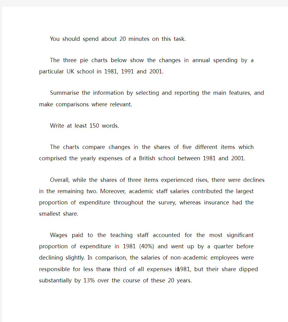
The charts compare changes in the shares of five different items which comprised the yearly expenses of a British school between 1981 and 2001.
Overall, while the shares of three items experienced rises, there were declines in the remaining two. Moreover, academic staff salaries contributed the largest proportion of expenditure throughout the survey, whereas insurance had the smallest share.
Wages paid to the teaching staff accounted for the most significant proportion of expenditure in 1981 (40%) and went up by a quarter before declining slightly. In comparison, the salaries of non-academic employees were responsible for less than a third of all expenses in 1981, but their share dipped substantially by 13% over the course of these 20 years.
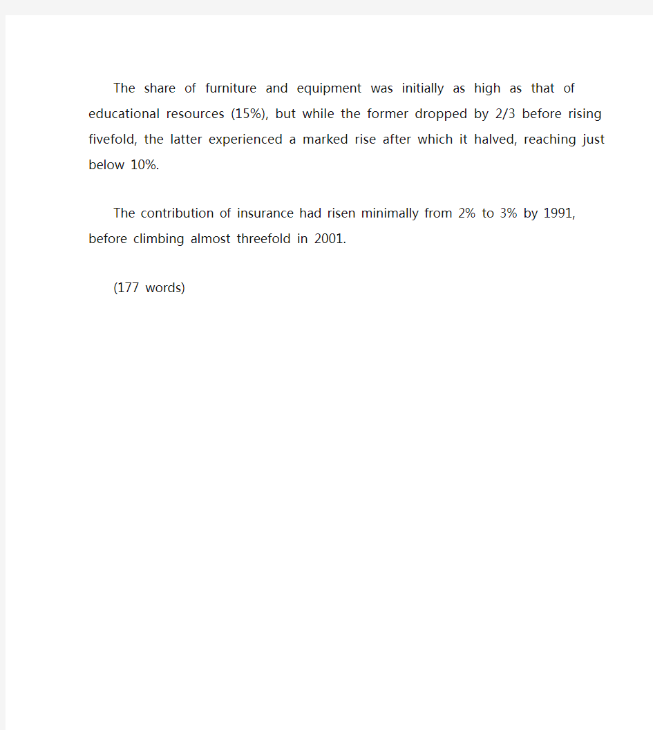
The share of furniture and equipment was initially as high as that of educational resources (15%), but while the former dropped by 2/3 before rising fivefold, the latter experienced a marked rise after which it halved, reaching just below 10%.
The contribution of insurance had risen minimally from 2% to 3% by 1991, before climbing almost threefold in 2001.
(177 words)
●批改By Will 本次批改严格按照ILETS小作文评分标准进行。ILETS小作文评分项:TA (内容的完整性), CC (连贯性及一致性), GRA (语法范围及精准度), LR (词汇资源)。文末会进行总评及打分。 ●文中标识: 用词不当逻辑错误语法错误修改添加 The graph provides the information concerning the average temperatures on a month basis in three major cities.(介于有两张图,都要提一下。此后可加一句:In addition, clearly demonstrated in the table are the time of sunshine on an annual base.) (补充:在下一段看到了你对于后一张图的总结,这样的话建议你在开头强调一下“the first graph”) As can be seen from the graph, there is a similar trend in terms of average monthly temperature between London and New York during the period from January to December. (可加入连接词:To be specific) The average temperature in London (介于你后面写的是两个城市的数据,这里改为:for both of the cities) gradually rises from January to July both in London and new york, reaching a peak at 25 degrees and 20 degrees respectively. After that, the following 4 months witness a dramatic decrease both in London and new york. In comparison (这里不妨分段), an opposite trend is found in Sydney. It (这是悉尼的第一句,建议写出来具体的量词至少:The temperature) keeps stable at 25 degrees from January to march, after which the average temperature undergoes a considerable descent, reaching the bottom point at approximately 15 degrees, before there is (there is 没必要了,可以去除) a steady ascent by 10 degrees. It is obvious that the table depicts the average number of hours of sunshine per year in three major cities. As we can see from the statistics, when it comes to the total annual hours of sunshine, new york ranks first, followed by Sydney ,London lies last. Specifically, people who live in new york enjoy 2,353 hours of sunshine every year, which is similar to people living in London with 2,473 hours (不是人和人像,是时间长短像,改为:which is similar to the amount of sunshine for those in London). However, only 1,180 hours of sunshine are found in London annually. 总评6.5(TA6.5 CC6.5 LR6.5 GRA7.0) 1.语法变化上从句数量可以了,分词的使用还可以多一些。偶尔试试一到两句倒装,如我在开头给你的那个。 2.趋势等词汇变化可以,试着多换换题目话题词汇,如people=residents=citizens
101. You should spend about 20 minutes on this task. The line graph below gives information about the number of visitors to three London museums between June and September 2013. Summarise the information by selecting and reporting the main features, and make comparisons where relevant. Write at least 150 words. Test Tip Check the horizontal axis to find whether the graph refers to past, present, future or all three. We use the present simple to describe the graph: The graph shows… , We can see… If the graph refers to past period of time, we use the past simple, and if the graph includes future times, we use will or it is predicted that. Look at the line graph and complete the text with the correct forms of the verbs in brackets and the correct prepositions.
雅思饼图小作文的高频词汇表达 雅思小作文是雅思作文中很多考生认为相对比较轻松的一项,但是还有相当一部分考生在这方面得分不佳,主要是一些表达非常的不专业,在词汇选择上存在很大的问题,其实这个问题并不大,天道小编觉得掌握一些基本的雅思作文词汇表达可以解决这些问题。 由于雅思小作文饼图主要以比例说明和数字列举为主,我们需要在考前准备好以下模板: ① 动词“占”的表达: account for, hold, make up, take up, constitute, comprise, represent ② 百分比的表达 percentage,proportion, share, 某些情况下可以用rate,如literacy rate ③ 约数表达 the majority of, most of, a considerable number of, a minority of , just over…, slightly more than…/less than…, nearly half… 等 ④ 确切数字表达 分数与百分比的转化:one third, two fifths,one tenth 常见表达:a quarter, a half ⑤ 句式 要灵活运用以上的词汇结合一定的句子,变换表达方式。 例:亚洲人口占世界比例近50%。 — Asia accounts for almost a half of world population. — Nearly 50% of people in the world come from Asia. — The percentage of Asian in the world population is slightly less than a half. — Asia has the largest percentage of population in the world( approximately 50%). ⑥ 排序段 在列举饼图数据时,为了防止单调枯燥,我们常常运用排序的方式进行说明,所以下面的关于排序的模板也是大家需要记忆的:
雅思写作小作文范文雅思写作饼状图pie chart 宾馆服务满意度 今天我们雅思写作小作文范文的文章来研究下饼状图pie chart。该题目包含两个图形,显示了某项调查问卷在2005年和2010年的结果。该调查要求顾客对Parkway宾馆的客户服务给出评价,并将评价结果分为很差,差,满意,良好,优秀五个等级。小编搜集了一篇相关的考官范文,以供大家参考。 雅思写作小作文题目 The charts below show the results of a questionnaire that asked visitors to the Parkway Hotel how they rated the hotel’s customer service. The same questionnaire was given to 100 guests in the years 2005 and 2010. Summarise the information by selecting and reporting the main features, and make comparisons where relevant. 雅思写作小作文范文 The pie charts compare visitors’ responses to a survey about customer service at the Parkway Hotel in 2005 and in 2010. 饼状图比较了2005年和2010年游客对Parkway宾馆客户服务满意度的调查结果。 It is clear that overall customer satisfaction increased considerably from 2005 to 2010. While most hotel guests rated customer service as satisfactory or poor in 2005, a clear majority described the hotel’s service as good or excellent in 2010. 很明显,从2005年到2010年,整体的客户满意度有了很大的提升。虽然大多数酒店顾客在2005年将客户服务评为满意或者质量差,但在2010年,绝大多数人都形容酒店服务为良好或者优秀。 Looking at the positive responses first, in 2005 only 5% of the hotel’s visitors rated its customer service as excellent, but this figure rose to 28% in 2010. Furthermore, while only 14% of the guests described customer service in the hotel as good in 2005, almost three times as many people gave this rating five years later. 首先来看下积极的评价。2005年,只有百分之五的酒店顾客评价其客户服务为优秀,但该数字在2010年上涨到了百分之28。此外,2005年只有百分之14的客人将客户服务描述为良好,而5年后,三倍以上的人给出这一评价。 With regard to negative feedback, the proportion of guests who considered the hotel’s customer service to be poor fell from 21% in 2005 to only 12% in 2010. Similarly, the proportion of people who thought customer service was very poor dropped from 15% to only 4% over the 5-year period. Finally, a fall in the number of ‘satisfactory’
两个雅思写作小作文饼图练习题 雅思小作文饼图是所有图表中出现次数最多的一个,所以需要大家更为关注。下面为大家搜集整理了雅思写作小作文饼图的练习题,共有两个,都是比较简单的两个饼图,大家在备考的时候,注意结构和顺序的描写。 1. The following pie charts illustrate the energy use in the USA. Write a report for a u niversity lecturer describing the information given in the pie charts below. 2. The following two pies show the average family income of New Zealand in 1990 and 2000 and the way people spend their income. Write a report for a university lecturer describing the information given in the pie charts below.
以上就是这两个雅俗写作小作文饼图练习题的全部内容,包括了美国的能源使用和新西兰的平均家庭收入两个话题。大家在备考雅思写作小作文饼图的时候,可以适当的练习一下上面的这两个题目。 雅思小作文图表描述方式小结 雅思小作文的图表描述是有自己的方式和特点的,掌握了这个方式可以让大家的小作文备考更快也更加贴近考试的要求。下面就为大家整理了雅思小作文图表描述的方式,供大家参考。 1. 与趋势有关的词语: 上升(v.):increase, rise, climb, ascend, surge, shoot up 下降(v.):decrease, decline, drop, fall, descend, plunge 持平(v.):remain stable, keep constant, level off, flatten out 波动(v.):fluctuate, wave, go up and down
二.雅思图表作文 1.企业垃圾(线性图) 题目:The graph below shows the amounts of waste produced by three companies over a period of 15 years. 范文:The line graph compares three companies in terms of their waste output between the years 2000 and 2015. It is clear that there were significant changes in the amounts of waste produced by all three companies shown on the graph. While companies A and B saw waste output fall over the 15-year period, the amount of waste produced by company C increased considerably. In 2000, company A produced 12 tonnes of waste, while companies B and C produced around 8 tonnes and 4 tonnes of waste material respectively. Over the following 5 years, the waste output of companies B and C rose by around 2 tonnes, but the figure for company A fell by approximately 1 tonne. From 2005 to 2015, company A cut waste production by roughly 3 tonnes, and company B reduced its waste by around 7 tonnes. By contrast, company C saw an increase
雅思小作文:饼图写法全解析 朗阁雅思考试研究中心 在雅思的学术类小作文中我们经常会遇到饼状图写作,不要看着一张一张的图,就退缩了,但是相对来说,这个题型还是比较容易写的一种图形,不过学生们也一定不要当做这是一件简单的事情,想要拿高分还是需要努力的,千万不能掉以轻心,否则不要就是因为这部分得分的不达标而影响到最后的综合得分。那么下面的文章中,朗阁雅思考试研究中心写作组的专家将要探讨的是饼图中静态数据和动态数据写法中的一些区别,并且将会从高分的角度来对各种写法作一汇总,希望对大家考试的准备有一定的帮助。 首先我们必须搞清楚什么是静态什么是动态数据的饼图: 当我们在考试中看到这个图示上的数据都是固定的,没有发生任何变化的时候,那么就能够认定这属于静态数据,搞清楚之后我们就能够开始写作了。 图二:
不要以为这里有很多的数据就属于动态的,其实这个图示还是表示是静态的,因为我们看到在途中的各项比重相对来说也是比较稳定的,因此这个饼图的数据也是属于静态的,那么究竟哪种数据属于动态的呢? 图三:
这个就是动态的图示,为什么这么说呢,因为两张图种的占比数据上出现了很大的差异,这是两个年份的数据,但是各自的所占比重有所不同,所以是动态的数据。 由此,我们可以得出结论,如果我们看到的是一张饼图,而且描述的是一段时间之内比较稳定的数据,那么我们就能基本上断定那就是静态的数据,但是我们如果看到的时候两张饼图,在两个时间段时间的对比,数据出现了明显的变化,那么就能够基本上断定这张图表示的就是动态的题型。
一、静态数据饼图的主体段写作理论 朗阁雅思考试研究中心建议考生可先按照扇形面积大小从大到小排列数据,若遇到饼图中有总数的描述,宜在开头先写。主体段在描写各个扇形数据的时候,要注意详略,即最大和第二大的扇形要重点描述。下面我们先以图一作为例子来详细解读这种写作套路: 首先,我们可以看到,在图中央有一个总数,因此我们先在开头段将其预先作交代:Overall, Coca-cola sold a total of 17.1 billion cases of their fizzy drink product worldwide in the year 2000. 或者我们还可以这样写: Overall, a total of 17.1 billion cases of Coca-cola fizzy drink were sold worldwide in the year 2000. 接着,我们就可以直接来写主体段了: The largest consumer was North America, where 30.4 percent of the total volume was purchased. The second biggest consume r was Latin America, taking up slightly over a quarter. Europe and Asia purchased 20.5 and 16.4 percent of the total volume respectively while Africa and the Middle East remained fairly small consumers at 7 percent of the total volume of sales. 以下我们来解读一下这种写法:图中一共有5块扇形区域,最大和第二大的扇形区域我们分别使用主系表的简单句引导数据的含义,请大家注意划线的部分。其中,两个句子的主语和表语其实都是可以互换的,这个可以让句子成分再多变些,另外,两个句子后面接续的数据描写的句型我们也要做到不同,比如第1个句子后面我们用的是定语从句,而第2个句子后面我们就用分词结构来描写了。接下来第3大的数据由于处于中间的位置,既非最大也非最小,不是很重要,因此就直接用简单句描写了。最小的那块扇形面积可以和前面的连起来组合成一个并列句,也可以单独写,若是单独写的话还可以用主系表的简单句引导,但是表语一般用insignificant,如:The figure for Africa and Middle East was insig nificant,…后面再接续数据即可。 在描写最大的两块扇形面积区域的时候,我们也是用相似的句式,即主系表来描述,然后接续定语从句或者介宾短语来说明数据。饼图中所占份额相对较小的我们就采用略写的方式交
剑桥英语10雅思考官范文(大作文+小作文)
剑10 1-2 It is important for children to learn the difference between right and wrong at an early age. Punishment is necessary to help them learn this distinction. To what extent do you agree or disagree with this opinion? What sort of punishment should parents and teachers be allowed to use to teach good behavior to children? One important stage in a child’s growth is certainly the development of a conscience, which is linked to the ability to tell right from wrong. This skill comes with time and good parenting, and my firm conviction is that punishment does not have much of a role to play in this. Therefore I have to disagree almost entirely with the given statement. To some extent the question depends on the age of the child. To punish a very young child is both wrong and foolish, as an infant will not understand what is happening or why he or she is being punished. Once the age of reason is reached however, a child can be rewarded for good behavior and discouraged from bad. This kind but firm approach will achieve more than harsh punishments, which might entail many negative consequences unintended by the parents. To help a child learn the difference between right and wrong, teachers and parents should firstly provide good role modelling in their own behavior. After that, if sanctions are needed, the punishment should not be of a physical nature, as that merely sends the message that it is acceptable for larger people to hit smaller ones-an outcome which may well result in the child starting to bully others. Nor should the punishment be in any way cruel.
雅思小作文:饼状图一例 Many women want or need to continue working after they have children. The chart below shows the working after they have children. The chart below shows the working pattern of mothers with young children. 作文写作要点: 介绍各扇面及总体的关系。 各个扇面之间的比较,同类扇面在不同时间、不同地点的比较。 重点突出特点最明显的扇面:最大的、最小的、互相成倍的。 The basic trends of the four charts: Just after bearing children, back to work. The older child…the more… Most part-time during child 5~9 Child 10+, full time double, part-time less the introduction can be written like this: Even just after having a child, a large number women return to work. As the child grows older, the percentage of mothers who choose or need to continue working rises. At least until the child is ten, the larger number of working mothers take part-time occupations. When the child is ten years or older, the number of the full-timers more than doubles while that of the part-timers decrease. Each chart entails / contains instruction, which illustrates what the chart involves rather than the over trends. Writing Paragraphs: Information analyzed according to the pie charts. Child 0~2, 30% back to work (19p.t., 11f.t.)
The development of Chorleywood village from 1868 to 1994. 思路: 1. 严格按照时间的推进进行描述,不可以出现倒序或是插叙的情况。 2. 物体的坐标词汇应该是绝对方位词:东西南北,物体的大小词汇应该是相对单位词:较大,较小,倍数等。 3. 线段的描述应该包含两方面:方向和动作。 4. 注意使用被动句来表达客观存在。 答案: The map shows the changes and development of Chorleywood village in Great Britain over a period of 126 years from 1868 to 1994. Chronologically, during the first 15 years from 1868 to 1883, Chorleywood was merely a very small village with two crossing main roads for its all transportation. From 1883 to 1922, with the expansion to the south, a new living area took shape and almost tripled the original scale. Besides, in 1909, a railway line, parallel with the east-bound main road, was built, linking the east and west, as well as forming Chorleywood Station. During the next period between 1922 and 1970, Chorleywood extended both eastward and westward and almost doubled the previous size. The year 1970 saw another big change of Chorleywood--the establishment of a south-bound motorway as the axis, which connected east-west main road with the railway. By 1994, there emerged 5 new resident places and some entertainment including Chorleywood Park and Golf course, all of which scattered along the two sides of the newly-built traffic system.(177)
2019-雅思小作文多图写作:方法及范例(线图+饼图)-范文模板 本文部分内容来自网络整理,本司不为其真实性负责,如有异议或侵权请及时联系,本司将立即删除! == 本文为word格式,下载后可方便编辑和修改! == 雅思小作文多图写作:方法及范例(线图+饼图) 雅思小作文多图写作是一个大的趋势,越来越多的组合图出现更加证明了 这一点。在此,我们先来介绍最常见的一种组合图,线图+饼图的写作构思及例题示范,帮助大家顺利攻克雅思小作文。 看到题目是由线图和饼图组成的多图组合,我们可以按以下3个思路构思: 1. 饼图和曲线图各自展示了什么数据在哪个时间点或段的变化特征? 2. 在饼图中,数据总值为多少?它由几部分组成?每一部分各代表什么?各 自所占百分比又是多少?百分比从大到小如何排列的?谁最大?谁最小? 3. 曲线图有何特征?根据特征,曲线可以分成几段来描述?起点值、终点值、峰值、谷值多少?各自对应的时间点又是什么? 现在,我们再来看一道例题: WRITING TASK 1: You should spend about 20 minutes on this task . The chart and graph below give information about sales and share prices for Coca - Cola . Summarise the information by selecting and reporting the main features , and make comparisons where relevant . You should write at least 150 words . 范文: The pie chart shows the worldwide distribution of sales of Coca - Cola in the year 201X and the graph shows the change in share prices between 1996 and 201X.
雅思小作文饼图写法全解析
雅思小作文:饼图写法全解析 朗阁雅思考试研究中心 在雅思的学术类小作文中我们经常会遇到饼状图写作,不要看着一张一张的图,就退缩了,可是相对来说,这个题型还是比较容易写的一种图形,不过学生们也一定不要当做这是一件简单的事情,想要拿高分还是需要努力的,千万不能掉以轻心,否则不要就是因为这部分得分的不达标而影响到最后的综合得分。那么下面的文章中,朗阁雅思考试研究中心写作组的专家将要探讨的是饼图中静态数据和动态数据写法中的一些区别,而且将会从高分的角度来对各种写法作一汇总,希望对大家考试的准备有一定的帮助。 首先我们必须搞清楚什么是静态什么是动态数据的饼图:
当我们在考试中看到这个图示上的数据都是固定的,没有发生任何变化的时候,那么就能够认定这属于静态数据,搞清楚之后我们就能够开始写作了。 图二:
不要以为这里有很多的数据就属于动态的,其实这个图示还是表示是静态的,因为我们看到在途中的各项比重相对来说也是比较稳定的,因此这个饼图的数据也是属于静态的,那么究竟哪种数据属于动态的呢? 图三:
这个就是动态的图示,为什么这么说呢,因为两张图种的占比数据上出现了很大的差异,这是两个年份的数据,可是各自的所占比重有所不同,因此是动态的数据。 由此,我们能够得出结论,如果我们看到的是一
张饼图,而且描述的是一段时间之内比较稳定的数据,那么我们就能基本上断定那就是静态的数据,可是我们如果看到的时候两张饼图,在两个时间段时间的对比,数据出现了明显的变化,那么就能够基本上断定这张图表示的就是动态的题型。 一、静态数据饼图的主体段写作理论 朗阁雅思考试研究中心建议考生可先按照扇形面积大小从大到小排列数据,若遇到饼图中有总数的描述,宜在开头先写。主体段在描写各个扇形数据的时候,要注意详略,即最大和第二大的扇形要重点描述。下面我们先以图一作为例子来详细解读这种写作套路: 首先,我们能够看到,在图中央有一个总数,因此我们先在开头段将其预先作交代: Overall, Coca-cola sold a total of 17.1 billion cases of their fizzy drink product worldwide in the year . 或者我们还能够这样写:Overall, a total of 17.1 billion cases of Coca-cola fizzy drink were sold worldwide
表格图001 You should spend about 20 minutes on this task. The table below give information about Favorite Pastimes in different countries. Summarise the information by selecting and reporting the main features, and make comparisons where relevant. Write at least 150 words. model answer: This table clearly presents and compares favorable pastimes in eight different countries. The pastimes, across the top of the table, are analyzed in relation to each country. As can be seen, about 60% of Canadians, Australians and Americans like watching television. On the other hand, this figure is quite low for China where only 15% of people watch television. Predictably, Americans like music at 23%, whereas only 2 to 5% of people in the other countries feel the same way. 20% of people in England enjoy sleeping as a pastime whereas in Canada and the USA, for example, the figure is only 2%. Interestingly, the Chinese like hobbies the most at 50%, as opposed to only 20% in France. It isn't surprising that the highest percentage of beach-lovers is in Australia and the USA at 30%. It seems that pastimes of people of different nationalities may be influenced by a number of
雅思写作小作文饼图真题句子练习P i e S e n t e n c e s It was last revised on January 2, 2021
P i e c h a r t In 1980 Australia used coal as the main electricity source(50 units) and the remainder was produced from natural gas, hydro power(each producing 20 units) and oil,which produced only 10 units. 在1980年,澳大利亚使用煤作为主要的电力来源(50 units),剩下的电力由天然气,氢能(两者各产生20 units)和石油,它仅仅只产生10 units。 By 2000, coal had become the fuel for more than 75% of electricity produced and only hydro continued to be another significant source supplying approximately 20%. 到了2000年,煤已经成为了产生超过75%电力的能源了,同时只有氢能继续成为另一个重要的供应来源,大约是20%。 In contrast, France used coal as a source for only 25 units of electricity in 1980, which was matched by natural gas. 相比之下,法国在1980年用煤供电只有25 units,这和天然气相同。 The remaining 40 units were produced largely from oil and nuclear power, with hydro contributing only 5 units. 剩下的40 units 主要都产生于石油和核能,其中氢能只贡献了5 units。 But by 2000 nuclear power, which was not used at all in Australia, had developed into the main source, producing almost 75% of electricity, at 126 units, while coal and oil together produced only 50 units.
雅思写作Task1饼状图考官范文(3) 本文为大家收集整理了雅思写作Task1饼状图考官范文(3)。认真研读一定的雅思范文及作文模板可以帮助我们检验自己的写作水平,并能很好地吸收和应用优秀范文里的优秀内容。 The charts below show the percentage of food budget the average family spent on restaurant meals in different years. The graph shows the number of meals eaten in fast food restaurants and sit-down restaurants. Write a report for a university lecturer describing the information in the graph below.
Sample Answer: The given illustration compares the amounts spent on restaurant foods and on home cooking foods in four different years and gives data on the number of meals eaten in two different restaurant types. As is presented in the pie chart, initially in 1970, 90% of total food budget was spent on home-made foods while only 10% was spent on restaurant foods. The amount spent on restaurant meals increased to 15% in 1980 while it reached to 35% in 1990. Finally in 200 average family spent half of the total budget in restaurant meals and that shows a rapid increase on the people’s habit of having meals in restaurants. In the line graph, we can observe that in 1970, the fast foods and sit-down restaurant meals were taken 20 thousand times each and over time these numbers kept increasing. Finally in 2000, more than 90 thousands fast food meals were eaten while the sit-down restaurant meals were eaten 50 thousand times a year. This indicates the changes of