考研英语图表作文案例分析
- 格式:docx
- 大小:43.34 KB
- 文档页数:45
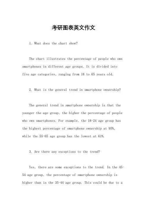
考研图表英文作文1. What does the chart show?The chart illustrates the percentage of people who own smartphones in different age groups. It is divided into five age categories, ranging from 18 to 65 years old.2. What is the general trend in smartphone ownership?The general trend in smartphone ownership is that the younger the age group, the higher the percentage of people who own smartphones. For example, the 18-24 age group has the highest percentage of smartphone ownership at 95%, while the 55-65 age group has the lowest at 61%.3. Are there any exceptions to the trend?Yes, there are some exceptions to the trend. In the 45-54 age group, the percentage of smartphone ownership is higher than in the 35-44 age group. This could be due to avariety of factors, such as increased access to technologyor changes in work and social habits.4. What do you think are the reasons for the trend?There are several reasons for the trend of higher smartphone ownership in younger age groups. One reason is that younger people are more likely to be early adopters of new technology. Additionally, smartphones are often seen as a status symbol among young people, and they may be more likely to prioritize purchasing one over other expenses. Finally, younger people tend to be more tech-savvy and may be more likely to use their smartphones for a variety of purposes, such as social media and entertainment.5. Do you think the trend will continue in the future?It is likely that the trend of higher smartphone ownership in younger age groups will continue in the future. As technology continues to advance and become moreintegrated into daily life, younger people will likely continue to be early adopters and prioritize technology intheir spending. However, it is also possible that as older generations become more comfortable with technology, the gap between age groups may begin to narrow.。
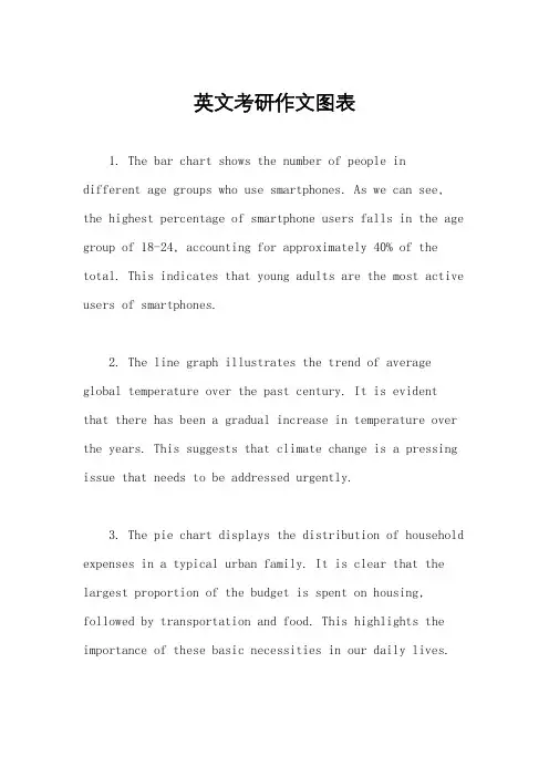
英文考研作文图表1. The bar chart shows the number of people indifferent age groups who use smartphones. As we can see, the highest percentage of smartphone users falls in the age group of 18-24, accounting for approximately 40% of the total. This indicates that young adults are the most active users of smartphones.2. The line graph illustrates the trend of average global temperature over the past century. It is evidentthat there has been a gradual increase in temperature over the years. This suggests that climate change is a pressing issue that needs to be addressed urgently.3. The pie chart displays the distribution of household expenses in a typical urban family. It is clear that the largest proportion of the budget is spent on housing, followed by transportation and food. This highlights the importance of these basic necessities in our daily lives.4. The scatter plot depicts the relationship between hours spent studying and exam scores. Interestingly, there seems to be no clear correlation between the two variables. This suggests that factors other than studying time may influence academic performance.5. The table presents data on the top five countries with the highest GDP growth rates in the past year. It is notable that all of these countries are emerging economies. This demonstrates their potential for rapid economic development.6. The line graph shows the fluctuation in oil prices over a five-year period. It is evident that there have been significant fluctuations in prices, with a sharp increase in 2014 followed by a gradual decline. This indicates the volatility of the oil market.7. The bar chart compares the literacy rates of different countries. It is clear that developed countries have higher literacy rates than developing countries. This highlights the importance of education in promoting socialand economic development.8. The pie chart illustrates the distribution of online shopping preferences by product category. It is evidentthat electronics and clothing are the most popular categories, while books and groceries are less commonly purchased online. This reflects changing consumer behaviorin the digital age.9. The scatter plot displays the relationship between income and happiness levels. Surprisingly, there seems tobe a weak correlation between the two variables. This suggests that factors other than financial well-being contribute to overall happiness.10. The table presents data on the number ofinternational tourists visiting different countries. It is evident that France attracts the highest number of tourists, followed by Spain and the United States. This highlightsthe popularity of these destinations among travelers.。
考研英语一作文模板一、图表作文。
Recently, there has been a heated discussion about the issue of (图表中的现象). (图表所反映的情况) has been on the rise/fall in recent years. According to the statistics shown in the chart, there has been a dramatic increase/decrease in (图表中的数据) from (具体数字) to (具体数字) during the period from (具体时间) to (具体时间).The reasons for this phenomenon can be various. On the one hand, (理由一). On the other hand, (理由二). In addition, (理由三). All these factors contribute to the change shown in the chart.In my opinion, we should take effective measures to deal with this issue. Firstly, (解决办法一). Secondly, (解决办法二). Only by doing so can we (解决问题所带来的好处).二、观点对比型作文。
When it comes to the issue of (观点对比的话题), people's opinions vary. Some people believe that (观点一). They argue that (支持观点一的理由). On the other hand, there are also people who hold the opposite view. They think that (观点二). Their reasons are that (支持观点二的理由).From my point of view, I tend to agree with the latter opinion. The reasons are as follows. Firstly, (支持观点二的原因一). Secondly, (支持观点二的原因二). In addition, (支持观点二的原因三). All these factors lead me to the conclusion that (你的观点).In conclusion, although different people have different opinions on this issue, I believe that (你的观点).三、问题解决型作文。
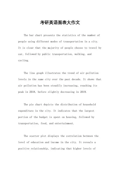
考研英语图表大作文The bar chart presents the statistics of the number of people using different modes of transportation in a city. It is clear that the majority of people choose to travel by car, followed by public transportation, walking, and cycling.The line graph illustrates the trend of air pollution levels in the same city over the past decade. It shows that air pollution has been steadily increasing, reaching its peak in 2018, before slightly decreasing in 2019.The pie chart depicts the distribution of household expenditure in the city. It indicates that the largest portion of the budget is spent on housing, followed by transportation, food, and entertainment.The scatter plot displays the correlation between the level of education and income in the city. It reveals a positive relationship, indicating that higher levels ofeducation are associated with higher incomes.The table provides information on the employment status of different age groups in the city. It shows that the unemployment rate is highest among young adults aged 20-24, and lowest among middle-aged adults aged 45-54.In conclusion, the data presented in these visual aids offer valuable insights into various aspects of life in the city, from transportation habits to environmental issues, household spending, education, income, and employment.。
考研英语图表作文范例50篇(9篇)在学习培训、工作中或日常生活,大家都难以避免地会触碰到作文吧。
尤其是在其中的话题作文,也是普遍,话题作文的主题风格无须从原材料中提炼出,只是从话题讨论引起出去的,原材料的功效取决于阐发话题讨论,启迪学生作文构思,就原材料自身来讲,既能够应用到创作中,还可以不用选用。
下边是我为大伙儿搜集的考研英语图表作文案例50篇【优选9篇】下边是我为大伙儿搜集的,仅作参考,期待可以协助到大伙儿。
If the salinity of ocean waters is analyzed, it is found to vary only slightly from place to place. Nevertheless, some of these small changes are important. There are three basic processes that cause a change in oceanic salinity. One of these is the subtraction of water from the ocean by means of evaporation--- conversion of liquid water to water vapor. In this manner the salinity is increased, since the salts stay behind. If this is carried to the extreme, of course, white crystals of salt would be left behind.The opposite of evaporation is precipitation, such as rain, by which water is added to the ocean. Here the ocean is being diluted so that the salinity is decreased. This may occur in areas of high rainfall or in coastal regions where rivers flow into the ocean. Thus salinity may be increased by the subtraction of water by evaporation, or decreased by the addition of fresh water by precipitation or runoff.Normally, in tropical regions where the sun is very strong, the ocean salinity is somewhat higher than it is in other parts of the world where there is not as much evaporation. Similarly, in coastal regions where rivers dilute the sea, salinity is somewhat lower than in other oceanic areas.A third process by which salinity may be altered is associated with the formation and melting of sea ice. When sea water is frozen, thedissolved materials are left behind. In this manner, sea water directly materials are left behind. In this manner, sea water directly beneath freshly formed sea ice has a higher salinity than it did before the ice appeared. Of course, when this ice melts, it will tend to decrease the salinity of the surrounding water.In the Weddell Sea Antarctica, the densest water in the oceans is formed as a result of this freezing process, which increases the salinity of cold water. This heavy water sinks and is found in the deeper portions of the oceans of the world.英文很重要,不只是在初试中,在复试中,针对名牌大学而言,通常便是一个挑选的副本,针对同等学力同学们而言更是如此,而英语中,作文充分体现你的综合能力了,因此大伙儿要提升自己的作文涵养,借着也有時间要多多的勤奋,下边就从2个层面来谈一谈这个问题。
图表英语考研真题作文答案根据你提供的题目,以下是一篇关于图表英语考研真题作文答案的文章:图表英语考研真题作文答案In recent years, the use of charts and graphs in English examinations, such as the English postgraduate entrance exam, has become increasingly common. These questions require students to analyze and interpret the data presented in the charts. In this article, we will provide a sample answer for a graph question and discuss the key points to consider when writing such a response.Sample Question:下面是一张柱状图,描述了2010年至2015年中国手机销售量的变化,请你根据图表内容写一篇短文。
According to the bar chart provided, the sales volume of mobile phones in China from 2010 to 2015 is shown. Write a short passage based on the information from the chart.Sample Answer:In the given bar chart, the sales volume of mobile phones in China between 2010 and 2015 is depicted. Overall, there was a significant increase in mobile phone sales during this period.From 2010 to 2012, the sales volume of mobile phones in China remained relatively stable, ranging from around 250 million units to justover 275 million units. However, a remarkable rise in sales can be observed in 2013. The sales volume reached approximately 350 million units, marking an approximately 28% increase compared to the previous year.Following this surge, the sales volume continued to escalate rapidly, reaching a peak of around 450 million units in 2015. This represents the highest sales volume during the given period, with a notable growth rate of almost 30% in comparison to the previous year.Looking specifically at the years 2014 and 2015, it is evident that the sales volume increased steadily. In 2014, the sales volume was approximately 400 million units, while in 2015, it reached around 450 million units. This indicates a growth rate of roughly 12.5% year-on-year.In conclusion, the bar chart clearly illustrates the upward trend in mobile phone sales in China from 2010 to 2015. The sales volume remained relatively stable from 2010 to 2012, experienced a significant increase in 2013, and continued to rise rapidly thereafter. The highest sales volume recorded during this period was approximately 450 million units in 2015.Key Points to Consider:1. Introduction:- Briefly describe the provided chart and its subject matter.2. Overview:- Provide a general summary of the trends depicted in the chart.3. Detailed Analysis:- Analyze the data and trends in a chronological manner.- Focus on significant changes and growth rates.4. Conclusion:- Summarize the main points discussed in the analysis.By following a clear structure and analyzing the data in a logical manner, you can effectively answer graph questions in English examinations. Remember to use appropriate vocabulary and grammar to ensure your writing is accurate and coherent.在这篇范文中,使用了适当的分段,并遵循了题目所需要的图表的格式。
研究生考试英语作文图表题In recent years, there has been a noticeable trend in the usage of different transportation systems among residents in a city. A bar chart provided illustrates the percentage of people who prefer different modes of transportation in 2010 and 2020.Based on the bar chart, it is evident that private car ownership has significantly increased over the course of a decade. In 2010, only 20% of the surveyed population possessed private cars, whereas this figure soared to 40% in 2020. On the other hand, public transportation, including buses and trains, witnessed a gradual decline in popularity, dropping from 45% in 2010 to 35% in 2020.Bicycles, which were once a prominent means of transportation, have seen a slight decrease in usage. In 2010, approximately 25% of the respondents relied on bicycles, whereas this number declined to 20% by 2020. Motorcycles, however, have remained relatively steady, with around 15% of people utilizing them as their primary mode of transportation in both years.The reasons behind this changing trend could be multifactorial. Firstly, the rapid economic development over the past decade has led to an increase in individual income levels, enabling more people to afford private cars. This rise in car ownership has undoubtedly contributed to the decline in the use of public transportation and bicycles.Moreover, the improvement in road infrastructure and the availability of parking facilities have also played a part in encouraging car ownership. These factors have made it moreconvenient and comfortable for individuals to choose private cars over public transportation or bicycles.However, it is important to consider the negative consequences of such a shift towards private car usage. With more cars on the road, traffic congestion and air pollution have become persistent issues in the city. Additionally, the designs of city roads and public transportation systems may need to be revised and updated to accommodate this changing transportation landscape.In conclusion, the bar chart clearly presents the changing preferences of residents in terms of transportation modes. The significant rise in private car ownership, along with the decline in the use of public transportation and bicycles, can be attributed to various factors such as increased income levels, better road infrastructure, and parking facilities. However, it is crucial to address the negative consequences associated with this shift towards private car usage, such as traffic congestion and pollution.。
考研英语历真题大小作文原题范文及解析(1)考研英语历真题大小作文原题范文及解析在备考考研英语的过程中,作文是需要重点关注的一部分,尤其是大小作文的写作。
下面将对历年真题中的大小作文进行梳理,并提供范文及解析,供考生参考。
一、小作文小作文的题目分为两大类,一种是对比类的问题,另外一种是图表类的问题。
其中对比类的题目比较容易理解和答题,但图表类的题目比较有技巧,需要考生有较高的数据分析能力。
1. 对比类小作文历年真题中对比类小作文题目如下:2007年:Directions: the following chart shows the average monthly incomes of five kinds of professionals in a country. Write a short essay to compare the incomes of these people.2008年:Directions: the bar chart below shows the percentage of students in Shanghai receiving different levels of allowances from their parents. Write a short essay about the chart.2009年:Directions: the graph below shows the sales of the popular science books for four months in 2009 in a bookstore.Write a short essay to compare the sales of these books and say something about the changing trend.对比类小作文的写作思路:(1) 看清图表:在开始写作前,首先需要认真看清并理解图表内容,明确图表中所涉及的数据。

考研英语二图表作文预测:全国出境游Topic3:TheboomofoverseastravelingindustryFromthebarchartgivenabove,wecanobservethatthenumberof peopletravelingabroadexperiencedsomechangesduringthepastseveral years.From1999to2000,thenumberofChinesepeopletravelingabroad increasedrapidlyfrom7.5millionto10million,andthento12.1millionin2001.Thebarchartrevealsthatpeopleinmountingnumbersaregoingtotravel abroad.Whatexactlycontributetothisphenomenon?Reasonscanbelisted asfollows:foronething,theauthoritieshaveissuedsomepreferentialpolicies topromotethedevelopmentoftheoverseastourismindustry,which encouragesasuddenemergenceoftravelagenciesthatcanprovide customerswithconvenientoverseastourismservices.Additionally,withthe improvementoffinancialstatusandpurchasingpower,aconsiderablenumber ofChinesepeoplecanaffordtheonce-deemed-expensivetravelingexpenses. Lastbutnotleast,asthereexistshugedifferenceincultures,customsand landscapesbetweenChinaandoverseascountries,quiteafewpeoplehold thatoverseastravelingisnotonlyaperfectwaytorelaxoneself,butalso enrichtheirknowledgeandexpandtheirhorizons.Byobservingthepasttrends,wemayforecastthatthegrowthtendency willcontinue.However,itisalsoahighlyvariableindustrywhichisvulnerable toseasonsandclimates,internationalpoliticalsituation,fluctuationsin exchange.考研英语二图表作文预测:电子商务成交额GlobalE-commerceturnoverFromthecurvechartgivenabove,wecanobservethattheturnoverofglobalE-commerceexperiencedsomechangeduringthepastseveralyears.From1997to2005,itrosedramaticallyfrom20billionto900billion.ThecurvechartrevealsthattheglobalE-commerceindustryenjoysan explosivegrowth.Quiteafewreasonscanbelistedtoaccountforthis phenomenon,andthefollowingsmightbethemostcriticalones:foronething, theauthoritiesofdifferentcountrieshaveissuedsomepreferentialpoliciesto protectandencouragethedevelopmentofE-commerce,thusquiteafewonline-transactionwebsitesemergeovernight.Moreover,theone-click-paymentconsumptionmodehasbeenwidelyacceptedbythepublic stbutnotleast,people’s decisiontopurchaseon-linecanalsobeputdowntothepowerofso-called“group-dynamics〞:whenourfriendsareshoppingatnetwork,wewillbe influencedbythemandimitatetheirbehaviorsunconsciously. TherapiddevelopmentofE-commercesignalsthatnewbusinessmodels contributelargelytothesustainabledevelopmentoftheglobaleconomy. However,whenenjoyingthefruitsofferedbymoderntechnology,weshould alsokeepaneyeontheunderlyingthreatofit.Inaworldfeaturesopenboundary,deceptionandfraudsometimeabound.(209words)考研英语二图表作文预测:职业选择Differentjobinclinationbetweenboysandgirls Fromthebarchartgivenabove,wecanfindthatitreflectsthestatisticsof professioninclinationbetweengirlsandboys.Mostobviously,40%ofboys intendtobeamanager,withonly15%ofgirlschoosingthisjob.Whenit comestotheprofessionofteacher,wecanobservethat45%ofgirlspreferto takethisjob,whiletheproportionofboysonlyaccountfor5%,40%lowerthan thatofgirls.Thebarchartinformsusofthephenomenonthatthereexistssome differenceinprofessioninclinationbetweenboysandgirls.Whatexactly contributetothisphenomenon?reasonscanbelistedasfollow:foronething, quiteafewboysregardbeingamanagerasasymbolofsuccess.Asthis professionstandsforpromisingfutures,fatpayandcompetence.Moreover, boys’decisiontobeamanagercanalsobeattributedtothepowerofso-called “groupdynamics〞:whenmembersoftheirsocialnetworkprefertobea manageraftergraduation,theyareeasilyinfluencedandimitateothers’behaviorunconsciouslyorconsciously.Whenitcomestogirls,thearemore inclinedtobeateacher.Asthisprofessionfeaturesstabilityandrespect.Takesocialandbiologicalfactorsintoaccount,weknowthatitisreasonableforgirl tochooseteacherastheiridealprofessiongoals.Bothgirlsandboyshaverightstochoosetheirprofession.However,one thingweshouldbearinmindisthatthereexistsnobetterorworse,superioror inferiorjobs,butsuitableandsatisfactoryones.(254words)考研英语二作文范文:中国职业的变化ThechangesofChineseprofessionsFromthepiechartgivenabove,wecanobservethattheprofessions structureofChinesepeopleexperiencedsomechangesduringthepast severalyears.From1980to1999,thepercentageofagriculturalprofessions decreasedby30%from68%to38%.Duringthesameperiod,however, servicesectorsincreasedrapidlyfrom5%to22%.Whenitcomestothe manufacturingprofessions,itspercentagerosemarkedlyfrom27%in1980to40%in1999.Thepiechartrevealsthephenomenonthatthereexistssomedifferencein thedevelopmenttendencyamongdifferentprofessionsinChina.Whatexactly contributetothisphenomenon?reasonscanbelistedasfollows:foronething, withtherapidprocessofurbanization,peopleinmountingnumbers,especially youngster,havelefttheirvillagehomes,movedintobigcitiesandthusbeen outofagriculturalindustries.Moreover,quiteafewpeople,especiallycollege graduatesholdthatitiscomparativelyeasyforthemtomakemoremoneyintheserviceindustry.Whenitcomestothemanufacturingindustry,its transformationmightbeattributedtotheadjustmentofindustrialstructure:the authoritieshaveissuedsomepreferentialpoliciestopromotetherapid extensionofmanufacturingindustry,thus,moreworkforcesarerequired.Byobservingthechangeoverthepastseveralyears,wemayforecast thattheproportionofprofessionsofserviceandmanufacturewillcontinueto rise.However,ahighvalueshouldbeplacedonthedevelopmentof agriculturalindustrybythepublicandtheauthorities.Otherwise,withthe numberofpeoplewhoareengagedinagriculturediminishing,wewilloneday havenothingtoeat!(262words)考研英语二作文范文:快餐和坐下来餐厅开展趋势Thedevelopmenttendencyoffastfoodandsitdownrestaurant Fromthecurvechartgivenabove,wecanobservethatthenumbermealsof fastfoodandsitdownrestaurantexperiencedsomechangesduringthepast severalyears.Thenumberofmealsoffastfoodincreasedslowlyfrom20in1970tonearly30in1980.From1980to2000,itascendedrapidlyfrom30to approximately90.Onthecontrary,whenobservingthestatisticsofsitdown restaurantmeals,wecanfindthatitincreasedslowlyfrom20in1970toroughly50in2000.Thecurvechartinformsusofthephenomenonthatthereexistssomedifferenceinthedevelopmenttendencybetweenfastfoodandsitdownrestaurants.Whatexactlycontributetothisphenomenon?Reasonscanbelistedasfollows:foronething,withthepaceofmodernlifequickening,people barelyhavemuchtimetowasteinliningupforrestaurantmeals,onthecontrary,fastfoodmealscandohelpbusypeoplesaveagreatdealoftime.Additionally,theauthoritieshaveissuedsomepreferentialpoliciestoprotect andencouragetherapidextensionoffastfoodindustry,thusthepubliccan buyfastfoodatshopsscatteringaroundthecity.Onthecontrary,peoplein diminishingnumbersarewillingtoeatatsitdownrestaurant.Theythinkthat eatingatrestaurantisalwaystime-consumingandinconvenient.Besides,food atrestaurantiscomparativelyexpensivethanfastfood.byobservingthetrendofthepast,wemayforecastthatthenumberoffast foodmealswillcontinuetoriseintheyearstocome.However,weshouldalso takethedetrimentalimpactoffastfoodintoconsideration.Dorememberthat fastfoodisoneofthemaincausingfactorsofdiseasessuchasheartattack, obesityanddiabetes.英语二话题具体话题英文核心词范围efficiency,revolution,culture,economicdevelopment, population,效率、经济开展、人口需求、产社会needs,quality,price,tension,naturalresourcesfinancial,efficient,品质量、满意度等environmentalrecycle,protect安康类、新通讯工具类、节约和Internet,cellphone,vigor,simplicity,organicfoodenergetic,生活浪费、交通、食品平安等exhaustedcherish,thrift,waste,squander 住城市还是农村、考研、就业、选择career,countryside,furthereducation,choice,journey,jobhunting出国留学、旅游等消费组成的变化、教育投资、购investment,education,communicationtool,entert ainment,消费买新的电子产品〔如电子书、通electronicproduct讯工具、娱乐产品等〕。

英语作文图表分析范文(汇总30篇)(经典版)编制人:__________________审核人:__________________审批人:__________________编制单位:__________________编制时间:____年____月____日序言下载提示:该文档是本店铺精心编制而成的,希望大家下载后,能够帮助大家解决实际问题。
文档下载后可定制修改,请根据实际需要进行调整和使用,谢谢!并且,本店铺为大家提供各种类型的经典范文,如工作总结、工作计划、合同协议、条据文书、策划方案、句子大全、作文大全、诗词歌赋、教案资料、其他范文等等,想了解不同范文格式和写法,敬请关注!Download tips: This document is carefully compiled by this editor. I hope that after you download it, it can help you solve practical problems. The document can be customized and modified after downloading, please adjust and use it according to actual needs, thank you!Moreover, our store provides various types of classic sample essays for everyone, such as work summaries, work plans, contract agreements, doctrinal documents, planning plans, complete sentences, complete compositions, poems, songs, teaching materials, and other sample essays. If you want to learn about different sample formats and writing methods, please stay tuned!英语作文图表分析范文(汇总30篇)英语作文图表分析范文第1篇图表类写作模版(1)模版1According to the chart / graph / diagram / table, we clearly learn that _________.As early as _________,___________.Then,_________.Last,__________.In contrast, by _________,__________.There are many reasons accounting for _________.Firstly, _________.Secondly,__________.Finally,_________.As a result,_________.As far as I am concerned,_________.For one thing,__________.For another,________.In brief, I hold that__________.(2)模版2What is shown in the chart / graph / diagram / table above indicates that in recent years, more and more people payattention to _________.The number of those who _________has increased ________,and furthermore,____________.There are two factors responsible for the changes.In the first place,_________.Moreover,__________.Yet, it is noticeable that __________.From the analysis, we can safely draw the conclusion that__________.It is possible that in the future,the tendency will__________.(3)模版3As is shown in the chart / graph / diagram / table above,__________has charged drastically in the past _________.While ___________,now the percentage of__________is __________.Meanwhile,the number of _________has soared up to ________.There are mainly two possible reasons contributing to the rapid changes.The first is that _________.Secondly,__________.In my point of view, the changes have a great influence on _________.At the same time,_______.To sum up ,_________.英语作文图表分析范文第2篇1、图形种类及概述法:泛指一份数据图表: a data graph/chart/diagram/illustration/table饼图:pie chart直方图或柱形图:bar chart / histogram趋势曲线图:line chart / curve diagram表格图:table流程图或过程图:flow chart / sequence diagram程序图:processing/procedures diagram2、常用的描述用法The table/chart diagram/graph shows (that)According to the table/chart diagram/graphAs (is)shown in the table/chart diagram/graphAs can be seen from the table/chart/diagram/graph/figures,figures/statistics shows (that)……It can be seen from the figures/statisticsWe can see from the figures/statisticsIt is clear from the figures/statisticsIt is apparent from the figures/statisticstable/chart/diagram/graph figures (that)……table/chart/diagram/graph shows/describes/illustrates how……3、图表中的数据(Data)具体表达法数据(Data)在某一个时间段固定不变:fiXed in time在一系列的时间段中转变:changes over time持续变化的data在不同情况下:增加:increase / raise / rise / go up ……减少:decrease / grow down / drop / fall ……波动:fluctuate / rebound / undulate / wave ……稳定:remain stable / stabilize / level off ……最常用的两种表达法:动词+副词形式(Verb+Adverb form)形容词+名词形式(Adjective+Noun form)英语作文图表分析范文第3篇雅思考试学术类图表作文分析考试学术类图表作文要求考生观察一幅图表并用自己的语言呈现出图表中的信息。
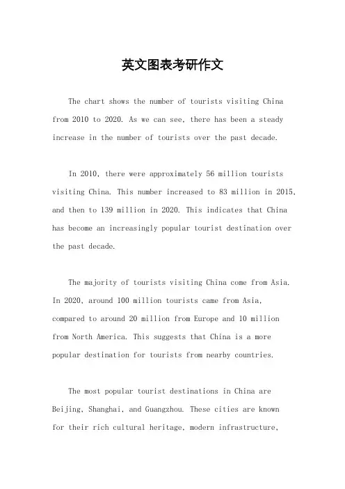
英文图表考研作文The chart shows the number of tourists visiting China from 2010 to 2020. As we can see, there has been a steady increase in the number of tourists over the past decade.In 2010, there were approximately 56 million tourists visiting China. This number increased to 83 million in 2015, and then to 139 million in 2020. This indicates that China has become an increasingly popular tourist destination over the past decade.The majority of tourists visiting China come from Asia. In 2020, around 100 million tourists came from Asia, compared to around 20 million from Europe and 10 million from North America. This suggests that China is a more popular destination for tourists from nearby countries.The most popular tourist destinations in China are Beijing, Shanghai, and Guangzhou. These cities are knownfor their rich cultural heritage, modern infrastructure,and vibrant nightlife. Other popular destinations include the Great Wall, the Terracotta Warriors, and the Yangtze River.The tourism industry in China has had a significant impact on the country's economy. In 2020, tourismcontributed around 11% of China's GDP and provided employment for millions of people. This highlights the importance of the tourism industry for China's economic development.Overall, the chart shows that China has become an increasingly popular tourist destination over the past decade, with the majority of tourists coming from Asia. The tourism industry has had a significant impact on China's economy, and popular destinations include Beijing, Shanghai, and Guangzhou.。
饼图考研英语作文饼图是一种常见的统计图表,它以圆形的方式展示数据的比例关系,通常用于展示各个部分在整体中的占比情况。
在考研英语作文中,饼图常常被用来描述和分析数据,引出相关话题,进行讨论和分析。
下面就以饼图为话题,写一篇考研英语作文。
The pie chart above illustrates the percentage of different energy sources in the total energy consumption in a certain country. As is shown in the chart, the majorityof the energy is derived from coal, accounting for 60%, followed by oil and natural gas with 20% and 15% respectively. Other sources, including nuclear energy and renewable energy, make up the remaining 5%.From the pie chart, we can draw several conclusions. Firstly, coal plays a dominant role in the energy consumption of the country, which indicates that thecountry heavily relies on coal as its primary energy source. This may lead to environmental issues such as air pollution and greenhouse gas emissions. Secondly, the relatively lowpercentage of renewable energy sources, such as wind and solar power, suggests that the country has not fully utilized its potential in developing clean and sustainable energy sources. This may hinder the country's efforts in reducing carbon emissions and combating climate change.The pie chart also raises some important questions for us to consider. Firstly, what measures can the country take to reduce its reliance on coal and promote the use of cleaner energy sources? This may involve investing in renewable energy technologies, improving energy efficiency, and implementing policies to limit the use of coal. Secondly, how can the country balance its energy needs with environmental concerns? This may require a comprehensive energy strategy that takes into account both economic development and environmental protection.In conclusion, the pie chart provides valuable insights into the energy consumption of the country and highlights the challenges it faces in achieving a sustainable energy future. It is imperative for the country to take proactive measures to reduce its reliance on coal and promote the useof cleaner energy sources in order to address environmental issues and contribute to global efforts in combating climate change. Only by doing so can the country achieve a balance between energy needs and environmental concerns, and pave the way for a sustainable and prosperous future.。
图表作文英文范文考研The bar chart shows the percentage of people in different age groups who use social media. The highest percentage of social media users is in the 18-24 age group, with over 90% of people using social media. The lowest percentage is in the 65+ age group, with around 30% of people using social media.The line graph illustrates the growth of internet users in China from 2000 to 2020. The number of internet users has increased steadily over the years, with a significant spike in growth from 2010 onwards. In 2020, there were over 900 million internet users in China.The pie chart displays the distribution of online shopping preferences among different age groups. The 25-34 age group has the highest preference for online shopping, accounting for over 40% of the total, while the 65+ age group has the lowest preference, accounting for less than 10% of the total.The table compares the time spent on different types of media by people of different age groups. It shows that the 18-24 age group spends the most time on social media, while the 65+ age group spends the most time watching TV. Overall, younger age groups tend to spend more time on digital media, while older age groups prefer traditional media.The scatter plot depicts the relationship between education level and internet usage. It indicates thatpeople with higher education levels tend to use theinternet more frequently. However, there are stillsignificant numbers of internet users in the lowereducation level categories.In conclusion, the data presented in the various charts and graphs highlight the significant impact of age, education, and technological advancements on media usage.It is clear that different age groups have distinct preferences and habits when it comes to media consumption, and these trends are likely to continue evolving in the future.。
第一段英二大作文考题为图表类,第一段是对图表的描述,如果对作文加以了解,不难看出,英二大作文可以分为两大类:一个是静态类,一个是动态类,下边对历年真题做一下列举:2010 年:发展中国家和发达国家手机用户数量变化;2011 年:国内市场中不同品牌轿车市场份额占比变化;2012 年:某公司不同年龄段职工工作满意度调查;2013 年:某大学四个年级中有兼职经历的人数占比;2014 年:20 年间城镇人口和乡村人口变化;2015 年:某城市春节假期各类开支占比;2016 年:某高校学生旅游目的调查;2017 年:图书馆数量和参观人数变化。
2018 年:某市消费者选择餐厅时关注的因素。
如果结合考题图表查看的话,很容易看到这两类的不同:动态类:描述主题在不同时间点的情形(多为数量),常以柱状图(又称条形统计图)或折线图呈现,其中横坐标为时间,纵坐标为某个时间对应的情形,如10、11、14、17 这四个年份;静态类:描述主题在同一时间点的情形(多为百分比),常以饼状图呈现,如12、13、15、16 、18这五个年份。
对英二大作文有初步认识后,我们再来看第一段的书写,此段的书写通常分为两部分:第一、结合图表引出主题;第二、对图表内容进行阐述(动态和静态有较大区别),以下详细展开。
第一、结合图表引出主题1.Given is a图表类型which vividly depicted the striking contrasts between 对象一and 对象二of 对比的主题from 起始年份to 终止年份.2.Reflected in the图表类型given above are the respective changes in the number/proportion of对象一and对象二of 对比的主题from the year起始年份to终止年份.3.What is clearly presented in the above图表类型is the different number/proportion of对象一and 对象二among年份一,年份二and年份三.(视情况定)4.Emerging from图表类型is a popular phenomenon that the proportion of图表所阐述的主题has changed during the different groups.5.What can be seen from the图表类型is the proportion change of图表所阐述的主题dunring the different groups.6.The pie chart provides some interesting data regarding the图表所阐述的主题.注释:1、1-3 适用于动态图第一句,4-5 适用于静态图第一句,6 动态图静态图均适合;2、图表类型,常见的图表类型汇总:扇形图pie chart; 折线图graph; 柱状图(即条形统计图)bar chart/column chart; 表格table;3、蓝色字体根据考题进行书写,例如10 年考题:对象一则为发展中国家,对象二为发达国家,对比的主题为手机用户的数量;4、number/proportion ,此处根据具体情况选择,例如,17 年考题选用number,18 年考题选用proportion。
考研英语作文图表及情景考研英语作文图表及情景模板第一部分、写作模板——图表式作文It is obvious in the graphic/table that the rate/number/amount of Y has undergone dramatic changes. It has gone up/grown/fallen/dropped considerably in recent years (as X varies). At the point of X1, Y reaches its peak &#118alue of …(多少).What is the reaso n for this change? Mainly there are … (多少) reasons behind the situation reflected in the graphic/table. First of all, …(第一个原因). More importantly, …(第二个原因). Most important of all, …(第三个原因).From the above discussions, we have enough reason to predict what will happen in the near future. The trend described in the graphic/table will continue for quite a long time (if necessary measures are not taken括号里的使用于那些不太好的变化趋势).第二部分、写作模板——提纲式作文一、说明原因型模块(一)Nowadays , there are more and more XX in some big cities . It is estimated that ( 1 ). Why have there been so many XX ? Maybe the reasons can be listed as follows.The first one is that ( 2 ) .Besides, ( 3 ) . The third reason is ( 4 ). To sum up , the main cause of XX is due to ( 5 ) .It is high time that something were done upon it. For one thing , ( 6 ). On the other hand , ( 7 ). All these measures will certainly reduce the number of XX .注释:(1)用具体数据说明XX现象;(2)原因一;(3)原因二;(4)原因三;(5)指出主要原因;(6)解决建议一;(7)解决建议二。
考研英语作文图表类型In the first chart, it shows the percentage of peoplein different age groups who use smartphones. The data reveals that the younger the age group, the higher the percentage of smartphone usage. For example, 95% of people aged 18-24 use smartphones, while only 40% of people aged 65 and above use them.Moving on to the second chart, it illustrates the average time spent on smartphones per day by people in different countries. Surprisingly, people in thePhilippines spend the most time on their smartphones, with an average of 4.7 hours per day, while people in Japan spend the least time, with an average of 1.9 hours per day.The third chart displays the most popular activities people engage in on their smartphones. It is evident that social media usage tops the list, with 80% of smartphone users using their devices for this purpose. Following closely behind is watching videos and playing games, with70% and 60% of users respectively.In conclusion, the data from these charts paints a clear picture of the widespread use of smartphones, especially among the younger generation. It also highlights the varying levels of smartphone usage and preferences across different countries and age groups.。
2022考研英语图表作文预测及范文(一)作文1DIRECTIONS:A.Study the following graphs carefully and write an essay in at least 150 words.B.Your essay must be written clearly on the ANSWER SHEET II.C.Your essay should cover these three points:1.effect of the countrys growing human population on its wildlife2.possible reason for the effect3.your suggestion for wildlife protection【段落类型分析】第一段其次段第三段图画/图表描述段缘由阐释段建议措施段【参考范文一】From these graphs,we can draw a conclusion that,with the growth of human population,the number of species has decreased rapidly in America,and some species have even vanished from our planet.There are numerous reasons accounting for the phenomenon and I would like to explore a few of the most important ones here.Above all,as the human population grows rapidly,a growing number of people came to live where somewild species have been living.Then these species have to move to other places.Some of them probably can not adapt to the new environment and die.In addition,although many people look on the wildlife as their friends,some people may not think so.They catch a lot of wild animals and sell them in order to get more money.Consequently,the natural balance and the ecologic environment are destroyed.The clear cutting has become increasingly serious.So some of the wildlife become homeless and extinct.In order to protect the wildlife,I have some suggestions.First,the governments should make laws to prevent them from being caught and killed.Second,the governments should educate people to love nature and protect it.Third,as for ourselves,we should take practical actions to protect our living environment.。
考研英语图表作文案例分析
考研英语图表作文案例分析,更多考研英语复习资料、考研英语备考经
验、考研历真题及答案等信息,请及时关注本周与同学们分享英语二图表作
文模拟题的写作思路及语言,这周我们继续进行饼形图的写作和模板的介
绍,首先同学们要知道我们图表的写作是不同的图表有着不同的特点和写作
的要点,而今天所讲的饼图体现的特点是数据所占的比例和整体由几部分的
内容组成,而这种写作的思路是要应用在文章中间得到体现的,那我们就来
看一下针对于柱型图有什幺写作的要点和写作的思路。
首先我们一起来看一
下的英语二模拟题:
48. Directions: Write an essay based on the following chart. In your writing, you should
1) interpret the chart, and
2) give your comments.
You should write about 150 words on the ANSWER SHEET. (15 points)。