
12.2 用图表描述数据
[教学目标]
1.知识与能力:
能够利用条形图、扇形图、折线图、直方图描述数据,能够从统计图中获取相关信息.2.过程与方法:
从问题的解决过程中体会各个统计图的优点和缺点,感受统计图的作用.
3.情感、态度与价值观:
培养学生运用统计图的能力以及用数据说话的习惯.
[重点难点]
1.教学重点:能够利用条形图、扇形图、折线图、直方图描述数据,能够从统计图中获取相关信息.
2.教学难点:读图、识图、获取信息.
[教学方法]
创设情境——主体探究——合作交流——应用提高.
[教学过程]
一、创设情境,激发学生兴趣,探究利用扇形图描述数据的方法
问题 1:资料显示,2000 年我国第五次人口普查的数据如下表:
你能用适当的统计图表示各种受教育人口在总人口中所占的百分比吗?
学生活动设计:
学生分组合作、共同解决问题.由于是表示部分占总数的百分比,因此需要用扇形图
来表示. 经过讨论可以发现,由于扇形统计图中是用扇形的面积表示各部分占总数的百分比,因此关键就是如何确定扇形圆心角的大小. 扇形的面积越大,表示圆心角就越大;扇形的面积越小,表示圆心角越小.
教师活动设计:
教师在学生解决问题的基础上引导学生探索如何确定各个扇形的圆心角.
归纳方法:
圆心角的度数 = 百分比×360°.
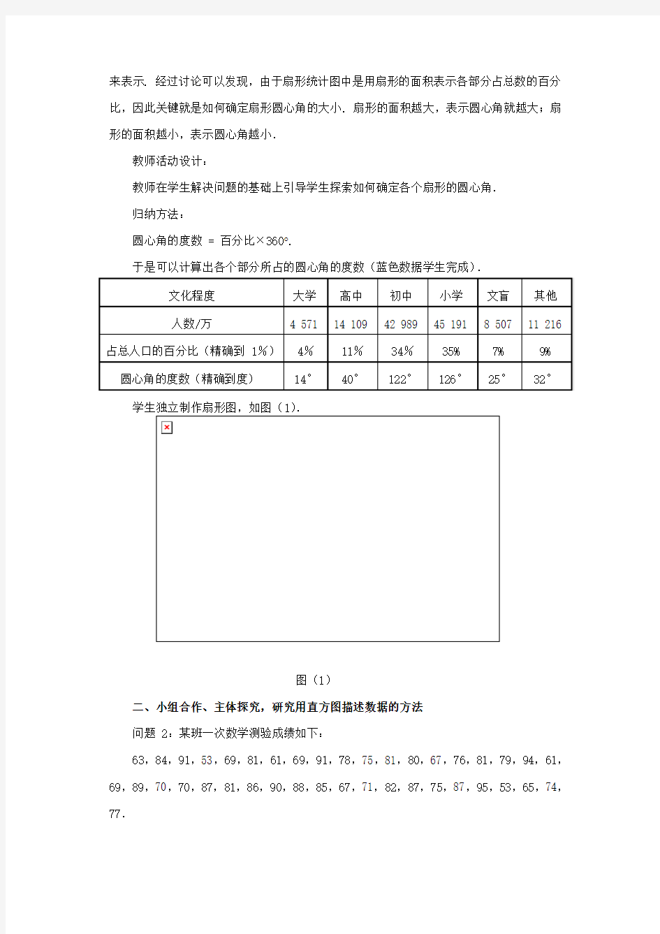
于是可以计算出各个部分所占的圆心角的度数(蓝色数据学生完成).
学生独立制作扇形图,如图(1).
图(1)
二、小组合作、主体探究,研究用直方图描述数据的方法
问题 2:某班一次数学测验成绩如下:
63,84,91,53,69,81,61,69,91,78,75,81,80,67,76,81,79,94,61,69,89,70,70,87,81,86,90,88,85,67,71,82,87,75,87,95,53,65,74,77.
大部分同学处于哪个分数段?成绩的整体分布情况怎样?
教师活动设计:
教师介绍频数分布直方图的绘制步骤:
(1)计算最大值与最小值的差;
(2)确定组距与组数. 通常 100 以内的数据分成 5-12 组,一般地,数据越多,分
的组数也就越多,即分的组数与样本容量有关. 确定组数的法则是一个经验法则,它与数
学公式、定理不同,需要灵活掌握,只有组数定得合适,才能使分布的规律性比较明显的
呈现出来.
那么确定组数的法则是怎样的?要注意以下两点:
①一般来说,组数与样本容量有关,容量大,组数多;容量小,组数少.一般法则是:当容量n≤50 时,分 5~8 组;当容量 50<n≤100 时,分 8~12 组.
②试选组距,估算组数.组数=.
由此可知,组数是根据组距计算出来的,只有对组距进行试定,才能确定合适的组数.(3)确定分点,常使分点比数据多一位小数,并且把第一组的起点稍微减小一点;
(4)用唱票的方式进行频数累计;
(5)用横轴表示各分段数据,纵轴反映各分段数据的频数,小长方形的高表示频数,
各频数之和等于数据总数,绘制直方图.
学生活动设计:
先将成绩按 10 分的距离分段,统计每个分数段学生出现的频数,填入表中.
成绩段49.5~59.5 59.5~69.5 69.5~79.5 79.5~89.5 89.5~99.5 频数记录正正正正正正
频数 2 9 10 14 5
图(2)
根据上表绘制直方图,如图(2).
从图中可以清楚地看出 79.5 分到 89.5 分这个分数段的学生数最多,90 分以上的学生数较少,不及格的学生数最少(正态分布).
三、问题引申,研究频数分布折线图
教师引导学生探索频数折线图的绘制:
方法 1:将每个小长方形上面一条边的中点顺次连结起来,可以得到频数折线图,如图(3).
图(3)
方法 2:求出表中各个小组两个端点的平均数,这些平均数叫作组中值,用横轴表示成绩、用纵轴表示频数,以各个小组的组中值为横坐标、各小组对应的频率作为纵坐标描点,就绘制成了频数分布折线图.
四、归纳小结、布置作业
小结:
扇形图、直方图的制作方法.
作业:
习题 12.2.
. 1、图形种类及概述法: 泛指一份数据图表: a data graph(曲线图)/chart/diagram/illustration/table 饼图:pie chart 直方图或柱形图:bar chart/histogram 趋势曲线图:line chart/curve diagram 表格图:table 流程图或过程图:flow chart/sequence diagram … 程序图:processing/procedures diagram 2、常用的描述用法 The table/chart diagram/graph shows (that) According to the table/chart diagram/graph As (is) shown in the table/chart diagram/graph As can be seen from the table/chart/diagram/graph/figures,
figures/statistics shows (that)…… It can be seen from the figures/statistics ^ We can see from the figures/statistics It is clear from the figures/statistics It is apparent from the figures/statistics table/chart/diagram/graph figures (that)…… table/chart/diagram/graph shows/describes/illustrates 3、图表中的数据(Data)具体表达法 数据(Data)在某一个时间段固定不变:fixed in time 在一系列的时间段中转变:changes over time ^ 持续变化的data在不同情况下: 增加:increase/raise/rise/go up …… 减少:decrease/grow down/drop/fall …… 波动:fluctuate/rebound/undulate/wave ……
图表的英文描述: 图表的种类: 饼状图 pie chart/pie graph segment 柱形图 bar chart/bar graph bar 线型/曲线图 line chart/line graph line线条实线solid line 虚线dotted line 横轴 horizontal axis竖轴vertical axis 表格 table行row 列column 常用的表达: 比例percentage percent 5% five percent 数量 number 趋势 trend 关系 relation This is a pie chart/bar chart/line chart/table of_________. 这是一个关于________的饼状图/柱形图/线型图/表格。 This pie chart/bar chart/line chart/table shows________ 这张图展示了___________. From this pie chart/bar chart/line chart/table, we can see/ know that_____________. 从这张图中,我们知道___________. As we can see from the pie chart/bar chart/line chart/table, ____________________. 我们可以从这张图中知道,________________________________. 在这张曲线图中,横轴代表_________________,竖轴代表___________________. In this line chart, the horizon tal axis stands for_________, the vertical axis stands for _____________. 比较:比较级+than 大 big/large 更大 bigger/larger 最大the biggest/largest 多 more 快 fast/rapid 更快faster/more rapidly 最快the fastest/the most rapid 高 high 更高 higher 最高the highest 好 good 更好 better 最好 the best Compared with_______, ___________________________. 同_______相比,________________. 例:同A相比,B的数量比A更多。Compared with A, the number of B is larger than the number of A. 同A相比,B增长得更快。Compared with A, B increases faster. 变化: 变化速度:快地fast/rapidly 慢地slowly 稳定地stably 变化程度:大(剧烈)dramatic ally 小(轻微)s light ly 改变change 增加 grow/increase/ go up 减少decrease/go down 无变化 have no change/ stay the same 描述、分析图表的主要步骤:
1.Map(地图、天体图、布局图、专用图、图谱)Battle map 作战地图 Highway map 公路图 Genetic map 基因图谱 2.Figure(图形、平面图) Geometric(al) figure 几何图形 Dimension figure 尺寸图 Plane figure 平面图 3.Pattern(图案、图型、图样) Checkboard pattern 棋盘型图案 Recording pattern 录像图型 Circular pattern 圆形图样 4.Sketch(草图、略图、简图) Eye sketch 目测草图 Topographic sketch 地形略图 Dimensional sketch 尺寸简图 5.Scheme/shematic(图解、示意图、流程图、电路图)Flow scheme 流程图 Induction scheme 感应电路图 6.Draft(草图) Chisel draft 雕刻前在石头上画出边缘轮廓草图 7.Curve(曲线图表) Algebraic curve 代数曲线 Comfort curve 湿度舒适曲线 8.Graph(曲线图表) Funtional graph 函数图(亦称plot) Bar graph 条形图(也称chart) 9.View(视图) Plane view 平面视图 10.Geometry(几何图) Plane geometry 平面几何 Solid geometry 立体几何图 11.Chart(航海图、图表) Aeronautical chart 领航图 Demographic data chart 人口统计图表 Pie chart 饼图 Bar chart 柱图 12.Drawing(工程图、插图) Drawing 建筑图 Explanatory drawing 说明(插)图 https://www.doczj.com/doc/3413694387.html,yout(布局图、规划图) 1、图形种类及概述法: 泛指一份数据图表:
As can be seen from the table given above, popular fiction is most popular with Chinese students, accounting for 65.9% of book circulation in the library. General Nonfiction takes up 18.2%, while books concerning science, technology and education, only 10.8%. In contrast, books of art, literature and poetry only have a circulation of 5.1%. Several reasons contribute to their reading preferences. Firstly, popular fiction is fascinating to the young students. Secondly, books about science and technology are usually too complex and difficult to read. They often contain many special terms which most students can’t understand. Finally, in today’s market economy, much more emphasis is laid on practical and vocational books rather than art or poetry. When it comes to me, poetry and art are my favorites. Such kind of books can nourish my mind, broaden my horizons and render me a fresh feeling. Reading a piece of good poetry tends to relieve my burden, and lessen my tension, making me more creative and dynamic. It gets me into an imaginary world, fresh and beautiful. I just love that feeling!(179 words) My View on Reading Extensively Nowadays few of us read extensively after we leave school. This tendency is rather disturbing, for one should know that reading extensively are no less necessary to one’s mental life than fresh air to one’s physical life. From reading extensively, we can derive companionship, experience and instruction. First and foremost, a good book is our faithful friend. It can increase our contentment when we are cheerful and happy, and lessen our pain when we are sad or lonely. Furthermore, reading extensively can also offer us a wide range of experiences. In reading we may join tourists marveling at incredible power of Niagara Falls, mingle with the happy throngs strolling in the Paris boulevards and experience the bitterness or joy of people in different lands and in different times. Few of us can travel far from home or live long over one hundred, but all of us can live many lives through the pages of books. The last but not the least, reading extensively can increase our intellectual ability, broaden our minds and make us wise. Though with the advent of TV and Internet, books are no longer read as extensively as they once were, nothing can replace the role that reading extensively plays in our lives. (206 words) It is obvious in the graph/table that the rate/number/amount of Y has undergone dramatic changes. It has gone up/grown/fallen/dropped considerably in recent years (as X varies). At the point of (接近)X1, Y reaches its peak value of …(多少). What is the reason for this change? Mainly there are … (多少) reasons behind the situation reflected in the graphic/table. First of all, …(第一个原因). More importantly, …(第二个原因). Most impo rtant of all, …(第三个原因). From the above discussions, we have enough reason to predict what will happen in the near future. The trend described in the graph/table will continue for quite a long time (if necessary measures are not taken括号里的使用于那些不太好的变化趋势). 图表作文经典句型总结
今天我们所要关注的是运动图表,无论是什么题目的运动图表,无论题出的多难,我们都要清醒的认识到,那就是考官也逃不出如下的5个范畴,它们分别是运动范畴,程度范畴,时间范畴,数据范畴与连接范畴。 在运动范畴中存在着如下的8种运动趋向: 1、保持平稳:我们可以使用的套用结构有: stay stable/ remain steady 举例:表示人口数量保持平稳的时候可以写: the number of population stayed stable。/the number of population remained steady 2、上升/增加:我们可以使用的套用结构有:rise/ climb/ increase/ ascend/mount/aggrandize(增加) 举例:人口上升:the number of population increased/ascended/mounted等等。 3、下降/减少:我们可以使用的套用结构有:fall/ drop/ decrease/ descend/ decline 举例:人口减少:the number of population decreased/ declined 全国注册建筑师、建造师考试备考资料历年真题考试心得模拟试题 4、下降后保持平稳:这个线段前面是向下的,后面是平的,在表示这个平的时候我们就不可以使用remain steady了,我们要使用的结构是bottom out 举例:人口下降后保持平稳:the number of population decreased and bottomed out 5、上升后保持平稳:前面的上升我们就不用说了,但是在上升以后保持平稳,我们需要使用level off 举例:人口上升后保持平稳:number of population mounted and leveled off 6、复苏:前面下降了以后,然后就上升了,这两条线段的连接点就叫复苏。英语中表达为recover 举例:人口下降后复苏:number of population decreased and recovered 7、波动:就像我们的心电图一样。英语中叫fluctuate 举例:人口波动:number of population fluctuated 8、达到顶峰:peak/ reach its summit/reach its zenith 举例:人口到达了顶峰:number of population peaked/ reached its summit/ reached its zenith 程度范畴 上面就是运动性线段的八种趋势了。但是同学们想过没有上升,下降,波动是存在程度的。所以我们接下来要讨论的是程度的描述方法。程度只有两种,缓慢和陡然。 缓慢的/轻微的:gradually/ smoothly/ steadily/ slightly 陡然的/大幅度的:dramatically/ sharply/ considerably/ appreciably/ greatly 举例:1、人口大幅度攀升:number of population mounted dramatically 2、人口轻微下降:number of population decreased slightly 3、人口逐渐下降:number of population decreased gradually 数据范畴
对于线性图表的描述 上升 1.对于上升趋势的描述: a.可以使用的动词或动词词组:to increase ;to go up;to rise;;to grow;to jump;to leap;to soar;to shoot;to pick up b. 可以使用的名词:an increase;a growth;a jump;a soar;an upward trend 2. 对于上升到某个位置的描述: a. 1. a. 中的动词+to+具体数据。 b. 1. a. 中的动词+to+the peak of+具体数据。 c. 1. a. 中的动词+reaching the peak of +具体数据。 d. 1. a. 中的动词+reaching + 具体数据。 e. to peak at +具体数据 f. to climb to + 具体数据 3. 对于上升的程度的描述: a. 1. a. 中的动词+by +具体数据。 b. 1. a. 中的动词+副词。 下降 1. 对于下降趋势的描述: a. 可以使用的动词或动词词组: to fall;to decrease;to go down;to slide;to collapse;to decline;to drop
b. 可以使用的名词: a collapse;a decrease;a fall;a decline;a drop 2. 对于下降到某个位置的描述: a. 1. a. 中的动词+to+具体数据。 b. 1. a. 中的动词+to+the bottom of+具体数据。 c. 1. a. 中的动词+reaching the bottom of +具体数据。 d. 1. a. 中的动词+reaching + 具体数据。 3. 对于下降程度的描述: a. 1. a. 中的动词+by +具体数据。 b. 1. a. 中的动词+副词。(见 对于平稳的趋势的描述: 可以使用的动词或动词词组: to hardly change;to have little change;to keep steady;to level off;to remain constant;to stay the same 表示程度的副词: 1. 程度较大: Considerably; dramatically; greatly; markedly; obviously; quickly; rapidly; sharply; significantly; suddenly 2. 程度较小: Slightly; gradually; slowly; steadily 时间的嵌入
15.5常用图表阐释语: (1)表示“图表所示”句型: As is shown in the chart…如图所示 As can be seen in the table…从表中可知 As the graph shows…该曲线图表明 The above table illustrates…该表格显示 The first column represents…第一栏代表 The second row demonstrates that…第二行表示 See Figure (Table) 2 请看图(表)2 (2)表示上升的动词: .increase, rise, go up, grow, climb, rocket, soar, rebound, ascend. Leap upwards, jump, speed up, surge, shoot up (3)表示下降的动词: .go down, fall, drop, decline, abate,decrease, slump, diminish, descend, plummet (fall quickly), shrink, slip, slide, take a plunge, dive,sink, slow down, (4)表示快速的副词: rapidly, quickly, sharply, dramatically, surprisingly, fast. (5)表示程度的副词、短语: considerably, a great deal, very much, a lot, rather, somewhat, quite a lot, a bit, a little, slightly significantly, markedly, noticeably, exactly, precisely, almost, nearly, roughly, approximay. (6)表示缓慢、逐步的副词、短语: steadily, gradually, small increase, slightly, moderay, slowly. (7)表示达到顶峰、平行向前等短语: to peak a high point at…, reach a peak at…, reach a plateau;reach the bottom at…, to bottom a low point at…,drop to the bottom at…, to level off;keep constant, stay the same, remain steady, remain the same/constant, stabilize. (8) 表示状况的单词、短语: erratic movements (unstable trend), fluctuations, trough (the lowest point),
图表的英文描述 This model paper was revised by the Standardization Office on December 10, 2020
图表的英文描述: 图表的种类: 饼状图 pie chart/pie graph segment 柱形图 bar chart/bar graph bar 线型/曲线图 line chart/line graph line线条实线solid line 虚线dotted line 横轴 horizontal axis竖轴vertical axis 表格 table行row 列column 常用的表达: 比例percentage percent 5% five percent 数量 number 趋势 trend 关系 relation This is a pie chart/bar chart/line chart/table of_________. 这是一个关于________的饼状图/柱形图/线型图/表格。 This pie chart/bar chart/line chart/table shows________ 这张图展示了___________. From this pie chart/bar chart/line chart/table, we can see/ know that_____________. 从这张图中,我们知道___________. As we can see from the pie chart/bar chart/line chart/table, ____________________. 我们可以从这张图中知道,________________________________. 在这张曲线图中,横轴代表_________________,竖轴代表___________________. In this line chart, the horizon tal axis stands for_________, the vertical axis stands for _____________. 比较:比较级+than 大 big/large 更大 bigger/larger 最大the biggest/largest 多 more 快 fast/rapid 更快faster/more rapidly 最快the fastest/the most rapid 高 high 更高 higher 最高the highest 好 good 更好 better 最好 the best Compared with_______, ___________________________. 同_______相比,________________. 例:同A相比,B的数量比A更多。Compared with A, the number of B is larger than the number of A. 同A相比,B增长得更快。Compared with A, B increases faster. 变化: 变化速度:快地fast/rapidly 慢地slowly 稳定地stably 变化程度:大(剧烈)dramatic ally 小(轻微)s light ly 改变change 增加 grow/increase/ go up
1、图表的种类 泛指一份数据图表:chart/diagram/illustration/table 曲线图:curve graph 饼图:pie chart 柱形图:bar chart 表格图:table 流程图:flow chart 树形图: tree diagram 2、如何描述图表,句子的开头 The table/chart/diagram/graph shows/illustrates (that) According to the table/chart/diagram/graph, As (is) shown/ exhibited in the table/chart/diagram/graph, As can be seen from the table/chart/diagram/graph/figures,
Figures/statistics show(that) It can be seen from the figures/statistics We can see from the figures/statistics It is clear/apparent from the figures/statistics 3、图表数据的内容 数据图中不外乎两种数据——number和percentage的体现。因此主语出来一般会是the number of 和 the percentage of 的形式,至于of后面的东西需要具体结合图表信息来判断。你必须得准确判断出这幅图究竟显示的是什么的数据和百分比,因为主语的准确性在图表描述中尤其重要。 4、图表中数据变化的描述 动态图中的关键点主要有三个:起点,拐点和终点。起点和终点应该尽量展现,但是拐点比较特殊,当出现频繁的拐点时便不需要每个点都给数据,只须描述出这一段的趋势便可。 数据在某一个时间段固定不变:be fixed in 1990,1995,2001 在一系列的时间段中转变:changes over time
如何用英语描述各种图表1、图形种类及概述法: 泛指一份数据图表: a data graph(曲线图)/chart/diagram/illustration/table 饼图:pie chart 直方图或柱形图:bar chart/histogram 趋势曲线图:line chart/curve diagram 表格图:table 流程图或过程图:flow chart/sequence diagram 程序图:processing/procedures diagram 2、常用的描述用法 The table/chart diagram/graph shows (that) According to the table/chart diagram/graph As (is)shown in the table/chart diagram/graph As can be seen from the table/chart/diagram/graph/figures, figures/statistics shows (that)…… It can be seen from the figures/statistics We can see from the figures/statistics It is clear from the figures/statistics It is apparent from the figures/statistics table/chart/diagram/graph figures (that)…… table/chart/diagram/graph shows/describes/illustrates 3、图表中的数据(Data)具体表达法
12.2 用图表描述数据 [教学目标] 1.知识与能力: 能够利用条形图、扇形图、折线图、直方图描述数据,能够从统计图中获取相关信息.2.过程与方法: 从问题的解决过程中体会各个统计图的优点和缺点,感受统计图的作用. 3.情感、态度与价值观: 培养学生运用统计图的能力以及用数据说话的习惯. [重点难点] 1.教学重点:能够利用条形图、扇形图、折线图、直方图描述数据,能够从统计图中获取相关信息. 2.教学难点:读图、识图、获取信息. [教学方法] 创设情境——主体探究——合作交流——应用提高. [教学过程] 一、创设情境,激发学生兴趣,探究利用扇形图描述数据的方法 问题 1:资料显示,2000 年我国第五次人口普查的数据如下表: 你能用适当的统计图表示各种受教育人口在总人口中所占的百分比吗? 学生活动设计: 学生分组合作、共同解决问题.由于是表示部分占总数的百分比,因此需要用扇形图
来表示. 经过讨论可以发现,由于扇形统计图中是用扇形的面积表示各部分占总数的百分比,因此关键就是如何确定扇形圆心角的大小. 扇形的面积越大,表示圆心角就越大;扇形的面积越小,表示圆心角越小. 教师活动设计: 教师在学生解决问题的基础上引导学生探索如何确定各个扇形的圆心角. 归纳方法: 圆心角的度数 = 百分比×360°. 于是可以计算出各个部分所占的圆心角的度数(蓝色数据学生完成). 学生独立制作扇形图,如图(1). 图(1) 二、小组合作、主体探究,研究用直方图描述数据的方法 问题 2:某班一次数学测验成绩如下: 63,84,91,53,69,81,61,69,91,78,75,81,80,67,76,81,79,94,61,69,89,70,70,87,81,86,90,88,85,67,71,82,87,75,87,95,53,65,74,77.
1.我们可以从图表上看出:托雅的女生比例远远高于男生所占比例。 As can be seen from the chart, the percentage of female students was far higher than that of male students at Toya. 2.从图表反映的情况来看:读雅思的人数远远超过读托福的,同时,读托福的人数一直呈现平稳上升趋势。 As can be seen from the chart, those who chose to study for IELTS far outnumbered those choosing to study for TOEFL. Meanwhile, the number of those who chose to study for TOEFL was on a steady rise. 3.从图表反映的情况来看:托雅学生在饭店用餐的频率在不同的月份呈现出了相应的波动趋势。 As can be seen from the diagram, the frequency of Toya students eating at restaurants revealed a trend of fluctuations in different months. 4.从图表反映的情况来看:托雅男教师所承担的每周工作量要高于女教师的。 As can be seen from the charts, the weekly workload borne by male teachers outweighed that of female teachers at Toya. 5.从整个图表反映的情况来看:托雅总部以及五个分校的营业收入都呈现出了快速的增长趋势。 As can be seen from the chart, the sales of Toya Headquarter and the five branch schools all revealed a trend of fast increase across the board. 6.从整个图表反映的情况来看:托雅教师的收入状况呈现出了稳步增长的总态势。 As can be seen from the chart, the income of Toya teachers revealed a general trend of steady rise. 7.图表显示:托雅广告投入呈现出逐渐下降的趋势,然而有趣的是,营业收入却呈现出大幅度的攀升。 As can be seen from the chart, the advertising investment of Toya revealed a trend of gradual decrease, but interestingly, its sales witnessed a trend of increase by leaps and bounds. 8.饼图反映出托雅女生的比例远远高于男生;曲线图则表明在雅思考试成绩方面,女生的表现也远远好于男生。
雅思图表作文数据描述例句 表示上升和下降的说法: 1.The proportion of the people who were divorced went up from 2.5% in 1981 to 7.5% in 1991, rising further to 8% in 2001. 2.The crop yields worldwide in 1990 were 15% up on those of 1985. 3. The number of shoppers during the Christmas period plunged by up to 23 per cent since then on. 4. After five years of steady decline, the high-school drop-out rate started to rise. 5. Oil consumption grew steadily from 1980 to 2000, apart from in 1990, when there was a drop of 5 per cent. 6. House prices fell as much as 40% between 1980 and 1985, compared with the period 1986 to 1990, when prices roughly doubled. 7. Arable land was being lost at the rate of over 38 thousand square miles per year throughout the 1980s. 8. Exports topped $10 billion in 2006, with those to Asia Pacific in excess of $2 billion. 9. The smoking rate in young girls was on the rise, similar to that among adult women. 10. Motorcycle casualities were in decline, down from a total of 54,037 in 1995 to 38,090 in 2000. 11. Gender equality would lead to 13.4 million fewer homeless children, a 13% reduction. 12. Inflation is likely to moderate through the early months of 2007. 13. The number of married couples showed a significant decline, accounting for 50.7% of the adult population, compared with 68% in 1971. 14. The smaller gap between movie-goers and television viewers reflected a 5% drop in the number of people who g to the cinema and a 1.2% increase in those who enjoy watching TV at home. 表示占据的说法: 15. V olunteers constitute nearly half of the work force of the health care sector. 16. While Asians account for 11% of the American population, Hispanics comprise 8%. 17. Women make up 52 % of the population of Britain.\18. 18. Landfill is composed of 36% municipal waste, 24% commercial and industrial waste and 40% construction waste. 表示倍数的说法: 19. Rent as a percentage of the household expenditure more than doubled between 1974 and 1998, from 5% to 12%. 20. Britons were twice as likely to die from hear attacks as Italians and three times as Chinese. 21. Women working as childminders in the under-35 age group in 1995 were almost twice as many as in 1990. 22. Television was twice as popular as washing machine in 1990, with close to 10% of households owning one TV set at home. 23. Young people used the Internet more than three times as often as the general population in 1999. 24. The study found that people who earned more than $100,000 received nearly 50% more junk mails than lower carners. 25. It also found that those on higher incomes lost on average four times more money than other victims in property-related crime. 26. China’s agricultural trade deficit against US jumped 1.5 times to $ 35 billion over the five-year period. 读数据的方法: 27. A quarter of the customers were African origin. 28. Some 700 migrants arrived to live in Australia every week in 2005. 29. Of course UK residents who traveled overseas, some 210,000 went to America. 30. The overall UK population was some 58 million in 2001, 17% higher than in 1951. 31. With an estimated 100 million international migrants worldwide, the proportion of people living outside their country of birth approached 2% of the world’s population in 2002.