圆形图
- 格式:ppt
- 大小:330.00 KB
- 文档页数:12

圆形统计图知识点总结一、基本概念1. 圆形统计图圆形统计图是一种以圆形为基础的统计图表,通过将数据按照比例呈现在整个圆形图中,展示各项数据在整体中的占比情况。
2. 扇形在圆形统计图中,每个数据项所占的比例用相应大小的扇形表示,扇形的大小和角度代表了数据在整体中的比例大小。
3. 数据占比圆形统计图主要用于展示各项数据在整体中的占比情况,通过比较各个扇形的大小和角度来看出不同数据项的比例大小。
二、绘制方法1. 数据准备绘制圆形统计图之前,首先需要准备好要展示的数据。
通常情况下,数据应包括各个数据项的数值和对应的标签,以便在图中清晰地显示每个数据项的比例和名称。
2. 计算百分比根据各项数据的数值计算出它们在整体中的百分比。
通常情况下,使用各项数据值除以总体数值,并将结果乘以100,得出各项数据在整体中的百分比。
3. 绘制图表根据各项数据的百分比,在图表上绘制相应大小和角度的扇形,代表各个数据项在整体中的比例大小。
同时在图表上标注出每个数据项的名称和所占比例的百分比。
4. 添加图例为了让读者更好地理解图表,可以添加图例来说明每个扇形代表的数据项名称和所占比例的百分比,增加图表的可读性和易理解性。
三、应用场景1. 展示占比圆形统计图主要用于展示各项数据在整体中的占比情况,适用于展示相对比例和占比情况较为明显的数据分布。
2. 对比分析通过观察不同扇形的大小和角度,可以直观地比较各项数据在整体中的占比情况,帮助人们进行对比分析。
3. 趋势分析在不同时间段内展示各项数据在整体中的占比情况,可以帮助人们观察数据的变化趋势,进行趋势分析。
4. 提供决策支持通过圆形统计图,可以清晰地展示各项数据在整体中的占比情况,为决策者提供直观的数据支持,帮助其做出更好的决策。
四、注意事项1. 避免过多数据在绘制圆形统计图时,应避免使用过多的数据项,一般情况下,最好控制在6-8个数据项之内,以保持图表的清晰度和易读性。
2. 合理标注数据为了增强图表的易读性,应合理地标注每个数据项的名称和所占比例的百分比,避免数据标注过于拥挤或混乱。

Abstract: statistics is an important form of information transmission. The accuracy required to use language to describe the transfer of the contents of the table, and then the data were analyzed and discussed, namely the chart type composition in English test. Therefore, to describe the statistical graph expression in English accurately the content is a skill of English learners should master. Generally speaking, the chart writing can be divided into four steps: observation chart, material description chart and modify written. This paper will start with L four steps, introduce some related writing skills. A description of the chart, the chart chart for the observed transfer to accurately understand the chart information. We must first recognize the chart, grasp its characteristics. Statistical charts are generally two forms, one is the statistics and the thing to be explained directly by the form to express, this Is Statistics (table, see example 1). Another form is the statistical graph (graph), such as linear map (Linegraph), bar graph (bargraph) and circular graph (piegraph). The linear curvecan clearly display the change of the data (see example 2). The bar chart shows the difference between the number size and quantity of the (see example 3). The circular diagram circle Fan said the size of the changes in the internal structure of the overall (see example 4). The observation chart to see first chart text, to determine the theme, and then carefully study the charts, to find the main features or trends in data. 2 for example the title shows that this figure is the total number of full-time teachers every year from 1960 to 1990 Chinese ordinary schools, the shape of the curve shows the teaching.一、图表作文写作常识1、图形种类及概述法:泛指一份数据图表: a data graph/chart/diagram/illustration/table 饼图:pie chart 直方图或柱形图:bar chart / histogram 趋势曲线图:line chart / curve diagram 表格图:table 流程图或过程图:flow chart / sequence diagram 程序图:processing/procedures diagram 2、常用的描述用法The table/chart diagram/graph shows (that) According to the table/chart diagram/graph As (is) shown in the table/chart diagram/graph As can be seen from the table/chart/diagram/graph/figures,figures/statistics shows (that)……It can be seen from the figures/statistics We can see from the figures/statistics It is clear from the figures/statistics It is apparent from the figures/statistics table/chart/diagram/graph figures (that) ……table/chart/diagram/graph shows/describes/illustrates how……3、图表中的数据(Data)具体表达法数据(Data)在某一个时间段固定不变:fixed in time 在一系列的时间段中转变:changes over time 持续变化的data在不同情况下:增加:increase / raise / rise / go up ……减少:decrease / grow down / drop / fall ……波动:fluctuate / rebound / undulate / wave ……稳定:remain stable / stabilize / level off ……最常用的两种表达法:动词+副词形式(Verb+Adverb form) 形容词+名词形式(Adjective+Noun form) 二、相关常用词组1、主章开头图表类型:table、chart、diagramgraph、column chart、pie graph 描述:show、describe、illustrate、can be seen from、clear、apparent、reveal、represent 内容:figure、statistic、number、percentage、proportion 2、表示数据变化的单词或者词组rapid/rapidly迅速的,飞快的,险峻的dramatic/dramatically戏剧性的,生动的significant/significantly有意义的,重大的,重要的sharp/sharply锐利的',明显的,急剧的steep/steeply急剧升降的steady/steadily稳固的,坚定不移的gradual/gradually渐进的,逐渐的slow/slowly缓慢的,不活跃的slight/slightly轻微的、略微地stable/stably稳定的3、其它在描述中的常用到的词significant changes图中一些较大变化noticeable trend明显趋势during the same period在同一时期grow/grew增长distribute分布,区别unequally不相等地in the case of adv.在……的情况下in terms of / in respect of / regarding在……方面in contrast相反,大不相同government policy政府政策market forces市场规率measure n.尺寸,方法,措施v.估量,调节forecast n.先见,预见v.预测三、考研英语图表写作套句精选1.the table shows the changes in the number of……over the period from……to……该表格描述了在……年之……年间……数量的变化。

七年级圆形地图知识点总结七年级地理学习的一个重点内容是地图学。
在地图学知识点中,圆形地图是一个十分重要的概念。
下面将对七年级圆形地图的知识点进行总结。
一、圆形地图的定义和制作方法圆形地图是一种平面地图,它的形状为圆形。
它是依据球形地球体裁剪而成的,用于反映地球表面的地理位置,以及地球与身边环境之间的关系。
制作圆形地图的方法包括以下几个步骤:1.选定包含所有地球表面的正圆球体;2.将正圆球体剪开,摊平使之成为平面图;3.把平面图上的地理位置信息按比例缩小并固定在图上。
二、圆形地图的特点与其他形状的地图相比,圆形地图的特点包括以下几点:1.映射区域:圆形地图在投影的过程中,地球上的每一点都能够与圆形地图上的一个点对应;2.保证比例尺:圆形地图在制作过程中需要根据比例来缩小地球表面,以保证放在纸面上的地图与地球表面的尺寸相对应;3.易于绘制:与其他形状的地图相比,圆形地图在绘制和标注上更加容易。
三、圆形地图的应用圆形地图在实际应用中有着广泛的用途。
下面列举一些具体的应用场合:1.制作低纬度地图:由于其他形状的地图在低纬度地区会出现面积含义变形等问题,在绘制低纬度地图时,圆形地图的利用率更高;2.进行空气路线规划:使用圆形地图可以更加方便地规划两个位置之间的航班或其他形式的空中交通路线;3.制作指南针:圆形地图可以用来制作指南针。
指南针在导航中有着广泛的应用。
总之,在地图学中,圆形地图是一种非常重要的地图形式。
通过深入掌握圆形地图的定义、制作方法、特点和应用场合,可以帮助学生更好地理解地理概念,提高他们的地理素养。

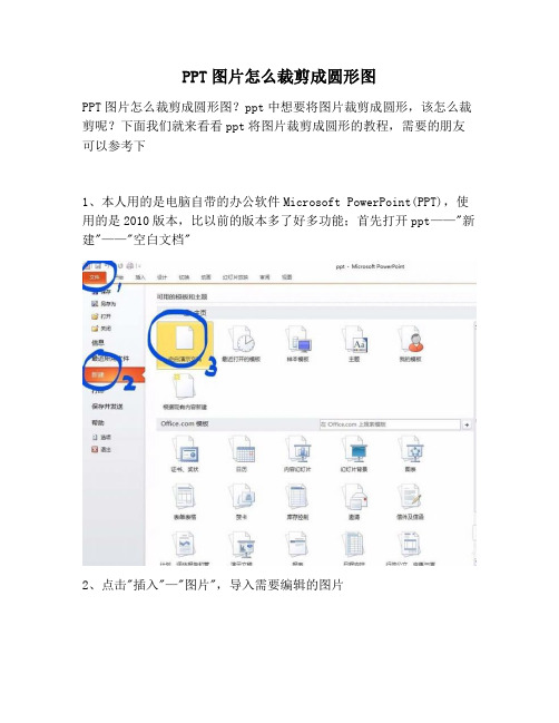
PPT图片怎么裁剪成圆形图
PPT图片怎么裁剪成圆形图?ppt中想要将图片裁剪成圆形,该怎么裁剪呢?下面我们就来看看ppt将图片裁剪成圆形的教程,需要的朋友可以参考下
1、本人用的是电脑自带的办公软件Microsoft PowerPoint(PPT),使用的是2010版本,比以前的版本多了好多功能;首先打开ppt——"新建"——"空白文档"
2、点击"插入"—"图片",导入需要编辑的图片
3、单击图片(图片四周出现四个小正方形和四个小圆)—选择"格式"功能下的“裁剪”
4、点击裁剪下有个小三角形△—纵横比选择正方形1:1 —形状选择为椭圆
5、这样能画出正圆
6、另存为选择需要保存的图片的格式,jpg,jpg均可
7、插入所需要编辑的图片,单击下图片,图片出现以下四个小正方形和四个小圆,如图
8、选择图片样式中的柔化边缘椭圆的样式,既可,图片变成边缘柔化的圆形
9、还可以选择图形样式中的——菱台形椭圆黑色
10、点击图片——选择"图片边框"点击下小三角——点击下"无轮廓"(即可去掉圆形的黑色边框)
11、另存为图片,"保存类型"选为jpg(常用格式)——点击"保存"。
