【原创】r语言收入逻辑回归分析报告附代码数据
- 格式:docx
- 大小:38.80 KB
- 文档页数:8
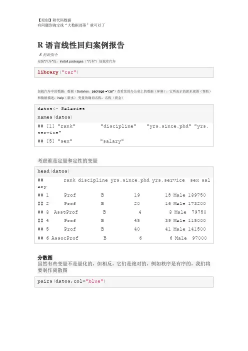
R语言线性回归案例报告R初始指令安装“汽车”包:install.packages(“汽车”)加载库汽车加载汽车中的数据:数据(Salaries,package =“car”)查看您的办公桌上的数据(屏幕):它所表示的薪水视图(帮助)和数据描述:help(薪水)变量的确切名称:名称(薪金)考虑谁是定量和定性的变量分散图虽然有些变量不是量化的,但相反,它们是绝对的,例如秩序是有序的,我们将要制作离散图考虑到图表,我们将运行变量之间的简单回归模型:“yrs.since.phd”“yrs.service”,但首先让我们来回顾一下变量之间的相关性。
因此,我们要确定假设正态性的相关系数考虑到这两个变量之间的相关性高,解释结果结果因变量yrs.since.phd的选择是正确的,请解释为什么编写表单的模型:y = intercept + oendiente * x解释截距和斜率假设检验根据测试结果,考虑到p值= 2e-16,是否拒绝了5%的显着性值的假设?斜率为零根据测试结果,考虑到p值= 2e-16,关于斜率的假设是否被拒绝了5%的显着性值?考虑到变量yrs.service在模型中是重要的模型和测试调整考虑到R的平方值为0.827,你认为该模型具有良好的线性拟合?解释调整的R平方值考虑到验证数据与模型拟合的测试由F统计得到:1894在1和395 DF,p值:<2.2e-16认为模型符合调整? ##使用模型进行估计为变量x的以下值查找yrs.since.phd的估计值:Graficas del modeloValidación del modeloEn este caso se desea determinar los residuos(error)entre el modelo y lo observado y ver si los residuos cumplen con: 1. Tener media=0 2. Varianza= constante 3. Se distribuyen normal(0,constante) Los residuos se generan a continuación (por facilidad solo generamos los primeros 20 [1:20])Valores ajustados, es decir el valor de la variable y dad0 por el modelo (por facilidad solo generamos los primeros 20 [1:20])Prueba de normalidad, utilizamos la prueba QQ que permite deducir si los datos se ajustan a la normal (si los datos estan cerca de la línea)Validación del modeloEn este caso se desea determinar los residuos(error)entre el modelo y lo observado y ver si los residuos cumplen con: 1. Tener media=0 2. Varianza= constante 3. Se distribuyen normal(0,constante) Los residuos se generan a continuación (por facilidad solo generamos los primeros 20 [1:20])Valores ajustados, es decir el valor de la variable y dad0 por el modelo (por facilidad solo generamos los primeros 20 [1:20])Prueba de normalidad, utilizamos la prueba QQ que permite deducir si los datos se ajustan a la normal (si los datos estan cerca de la línea)condidera que los que estan a más de dos desviaciones estandar se distribuyen normal?。
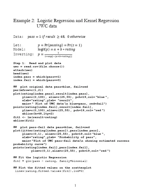
Example 2: Logistic Regression and Kernel RegressionUWC dataData: pass=1 if result ≥48, 0 otℎerwiseLet: p=Pr(passing)=Pr (z=1)Model: logit(p)=a+b∗ratingInverting: p=11+exp {−(a+b∗rating)}Step 1: Read and plot datauwc = read.csv(file.choose())attach(uwc)head(uwc)index.pass = which(pass==1)index.fail = which(pass==0)## plot original data pass=blue, fail=redpar(mfrow=c(1,2))plot(rating[index.pass],result[index.pass],ylim=c(0,100), xlim=c(25,55), pch=19,col="blue",xlab="rating",ylab= "result",main=" Plot of UWC data\n blue=pass, red=fail")points(rating[index.fail],result[index.fail],ylim=c(0,100),xlim=c(25,55), pch=19,col="red")abline(h=48,lty=2)fit1 <- lm(result~rating)abline(fit1)## plot pass-fail data pass=blue, fail=redplot(jitter(rating[index.pass]),pass[index.pass],ylim=c(0,1), xlim=c(25,55), pch=19,col="blue",xlab="rating",ylab= "Probability of pass",main="Plot of UWC pass–fail data\n showing estimated success probability curve")points(rating[index.fail],pass[index.fail],ylim=c(0,1),xlim=c(25,55), pch=19,col="red")## Fit the logistic Regressionfit2 = glm(pass ~ rating, family=binomial)## Plot the fitted values on the scatterplotlines(rating,fitted.values(fit2),lwd=3)## Assess the Logistic Regressionsummary(fit2)Coefficients:Estimate Std. Error z value Pr(>|z|) (Intercept) -8.89671 2.02980 -4.383 1.17e-05 *** rating 0.20111 0.04938 4.073 4.64e-05 ***Null deviance: 126.90 on 101 df (constant term only) Residual deviance: 105.19 on 100 df (full model) AIC: 109.19Number of Fisher Scoring iterations: 4NB: In generalized linear models the fit is measured by deviance difference in deviance follows a Chi-squared distribution with degrees of freedom = difference in degrees of freedomChange in deviance = 126.90-105.19 = 21.71 This follows a chi-squared dist with 1 df25303540455055rating253035404550550.00.20.40.60.81.0Plot of UWC pass–fail datashowing estimated success probability curveratingP r o b a b i l i t y o f p a s s## Diagnostic plotspar(mfrow=c(2,3))plot(hatvalues(fit2),type="h") plot(dffits(fit2), type="h")plot(cooks.distance(fit2), type="h") plot(dfbetas(fit2)[,1], type="h") plot(dfbetas(fit2)[,2], type="h")## InterpretationGraphical – see plotSummary Table : The reduction in deviance explained by the rating is 126.90-105.19 = 21.71 on 1 degree of freedom is highly statistically significant.the log(odds) increases by 0.20111 for every unit increase in rating0204060801000.020.030.040.05Indexh a t v a l u e s (f i t 2)020*********-0.4-0.20.00.2Indexd f f i t s (f i t 2)020*********0.000.050.100.15Indexc o o k s .d i s t a n ce (f i t 2)020406080100-0.10.00.10.20.30.4Indexd f be t a s (f i t 2)[, 1]020406080100-0.4-0.3-0.2-0.10.00.1Indexd f be t a s (f i t 2)[, 2]## Possible Cross Tabulation & Pearson’s Chi-squared Testu=cut(rating,c(0,35,40,45,60))v=cut(result,c(0,48,100))a=table(v,u)print(a)uv (0,35] (35,40] (40,45] (45,60](0,48] 24 31 12 4(48,100] 3 7 10 11chisq.test(a)Pearson's Chi-squared testdata: aX-squared = 22.7525, df = 3, p-value = 4.548e-05Warning message:In chisq.test(a) : Chi-squared approximation may be incorrect Pearson’s chi-squared tests if the conditional distributions are independentKernel Regression (Smoothing)Kernel regression goes straight to the heart of what regression is:The average of conditional distributions.Usage:ksmooth(x, y, kernel = c("box", "normal"), bandwidth = 0.5, range.x = range(x),n.points = max(100, length(x)), x.points)Arguments:x: input x valuesy: input y valueskernel: the kernel to be used.bandwidth: the bandwidth.range.x: the range of points to be covered in the output.n.points: the number of points at which to evaluate the fit.x.points: points at which to evaluate the smoothed fit. If missing, ‘n.points' are chosen uniformly to cover 'range.x'.Value:A list with componentsx: values at which the smoothed fit is evaluated. Guaranteed to be in increasing order.y: fitted values corresponding to 'x'.First example on kernel regressione: UWC data, Kernel Regression, Box and Normal kernelsuwc = read.table("E:/uwcdata.txt",header=T)attach(uwc)plot(rating,result,ylim=c(0,100))fit.lm <- lm(result~rating)fit.box.4 <- ksmooth(rating,result,kernel="box", bandwidth=4) fit.box.7 <- ksmooth(rating,result,kernel="box", bandwidth=7) fit.box.10 <- ksmooth(rating,result,kernel="box", bandwidth=10) fit.box.20 <- ksmooth(rating,result,kernel="box", bandwidth=20) fit.normal.4 <- ksmooth(rating,result,kernel="normal", bandwidth=4) fit.normal.7 <- ksmooth(rating,result,kernel="normal", bandwidth=7) fit.normal.10 <- ksmooth(rating,result,kernel="normal", bandwidth=10) fit.normal.20 <- ksmooth(rating,result,kernel="normal", bandwidth=20)ratingr e s u l t30354045505520406080100-4-20240.00.51.01.52.0x ypar(mfrow=c(2,4))plot(rating,result,ylim=c(0,100), main="bandwidth=4\n kernel=box") lines(fit.box.4,lwd=3);abline(fit.lm,col="red",lwd=3)plot(rating,result,ylim=c(0,100), main="bandwidth=7\n kernel=box") lines(fit.box.7,lwd=3); abline(fit.lm,col="red",lwd=3)plot(rating,result,ylim=c(0,100), main="bandwidth=10\n kernel=box") lines(fit.box.10,lwd=3); abline(fit.lm,col="red",lwd=3)plot(rating,result,ylim=c(0,100), main="bandwidth=20\n kernel=box") lines(fit.box.20,lwd=3); abline(fit.lm,col="red",lwd=3)plot(rating,result,ylim=c(0,100), main="bandwidth=4\n kernel=normal") lines(fit.normal.4,lwd=3); abline(fit.lm,col="red",lwd=3)plot(rating,result,ylim=c(0,100), main="bandwidth=7\n kernel=normal") lines(fit.normal.7,lwd=3); abline(fit.lm,col="red",lwd=3) plot(rating,result,ylim=c(0,100), main="bandwidth=10\n kernel=normal")lines(fit.normal.10,lwd=3); abline(fit.lm,col="red",lwd=3) plot(rating,result,ylim=c(0,100), main="bandwidth=20\n kernel=normal")lines(fit.normal.20,lwd=3); abline(fit.lm,col="red",lwd=3)A big complicated issue: How do we choose the bandwidth = hIt’s a bias – variance trade off:small h gives small bias and high variance big h gives large bias and small variance It depends on the geometry of the data.Lots of theoretical work has been done on choosing the bandwidth. Still lots to be done303540455055020406080100bandwidth=4 kernel=boxratingr e s u lt303540455055020406080100bandwidth=7 kernel=boxratingr e s u lt30354045505520406080100bandwidth=10 kernel=boxratingr e s u lt303540455055020406080100bandwidth=20 kernel=boxratingr e s u lt303540455055020406080100bandwidth=4 kernel=normalratingr e s u lt303540455055020406080100bandwidth=7 kernel=normalratingr e s u lt30354045505520406080100bandwidth=10 kernel=normalratingr e s u lt303540455055020406080100bandwidth=20 kernel=normalratingr e s u ltLessor issues: End effects AND at peaks and valleys.Here we fitted a constant in the window: This is called first-order kernel regressionWe could fit a straight like, or polynomial in the window. That helps with the end effects and the bias. Called higher order kernel regression.Kernel Regression on Pass-Fail data:uwc = read.csv(file.choose())attach(uwc)pass = 1*(result >= 48)## four kernel regressionsfit.1 = ksmooth(rating,pass,kernel="normal",bandwidth=6)fit.2 = ksmooth(rating,pass,kernel="normal",bandwidth=7)fit.3 = ksmooth(rating,pass,kernel="normal",bandwidth=8)fit.4 = ksmooth(rating,pass,kernel="normal",bandwidth=10)# Logistic Regression:fit.glm = glm(pass ~ rating,family=binomial)yhat.glm = fitted.values(fit.glm)par(mfrow=c(1,4))plot(jitter(rating),pass,xlab="rating", ylab="Probability of success",main="Kernel regression UWC data\n kernel width=6")lines(fit.1,lwd=3,col="red")lines(rating,yhat.glm, lwd=3)plot(jitter(rating),pass,xlab="rating", ylab="Probability of success",main="Kernel regression UWC data\n kernel width=7")lines(fit.2,lwd=3, col="red")lines(rating,yhat.glm, lwd=3)plot(jitter(rating),pass,xlab="rating", ylab="Probability of success",main="Kernel regression UWC data\n kernel width=8")lines(fit.3,lwd=3, col="red")lines(rating,yhat.glm, lwd=3)plot(jitter(rating),pass,xlab="rating", ylab="Probability of success",main="Kernel regression UWC data\n kernel width=10")lines(fit.4,lwd=3, col="red")lines(rating,yhat.glm,lwd=3)3035404550550.00.20.40.60.81.0Kernel regression UWC datakernel width=6ratingP r o b a b i l i t y o f s u c c e ss3035404550550.00.20.40.60.81.0Kernel regression UWC datakernel width=7ratingP r o b a b i l i t y o f s u c c e s s3035404550550.00.20.40.60.81.0Kernel regression UWC datakernel width=8ratingP r o b a b i l i t y o f s u c c e s s3035404550550.00.20.40.60.81.0Kernel regression UWC datakernel width=10ratingP r o b a b i l i t y o f s u c c e s s。
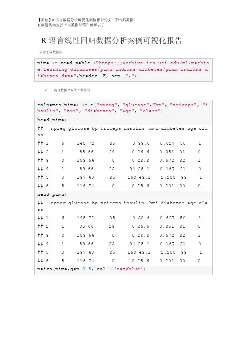
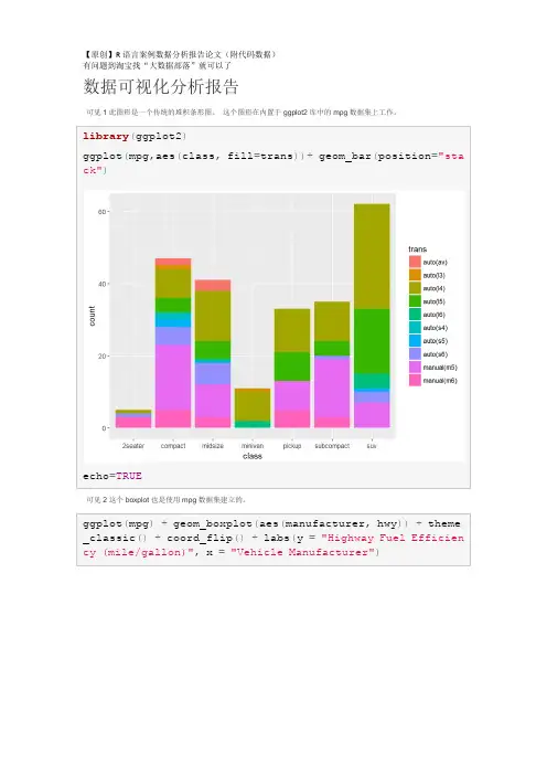
R语言线性回归数据分析案例可视化报告从源下载数据集。
2.清理数据2.a放入数据列pimalm<-lm(class~npreg+glucose+bp+triceps+insulin+bmi+dia betes+age, data=pima)去除大p值的变量(p值> 0.005)Remove variables (insulin, age) with large p value (p value > 0.005) After the variables are dropped, the R-squared value remain about the same. This suggests the variables dropped do not have much effect on the model.Residual analysis shows almost straight line with distribution around zero. Due to this pattern, this model is not as robust.qqnorm(resid(pimalm), col="blue")qqline(resid(pimalm), col="red")The second dataset with much simpler variables. Although intuitively the variables both effect the output, the amount of effect by each variable is interesting. This dataset was examined to have a better sense of how multivariate regression will perform.allbacks.lm<-lm(weight~volume+area, data=allbacks) summary(allbacks.lm)qqnorm(resid(allbacks.lm), col="blue") qqline(resid(allbacks.lm), col="red")。

咨询QQ:3025393450有问题百度搜索“”就可以了欢迎登陆官网:/datablog在R语言中实现Logistic逻辑回归数据分析报告来源:大数据部落|原文链接/?p=2652逻辑回归是拟合回归曲线的方法,当y是分类变量时,y = f(x)。
典型的使用这种模式被预测Ÿ给定一组预测的X。
预测因子可以是连续的,分类的或两者的混合。
R中的逻辑回归实现R可以很容易地拟合逻辑回归模型。
要调用的函数是glm(),拟合过程与线性回归中使用的过程没有太大差别。
在这篇文章中,我将拟合一个二元逻辑回归模型并解释每一步。
数据集我们将研究泰坦尼克号数据集。
这个数据集有不同版本可以在线免费获得,但我建议使用Kaggle提供的数据集,因为它几乎可以使用(为了下载它,你需要注册Kaggle)。
数据集(训练)是关于一些乘客的数据集合(准确地说是889),并且竞赛的目标是预测生存(如果乘客幸存,则为1,否则为0)基于某些诸如服务等级,性别,年龄等特征。
正如您所看到的,我们将使用分类变量和连续变量。
咨询QQ:3025393450有问题百度搜索“”就可以了欢迎登陆官网:/datablog数据清理过程在处理真实数据集时,我们需要考虑到一些数据可能丢失或损坏的事实,因此我们需要为我们的分析准备数据集。
作为第一步,我们使用该函数加载csv数据read.csv()。
确保参数na.strings等于c("")使每个缺失值编码为a NA。
这将帮助我们接下来的步骤。
training.data.raw < - read.csv('train.csv',header = T,na.strings = c(“”))现在我们需要检查缺失的值,并查看每个变量的唯一值,使用sapply()函数将函数作为参数传递给数据框的每一列。
sapply(training.data.raw,function(x)sum(is.na(x)))PassengerId生存的Pclass名称性别0 0 0 0 0 年龄SibSp Parch票价177 0 0 0 0 小屋着手687 2 sapply(training.data.raw,函数(x)长度(unique(x)))PassengerId生存的Pclass名称性别891 2 3 891 2 年龄SibSp Parch票价89 7 7 681 248 小屋着手148 4对缺失值进行可视化处理可能会有所帮助:Amelia包具有特殊的绘图功能missmap(),可以绘制数据集并突出显示缺失值:咨询QQ:3025393450有问题百度搜索“”就可以了欢迎登陆官网:/datablog咨询QQ:3025393450有问题百度搜索“”就可以了欢迎登陆官网:/datablog可变机舱有太多的缺失值,我们不会使用它。
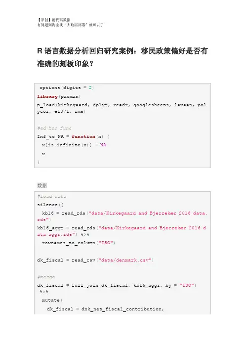
R语言数据分析回归研究案例:移民政策偏好是否有准确的刻板印象?数据重命名,重新编码,重组Group <chr> Count<dbl>Percent<dbl>6 476 56.00 5 179 21.062 60 7.063 54 6.354 46 5.41 1 27 3.18 0 8 0.94对Kirkegaard&Bjerrekær2016的再分析确定用于本研究的32个国家的子集的总体准确性。
#降低样本的#精确度GG_scatter(dk_fiscal, "mean_estimate", "dk_benefits_use",GG_scatter(dk_fiscal_sub, "mean_estimate", "dk_benefits_us e", case_names="Names")GG_scatter(dk_fiscal, "mean_estimate", "dk_fiscal", case_n ames="Names")#compare Muslim bias measures#can we make a bias measure that works without ratio scaleScore stereotype accuracy#add metric to main datad$stereotype_accuracy=indi_accuracy$pearson_rGG_save("figures/aggr_retest_stereotypes.png")GG_save("figures/aggregate_accuracy.png")GG_save("figures/aggregate_accuracy_no_SYR.png")Muslim bias in aggregate dataGG_save("figures/aggregate_muslim_bias.png")Immigrant preferences and stereotypesGG_save("figures/aggregate_muslim_bias_old_data.png") Immigrant preferences and stereotypesGG_save("figures/aggr_fiscal_net_opposition_no_SYR.png")GG_save("figures/aggr_stereotype_net_opposition.png")GG_save("figures/aggr_stereotype_net_opposition_no_SYR.pn g")lhs <chr>op<chr > rhs <chr> est <dbl> se <dbl> z <dbl> pvalue <dbl> net_opposition ~ mean_estimate_fiscal -4.4e-01 0.02303 -19.17 0.0e+00net_opposition~Muslim_frac 4.3e-02 0.05473 0.79 4.3e-01net_opposition~~net_opposition 6.9e-03 0.00175 3.94 8.3e-05dk_fiscal ~~ dk_fiscal 6.2e+03 0.00000 NA NAMuslim_frac~~Muslim_frac1.7e-01 0.0000NANAIndividual level modelsGG_scatter(example_muslim_bias, "Muslim", "resid", case_na mes="name")+#exclude Syria#distributiondescribe(d$Muslim_bias_r)%>%print()GG_save("figures/muslim_bias_dist.png")## `stat_bin()` using `bins = 30`. Pick better value with `GG_scatter(mediation_example, "Muslim", "resid", case_name s="name", repel_names=T)+scale_x_continuous("Muslim % in home country", labels=scal#stereotypes and preferencesmediation_model=plyr::ldply(seq_along_rows(d), function(rGG_denhist(mediation_model, "Muslim_resid_OLS", vline=medi an)## `stat_bin()` using `bins = 30`. Pick better value with `add to main datad$Muslim_preference=mediation_model$Muslim_resid_OLS Predictors of individual primary outcomes#party modelsrms::ols(stereotype_accuracy~party_vote, data=d)GG_group_means(d, "Muslim_bias_r", "party_vote")+ theme(axis.text.x=element_text(angle=-30, hjust=0))GG_group_means(d, "Muslim_preference", "party_vote")+#party agreement cors wtd.cors(d_parties)。

有问题到淘宝找“大数据部落”就可以了逻辑回归对收入进行预测1逻辑回归模型回归是一种极易理解的模型,就相当于y=f(x),表明自变量x与因变量y的关系。
最常见问题有如医生治病时的望、闻、问、切,之后判定病人是否生病或生了什么病,其中的望闻问切就是获取自变量x,即特征数据,判断是否生病就相当于获取因变量y,即预测分类。
最简单的回归是线性回归,在此借用Andrew NG的讲义,有如图1.a所示,X为数据点——肿瘤的大小,Y为观测值——是否是恶性肿瘤。
通过构建线性回归模型,如h θ (x)所示,构建线性回归模型后,即可以根据肿瘤大小,预测是否为恶性肿瘤h θ(x)≥.05为恶性,h θ (x)<0.5为良性。
Zi=ln(Pi1−Pi)=β0+β1x1+..+βnxn Zi=ln(Pi1−Pi)=β0+β1x1+..+βnxn2数据描述该数据从美国人口普查数据库抽取而来,可以用来预测居民收入是否超过50K$/year。
该数据集类变量为年收入是否超过50k$,属性变量包含年龄,工种,学历,职业,人种等重要信息,值得一提的是,14个属性变量中有7个类别型变量。
3问题描述其实对于收入预测,主要是思考收入由哪些因素推动,再对每个因素做预测,最后得出收入预测。
这其实不是一个财务问题,是一个业务问题。
对于某企业新用户,会利用大数据来分析该用户的信息来确定是否为付费用户,弄清楚用户属性,提高运营人员的办事效率。
流失预测。
这方面会偏向于大额付费用户,提取额特征向量运用到应用场景的用户流失和预测里面去。
我们尝试并预测个人是否可以根据数据中可用的人口统计学变量使用逻辑回归预测收入是否超过$ 50K的资金。
在这个过程中,我们将:1.导入数据2.检查类别偏差3.创建训练和测试样本有问题到淘宝找“大数据部落”就可以了4.建立logit模型并预测测试数据5.模型诊断4数据描述分析查看部分数据AGE WORKCLASS FNLWGT EDUCATION EDUCATIONNUM MARITALSTATUS1 39 State-gov 77516 Bachelors 13 Never-married2 50 Self-emp-not-inc 83311 Bachelors 13 Married-civ-spouse3 38 Private 215646 HS-grad 9 Divorced4 53 Private 234721 11th 7 Married-civ-spouse5 28 Private 338409 Bachelors 13 Married-civ-spouse6 37 Private 284582 Masters 14 Married-civ-spouse occupation RELATIONSHIP RACE SEX CAPITALGAIN CAPITALLOSS1 Adm-clerical Not-in-family White Male 2174 02 Exec-managerial Husband White Male 0 03 Handlers-cleaners Not-in-family White Male 0 04 Handlers-cleaners Husband Black Male 0 05 Prof-specialty Wife Black Female 0 06 Exec-managerial Wife White Female 0 0 HOURSPERWEEK NATIVECOUNTRY ABOVE50K1 40 United-States 02 13 United-States 03 40 United-States 04 40 United-States 05 40 Cuba 06 40 United-States 0对数据进行描述统计分析:AGE WORKCLASS FNLWGTMin. :17.00 Private :22696 Min. : 122851st Qu.:28.00 Self-emp-not-inc: 2541 1st Qu.: 117827Median :37.00 Local-gov : 2093 Median : 178356Mean :38.58 ? : 1836 Mean : 1897783rd Qu.:48.00 State-gov : 1298 3rd Qu.: 237051Max. :90.00 Self-emp-inc : 1116 Max. :1484705(Other) : 981EDUCATION EDUCATIONNUM MARITALSTATUSHS-grad :10501 Min. : 1.00 Divorced : 4443Some-college: 7291 1st Qu.: 9.00 Married-AF-spouse : 23Bachelors : 5355 Median :10.00 Married-civ-spouse :14976Masters : 1723 Mean :10.08 Married-spouse-absent: 418Assoc-voc : 1382 3rd Qu.:12.00 Never-married :1068311th : 1175 Max. :16.00 Separated : 1025(Other) : 5134 Widowed : 993OCCUPATION RELATIONSHIP RACEProf-specialty :4140 Husband :13193 Amer-Indian-Eskimo: 311Craft-repair :4099 Not-in-family : 8305 Asian-Pac-Islander: 1039Exec-managerial:4066 Other-relative: 981 Black : 3124有问题到淘宝找“大数据部落”就可以了Adm-clerical :3770 Own-child : 5068 Other : 271 Sales :3650 Unmarried : 3446 White :27816 Other-service :3295 Wife : 1568 (Other) :9541 SEX CAPITALGAIN CAPITALLOSS HOURSPERWEEKFemale:10771 Min. : 0 Min. : 0.0 Min. : 1.00Male :21790 1st Qu.: 0 1st Qu.: 0.0 1st Qu.:40.00Median : 0 Median : 0.0 Median :40.00Mean : 1078 Mean : 87.3 Mean :40.443rd Qu.: 0 3rd Qu.: 0.0 3rd Qu.:45.00Max. :99999 Max. :4356.0 Max. :99.00NATIVECOUNTRY ABOVE50KUnited-States:29170 Min. :0.0000Mexico : 643 1st Qu.:0.0000: 583 Median :0.0000Philippines : 198 Mean :0.2408Germany : 137 3rd Qu.:0.0000Canada : 121 Max. :1.0000(Other) : 1709从上面的结果中我们可以看到每个变量的最大最小值中位数和分位数等等。

R语言线性回归案例数据分析可视化报告在本实验中,我们将查看来自所有30个职业棒球大联盟球队的数据,并检查一个赛季的得分与其他球员统计数据之间的线性关系。
我们的目标是通过图表和数字总结这些关系,以便找出哪个变量(如果有的话)可以帮助我们最好地预测一个赛季中球队的得分情况。
数据用变量at_bats绘制这种关系作为预测。
关系看起来是线性的吗?如果你知道一个团队的at_bats,你会习惯使用线性模型来预测运行次数吗?散点图.如果关系看起来是线性的,我们可以用相关系数来量化关系的强度。
.残差平方和回想一下我们描述单个变量分布的方式。
回想一下,我们讨论了中心,传播和形状等特征。
能够描述两个数值变量(例如上面的runand at_bats)的关系也是有用的。
从前面的练习中查看你的情节,描述这两个变量之间的关系。
确保讨论关系的形式,方向和强度以及任何不寻常的观察。
正如我们用均值和标准差来总结单个变量一样,我们可以通过找出最符合其关联的线来总结这两个变量之间的关系。
使用下面的交互功能来选择您认为通过点云的最佳工作的线路。
# Click two points to make a line.After running this command, you’ll be prompted to click two points on the plot to define a line. Once you’ve done that, the line you specified will be shown in black and the residuals in blue. Note that there are 30 residuals, one for each of the 30 observations. Recall that the residuals are the difference between the observed values and the values predicted by the line:e i=y i−y^i ei=yi−y^iThe most common way to do linear regression is to select the line that minimizes the sum of squared residuals. To visualize the squared residuals, you can rerun the plot command and add the argument showSquares = TRUE.## Click two points to make a line.Note that the output from the plot_ss function provides you with the slope and intercept of your line as well as the sum of squares.Run the function several times. What was the smallest sum of squares that you got? How does it compare to your neighbors?Answer: The smallest sum of squares is 123721.9. It explains the dispersion from mean. The linear modelIt is rather cumbersome to try to get the correct least squares line, i.e. the line that minimizes the sum of squared residuals, through trial and error. Instead we can use the lm function in R to fit the linear model (a.k.a. regression line).The first argument in the function lm is a formula that takes the form y ~ x. Here it can be read that we want to make a linear model of runs as a function of at_bats. The second argument specifies that R should look in the mlb11 data frame to find the runs and at_bats variables.The output of lm is an object that contains all of the information we need about the linear model that was just fit. We can access this information using the summary function.Let’s consider this output piece by piece. First, the formula used to describe the model is shown at the top. After the formula you find the five-number summary of the residuals. The “Coefficients” table shown next is key; its first column displays the linear model’s y-intercept and the coefficient of at_bats. With this table, we can write down the least squares regression line for the linear model:y^=−2789.2429+0.6305∗atbats y^=−2789.2429+0.6305∗atbatsOne last piece of information we will discuss from the summary output is the MultipleR-squared, or more simply, R2R2. The R2R2value represents the proportion of variability in the response variable that is explained by the explanatory variable. For this model, 37.3% of the variability in runs is explained by at-bats.output, write the equation of the regression line. What does the slope tell us in thecontext of the relationship between success of a team and its home runs?Answer: homeruns has positive relationship with runs, which means 1 homeruns increase 1.835 times runs.Prediction and prediction errors Let’s create a scatterplot with the least squares line laid on top.The function abline plots a line based on its slope and intercept. Here, we used a shortcut by providing the model m1, which contains both parameter estimates. This line can be used to predict y y at any value of x x. When predictions are made for values of x x that are beyond the range of the observed data, it is referred to as extrapolation and is not usually recommended. However, predictions made within the range of the data are more reliable. They’re also used to compute the residuals.many runs would he or she predict for a team with 5,578 at-bats? Is this an overestimate or an underestimate, and by how much? In other words, what is the residual for thisprediction?Model diagnosticsTo assess whether the linear model is reliable, we need to check for (1) linearity, (2) nearly normal residuals, and (3) constant variability.Linearity: You already checked if the relationship between runs and at-bats is linear using a scatterplot. We should also verify this condition with a plot of the residuals vs. at-bats. Recall that any code following a # is intended to be a comment that helps understand the code but is ignored by R.6.Is there any apparent pattern in the residuals plot? What does this indicate about the linearity of the relationship between runs and at-bats?Answer: the residuals has normal linearity of the relationship between runs ans at-bats, which mean is 0.Nearly normal residuals: To check this condition, we can look at a histogramor a normal probability plot of the residuals.7.Based on the histogram and the normal probability plot, does the nearly normal residuals condition appear to be met?Answer: Yes.It’s nearly normal.Constant variability:1. Choose another traditional variable from mlb11 that you think might be a goodpredictor of runs. Produce a scatterplot of the two variables and fit a linear model. Ata glance, does there seem to be a linear relationship?Answer: Yes, the scatterplot shows they have a linear relationship..1.How does this relationship compare to the relationship between runs and at_bats?Use the R22 values from the two model summaries to compare. Does your variable seem to predict runs better than at_bats? How can you tell?1. Now that you can summarize the linear relationship between two variables, investigatethe relationships between runs and each of the other five traditional variables. Which variable best predicts runs? Support your conclusion using the graphical andnumerical methods we’ve discussed (for the sake of conciseness, only include output for the best variable, not all five).Answer: The new_obs is the best predicts runs since it has smallest Std. Error, which the points are on or very close to the line.1.Now examine the three newer variables. These are the statistics used by the author of Moneyball to predict a teams success. In general, are they more or less effective at predicting runs that the old variables? Explain using appropriate graphical andnumerical evidence. Of all ten variables we’ve analyzed, which seems to be the best predictor of runs? Using the limited (or not so limited) information you know about these baseball statistics, does your result make sense?Answer: ‘new_slug’ as 87.85% ,‘new_onbase’ as 77.85% ,and ‘new_obs’ as 68.84% are predicte better on ‘runs’ than old variables.1. Check the model diagnostics for the regression model with the variable you decidedwas the best predictor for runs.This is a product of OpenIntro that is released under a Creative Commons Attribution-ShareAlike 3.0 Unported. This lab was adapted for OpenIntro by Andrew Bray and Mine Çetinkaya-Rundel from a lab written by the faculty and TAs of UCLA Statistics.。

Chapter2DJM30January2018What is this chapter about?Problems with regression,and in particular,linear regressionA quick overview:1.The truth is almost never linear.2.Collinearity can cause difficulties for numerics and interpretation.3.The estimator depends strongly on the marginal distribution of X.4.Leaving out important variables is bad.5.Noisy measurements of variables can be bad,but it may not matter. Asymptotic notation•The Taylor series expansion of the mean functionµ(x)at some point uµ(x)=µ(u)+(x−u) ∂µ(x)∂x|x=u+O( x−u 2)•The notation f(x)=O(g(x))means that for any x there exists a constant C such that f(x)/g(x)<C.•More intuitively,this notation means that the remainder(all the higher order terms)are about the size of the distance between x and u or smaller.•So as long as we are looking at points u near by x,a linear approximation toµ(x)=E[Y|X=x]is reasonably accurate.What is bias?•We need to be more specific about what we mean when we say bias.•Bias is neither good nor bad in and of itself.•A very simple example:let Z1,...,Z n∼N(µ,1).•We don’t knowµ,so we try to use the data(the Z i’s)to estimate it.•I propose3estimators:1. µ1=12,2. µ2=Z6,3. µ3=Z.•The bias(by definition)of my estimator is E[ µ]−µ.•Calculate the bias and variance of each estimator.Regression in general•If I want to predict Y from X ,it is almost always the case thatµ(x )=E [Y |X =x ]=x β•There are always those errors O ( x −u )2,so the bias is not zero.•We can include as many predictors as we like,but this doesn’t change the fact that the world isnon-linear .Covariance between the prediction error and the predictors•In theory,we have (if we know things about the state of nature)β∗=arg min βE Y −Xβ 2 =Cov [X,X ]−1Cov [X,Y ]•Define v −1=Cov [X,X ]−1.•Using this optimal value β∗,what is Cov [Y −Xβ∗,X ]?Cov [Y −Xβ∗,X ]=Cov [Y,X ]−Cov [Xβ∗,X ](Cov is linear)=Cov [Y,X ]−Cov X (v −1Cov [X,Y ]),X(substitute the def.of β∗)=Cov [Y,X ]−Cov [X,X ]v −1Cov [X,Y ](Cov is linear in the first arg)=Cov [Y,X ]−Cov [X,Y ]=0.Bias and Collinearity•Adding or dropping variables may impact the bias of a model •Suppose µ(x )=β0+β1x 1.It is linear.What is our estimator of β0?•If we instead estimate the model y i =β0,our estimator of β0will be biased.How biased?•But now suppose that x 1=12always.Then we don’t need to include x 1in the model.Why not?•Form the matrix [1x 1].Are the columns collinear?What does this actually mean?When two variables are collinear,a few things happen.1.We cannot numerically calculate (X X )−1.It is rank deficient.2.We cannot intellectually separate the contributions of the two variables.3.We can (and should)drop one of them.This will not change the bias of our estimator,but it will alterour interpretations.4.Collinearity appears most frequently with many categorical variables.5.In these cases,software automatically drops one of the levels resulting in the baseline case being inthe intercept.Alternately,we could drop the intercept!6.High-dimensional problems (where we have more predictors than observations)also lead to rankdeficiencies.7.There are methods (regularizing)which attempt to handle this issue (both the numerics and theinterpretability).We may have time to cover them slightly.【原创】定制代写 r 语言/python/spss/matlab/WEKA/sas/sql/C++/stata/eviews 数据挖掘和统计分析可视化调研报告等服务(附代码数据),官网咨询链接:/teradat有问题到淘宝找“大数据部落”就可以了White noiseWhite noise is a stronger assumption than Gaussian .Consider a random vector .1. ∼N (0,Σ).2. i ∼N (0,σ2(x i )).3. ∼N (0,σ2I ).The third is white noise.The are normal,their variance is constant for all i and independent of x i ,and they are independent.Asymptotic efficiencyThis and MLE are covered in 420.There are many properties one can ask of estimators θof parameters θ1.Unbiased:E θ−θ=02.Consistent: θn →∞−−−−→θ3.Efficient:V θ is the smallest of all unbiased estimators4.Asymptotically efficient:Maybe not efficient for every n ,but in the limit,the variance is the smallest of all unbiased estimators.5.Minimax:over all possible estimators in some class,this one has the smallest MSE for the worst problem.6....Problems with R-squaredR 2=1−SSE ni =1(Y i −Y )2=1−MSE 1n n i =1(Y i −Y )2=1−SSE SST •This gets spit out by software •X and Y are both normal with (empirical)correlation r ,then R 2=r 2•In this nice case,it measures how tightly grouped the data are about the regression line •Data that are tightly grouped about the regression line can be predicted accurately by the regression line.•Unfortunately,the implication does not go both ways.•High R 2can be achieved in many ways,same with low R 2•You should just ignore it completely (and the adjusted version),and encourage your friends to do the sameHigh R-squared with non-linear relationshipgenY <-function (X,sig)Y =sqrt (X)+sig *rnorm (length (X))sig=0.05;n=100X1=runif (n,0,1)X2=runif (n,1,2)X3=runif (n,10,11)df =data.frame (x=c (X1,X2,X3),grp =rep (letters[1:3],each=n))df $y =genY (df $x,sig)ggplot (df,aes (x,y,color=grp))+geom_point ()+geom_smooth (method = lm ,fullrange=TRUE ,se =FALSE )+ylim (0,4)+stat_function (fun=sqrt,color= black)12340369xy grpab cdf %>%group_by (grp)%>%summarise (rsq =summary (lm (y ~x))$r.sq)###A tibble:3x 2##grp rsq ##<fctr><dbl>##1a 0.924##2b 0.845##3c 0.424。

回归模型项目分析报告论文(附代码数据)摘要该项目包括评估一组变量与每加仑(MPG)英里之间的关系。
汽车趋势大体上是对这个具体问题的答案的本质感兴趣:* MPG的自动或手动变速箱更好吗?*量化自动和手动变速器之间的手脉差异。
我们在哪里证实传输不足以解释MPG的变化。
我们已经接受了这个项目的加速度,传输和重量作为解释汽油里程使用率的84%变化的变量。
分析表明,通过使用我们的最佳拟合模型来解释哪些变量解释了MPG 的大部分变化,我们可以看到手册允许我们以每加仑2.97多的速度驱动。
(A.1)1.探索性数据分析通过第一个简单的分析,我们通过箱形图可以看出,手动变速箱肯定有更高的mpg结果,提高了性能。
基于变速箱类型的汽油里程的平均值在下面的表格中给出,传输比自动传输产生更好的性能。
根据附录A.4,通过比较不同传输的两种方法,我们排除了零假设的0.05%的显着性。
第二个结论嵌入上面的图表使我们看到,其他变量可能会对汽油里程的使用有重要的作用,因此也应该考虑。
由于simplistisc模型显示传播只能解释MPG变异的35%(AppendiX A.2。
)我们将测试不同的模型,我们将在这个模型中减少这个变量的影响,以便能够回答,如果传输是唯一的变量要追究责任,或者如果其他变量的确与汽油里程的关系更强传输本身。
(i.e.MPG)。
### 2.模型测试(线性回归和多变量回归)从Anova分析中我们可以看出,仅仅接受变速箱作为与油耗相关的唯一变量的模型将是一个误解。
一个更完整的模型,其中的变量,如重量,加速度和传输被考虑,将呈现与燃油里程使用(即MPG)更强的关联。
一个F = 62.11告诉我们,如果零假设是真的,那么这个大的F比率的可能性小于0.1%的显着性是可能的,因此我们可以得出结论:模型2显然是一个比油耗更好的预测值仅考虑传输。
为了评估我们模型的整体拟合度,我们运行了另一个分析来检索调整的R平方,这使得我们可以推断出模型2,其中传输,加速度和重量被选择,如果我们需要,它解释了大约84%的变化预测汽油里程的使用情况。

咨询QQ:3025393450有问题百度搜索“”就可以了欢迎登陆官网:/datablog在R语言中实现Logistic逻辑回归数据分析报告来源:大数据部落|逻辑回归是拟合回归曲线的方法,当y是分类变量时,y = f(x)。
典型的使用这种模式被预测Ÿ给定一组预测的X。
预测因子可以是连续的,分类的或两者的混合。
R中的逻辑回归实现R可以很容易地拟合逻辑回归模型。
要调用的函数是glm(),拟合过程与线性回归中使用的过程没有太大差别。
在这篇文章中,我将拟合一个二元逻辑回归模型并解释每一步。
数据集我们将研究泰坦尼克号数据集。
这个数据集有不同版本可以在线免费获得,但我建议使用Kaggle提供的数据集,因为它几乎可以使用(为了下载它,你需要注册Kaggle)。
数据集(训练)是关于一些乘客的数据集合(准确地说是889),并且竞赛的目标是预测生存(如果乘客幸存,则为1,否则为0)基于某些诸如服务等级,性别,年龄等特征。
正如您所看到的,我们将使用分类变量和连续变量。
数据清理过程咨询QQ:3025393450有问题百度搜索“”就可以了欢迎登陆官网:/datablog在处理真实数据集时,我们需要考虑到一些数据可能丢失或损坏的事实,因此我们需要为我们的分析准备数据集。
作为第一步,我们使用该函数加载csv数据read.csv()。
确保参数na.strings等于c("")使每个缺失值编码为a NA。
这将帮助我们接下来的步骤。
training.data.raw < - read.csv('train.csv',header = T,na.strings = c(“”))现在我们需要检查缺失的值,并查看每个变量的唯一值,使用sapply()函数将函数作为参数传递给数据框的每一列。
sapply(training.data.raw,function(x)sum(is.na(x)))PassengerId生存的Pclass名称性别0 0 0 0 0 年龄SibSp Parch票价177 0 0 0 0 小屋着手687 2 sapply(training.data.raw,函数(x)长度(unique(x)))PassengerId生存的Pclass名称性别891 2 3 891 2 年龄SibSp Parch票价89 7 7 681 248 小屋着手148 4对缺失值进行可视化处理可能会有所帮助:Amelia包具有特殊的绘图功能missmap(),可以绘制数据集并突出显示缺失值:咨询QQ:3025393450有问题百度搜索“”就可以了欢迎登陆官网:/datablog咨询QQ:3025393450有问题百度搜索“”就可以了欢迎登陆官网:/datablog可变机舱有太多的缺失值,我们不会使用它。
data=read.table("clipboard",header=T)#在excel中选取数据,复制。
在R中读取数据apply(data,2,mean)#计算每个变量的平均值obs lnWAGE EDU WYEAR SCORE EDU_MO EDU_FA25.5000 2.5380 13.0200 12.6400 0.0574 11.5000 12.1000apply(data,2,sd) #求每个变量的标准偏差obs lnWAGE EDU WYEAR SCORE EDU_MO EDU_FA 14.5773797 0.4979632 2.0151467 3.5956890 0.8921353 3.1184114 4.7 734384cor(data)#求不同变量的相关系数可以看到wage和edu wyear score 有一定的相关关系plot(data)#求不同变量之间的分布图可以求出不同变量之间两两的散布图lm=lm(lnWAGE~EDU+WYEAR+SCORE+EDU_MO+EDU_FA,data=data)#对工资进行多元线性分析Summary(lm)#对结果进行分析可以看到各个自变量与因变量之间的线性关系并不显著,只有EDU变量达到了0.01的显著性水平,因此对模型进行修改,使用逐步回归法对模型进行修改。
lm2=step(lm,direction="forward")#使用向前逐步回归summary(lm2)可以看到,由于向前逐步回归的运算过程是逐个减少变量,从该方向进行回归使模型没有得到提升,方法对模型并没有很好的改进。
因此对模型进行修改,使用向前向后逐步回归。
lm3=step(lm,direction="both")#使用向前向后逐步回归Summary(lm3)从结果来看,该模型的自变量与因变量之间具有叫显著的线性关系,其中EDU变量达到了0.001的显著水平。
【原创】R语言经济指标回归、时间序列分析报告论文附代码数据
本文使用R语言对经济指标进行回归和时间序列分析,旨在探讨经济指标对GDP的影响以及GDP的未来走势。
首先,我们使用OLS回归分析了GDP与各经济指标之间的关系,并通过分析结果
得出相关结论。
接着,我们引入时间序列分析工具ARIMA模型对GDP进行预测,并对预测结果进行解读,为决策者提供参考。
除此之外,我们还附上了相关代码和数据,以便读者复现整个分析过程。
本文的主要内容包括:
1. 数据获取和处理
2. OLS回归分析
3. 时间序列分析
4. 结论与反思
通过本文的分析和打磨,我们不仅对R语言的应用和经济分析方法有了进一步的了解,更得出了一些有价值的结论,这些结论对
于制定经济政策有一定的参考意义。
同时,本文的数据和代码也可以为读者在以后的应用和研究中提供参考价值。
需要说明的是,本文中使用的数据来自官方统计机构的公开数据,数据的准确性和真实性得到了验证。
为了避免涉及版权问题,本文中没有引用其他的资料。
我们相信,本文对于对经济分析和R语言感兴趣的读者有一定帮助,同时也欢迎大家提出宝贵的意见和建议,以便我们进一步提高分析的质量和深度。
原创R语言线性回归案例数据分析可视化报告附代码数据在数据分析领域,线性回归是一种常用的数据建模和预测方法。
本文将使用R语言进行一个原创的线性回归案例分析,并通过数据可视化的方式呈现分析结果。
下面是我们的文本分析报告,同时包含相关的代码数据(由于篇幅限制,只呈现部分相关代码和数据)。
请您详细阅读以下内容。
1. 数据概述本次案例我们选用了一个关于房屋价格的数据集,数据包含了房屋面积、房间数量、地理位置等多个维度的信息。
我们的目标是分析这些因素与房屋价格之间的关系,并进行可视化展示。
2. 数据预处理在开始回归分析之前,我们需要对数据进行预处理,包括数据清洗和特征选择。
在这个案例中,我们通过删除空值和异常值来清洗数据,并选择了面积和房间数量两个特征作为自变量进行回归分析。
以下是示例代码:```R# 导入数据data <- read.csv("house_data.csv")# 清洗数据data <- na.omit(data)# 删除异常数据data <- data[data$area < 5000 & data$rooms < 10, ]# 特征选择features <- c("area", "rooms")target <- "price"```3. 线性回归模型建立我们使用R语言中的lm()函数建立线性回归模型,并通过summary()函数输出模型摘要信息。
以下是相关代码:```R# 线性回归模型建立model <- lm(data[, target] ~ ., data = data[, features])# 输出模型摘要信息summary(model)```回归模型摘要信息包含了拟合优度、自变量系数、截距等重要信息,用于评估模型的拟合效果和各个因素对因变量的影响程度。
1. Exploratory analysis1.1 IntroductionOn 23rd Jun216, a referendum was held in the UK to decide whether or not to remainpart of the European Union (EU).72% of registered voters took part. Of those, 51.2% votedto leave the EU, and 48.1% voted to remain. And now we have the 1070 electoral wards information with 49 columns such as electoral regions name, leave votes, remain votes, age’s information, education’s information, ethnic information, etc. Using the function of str() in R program, we can find that columns of ID, NV otes, Leave, Residents and are integer type, columns of AreaType, RegionName, Postals are factor and the remain columns are numerous.1.2 Covariates reduced by correlationWith the variables NV otes and Leave, we can make a new variable named Leave_proportion using Leave/ NV otes, which means the proportion of leave votes.And then calculate the correlations between numerous covariates and dependent variables and the correlation between numerous covariates. It’s found that covariates of Age_0to4, Age_5to7 and Age_18to19 havesmall impact to the dependent variables. There are several variables have highly correlations such as Age_15 with Age_16to17, White with Asian and so on, then it isdifficult to disentangle their effects and it may be preferable to work with asingle `index' that combines all of them.For the features about age, we can combine those who have adjacent age and highly correlations into a new single feature. Then age 0 to 17 formsa new variable named Age_0to17, age 18 to 24 forms a new variable named Age_18to24, age 25 to 44 forms a new variable named Age_25to44 and age older than 34 forms a new variable named Age_45plus.In some pairs of features, the correlation between them is very high, and then anyone of those features can represent all of them, such as the features of Unemp between UnempRate_EA, Deprived between MultiDepriv and so on.1.3 Covariates reduced by PCAFor ethnicity, we take PCA technique to rotate White, Black, Asian, Indian, and Pakistani into a new Compound feature. The top two components’ cumulative proportion are bigger than 80%, so we choose the top two components as new features, named as ethnicity_1 and ethnicity_2. For the three education features NoQuals, L1Quals and L4Quals_plus, we can also use the PCA technique to get a new feature named as education.1.4Analysis of the Factor CovariatesIn this part, we will take boxplots to see if there exists variation. The plotsare as follows:From the plots we can that leave proportion differs in different level of factors. And from the region values wen can find that all of the Leave’ proportion in East Midlands, North East, North West, South East, South West, West Midlands and Yorkshire and The Humber are bigger than 50% which means that people in these places tend to leave.1.5Analysis of the some other important featuresFinally of this section, several more important dimensions are analyzed: eg average age, number of inhabitants, number of households and student proportion.Due to limited space, we only give the plot of student proportion for the impact of the Leave proportion.From these analyses, we can find that the older the region’s average age of Residents the higher the Leave proportion, the smaller the students proportion the higher the Leave proportion and so on. This also explains why North East’s Leave proportion is the highest, because the region's average age was significantly higher than other regions, and students proportion for significantly lower than other regions.In the two dimensions of the number of inhabitants and the number of households can be found, these two dimensions only in individual states (such as North West, West Midlands and kshire and The Humber) have some influence, that is, the number of residents or the number of households, the more The lower the probability, the fewer the number of residents or the number of households, the higher the probability of leaving. In the other six states, these two variables almost have no effect.2. ModelingFrom above, we have done a lot of exploratory work. And by those works, many covariates are reduced and some new covariates are constructed such as Age_0to17, education and so on. Then, excluding the irrelevant variables such as ID and the number of leave, there are 22 covariates and a dependentvariable.First of all, we need to check whether the leave proportion conform to normal distribution. If the leave proportion conform to normal distribution, we can build a regular regression. There, we use the Q-Q plot technique to check it.From the Q-Q plot, we prefer think it does not conform to the normal distribution.Therefore, a regular linear regression is not fit to this problem. Now construct a new dependent variable named label, where label=1 when proportion is bigger or equal to 0.5 and label = 0 when leave proportion is smaller than 0.5. The formula of generalized linear model can be expressed asLog(p/(1-p)) = b0+b1* NVotes+b2*Residents+…+b22*educationWhere p is the probability of label = 1. From the summary function we find that the features of RegionName and AreaType is not significant to the model, then reduce this model to rebuild the glm model, then use the step wise method to choose the final significant features automation.By summary function, we can find that there are 8 features significant to the glm model, such as PostalsP, HigherOccup, Deprived, C1C2DE, Age_18to24, Age_25to44, Age_45plus, education and so on. Rebuild the glm model using the 8 features, we can get the final model as:Log(p/(1-p)) = -36.8453-2.719(if(Postals=P,1,0))+ 0.210* HigherOccup -0.0497* Deprived+0.183* C1C2DE +0.234* Age_18to24+0.1943* Age_25to44 0.43* Age_45plus -2.964* education3.Result AnalysisThe coefficient of PostalsP is -2.71931, which represent leave proportion in Postals P is 2.72% smaller the Postals NP. Coefficients of Age_18to24, Age_25to44 and Age_45plus are all larger than 0, means that the as the number of people 18+ grows, the leave proportion is on the rise. People of older than 45 have the greatest impact, and 1 unit45+ old people increase, the value of Log(p/(1-p)) will increase 0.43. The coefficient of education is -2.96399, which means that education growing 1 unit, the value of Log(p/(1-p)) will decrease 2.96399.ReferenceLocal voting figures shed new light on EU referendum, BBC News, Martin Rosenbaum。
基于逻辑回归模型的ST股票分析研究问题通过对某股票数据分析,了解经营活动产生的现金流量净额净资产收益率... 每股收益和每股净资产对股票是否ST的影响。
数据介绍随机抽取的股票。
因变量是否为ST股票(0=非ST,1=ST)。
为了能够预测是否为ST,我们采集了下面这些来自当年的指标。
该数据存放在 csv 文件上市公司数据 (1).csv 中。
做完整的逻辑回归分析,包括参数估计、假设检验,以及预测评估和模型评价;因变量(是否为ST)STindex[1] 1 0数据描述绘制变量之间的散点图经营活动产生的现金流量净额净资产收益率...经营活动产生的现金流量净额 1.00000000 -0.06822659净资产收益率... -0.06822659 1.00000000每股收益 0.14347066 0.46849026每股净资产 0.39543001 -0.10833833ST -0.11777849 0.11277458每股收益每股净资产 ST经营活动产生的现金流量净额 0.1434707 0.3954300 -0.1177785净资产收益率... 0.4684903 -0.1083383 0.1127746每股收益 1.0000000 0.3101421 -0.1607072每股净资产 0.3101421 1.0000000 -0.4064833ST -0.1607072 -0.4064833 1.0000000从上面的图中,我们可以看到各个变量之间的相关关系,其中每股收益和每股净资产呈正相关关系。
绘制箱线图可以看到ST股票和非ST股票的4个变量具有显著差异。
非ST股票的各项指标要高于ST股票的变量值。
建立逻辑回归模型因此进行逻辑回归模型的分析。
随机抽取2/3作为训练集summary(fit)data = data_train)Deviance Residuals:Min 1Q Median 3Q Max-1.5105 -0.9038 -0.3875 0.9781 1.9334Coefficients:Estimate Std. Error z value Pr(>|z|)(Intercept) 7.272e-01 4.283e-01 1.698 0.08950 .经营活动产生的现金流量净额 3.803e-10 4.233e-10 0.899 0.36888 净资产收益率... 2.198e-01 2.808e-01 0.783 0.43365每股收益 -2.121e+00 8.805e-01 -2.409 0.01600 *每股净资产 -4.901e-01 1.641e-01 -2.986 0.00282 **---Signif. codes: 0 '***' 0.001 '**' 0.01 '*' 0.05 '.' 0.1 ' ' 1(Dispersion parameter for binomial family taken to be 1)Null deviance: 96.716 on 70 degrees of freedomResidual deviance: 74.795 on 66 degrees of freedomAIC: 84.795Number of Fisher Scoring iterations: 6从输出结果可以看出,回归方程为ST= 1.285e+1.532e-10经营活动产生的现金流量净额 +3.023e-01 净资产收益率-2.078e+00每股收益-4.586e-01 股净资产,变量和的统计量的估计值分别为1.285e+00、1.532e-10、3.023e-01、-2.078e+00和-4.586e-01 ,每股收益和每股净资产对应的值都比显著性水平0.05小,可得2个偏回归系p数在显著性水平0.05下均显著不为零。
R语言线性回归分析案例报告附代码数据线性回归是一种非常常见的预测和分析方法,它用于理解两个或更多变量之间的关系。
在本案例中,我们将使用R语言进行线性回归分析。
我们将从一个简单的数据集开始,然后逐步构建线性回归模型,并对其进行解释和评估。
首先,我们需要一份数据集。
在这个例子中,我们将使用R内置的“mtcars”数据集。
该数据集包含了32辆不同车型的汽车在不同速度下的发动机排量、马力、扭矩等数据。
接下来,我们将使用“lm”函数来拟合一个线性回归模型。
在这个例子中,我们将预测“mpg”变量(每加仑英里数),并使用“hp”(马力)和“wt”(车重)作为自变量。
输出结果会给出模型的系数、标准误差、t值、p值等信息。
我们可以根据这些信息来解释模型。
在这个例子中,我们的模型是“mpg = β0 + β1 * hp + β2 * wt”,其中“β0”是截距,“β1”和“β2”是系数。
根据输出结果,我们可以得出以下结论:1、马力每增加1个单位,每加仑英里数平均增加0.062个单位(β1的95%置信区间为[0.022, 0.102]);2、车重每增加1个单位,每加仑英里数平均减少0.053个单位(β2的95%置信区间为[-0.077, -0.030])。
接下来,我们将使用一些指标来评估模型的性能。
首先,我们可以使用R-squared(决定系数)来衡量模型对数据的解释能力。
R-squared 的值越接近1,说明模型对数据的解释能力越强。
接下来,我们将使用残差标准误差来衡量模型预测的准确性。
残差标准误差越小,说明模型的预测能力越强。
最后,我们将使用模型预测值与实际值之间的均方根误差(RMSE)来评估模型的预测能力。
RMSE越小,说明模型的预测能力越强。
通过线性回归分析,我们可以更好地理解变量之间的关系,并使用模型进行预测和分析。
在本案例中,我们使用R语言对“mtcars”数据集进行了线性回归分析,并使用各种指标评估了模型的性能。
逻辑回归对收入进行预测1逻辑回归模型回归是一种极易理解的模型,就相当于y=f(x),表明自变量x与因变量y的关系。
最常见问题有如医生治病时的望、闻、问、切,之后判定病人是否生病或生了什么病,其中的望闻问切就是获取自变量x,即特征数据,判断是否生病就相当于获取因变量y,即预测分类。
最简单的回归是线性回归,在此借用Andrew NG的讲义,有如图1.a所示,X为数据点——肿瘤的大小,Y为观测值——是否是恶性肿瘤。
通过构建线性回归模型,如h θ (x)所示,构建线性回归模型后,即可以根据肿瘤大小,预测是否为恶性肿瘤h θ(x)≥.05为恶性,h θ (x)<0.5为良性。
Zi=ln(Pi1−Pi)=β0+β1x1+..+βnxn Zi=ln(Pi1−Pi)=β0+β1x1+..+βnxn2数据描述该数据从美国人口普查数据库抽取而来,可以用来预测居民收入是否超过50K$/year。
该数据集类变量为年收入是否超过50k$,属性变量包含年龄,工种,学历,职业,人种等重要信息,值得一提的是,14个属性变量中有7个类别型变量。
3问题描述其实对于收入预测,主要是思考收入由哪些因素推动,再对每个因素做预测,最后得出收入预测。
这其实不是一个财务问题,是一个业务问题。
对于某企业新用户,会利用大数据来分析该用户的信息来确定是否为付费用户,弄清楚用户属性,提高运营人员的办事效率。
流失预测。
这方面会偏向于大额付费用户,提取额特征向量运用到应用场景的用户流失和预测里面去。
我们尝试并预测个人是否可以根据数据中可用的人口统计学变量使用逻辑回归预测收入是否超过$ 50K的资金。
在这个过程中,我们将:1.导入数据2.检查类别偏差3.创建训练和测试样本4.建立logit模型并预测测试数据5.模型诊断4数据描述分析查看部分数据AGE WORKCLASS FNLWGT EDUCATION EDUCATIONNUM MARITALSTATUS1 39 State-gov 77516 Bachelors 13 Never-married2 50 Self-emp-not-inc 83311 Bachelors 13 Married-civ-spouse3 38 Private 215646 HS-grad 9 Divorced4 53 Private 234721 11th 7 Married-civ-spouse5 28 Private 338409 Bachelors 13 Married-civ-spouse6 37 Private 284582 Masters 14 Married-civ-spouse occupation RELATIONSHIP RACE SEX CAPITALGAIN CAPITALLOSS1 Adm-clerical Not-in-family White Male 2174 02 Exec-managerial Husband White Male 0 03 Handlers-cleaners Not-in-family White Male 0 04 Handlers-cleaners Husband Black Male 0 05 Prof-specialty Wife Black Female 0 06 Exec-managerial Wife White Female 0 0 HOURSPERWEEK NATIVECOUNTRY ABOVE50K1 40 United-States 02 13 United-States 03 40 United-States 04 40 United-States 05 40 Cuba 06 40 United-States 0对数据进行描述统计分析:AGE WORKCLASS FNLWGTMin. :17.00 Private :22696 Min. : 122851st Qu.:28.00 Self-emp-not-inc: 2541 1st Qu.: 117827Median :37.00 Local-gov : 2093 Median : 178356Mean :38.58 ? : 1836 Mean : 1897783rd Qu.:48.00 State-gov : 1298 3rd Qu.: 237051Max. :90.00 Self-emp-inc : 1116 Max. :1484705(Other) : 981EDUCATION EDUCATIONNUM MARITALSTATUSHS-grad :10501 Min. : 1.00 Divorced : 4443Some-college: 7291 1st Qu.: 9.00 Married-AF-spouse : 23Bachelors : 5355 Median :10.00 Married-civ-spouse :14976Masters : 1723 Mean :10.08 Married-spouse-absent: 418Assoc-voc : 1382 3rd Qu.:12.00 Never-married :1068311th : 1175 Max. :16.00 Separated : 1025(Other) : 5134 Widowed : 993OCCUPATION RELATIONSHIP RACEProf-specialty :4140 Husband :13193 Amer-Indian-Eskimo: 311Craft-repair :4099 Not-in-family : 8305 Asian-Pac-Islander: 1039Exec-managerial:4066 Other-relative: 981 Black : 3124Adm-clerical :3770 Own-child : 5068 Other : 271Sales :3650 Unmarried : 3446 White :27816Other-service :3295 Wife : 1568(Other) :9541SEX CAPITALGAIN CAPITALLOSS HOURSPERWEEKFemale:10771 Min. : 0 Min. : 0.0 Min. : 1.00Male :21790 1st Qu.: 0 1st Qu.: 0.0 1st Qu.:40.00Median : 0 Median : 0.0 Median :40.00Mean : 1078 Mean : 87.3 Mean :40.443rd Qu.: 0 3rd Qu.: 0.0 3rd Qu.:45.00Max. :99999 Max. :4356.0 Max. :99.00NATIVECOUNTRY ABOVE50KUnited-States:29170 Min. :0.0000Mexico : 643 1st Qu.:0.0000? : 583 Median :0.0000Philippines : 198 Mean :0.2408Germany : 137 3rd Qu.:0.0000Canada : 121 Max. :1.0000(Other) : 1709从上面的结果中我们可以看到每个变量的最大最小值中位数和分位数等等。
查看数据维度dim(inputData)[1] 32561 15从上面的结果中我们可以看到收入情况和一个人的资本收入以及性别存在着正相关。
从图中我们可以看到,如果性别是男性,那么他的收入一般会较高,性别是女性,收入较低。
5检查类偏差理想情况下,Y变量中事件和非事件的比例大致相同。
所以,我们首先检查因变量ABOVE50K中的类的比例。
0 124720 7841显然,不同收入人群比例有偏差。
所以我们必须以大致相等的比例对观测值进行抽样,以获得更好的模型。
6建模分析6.1创建训练和试验样本解决类别偏差问题的一个方法是以相等的比例绘制训练数据(开发样本)的0和1。
在这样做的时候,我们将把其余的inputData不包含在testData 中。
test_ones <-input_ones[-input_ones_training_rows, ]test_zeros <-input_zeros[-input_zeros_training_rows, ]testData <-rbind(test_ones, test_zeros) row bind the 1's and 0's接下来,需要找到变量的信息值,以了解在解释因变量(ABOVE50K)方面的价值。
6.2构建Logit模型和预测确定模型的最优预测概率截止值默认的截止预测概率分数为0.5或训练数据中1和0的比值。
但有时,调整概率截止值可以提高开发和验证样本的准确性。
InformationValue :: optimalCutoff功能提供了找到最佳截止值以提高1,0,1和0的预测的方法,并减少错误分类错误。
可以计算最小化上述模型的错误分类错误的最优分数。
optCutOff <-optimalCutoff(testData$ABOVE50K, predicted)[1]=> 0.716.3模型诊断给出了β系数,标准误差,z值和p值。
如果模型具有多个级别的分类变量,则会为该变量的每个类别找到一个行条目。
这是因为,每个单独的类别被glm()视为一个独立的二进制变量。
在这种情况下,如果多类别变量中的少数类别在模型中并不显着(即p值大于显着性水平0.5)。
glm(formula = ABOVE50K ~ RELATIONSHIP + AGE + CAPITALGAIN + 职业 +EDUCATIONNUM, family = binomial(link = "logit"), data = trainingData)。