PS制作艺术字LOGO方法教程
- 格式:doc
- 大小:21.00 KB
- 文档页数:4
Photoshop制作2024发光特效艺术字艺术字体设计
制作发光特效艺术字的步骤如下:
步骤1:打开Photoshop软件,并创建一个新的画布。
可以根据需要
设置画布的尺寸和分辨率。
步骤2:选择合适的字体。
可以在字体库中浏览并选择一个适合的字体,建议选择一些装饰性强的字体以增加艺术效果。
步骤3:添加文本层。
在左侧的工具栏中选择文本工具(T),点击
画布并输入所需的文字。
调整字体大小、颜色和对齐方式,使其适配于画布。
步骤4:添加发光效果。
选中文本图层,在图层面板中找到“fx”按钮,点击并选择“外发光”。
调整外发光的大小、颜色、不透明度和其他
属性以达到预期的发光效果。
步骤5:添加背景。
可以选择合适的背景颜色或图片作为底色。
新建
一个图层并将其放置在文本图层的下面,使用油漆桶工具(G)填充背景
颜色或导入背景图片。
注意事项:
-在调整发光属性时可以尝试不同的设置,以找到最适合的发光效果。
-可以通过在文本图层上重复添加外发光效果来增加发光的层数和复
杂度。
-尝试使用不同的混合模式(如“加亮”、“滤色”)来获得更多的
艺术效果。
-可以在设计中添加其他装饰元素,如阴影、纹理或渐变,以增加视觉效果。
PS制作艺术字LOGO方法教程在很多非正式场合我们常常使用艺术字来增添文档,幻灯片等色彩,那么制作艺术字好用的软件大家应该都想到ps,具体怎么设计和制作艺术字logo呢,下面给大家分享使用PS制作艺术字LOGO 的操作教程。
具体步骤如下:1、新建一个画布,大小自己随意,这里准备设置为桌面,所以设置的参数为1366*7682、接着填充背景颜色,设置颜色值为#ededed3、然后在图层上输入自己想要的文字,选择适当的字体样式,然后对文字进行栅格化处理4、然后我们将需要改变的部分用选区工具选取,然后删除,之后用钢笔工具描绘出自己喜欢的造型。
5、接着继续修改字体,以达到最终效果。
如图所示:6、然后我们在为字体添加色彩,设置渐变叠加,参数为108度, 设置颜色#ea9c2d到#fdfa9f的渐变7、这样我们就可以得到如下效果:8、将背景以外的所有图层进行合并,然后按下键盘的【CTRL+J】进行复制,并且添加图层样式补充:ps工具箱常用快捷键技巧矩形、椭圆选框工具【M】移动工具【V】套索、多边形套索、磁性套索【L J魔棒工具【W】裁剪工具【C J切片工具、切片选择工具【K】喷枪工具【J】画笔工具、铅笔工具【B]像皮图章、图案图章【S]历史画笔工具、艺术历史画笔【Y]像皮擦、背景擦除、魔术像皮擦【E]渐变工具、油漆桶工具【G ]模糊、锐化、涂抹工具【R]减淡、加深、海棉工具【0]路径选择工具、直接选取工具【A ]文字工具【T]钢笔、自由钢笔【P]矩形、圆边矩形、椭圆、多边形、直线【U ]写字板、声音注释【N ]吸管、颜色取样器、度量工具【I】抓手工具【H】缩放工具【Z】默认前景色和背景色【D】切换前景色和背景色【X】切换标准模式和快速蒙板模式【Q】标准屏幕模式、带有菜单栏的全屏模式、全屏模式【F】跳到lmageReady3.0 中【Ctrl 】+【Shift 】+【M 】临时使用移动工具【Ctrl】临时使用吸色工具【Alt】临时使用抓手工具【空格】快速输入工具选项(当前工具选项面板中至少有一个可调节数字)【0】至【9】循环选择画笔【[】或【]】建立新渐变(在”渐变编辑器”中)【Ctrl】+【N】相关阅读:ps入门实用技巧第一项:图片的移动ctrl+滚轮页面左右移动。
ps立体效果艺术字教程_PS制作漂亮的立体镀银字体
PS制作漂亮的立体镀银字体方法,制作出来的字体非常漂亮,值得大家学习。
下面由店铺为大家整理的ps立体效果艺术字教程,希望大家喜欢!
ps立体效果艺术字教程
1、点击菜单栏“文件”→“新建”,设定宽度、高度,模式为“RGB颜色”。
2、确定前景色为白色,背景色为黑色。
3、点击工具箱上的文字工具。
4、设定字体、大小、颜色,本例为Arial、90点、白色。
5、在画布上输入文字,因为字体颜色是白色,所以看不到。
点击背景图层前面的小眼睛,隐藏背景图层。
白色文字显示出来了。
6、点击图层面板左下角第一个按钮,选择“斜面和浮雕”。
7、“深度”设为了50,“大小”设为12,“角度”设为-60,“高度”设为70。
光泽等高线的“映射”设置如下图所示。
8、点击“等高线”并打开等高线编辑器。
“映射”线设置如下图所示。
9、点击“投影”,按默认选项就好。
10、最终效果图。
手把手教你制作精美玫瑰字体效果:Photoshop指南Photoshop是一款功能强大的图像处理软件,广泛应用于图形设计、照片编辑和数字绘画等领域。
在本教程中,我将教你如何使用Photoshop制作精美的玫瑰字体效果。
让我们开始吧!第一步:准备工作首先,确保你已经安装了最新版本的Photoshop软件。
打开软件后,选择“新建”以创建一个新的工作画布。
根据你的需求,设置你想要的画布大小和分辨率。
第二步:创建文字在工作画布上,使用文字工具(快捷键:T)创建你想要应用玫瑰效果的文字。
选择一个具有足够大小和清晰度的字体,以确保效果能够充分展现。
第三步:应用外发光效果选中文字图层,然后点击图层面板右下角的“添加图层样式”按钮,选择“外发光”。
调整外发光效果的属性,使其与玫瑰效果契合。
你可以根据个人喜好选择颜色、大小和透明度等参数。
如果你想要更加突出的效果,可以添加多个外发光效果。
第四步:添加渐变填充在图层样式中,选择“渐变叠加”。
选择一个适合玫瑰效果的渐变,并根据需要进行微调。
你可以通过调整不同颜色的位置和不透明度来改变渐变的效果。
确保渐变填充与字体的形状相互呼应,以达到更好的效果。
第五步:制作花瓣形状接下来,我们需要制作玫瑰字体的花瓣形状。
选择“自定义形状工具”(快捷键:U),在选项栏中选择一个适合的花瓣形状。
然后,在新的图层上创建一个花瓣形状,并调整其大小和位置,以覆盖住字体的一部分。
第六步:复制和旋转花瓣选中花瓣形状图层,按住Alt键,拖动图层复制一个花瓣。
重复此步骤,直到字体的一部分被完全覆盖。
然后,逐个选中每个花瓣图层,并使用“变换”工具(快捷键:Ctrl+T)将其旋转到合适的位置。
确保花瓣的整体布局和字体形状相协调。
第七步:添加细节和装饰根据个人喜好和创意,你可以添加一些额外的细节和装饰来增强效果。
你可以使用笔刷工具和形状工具来绘制叶子、藤蔓等元素。
通过改变图层样式的属性,如阴影、浮雕和颜色叠加等,使装饰元素与玫瑰字体形成有机的整体。
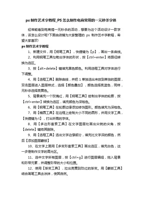
ps制作艺术字教程_PS怎么制作电商常用的一元秒杀字体
经常能看到电商搞一元秒杀的活动,想要为这个活动设计一款字体,该怎么设计呢?下面由店铺为大家整理的ps制作艺术字教程,希望大家喜欢!
ps制作艺术字教程
1、新建文件,用【钢笔工具】,快捷键为【p】,画出一条曲线。
2、利用钢笔工具勾勒出字体的形状,按【ctrl+enter】将路径转换为选区。
3、按【alt+delete】键填充黑色颜色。
利用选框工具对字体进行下调整。
4、用【选框工具】删除曲线,并把1单独选出来放到单独的图层,双击图层进入图层样式,选择【颜色叠加】,颜色选择亮蓝色,同样,元秒杀选择亮黄色。
5、背景填充一个玫瑰红,用【钢笔工具】绘制出字体的轮廓,按【ctrl+enter】转换为选区,填充颜色为深咖色。
6、用【钢笔工具】在轮廓边缘添加修饰图形。
颜色填充为深咖色。
7、用【椭圆工具】在边框上绘制大小不同的圆形,并用文字工具,【快捷键为t】,打出所需的字体。
8、用【多边形套索工具】在文字图层处画出尖锐的尖角,按【delete】键将其删除。
9、用【选框工具】选出文字边缘部分,填充比文字深的颜色,然后【添加图层蒙版】
10、在文字上面用【多变形套索工具】画出选区,填充白色,这一步是制作文字的高光区。
11、选中文字所有图层,按【ctrl+g】进行图层编组,拖入背景和彩带元素,并调整彩带的大小和位置。
12、使用【渐变工具】,拉出亮黄到玫红的渐变。
用【蒙版工具】结合画笔工具去涂抹,使其自然。
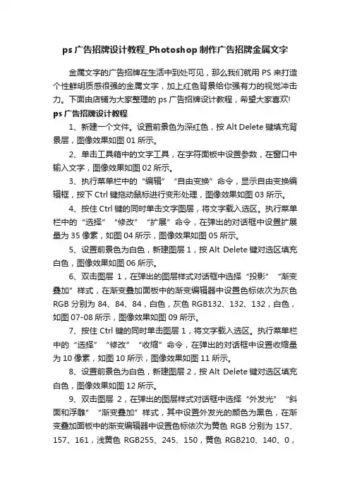
ps广告招牌设计教程_Photoshop制作广告招牌金属文字金属文字的广告招牌在生活中到处可见,那么我们就用PS来打造个性鲜明质感很强的金属文字,加上红色背景给你强有力的视觉冲击力。
下面由店铺为大家整理的ps广告招牌设计教程,希望大家喜欢! ps广告招牌设计教程1、新建一个文件。
设置前景色为深红色,按Alt Delete键填充背景层,图像效果如图01所示。
2、单击工具箱中的文字工具,在字符面板中设置参数,在窗口中输入文字,图像效果如图02所示。
3、执行菜单栏中的“编辑”“自由变换”命令,显示自由变换编辑框,按下Ctrl键拖动鼠标进行变形处理,图像效果如图03所示。
4、按住Ctrl键的同时单击文字图层,将文字载入选区。
执行菜单栏中的“选择”“修改”“扩展”命令,在弹出的对话框中设置扩展量为35像素,如图04所示,图像效果如图05所示。
5、设置前景色为白色,新建图层1,按Alt Delete键对选区填充白色,图像效果如图06所示。
6、双击图层1,在弹出的图层样式对话框中选择“投影”“渐变叠加”样式,在渐变叠加面板中的渐变编辑器中设置色标依次为灰色RGB分别为84、84、84,白色,灰色RGB132、132、132,白色,如图07-08所示,图像效果如图09所示。
7、按住Ctrl键的同时单击图层1,将文字载入选区。
执行菜单栏中的“选择”“修改”“收缩”命令,在弹出的对话框中设置收缩量为10像素,如图10所示,图像效果如图11所示。
8、设置前景色为白色,新建图层2,按Alt Delete键对选区填充白色,图像效果如图12所示。
9、双击图层2,在弹出的图层样式对话框中选择“外发光”“斜面和浮雕”“渐变叠加”样式,其中设置外发光的颜色为黑色,在渐变叠加面板中的渐变编辑器中设置色标依次为黄色RGB分别为157、157、161,浅黄色RGB255、245、150,黄色RGB210、140、0,浅黄色RGB255、245、150,黄色RGB210、140、0,如图13-15所示,图像效果如图16所示。
如何使用Photoshop设计创意字母Logo步骤一:准备工作1. 下载并安装Photoshop软件。
2. 打开软件,创建新的画布。
3. 设置画布大小、分辨率和背景颜色。
步骤二:选择字母1. 确定设计所需的字母。
2. 在字母形状的基础上进行创意改造,可以尝试变形、扭曲、旋转等操作,使字母具有独特的外观。
3. 确定字母的大小、比例和位置。
步骤三:颜色选择1. 选择适合设计的配色方案,可以使用Photoshop中的调色板或自定义颜色。
2. 确定字母的主要颜色和背景颜色,考虑到颜色的对比度和可读性。
步骤四:添加效果1. 使用文本工具在字母上添加文字效果,如阴影、描边、渐变等。
2. 尝试使用滤镜效果,如模糊、扭曲、光晕等,以增强字母的视觉效果。
3. 通过调整图层样式、混合模式和不透明度等属性,优化字母的外观。
步骤五:添加图形元素1. 在字母周围添加有趣的图形元素,如符号、图标、图案等,以增加设计的创意性。
2. 考虑图形元素和字母的相互关系,通过调整大小、位置和颜色等参数,使其相互融合。
步骤六:调整细节1. 对整体设计进行细致的调整,确保字母和图形元素之间的比例和协调性。
2. 优化颜色、光影和对比度等细节,以突出设计的特点和表现力。
步骤七:保存和输出1. 完成设计后,保存工作文件。
2. 根据需要选择适当的文件格式,如JPEG、PNG或PDF等,进行输出和分享。
总结:使用Photoshop设计创意字母Logo需要一定的专业知识和技能,但只要按照上述步骤进行,即可轻松完成一个独具创意的字母Logo设计。
记住,在设计过程中要保持灵感的启发,并尝试不同的效果和元素组合,以使设计更具个性和吸引力。
通过不断探索和练习,你将能够设计出令人印象深刻的字母Logo作品。

怎样用Photoshop制作艺术字?出处:多特软件站时间:2010-01-04 人气:83427我要提问我来说两句核心提示:教你怎样用ps制作艺术字,光芒字,爆炸字,ps制作艺术字等等。
相关下载:Adobe Photoshop CS5 Adobe Photoshop CS4 Adobe Photoshop CS3 AdobePhotoshop CS2皮革效果1。
新建-白色背景图像2。
杂色-添加杂色(150,高斯分布)3。
像素化-点状化(单元格大小:5)4。
模糊-高斯模糊(2)5。
纹理-染色玻璃(8,2,1)6。
风络化-浮雕效果(-50,2,20%)7。
色相饱和度(34,70,-19)PS制作石雕字1。
新建,输入文字。
2。
滤镜-模糊-高斯模糊(1.5)3。
风格化-浮雕效果(12,5,120)4。
色阶(0,1.66,255)PS制作黄金字1。
新建-图像,进入通道,新建通道2。
利用文字蒙版工具输入文字,白色填充。
3。
模糊-高斯模糊(2,5)4。
用透明彩虹渐变,从左上角到右下角拉一条直线5。
曲线调整为:上2下1上2下0.8最右上6。
全选-复制-进入图层面板-粘贴。
7。
调整-色彩平衡(暗调为:19,0,-92中间调为:7,0,-35高光为:19,0,-83)PS制作飞雪效果(一)1。
打开一幅图像,复制后放在新的一层。
2。
像素化-点状化(6)3。
图像-调整-阈值(200)4。
复制层的模式变为滤色5。
模糊-动感模糊(-45,13)PS制作磨皮用Photoshop修复照片教程,从美女到恐怖级别的蜕变过程,非常精彩,在网上找到原图,我们进行给她磨皮。
让她变得漂亮。
源图。
1。
打开原图。
2。
点击“快速蒙板”(双击)3。
出现这个对话框(根据需要选择颜色)4。
选择画笔工具,用画笔在脸部涂抹,要均匀。
5。
选择橡皮擦工具,擦掉皮肤以外的部分,包括眼睛等部位,实际制作要很仔细,可以把头发很精确的选出来。
6。
退出蒙板,这个时候刚刚画的就成了选区7。
教大家如何用ps做艺术字的绝招(How to teach you to use ps forart)How to teach you to use PS for artLight words1. Build a new 500 * 300 pixel black background2. Text mask, input text (I will write the colorful light), white fill, cancel the selection.3. Filter - contorted - polar coordinates (polar coordinates to plane coordinates)Image - rotate canvas - 90 degrees counterclockwise4. Filter - stylized - wind (from left) and twice (shortcut CTRL + F)Image - rotate the canvas - clockwise 90 degrees5. Filter - contorted polar coordinates (plane coordinates to polar coordinates)Create a new layer, mode: overlay.Gradient (reference: rainbow color)The explosion word1. The new. 280 * 170, resolution 72, mode RGB.2. Input text, (reference color is red), yellow size 200, official script, (strong symmetry text)3. Merge the text layer with the background layer.4. Duplicate the layer.5. Duplicate copy for current layer, filter - blur - gaussian radius is 2.5.6. Filter - stylized - overexposure7. Image-adjustments-auto color step, CTRL + A CTRL + C (duplicate layer)8. New layer, set opacity to 75%, mode is: stack.9. CTRL + V. Click on the background copy for the current layer.10. Filter - contorted polar coordinates (polar coordinates to plane coordinates)11. Image - rotate the canvas - 90 degrees clockwise12. Image-adjustments-anti-phase filter - stylized - wind (from left)13. CTRL + F (using three times), image-adjustments-automatic color order14. Image - adjustment - invert phase, filter - stylized - wind (from left)15... CTRL + F (twice)16. Image - rotation - 90 degrees counterclockwise, filter - contorted - polar coordinates (from plane coordinates to polar coordinates)17. Image-adjustments-hue saturation (coloring, 45,100,0)Pieces of wordsIt's probably the color...1. Background: white. Outlook: blue.2. The new. The resolution 72 model RGB.3. The text size is set, the font had better be the variety body word or the black body.4. The text layer is deleted. Switch to a normal layer.5. Duplicate the layer and make sure the text copy is the current layer.6. Edit - fill. Set to use black, blending mode is normal, opacity 100%, check to retain transparent area.7. Filter - variegated - add a variegated amount of 400, distribution: average monochrome.8. Filter - pixel - lattice cell size 309. Filter - stylized - illuminates edge width 1, edge brightness 20, smoothness 1.10. CTRL + A select all canvas areas, CTRL + C, CTRL + D.11. Establish channel Alpha1 (channel display is black)12. Image-adjustments-invert phase (display white)13. CTRL + V, CTRL + D.14. CTRL + click Alpha1.15. Select delete on Alpha1 right mouse.16. Delete the "text copy" from the layer.17. The text layer is the current layer, deltlt. CTRL + d18. Layer - effect - projection mode multiply. Fuzzy 5, intensity 0.19. Spell... OK!Explosive effect.1. Create a new 420 * 420 white background.2. Add color (15, average distribution, monochrome)Image - adjustment - threshold 220.3. Motion blur (90,400), adjustable - invert phase.4. New layer, linear gradient (white to black, up from top)Pattern: filter color. Merge layers.5. Contorted - polar coordinates (plane coordinates to polar coordinates)Change the canvas size (600 * 600)6. Radial blur (100, zoom)7. Hue saturation (color, 40, 60, 10)8. New layer, mode: color dodge.Clouds and layered clouds are used. Get the best results.9. Add color (9, gauss, variegated)10. OK.Time channel tunnel [/ size1. Create 200 * 10 pixels, and fold the background image.(2). Filter - variegated - add variegated (35, gaussian blur, monochrome)3. Adjustment - threshold (200)4. Change the image size (200 * 200)5. Duplicate the layer. Add a black background. Rotate the canvas 90 degrees clockwise on the replica layer to multiply the bottom.6. Closed layer (without background), adjustable - invert phase.7. Filter - warped - shear8. Layer rotation 90 degrees clockwise, filter - contorted - shear. (invariant Settings)9. Add mask, gradient (black to white), and overlay the middle of the image (the display is the radius of the sphere).10. Merge all layers. Filter - contorted polar coordinates (plane coordinates to polar coordinates)11. Adjust - hue saturation (coloring, 83,601) for reference only.12. OVER.Stone carving word1. New, input text.2. Filter - blur - gaussian blur (1.5)3. Wind - relief effect (12, 5, 120)4. Color order (0, 1.66, 255)The golden1. New - image, access channel, new channel2. Use the text mask tool to enter text, white fill.3. Blur - gaussian blur (2, 5)4. Using a transparent rainbow gradient, pull a straight line from the top left to the bottom right5. The curve is adjusted to: 2 down and 0.8 on the upper right6. Select - copy - go to the layer palette - paste.7. Adjust - color balance(dark tone: 19, 0, -92The middle is: 7, 0, -35Highlights: 19, 0, -83)Concave and convex word1. The new wide 8 high 5pdi72 model is grayscale2. New channel. Input text. Use (edit - stroke) white stroke 1 pixel. Outside. Opacity 50. Cancel selection.3. Filter - other - high contrast reservation with radius 1.Filter - sketch - photocopy (2, 15),Delete the original grey channel.4. Image - mode - grayscale (transfer mode)Image-mode - two-tone (three-tone) value setting1 color does not move the tone to change 0 to 12Let me do that in a color of 139 colors and I'm going to go from 0 to 30, so it's going to be 753 colors choose 397 tones to change 0 to 40 100 to 905. Image-mode - RGBFilter - render - lighting effect, set the value of the following style by default, full light source,Intensity: negative 1. 0 luminescent plastic effect 100 metal texture. 0. Excessive negative light. 18 positive slices red and white, 50 bumps6. Adjustment of the layer (reference value 65,50)Drop words(note: I saw it when I was doing a ghost site.)1. New construction, as shown in the figure, with a black width of 280 high 160 RGB model2. Create a new layer 1 and fill it with white.Enter text, red, 120 pixels.Combine text with a new layer (white)Image - rotate canvas - 90 degrees counterclockwise4. Filter - stylized - wind direction: from left CTRL + F (repeat)5. Image - rotate the canvas - 90 degrees clockwise6. Filter - sketch - seal value (22,2)7. Merge the two layers and remove the white background with magic wand tool. (or any other way.)8. Image - rotate canvas - 90 degrees counterclockwise9. Filter - wind - wind (from left)10. Filter - blur - gauss (radius 1.0)11. Image - rotate the canvas - 90 degrees clockwiseLiquid metal word1. The new. The background is white.2. Channel new Alpha1.3. Enter text. Official script.4. Filter - other - maximum radius 1.5. Right-click on Alpha1 to copy Alpha2.6. In Alpha2 for current, filter - blur - gaussian radius 4.0.7. Generate "Alpha2 copy" in Alpha2 right click replication8. Alpha2 copy is current, filter - other - displacement (horizontal, vertical to -2, undefined area: set to background)9. Alpha2 for current, filter - other - displacement (horizontal, vertical 2, undefined area: set to background)10. Image - calculation source 1: Alpha2 source 2: Alpha2 copy mixing: difference valueOpacity 100% result: new channel Alpha3.11. Alpha3 (default to Alpha2 can be changed to Alpha3) for the current, image-adjustments-invert phase.12. Image-adjustments-curve. 1024 output of 12013. Alpha1 for the current, select - load selection channel for Alpha1.14. Edit-stroke width 5 center opacity 100% mode: normal.15. Cancel the selection (CTRL + D). Alpha3 for current, select (CTRL + A), copy (CTRL + C)16. Click RGB channel for the current, and paste (CTRL + V).17. On the layer palette, layer 1 is the current layer.18. Select - load selection to select Alpha1. Select-inverse, Deltte, CTRL + D.19. Image-adjustments-hue saturation (coloring, adjusting hue 40, saturation 100, brightness 0) color is only for reference. You can mix it yourself.20. Layer - effects - projection, final merge layer.Stereoscopic word1. Create a new document, the size of self-determination, input text, color self-determination (with dark color) and delete the lattice;2. Create a text selection, create a new layer, and edit it. Stroke, color white, width 1, and move 2 to the right? 3 pixels;3. Preserve the text selection and create a new layer to edit. Stroke.Color is text color, width 1, and move 2 to the right? 3 pixels;4. Select the text layer, layer? Layer style?? Inclined plane relief, depth 440, size 7, glossy contour selection Ring; (customizable)5. Use the dodge tool to remove highlights from a certain part of the text;6. Complete.Transparent:1. New documents;2. New channel:3. Input text and move to RGB;4. New layer, edit -?? Fill?? Historical records.5. Layer? Layer style?? Inclined plane relief, parameter depth to right, size 3? 5.6, completeHalo beautification word:1. Create new files and press D to make the front and background colors default;2. Press T key to enter the text and the size is self-determined;3. Layer? Layer style?? Outer glow, color is white, mode is normal;4. Copy the text layer to the copy, double-click the copy layer style, and the outer glow color is set to: 255, 240 0; Extension: 14, size 27;5. Copy the text layer copy to copy 2, double-click the duplicate layer style, the outer glow color is white, expand: 10, the size is 9;6. New layer, layer mode is soft light, opacity 100%, edit?? Fill in the "use" drop-down menu to select 50% neutral grey;7. Filter? Sketch?? Semi-adjustable pattern, the parameters are: 1, 3;8. Complete.Metal stereotyping;1. The new background is black;2. The foreground is set to 50% neutral grey: 128,128,128, and input text;3. Layer style, set the figure;4. Select the selected text selection. Change?? Shrinkage, radius of text size self-determination;5. Create a new layer, pull a gradient from grey to black, and filter rendering?? Lighting effect, the top color is light grey, metal texture 100 %, choose the bottom pull down menu?? Layer 1 transparent area, add stereo effect to text;6. Filter? Noise?? Add variegated colors, number 15, gaussian distribution, monochrome;7. Complete."Melon deep shadow" layer above, executive editor - transform - flip vertical, move down to the shadow, load "melon deep shadow" constituency, choose delete, reduce the opacity to 12%, middle shadow is can't see the texture, with rubber polishing finishing.28. It's almost done. Observe the whole, then make some subtletreatment of the shadow, such as the shadow and the part of the bottom of the disk to be darker, and the backlit areas are more deeply. Finally, add a slight color to the background to foil the highlights.The picture text is a brush1. Open the image and duplicate the layer2. Hide the background layer, select the white part with the magic wand, and delete by DEL3. Select edit > to define brush4. Then select edit > preset managerMetal stereotyping;1. The new background is black;2. The foreground is set to 50% neutral grey: 128,128,128, and input text;3. Layer style, set the figure;4. Select the selected text selection. Change?? Shrinkage, radius of text size self-determination;5. Create a new layer, pull a gradient from grey to black, and filter rendering?? Light effect, the top color is light grey,。
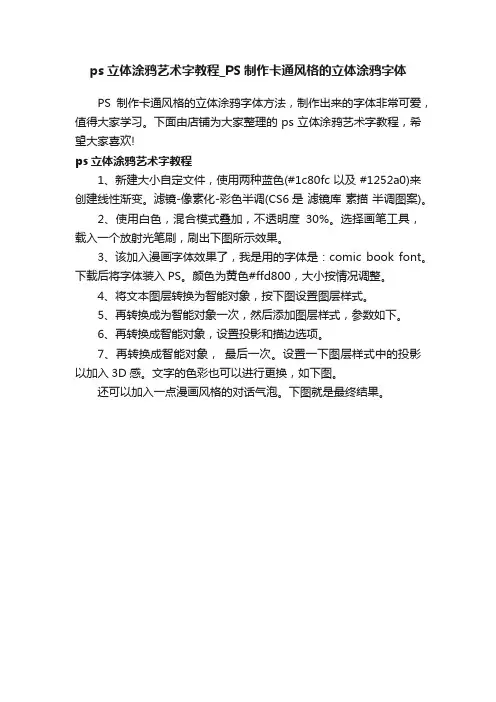
ps立体涂鸦艺术字教程_PS制作卡通风格的立体涂鸦字体
PS制作卡通风格的立体涂鸦字体方法,制作出来的字体非常可爱,值得大家学习。
下面由店铺为大家整理的ps立体涂鸦艺术字教程,希望大家喜欢!
ps立体涂鸦艺术字教程
1、新建大小自定文件,使用两种蓝色(#1c80fc 以及 #1252a0)来创建线性渐变。
滤镜-像素化-彩色半调(CS6是滤镜库素描半调图案)。
2、使用白色,混合模式叠加,不透明度30%。
选择画笔工具,载入一个放射光笔刷,刷出下图所示效果。
3、该加入漫画字体效果了,我是用的字体是:comic book font。
下载后将字体装入PS。
颜色为黄色#ffd800,大小按情况调整。
4、将文本图层转换为智能对象,按下图设置图层样式。
5、再转换成为智能对象一次,然后添加图层样式,参数如下。
6、再转换成智能对象,设置投影和描边选项。
7、再转换成智能对象,最后一次。
设置一下图层样式中的投影以加入3D感。
文字的色彩也可以进行更换,如下图。
还可以加入一点漫画风格的对话气泡。
下图就是最终结果。
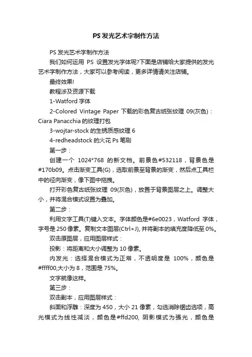
PS发光艺术字制作方法PS发光艺术字制作方法我们如何运用PS设置发光字体呢?下面是店铺给大家提供的发光艺术字制作方法,大家可以参考阅读,更多详情请关注店铺。
最终效果!教程涉及资源下载1-Watford字体2-Colored Vintage Paper下载的彩色复古纸张纹理09(灰色):Ciara Panacchia的纹理打包3-wojtar-stock的生锈质感纹理64-redheadstock的火花Ps笔刷第一步:创建一个1024*768的新文档。
前景色#532118,背景色是#170b09。
点击渐变工具(G),选取前景至背景的渐变,然后点工具栏中的径向渐变,像下图中拖拽。
打开彩色复古纸张纹理09(灰色),放置于背景图层之上。
调整大小,并将混合模式设置为叠加。
第二步:利用文字工具(T)键入文本。
字体颜色是#6e0023,Watford字体,字号是250像素。
复制文本图层(Ctrl+J), 并将副本的填充度降低至0%。
双击原图层,应用图层样式:投影:将距离和大小调整为10像素。
内发光:选择混合模式为正常,不透明度是100%,颜色是#ffff00,大小为8,范围是75%。
文字就像这样。
第三步:双击副本,应用图层样式:斜面和浮雕:深度为450,大小21像素,勾选消除锯齿选项,高光模式为线性减淡,颜色是#ffd200, 阴影模式为强光,颜色是#9c2323。
等高线:仅勾选消除锯齿。
两个图层应用图层样式后,文字大概是这种效果。
第四步:在顶层新建一个图层,命名为“纹理”。
按住Ctrl键,当出现“点击图层”的图标样式时选择。
前景色设置为#f8f400,背景色设置为#6e0023。
用前景色填充,然后执行“选择——取消选择(Ctrl+D)”。
第五步:我们接下来要用滤镜做一个简单的纹理。
这个纹理是我们一会儿要用到的基础。
像如下执行滤镜步骤:滤镜——素描——网状。
滤镜——艺术效果——彩色铅笔。
滤镜——扭曲——海洋波纹。
ps拓印艺术字教程_ps怎么设计拓印字体效果
拓印字就是从其他的什么器物上拓印下来的文字效果,该怎么设计这个效果呢?下面由店铺为大家整理的ps拓印艺术字教程,希望大家喜欢!
ps拓印艺术字教程
1、首先新建一个文档,大小自己看着设置,不过建议最好是一个高度大于宽度数值的文档。
背景色为白色。
如下图:
2、然后我们在新建的文档上打上字,用直排文字工具,可以找到工具栏中的“T”点击设置,也可以直接Shift+T切换。
打好字之后还上自己喜欢的字体,最好用比较复古一些的字体,我这里用的是小篆。
如下图:
3、打完字之后,点击图层下的小工具新建一个图层1,填充黑色。
4、选中文字层,键盘按住CTRL键鼠标单击文字层形成文字层的选区,然后点击新建的黑色图层1按键盘上的Delete键,之后删除原来的文字层。
如下图:
5、接下来打开通道,点击通道下面的新建通道,新建一个Alpha 1通道。
如下图:
6、建好Alpha 1通道之后,请在菜单栏找到滤镜——渲染——云彩点击。
如下图:
7、之后继续打开菜单栏上的滤镜,进入滤镜库,找到“纹理”这个文件夹,打开文件夹找到“龟裂缝”之后调设龟裂缝的数值,如下图:
8、调整完成龟裂缝之后,回到新建的通道,找到魔棒工具,在工作区点击,务必要将能点上的工作区全部点上,可以按住Shift键再点击。
如下图:
9、确认能点击的都点击完成之后,回到图层点击图层1,按键盘的CTRL+Shift+I反选选区,然后Delete。
至此大功告成。
如下图:
10、最终效果。
ps制作文字logoPS制作文字logo是一种非常有趣和具有挑战性的设计工作。
文字logo是公司或品牌的标志,它需要通过设计来展现出品牌的特色和形象。
在PS软件中,我们可以通过各种工具和效果来制作出独特的文字logo,让它更加吸引人和具有辨识度。
首先,在PS软件中打开一个新的文件,选择合适的画布大小和分辨率。
然后,选择文字工具,在画布上输入品牌的名称或标语。
选择合适的字体和大小,让文字看起来清晰、易读,并且符合品牌的形象。
接下来,可以通过调整字体的颜色和样式,让文字更加突出和个性化。
在文字logo的制作过程中,可以利用PS软件中丰富的滤镜和效果来增加设计的创意和趣味性。
比如可以使用阴影效果、发光效果、渐变效果等,让文字看起来更加立体和生动。
同时,还可以添加一些图案或图标作为文字logo的装饰,让整体设计更加丰富多彩。
另外,文字logo的排版和布局也是非常重要的。
在PS软件中,可以通过调整文字的位置和间距,让整体布局更加协调和美观。
同时,还可以利用对齐工具和参考线来保持文字的水平和垂直对齐,让整体设计更加专业和精致。
在文字logo的制作过程中,需要不断地尝试和调整,直到达到理想的效果为止。
可以多尝试一些不同的效果和风格,看看哪种设计更符合品牌的形象和要求。
同时,也可以参考一些优秀的文字logo设计作品,吸取一些设计灵感和经验。
总的来说,PS制作文字logo是一项非常有趣和具有挑战性的设计工作。
通过丰富的工具和效果,可以制作出独特、个性化的文字logo,让品牌更加突出和具有辨识度。
希望大家在设计文字logo 的过程中,能够不断地尝试和创新,制作出更加优秀的作品。
如何使用Photoshop设计创意招牌和广告牌怎样使用Photoshop设计创意招牌和广告牌Photoshop是一款功能强大的图像处理软件,广泛用于设计领域。
在设计创意招牌和广告牌时,Photoshop的多种工具和功能可以帮助我们实现各种效果和样式。
下面将介绍一些使用Photoshop设计创意招牌和广告牌的技巧。
1. 创建新画布:打开Photoshop后,点击“文件”菜单,选择“新建”创建一个新画布。
可以根据实际需要设置画布的尺寸和分辨率。
2. 导入背景图片:点击“文件”菜单,选择“导入”-“文件”,选择一张合适的背景图片并导入到画布中。
可以使用自己拍摄的照片或者从网上下载的图片作为背景,确保图片清晰并符合设计主题。
3. 添加文字:点击工具栏上的“文字工具”,在画布上点击鼠标并拖动,创建一个适当大小的文本框。
在文本框内输入要显示的文字,并根据需要调整字体、大小和颜色。
可以尝试使用不同的字体和颜色来营造不同的风格和效果。
4. 图层样式:为了增加文字的可读性和吸引力,可以对文字图层应用一些图层样式。
选择文字图层,在图层面板中点击“图层样式”按钮,选择合适的效果,如描边、阴影、渐变等。
可以根据具体需求调整样式参数,使文字更突出和引人注目。
5. 添加图片:除了文字,还可以添加图片元素来增加视觉效果。
点击工具栏上的“矩形选框工具”或“椭圆选框工具”,在画布上创建一个选区。
然后点击“文件”菜单,选择“导入”-“文件”,将要使用的图片导入到选区中。
在图层面板中,调整图片图层的位置和大小,以及透明度和混合模式等属性,使其与背景和文字融合自然。
6. 调整色彩和对比度:通过调整色彩和对比度可以增强图像的效果和吸引力。
点击菜单栏中的“图像”-“调整”-“亮度/对比度”或“色相/饱和度”,根据个人喜好和设计要求调整相应参数。
可以使图像色彩更鲜艳,对比度更强烈,以及改变图片的色调和饱和度等。
7. 添加特效和滤镜:Photoshop提供了各种特效和滤镜,可以给招牌和广告牌增加一些独特的视觉效果。
ps怎么做艺术字效果
ps是一种功能非常广泛的软件,因此制作艺术字效果也在其范畴之内,以下就由店铺告诉大家ps怎么做艺术字效果,希望对大家有帮助!
用ps做艺术字效果的步骤
01打开ps软件,点击文件,新建一个文档。
大小随意,不能太小。
02然后看到右边图层下面,有一个类似锁一样的图标。
03左手按住Alt键不放,右手用鼠标双击锁,解锁。
04在左边工具栏中,有"T"状的工具。
这是用来输入文字的,点击,然后再在文本上输入文字。
如:PS怎么做立体艺术字。
05接着看到右上方有一个3D的特效,点击。
06屏幕变成下图时,就可以通过鼠标在文字图层的箭头提示下,调整字体的立体效果。
07调整好了之后,点击“z”,就可以退出3D模式了。
漂亮的立体艺术字就做好了。
以上是店铺与大家分享的ps怎么做艺术字效果,希望能给大家带来帮助!。
Photoshop(PS)设计制作具有流淌效果的艺术字实例教
程
本教程主要使⽤Photoshop制作纸质风格的流淌艺术字,教程只要是把贴在地上的纸质字体边缘部分调成流淌效果,喜欢的朋友让我们⼀起来学习吧。
我们先来看看最终的效果图:
临摹原图:
具体的制作步骤如下:
那本书就不去理会它了,我找了⼀张⽜⽪纸的素材
先做⼀个浅浅的渐变
以图中的⾓度填充
新建⼀层,⽤矩形选框拉⼀个矩形,设置⼀个渐变⾊
填充
CTRL+T调整⾓度,由于透视的原理,右边应该会窄⼀点点
输⼊⼀个⽂本
在该图层上右键转成现状图层
CTRL+T调整透视⾓度,忘记ps中⾃带的透视吧,真的不⼤好⽤
⽤钢笔减去⼀部分
⽤矩形⼯具叠加
合并
添加⼀个模板,把下⾯多余的部分遮盖掉
细节是重点
完成。
photoshopcs6艺术字体
刚刚学习PS,photoshopcs6艺术字体还不懂操作,怎么办,下面店铺就告诉大家解决photoshopcs6艺术字体的方法,仅供大家参考!
设置photoshopcs6艺术字体的方法
执行:文件——新建,新建一个500*200像素的文档,将背景色设置为深灰色,使用Alt+Delete键的将前景色填充到背景上;
选择工具栏中的横排文字工具,在图形上输入所需的文字内容,将文字的颜色填充为红色,并将文字大小调整至合适大小;
选中文字图层,使用Ctrl+T键,在弹出可编辑边框后,将设置水平缩放的值该为99%(也可以根据自己的需要来该,改变的数值越小,图越精细),修改完成后双击回车键;
按住键盘的上的Alt+Shift+Ctrl键的同时,点击T键,重复上一步的水平缩放命令并复制图层(点击次数越多立体效果就越明显);
选中背景上的文字图层将该图层移动至所有图层的顶部,然后,将除了刚刚移动的文字层和背景层外的图层合并;
选中原始的文字图层,点击图层面板中的图层样式按钮,选择混合选项按钮,设置斜面浮雕、内发光、渐变叠加、图案叠加、外发光、投影的参数(具体设置参数在下面的图片中有),完成本例效果的制作;
以上是小编为大家解答的photoshopcs6艺术字体,希望对大家有帮助!。
PS制作艺术字LOGO方法教程
在很多非正式场合我们常常使用艺术字来增添文档,幻灯片等色彩,那么制作艺术字好用的软件大家应该都想到ps,具体怎么设计和制作艺术字logo呢,下面给大家分享使用PS制作艺术字LOGO 的操作教程。
具体步骤如下:
1、新建一个画布,大小自己随意,这里准备设置为桌面,所以设置的参数为1366*768
2、接着填充背景颜色,设置颜色值为#ededed
3、然后在图层上输入自己想要的文字,选择适当的字体样式,然后对文字进行栅格化处理
4、然后我们将需要改变的部分用选区工具选取,然后删除,之后用钢笔工具描绘出自己喜欢的造型。
5、接着继续修改字体,以达到最终效果。
如图所示:
6、然后我们在为字体添加色彩,设置渐变叠加,参数为108度,设置颜色#ea9c2d到#fdfa9f的渐变
7、这样我们就可以得到如下效果:
8、将背景以外的所有图层进行合并,然后按下键盘的【CTRL+J】进行复制,并且添加图层样式
补充:ps工具箱常用快捷键技巧
矩形、椭圆选框工具【M】
移动工具【V】
套索、多边形套索、磁性套索【L】
魔棒工具【W】
裁剪工具【C】
切片工具、切片选择工具【K】
喷枪工具【J】
画笔工具、铅笔工具【B】
像皮图章、图案图章【S】
历史画笔工具、艺术历史画笔【Y】
像皮擦、背景擦除、魔术像皮擦【E】
渐变工具、油漆桶工具【G】
模糊、锐化、涂抹工具【R】
减淡、加深、海棉工具【O】
路径选择工具、直接选取工具【A】
文字工具【T】
钢笔、自由钢笔【P】
矩形、圆边矩形、椭圆、多边形、直线【U】
写字板、声音注释【N】
吸管、颜色取样器、度量工具【I】
抓手工具【H】
缩放工具【Z】
默认前景色和背景色【D】
切换前景色和背景色【X】
切换标准模式和快速蒙板模式【Q】
标准屏幕模式、带有菜单栏的全屏模式、全屏模式【F】
跳到ImageReady3.0中【Ctrl】+【Shift】+【M】
临时使用移动工具【Ctrl】
临时使用吸色工具【Alt】
临时使用抓手工具【空格】
快速输入工具选项(当前工具选项面板中至少有一个可调节数字) 【0】至【9】
循环选择画笔【[】或【]】
建立新渐变(在”渐变编辑器”中) 【Ctrl】+【N】
相关阅读:ps入门实用技巧
第一项:图片的移动
ctrl+滚轮页面左右移动。
shift+滚轮页面上下翻页。
alt+滚轮页面缩小放大。
空格+左键页面自由移动。
空格+右键页面快速变为100%的实际大小和适应屏幕的全图
观看视角(也可以ctrl+小键盘的0和1,来控制)
第二项:图层操作
Actrl+j 快速复制选中的图层。
ctrl+e 合并选中图层。
ctrl+shift+e 合并可见图层。
ctrl+shift+alt+e 盖印图层(即:合并选中图层的以下层级所有可见图层,然后成为新的独立图层。
而被合并的图层仍旧保留。
)。
ctrl+alt+e 将选中的图层,其内的像素内容复制到底部紧邻的一个图层上。
紧邻的图层需要可见。