雅思图表写作讲义
- 格式:docx
- 大小:67.99 KB
- 文档页数:16


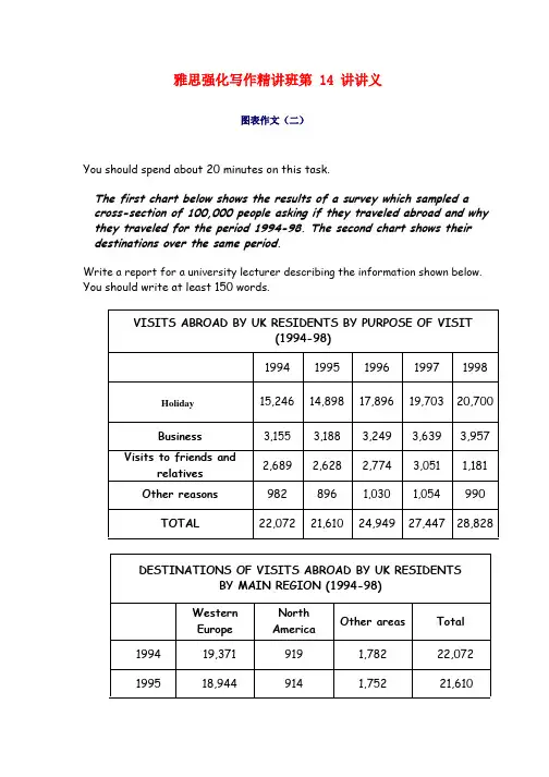
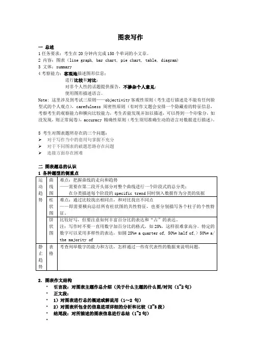
雅思强化写作精讲班第 14 讲讲义图表作文(二)You should spend about 20 minutes on this task.The first chart below shows the results of a survey which sampled a cross-section of 100,000 people asking if they traveled abroad and why they traveled for the period 1994-98. The second chart shows their destinations over the same period.Write a report for a university lecturer describing the information shown below. You should write at least 150 words.199621,8771,1671,90524,949199723,6611,5592,22727,447199824,5191,8232,48628,828You should spend about 20 minutes on this task.The graph below shows the number of people at a London underground station from 6:00 to 22:00.Write a report for a university lecturer describing the information shown below.You should write at least 150 words.Sample Essay 2The line graph illustrates the data about people at a London subway station from 6am to 10pm.As we can see from the line graph, the number of people using this station fluctuates over these 16 hours. More specifically, at first, at 6am the number of people at the station stands at only 100. Then, the number shoots up over the next two hours, peaking at 400 at 8am. After that, the number declines rapidly for two hours, bottoming out at 180 at 10am. The period between 10 o’clock and 12 o’clock experiences a slight growth in thenumber of people in the station, with the number reaching 280 at midday. Numbers in the following two hours level off at just under 300 people. From this point onwards, the number plunges to only 100 from 2pm to 4pm. The next two hours experiences a sharp rise again, with 6 pm arriving at 380 people. After 6pm,the number falls again, reaching the lowest point of 130 at 8pm. The period from 8pm to 10pm sees a slight rise, but finally the number of people declines again from 180 at 9pm to 135 at 10pm.Therefore, it can be clearly seen from the line graph that the most people use the subway station during the rush hours in the early morning and the early evening.图表题的规律表示“分别”的副词respectivelyIn the 2004 Olympics, China and Chile won X and Y gold medals, respectively.表示“大约”的副词或者词组about ,around , approximately , roughly , just over , just underThe graph below shows radio and television audiences throughout the day in 1992. Write a report for a university lecturer describing the information shown below. You should write at least 150 words.Radio and television audiences in the UK, October – December 1992Sample Essay 3The line graph indicates the data of radio and TV audiences in 24 hours ( 6am to 6am the next day) in 1992.As can be seen from the line graph, there was a slight rise in the number of audiences from around 3% at 6am to about 7% at 8am. Then, from 8am to noon, it remained stable. After that, the number of audiences rose sharply until 8pm, peaking at just over 40%. From this point onwards, the number declined fast to around 4% at 6am the next morning.from 6am( 4%) to 8 am, reaching the highest point at 30%. Then, in the next 22 hours, the number decreased gradually, with a slight rise from 4 pm to 5pm and around 11pm.Therefore, it can be clearly seen from the line graph that before 2pm, the number of people who listened tothe radio was larger than the number of people watching TV. After that, more UK residents chose to watchTV instead of listening to the radio. Overall, in these 24 hours, the TV audiences were larger than the radio audiences.The diagram below shows how The Australian Bureau of Meteorology Y collects up-to-the-minute information on the weather in order to produce reliable forecasts.You should write at least 150 words.The diagram shows in four stages how the Australian Bureau of Meterlogy gets its weather information.In the first stage there is the “incoming information”. Raw data is collected from outer space, on land, or at sea, using satellite, radar, and drifting buoy respectively. Next, this data is analyzed and forecasted by experts. At this stage experts study satellite photos, radar screens, and synoptic charts to determine weather conditions. Stage three of the process is when the information is prepared for broadcast. This is done through computer which sends all necessary data to the fourth stage. At this point the weather data is broadcasted to the general public via TV, radio and telephone (recorded announcement).Thus, the process diagram shows how weather data is collected, studied, prepared, and finally broadcast.。

雅思强化写作精讲班第 14 讲讲义图表作文(二)You should spend about 20 minutes on this task.The first chart below shows the results of a survey which sampled a cross-section of 100,000 people asking if they traveled abroad and why they traveled for the period 1994-98. The second chart shows their destinations over the same period.Write a report for a university lecturer describing the information shown below. You should write at least 150 words.199621,8771,1671,90524,949199723,6611,5592,22727,447199824,5191,8232,48628,828You should spend about 20 minutes on this task.The graph below shows the number of people at a London underground station from 6:00 to 22:00.Write a report for a university lecturer describing the information shown below.You should write at least 150 words.Sample Essay 2The line graph illustrates the data about people at a London subway station from 6am to 10pm.As we can see from the line graph, the number of people using this station fluctuates over these 16 hours. More specifically, at first, at 6am the number of people at the station stands at only 100. Then, the number shoots up over the next two hours, peaking at 400 at 8am. After that, the number declines rapidly for two hours, bottoming out at 180 at 10am. The period between 10 o’clock and 12 o’clock experiences a slight growth in thenumber of people in the station, with the number reaching 280 at midday. Numbers in the following two hours level off at just under 300 people. From this point onwards, the number plunges to only 100 from 2pm to 4pm. The next two hours experiences a sharp rise again, with 6 pm arriving at 380 people. After 6pm,the number falls again, reaching the lowest point of 130 at 8pm. The period from 8pm to 10pm sees a slight rise, but finally the number of people declines again from 180 at 9pm to 135 at 10pm.Therefore, it can be clearly seen from the line graph that the most people use the subway station during the rush hours in the early morning and the early evening.图表题的规律表示“分别”的副词respectivelyIn the 2004 Olympics, China and Chile won X and Y gold medals, respectively.表示“大约”的副词或者词组about ,around , approximately , roughly , just over , just underThe graph below shows radio and television audiences throughout the day in 1992. Write a report for a university lecturer describing the information shown below. You should write at least 150 words.Radio and television audiences in the UK, October – December 1992Sample Essay 3The line graph indicates the data of radio and TV audiences in 24 hours ( 6am to 6am the next day) in 1992.As can be seen from the line graph, there was a slight rise in the number of audiences from around 3% at 6am to about 7% at 8am. Then, from 8am to noon, it remained stable. After that, the number of audiences rose sharply until 8pm, peaking at just over 40%. From this point onwards, the number declined fast to around 4% at 6am the next morning.from 6am( 4%) to 8 am, reaching the highest point at 30%. Then, in the next 22 hours, the number decreased gradually, with a slight rise from 4 pm to 5pm and around 11pm.Therefore, it can be clearly seen from the line graph that before 2pm, the number of people who listened tothe radio was larger than the number of people watching TV. After that, more UK residents chose to watchTV instead of listening to the radio. Overall, in these 24 hours, the TV audiences were larger than the radio audiences.The diagram below shows how The Australian Bureau of Meteorology Y collects up-to-the-minute information on the weather in order to produce reliable forecasts.You should write at least 150 words.The diagram shows in four stages how the Australian Bureau of Meterlogy gets its weather information.In the first stage there is the “incoming information”. Raw data is collected from outer space, on land, or at sea, using satellite, radar, and drifting buoy respectively. Next, this data is analyzed and forecasted by experts. At this stage experts study satellite photos, radar screens, and synoptic charts to determine weather conditions. Stage three of the process is when the information is prepared for broadcast. This is done through computer which sends all necessary data to the fourth stage. At this point the weather data is broadcasted to the general public via TV, radio and telephone (recorded announcement).Thus, the process diagram shows how weather data is collected, studied, prepared, and finally broadcast.。
图表写作一总述1任务要求:考生在20分钟内完成150个单词的小文章。
2 内容:图表(line graph, bar chart, pie chart, table, diagram)3 文体:summary4考察能力:客观地描述图形信息;进行比较和对比;对非个人性的话题提供报告,不掺杂个人意见;使用图形描述语言。
Note: 这里涉及到考试三原则——objectivity客观性原则(考生进行描述是不能有任何脸型式的个人观点),carefulness 周密性原则(有时作文题会安排一个隐藏着的特征信息,考察考生的观察能力和横向比较能力,考生若能发现并加以描述,可以得到一个印象分,如没发现,则正常阅卷),accuracy 精确性原则(考生须用准确生动的语言对数据进行描述)。
5 考生对图表题所存在的三个问题:➢对于写作当中的套用句掌握不充分➢对于不同图表的破题思路存在问题➢连接方面存在困难二图表题总的认识2.图表作文结构•引言段:对图表主题作总介绍(关于什么主题的什么图/时间(1~2句)•正文段:•1)对图表进行总的概述或解说用(1~2 句)•2)对图表所包含的信息进项详细的分析和比较(2~3段)•结尾段:对所描述的图表信息进行总结(1~2句)•三、图表题写作 1.审题:• -先看文字信息-把握主题 • -再看图标信息-把握具体信息 • Eg.p28• 横坐标:时间1950-1996(时态?) • 纵坐标:数据(单位?)• 图表标题:world grain harvested area,1950-19962.Introduction 写作通过改写题目(同义词转换,句式结构改変,增减细节)完成引言段写作 • Eg.请改写P28的题目• 比较原题与改写后的introduction 有什么不同之处:• The graph below shows the area of land from which grain was harvested. • This line graph above illustrates the total world grain harvested areas inmillions of hectares between 1950 and 1996. • 同义词转换:show- illustrate ,reveal ,depict, demonstrate, compare, give someinformation about …,• 句式转换:the total grain harvested areas• 增加细节:in millions of hectares , between 1950 and 1996注意:为避免plagiarism,一定要对题目进行改头换面。
雅思小作文图表题主体段讲义1. Before writing – planning1.1 What to write – content1.1.1. Summarize Features, not list data•a1, a2, a3, … , an•Trend•Max / Min•Slope1.1.2. Comparisons within the chart or between the charts1.1.3. Select Main Features (recreates the picture in the examiner’s mind)1.1.4. Supporting Data1.1.5. Report facts, not opinions1.2 How to write – structure1.2.1. How to Paragraph?•New idea, new paragraph•Introduction – Main body -- Conclusion (if needed)1.2.2. Paragraphs•Multiple Charts/graphsIntroductionChart 1Chart 2…Comparison•Single Chart/graphIntroductionFeature 1Feature 2…Conclusion (if needed)2. Writing例题1. 剑四p100You should spend about 20 minutes on this task.The chats below gave information about travel to and from The UK, and about the most popular countries for UK residents to visit.Summarise the information by selecting and reporting the main features, and make comparisons where relevant.Write at least 150 words.Planning – structure:Introduction – graph 1(line graph) – graph 2(bar chart) – comparison 2.1. Introduction (paragraph 1)2.1.1. words⏹chart = graph = diagram (注意单复数)•line, curve•bar, column•pietable = figures = statistics⏹give information about (时态:一般现在时,是否是三单)•reveal•indicate•demonstrate•show⏹the UK = Britain⏹popular•favorite / fashionable / stylish⏹UK residents to visit•UK travelers / visitors / tourists⏹(Time)•in 19992.1.2. sentence structure⏹Passive Voice•The chart shows A. (do)• A is shown by the chart. (be done)E.g. The line chart reveals visits to and from the UK.Visits to and from the UK are revealed in the line chart.⏹Compound SentenceE.g. The line chart reveals …, and the bar graph indicates …The line chart reveals …, and …are indicated in the bar graph.2.1.3. sample writingThe line chart reveals visits to and from Britain and UK travelers’top 5 favorite nations in 1999 are indicated in the bar graph.2.2. Main body2.2.1. Linking devices⏹Between paragraphs•According to the chart,line chartupper / lower chartchart 1chart of visits to and from the UK⏹Between Features•also / besides / in addition (用在句首) / and / as well as / while (用在句中) •but / however / conversely / on the contrary / (用在句首) /•in particular / particularly / to be more exact2.2.2 Sentence structure⏹Basic Structure 1The visits increased greatly from about 12 to 57 million from 1979 to 1999.(1) (2) (3) (4) (5)(1) Subjects•SynonymsUK visitors / travelers / tourists•it / theyThe visits increased from 1979 to 1999. In particular, they increased most quickly from 1985 to 1988.(2) Verbs (注意时态)•increase: decrease / rise : fall•go up: come down•climb: slide•ascend: decline•rocket: collapse•keep / remain unchanged / constant / stable• fluctuate•double / triple / quadruple•is expected / predicted to increase (未来预测)(3) Adverbs•sharply / rapidly / swiftly•slowly / gradually / tardily•greatly / vastly / considerably•slightly / marginally / minutely(4) Numbers•about / around / roughly / more or less•from about 12 to 53 million(5) Time•from 1979 to 1999•between 1979 and 1999during the 20 years / two decadesstarting from 1979⏹Basic Structure 2 (there be 句型)There was a sharp increase in the visits from about 12 to 53 million from 1979(3) (2) (1) (4) (5)to 1999.⏹Basic Structure 3 (名词做主语)A sharp increase was seen in the visits from about 12 to 53 million from(3) (2) (6) (1) (4)1979 to 1999.(5)(3)(2) noun subject (adj+n)• a sharp / slow / great / slight increase•an upward / rising / increasing tendency• a downward / falling / decreasing trend(6) verb (被动语态)•show / prove / witness (was shown/ was proved/ was witnessed)(2) 名词主语•decline/fall/drop/decrease•increase/riseGraph 1Sample writing:•According to the line chart, both UK tourists abroad and overseas ones to the UK went up from 1979 to 1999 and the former climbed more markedly than the latter. In 1979, UK visitors were only around 2 million more than their overseas counterparts, being approximately 12 and 10 million respectively. However, two decades later, they almost doubled the foreign travelers to Britain (roughly 53 and 27 million separately). Graph 2Sample writing:•The bar graph demonstrates that France and Spain were the favorite countries for UK tourists in 1999, which attracted around 11.0 and 9.5 million UK visitors respectively. Remotely following were the USA, Greece and Turkey with 4.0, 3.5 and 2.0 million travelers separately.2.3 结尾段: Comparison•What is also worth mentioning is that France and Spain alone accounted for almost 40 percent of UK tourists abroad in 1999, if the two diagrams are considered as a whole.3. After writing – check3.1 spelling大小写、标点符号3.2 grammatical mistakes主谓一致(三单)动词:时态、语态名词:单复数。

雅思图表作文:一.图表的种类(表格,柱状图,线形图,饼状图,流程图,地图等)二.解题思路:开头段改写题目,正文段学会分组,结尾段学会总结。
(一定要与不要)三.学员问题:分组问题,时态问题,常备词汇,短语记不住,不会用。
四.常备词汇五.写什么?:起点(最高值),终点(最低值),拐点,交点,变化趋势,总数(末段)第一类:表格题目:剑桥7, Test 1 Writing Task 1You should spend about 20 minutes on this task.The table below gives information on consumer spending on different items in five different countries in 2002.Summarise the information by selecting and reporting the main features, and make comparisons where relevant.Write at least 150 words.Percentage of national consumer expenditure by category-2002参考范文:The table gives the breakdown about data on consumer spending on various items (Food/Drink/Tobacco, Clothing/Footwear and Leisure/Education) in five different countries (Ireland, Italy, Spain, Sweden and Turkey) in 2002.Generally, each country consumed much more in food/drink/tobacco where Turkey dominated the first place with 32.14%, standing in marked contrast with Sweden (only 15.77%) than in other 2 categories. In terms of Clothing/Footwear, Italy expectedly spent most with 9% compared with still Sweden seeing the smallest proportion (5.4%). As for Leisure/Education, it was Turkey and Spain that consumed the most and least with 4.35% and 1.98% respectively.Additionally, we can see immediately that in food/drink/tobacco, after Turkey, Ireland,Spain and Italy came in turn with 28.91%, 18.80% and 16.36%. On the contrary, in Clothing/Footwear, we failed to see big gap from Ireland, Spain and Turkey in middle positions which saw different reductions of 2.57%, 2.49% and 2.37% in comparison with Italy, likewise, in Leisure/Education, still small differences were found. To be exact, Turkey was followed by Sweden, Italy and Ireland in a slow falling turn with 3.22%, 3.2% and 2.21%.In conclusion, people prefer to spend on those products directly relating to food. (189 words)Writing Task 1You should spend about 20 minutes on this task.The table below summarises some data collected by a college bookshop for the month of February 1998.Write a report describing the sales figures of various types of publications, based on the information shown in the table.Write at least 150 words.参考范文:The table describes some sales figures gathered by a university bookstore for February, 1998.We can see from the table that the non-book club member figures are made up of sales to college staff, college students and members of the public. More specifically, college staff bought 332 magazines, 44 fiction and 29 non-fiction books while college students bought 1249 magazines, 194 non-fiction books and 31 fiction books. More magazines were sold to college students than any other group of customers. In contrast, although no fiction books were sold to members of the public, they bought 122 non-fiction books and 82 magazines.According to the table,book club members bought more fiction (76) and non-fictionbooks (942) than other customers. On the other hand, magazine sales to club members (33) were fewer than to any other type of customers.The total number of sales for the month was 3134 (1474 to college students, 405 to staff,204 to the public and 1051 to book club members). 151 books sold were fiction and1287 were non-fiction. Therefore, it can be clearly seen from the table that magazines accounted for the greatest number of sales (1696).(192 words)使用括弧的注意事项:后面不加单位。
雅思图表写作讲义内部编号:(YUUT-TBBY-MMUT-URRUY-UOOY-DBUYI-0128)图表写作一总述1任务要求:考生在20分钟内完成150个单词的小文章。
2 内容:图表(line graph, bar chart, pie chart, table, diagram)3 文体:summary4考察能力:客观地描述图形信息;进行比较和对比;对非个人性的话题提供报告,不掺杂个人意见;使用图形描述语言。
Note: 这里涉及到考试三原则——objectivity客观性原则(考生进行描述是不能有任何脸型式的个人观点),carefulness 周密性原则(有时作文题会安排一个隐藏着的特征信息,考察考生的观察能力和横向比较能力,考生若能发现并加以描述,可以得到一个印象分,如没发现,则正常阅卷),accuracy 精确性原则(考生须用准确生动的语言对数据进行描述)。
5 考生对图表题所存在的三个问题:对于写作当中的套用句掌握不充分对于不同图表的破题思路存在问题连接方面存在困难二图表题总的认识1 各种题型的侧重点运动趋曲线图难点:把握曲线的走向和趋势——需要在第二段开头部分对整个曲线进行一个阶段式的总分类;2.图表作文结构•引言段:对图表主题作总介绍(关于什么主题的什么图/时间(1~2句)•正文段:•1)对图表进行总的概述或解说用(1~2 句)•2)对图表所包含的信息进项详细的分析和比较(2~3段)•结尾段:对所描述的图表信息进行总结(1~2句)三、图表题写作1.审题:•-先看文字信息-把握主题•-再看图标信息-把握具体信息••横坐标:时间1950-1996(时态)•纵坐标:数据(单位)•图表标题:world grain harvested area,1950-1996写作通过改写题目(同义词转换,句式结构改変,增减细节)完成引言段写作•Eg.请改写P28的题目•比较原题与改写后的introduction 有什么不同之处:•The graph below shows the area of land from which grain was harvested.•This line graph above illustrates the total world grain harvested areas in millions of hectares between 1950 and 1996.•同义词转换:show- illustrate,reveal,depict, demonstrate, compare, give some information about…,•句式转换:the total grain harvested areas•增加细节:in millions of hectares , between 1950 and 1996注意:为避免plagiarism,一定要对题目进行改头换面。
Eg.1) The two pie charts show the proportion of males and females inemployment in 6 broad categories. 更换词语The two pie charts give the proportion of men and women employed in6 broad areas.2)The two pie charts show the proportion of males and females in employment in 6 broad categories. 更换句式结构•The two pie charts show, in 6 broad categories, the proportion of males and females in employment.图表作文开头段落常见语言结构:练习:1.请为P30的线状图写引言段。
参考:The graph shows the number of West Indians and Indians and Pakistanis immigrating to the UK from 1940 to 1970.2.请为以下的复合图写引言段。
People arrested over the past 5 years参考答案:•The pie charts and the bar chart respectively present the proportion of males and females arrested over the past five years and some significant reasons why they were arrested in 2007. 或•The pie charts compare the proportion of males and females arrested over the past five years and the bar chart illustratessome significant reasons in2007.3.主体段落写作1)对图表的特点或趋势进行总的概述或解说(1~2 句)2)对图表所包含的信息进项详细的分析和比较(2~3段)1)对图表的特点或趋势进行总的概述或解说-general statement即概述图表写作的最大特点或总趋势线状图的总趋势In general, the total harvest area increased until 1980, at which point there was a reduction in the area harvested due to retrenchment. P30 两条线的总趋势/总特点As can be seen, immigration of both West Indians and Indians and Pakistanis increased rapidly over a twenty-year period. After 1960, the number of West Indian immigrants decreased sharply whereas the number of Indian and Pakistani immigrants continued to increase.练习请为以下复合图写作总概述People arrested over the past 5 years参考According to the graph, more males than females were arrested and thief became the most common reason of arrest in 2007.引出总概述的语言•As can be seen, the most striking feature is …•As is shown/depicted in the table, the most obvious feature is …•From the graph, we can see clearly that…•From the chart, it is apparent that…•According to the graph,•Generally speaking,•It is noted that…•Overall,…2)对图表所包含的信息进项详细的分析和比较(2~3段)2.1 趋势图(线状图):解题思路:按时间发展顺序写作;语言点:四个方向的语言点-运动范畴,程度范畴,时间范畴,数据范畴与连接范畴.运动范畴中存在着如下的8种运动趋向:1.保持平稳:我们可以使用的套用结构有: stay stable/remain steady.举例:表示人口数量保持平稳的时候可以写: the number of population stayed stable。
/the number of population remained steady.2.上升/增加:我们可以使用的套用结构有:rise/ climb/ increase/ascend/mount/aggrandize(增加)举例:人口上升:the number of population increased/ascended/mounted等等。
3.下降/减少:我们可以使用的套用结构有:fall/ drop/ decrease/ descend/ decline举例:人口减少:the number of population decreased/ declined.4..波动:这个就像我们的心电图一样。
英语中叫fluctuate.举例:人口波动:number of population fluctuated.5.达到顶峰:peak/ reach its summit/reach its zenith举例:人口到达了顶峰:number of population peaked/ reached its summit/ reached its zenith.程度范畴:、缓慢的/轻微的:gradually/ smoothly/ steadily/slightly/moderately/slowly陡然的/大幅度的:dramatically/ sharply/ considerably/ appreciably/ greatly/ steeply/ significantly/ markedly/rapidly/quickly/ suddenly/举例:1.人口大幅度攀升:number of population mounted dramatically.2.人口轻微下降:number of population decreased slightly.3.人口逐渐下降:number of population decreased gradually.1)上升/下降后面使用to(到)和by(了)举例:1. 人口下降到200万: number of population decreased to 2 million.2. 人口下降了200万: number of population decreased by 2 million.3. 人口上升到1000万: number of population increased to 10 million.4. 人口上升了500万: number of population increased by 5 million.2). remain steady/ stay stable/ level off/ bottom out/ peak/reach its peak/ reach its zenith后面需要使用的是at.举例: 1.人口在500万上保持平稳:number of population remained steady at 5 million.1. 人口在800万时到达了顶峰:number of population peaked at 8 million.2. 下降后,人口在400万保持平稳:after decreasing, number of population bottomed out at 4 million.3. 上升后,人口在700万保持平稳: after mounting, number of population leveled off at 7 million.3)fluctuate的后面大家需要连接between …..and…..举例: 人口在2和100亿之间波动:number of population fluctuated between 2 and 10 billion.(那俩人是ADAM和EVE)练习:请描述一下线状图1950 1960 1965 1975 1985 1995 2005参考答案:The number of tourists increased greatly during the first 10 years from 1950 to 1960, reaching its peak at 100 in 1960. After an initial drop, the tourist numbers had kept steady at around 100 for 10 years between 1965 and 1975. It is noted that the following 30-year period saw an overall upward trend with some fluctuations.常用4大句型:1)sth + verb+程度+数据+时间。