chart
- 格式:docx
- 大小:14.26 KB
- 文档页数:5
博学笃行 自强不息
1
chart
Chart
Introduction:
In today's data-driven world, charts have become an
indispensable tool for visualizing and presenting information.
From business analysts to educators and researchers,
everyone relies on charts to communicate complex data in a
clear and concise manner. This document aims to provide an
in-depth understanding of charts, their types, and their
significance in various fields.
Section 1: What is a Chart?
A chart is a graphical representation of data, often depicted
in the form of bars, lines, or other symbols. It presents data in
a visually appealing manner, making it easier for viewers to
grasp trends and patterns. Charts are commonly used in
presentations, reports, and dashboards to provide an
overview of data or to support key points. They play a crucial
role in data analysis and decision-making processes.
博学笃行 自强不息
2
Section 2: Types of Charts
2.1 Bar Charts:
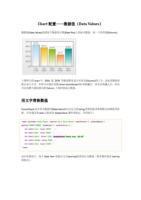
Bar charts are one of the most common chart types used to
compare values across different categories. They consist of
horizontal or vertical bars, with the length or height
representing the data values. Bar charts are effective in
demonstrating data comparisons, such as sales performance
by product category or population distribution by age group.
2.2 Line Charts:
Line charts are used to represent data changes over time.
They consist of data points connected by lines, thereby
illustrating trends and patterns. Line charts are widely used in
financial analysis, stock market tracking, and weather
forecasting. They enable analysts to identify trends, predict
future outcomes, and make informed decisions.
2.3 Pie Charts:
博学笃行 自强不息
3
Pie charts are circular charts divided into sectors, each
representing a portion of the whole. They are used to
showcase proportions and percentages. Pie charts work best
when comparing a few categories or when the data set adds
up to 100%. They are commonly used in market research,
budget allocation, and demographic analysis.
2.4 Scatter Plots:
Scatter plots are useful for identifying relationships between
two variables. They consist of dots plotted on a graph, with
the x-axis representing one variable and the y-axis
representing another. Scatter plots help establish correlations
and identify outliers, making them valuable in scientific
research, forecasting, and trend analysis.
2.5 Area Charts:
Area charts are similar to line charts but filled with color or
shading. They are used to visualize cumulative data, often
showing how categories contribute to a whole over time.
Area charts are commonly used in statistics, economics, and
project management. They effectively communicate
cumulative data trends and patterns. 博学笃行 自强不息
4
Section 3: Importance of Charts
3.1 Data Visualization:
Charts play a vital role in data visualization by transforming
complex data sets into concise and understandable visuals.
They make data more approachable and enable effective
decision-making.
3.2 Communication and Presentation:
Charts simplify data interpretation and enhance
communication between stakeholders. They provide a
comprehensive overview and make it easier for the audience
to understand and retain information.
3.3 Analytics and Insights:
Charts facilitate data analysis by highlighting trends, outliers,
and patterns. They allow analysts to uncover insights,
discover correlations, and make data-driven decisions. 博学笃行 自强不息
5
3.4 Decision-making:
Charts aid in decision-making processes by presenting data
in a format that is easy to comprehend. They provide a visual
context that supports problem-solving and strategic planning.
Conclusion:
Charts are an essential tool in visualizing and presenting data.
They simplify complex information, facilitate data analysis,
enhance communication, and aid in decision-making
processes. With a wide range of chart types available,
individuals and businesses can effectively present their data
and convey key insights. Understanding the various chart
types and their applications is crucial for professionals in
diverse fields. Embracing the power of charts can significantly
improve data analysis and communication, leading to
informed decisions and better outcomes.