雅思小作文混合图表
- 格式:pptx
- 大小:2.04 MB
- 文档页数:32
雅思写作小作文范文雅思写作混合图温度与降水今天我们雅思写作小作文范文的文章来研究下雅思写作混合图。
该图表为柱状图和折线图的组合。
其中柱状图展示了某个城市一月到十二月的降水量,折线图展示了在此期间温度的变化。
两者的趋势并不完全一致。
小编搜集了一篇相应的范文,大家参考下考官是如何选取数据并进行比较的。
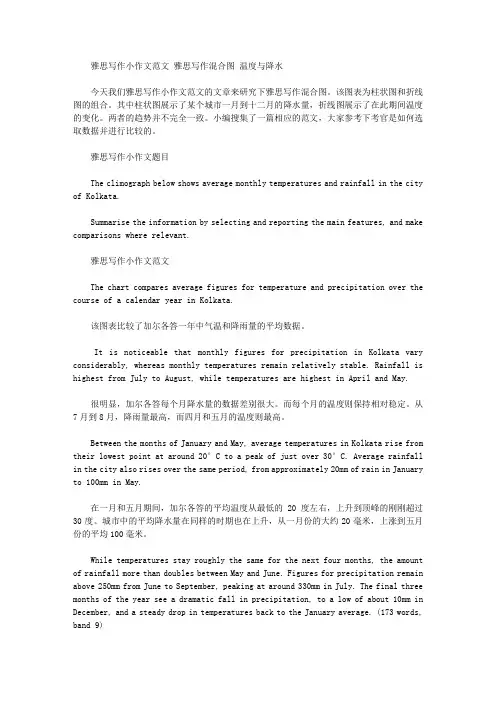
雅思写作小作文题目The climograph below shows average monthly temperatures and rainfall in the city of Kolkata.Summarise the information by selecting and reporting the main features, and make comparisons where relevant.雅思写作小作文范文The chart compares average figures for temperature and precipitation over the course of a calendar year in Kolkata.该图表比较了加尔各答一年中气温和降雨量的平均数据。
It is noticeable that monthly figures for precipitation in Kolkata vary considerably, whereas monthly temperatures remain relatively stable. Rainfall is highest from July to August, while temperatures are highest in April and May.很明显,加尔各答每个月降水量的数据差别很大。
而每个月的温度则保持相对稳定。
从7月到8月,降雨量最高,而四月和五月的温度则最高。
Between the months of January and May, average temperatures in Kolkata rise from their lowest point at around 20°C to a peak of just over 30°C. Average rainfall in the city also rises over the same period, from approximately 20mm of rain in January to 100mm in May.在一月和五月期间,加尔各答的平均温度从最低的20度左右,上升到顶峰的刚刚超过30度。

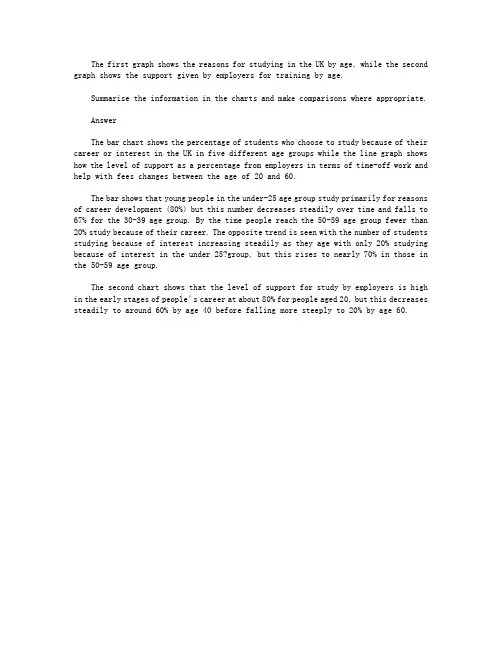
The first graph shows the reasons for studying in the UK by age, while the second graph shows the support given by employers for training by age.Summarise the information in the charts and make comparisons where appropriate.AnswerThe bar chart shows the percentage of students who choose to study because of their career or interest in the UK in five different age groups while the line graph shows how the level of support as a percentage from employers in terms of time-off work and help with fees changes between the age of 20 and 60.The bar shows that young people in the under-25 age group study primarily for reasons of career development (80%) but this number decreases steadily over time and falls to 67% for the 30-39 age group. By the time people reach the 50-59 age group fewer than 20% study because of their career. The opposite trend is seen with the number of students studying because of interest increasing steadily as they age with only 20% studying because of interest in the under 25?group, but this rises to nearly 70% in those in the 50-59 age group.The second chart shows that the level of support for study by employers is high in the early stages of people’s career at about 80% for people aged 20, but this decreases steadily to around 60% by age 40 before falling more steeply to 20% by age 60.。

雅思小作文(图表题)题型归纳一.t able 表格题1.剑2 (1)4.剑5(4)6.剑7(1)二.Line graph线图(含直线和曲线图)1.剑3(4)You should spend about 20 minutes on this task.The graph below shows the unemployment rates in the US and Japanbetween March 1993 and March 1999.Write a report for a university lecturer describing the information shownbelow.You should write at least 150 words.You should spend about 20 minutes on this task.The graph below shows the proportion of the population aged 65 and overbetween 1940 and 2040 in three different countries.Summarize the information by selecting and reporting the main features,and make comparisons where relevant.Write at least 150 words.You should spend about 20 minutes on this task.The graph below shows the consumption of fish and some different kinds of meatin a European country between 1979-2004.Summarize the information by selecting and reporting the main features, andmake comparisons where relevant.Write at least 150 words.You should spend about 20 minutes on this task.The graph below shows the quantities of goods transported in the UK between 1974 and 2002 by four different modes of transport.Summarize the information by selecting and reporting the main features, and make comparisons where relevant.Write at least 150 words.5.剑9(4)三.Bar chart 柱状图You should spend about 20 minutes on this task.The chart below shows the amount of leisure time enjoyed by men and women of different employment status.Write a report for a university lecturer describing the information shown below.Write at least 150 words.Leisure time in a typical week: by sex and employment status,1998-99You should spend about 20 minutes on this task.The table below shows the figures for imprisonment in five countries between 1930 and 1980.Write a report for a university lecturer describing the information shown below.You should write at least 150 words.You should spend about 20 minutes on this task.The chart below shows the amount spent on six consumer goods in fourEuropean countries.Write a report for a university lecturer describing the information shown below. You should write at least 150 words.You should spend about 20 minutes on this task.The charts below show the level of participation in education and sciencein developing and industrialized countries in 1980 and 1990Write a report for a university lecturer describing the information shown below. You should write at least 150 words.5.剑4(3)You should spend about 20 minutes on this task.The chart below shows the different levels of post-school qualifications inAustralia and the proportion of men and women who held them in 1999.Summarize the information by selecting and reporting the main features,and make comparisons where relevant.You should write at least 150 words.You should spend about 20 minutes on this task.The charts below show the main reasons for study among students ofdifferent age groups and the amount of support they received from employers.Summarize the information by selecting and reporting the main features,and make comparisons where relevant.You should write at least 150 words.You should spend about 20 minutes on this task.The charts below give information about USA marriages and divorce ratesbetween 1970 and 2000, and the marital status of adult Americans in twoof the years.Summarize the information by selecting and reporting the main features,and make comparisons where relevant.You should write at least 150 words.You should spend about 20 minutes on this task.The chart below shows information about changes in average house prices in fivedifferent cities between 1990 and 2002 compared with the average house prices in 1989.Summarize the information by selecting and reporting the main features, and makecomparisons where relevant.You should write at least 150 words.四.Pie chart饼图1.剑7(4)2.剑8(2)3.剑9(3)五.流程图1.剑1(2)You should spend about 20 minutes on this task.The diagrams below show the life cycle of the silkworm and the stages inthe production of silk cloth.Summarize the information by selecting and reporting the main features,and make comparisons where relevant.Write at least 150 words.六.混合图。

雅思英语图表作文范文第1篇A类雅思各类图表作文要点及范文一.曲线图解题关键1曲线图和柱状图都是动态图,解题的切入点在于描述趋势。
2在第二段的开头部分对整个曲线进行一个阶段式的总分类,使写作层次清晰,同时也方便考官阅卷。
接下来再分类描述每个阶段的specifictrend,同时导入数据作为分类的依据。
3趋势说明。
即,对曲线的连续变化进行说明,如上升、下降、波动、持平。
以时间为比较基础的应抓住“变化”:上升、下降、或是波动。
题中对两个或两个以上的变量进行描述时应在此基础上进行比较,如变量多于两个应进行分类或有侧重的比较。
4极点说明。
即对图表中最高的、最低的点单独进行说明。
不以时间为比较基础的应注意对极点的描述。
5交点说明。
即对图表当中多根曲线的交点进行对比说明。
6不要不做任何说明就机械地导入数据,这不符合雅思的考试目的。
曲线图常用词汇动词—九大运动趋势一:表示向上:increase,rise,improve,grow,ascend,mount,aggrandize,goup,climb, take off, jump,shoot up暴涨,soar,rocket, skyrocket雅思英语图表作文范文第2篇It is said that countries are becoming similar to each other because of the global spread of the same products, which are now available for purchase almost anywhere. I strongly believe that this modern development is largely detrimental to culture and traditions worldwide.A country’s history, language and ethos are all inextricably bound up in its manufactured artefacts. If the relentless advance of international brands into every corner of the world continues, these bland packages might one day completely oust the traditional objects of a nation, which would be a loss of richness and diversity in the world, as well as the sad disappearance of t he manifestations of a place’s character. What would a Japanese tea ceremony be without its specially crafted teapot, or a Fijian kava ritual without its bowl made from a certain type of tree bark?Let us not forget either that traditional products, whether these be medicines, cosmetics, toy, clothes, utensils or food, provide employment for local people. The spread of multinational products can often bring in its wake a loss of jobs, as people urn to buying the new brand,perhaps thinking it more glamorous than the one they are used to. This eventually puts old-school craftspeople out of work.Finally, tourism numbers may also be affected, as travelers become disillusioned with finding every place just the same as the one they visited previously. To see the same products in shops the world over is boring, and does not impel visitors to open their wallets in the same way that trinkets or souvenirs unique to the particular area too.Some may argue that all people are entitled to have access to the same products, but I say that local objects suit local conditions best, and that faceless uniformity worldwide is an unwelcome and dreary prospect.Heres my full answer:The line graphs show the average monthly amount that parents in Britain spent on their children’s s porting activities and the number of British children who took part in three different sports from 2008 to is clear that parents spent more money each year on their children’s participation in sports over the six-year period. In terms of the number of children taking part, football was significantly more popular than athletics and 2008, British parents spent an average of around £20 per month on their children’s sporting activities. Parents’ spending on children’s sports increased gradually over the followi ng six years, and by 2014 the average monthly amount had risen to just over £ at participation numbers, in 2008 approximately 8 million British children played football, while only 2 million children were enrolled in swimming clubs and less than 1 million practised athletics. The figures for football participation remained relatively stable over the following 6 years. By contrast, participation in swimming almost doubled, to nearly 4 million children, and there was a near fivefold increase in the number of children doing athletics.剑桥雅思6test1大作文范文,剑桥雅思6test1大作文task2高分范文+真题答案实感。
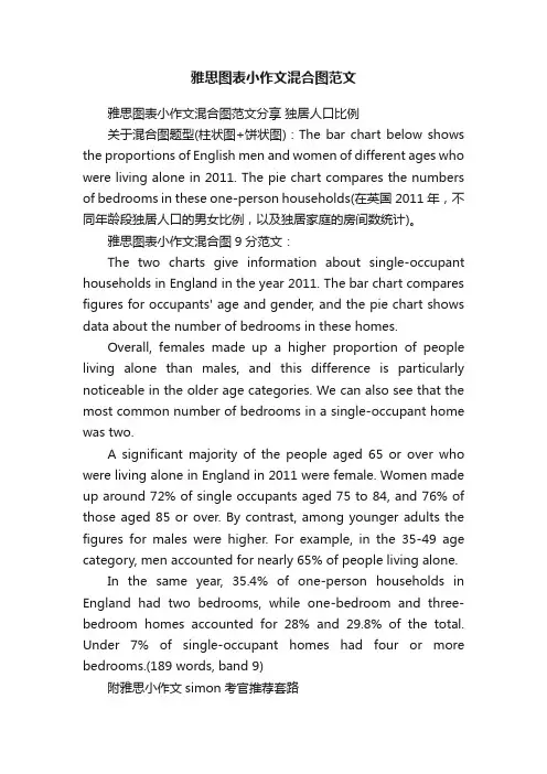
雅思图表小作文混合图范文雅思图表小作文混合图范文分享独居人口比例关于混合图题型(柱状图+饼状图):The bar chart below shows the proportions of English men and women of different ages who were living alone in 2011. The pie chart compares the numbers of bedrooms in these one-person households(在英国2011年,不同年龄段独居人口的男女比例,以及独居家庭的房间数统计)。
雅思图表小作文混合图9分范文:The two charts give information about single-occupant households in England in the year 2011. The bar chart compares figures for occupants' age and gender, and the pie chart shows data about the number of bedrooms in these homes.Overall, females made up a higher proportion of people living alone than males, and this difference is particularly noticeable in the older age categories. We can also see that the most common number of bedrooms in a single-occupant home was two.A significant majority of the people aged 65 or over who were living alone in England in 2011 were female. Women made up around 72% of single occupants aged 75 to 84, and 76% of those aged 85 or over. By contrast, among younger adults the figures for males were higher. For example, in the 35-49 age category, men accounted for nearly 65% of people living alone.In the same year, 35.4% of one-person households in England had two bedrooms, while one-bedroom and three-bedroom homes accounted for 28% and 29.8% of the total. Under 7% of single-occupant homes had four or more bedrooms.(189 words, band 9)附雅思小作文simon考官推荐套路For the task 1 report, I aim for 9 sentences.这是他所擅长的图表作文4段9句大法,具体结构如下:1.Introduction: 1 sentence,Introduction段落,1句话介绍图表大意足矣2.Overview (summary): 2 sentences,Overview段,用2句话做图表信息的摘要3.First 'details' paragraph: 3 sentences4.Second 'details' paragraph: 3 sentences。

雅思写作小作文范文雅思写作混合图国际移民今天我们雅思写作小作文范文的文章来研究下混合图。
该图表由两条折线和一些柱状图构成,涵盖从1999年到2008年这10年的时间。
其中最上方的折线表示每年移居到英国的人口数量。
第二条折线表示每年离开英国的人口数量。
柱状图则表示每年的净人口流入量,即流入量减去流出量的差值。
小编搜集了一篇相关的考官范文,以供大家参考。
雅思写作小作文题目雅思写作小作文范文The chart gives information about UK immigration, emigration and net migration between 1999 and 2008.该图表给出了英国在1999年和2008年期间移民进来,移民出去以及净移民人口的相关数据。
Both immigration and emigration rates rose over the period shown, but the figures for immigration were significantly higher. Net migration peaked in 2004 and 2007.移民进入英国和移民离开英国的数字在上述时间段都有所增长。
但移民进来的人数要明显更高一些。
净流入人口在2004年和2007年达到顶峰。
In 1999, over 450,000 people came to live in the UK, while the number of people who emigrated stood at just under 300,000. The figure for net migration was around 160,000, and it remained at a similar level until 2003. From 1999 to 2004, the immigration rate rose by nearly 150,000 people, but there was a much smaller rise in emigration. Net migration peaked at almost 250,000 people in 2004.1999年,超过450000的人来到英国,而选择离开英国的人数还不到300000。

英语考试作文9分雅思图表写作范文全集之混合图篇英国移民9分雅思图表小作文范文全集之混合图题型:英国移民The chart below shows long-term international migration in UK.范文集结:全部9篇9分雅思写作混合图范文汇总放送真题传送门:2017全年雅思写作真题范文大汇总(第一时间更新)范文:The chart gives information about UK immigration, emigration and net migration between 1999 and 2008.Both immigration and emigration rates rose over the period shown, but the figures for immigration were significantly higher. Net migration peaked in 2004 and 2007.In 1999, over 450,000 people came to live in the UK, while the number of people who emigrated stood at just under 300,000. The figure for net migration was around 160,000, andit remained at a similar level until 2003. From 1999 to 2004, the immigration rate rose by nearly 150,000 people, but there was a much smaller rise in emigration. Net migration peaked at almost 250,000 people in 2004.After 2004, the rate of immigration remained high, but the number of people emigrating fluctuated. Emigration fell suddenly in 2007, before peaking at about 420,000 people in 2008. As a result, the net migration figure rose to around 240,000 in 2007, but fell back to around 160,000 in 2008.(159)。
雅思小作文流程图类题目范文及解析雅思小作文流程图类题目范文及解析,一起来学习一下吧,下面就和大家分享,来欣赏一下吧。
雅思小作文流程图类题目范文及解析雅思小作文流程图类题目范文及解析为大家带来雅思小作文当中一类较有难度的图表——流程图类的小作文的范文以及解析。
流程图顾名思义就是对某一有时间和步骤先后顺序的行为进行步骤的拆解,并配上相应的文字和解说而生成的图表。
我们在处理流程图类图表作文是应该怎么写,请看下文。
上图来自网络主题:家居设计题型:流程图The diagrams below show some principles of house design for cool and for warm climates.满分范文:The diagrams show how house designs differ according to climate.这些图表显示房子的设计因气候而不同。
The most noticeable difference between houses designed for cool and warm climates is in the shape of the roof. The designs also differ with regard to the windows and the use of insulation.为凉爽和温暖气候设计的房子之间最明显的区别是屋顶的形状。
在窗户和保温材料的使用方面,设计也有所不同。
We can see that the cool climate house has a high-angled roof, which allows sunlight to enter through the window. By contrast, the roof of the warm climate house has a peak in the middle and roof overhangs to shade the windows. Insulation and thermal building materials are used in cool climates to reduce heat loss, whereas insulation and reflective materials are used to keep the heat out in warm climates.我们可以看到凉爽的气候房子有一个高角度的屋顶,它允许阳光通过窗户进入。
雅思小作文TASK1图表题规律注意事项:1.Task1是客观写作,要求客观真实。
2.客观性:不应该有任何图里没有而靠自己主观想象加入的成分。
结尾段针对图形做出的总结性结论也应该是根据图表的实际内容做出的符合逻辑的总结。
准确性:图表里面的数据介绍要力求精确,不能抄错数字。
但当一个特征点没有落在一个准确的坐标值上时,允许进行合理的目测或估计一个大概数值。
详尽性:要有层次感,并不需要把所有的数字都推到文章里。
3.类型Table表格题LineGraph线图BarChart柱状图PieChart饼状图ProcessChart流程图4.看图要注意单位,标题和图例。
5.对于多数小作文题,题中给出了几个图就对应的写出几个主体段。
题目里只给出一个图,根据图中包含几类图形元素写几个主体段。
图中只给了一个图,但图中所含图形元素很多,则分类。
题目中出现多线多柱多饼,用“对应提取法“,把每组里的对应元素提出来组织主体段。
6.时态和发生时间意义对应。
陈述永恒事实的句型,其主句的谓语动词必定用一般现在时。
若题目里没有出现时间,则全文都使用一般现在时。
7.结构开头段(1~2句)改写原题主体段1总体概括具体介绍数字主体段N总体概括具体介绍数字结尾段(1~2句)介绍总数(若图里并没有明确的给出总数,则省略)结论(根据图里的数据得出有一定合理性的结论)8.开头段的改写题目中改写成Show illustrate /compareProportion percentageInformation dataThe number/amount of the figure forFamily householdMales menFemale womenInfluence affect/effectCategories kinds/typesSubway system underground railway/train systemStore shop9.介绍数据或描述变化趋势的常用词。
组合图是雅思小作文里常考的题型之一,其写作非常值得我们深入研究。
现专供一组合图(组合图+饼图或pie chart + line chart)写作范例和各位“雅友”一起分享,期望对大家的组合图写作带去一些启发和帮助。
不过,在鉴赏前还是请各位先看图表,并思考以下问题:* 饼图和曲线图各自展示了什么数据在哪个时间点或段的变化特征?* 在饼图中,数据总值为多少?它由几部分组成?每一部分各代表什么?各自所占百分比又是多少?百分比从大到小如何排列的?谁最大?谁最小?* 曲线图有何特征?根据特征,曲线可以分成几段来描述?起点值、终点值、峰值、谷值多少?各自对应的时间点又是什么?WRITING TASK 1:雅思口语考试最新评分标准雅思考试小作文—图表作文逻辑分析雅思流程图作文—你不知道的秘密雅思写作流程图的注意事项如何在20分钟内写出不低于6分的雅思小作文雅思流程图作文的注意事项雅思零基础三个月创6分奇迹You should spend about 20 minutes on this task.* The chart and graph below give information about sales and share prices for Coca-Cola.* Summarise the information by selecting and reporting the main features, and make parisons where relevant.You should write at least 150 words.写作范文:The pie chart shows the worldwide distribution of sales of Coca-Cola in the year 2000 and the graph shows the change in share prices between 1996 and 2001.In the year 2000, Coca-Cola sold a total of 17.1 billion cases of their fizzy drink product worldwide. The largest consumer was North America, where 30.4 per cent of the total volume was purchased. The second largest consumer was Latin America. Europe and Asia purchased 20.5 and 真的不掉线吗??、????????????16.4 per cent of the total volume respectively, while Africa and the Middle East remained fairly small consumers at 7 per cent of the total volume of sales.Since 1996, share prices for Coca-Cola have fluctuated. In that year, shares were valued at approximately $35. Between 1996 and 1997, however, prices rose significantly to $70 per share. They dipped a little in mid-1997 and then peaked at $80 per share in mid-98. From then until 2000 their value fell consistently but there was a slight rise in mid-2000.真的不掉线吗??、????????????文言文临场翻译的技巧及七大误区临场翻译的技巧古文翻译是对古汉语知识的综合能力的训练。
雅思小作文范文-混合图Information about food budget on restaurants, and the change number of fast food and restaurant meals.思路:1. 分段原则为:饼图一段,折线一段。
2. 切记:千万不要试图把两个不同图表的数据联系起来,因为它们本身就无关。
3. 由于图形信息过多,注意只描述关键数据(Max, Min, 交点)。
答案:A set of pie charts below give the information about the change of food budget on restaurants and home cooking, and the two lines are concerned with the growth in the number of both fast food and restaurant meals, in the period between 1970 and 2000.The first trend in pie charts is that the past 3 decades saw a soar in the percentage of food budget on restaurant meals. At the beginning of 1970, the number was only 10%, it then rose dramatically to 15% by 1980 and 35% by 1990, which was triple the original proportion. In the last 10 years, it kept a straight increase and went up to 50% by 2000, reaching the same level of Home cooking. The growing trend is also showed in the annual number of meals of fast food and sit-down restaurant. Specifically, in 1970, they had the same number at 20. During the first period from 1970 to 1980, both of them rose and the number of sit-down restaurant meals improved faster. Since 1980, however, there emerged a reversed pattern. The data about fast food began to rocket while the number of meals consumed in restaurants slowed down, and the year 1985 saw fast food overriding sit-down restaurant. After the final 10-year sharp rise, the number of fast food ended up peaking at over 90, almost twice of that of sit-down restaurants.(231)The graph and table below give information about water use worldwide and water consumption in two different countries.答案:The charts compare the amount of water used for agriculture, industry and homes around the world, and water use in Brazil and the Democratic Republic of Congo.It is clear that global water needs rose significantly between 1900 and 2000, and that agriculture accounted for the largest proportion of water used. We can also see that water consumption was considerably higher in Brazil than in the Congo.In 1900, around 500km3of water was used by the agriculture sector worldwide. The figures for industrial and domestic water consumption stood at around one fifth of that amount. By 2000, global water use for agriculture had increased to around 3000km3, industrial water use had risen to just under half that amount, and domestic consumption had reached approximately 500km3.In the year 2000, the populations of Brazil and the Congo were 176 million and 5.2 million respectively. Water consumption per person in Brazil, at 359m3, was much higher than that in the Congo, at only 8m3, and this could be explained by the fact that Brazil had 265 times more irrigated land.(179words, band 9) The climograph below shows average monthly temperatures and rainfall in the city of Kolkata.答案:The chart compares average figures for temperature and precipitation over the course of a calendar year in Kolkata.It is noticeable that monthly figures for precipitation in Kolkata vary considerably, whereas monthly temperatures remain relatively stable. Rainfall is highest from July to August, whiletemperatures are highest in April and May.Between the months of January and May, average temperatures in Kolkata rise from their lowest point at around 20°C to a peak of just over 30°C. Average rainfall in the city also rises over the same period, from approximately 20mm of rain in January to 100mm in May.While temperatures stay roughly the same for the next four months, the amount of rainfall more than doubles between May and June. Figures for precipitation remain above 250mm from June to September, peaking at around 330mm in July. The final three months of the year see a dramatic fall in precipitation, to a low of about 10mm in December, and a steady drop in temperatures back to the January average.(173 words, band 9)4. 饼+柱状+折线The information of a flu epidemic.思路:1. 分段原则:每个图形分为一段。
雅思写作小作文范文雅思写作混合图独居的人今天我们雅思写作小作文范文的相关文章来研究下混合图。
所谓混合图,即雅思写作task 1的题目中出现两种图形,包括但不限于饼图、柱状图、表格等,需要大家进行比较和描述。
这种题目和一般的题目其实并没有什么差别,只是看着比较唬人罢了。
小编找了一篇考官范文,以供大家参考其具体写法和数据的选取。
雅思写作小作文题目The bar chart below shows the proportions of English men and women of different ages who were living alone in 2011. The pie chart compares the numbers of bedrooms in these one-person households.Summarise the information by selecting and reporting the main features, and make comparisons where relevant.雅思写作小作文范文The two charts give information about single-occupant households in England in the year 2011. The bar chart compares figures for occupants’ age and gender, and the pie chart shows data about the number of bedrooms in these homes.这两张图给出2011年英国独居人口的相关信息。
柱状图比较了居住者年龄和性别的数据,而饼图则展示了这些房子里有多少个卧室。
Overall, females made up a higher proportion of people living alone than males, and this difference is particularly noticeable in the older age categories. This article is from Laokaoya website. We can also see that the most common number of bedrooms in a single-occupant home was two.整体而言,在独居人群中,女性比男性占据更高的比例。
英语考试作文9分雅思图表写作范文全集之混合图篇独居人口9分雅思图表小作文范文全集之混合图题型:独居人口The bar chart below shows the proportions of English men and women of different ages who were living alone in 2011. The pie chart compares the numbers of bedrooms in these one-person households.真题传送门:2017全年雅思写作真题范文大汇总(第一时间更新)范文集结:全部9篇9分雅思写作混合图范文汇总放送范文The two charts give information about single-occupant households in England in the year 2011. The bar chart compares figures for occupants’age and gender, and the pie chart shows data about the number of bedrooms in these homes.Overall, females made up a higher proportion ofpeople living alone than males, and this difference is particularly noticeable in the older age categories. We can also see that the most common number of bedrooms in a single-occupant home was two.A significant majority of the people aged 65 or over who were living alone in England in 2011 were female. Women made up around 72% of single occupants aged 75 to 84, and 76% of those aged 85 or over. By contrast, among younger adults the figures for males were higher. For example, in the 35-49 age category, men accounted for nearly 65% of people living alone.In the same year, 35.4% of one-person households in England had two bedrooms, while one-bedroom and three-bedroom homes accounted for 28% and 29.8% of the total. Under 7% of single-occupant homes had four or more bedrooms.(189 words, band 9)。