52个漂亮的创意字体设计
- 格式:doc
- 大小:4.76 MB
- 文档页数:36

中文优秀字体设计作品及设计说明一、引言在当今数字化时代,中文字体设计作为一门艺术和技术相结合的学科逐渐备受关注。
优秀的中文字体设计作品能够提升文字的艺术性和可读性,为传播信息提供更好的载体。
本文将重点介绍一些中文优秀字体设计作品,并对其设计理念和特点进行深入解析。
二、中文优秀字体设计作品展示1. 《汉仪综艺体简》汉仪综艺体简是一款极具现代感的中文字体设计作品。
其设计理念是将传统汉字的结构特点与现代审美相结合,让汉字在数字时代焕发出新的活力。
该字体的线条流畅、简洁大方,体现了一种现代感,同时保留了汉字的传统韵味。
通过对横竖撇捺的创新运用,使得汉字在不失传统感的同时更富有时代气息。
2. 《方正兰亭黑简》方正兰亭黑简是一款结合了传统书法艺术和现代设计理念的中文字体设计作品。
其设计师充分挖掘了兰亭体的书法美感,同时结合了黑体的设计特点,形成了独特的风格。
该字体的笔画流畅自然,气势宏大,使得汉字在数字化环境下更加优美流畅,表现出传统与现代的完美结合。
3. 《华文行楷》华文行楷是一款繁体中文字体设计作品,其设计理念是将传统行书的韵味与现代审美相结合,打造出具有时代感的中文字体。
该字体的线条流畅柔美,具有一定的装饰性,同时兼顾了书写的实用性。
设计师通过对笔画结构和比例的精准控制,让传统行楷在数字化环境下得到了更好的体现。
三、中文优秀字体设计作品的设计说明1. 设计师的设计理念和审美观念对于中文字体设计作品至关重要。
优秀的设计师能够将传统与现代相结合,让中文字体在数字化时代焕发出新的活力。
2. 字体的线条、比例、结构和笔画都是设计中需要重点考虑的要素。
合理的设计能够使得中文字体更加优美、易读、易懂。
3. 中文字体设计作品要符合实际应用的需要。
在数字化环境下,设计师需要考虑字体的显示效果和版式调整,使之更加贴合实际应用需求。
四、总结与展望通过对中文优秀字体设计作品的展示及其设计说明的解析,我们可以看到优秀字体设计作品不仅仅是艺术的体现,更是技术和审美的结合。

作者:UCD素材网甜筒转载请注明出处加上原文链接原文:72个字体logo设计上次给大家分享了110新鲜的灵感logo设计,今天带来用字体的变化设计的logo,这个趋势已经有很长一段时间了,字体本身就具有简洁,易读的特性,用字体的变化来设计logo 方法包括:改变颜色,大小,留白,间距,变形,透视,再次排版,加辅助图案,合并字体,字体局部形象化等等,这里我们挑选出72个此类logo,和大家一起欣赏学习!1. Killed ProductionsWho killed letter i?2. Wrong / RightReally smart logo!3. TypeFACETypeface: word-play: face from the type and letter T.4. Galeria 291Just loving this logo, great stylization!5. TwinsVery popular logo already, but thought I still share it in typography section.Author’s comment: ―Logo was made for a bold creative team consisting of two people. Two peop le being brothers …and fortunately born on the same day. TWINS was a suitable name for the two. To reflect the essence of the duo, a bold typeface was created to reflect the boldness of their approaches. The number 2 was integrated to show the creati veness of their ideas.‖6. TicToc ClocksJust smart logo, which ring the bell!7. Gizzy bearAuthor’s comment: ―Gizzy bear is how a little kid might say grizzly bear. Mark is a lower case g bear and paw.‖Just genious!8. Artists UnitedSimple, artistic and very clever – all in one place!9. StickyVery good logo – yes, sticky!10. SnapOh, snap – logo with very clear message.11. Shift12. Time watchVery obvious concept – great idea!13. Upside down productionsEach letter form is either another letter or itself flipped upside down… (umop episdn)14. M1llion15. Fuel FitnessLogo designed for a fitness trainer. Looks like a shoe lice presented in good way.16. Logotomy version217. MicrogreenAuthor’s comment: ―G —microscope + green = microgreen‖.18. Review CodeAuthor’s comment: ―Concept for a consulting company‖. Creative and reads very well too!19. Looks of loveLogo for woman underwear store – I think very appropriate and elegant logo!20. Brand21. HeightSmart way to display Height and letter H.22. MotionCreative dynamic logo looking like some kind of mechanism.23. CrownSimple, clean yet strong mark that could be used for almost all business.24. Precision NetworkingPrecision in logotype, stylized E letters and beautiful outcome!25. HALFDid you know how half of letters can be displayed and separated just by stylized straight, invisible line? Real beauty.26. Coffee Cup27. Twenty-four Seven28. TalkMoreAlready classic and famous logotype with smart little accents.29. Invizio30. HIGHROADHow high? Smart perspective logo with depth.31. UPProgressive logo, I really like it!32. EXiTFind exit -subtle, smart accent in letter i dot, excellent logo!33. NoseyType Nosey and see human face at the same time! Very inspiring!34. FLAT LANDMidwest core-clothing company – typography with obvious meaning.35. TrustHeavenly trust, the letters a mirrored sort of an ambigram.36. Trust v2Exactly opposite logo from same artist with very interesting typographic play in devil’s face.37. ABCVery good stylization in letters with just typography.38. WinerySurprisingly easy to read and eye-catching logotype!39. Ty woodAuthor’s comment: ―Proposal for a photographer specialized in wedding phot ography‖. Many circles are used in design, again surprisingly easy to read showing designer’s professionalism.40. KadooOne letter stylization and professional font with good spacing can really make difference.41. RinkeInteresting 3D logo, though I don’t unders tand why letter K is accented.42. I look Like YouLoving and sharing, simple and smart logo.43. MoodboardModern, tasty logo and letter M and B uniting done in good way, a lot of circles and roundups!44. PepperlandHow many peppers you see in this logo?45. Jive SoftwareReally eye-catching!46. CropdA little bit cropped logotype for photo editing and sharing web site.47. BeeqInteresting typography, reads the same when rotated.48. KNIFEVery sharp logotype!49. Forty 7 StudiosInteresting logo, where 4 and 7 read nicely, but if you look closer y ou’ll also note ―S‖ in negative space! Really smart!50. Love Logo DesignsDo you see all the letters? Smart play with positive, negative spaces.51. JumpDo you see jumping guy in letter J?52. KnockOut Design3 letters(KOD) demonstrated in logo again using positive, negative spaces.53. BENDThis logo really invite to take a sit!54. GSK Models55. FuturEarthSmart two letter connection!56. ZIPYou really should have seen this one, but still thought to include!57. JuicyLogo for club night.58. KootureAuthor’s comment: ―This is being developed for a company in the fashion clothing industry. Client wants the new logotype for Kooture to be fresh, youthful, quirky and assured chic.‖59. SpiritStylish and clear logotype!60. LogoReview61. Michael Jin Photography62. HA TERS63. 24/7 Pizza64. Smokin Brands65. KnowITSimple but catchy!66. 365 DesignLook carefully at this one!67. Ripple68. SEOlution.itAuthor’s comment: ―Seolution.it is a new brand for a seo company. The idea of this brand/logo is combination of SEO+solution. For this reason ―e‖ + ―o‖ in the logo are combined to form a unique letter.‖69. GreatWorxLogo for a software and systems consultancy.70. Parnell DickinsonAuthor’s comment: ―Logo for partner brokers in the livestock business. They wanted a ―not so western‖ look and more conservative and corporate feel.‖71. Five Sharp72. Network Expertise其它:/list-0-0-1-10000-0KHD1w-1.html /。
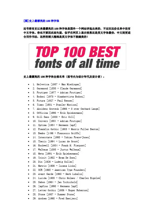
[图]史上最漂亮的100种字体这号称有史以来最漂亮的100种字体是国外一个网站评选出来的,不过在这份名单中没有中文字体。
你也不要因此而失望,似乎在网页上显示效果还是英文字体最佳,中文则更适合用作书法,这样的博大精深是英文字体不能媲美的!史上最漂亮的100种字体全部名单(括号内为设计年代及设计者):∙ 1. Helvetica [1957 - Max Miedinger]∙ 2. Garamond [1530 - Claude Garamond]∙ 3. Frutiger [1977 - Adrian Frutiger]∙ 4. Bodoni [1970 - Giambattista Bodoni]∙ 5. Futura [1927 - Paul Renner]∙ 6. Times [1931 - Stanley Morison]∙7. Akzidenz Grotesk [1966 - G nter Gerhard Lange]∙8. Officina [1990 - Erik Spiekermann]∙9. Gill Sans [1930 - Eric Gill]∙10. Univers [1954 - Adrian Frutiger]∙11. Optima [1954 - Hermann Zapf]∙12. Franklin Gothic [1903 - Morris Fuller Benton]∙13. Bembo [1496 - Francesco Griffo]∙14. Interstate [1993 - Tobias Frere-Jones]∙15. Thesis [1994 - Lucas de Groot]∙16. Rockwell [1934 - Frank H. Pierpont]∙17. Walbaum [1800 - Justus Walbaum]∙18. Meta [1991 - Erik Spiekermann]∙19. Trinit [1982 - Bram De Does]∙20. Din [1926 - Ludwig Goller]∙21. Matrix [1986 - Zuzana Licko]∙22. OCR [1965 - American Type Founders]∙23. Avant Garde [1968 - Herb Lubalin]∙24. Lucida [1985 - Chris Holmes / Charles Bigelow]∙25. Sabon [1964 - Jan Tschichold]∙26. Zapfino [1998 - Hermann Zapf]∙27. Letter Gothic [1956 - Roger Roberson]∙28. Stone [1987 - Summer Stone]∙29. Arnhem [1998 - Fred Smeijers]∙30. Minion [1990 - Robert Slimbach]∙31. Myriad [1992 - Twombly & Slimbach]∙32. Rotis [1988 - Olt Aicher]∙33. Eurostile [1962 - Aldo Novarese]∙34. Scala [1991 - Martin Majoor]∙35. Syntax [1968 - Hans Eduard Meier]∙36. Joanna [1930 - Eric Gill]∙37. Fleishmann [1997 - Erhard Kaiser]∙38. Palatino [1950 - Hermann Zapf]∙39. Baskerville [1754 - John Baskerville]∙40. Fedra [2002 - Peter Bil'ak]∙41. Gotham [2000 - Tobias Frere-Jones]∙42. Lexicon [1992 - Bram De Does]∙43. Hands [1991 - Letterror]∙44. Metro [1929 - W. A. Dwiggins]∙45. Didot [1799 - Firmin Didot]∙46. Formata [1984 - Bernd M llenst dt]∙47. Caslon [1725 - William Caslon]∙48. Cooper Black [1920 - Oswald B. Cooper]∙49. Peignot [1937 - A. M. Cassandre]∙50. Bell Gothic [1938 - Chauncey H. Griffith]∙51. Antique Olive [1962 - Roger Excoffon]∙52. Wilhelm Klngspor Gotisch [1926 - Rudolf Koch] ∙53. Info [1996 - Erik Spiekermann]∙54. Dax [1995 - Hans Reichel]∙55. Proforma [1988 - Petr van Blokland]∙56. Today Sans [1988 - Volker K ster]∙57. Prokyon [2002 - Erhard Kaiser]∙58. Trade Gothic [1948 - Jackson Burke]∙59. Swift [1987 - Gerald Unger]∙60. Copperplate Gothic [1901 - Frederic W. Goudy] ∙61. Blur [1992 - Neville Brody]∙62. Base [1995 - Zuzana Licko]∙63. Bell Centennial [1978 - Matthew Carter]∙64. News Gothic [1908 - Morris Fuller Benton]∙65. Avenir [1988 - Adrian Frutiger]∙66. Bernhard Modern [1937 - Lucian Bernhard]∙67. Amplitude [2003 - Christian Schwartz]∙68. Trixie [1991 - Erik van Blokland]∙69. Quadraat [1992 - Fred Smeijers]∙70. Neutraface [2002 - Christian Schwartz]∙71. Nobel [1929 - Sjoerd de Roos]∙72. Industria [1990 - Neville Brody]∙73. Bickham Script [1997 - Richard Lipton]∙74. Bank Gothic [1930 - Morris Fuller Benton]∙75. Corporate ASE [1989 - Kurt Weidemann]∙76. Fago [2000 - Ole Schafer]∙77. Trajan [1989 - Carol Twombly]∙78. Kabel [1927 - Rudolf Koch]∙79. House Gothic 23 [1995 - Tal Leming]∙80. Kosmik [1993 - Letterror]∙81. Caecilia [1990 - Peter Matthias Noordzij]∙82. Mrs Eaves [1996 - Zuzana Licko]∙83. Corpid [1997 - Lucas de Groot]∙84. Miller [1997 - Matthew Carter]∙85. Souvenir [1914 - Morris Fuller Benton]∙86. Instant Types [1992 - Just van Rossum]∙87. Clarendon [1845 - Benjamin Fox]∙88. Triplex [1989 - Zuzana Licko]∙89. Benguiat [1989 - Ed Benguiat]∙90. Zapf Renaissance [1984 - Hermann Zapf]∙91. Filosofia [1996 - Zuzana Licko]∙92. Chalet [1996 - House Industries]∙93. Quay Sans [1990 - David Quay]∙94. C zanne [1995 - Michael Want, James Grieshaber] ∙95. Reporter [1938 - Carlos Winkow]∙96. Legacy [1992 - Ronald Arnholm]∙97. Agenda [1993 - Greg Thompson]∙98. Bello [2004 - Underware]∙99. Dalliance [2000 - Frank Heine]∙100. Mistral [1953 - Roger Excoffon]排名前33位最漂亮的字体效果如下:。
结构转变法字体设计
结构转变法字体设计
在字体设计领域,结构转变法是一种常见的设计方法,它通过调整字体的结构和形态来创造出独特的字型。
这种设计方法不仅能够给文字带来新颖的外观,还能够传达出特定的情感和意义。
在结构转变法字体设计中,设计师会对字母的形状和结构进行改变,使其与原始字母有所差异。
这种转变可以是微小的,例如改变字母的宽度、高度或曲线的弯曲程度;也可以是大胆的,例如改变字母的整体形状或添加额外的装饰元素。
通过这种方式,原本平凡无奇的字母可以变得独特而富有表现力。
结构转变法字体设计的一个重要应用领域是商标设计。
很多知名品牌通过设计独特的字体来塑造其品牌形象和标识。
例如,可口可乐的标志就采用了结构转变法字体设计的方法,将字母'O'的结构转变为一
个波浪形,使其看起来更加亲切和有活力。
此外,结构转变法字体设计还可以用于表达特定的情感和意义。
设计师可以通过调整字体的结构和形态来传达出不同的情绪和主题。
例如,在设计浪漫的婚礼邀请函时,可以使用优雅而流畅的字体,将爱的氛围渲染得更加浓厚。
而在设计科幻电影海报时,可以使用未来感十足
的字体,来强调电影的科技和未来主题。
结构转变法字体设计是一种富有创意和表现力的设计方法。
通过改变字体的结构和形态,设计师可以创造出独特而富有个性的字型,使文字更加生动和有趣。
无论是商标设计还是文化创意产业,结构转变法字体设计都具有广泛的应用前景和市场潜力。
优秀的字体设计案例
以下是一些优秀的字体设计案例:
1. “浪潮”字体设计:这个字体设计灵感来源于海浪,通过流畅的曲线和圆润的形状来表现海浪的柔美和力量,同时采用简约的线条风格,使字体看起来现代、简洁,适合用于品牌标识、海报等设计。
2. “璀璨星辰”字体设计:这个字体设计的灵感来源于星空,通过将每个字母拆分成多个小星星,再利用不同大小、颜色和排列方式来表现星星闪烁的效果,使字体看起来充满神秘感和浪漫气息,适合用于主题活动、婚礼等场合的宣传资料。
3. “墨竹”字体设计:这个字体设计的灵感来源于竹子,通过将笔画以竹叶的形式表现,再利用竹子的绿色和深墨色来对比,使字体看起来清新自然、有质感,适合用于书籍封面、品牌形象设计等。
4. “瑞光”字体设计:这个字体设计的灵感来源于中国传统文化中的瑞兽和吉祥图案,通过将笔画以瑞兽的形状表现,再利用中国红和金色来表现吉祥和富贵的气息,使字体看起来传统而又充满现代感,适合用于文化活动、品牌形象设计等。
5. “花间集”字体设计:这个字体设计的灵感来源于花卉,通过将每个字母以花形表现,再利用各种颜色和形状来表现花卉的绚丽多彩,使字体看起来浪漫、唯美,适合用于女性用品、美妆产品的宣传资料。
以上是一些优秀的字体设计案例,它们的创意和美感都值得借鉴和学习。
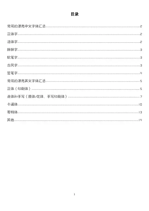
目录常用的漂亮中文字体汇总 (2)正体字 (2)活体字 (2)胖胖字 (3)软笔字 (3)古风字 (3)签笔字 (4)常用的漂亮英文字体汇总 (5)正体(印刷体) (5)连体和手写(圆体/花体,手写印刷体) (7)卡通体 (10)哥特体 (13)其他 (14)常用的漂亮中文字体汇总点击下载可编缉原文档本文档来自于本人的百度经验《去哪里找手绘海报的POP字体(中文版)》《有哪些漂亮的英文字体及如何表现》正体字正体字正体字正体字迷你简家书迷你简方叠体微软雅黑正体字正体字正体字造字工房悦黑体方正细谭黑简体方正综艺简体活体字活体字活体字活体字叶根友圆趣卡通体方正喵呜体迷你简漫步活体字活体字活体字迷你简少儿汉真广标迷你简菱心活体字活体字活体字汉仪粗圆简方正稚艺简体华康少女文字W5(P)胖胖字胖胖字胖胖字胖胖字迷你简胖头鱼汉仪琥珀体简汉仪黑咪体简软笔字软笔字软笔字软笔字软笔字汉仪黛玉体简叶根友蚕燕隶书汉仪柏青体简迷你简凌波古风字适合表现人文历史古风的素材里。
古风字古风字古风字叶根友蚕燕隶书(新春版)叶根友行书繁叶根友毛笔行书古风字古风字古风字书体坊米芾体章草李旭科书法古风字古风字古风字草檀斋毛泽东字体孙过庭草体测试版金文大篆体签笔字手写体亲切自然,适合表现手写的设计中。
签笔字签笔字签笔字方正喵呜体方正硬笔行书简体叶根友钢笔行书升级版签笔字签笔字签笔字方正静蕾简体迷你简丫丫书体坊赵九江钢笔行书签笔字签笔字签笔字书体坊硬笔行书书体坊雪纯体书体坊安景臣钢笔行书常用的漂亮英文字体汇总正体(印刷体)Segoe UI Light、Poiret One等几款纤细的字体,优雅简洁,尤其适合现在流行的扁平风格。
微软雅黑等几款稍微粗的无衬线字体,在正文里面大量使用方便识别。
Tahoma比较圆润,给人以亲切感。
Times New Roman是一款比较经典的衬线字体,适合表现人文历史类的设计中。
ABCDEFabcdef123450Segoe UI LightABCDEFabcdef123450DFGKinBun-W3ABCDEFabcdef123450Poiret OneABCDEFabcdef123450Sakkal MajallaABCDEFabcdef123450微软雅黑ABCDEFabcdef123450黑体ABCDEFabcdef123450Tw Cen MT Condensed Extra Bold ABCDEFabcdef123450Tahoma ABCDEFabcdef123450Arial Rounded MT Bold ABCDEFabcdef123450Times New Roman ABCDEFabcdef123450 Simplified Arabic FixedABCDEFabcdef123450GungsuhChe连体和手写(圆体/花体,手写印刷体)Vladimir Script和Rage Italic是两款比较经典英文花体字,飘逸简洁。
设计师常用字体精选30款毛泽东字体汉真广标体方正精倩体方正琥珀体时尚中黑体华康俪金黑华康海报体华康POP3体方正粗谭黑方正综艺体蒙纳超刚黑金梅毛行书文鼎中特广告体方正正大黑体方正大标宋体方正大黑体方正黑体方正隶书体方正楷体方正书宋体方正报宋体方正宋黑体方正魏碑体方正细圆体方正准圆体方正行楷体方正中等线方正喵呜体超世纪粗方篆精选手写书法字体30款毛泽东字体春联标准行书体方正大草体李旭科毛笔行书体良怀行书体梁秋生书法体书体坊米蒂体书体坊兰亭体苏新诗鼠标行简体叶根友毛笔行书体中山行书百年纪念版钟齐李洤标准草书钟齐流江毛笔草体钟齐志莽行书FG行书体Hiragino特太行书TT-JTC 淡齐草书淡齐行书祥南行书中国龙豪行书蒙纳喜宴体简金梅新毛笔行书金梅毛笔芦行书金梅草行书体邢体草书繁体邢体草书简体流丽太行书钟齐王庆华毛笔体卡通海报POP字体精选48款造字工房丁丁常规体云游体字体叶根友圆趣卡通简体叶根友童体简体雅坊美工14 雅坊美工12 新蒂黑板报体文鼎中特广告体腾祥铚谦幼儿简迷你简丫丫体迷你简娃娃篆体迷你简胖娃迷你简漫步体蒙纳俏皮简体蒙纳海报体萝莉体第二版经典趣体简金梅美工广告字体金梅浪漫美工国际码华康娃娃体W5-GF5 华康海报体W12-GF5 华康布丁体W12简体方圆卡通POP 字体和平海报体日本Takahand字系粗体字奶油POP 体文鼎新潮POP体文鼎霹雳体简迷你简流行体迷你简雪峰体蒙纳粗俏皮简体蒙纳童稚简体文鼎水管体文鼎火柴体简迷你简稚体迷你太极体华康POP3体-GB5 汉仪凌波体简邓玉二笔体崩溃的黄瓜字体文鼎习字体日本豆豆字体迷你简剪纸体蒙纳漫画体简落落的汤圆字体喵不姐简体行政机关办公常用字体10款方正兰亭粗黑方正小标宋方正书宋方正仿宋方正楷体方正魏碑方正美黑方正隶书华文细黑OCR-B10BT精选春天字体12款方正正大黑体汉仪粗宋简体方正粗倩简体方正超粗黑体蒙纳综艺简体蒙纳超刚黑体华康海报体W12 时尚中黑简体汉仪菱心体简汉真广标简体方正中倩简体汉仪中圆简体新年类设计字体10款时尚中黑体春联标准行书体方正谭黑汉真广标体蒙纳超刚黑方正正大黑体良怀行书体方正超粗黑体金梅毛张楷方正粗宋体综艺节目字体12款雅坊美工14 汉仪菱心体简迷你简选毡笔黑迷你简粗倩经典繁仿黑蒙纳综艺简体一碳纤维大黑简体a_AIternaRg 时尚中黑简体Enter Sansman 方正粗谭黑简体蒙纳超刚黑体精选硬笔书法字体52款钟齐余好建行艺体钟齐孟宪敏钢笔简体钟齐立强行书简钟齐陈伟勋硬笔行书字库造字工房情书体云游体字体禹卫硬笔常规体英章行书叶根友钢笔行书新蒂小丸子高级版文鼎细钢笔行楷王晓辉行楷字体王金彦简行书完善体腾祥铚谦钢笔简司马彦简行修正版金新硬笔行书简庞中华硬笔字体庞中华简体V2007 蒙纳喜宴体简罗西钢笔行楷建刚草稿体黄彦文行书字体国祥手写体戴锦好字体陈代明硬笔体蔡云汉硬笔行书简书法字体蔡云汉简体行书白舟极太行书叶根友疾风草书造字工房情书体叶根友刀锋黑草书体坊向佳红毛笔行书书法家行书体方圆吉祥行书体陈继世行楷简体德彪钢笔行书字库钟齐陈伟勋硬笔行楷简腾祥铚谦钢笔简庞中华行书建刚体粗体修正版迷你简硬笔楷书迷你简硬笔行书凌惠字体方圆疾风草书方圆钢笔粉笔字王金彦简行书完善体建刚字库徐明简体金梅宽钢笔字国际码优雅连笔字体新蒂下午茶白金版微软字库27款微软繁标宋微软繁粗圆微软繁黑体微软繁琥珀微软繁楷体微软繁隶书微软繁宋体微软繁魏碑微软繁细圆微软繁线体微软繁综艺微软简标宋微软简粗黑微软简仿宋微软简楷体微软简老宋微软简隶书微软简魏碑微软简行楷微软简中圆微软简综艺微软雅黑体微软正黑体微软雅黑粗微软正黑粗体微软明瞭体微软雅黑繁简完全版味根友字库24款奥运字体仿刘德华字体蚕燕隶书刀锋黑草非主流手写体风帆简体风帆特色钢笔行书升级版疾风草书爵宋体空心简体毛笔行书毛笔行书简体2012版签名体特楷简体特隶简体特色简体升级版特色空心简体终极版童体简体小京楷简体篆简体试用版行书繁体圆趣卡通体神工体华文字库10款华文彩云华文仿宋华文琥珀华文楷体华文隶书华文细黑华文新魏华文行楷华文中宋华文黑体汉仪插画字体12汉仪晴空体汉仪跳跳体汉仪黑荔枝汉仪悠然体汉仪糖糖体汉仪PP体汉仪小麦体汉仪乐喵体汉仪柏京体汉体晨妹子汉仪歪歪体汉体时光体古今名人字体10款王羲之行书体书体坊米蒂体颜真卿体W7 新蒂赵孟副字体毛泽东字体书体坊邓小平字体中山行书百年纪念版方正启体书体坊于右任标准草书迷你简舒同体。
推荐:17种设计字体的创意方法推荐: cyRotel 2013/07/23 in 字体设计更多在我们做海报、广告设计中,我们该怎样创造出有魔力的字体紧紧抓住读者的心呢?这篇文章提供的17种创意的字体设计方法也许可以提供给你不一样的灵感与技巧,希望你能在其中找到自己喜欢的 :)复古、时尚、创意字体下载及欣赏→字体教程及资源集合1、替换法替换法是在统一形态的文字元素加入另类不同的图形元素或文字元素。
其本质是根据文字的内容意思,用某一形象替代字体的某个部分或某一笔画,这些形象或写实或夸张。
将文字的局部替换,是文字的内涵外露,在形象和感官上都增加了一定的艺术感染力。
2、共用法“笔画公用”是文字图形化创意设计中广泛运用的形式。
文字是一种视觉图形,它的线条有着强烈的构成性,可以从单纯的构成角度来看到笔画之间的异同,寻找笔画之间的内在联系,找到他们可以共同利用的条件,把它提取出来合并为一。
3、叠加法叠加法是将文字的笔画互相重叠或将字与字、字与图形相互重叠的表现手法。
叠加能使图形产生三度空间感,通过叠加处理的实行和虚形,增加了设计的内涵和意念,以图形的巧妙组合与表现,使单调的形象丰富起来。
4、分解重构法分解重构发是将熟悉的文字或图形打散后,通过不同的角度审视并重新组合处理,主要目的是破坏其基本规律并寻求新的设计生命。
总之,平面图形设计的目的是人与人的交流,作为设计者,学习运用符号学工具,会使设计更加有效。
在平面设计如此繁杂的今天,把文字图形化运用到设计中,才能使作品具有强烈的视觉冲击力,更便于公众对设计者的作品主题的认识、理解与记忆。
5、俏皮设计法把横中间拉成圆弧,角也用圆处理,这个方法还有重要一点就是色彩,字体处理上加上色彩的搭配才能作出好的俏皮可爱字体。
6、尖角法把字的角变成直尖、弯尖、斜卷尖;可以是竖的角可以是横的角,这样文字看起来会比较硬朗。
7、断肢法把一些封合包围的字,适当的断开一口出来,或把左边断一截,或右边去一截。
可复制英文花体字大全在日常生活和工作中,我们经常会用到各种各样的英文花体字,无论是在设计海报、制作宣传册,还是在书信、贺卡中使用,都需要用到美丽的英文花体字来装点文字,增加视觉冲击力。
因此,今天我将为大家整理一份可复制的英文花体字大全,希望能够帮助大家更方便地使用这些美丽的字体。
1. Adore。
2. Beautiful。
3. Charming。
4. Delightful。
5. Elegant。
6. Fabulous。
7. Gorgeous。
8. Harmonious。
9. Incredible。
10. Joyful。
11. Kindhearted。
12. Lovely。
13. Magnificent。
14. Noble。
15. Outstanding。
16. Peaceful。
17. Quaint。
18. Radiant。
19. Splendid。
20. Tranquil。
21. Unique。
22. Vibrant。
23. Wonderful。
24. Xquisite。
25. Youthful。
26. Zesty。
以上是一些常见的英文花体字,它们有着不同的特点和风格,可以根据不同的场合和需求进行选择。
比如,如果是用于书信或者贺卡,可以选择一些温馨、优雅的字体,比如“Adore”、“Lovely”、“Charming”等;如果是用于海报设计或者广告宣传,可以选择一些充满活力、独特的字体,比如“Incredible”、“Vibrant”、“Wonderful”等。
除了以上列举的字体之外,还有许多其他美丽的英文花体字可供选择。
在使用这些字体时,我们需要注意保持整体的美感和协调性,避免出现过多不同风格的字体混搭,以免影响整体的视觉效果。
另外,也要注意字体的大小和排版,保持文字的整齐和美观。
总的来说,英文花体字是一种非常有魅力的文字装饰方式,它可以让文字更加生动、美丽,增加视觉吸引力。
在使用这些字体时,我们需要根据具体的场合和需求进行选择,保持整体的美感和协调性。