2011雅思强化写作课程 S1 TASK1概论和基本策略
- 格式:pdf
- 大小:570.78 KB
- 文档页数:64

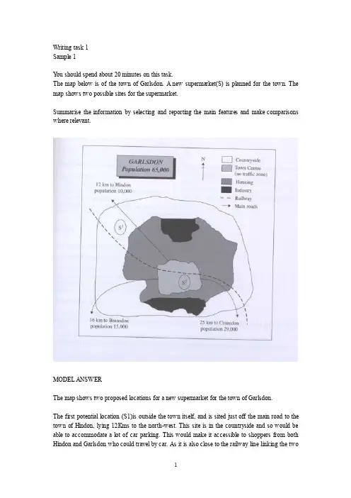
Writing task 1Sample 1Y ou should spend about 20 minutes on this task.The map below is of the town of Garlsdon. A new supermarket(S) is planned for the town. The map shows two possible sites for the supermarket.Summarise the information by selecting and reporting the main features and make comparisons where relevant.MODEL ANSWERThe map shows two proposed locations for a new supermarket for the town of Garlsdon.The first potential location (S1)is outside the town itself, and is sited just off the main road to the town of Hindon, lying 12Kms to the north-west. This site is in the countryside and so would be able to accommodate a lot of car parking. This would make it accessible to shoppers from both Hindon and Garlsdon who could travel by car. As it is also close to the railway line linking the twotowns to Cransdon(25km to the south-east), a potentially large number of shoppers would also be able to travel by train.In contrast, the suggested location, S2, is right in the town centre, which would be good of local residents. Theoretically the store could be accessed by road or rail from the surrounding towns, including Bransdon, but as the central area is a no-traffic zone, cars would be unable to park and access would be difficult.Overall, neither site is appropriate for all the towns, but for customers in Cransdon, Hindon and Garlsdon, the out-of-town site (S1) would probably offer more advantages.Sample 2The table below gives information about the underground railway systems in six cities.Summarise the information by selecting and reporting the main features, and make comparisons where relevant.Underground Railway SystemsMODEL ANSERThe table shows the details regarding the underground railway systems in six cities.London has the oldest underground railway systems among the six cities. It was opened in the year 1863, and it is already 140 years old. Paris is the second oldest, in which it was opened in the year 1900. This was then followed by the opening of the railway systems in Tokyo, Washington DC and Kyoto. Los Angeles has the newest underground railway system, and was only opened in the year 2001. In terms of the size of the railway systems, London, for certain, has the largest underground railway systems. It has 394 kilometers of route in total, which is nearly twice as large as the system in Paris. Kyoto, in contrast, has the smallest system. It only has 11 kilometers ofroute, which is more than 30 times less than that of London.Interestingly, Tokyo, which only has 155 kilometers of route, serves the greatest number of passengers per year, at 1927 millions passengers. The system in Paris has the second greatest number of passengers, at 1191 millions passengers per year. The smallest underground railway system, Kyoto, serves the smallest number of passengers per year as predicted.In conclusion, the underground railway systems in different cities vary a lot in the size of the system, the number of passengers served per year and in the age of the system.Sample 3The graph and table below give information about water use worldwide and water consumption in two different countries.Summarise the information by selecting and reporting the main features, and make comparisons where relevant.MODEL ANSWERThis model has been prepared by an examiner as an example of a very good answer. However, please note that this is just one example out of many possible approaches.The graph shows how the amount of water used worldwide changed between 1900 and 2000.Throughout the century, the largest quantity of water was used for agricultural purposes, and this increased dramatically from about 500 km3 to around 3,000 km3 in the year 2000. Water used in the industrial and domestic sectors also increased, but consumption was minimal until mid-century. From 1950 onwards, industrial uses grew steadily to just over 1,000 km3, while domestic use rose more slowly to only 300 km3oth far below the levels of consumption by agriculture.The table illustrates the differences in agricultural consumption in some areas of the world by contrasting the amount of irrigated land in Brazil (26,500 km3 ) with that in the D.R.C. (100 km3). This means that a huge amount of water is used in agriculture in Brazil, and this is reflected on the figures for water consumption per person: 359 m3 compared with only 8 m3 in the Congo. With a population of 176 million, the figures for Brazil indicate how high agricultural water consumption can be in some countries.Sample 4The table below gives information about changes in modes of travel in England between 1985 and 2000.Summarise the information by selecting and reporting the main features and make comparisons where relevant.A verage distance in miles traveled per person per year, by mode of travelSAMPLE ANSERThis is an answer written by a candidate who achieved a Band 6score. Here is the examiner’scomment:This answer does not introduce the information in the table, nor does it report it accurately. The figures are misinterpreted as representing the number of people rather than the average number of miles traveled per person per year. Consequently the information about the increase in total travel is simply not mentioned, so not all key information is covered. There is an attempt to summarise trends in the figures, but the reader cannot get a clear overall picture of the information because of the fundamental confusionNevertheless, the information is organized and the writing flows quite well because of good use of referencing and other connectors, but there are occasional errors in these and the links between ideas are slightly confusing at times.The strong feature in this answer is the range of vocabulary which is used with some flexibility and good control. A good range of structures is also used, but there are still some fairly basic mistakes, such as in the choice of tense, subject/verb agreement and inappropriate use of the passive.In 2000 the most preferred mode of travel is by car with 4,860 people. There’s a noticeable decrease in public transportation locally where it dropped from 429 people in 1985 to 274 people in 2000. However the long distance bus rides is much more preferred by people as its figures are more than doubled in the last 15 years. People who chose to walk or cycle are decreased slightly in 2000, which probable made people take the train more often. There is a significant increase in the numbers of people who traveled by train. It jumped from 289 in 1985 to 366 in 2000. This makes the train second popular mode of transportation. The biggest leap in the chart is the increase of taxi users who are tripled in 2000 with 42 people where it was only 13 in 1985.Apart from all this modes of travel, there are some more different types of travel as well of course. Number of people choosing different modes of travel is rapidly increased from 450 to 585 in 2000.Sample 5The diagrams below show the life cycle of the silkworm and the stages in the production of silk cloth.Summarise the information by selecting and reporting the main features, and make comparisons where relevant.MODEL ANSWERThis model has been prepared by an examiner as an example of a very good answer. However, please note that this is just one example out of many possible approaches.The first diagram shows that there are four main stages in the life of the silkworm. First of all, eggs are produced by the moth and it takes ten days for each egg to become a silkworm larva that feeds on mulberry leaves. This stage lasts for up to six weeks until the larva produces a cocoon of silk thread around itself. After a period of about three weeks, the adult moths eventually emerge from these cocoons and the life cycle begins again.The cocoons are the raw material used for the production of silk cloth. Once selected, they are boiled in water and the threads can be separated in the unwinding stage. Each thread is between 300 and 900 metres long, which means they can be twisted together, dyed and then used toproduce cloth in the weaving stage.Overall, the diagrams show that the cocoon stage of the silkworm can be used to produce silk cloth through a very simple process.Sample 6The charts below give information about USA marriage and divorce rates between 1970 and 2000, and the marital status of adult Americans in two of the years.Summarise the information by selecting and reporting the main features and make comparisons where relevant.SAMPLE ANSWERThis is an answer written by a candidate who achieved a Band 6.5 score. Here is the examiner’s comment:The task Achievement is the weak point in this answer. Some of the data is summarized but the points are not well-selected to convey the key trends shown in the charts. The main features of the first chart are not adequately presented and the overall conclusion does not summarise the main information. No figures are given to illustrate the points made.The information is well-organised, however, with clear paragraphing and well-signaled sections. The accurate use of a range of sequencers and other linkers makes it easy to follow the writing. There are examples of errors but they are not frequent and do not cause confusion.A range of vocabulary is used with flexibility, in spite of some inappropriate collocations and awkward phrasing. Structures are varied and generally accurate, while any mistakes do not make the message unclear.We are given two charts which show us a few sets of data about the marital status of the Americans between 1970 and 2000.The first chart compares the number of marriages and divorces in the United States of America between 1970 and 2000. We can see that data is given for each decade; the number of people who are getting married decreased slightly since 1980, as well as the divorces one. Nevertheless, divorces increased between 1970 and 1980.The second chart is more precise about the different marital status of the Americans between 1970 and 2000. The number of divorced people has risen more than the double during this two years, and the data for the never married people has also increased significantly. However, less and less people are married, as the first chart showed us; the widowed American number is also decreasing.As a conclusion, we can say that the marital status background of the Americans has maybe known the greatest change it had ever seen.Sample 7The graph below shows the demand for electricity in England during typical days in winter and summer. The pie chart shows how electricity is used in an average English home.Summarise the information by selecting and reporting the main features, and make comparisons where relevant.SAMPLE ANSWERThis is an answer written by a candidate who achieved a Band 6score. Here is the examiner’s comment:This answer focuses too closely on the details in the graph but fails to compare trends or general differences between figures of winter and summer. Some comparisons are made, but these are about details, and it is difficult to get a clear idea of the information from this description.Similarly, information in the pie chart is simply listed using the language from the chart and there is no attempt to relate this to information in the graph.The description is not well organized, although a range of linkers are used, and the use of paragraphs does not reflect the different sections of information covered.There is a suitable range of vocabulary for this task, although some words are misused and there are several spelling errors. The range and control of grammatical structures is the strong point ofthe main part of this response. There are examples of complex structures that are used with accuracy and some flexibility.The use of electricity in England is indispensed with demand for electricity in England during typical days in wither and summer is illustrated in the graph. The use of electricity in an average English home is shown in the pie chart. From the graph, it is generally obvious that the demand is in its maximum around 2100 in winter times, and in its minimum around 400, being almost constant between 1200 and 2100 in winter times. During summer times, on the other hand, the demand reaches its top point around 1300, and the bottom point around 900, being almost constant between 1550 and 2000.In wither times, the curve gradually increases to reach 40,000 units of electricity by 3 o’clock in the morning. This is followed by gradual decline to its lowest limit of 30,000 units at 9 o’clock. A gradual rise is obvious again to reach a stationary level between 3 o'clock and 9 o’clock of about 40,000 units again. Then, there is a sharp rise in the next hour to reach its maximum before collapsing again to a a lower level by the end of the day.In summer time, the curve gradually decrease to reach its lower limit around 9 o’clock of a bit more that 10,000 units. A gradual increase is noticed to reach its top of 20,000 after which a stationary phase is obvious between 3 o’clock and 10 o’clock at night of about 15,000 units.The pie chart, on the other hand, shows that 52.5% of the electricity is used for heating rooms and water. 17.5% is consumed for ovens, kettles and washing machines, 15% is used in lighting, TV and radio, and finally 15% is consumed in the sue of vacuum cleaners, food mixtures and electric tools.。
剑桥雅思写作11task1(原创实用版)目录1.剑桥雅思 11test1 写作真题解析概述2.剑桥雅思 11test1 写作真题 Task 1 解析3.剑桥雅思 11test1 写作真题 Task 2 解析4.剑桥雅思写作高分范文及学习建议正文【剑桥雅思 11test1 写作真题解析概述】剑桥雅思 11test1 写作真题解析共包括 8 篇文章,主要针对雅思写作的 Task 1 和 Task 2 进行解析。
Task 1 要求考生根据提供的图表或数据,完成一篇不超过 20 分钟的写作任务;而 Task 2 则要求考生针对某个话题或问题,完成一篇议论文。
本文将对这些真题进行详细解析,并提供一些学习建议。
【剑桥雅思 11test1 写作真题 Task 1 解析】Task 1 的真题主要涉及数据图表的解析,例如柱状图、饼图等。
在解析过程中,需要注意以下几点:1.仔细阅读题目要求,了解图表的主要信息和需要完成的任务。
2.对图表中的数据进行对比和分析,找出主要的趋势和变化。
3.结合数据,清晰地描述图表的内容,并准确地使用词汇和表达。
【剑桥雅思 11test1 写作真题 Task 2 解析】Task 2 的真题主要涉及议论文的写作,例如社会问题、教育、环境等。
在写作过程中,需要注意以下几点:1.仔细阅读题目要求,理解题目的观点和立场。
2.确定自己的观点和立场,并进行合理的论证和论述。
3.注意文章的结构和逻辑,确保观点清晰、论证充分。
【剑桥雅思写作高分范文及学习建议】为了提高雅思写作的成绩,可以参考一些优秀的剑桥雅思写作高分范文。
这些范文不仅提供了丰富的写作素材,还对词汇、表达和句型进行了升级。
在学习过程中,可以借鉴以下几点建议:1.对范文进行深入的阅读和分析,了解其结构、逻辑和表达方式。
2.结合自己的实际情况,选取合适的写作技巧和策略,进行有效的写作练习。
3.多做真题练习,提高自己的写作速度和质量。
雅思写作Task 1图表小作文第一节简介一.图表简介:图表分类:图表通常分为两大类。
一类是数据图,包括曲线图(graph/ line chart),柱状图(bar chart/ column chart),饼状图(pie chart)和表格(table)。
另一类是示意图/流程图(diagram/flow chart)。
目前在雅思考试中主要出现的是数据图。
图表出题频率:最多柱状图,其次曲线图,再者饼状图,表格。
图表大忌:切忌发表个人观点和看法,切忌照搬题目、切忌简单罗列数据、避免词汇重复写作注意事项:词汇语法:词汇准确多样,不能重复those who work in = people working in = the employee in句子:结构不能太简单,一句话要同时写两个对象的特征。
逻辑:句子里,句子与句子之间,段与段之间都要使用表示对比,转折,相似的连词或副词。
时态:第一句使用一般现在时,主体部分大多用一般过去式。
二.图表作文审题审题包括审读题目要求或说明以及查看图表及其注解。
题目的文字部分一般提供了有关这个图表的最基本信息,如所涉及的背景、研究的对象、时间和地点。
对于图表部分,我们需要仔细考察,查看纵横轴等,找出值得描述的主要规律和特征、关键点( 最高,最低值,中间值、相似类的)、总体趋势(overall trends)和不规则变化(irregularities 上升,下降,持平的)。
第二节常用基本句式开头段图表类型动词谓语三要素:研究的对象+时间+地点The chartgraphtablediagramshowsindicatesillustratesdescribesgivespresentsdepictsrevealsthe number / amount/ quantity/ percentage/ proportion ofinformation aboutdata onthatfiguresstatistics主体段一.描述信息出处According to theAccording to the number shown in theAs is shown in theAs can be seen from the pie charttable/chartdiagramgraph/line chartfigures +总概括句子It can be seen from theWe learn from theWe can see from theIt is clear/apparent from thethat+总概括句子As the showsindicatesillustratesdescribes that+总概括句子presentsdepictsreveals二.动态变化描写1)上升/ 下降(用变化动词)主语变化动词变化程度的副词时间段导入数据The number of The figure of The percentage of The proportion of 上升/增加increasedjumpedrosegrewwent upclimbedsoargentlysuddenlyrapidly / quicklydramaticallysignificantlysharply / steeplysteadily / stablysmoothlyconsistentlycontinuallygradually / slowlyslightlymaximallyminimallycomparatively slowlyfrom … to …,between… and…,for one month,for a period of ,over the next month,during the next month,over the period from .toover the 25-year periodduringthe25-year period, with…, at…( )bytofrom…to…,falling/increasing from. to.,making up 20%.,accounting for 20%.,amounting to 2000.,which falls/increase from.to,which is 20%.,which makes up 20%.,which constitutes 20%.,which account for 20%.或插入语下降/减少decreaseddeclineddroppedfellreducedwent downslumpedsink上下波动fluctuatedvariedrise and fall(注:数据为估计数据时,需使用about, nearly, almostapproximately, over,up to, a bit over, around等。
详解雅思写作Task1常出现的问题对于雅思写作中的T ask1而言,很多考生容易忽视里面出现的问题。
因为字数少,要求又不多,而且通常都是比较描述等。
所以很多考生都不是特别重视,往往导致得分很低。
因为我们通常要求task 1能拿到高分,这样才能有效为你的雅思写作Task1获得高分。
今天店铺就为大家介绍常出现的两大问题。
详解雅思写作Task1常出现的两大问题雅思写作Task1需要注意的主语问题通常我们在Task 1会遇到很多变化类的图表题,例如表格,柱状,饼状图等。
常常需要描述某数据的变化趋势,以及对比哪些不同,发表一下简单的预测等。
我们可以看下面分析:WRITING TASK 1 (剑9 Test 4 Task 1)You should spend about 20 minutes on this task.The graph below gives information from a 2008 report about consumption of energy in the USA since 1980 with projections until 2030.Summaries the information by selecting and reporting the main features, and make comparisons where relevant.Write at least 150 words.通过上述的图表可以得知,Petrol and Oil这条线是能够很轻易的看得出他的变化趋势即整体上升,虽然在一开始这个数据是存在波动的。
于是大多数考生就会写出下面的语句:Petrol and oil increase from 1980 to 2030, despite initial fluctuations.当我们看到这样的语句时,通常喜欢选择正确的谓语动词以及相应的趋势名词来进行描述其变化,但是关键问题是主语在描述数据变化趋势时,广大考生一定要擦亮眼睛,并不是所有的名词都能够作为变化趋势的主语,比如这道题目中上升或者波动的其实并不是汽油和石油,而是它们的消耗量。
雅思备考干货:雅思写作备考方案雅思写作备考,对于许多考生来说都是一道难以逾越的门槛。
在这篇文章里,我就来和大家分享一下我的十年写作经验,帮助你更好地备战雅思写作。
咱们就直接进入主题,一点一点梳理出来。
咱们得明确雅思写作的评分标准。
雅思写作分为Task1和Task2两个部分,Task1主要考察考生对图表、表格、流程图等数据的描述能力,Task2则是议论文,考察考生的观点阐述和论证能力。
这两个部分分别占写作总分的50%,所以咱们要均衡发展。
一、Task1备考策略1.熟悉题型:Task1的题型主要有柱状图、线状图、饼状图、表格和流程图等。
我们要对这些题型了如指掌,知道如何描述各种数据。
2.提高阅读速度:Task1的描述往往需要对图表中的数据进行快速而准确的阅读。
因此,平时我们要多练习阅读各种图表,提高自己的阅读速度。
3.学习描述方法:要学会用准确的词汇和句型来描述数据。
比如,我们可以用“increased”,“decreased”,“remnedstable”等词汇来描述数据的增减。
同时,要掌握一些固定搭配,如“asharpincrease”,“aslightdecrease”等。
4.练习写作:平时多练习Task1的写作,可以从网上找到一些真题进行练习。
写完之后,可以找老师或同学帮忙批改,找出自己的不足之处。
二、Task2备考策略1.熟悉题型:Task2的题型主要有观点对比、问题解决、论证观点等。
我们要了解各种题型的写作框架,才能在考试时迅速进入状态。
2.建立观点库:平时要多积累一些观点和例子,这样才能在考试时迅速找到合适的论据。
观点可以从时事、社会、教育、科技等方面进行积累。
3.学习论证方法:要学会运用各种论证方法,如因果论证、对比论证、举例论证等。
这样可以使文章更有说服力。
4.提高语言表达能力:Task2对语言表达能力要求较高,我们要学会用简洁明了的语言表达自己的观点。
平时可以多读一些范文,学习其中的表达技巧。
雅思写作第一部分满分攻略雅思写作第一部分满分攻略TASK 1写作三大步骤(1)审题:找出主要信息点,具体为两个任务:A: 辨别所要写图表的类型,是线状(line ),柱状(bar ),还是饼状(pie)等B: 找图表的主要内容,是人口变化,交通工具,受教育水平,或者是一项工艺的制作流程。
(2)构思:审题是对文章主要内容的一个大概认识,而构思就是对自己认识的进一步深化。
构思的主要任务为:分析图表的主要特征,弄清写作重点并选用适当的分析方法。
图表的主要特征是指其所描述现象或者问题的规律,并找出描述重点,不是图表上所出现的所有信息都要写出来,之后就是分析方法的选择,主要的分析方法有:数据分类,数据比较,平铺直叙法等,具体选哪种,需要根据图表的内容来确定。
(3)写作:写作是对前两个步骤的确认。
考生把自己的想法准确而详细的落实下来。
一般来说,这个部分的写作可以采用三或四段式:1)引言段(用简短的语言来描述图表的主要内容)。
一把来说,写作命题会给出的主要信息,如,The line chart below shows thegrowth of households with personal computers in the U.S.通过这句话,我们可以了解图表的主要信息,“美国每个家庭所拥有计算机量的增长变化。
”在这种情况下,考生可以重现组织一下这个具体,在中间加入一些具体的数字和变化年限等,使得阅卷老师一下就明白图表的主要内容。
引言段通用句式如下:This is a table / chart / (line线状 bar柱状pie饼状)graph whichdemonstrate / illustrate / reveal /depict/privide informationabout.............2)图表具体信息描述段:这个段落主要描写体现图表主要特征或总体变化规律的数据或信息,并用恰当的连接词语,如,on contrast , on theotherhand, however, like wise 等,把文章内容紧密的衔接起来。
Lesson oneI.Teaching ObjectiveEnable students to master basic writing skills to fulfill task 1II.The points to be highlightedThe general format for writing academic writing task 1;Necessary vocabularyIII.Teaching approachesLecture; Q&AIV.Teaching procedures1.Lead-inAsk what they know about IELTS and the types of task one2.Specific contents2.1 Things you should know about Academic Writing Task 1小作文须知•You are asked to describe information presented in graph/ table/ chart/ diagram.•You have 20 minutes to finish the task and you have to write at least 150 words.•If you are asked to use the information presented in the graph you must be careful not to copy it.2.2 Assessment criteria 评分标准标准一:Task Achievement (任务完成情况)标准二:Coherence and Cohesion (连贯与衔接)标准三:Lexical Resources (词汇丰富程度)标准四:Grammatical Range and Accuracy (语法多样性及准确性)2.3 Attention注意事项TA:确认描述对象(一定要确定好图表里的数字代表什么);一定要写总结和归纳段;注意总结图表里的主要信息和趋势(图表的最高值和最低值、数值之间的比较、上升或下降等趋势的归纳)CC:连接词(表示对比、比较、转折、相同趋势的一些连接词);描述信息遵循合理的顺序(譬如从高值到低值,或者先总结上升幅度大的,然后说上升幅度小的);分段恰当LR:词性的变化;灵活使用单词GRA:句子结构的多样性及准确性;没有错误的句子;时态正确2.4 The general format/ structure套路:Introduction + Basic/General Trends + Details Description + Conclusion.2.5 necessary vocabulary 必备词汇(课堂补充,课后记忆)2.5.1 introductionYou need to begin with one or two sentences that state what the IELTS writing task 1 shows. To doHere is an example for the above line graph:The line graph compares the fast food consumption of teenagers in Australia between 1975 and 2000, a period of 25 years.You can see this says the same thing as the title, but in a different way.2.5.2 General trendIt is recommended to write the general trend parts in the same paragraph with the introduction. The general trend part should focus the main point of the presentation and should not be too large with lots of information. However you should not give the specific figure, time, amount or data presented in the graph. You can use phrase like As is presented/ as is observed / in general / in common etc. to start this part.One thing that stands out in this graph is that one type of fast food fell over the period, whilst the other two increased, so this would be a good overview.Here is an example:Overall, the consumption of fish and chips declined over the period, whereas the amount of pizza and hamburgers that were eaten increased.This covers the main changes that took place over the whole period.You may sometimes see this overview as a conclusion. It does not matter if you put it in the conclusion or the introduction when you do an IELTS writing task 1, but you should provide an overview in one of these places.2.5.3 Detailed descriptionThe Detailed description part comes after the introduction and general trend and should be written in the second paragraph. When you give the detail in your body paragraphs in your IELTS writing task 1, you must make reference to the data.The key to organizing your body paragraphs for an IELTS writing task 1 is to group data together where there are patterns.To do this you need to identify any similarities and differences.Look at the graph –what things are similar and what things are different?As we have already identified in the overview, the consumption of fish and chips declined over theperiod, whereas the amount of pizza and hamburgers that were eaten increased.So it is clear that pizza and hamburgers were following a similar pattern, but fish and chips were different. On this basis, you can use these as your ‘groups’, and focus one paragraph on fish and chip and the other one on pizza and hamburgers.Here is an example of the first paragraph:I n 1975, the most popular fast food with Australian teenagers was fish and chips, being eaten 100 times a year. This was far higher than Pizza and hamburgers, which were consumed approximately 5 times a year. However, apart from a brief rise again from 1980 to 1985, the consumption of fish and chips gradually declined over the 25 year timescale to finish at just under 40.As you can see, the focus is on fish and chips. This does not mean you should not mention the other two foods, as you should still make comparisons of the data as the questions asks.The second body then focuses on the other foods:In sharp contrast to this, teenagers ate the other two fast foods at much higher levels. Pizza consumption increased gradually until it overtook the consumption of fish and chips in 1990. It then levelled off from 1995 to 2000. The biggest rise was seen in hamburgers as the occasions they were eaten increased sharply throughout the 1970’s and 1980’s, exceeding that of fish and chips in 1985. It finished at the same level that fish and chips began, with consumption at 100 times a year.The things you should follow in this part :» Use appropriate tense to describe the data.(基于以往的统计数据,常用一般过去式。
9月13日小作文范文及TASK1写作对策尽管2003年9月开考的写作TASK2几乎全为陈年“腐”题,TASK1却让绝大多数考生措手不及,许多考生反映无从下手。
为此特献上这篇9月13日考题TASK1的范文供大家参考。
其实,每一篇过程/流程图在题目中均有讲清楚是干什么用的。
重要的一点是要会用被动语态,基本句型为:object(图中提供的物品/用具)+is/are+动词过去分词+to do sth.(当然,时态应由图表来确定)其它要点为:1、努力搞清其工作原理,由题目、图及图表旁解来确定,没搞清原理则匆忙下笔易离题。
所以这种题对常识的要求较高,下回若出现“热胀冷缩”(another two scientific principles: expansion and contraction---heat makes something expand while cold makes it contract)那也是考你没商量;2、描述顺序前后须先确定;3、图表中的每一件东西均有用,它们都必须出现在你的描述中。
多变准确的谓语动词是区分高低分的关键;4、introduction是需要的,最简方法为restate the topic but never copy it. 无须conclusion,除非字数不够;5、不必为自己贫乏的动词而苦恼,实在没办法,可将几个常用的动词顶一顶。
不就是考个5分6分么,你若看懂13/9的TASK1考题,而且会用put/use/place/come up/come down/get/take等,我就不信你做不到。
―――广州仲恺雅思培训中心老师赖劲松--------------------totally 172 words----------------------------------------------------The diagram describes an outdoor way of acquiring water from nature.(The following device can possibly help you out of trouble for survival after desperately failing to search water in the wild.----不够字数时可用这种描述,即适当加一些个人见解,但要慎用)There are six key components in the diagram: the sun, the stones, two pieces of plastic film, green plants, a plane tree and a container. This process applies two scientific principles to collect water: evaporation and condensation.We can see clearly that water stored in the green plants is evaporated by the heat of the sun to form a certain amount of water vapor, rising to condense on the top sheet of plastic film which functions as a cover. Under the cover, there is a larger sheet of plastic film which is used to encircle the plants in order to trap the heat. Two pieces of plastic film are secured by the plane and stones, and another stone is placed to form a depression in the center of the cover, forming a cone. As a result, the water vapor is collected/condensed and water drops are formed/created at thebottom of the cone.新通外语抢先独家发布10月11日雅思考试全解析——权威专业全面的雅思资讯,尽在新通雅思!听力ListeningSECTION 1 开会地点讨论1-10 Completion1. e-mail marketing. (international是干扰项)2. sandwiches provided after presentation. 演讲完之后要提供3. 讨论一下project4. 要提供taxi送到station(airport是干扰项)接下来就是讨论选什么酒店:5.第一个宾馆因为financial的原因,宾馆已经closed了6-7. 第二个酒店是near bridge、view8. 第三个是noisy9-10. 第四个是near hospital, but no restaurantSECTION 2 建房子11-16 C单项选择11. Why does she choose this topic?C. She want to choose a building with better quality.想选一个最好质量的building12. How long does it need to put window on roof?B. needs a day一天13. What surprised her most during the research?C. range of price difference is wide 价格的range 差了很多14. Why there is difference of price?C. because calculating method is different 因为价格计算的方式不一致15.小的建筑公司怎么付钱?Need to pay a deposit before project started.工程开始就要先付一些定金16. Need to compare price in:A. radio’s websiteB. 错的,因为说资料要钱C. 错的,因为资料不准确17-20 多项选择17-18. How can we know the quality of building?去看之前看过的房子、同之前的客户联系19-20. 如果房子有问题,应当如何解决呢?让建筑商redo the work、找regulators反映拨打全国免费专线400-618-0272 即可获得雅思考试全套资料包!SECTION 3 论文讨论21-25 搭配题A. save business time and effortB. officer visual help or guideC. have little use to their studyD. too long timeE. hard to useF. suit any-sized companies21. PEST method----C22. Drill down method----E hard to apply23. Prepare to analyze----D take ages24. PMI analysis A east to use25. SWOT analysis----F26-30 多项选择26. what is the most useful in the future for manufactory?A. regulation/reputation of companyB. experience of staff and employeesC. major competitors27. what is tutor suggestion of manufactory’s strengths?B. oversea expansion opportunities28. Which one impress the tutor to the greatest extent?B. the new leagal legislationC. find out new skills to the equipment29. The man thinks what is the most difficult part in the investigation is?C. different between practice and theory30.what are the supervisor’s suggestion?A.文章的structure需要调整B. 需要添加detailed informationSECTION 4 作报告31-40 Completion31. rags made from wool32. Brown 设计师擅长于natural bird images33. in symbol of rainsomething brings rainbow34. Based on symbols, structures, family and nature35.He started design in prison36. Design can be used in clothing37. 艺术家Jimmy的灵感来自于Australia, especially the desert38. Jeans出名因为lizards and a snake39. Fabric’s Background look like a rainbow40. carpet case.若想定期收到雅思机经或押题信息,请向在线老师咨询要求>>>雅思在线课程,足不出户,轻松押题多胜算!>>>点击咨询即可获得260元名师在线课程阅读ReadingPassage 1 新西兰珊瑚鱼题型:T/F/NG 4、填空(summery completion 5、Table completion 41 NG2 T3 F4 T5-9 summery completion5. mouth size6. medium7. artificial light 8. laboratory9. moon10-1410. fish body 11. open ocean12. reef 13. moralityPassage 2 Bright Children题型:段子绝孙题6、人名观点配对题4、选择 4有关教育资源的分配问题。
雅思task1写作模板全文共四篇示例,供读者参考第一篇示例:雅思写作任务1是雅思考试中的第一部分,要求考生根据图表、图形或表格等形式的信息,对相关数据进行描述和比较。
这部分考试主要是考察考生的数据分析和描述能力。
为了帮助考生更好地应对雅思写作任务1,下面提供一份雅思task1写作模板供考生参考。
雅思task1写作模板第一段:引言在第一段,我们需要简要介绍图表的背景信息,如图表内容、数据来源、时间范围等。
同时简要概括图表呈现的数据趋势。
例如:This bar chart illustrates the amount of consumption of three different types of beverages in 2015 and 2020.以上就是一份简单的雅思task1写作模板,希望考生能够根据此模板进行练习和准备,提高自己的写作水平,取得理想的雅思考试成绩。
祝考生们考试顺利!第二篇示例:雅思考试是全球最著名的英语语言考试之一,被广泛认可和应用于全球范围内的教育和职业领域。
雅思写作任务1是两种写作任务之一,要求考生根据给定的图表、数据或图像来描述和解释相关信息。
为了帮助考生更好地应对雅思写作任务1,以下是一个常用的模板供考生参考:第三段:比较要点1. highlight any comparisons or contrasts shown in the graph/picture2. discuss similarities and differences between different categories or groups3. analyze the reasons behind the differences以上是一个典型的雅思写作任务1模板,考生可以根据具体情况在这个模板的基础上进行增减和调整。
在应对雅思写作任务1时,考生应该注意遵循规定的字数要求、清晰明了地描述数据和信息、合理分析数据并提出相关见解。
剑雅写作c11test1小作文英文回答:In the realm of communication, the choice between using one's native tongue and a foreign language presents a multifaceted decision. While each option holds its own unique advantages and drawbacks, the optimal selection hinges upon the specific context and communicative goals.When communicating within one's native language, individuals enjoy an inherent fluidity and depth of expression. The familiarity with the language's nuances, idioms, and cultural references facilitates seamless communication and allows for a more profound understanding of the message. Moreover, native speakers can convey subtle nuances and emotions with ease, as they possess anintuitive grasp of the language's expressive capabilities.Conversely, employing a foreign language can present significant challenges. Language barriers may hinder thefluent transmission of ideas, and cultural differences can lead to misunderstandings or misinterpretations. Additionally, the unfamiliar linguistic conventions and vocabulary of a foreign language can impede spontaneous and natural expression.Nevertheless, using a foreign language also offers distinct benefits. It expands linguistic horizons,fostering cultural exchange and understanding. By mastering a foreign language, individuals gain access to a broader world of perspectives, ideas, and literature. Moreover, it enhances cognitive abilities, as the brain must adapt to new linguistic structures and process information in different ways.In situations where precise technical communication is paramount, the use of a foreign language may be necessary to ensure clarity and accuracy. For instance, in scientific or medical contexts, specialized terminology and jargon may not be adequately translated into other languages. Furthermore, when communicating with individuals from diverse linguistic backgrounds, using a common foreignlanguage can facilitate effective cross-cultural exchange.Ultimately, the choice between using one's native language and a foreign language depends on the specific communication goals and context. If the primary objectiveis to convey emotions and ideas with precision and depth, then using one's native language is often the mosteffective choice. However, if the aim is to facilitatecross-cultural communication, expand linguistic horizons,or engage with specialized domains, then using a foreign language may be more appropriate.中文回答:在交流领域,使用母语与外语之间的选择是一个多方面的决定。
雅思写作task1复习策略分享为了帮助大家备考雅思。
下面收集整理了关于雅思写作task1复习策略的内容。
期望可以考生大家从中受益,不断把自己的备考方法提高,这样在考试里取得更加满意的成绩。
雅思写作task1复习策略分享一、时间倾斜雅思复习关于听说读写4个方面,还有2个基础,即词汇和语法,考生们想做的依然有3件事,背单词,练听力和做阅读。
背单词使得大家有学习的感觉,当练习听力与做阅读不但使得你有学习的感觉,还有一种期待,期待正确率提高给自己心情带来的愉悦。
而口语和写作练习相对较少,以写作为例,其一是由于大家普遍写作练习较少,写作水平不高,因此开始在规定的时间内无法完成作文,或者对自己写出的作文充满了厌恶;二是因为写出的作文无法衡量优劣,没有办法看到自己的进步。
这样形成恶性循环,中国同学普遍阅读和听力分数较高,而口语和写作分数偏低。
二、资料充分1. (《剑桥雅思系列3-7》)2.《雅思写作高分胜经》、群言出版社3.如今在市场上的雅思资料不是太少,而是太多,良莠不齐,乱花的确迷人眼。
人的精力有限,可以在有限的时间里把主要的资料复习抓住才是上策,在以上的2本书加上对写作复习已经足够。
三、雅思写作task1详细计划1. 复习课上讲解的基本写作理论:内容,结构和语言。
2. 阅读范文基础阅读:Test 1 text-align: left;">辅助阅读:Test 2 text-align: left;">3. 写作基础写作:8套Task 1, Test 1 text-align: left;">写作注意计时(开始几篇时间能够适当稍延长,保证完成),手写(借助电脑是会掩盖拼写错误),使用答题纸,铅笔和橡皮(模拟真实考场感觉)。
雅思写作范文:只有游客参观古迹Task:Many museums and historical sites are mainly visited by tourists, not local people. Why is this the case and what can be done to attract local people.Sample answer:Museums and historical sites are the sanctuary where we can acquire historical knowledge and cultural heritage. However, it has become less attractive to the local recently. As well as discussing the factors contributing to this trend. This essay will try to find its solutions.It is apparent that many local people assume that they are consciously aware of their cities. And they feel less fresh if they have appreciated such places ever before. In addition, manymuseum and sites are chargeable. As a result. The local prefer to enjoy their leisure time at home rather than in museum or historical sites.The inescapable fact is that Museums and historical sites are always the first option to many tourists. For one thing, they can pay the least spending as well as enjoy the most local knowledge and scenery. For another thing, the revenue of museums and historical sites account for the most local tourism. Governments are more pleased to attract tourists to these two places rather than to the locals. If this situation still continues in the future, there will be less local visiting to the museums and historical sites.One main solution is to enrich their diversity of activities. Museums can hold some larruping activities, such as Healthy Lecture and Civil Sporting Meeting. These activities will not only arouse the enthusiasm of citizens, but also add some color to this city. Besides, at some degree, lowing the price to draw more visits is also a feasible solution.To summarise, tourists will continuously choose museum and historical sites as their must-visits. However, it is still necessary to take some actions to maintain the local’s visiting.(348 words)雅思写作范文:提高教学质量Task:To improve the quality of education, people think that we should encourage our students to evaluate and criticize their teachers. Others believe that it will result in a loss of respect and discipline in the classroom. Discuss both views and give your own opinion.Sample answer:Nowadays, whether evaluating and criticising teachers should be supported in the classroom has become a controversial issue. From my perspective, evaluation and criticism of teachers are necessary for the improvement of education if they are objective and reasonable.On the one hand, proposing changes to teachers’lesson content contributes to the improvement of teaching quality. Usually, it is difficult for teachers to realise the mistakes and slips in their teaching unless students remind them. Additionally, teachers may not clearly know what students have known and want to know when planning their lessons. If students can put forward their ideas and suggestions towards the lesson, it will be of great help for teachers to upgrade the teaching projects. Moreover, trying to evaluate teachers’lesson is particularly beneficial for students’academic andcareer development in the future. The modern education emphasises criticism and innovation. Undoubtedly, it is an effective way for students to debate or discuss with teachers. On the other hand, the disruptive students will probably disturb the class and negatively affect both teaching and learning outcomes. When students voice their opinions in the classroom, it will be hard to maintain the order and discipline and the teachers may feel disrespected. Also, students will suffer a loss in terms of knowledge and other learning content. This is because teachers always devote much to delivering knowledge and explaining theories. If they are disrupted, the teaching plan may not be able to be fulfilled. As a result, both teachers and students have to face a loss in the quality of education.To sum up, it can be recommended that students evaluate and criticise teachers in the classroom on the premise that they have decent manners without disturbing the learning atmosphere. Only in this way will teachers and students achieve a win-win outcome in education.(302 words)雅思写作范文:先旅游or先工作?Task:School leavers go travelling or work before they godirectly to university. Are there more advantages or disadvantages on their study?Sample answer:Before the beginning of university, students who wish to continue with their education face two probable choice--either suspend their study for a year to obtain work and travel experience, or go directly into university. I will analyze the pros and cons of these two choices below.A year’s time to work or travel before university has been popular among young people in recent years. In fact, students can obtain several good points by doing this. To begin with, students can enhance their life skills and maintain a balance between their studies and work from the one yeat experience. They will become more independent during this meaningful process. Also, they can identify career preference and areas of interests during travelling, which will help them to decide their major in university.However, one year’s work or travel also has its obvious disadvantages. Coming fresh out og high school, students do not have a clear understanding of the harsh realities of the world. They are not in a strong position to undertake early employment. Besides, young people are not able to make acorrect career decision. Choosing a career requires sufficient knowledge of one’s own strengths, aptitudes and the trends in job market. Most young adults lack such knowledge. Moreover, travelling and working will divert young people’s attention from their previous objectives. If students give up the opportunity of being educated and pursue other ventures, they will lose their willpower to learn something carefully and patiently. The side effect of disengagement from schooling might not be significant in the first several years, but it will surly disadvantages them a lot in a long run.To conclude, work or travel before university has its advantages and disadvantages. In fact, the disadvantages outweigh advantages.(294 words)雅思写作task1复习策略分享。
ielts academic writing task1 教案教案:IELTS Academic Writing Task 1教学目标:- 了解和理解IELTS Academic Writing Task 1的要求和评分标准- 学习如何组织和写作各种类型的Task 1报告- 提高学生的数据分析和描述能力- 提高学生的写作和组织能力教学材料:- IELTS Academic Writing Task 1的样本题目和参考答案- 一些真实或模拟的数据表格、图表或图示(例如柱状图、折线图、饼图、流程图等)教学步骤:步骤1:介绍IELTS Academic Writing Task 1- 解释Task 1的要求和格式:学生需要写一篇150字左右的报告,对给定的图表、图示或表格进行描述和分析。
- 强调重要的写作技巧,例如选择最重要的数据和信息进行描述,使用适当的词汇和语法,确保句子的连贯性和一致性。
步骤2:讲解Task 1的不同类型和写作方法- 解释不同类型的Task 1问题,例如静态图表、动态图表、比例图、流程图等,以及相应的写作方法。
- 提供一些例子并进行详细的说明和讨论,让学生了解如何在不同类型的图表下撰写合适的报告。
步骤3:演示如何编写Task 1报告- 展示给学生一份Task 1问题和相应的数据表格、图表或图示。
- 演示如何仔细观察图表和提取关键信息,然后按照逻辑顺序编写报告。
- 强调使用适当的表达方式和连接词,例如使用比较级和最高级进行描述,使用过渡词进行句子和段落之间的连接。
步骤4:学生练习- 提供一些真实或模拟的Task 1问题和相应的数据表格、图表或图示,让学生独立完成报告的撰写。
- 学生可以在考试模拟环境下进行练习,或者在教师的指导下逐步完成。
步骤5:互相评估和讨论- 学生互相交换他们的报告,并对彼此的写作进行评估和讨论。
- 强调评估的标准,例如语言表达的准确性、句子结构的连贯性、数据描述的完整性等。
雅思写作task1技巧雅思写作task1技巧雅思考试,全称国际英语语言测试系统,下面就是店铺整理的雅思写作task1技巧,一起来看一下吧。
举个例子看完题目以后,为了更好的组织好这篇文章的结构,建议大家从三个基础方面着手:介绍这个图表;简述图表的概要;详细分析接下来,我们就按照这三条逐步分析一下这个例子。
1)介绍这个图表首先建议你先用1到2句话陈述一下这个图表展示的主题是什么。
写句子的时候,最简答的方法就是转述一下这个图表的标题,当然最好是能把这个事情放到一个时间段里面去描述。
比如:The line graph illustrates the amount of fast food consumed by teenagers in Australia between 1975 and 2000, a period of 25 years.是不是感觉很熟悉,这完全就是题目的另外一种表述而已,简单吧。
2)简述图表的概要首先,你还是要先陈述一下这张图表的主要发展趋势,但是注意不要涉及到具体日期,只需要用一些描述整体情况的句子就可以了。
很显然的,通过这个图表,我们能够看到一类快餐食品的数量呈下降趋势,而同时另外两类则呈现上升趋势,抓住这一点,我们可以这么写这一部分:Overall, the consumption of fish and chips declined over the period, whereas the amount of pizza and hamburgers that wereeaten increased.简单的一句话,就囊括了整个过程中发生的.主要变化。
3)详细分析从这部分开始,就进入主体段落了,就得需要一些更详细的细节了。
组织主体部分的重要之处在于把数据按照类别进行归类。
归类的重点在于区别数据的相似之处和不同之处。
我们再看看这个表格,有什么相同之处和不同之处呢?其实答案我们在第二部分简述概要的时候已经发现了,那就是鱼和炸土豆的消耗量呈下降趋势,与此同时披萨和汉堡的消耗量却在上升。
2011雅思英语写作必胜雅思英语写作必胜英语应用文概述:英语应用文在交流情感、增进友谊、开展商业活动、促进文化交流等方面,都起着积极且重要的作用。
根据英语应用文在不同环境下的不同功能机器不同格式,我们将其分为3大类:书信(letter)、表格(forms)和其他(others)。
其中,书信是英语应用文的主要组成部分,又可分为2类:社交书信(social letters)和商务书信(bussines letters).Applied English in exchange emotions, enhance friendship, conducting business activities, promote cultural exchanges, plays a positive and significant effect.According to the applied English in different environment the different function of the machine is different formats, we will its can be divided into three groups: letters, form and other. Among them, the letter is applied English key component, and can be divided into two categories: social letters and a business letter.This paper jointly create and modify by king and mikey, if there are other mistakes, please inclusion and puts forward, we are the first to make corrections, thank you!目录第一部分书信篇一、社交书信(social letters)1、感谢信(letter of thanks)2、求职信(letter of application for a position)3、道歉信(letter of apology)4、推荐信(lette of recommendation)5、辞职信(letter of resignation)6、祝贺信(letter of congratulation)7、预定信(letter of reservation)8、邀请信及回复(letter of invitation & reply)二、商务书信(bussiness letters)1、投诉(complaints )2、销售函(sales letter)3、订购函(order letter)4、理赔与拒绝(adjustments & refusals)5、建立贸易关系(establishing bussiness relations)第二部分图表篇第三部分其他1、传真(fax)2、备忘录(memo)3、电子邮件(e-mail)4、通知和启事(notice&announcement)5、使用说明书(operating instruction)6、公司与产品介绍(company profile & product intrduction)一、社交书信1、感谢信(letter of thanks)感谢信是受到对方某种恩惠,如受到邀请、接待、慰问,收到礼品及得到帮助之后,而表达感谢之情的信函……感谢信:感谢信是受到对方某种恩惠,如受到邀请、接待、慰问,收到礼品及得到帮助之后,而表达感谢之情的信函。